3D Logo Animation
(1) Researching Animated Logos
Brief and Research
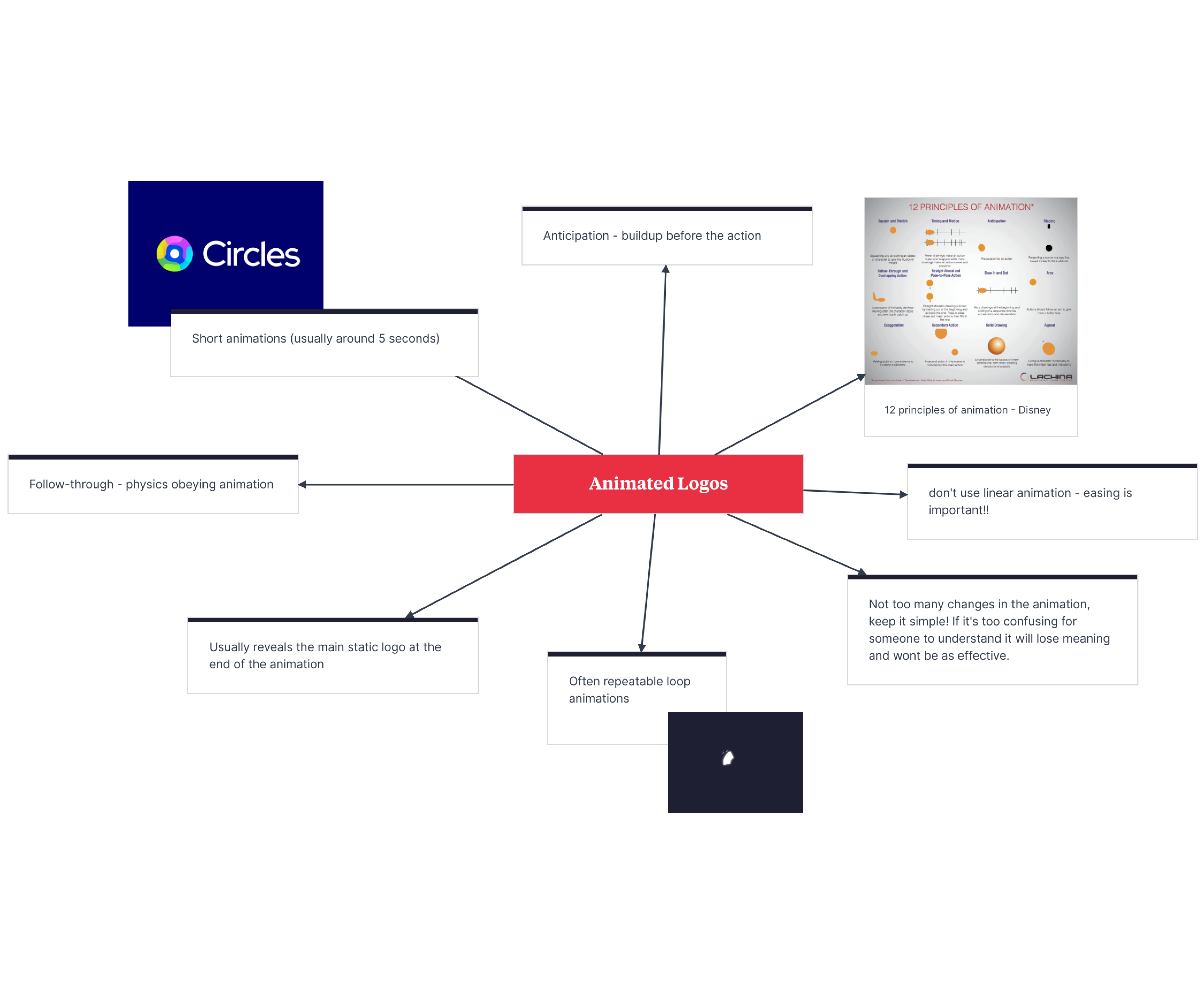
For this project, we were given a brief to design and animate a 3D logo for a title sequence or a channel indent, thinking about the meaning behind our logo and the way we would animate it. When hearing this brief, I was initially short on ideas and couldn’t find an idea to stick with, so I decided I would research other animated logos and find some common themes to overcome this. Some common themes I found when researching animated logos included short animations of usually around five seconds, simple and subtle animations, and these animations are often repeatable (1).
To strengthen my understanding of animating logos, I also decided to do some research into the 'Principles of Animation' from Disney. From this, I learned the importance of anticipation, follow-through, easy easing and many more. I kept record of all of this research, and my design process for this logo animation on Milanote, similar to many of my other projects.
(2) Initial Logo Sketches
Initial Sketches
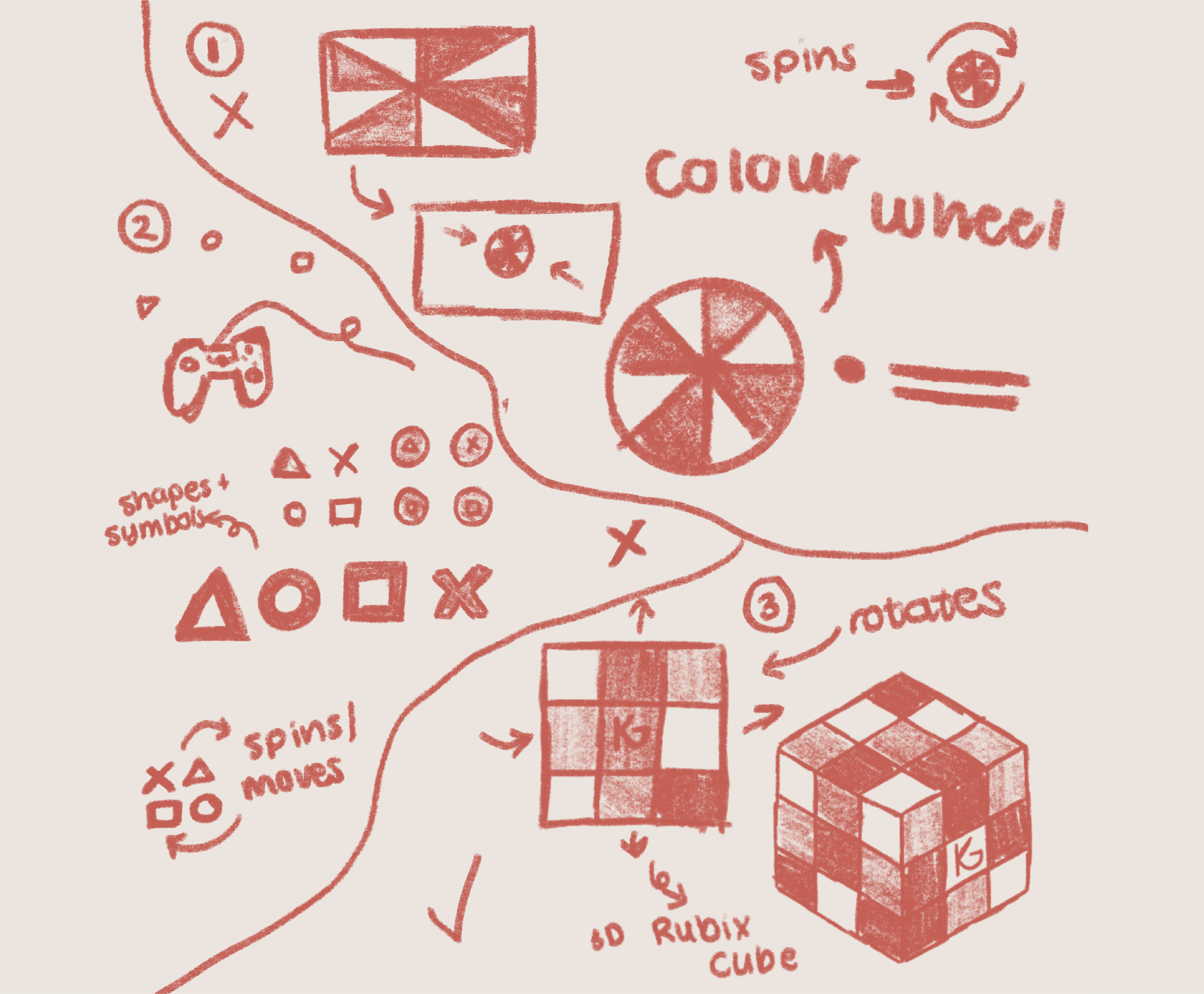
To help spark an idea for this project, I opened up my chosen sketching app, Procreate, and began putting some ideas onto the page (2). My ideas included:
1. Animating a colour wheel, which starts by spinning and revealing the full wheel over the whole page, before collecting in the centre and spinning again.
2. Using shapes, similar to the PlayStation or Switch control shapes, since this would give an insight into my personality and my love of video games.
3. Animating a Rubik’s cube that spins, before revealing my main logo in the centre tile similar to the logo on a regular Rubik’s Cube. This is the idea that would challenge me the most, as I was new to 3D animation, and therefore was the idea I decided to go forwards with.
I decided to animate a Rubik’s cube because they are vibrant and colourful, which is a positive attribute I wanted my logo to represent. They’re also flexible and fun, which is something I wanted to be established as a similarity in my own brand. The idea of a Rubik’s cube also has a good brand narrative, as it gives an insight into my personality and how I can solve a Rubik’s cube and used to play with them all the time as a child.
(3) Storyboarding Animated Logo
Storyboarding
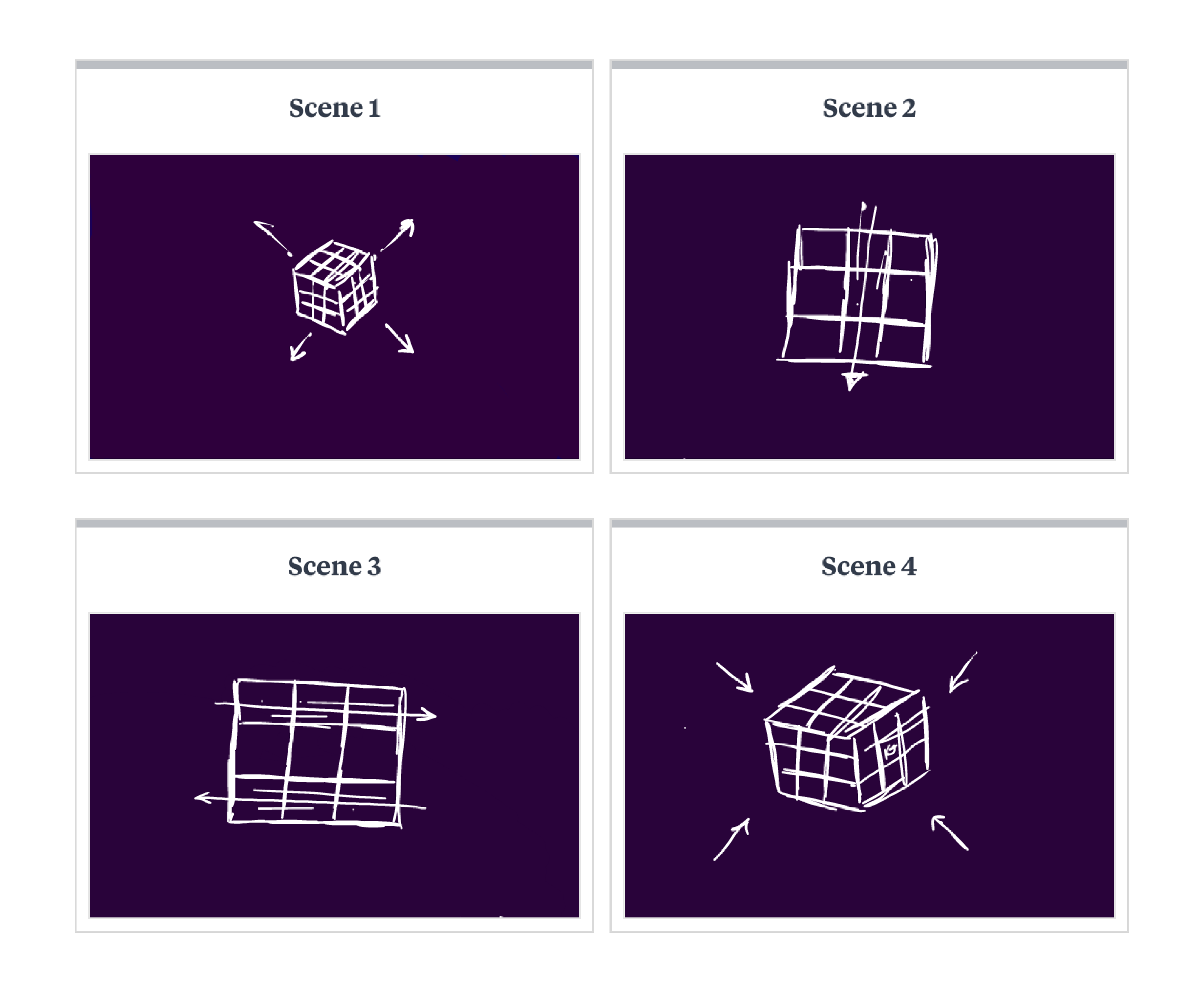
Due to this logo animation only being around five seconds in length and having minimal effects, I only needed to create around four scenes on my storyboard. Stripping my animation down to their basic animations, without adding any colour or developing full designs, I sketched out my scenes and annotated them in Milanote.
Scene 1 - For the first scene of my animation, I want the Rubik's to rotate and zoom in, showing off the 3D design immediately. For this zoom, it's important that I easy ease my keyframes so that it appears smoothly.
Scene 2 and 3 - For these scenes, the rows of the Rubik's cube would rotate to the next face, revealing a new row of colours each time. In these shots, paying close attention to 'anticipation' would greatly add to the impact of the animation, creating a build-up before the row completely rotates.
Scene 4 - For this last scene, the cube would repeat the same animation as the first scene, but in reverse. This would allow for a looping animation, which is a common theme in logo animation in the industry.
Project Development - Illustrator
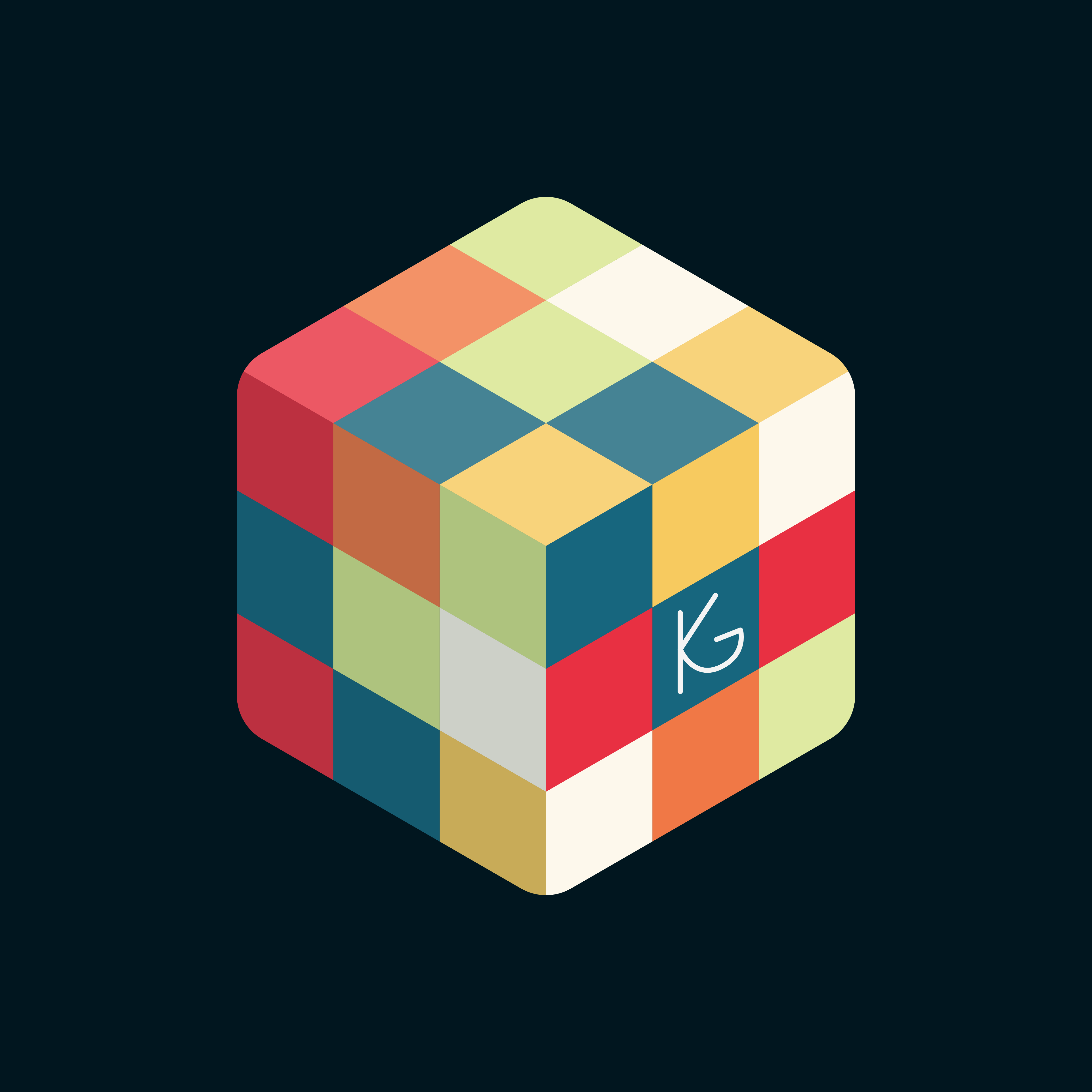
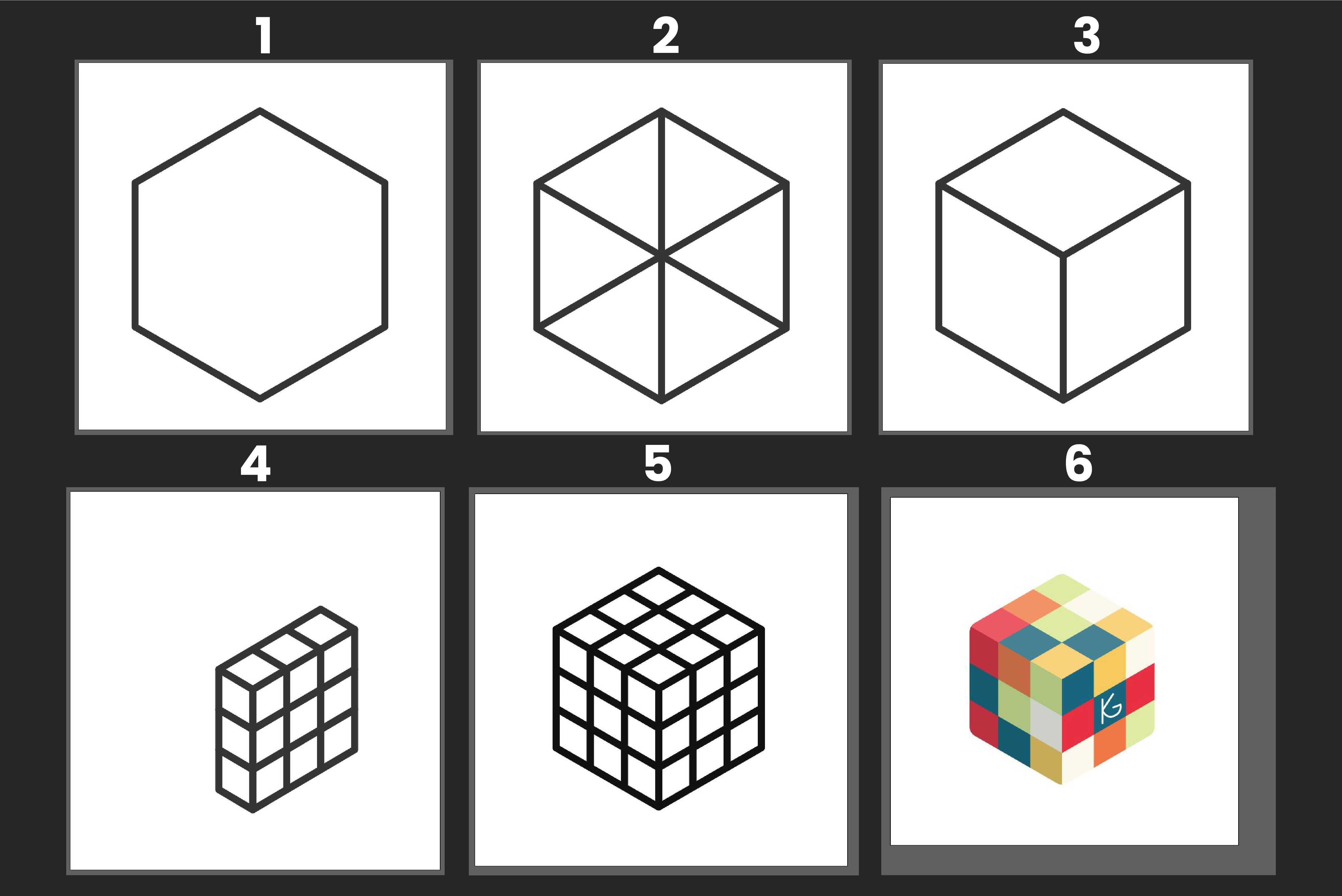
Before animating my logo, I knew I needed to create a static logo design to work with, so I loaded up Illustrator to explore colour and isometric design. For this, I started by using the polygon tool to create a hexagon shape and rotated it to give me a cube outline. I then drew lines between each corner and then cut the lines off at the middle to give me three faces. Using the shape builder tool, I split these faces into three separate shapes to work with. Since a standard Rubik’s cube is a 3x3 grid, I duplicated the shapes on each face and rearranged them until I got the desired finished cube. Finally, I used vibrant colours that you would normally find on a Rubik’s cube to colour in my logo and added highlights and shadows to the side faces to add more depth to my design.
Moving on to animating my logo, I decided to use After Effects, as this program would allow me to import any vector designs from Illustrator if I needed to, and it was also the program I was most familiar with when animating.
Project Development - After Effects
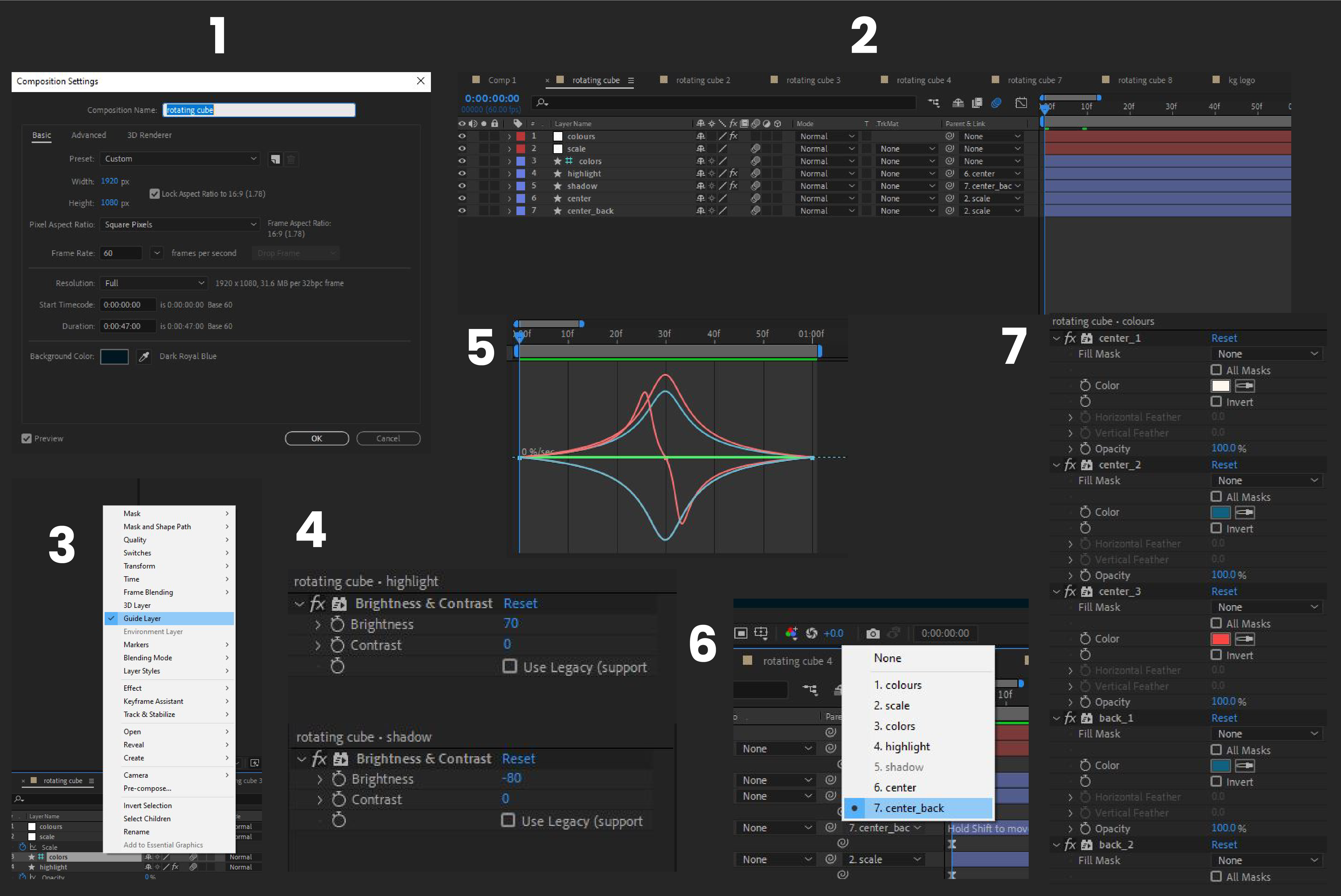
To start animating my logo, I created a composition size, 1920x1080px with 60fps (1), with a background of a darker complementary blue to my Rubik’s cube colours to help it stand out. Next, I needed to create my cube in After effects before working with it, so I created a shape layer and started working on the front face of my cube, constructed of 9 individual squares so that I could easily change the colours of these later on. I then separated the top and bottom row from the middle row, so I could focus on animating one layer and use that to repeat, which prevents me from having to individually animate per row each time and wasting time in the process. I then duplicated this middle row and called it ‘back’, as this would be the face of the cube that it would rotate to. Duplicating it again twice enabled me to create a highlights and shadows layer (4) so that as it was rotating, I could create the illusion that my cube was affected by light. Once I had all of the layers I needed for my rotating animation, I precomposed them (2) with my colour palette as a guide layer, so that it would only show up in this composition (3).
For the rotating animation, I changed the anchor point of my front and back layers, moving it to the left side of the font and the right side of the back. This would allow me to adjust the scale when rotating without distorting the placement of the row.
Speaking of animating the scale, I did this by removing the scale uniform so it would change from the anchor point, creating a rotating illusion. I then parent pathed the highlights and shadows to the corresponding row layers so that these layers moved with the cube (6). Once I had my rotation animation established, I animated the opacity, using keyframes, of my highlights and shadows so that they would appear as the cube rotated. Although my cube did look as though it was rotating, I thought it looked a little disproportionate, so I animated a stretch over the scale keyframes on a parented null layer, so that the row of the cube looked proportional the whole way through the rotation. Using the knowledge I had learned from Disney’s ‘Principles of Animation’, I made sure to easy ease these keyframes animations and edited the speed graph in the graph editor (5) to make them appear less linear. Once I was happy with this animation, all I needed to do was duplicate the composition whenever I wanted another rotation in my animation.
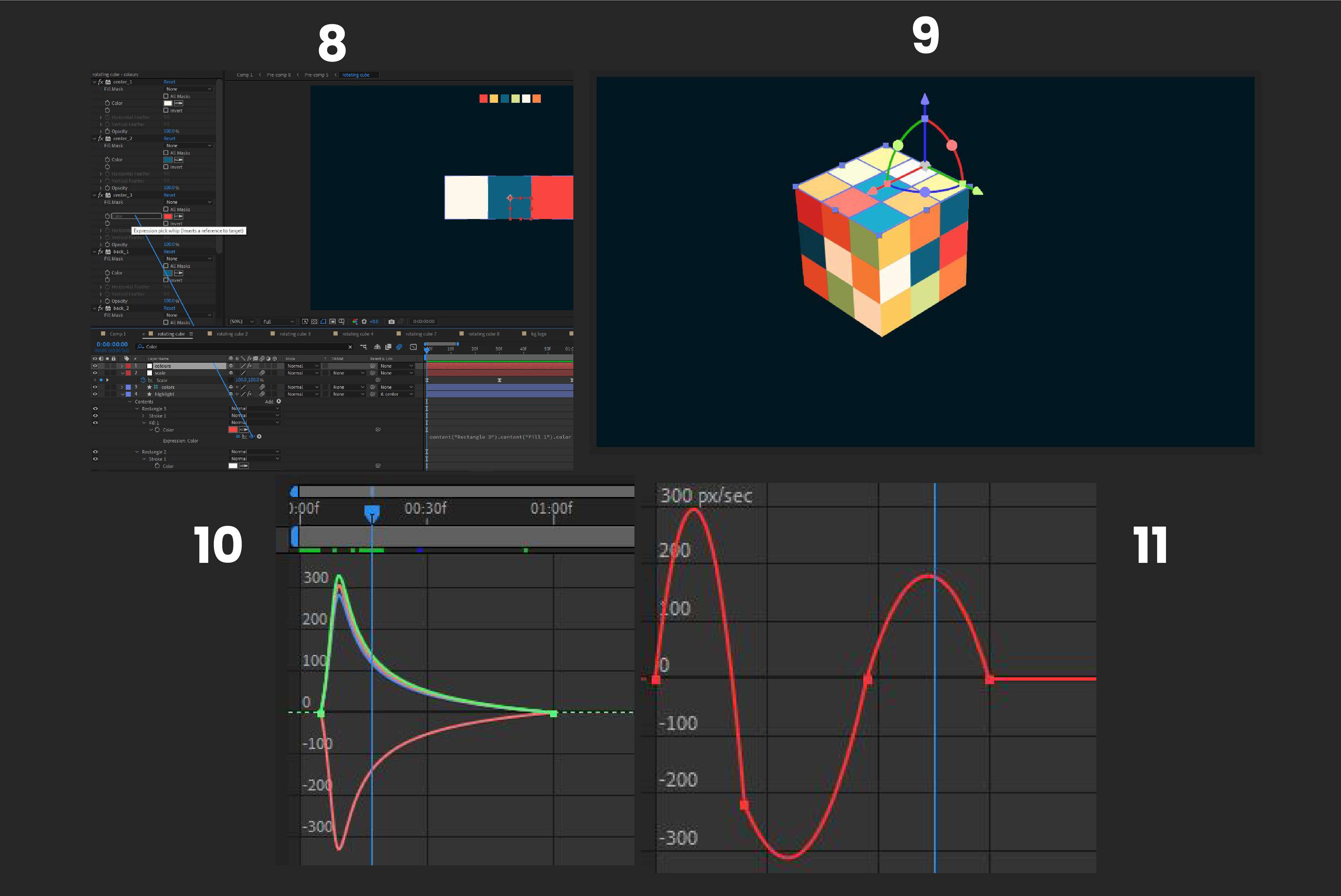
For my final rotation, I made sure to add my logo in the centre of my cube, so that it would reveal similarly to other animated logos I had researched. To create anticipation and follow-through for each rotation, I added a slight shake using position keyframes on a parented null layer (11), which made the cube shake slightly before each rotation to build it up.
Finally, I constructed a cube using 3D layers (9) and the snapping tool at the start and end of my animation and used rotation and scaling keyframes (10) to make it zoom in and zoom out so that the animation was repeatable.
As a final touch, I attempted to add some sound effects, using a swooshing sound effect when it zooms in and Rubik’s cube sound effects when the cube was rotating. I added these sound effects with premiere pro, as this was the program I was most familiar with when adding sound to video, and using different programs when possible helps to expand my software library for future design work.
(4) Final Animated 3D Logo
Reflection of Project
Overall I am happy with the outcome of my animated logo (4), and I feel that it successfully relates to other animated logos in the industry, as it is a short animation, not too complicated and it is a looping animation. The logo I have animated reflects the brief, as it has been animated, the meaning behind it has been thoroughly thought about, it is a 3D logo instead of just a 2D animation, and using Premiere Pro gave me a brief introduction to sound.
If I was to do this task again, I would try something a little more complicated for the appearing and disappearing animation than a simple zoom. Another option that could be explored is a rolling animation, or a reveal similar to the Nintendo GameCube logo animation. I would also try to make the logo cover the whole face instead of just one cube, as this makes it feel a little more complete, as it is a solved cube. Having it unsolved could maybe give the message that my workflow or working with me is messy if perceived in the wrong way.
