1. Brief Exploration
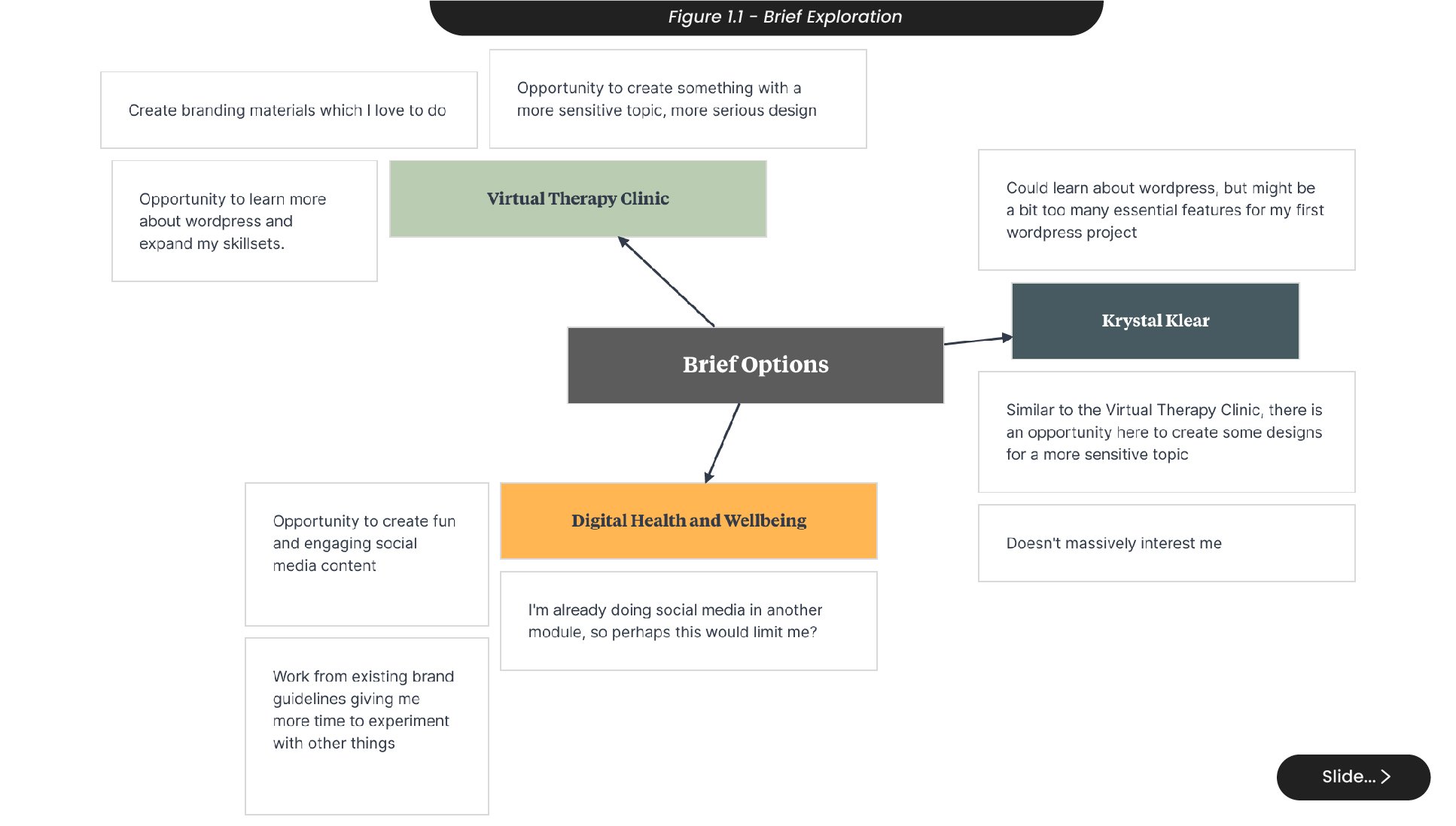
For this project, I started by having a closer look at all of the briefs that interested me after the client pitches to decide which project I wanted to be a part of throughout my second semester (Figure 1.1). From the briefs given to us, there were a variety of projects that offered design roles, and I was interested in three- ‘Krystal Klear’, the digital health and wellbeing week, and the virtual therapy clinic.
Looking at these briefs, I noticed that both ‘Krystal Klear’ and the virtual therapy clinic would allow me to improve my understanding of designing for a website, opening up opportunities to work with developers and create websites going forward as a designer. Both of these briefs would also allow me to design for more sensitive topics, which interested me as I am comfortable with designing for exciting and fun topics and it would be beneficial to try something new. However, after looking closer into the brief, ‘Krystal Klear’ didn’t interest me as much as it initially had, and I felt that the requirements for the website were overwhelming for my first project working with website design.
Another brief that interested me was digital health and wellbeing which would allow me to create fun and exciting content online. However, I was required to create my own social media campaign for another module this semester and felt it wiser to explore a wider variety of skill sets to get the most out of my time.
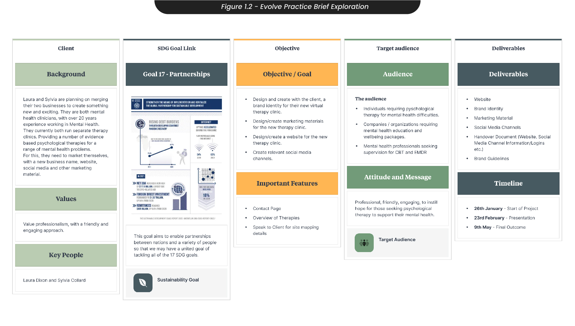
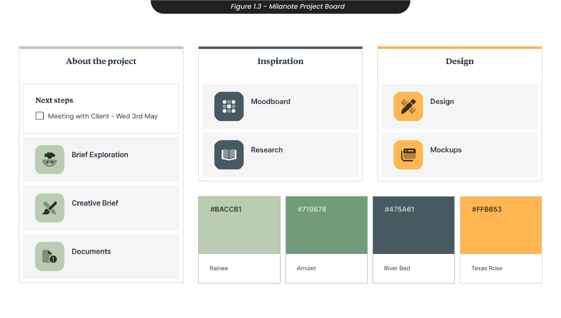
With my decision to not continue with Krystal Klear and the digital health and wellbeing briefs, I started taking a much more detailed look at the virtual therapy clinic brief (Figure 1.2). Here I was able to set out goals, deliverables, and objectives to establish an effective plan to manage my time throughout the semester. This brief is from mental health clinicians who aim to merge their businesses to create a new virtual therapy clinic, where they require a new business name, website, logo, and other marketing materials. With this knowledge, I set up a collaborative project board in ‘Milanote’ (Figure 1.3), so that my clients would be able to see live updates of what I’m working on and provide feedback.
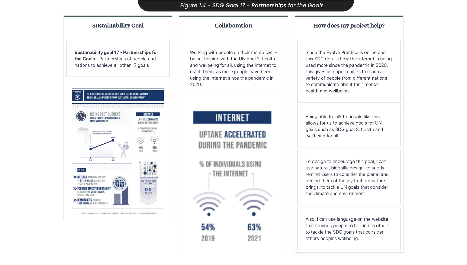
Another aspect of this module I needed to consider was the United Nations' sustainable development goal 17, partnerships for the goals (Figure 1.4). This goal attempts to bring people and nations together to have a united aim to achieve all of the 17 goals and acknowledges that if we are not united and don’t have a common vision, we will not succeed. My project will aim to achieve and support this goal, as this practice aims to work with people closely on their mental well-being and tackle goals such as SDG 3, health and wellbeing. SDG 17 details how since the pandemic, there has been an increase in users on the internet, proving that an online therapy clinic is a great way to unite and help people in the present.
To design for this goal, I can use natural biophilic design to subtly remind users to consider the planet and remind them of the importance of the environment, as well as use language that reminds users to be kind to others, tackling goals that consider climate and goals that consider the wellbeing of others.
2. Time Management
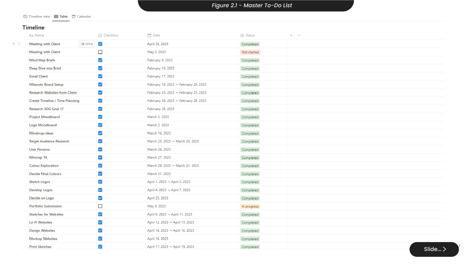
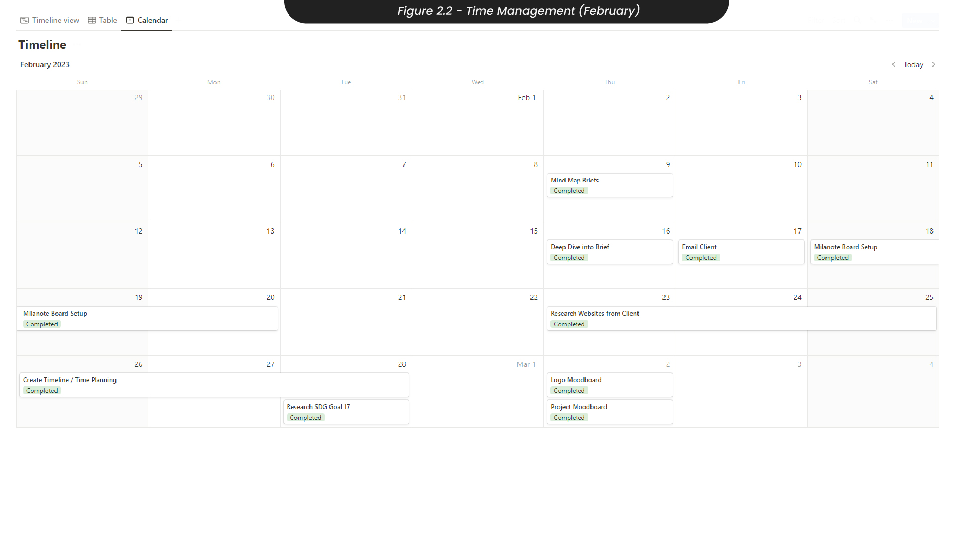
To manage my time for this project throughout the semester, I started by creating a master to-do list in Notion (Figure 2.1), so that I could organise when I would need to do each task and keep track of progress as I do. When deciding what dates I needed to complete each task by, I tried to give myself plenty of breathing room to account for any unexpected circumstances. Assigning due dates and deadlines to these tasks automatically created a calendar so that I could easily see what tasks I needed to do each month and prepare accordingly.
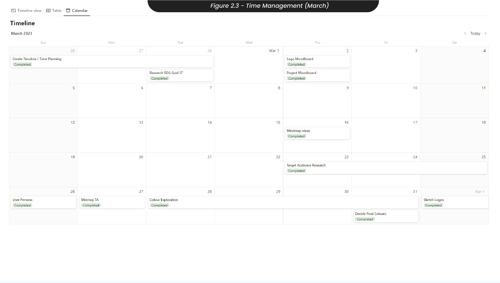
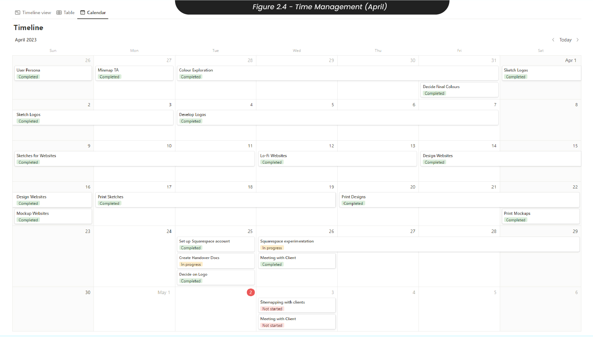
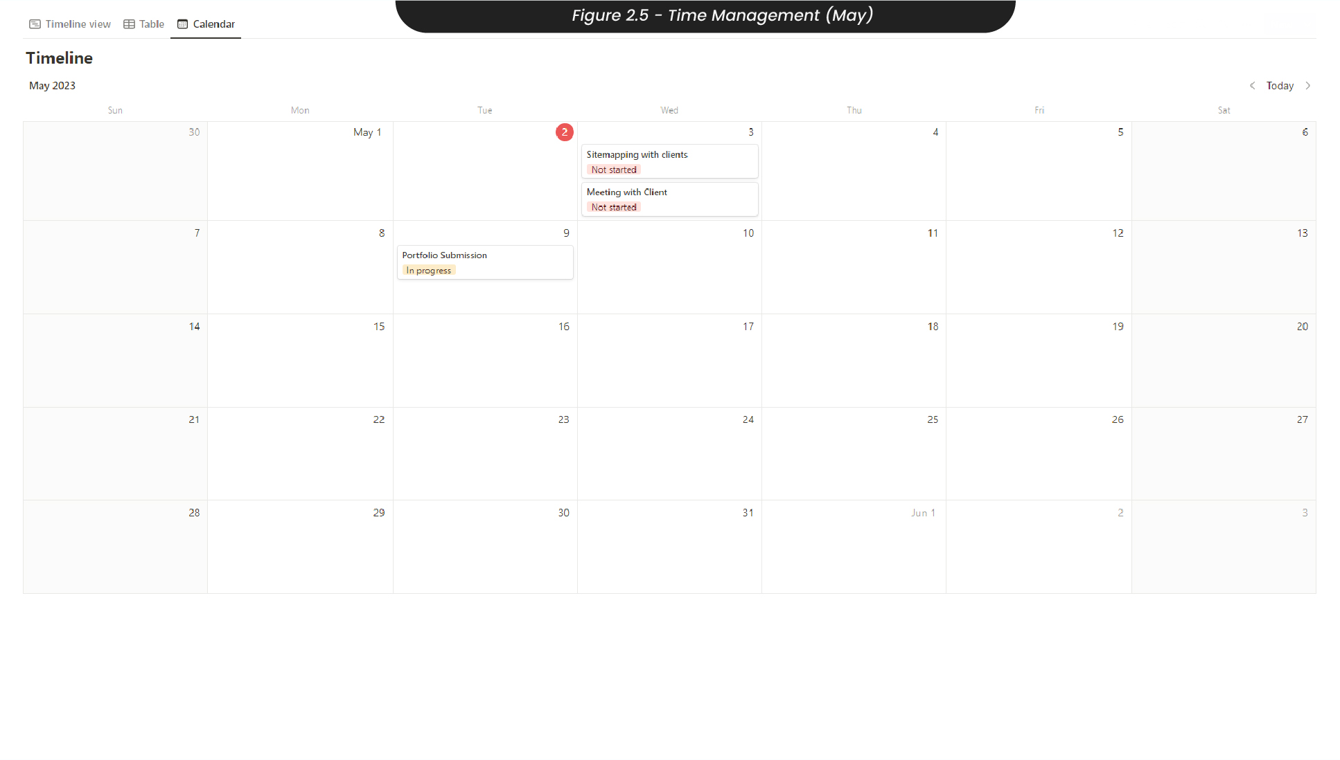
For example, I dedicated the first few weeks of the project in March to research and understanding my target audience (Figure 2.3), before dedicating April and the beginning of May to developing the project (Figure 2.4). I also made sure to allow time for meetings with my clients, Laura and Sylvia, for feedback.
Seeing these tasks in a monthly calendar view allowed me to notice when tasks were upcoming and when tasks were going overdue so that I could easily view how much time I had to make up for any time lost..
3. Research
When researching the competitive field, my clients sent over some websites they liked - the salisbury practice and wimborne psychology, along with a website they didn’t like, avenue therapies. This allowed me to identify some common themes that were liked so that I may align my designs and create something similar, along with avoid the design choices they didn’t like.
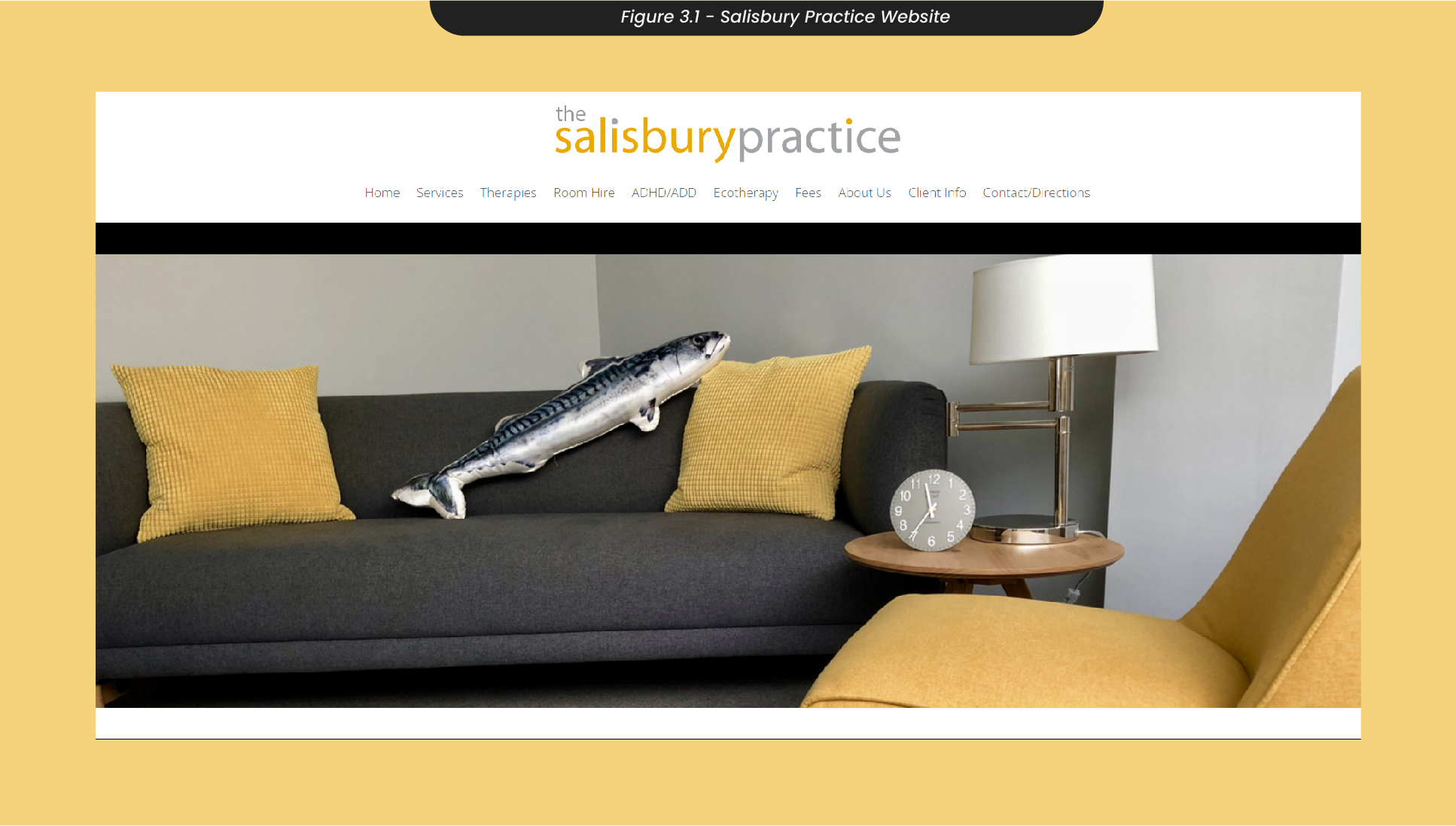
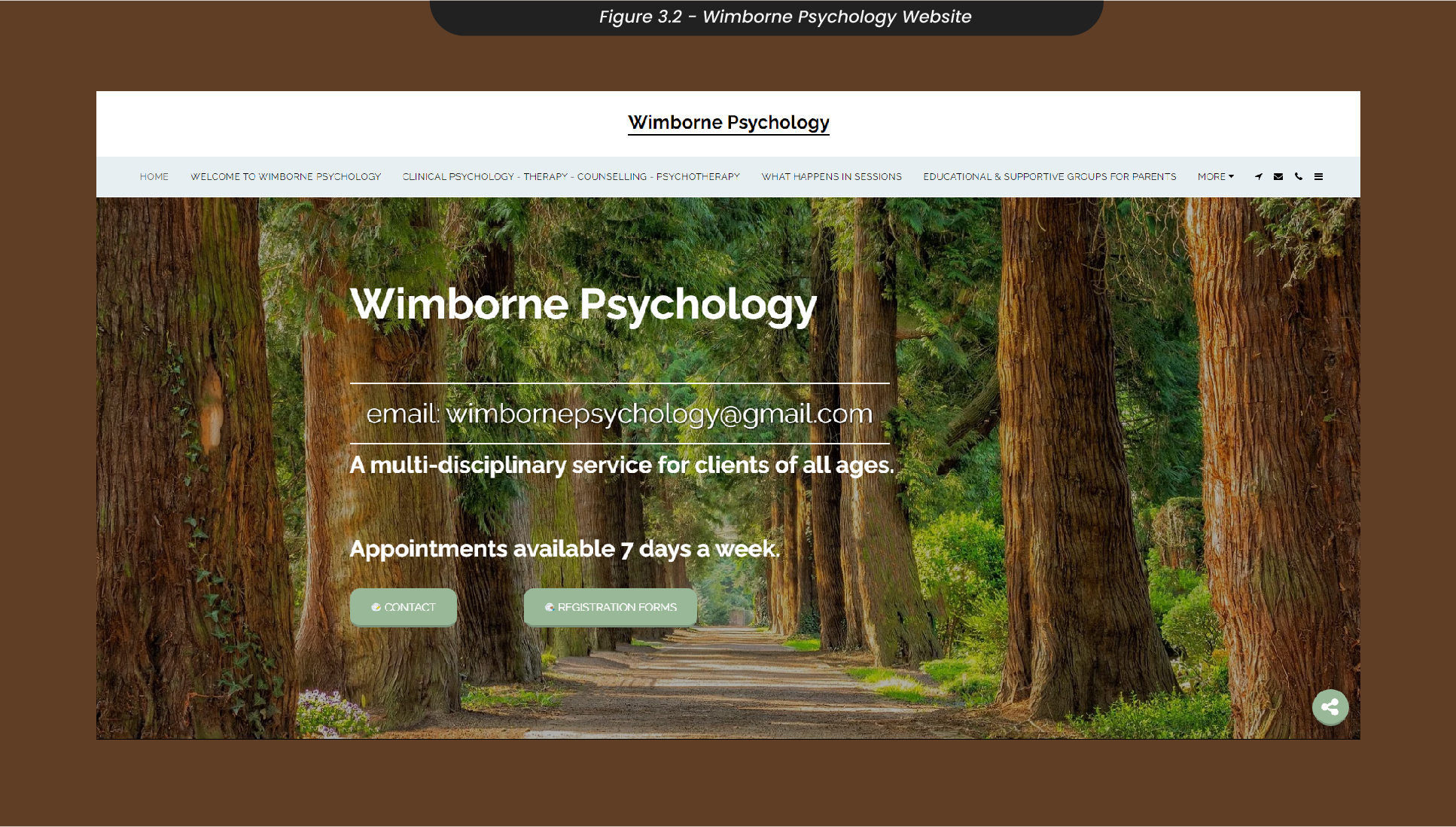
For example, I found that the website for Salisbury Practice (Figure 3.1)was clean and simple, as it used a minimal colour palette with only one colour being used consistently throughout the website, on a black or white background. Both the Salisbury Practice and Wimborne Psychology (Figure 3.2) use comforting or natural images to relax whoever is visiting the website. Most of these images also have soft corners, to further push that soft and relaxing feeling while navigating the site. Due to the nature of these websites and the heavy amounts of information, both sites liked by the client use clear and easy-to-read serif fonts, so that anyone navigating the website will find the information easy to digest and clear to read.
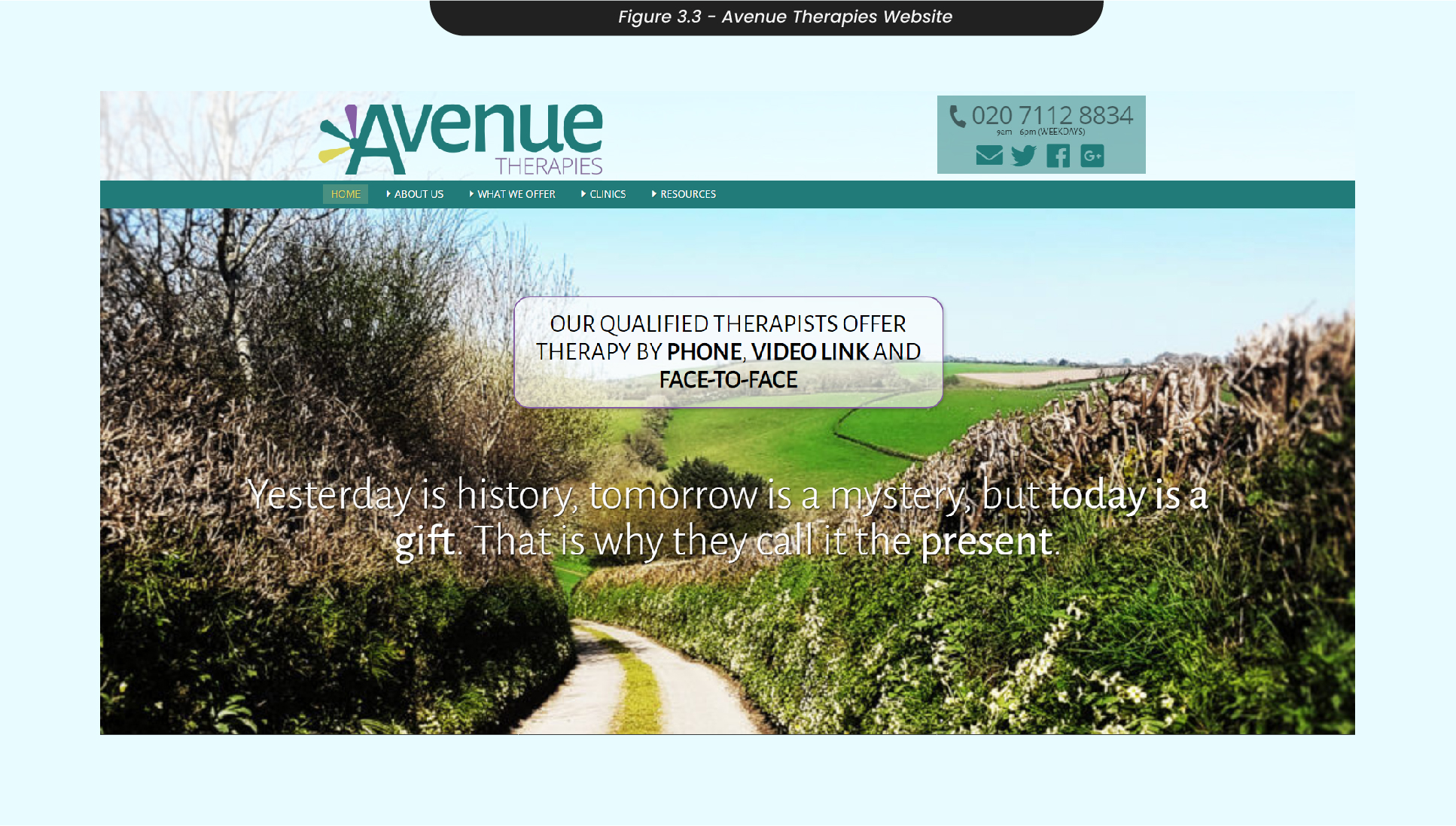
Avenue Therapies was a website that the clients didn’t like and didn’t feel successfully achieved their goal (Figure 3.3). When landing on this website, you are instantly met with a large amount of text, which can be overwhelming for anyone, let alone somebody who is struggling with their mental wellbeing and looking for help. From this, it is clear that we need to ensure the website has a minimal amount of information so that it can be easily digested and understood, allowing people to find help and not be turned away. The colours on this website are also relatively bright and not incredibly cohesive, which can also overwhelm anyone navigating the site as the wrong colour palette can be jarring and disrupt an entire design. Therefore, we need to ensure we use a cohesive and consistent colour palette that is easy on the eyes so that the whole experience of finding help is calming and inviting.
4. Project Ideation
After researching other therapy clinics, I used this new knowledge to start mood boarding and brainstorming ideas that aligned with what was successful about them.
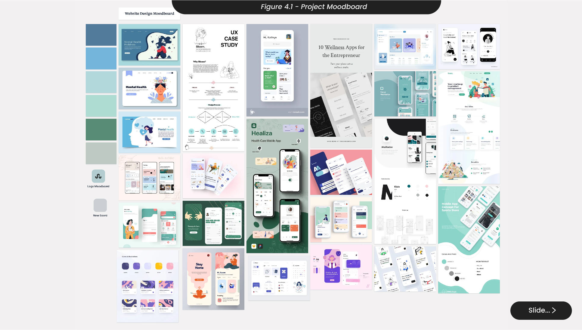
For example, I created a mood board (Figure 4.1) for the overall project design with designs that I felt were cohesive, calming, and similar to the theming of the Salisbury Practice and Wimborne Psychology, while still unique to the project we were creating. With this mood board, I identified that commonly amongst all of the images I had picked out, the colours were often muted and not many palettes used a true black. This could be due to black backgrounds and assets not being easy on the eyes, as your eyes need to work harder to digest a black image. Another noteworthy common theme I was finding in my mood board images was the use of serif fonts so that the content on the designs was easy to read and digest, which is incredibly important for the information-heavy website we were planning to create.
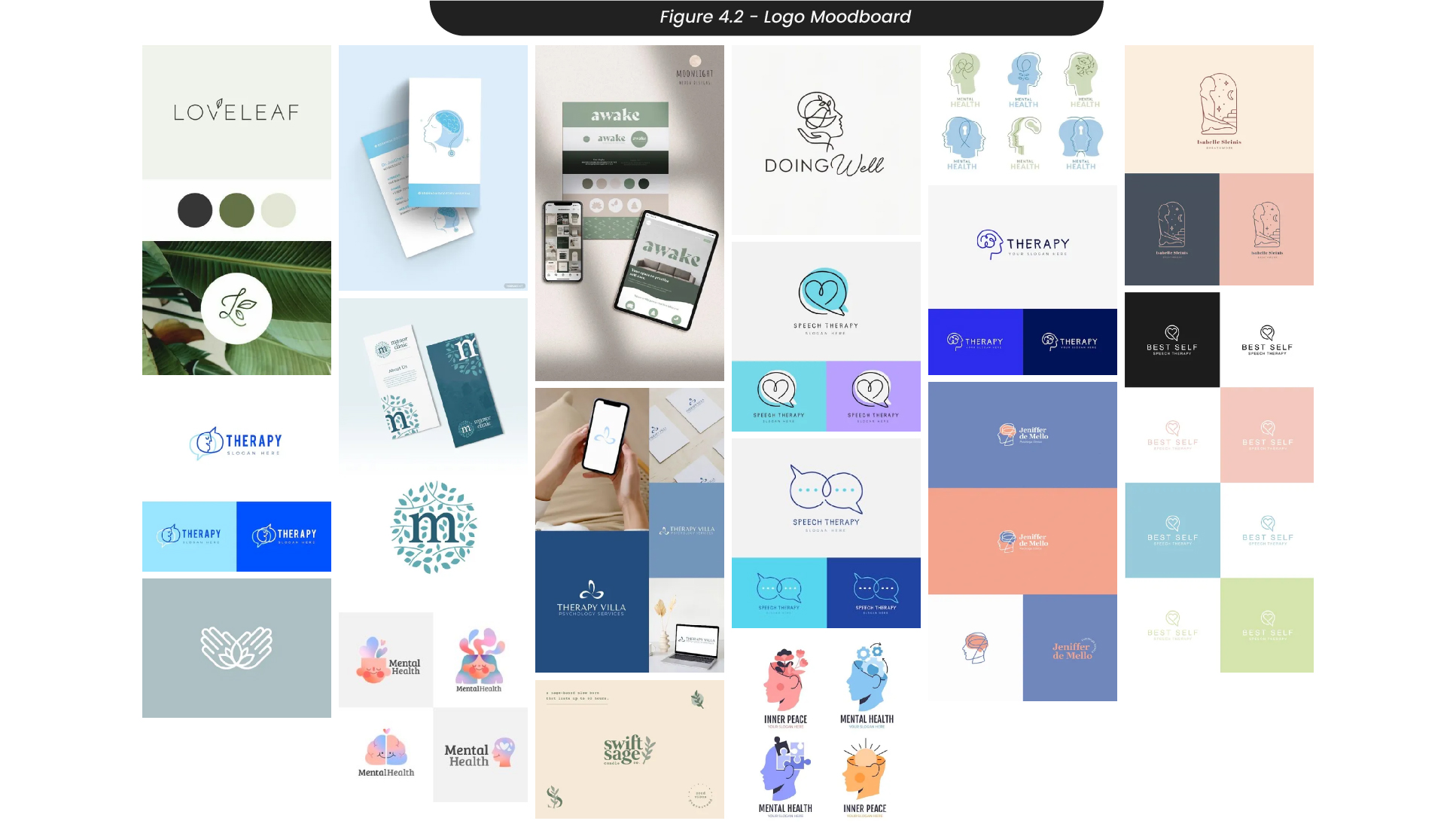
I then created a logo mood board to see what common themes and how other therapy clinics had approached their logo design (Figure 4.2). I found that most of these logos were simple and clean, with not too many abstract or eccentric design techniques. Many of the logos I had found, a common theme throughout my research, were nature-focused and featured biophilia. This informed me that the branding I created for this project needed to have hints of nature, even if not entirely. The fonts I found also featured more round and circular shapes, so they appeared softer and more inviting than shapes with sharp, jagged edges.
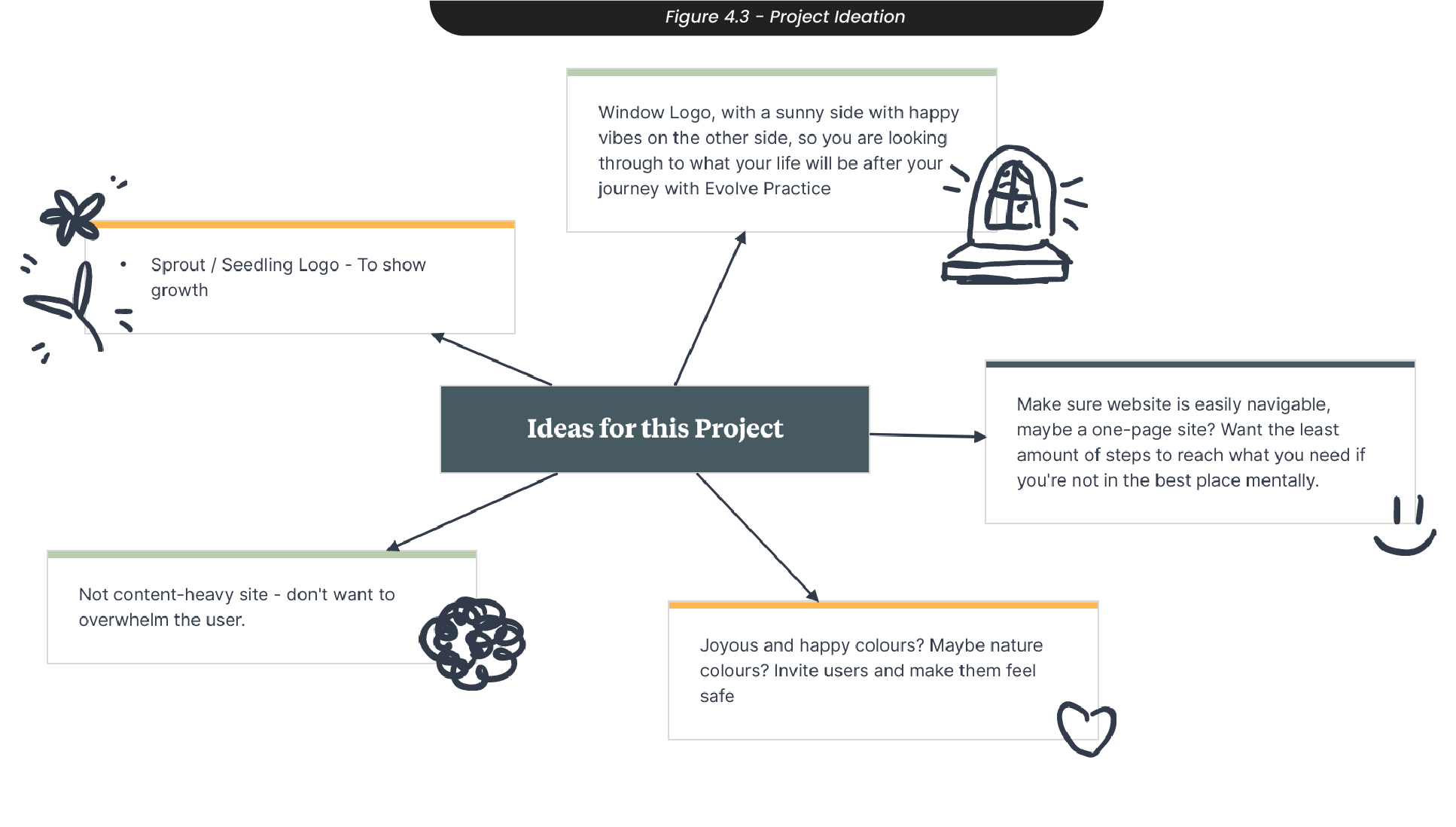
Using common themes and design techniques I liked from my mood boards, I started to think about what was needed and what would appear aesthetically pleasing and match the brief (Figure 4.3). I thought about using sprouts or seedlings as the logo, to signify the personal growth that this therapy clinic would offer. For colours, I wanted to use a cohesive and nature-focused colour palette, to really push that nature focus in the design.
I also made sure to note that the website needed to refrain from having a large amount of information at once and that the site needed to be easily navigable. In fact, I originally thought about creating a one-page site to prevent users from being overwhelmed by content, but with the amount of information required, I thought it better to break this content up with different site pages.
5. Target Audience
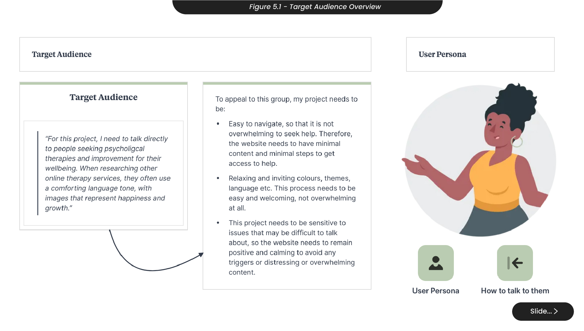
For this project, it was important to consider my target audience - those requiring psychological therapies or advice on improving their mental well-being (Figure 5.1).
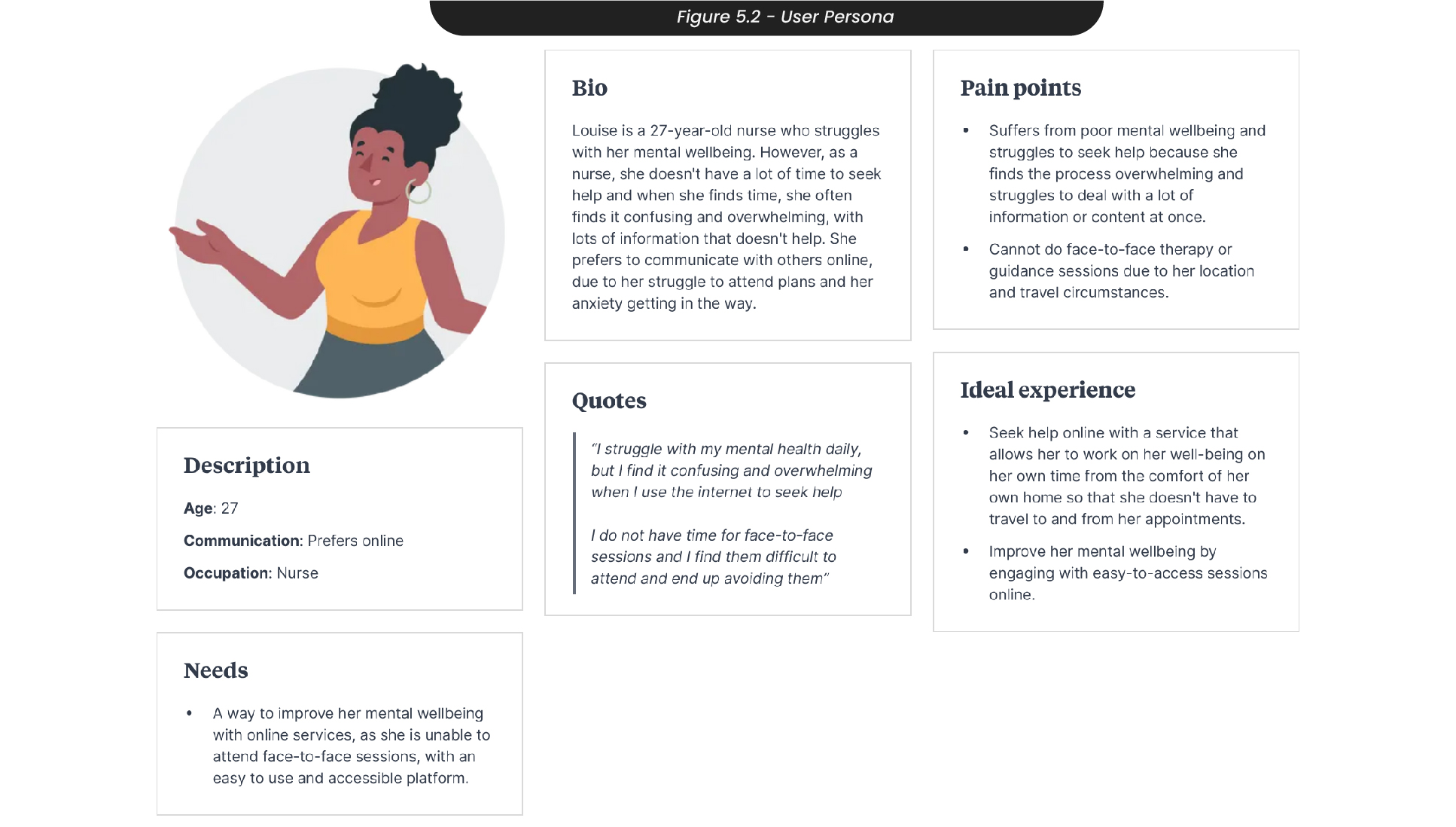
To understand this target audience, I created a user persona to analyse the pain points, ideal experience, needs and more of the users I would be indirectly speaking to (Figure 5.2). For example, ‘Louise’ is a 27-year-old nurse who is struggling with her mental well-being, but finds the process of accessing help overwhelming and confusing. She would prefer to do online communication if she was able to speak to someone about her mental health, as she is very busy and cannot find time to travel to face-to-face sessions. Therefore, her ideal experience would be to find an easy-to-access online therapy clinic that allowed her to work on her mental well-being with a professional in her own time from the comfort of her own home.
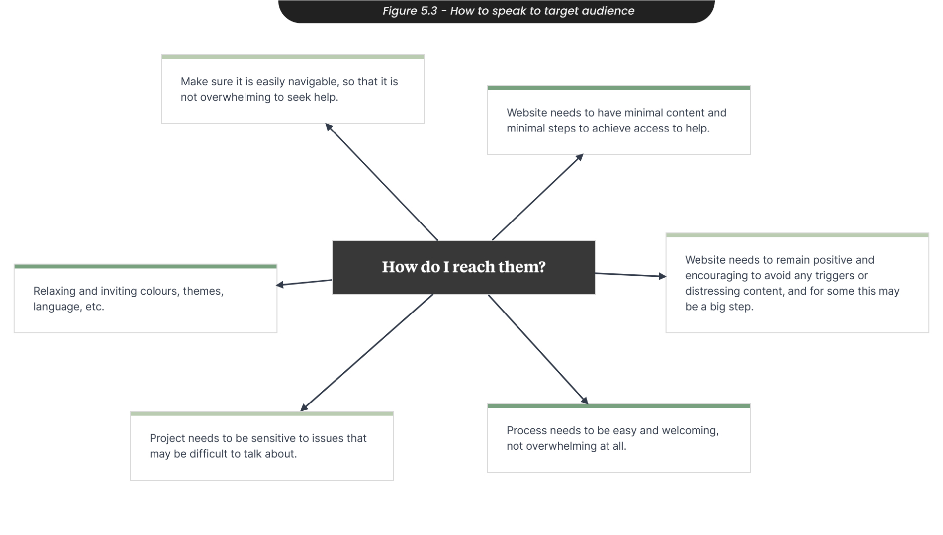
To reach and successfully appeal to this target audience, it is important that the design of the website is relaxing and inviting, with minimal content so that they do not get overwhelmed while navigating the site and get turned away from seeking help (Figure 5.3). It is also important that the language and tone of voice throughout the website is welcoming and comforting, to allow them to feel safe and open to talking about their problems with professionals. Something worth noting is that the website needs to also remain positive and encouraging, to prevent users from worrying or potentially triggering them with distressing content or a negative tone of voice.
6. Branding
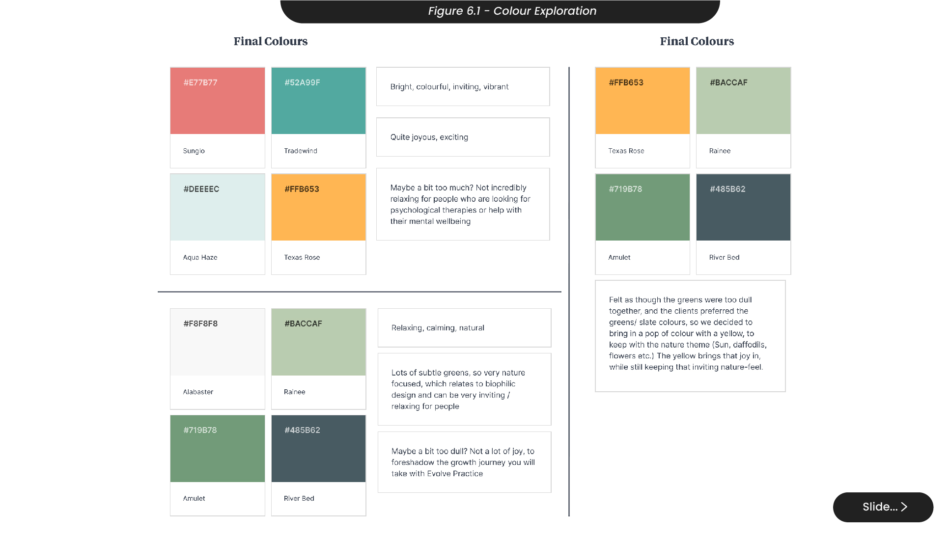
When deciding on the colours for this project, I initially thought about using bright and colourful colours (Figure 6.1). Although these colours were exciting, we thought maybe they were a bit too overwhelming, and not relaxing enough for people looking for psychological therapies. Therefore, I also looked at using a more muted colour palette with lots of subtle greens that signified nature. These colours were very inviting and easy on the eye, but after discussing with the clients, we both felt it could benefit with a pop of colour to help it stand out. In one of our meetings, we decided to bring in a yellow to keep with our nature-themed palette, reflecting the sun and flowers like daffodils. The yellow brings that joy and pop of colour, while still keeping that subtle, muted colour palette.
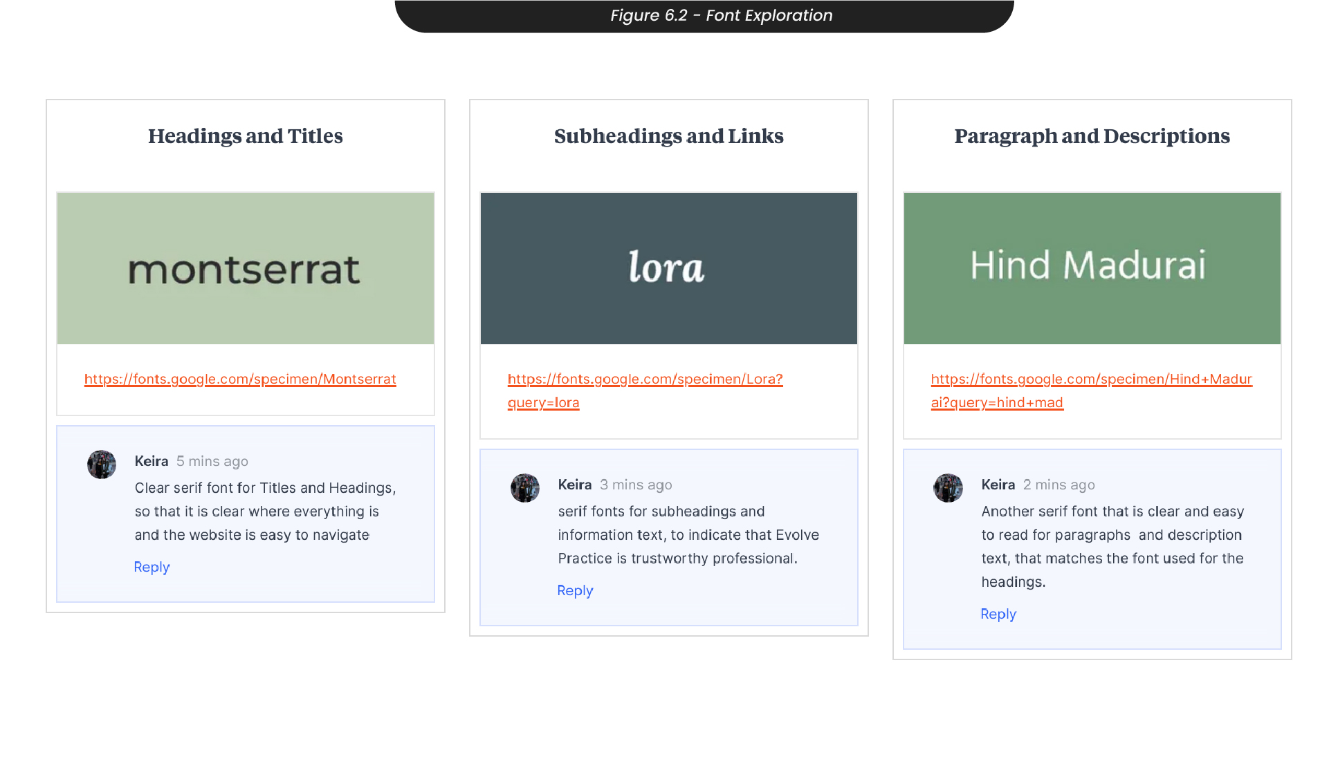
Knowing that the site would have lots of information and large amounts of text, I chose fonts that are easily readable (Figure 6.2). For example, I decided on montserrat for the headings and titles, and hind madurai for paragraphs and body text, as these serif fonts are clear and easy to read. For subheadings or links, I chose to use Lora, as this brings in the use of a sans serif font to support the feeling of professionalism and trust on the site, while still ensuring the overall site is incredibly easy to read.
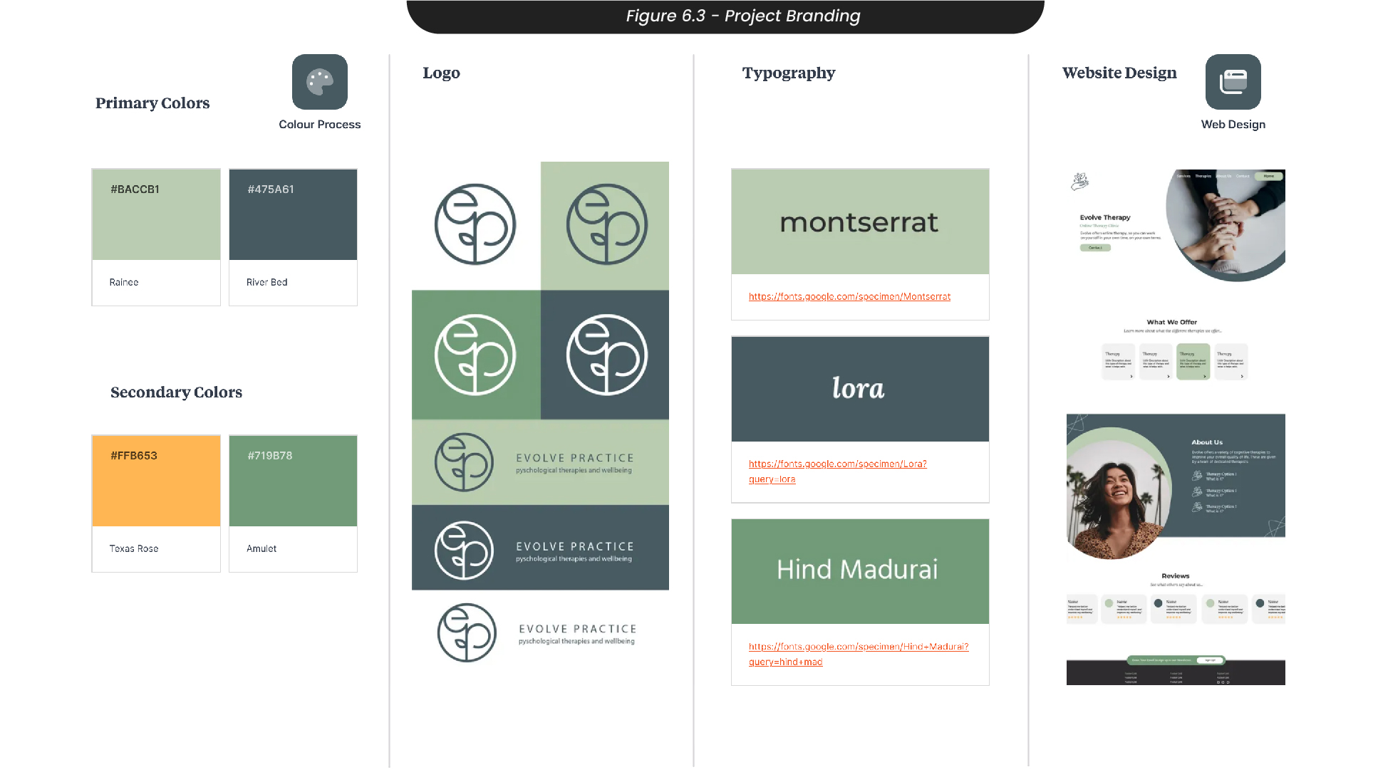
Using these decisions, I created an early set of brand guidelines in Milanote to ensure all of my materials and designs going forward were consistent (Figure 6.3).
7. Logo Sketches
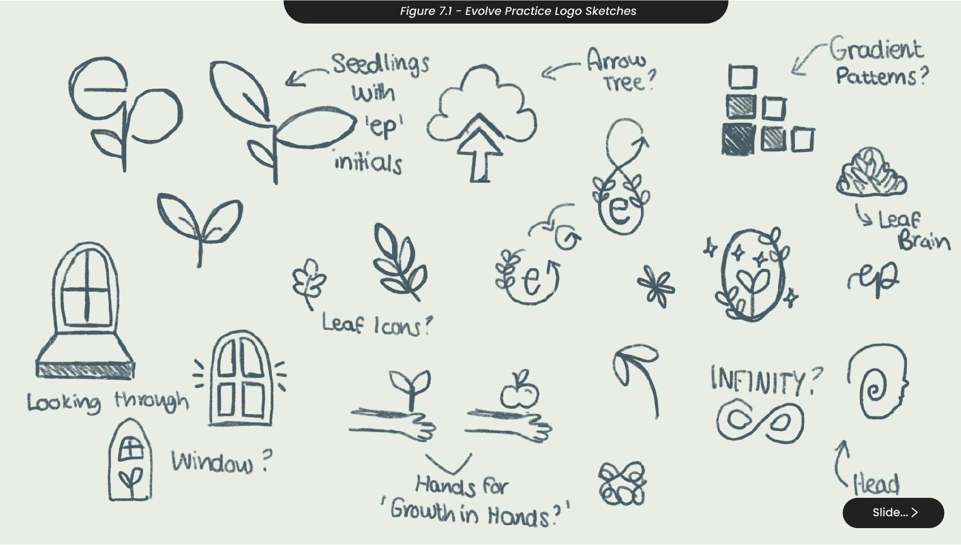
Starting my design process, I sketched a variety of logo ideas for the name ‘Evolve Practice’, a name the clients had come up with (Figure 7.1). For example, I sketched many logos that centred around nature, with leaves, seedlings and plants. With these, I was aiming to reflect on the personal growth you would take when joining the Evolve practice. Another sketch I thought of for this logo was a head icon or a brain, to instantly communicate this practice has psychological therapies and focuses on mental well-being. However, I felt this idea was overdone with other therapy clinics so prevents the practice from standing out or being recognisable.
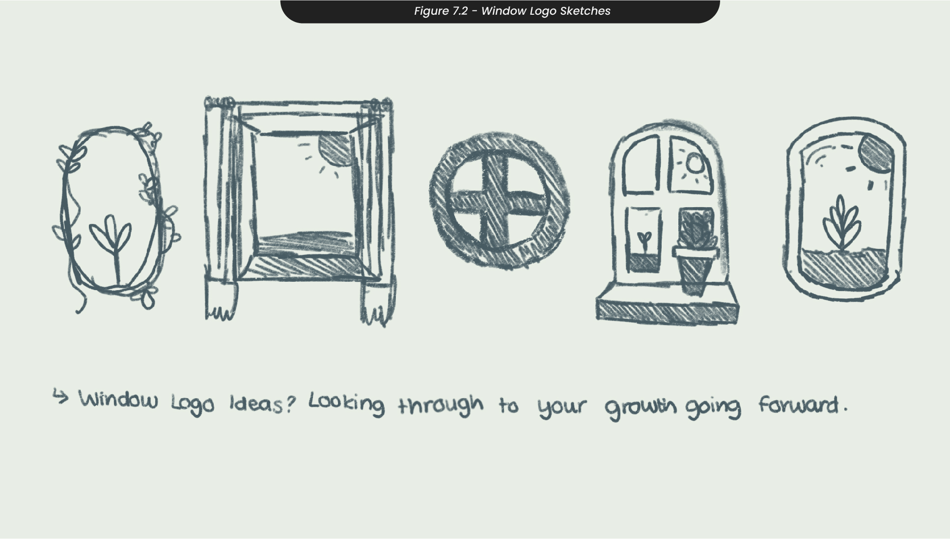
An idea I played with during the early stages of this project was a window logo, to represent you on the website, looking through to your future growth with the evolve practice (Figure 7.2). However, these were too detailed for a logo that would likely sit in the corner of the website or print materials, and minimising the detail would take away from the meaning.
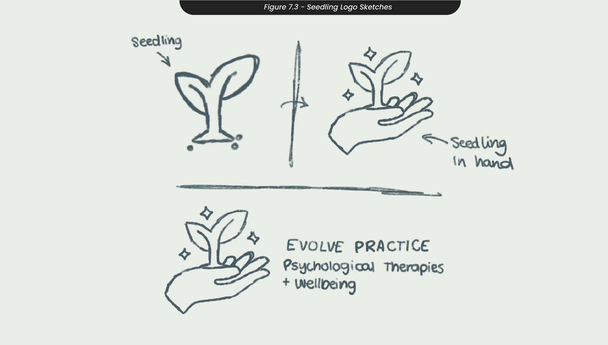
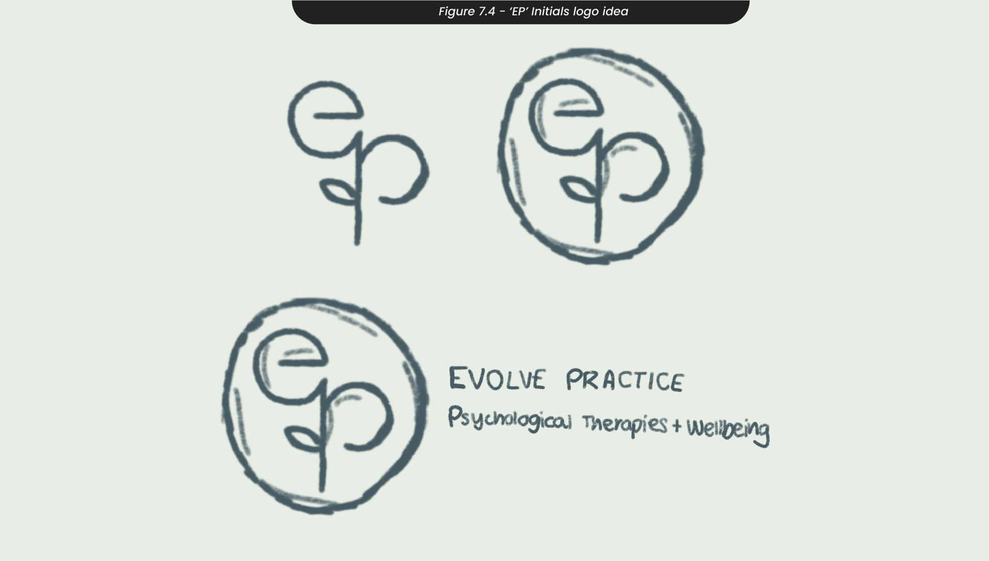
Another idea I had during my sketching process was a hand holding a sprout, to represent your personal growth and how it was in your hands (Figure 7.3). Following the sprout iconography for the logo, I created a logo that captured the ‘ep’ initials of the Evolve Practice, which is something my clients had requested after discussing further. Both the E and P in this logo acted as leaves to this seedling allowing it to still represent a sprout, but keeping the ‘E’ and ‘P’ as the focal point (Figure 7.4).
8. Logo Development
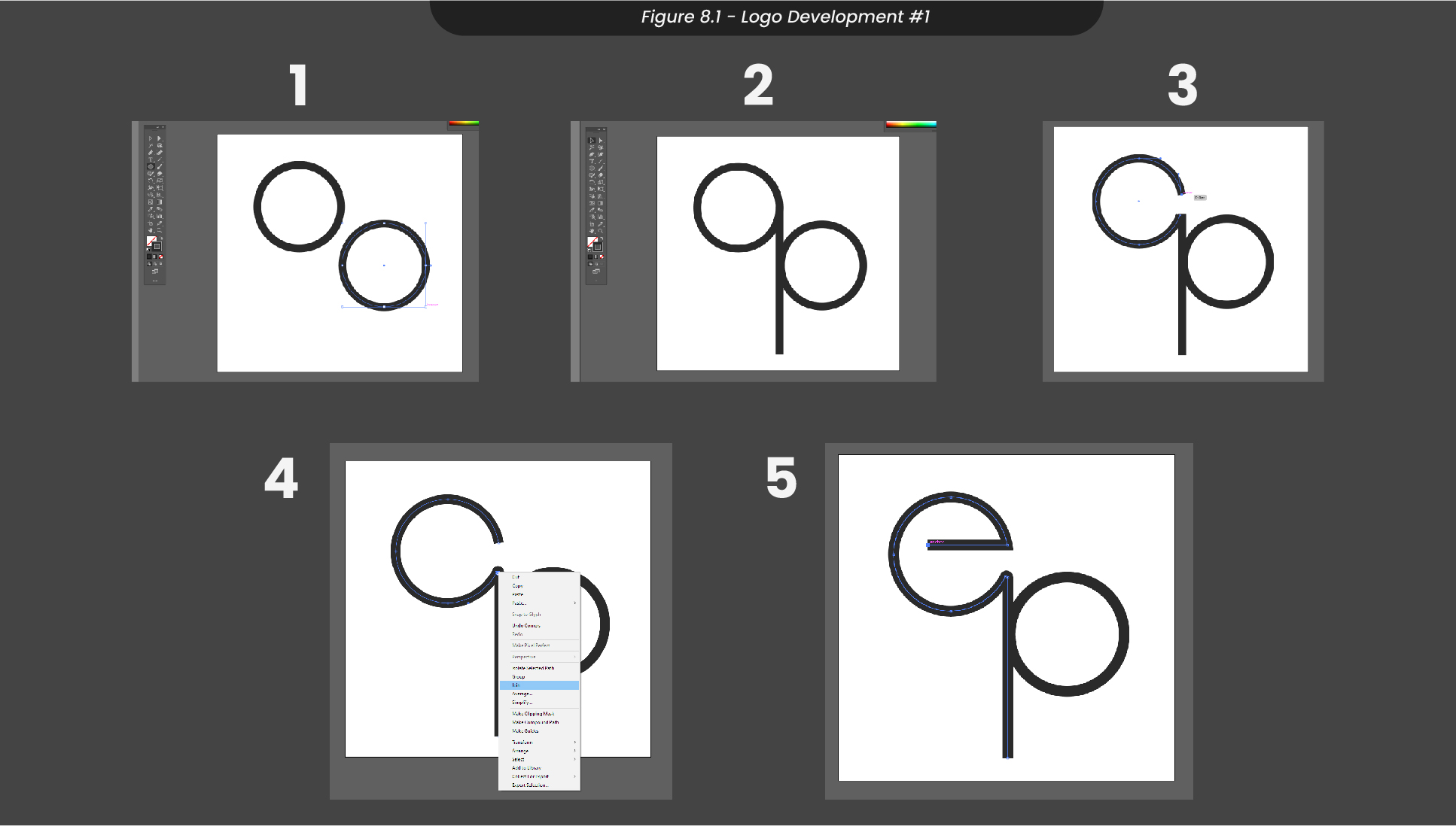
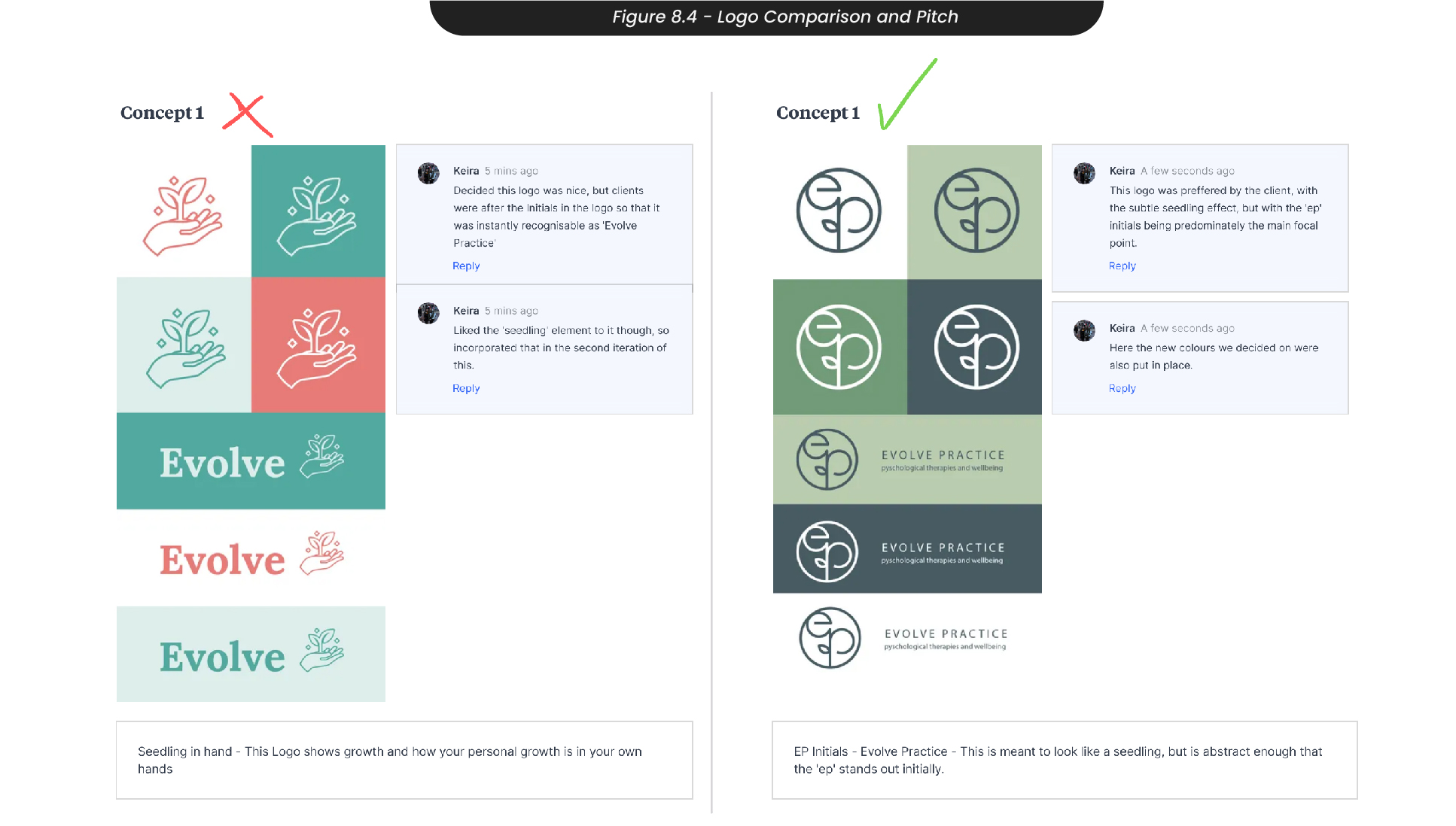
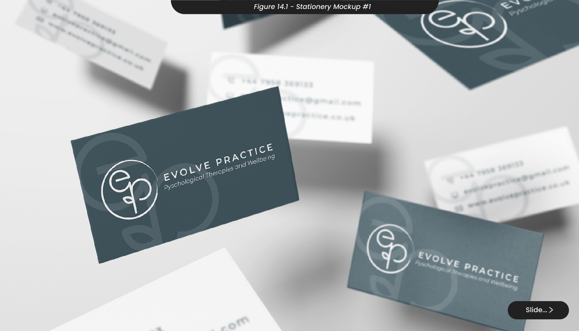
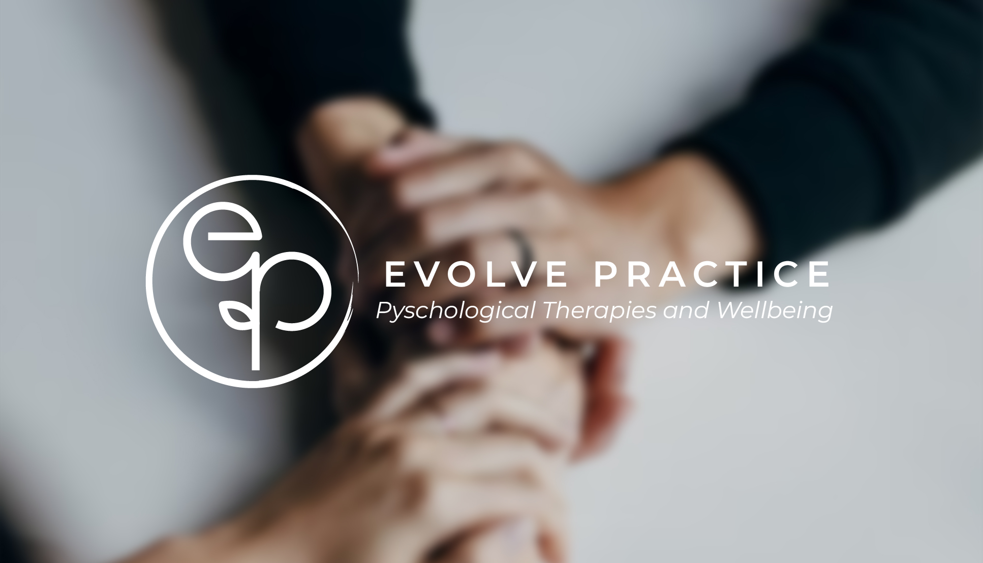
After looking at both the hand logo and the initials logo, as these were the logos with the narrative and aesthetic we were aiming for with this project, the clients decided they preferred the ‘ep’ seedling logo as the initials of Evolve Practice were clear and the main focal point, with a subtle nature theme as well (Figure 8.1)(Figure 14.1).
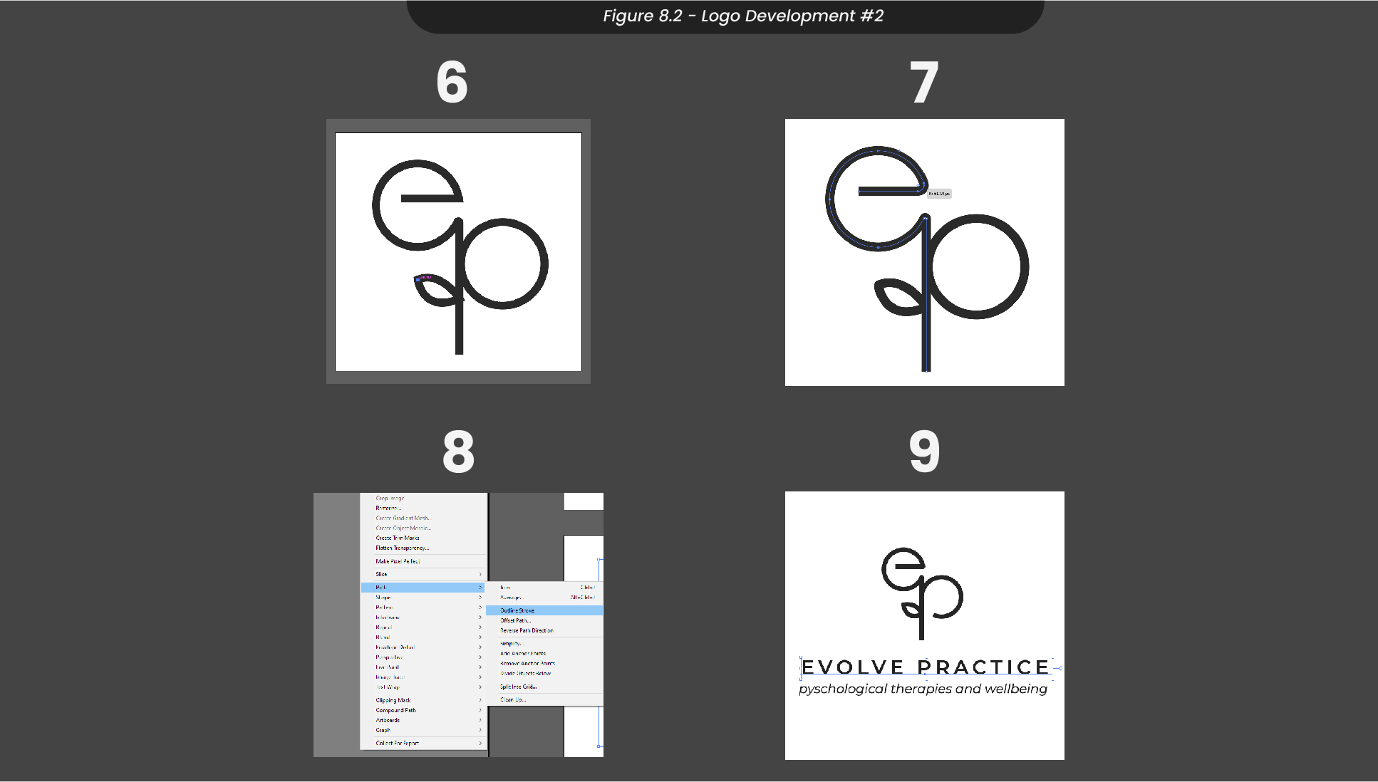
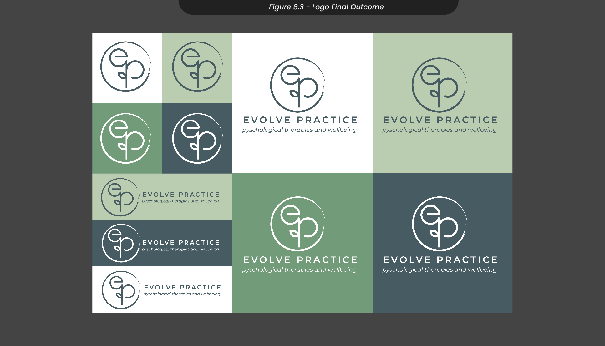
To create this logo (Figure 8.2), I started by creating an artboard in Illustrator and adding two circles using the Elipse tool. Following my sketch, I connected these circles by creating the stalk using the pen tool, and connected the paths using ‘join’. To ensure the initial ‘e’ and ‘p’ stood out, I adjusted the first circle by adding a point along the path and disconnecting it from the rest of the circle, before extending it across the middle so it appeared as a lowercase ‘e’. To finish off this logo design, I added a leaf along the left side of the stalk and rounded out all of the corners to give it a softer look (Figure 8.3), before attaching the name of the practice along with a tagline - ‘psychological therapies and wellbeing’.
9. Sitemapping and Website Sketches
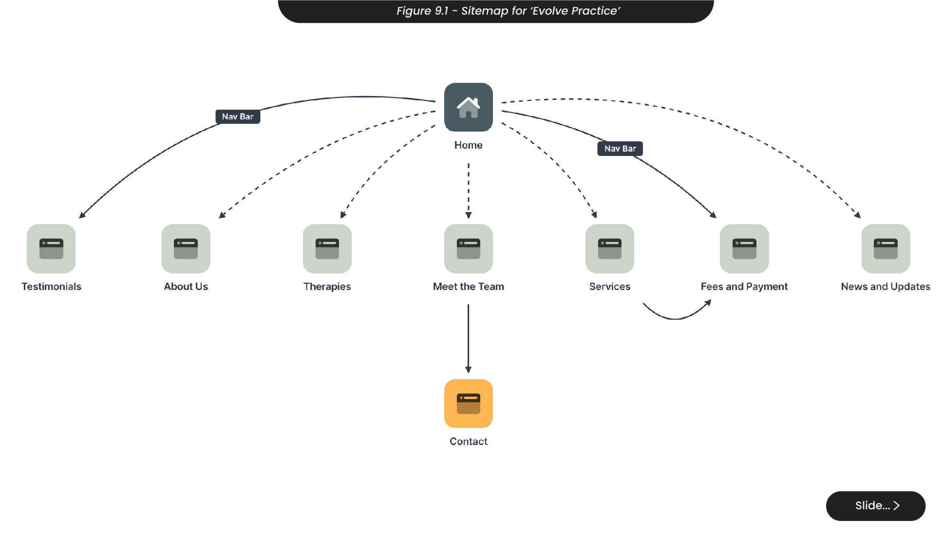
To start creating the website, I first outlined a sitemap to identify what would be needed on the navigation bar along with what would work well on the home page (Figure 9.1). Doing this also allowed me to ensure the process of getting to what you need on the website was not too long, as this can deter visitors from staying on the page and they might click off the website altogether. I chose to put the about me and our Meet the Team section on the homepage, as this would allow visitors on the site to instantly understand what Evolve is and see the accredited therapists that are behind it. While most of the sections on the home page will expand in more detail on a separate page, having an initial view of the services and therapies available will allow visitors to find what they’re looking for much faster, supporting Hicks Law, which states reducing the number of clicks or steps to encourage a faster decision-making process.
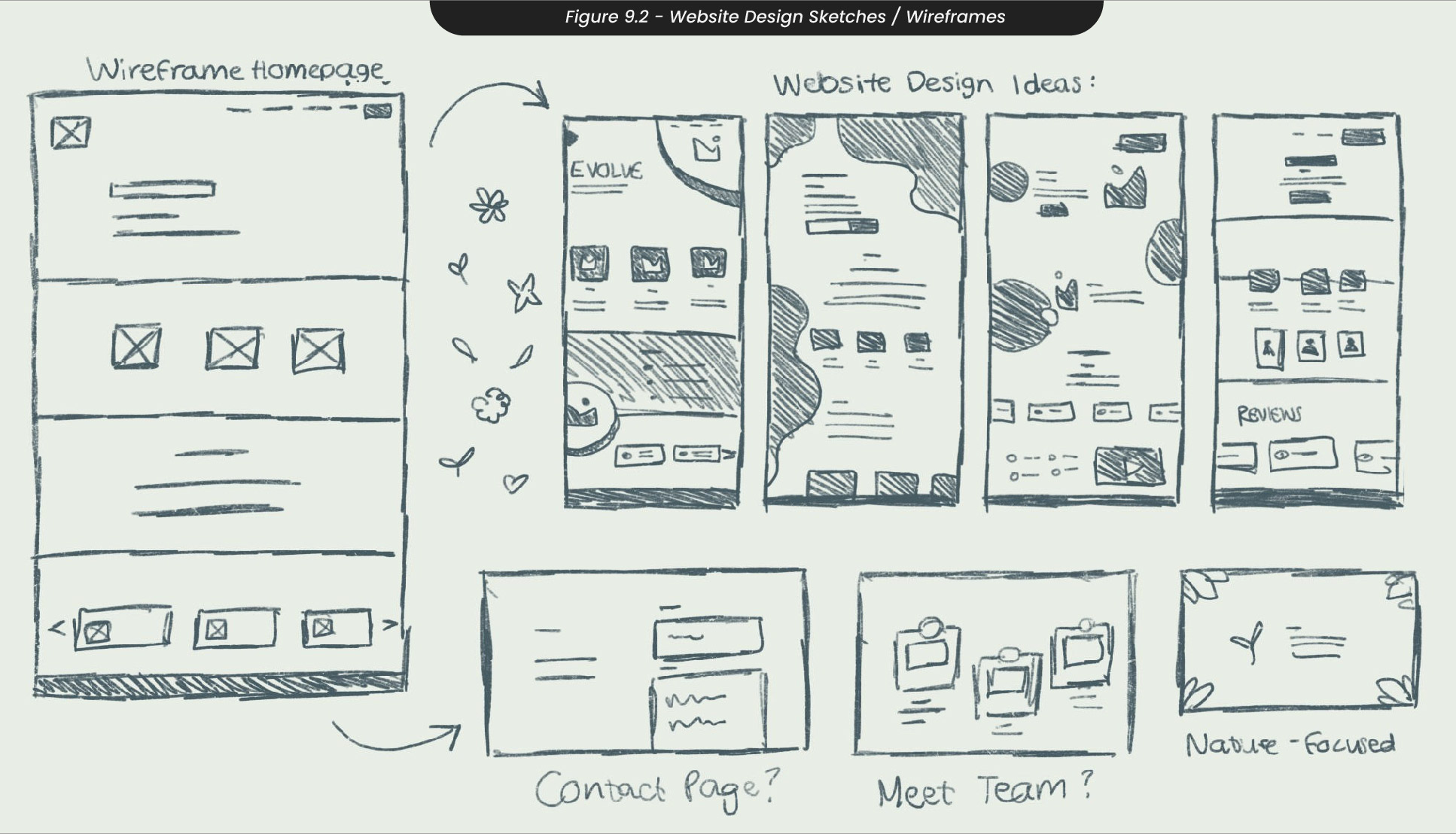
When wireframing ideas for the design and aesthetics of the website (Figure 9.2), I thought back to my research of other therapy clinic websites, like Salisbury Practice and Wimborne Psychology. These websites used lots of comforting images throughout their design, so I knew it would be important to use a range of images throughout each website page. These websites also often used a softer design with rounded corners and no harsh or sharp edges, so I made sure to use lots of fluid shapes and circles to reflect this. I decided not to go forward with my second sketch, as this design didn’t have a lot of room for images and was mainly just shapes around the edges. The first and third ones, however, had lots of room for images but still kept the use of round and softer shapes and designs.
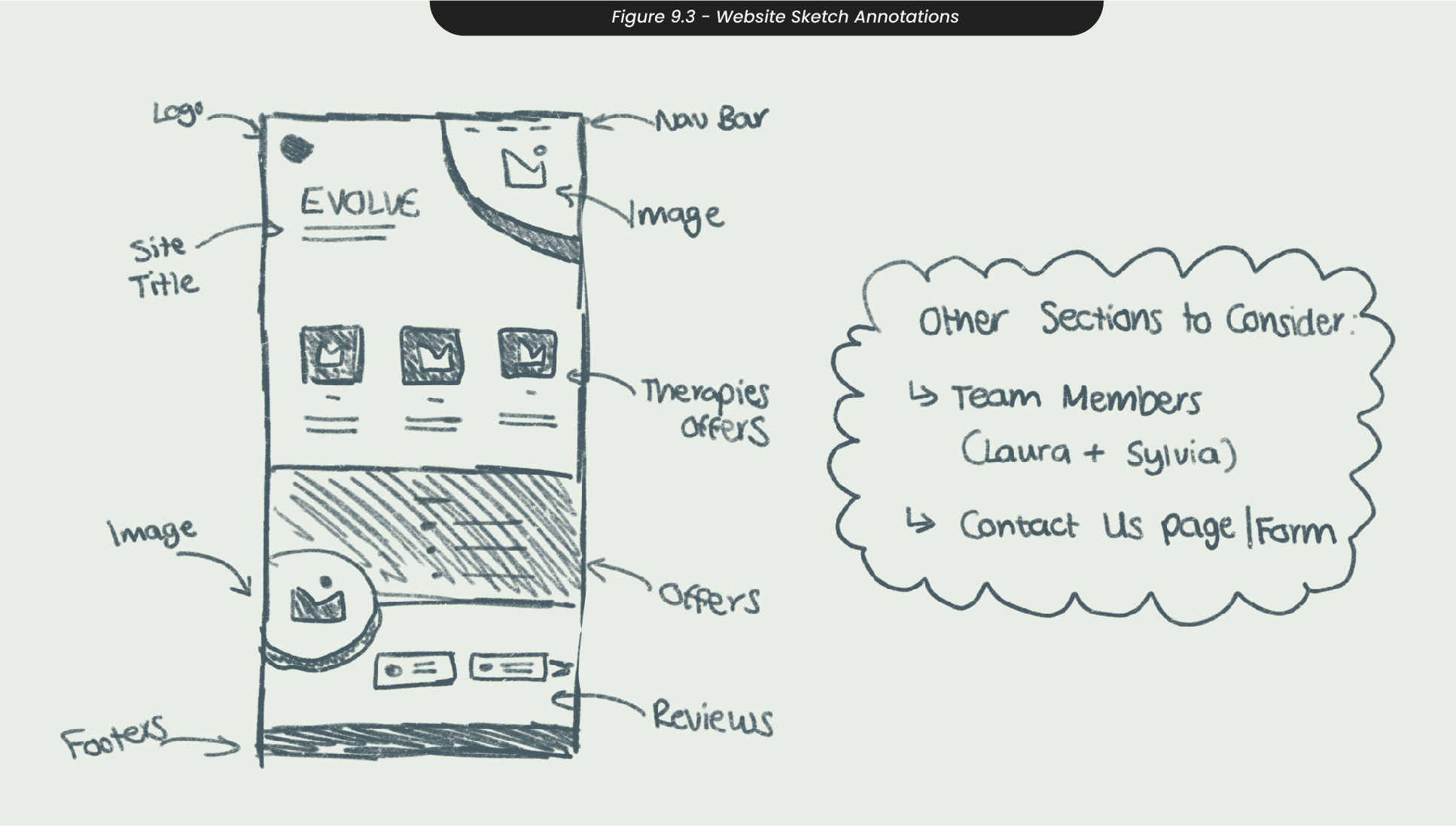
When deciding which website design to take into high-fidelity wireframes, I annotated where each section from the sitemap would sit on the home page (Figure 9.3). This allowed me to organise the best way for the user to navigate the page, with the offers and therapies clear at the top so they can see immediately what they might be looking for.
10. High Fidelity Wireframes and Website Design
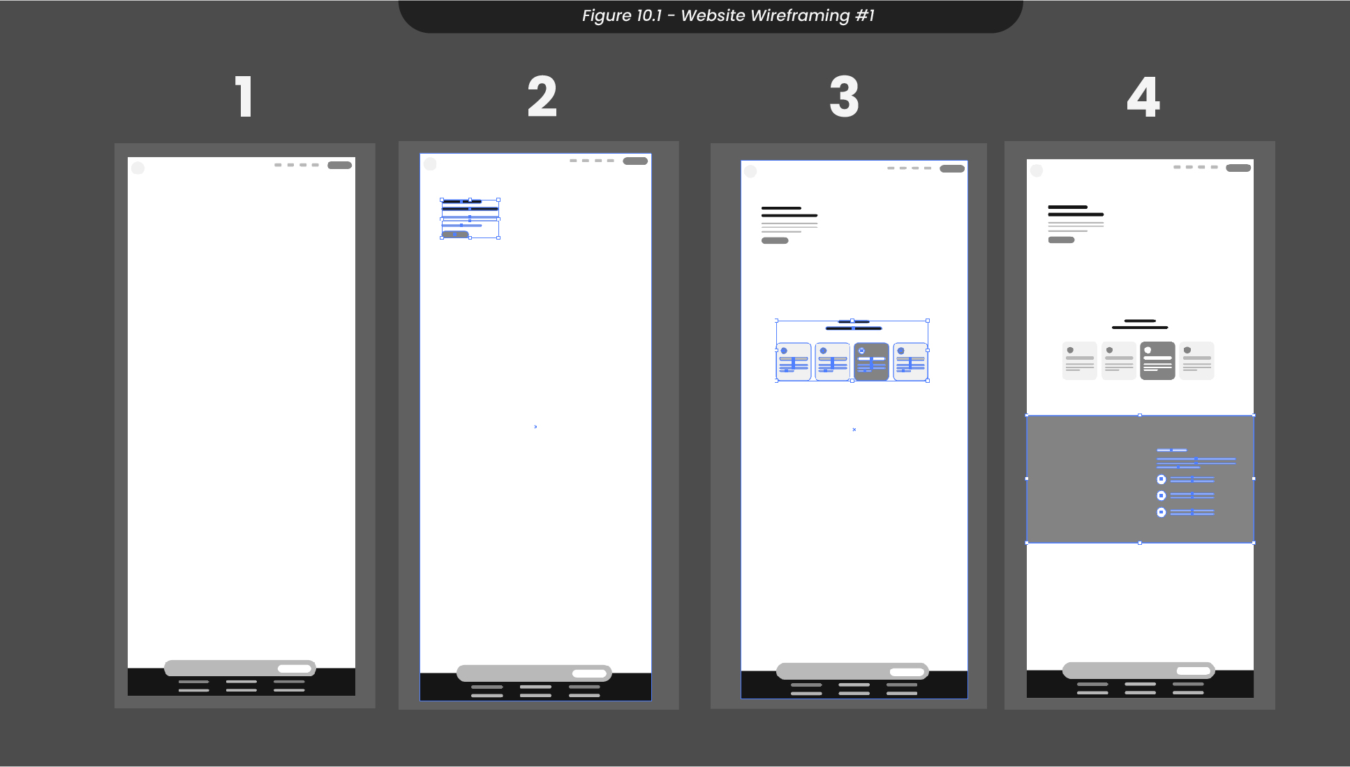
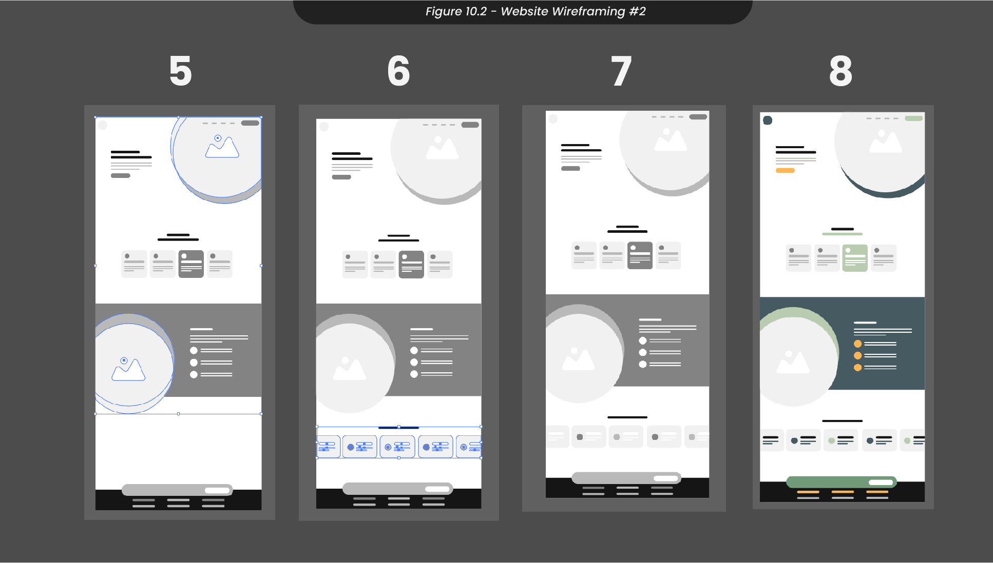
Developing my wireframes and sketches, I opened an Illustrator artboard of 1920x4320, as the average monitor size is 1920x1080, and I wanted to have four different scenes while scrolling through the home page (Figure 10.1). I started by adding in the rough locations for the footer and the header using only shapes, as this was still only a low-fidelity wireframe and there was no need for high amounts of detail. Next, I mapped out where I wanted each section to be, from the therapy information to the reviews at the bottom of the page. To ensure that my colour palette worked with the design I had, I colour-blocked this wireframe and decided where I wanted to bring in that splash of yellow.
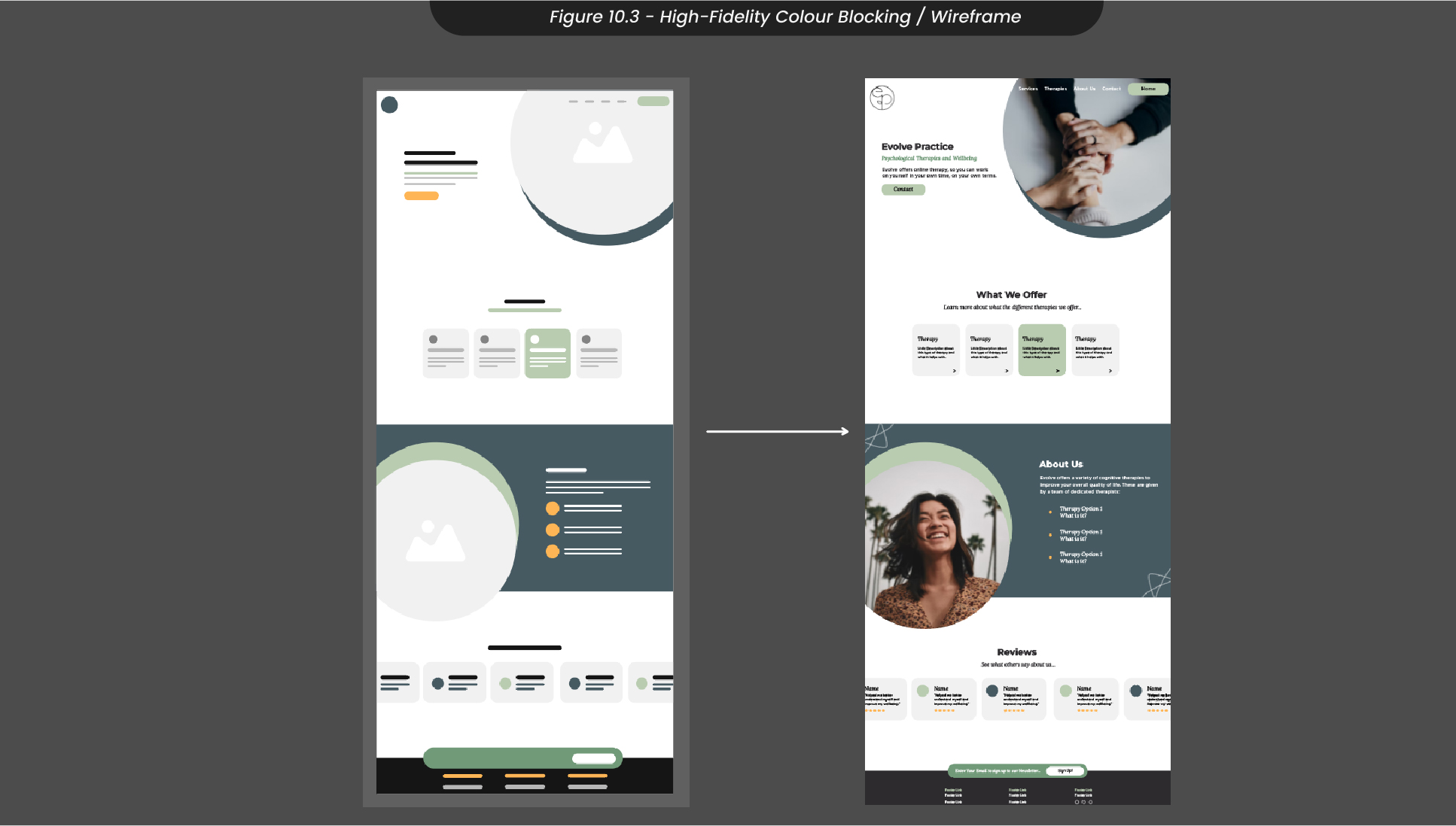
Next, I developed this low-fidelity wireframe into a much higher-fidelity wireframe by adding in images and text where the shapes and grey boxes were (Figure 10.3). This allowed me to see how things would look live on the website without stepping into development for the time being. Although most of my wireframe stayed the same, I ended up changing the size of some of the shapes and adjusting some of the colours to help support the visual hierarchy of the website. Once I was happy with my final homepage design, I exported this design and uploaded it to my Milanote board for the clients to see.
11. Website Mockups
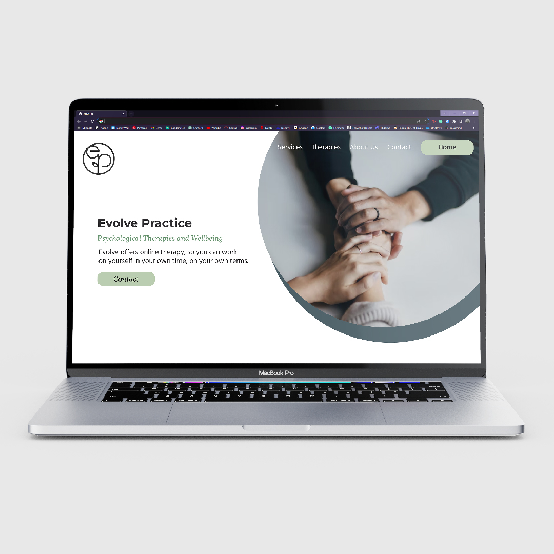
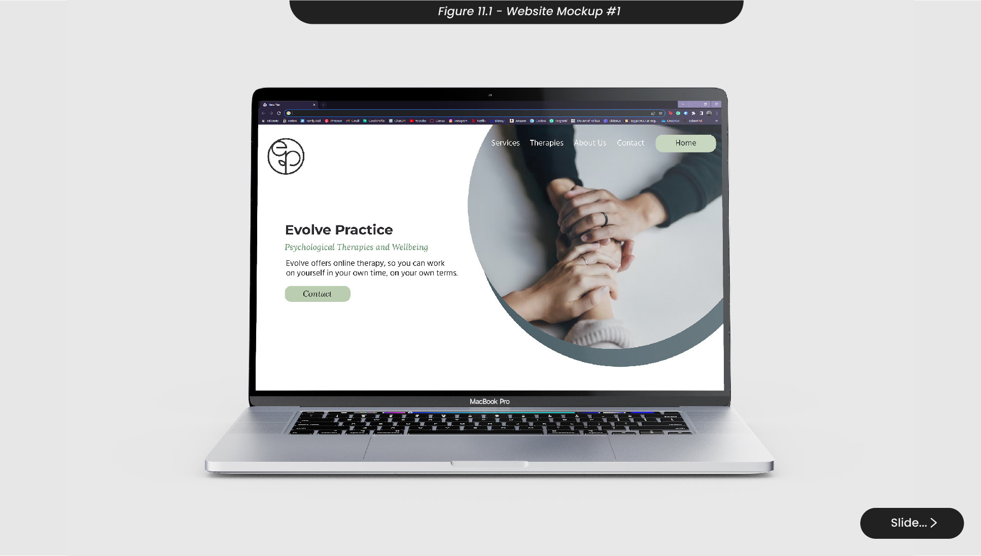
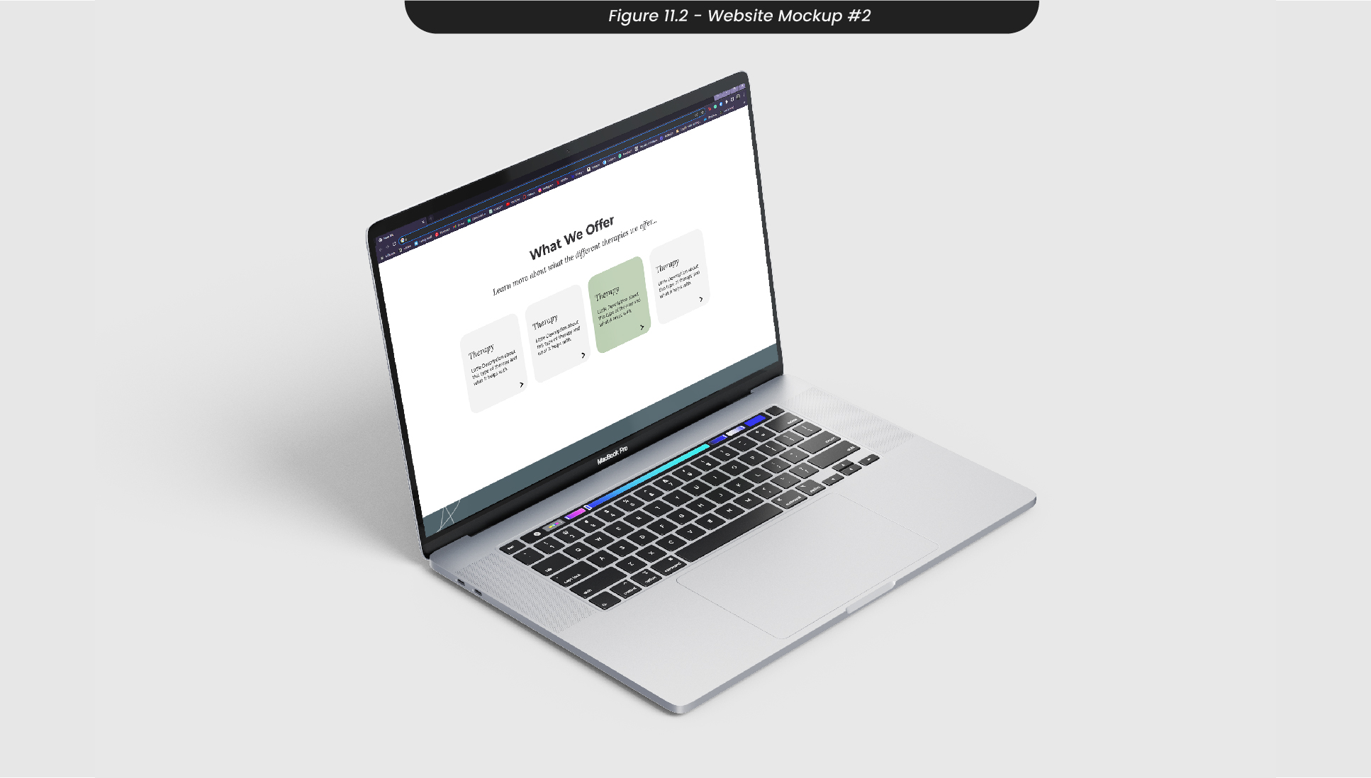
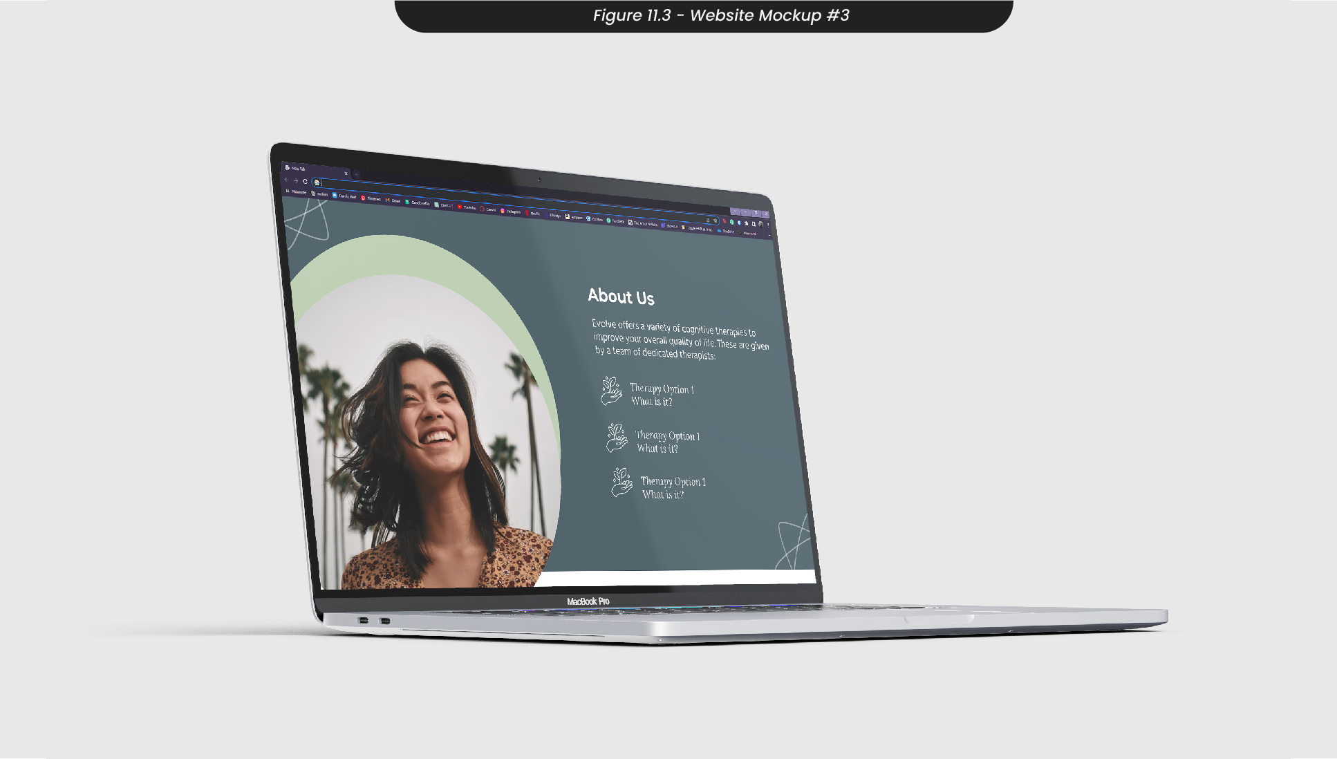
Once I had a website design I was happy with, I created some mockups on laptop screens to visualise how it would look as a live website (Figure 11.1-3). This way, I was able to ensure that there wasn’t too much information or heavy content on each section of the webpage, and everything above the fold was relevant and easy on the eyes.
12. Stationery Sketches
Although a lot of this therapy clinic would be delivered online, the clients requested some print materials that could be used when networking with other healthcare providers, as well as sending out letters to patients when needed. Therefore, I decided to sketch some ideas for business cards and letterhead designs.
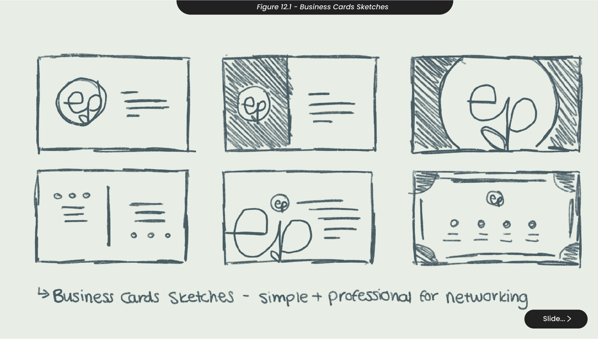
For business cards, as these would be primarily used for handouts to other healthcare workers or therapy clinics, I knew they needed to be clean and professional (Figure 12.1). Therefore, I didn’t want to include any unnecessary information but still wanted to communicate the design and aesthetic feel of the brand. I initially thought about having a business card with edges and icons on it, but ended up feeling it was too busy and diminished the professional aesthetic. Therefore, I sketched a few ideas where the card only had the logo and the name of the clinic, so there would only be the most relevant information.
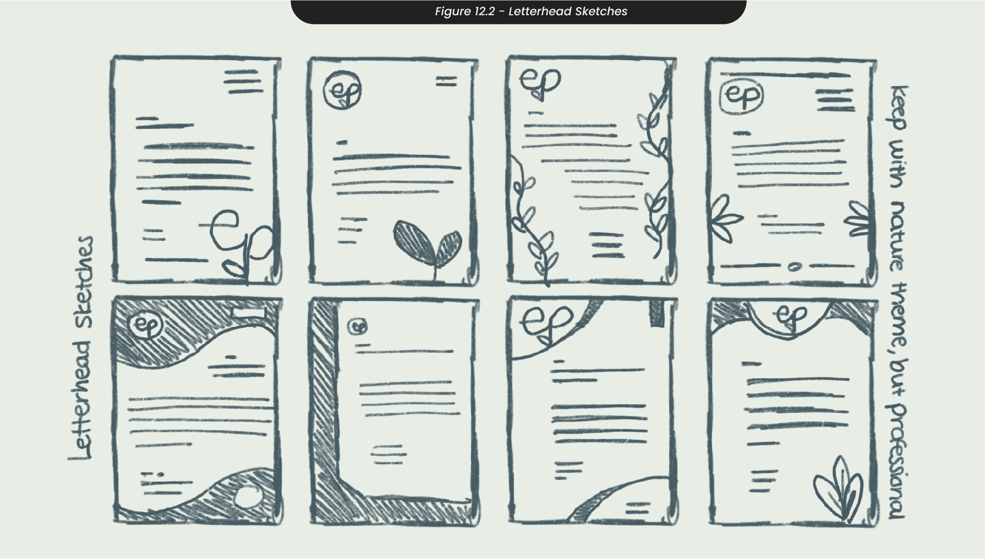
When sketching ideas for letterheads (Figure 12.2), I made to sure to take the same approach as I had when sketching the business cards, by ensuring they remained professional and easy to read. Although I had many ideas where there were lots of whimsical plants and shapes around the edges, I decided not to take these any further as they appeared more fun than professional. The designs both me and the client leaned towards were the designs where only the logo and use of minimal shapes were displayed, so there would be plenty of room for the letter without overwhelming the reader with anything else.
13. Stationery Development
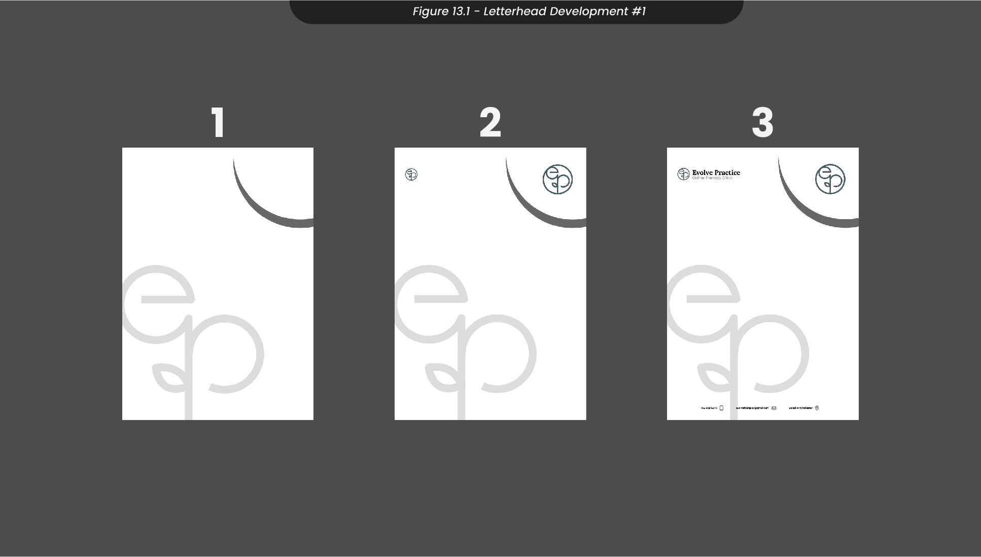
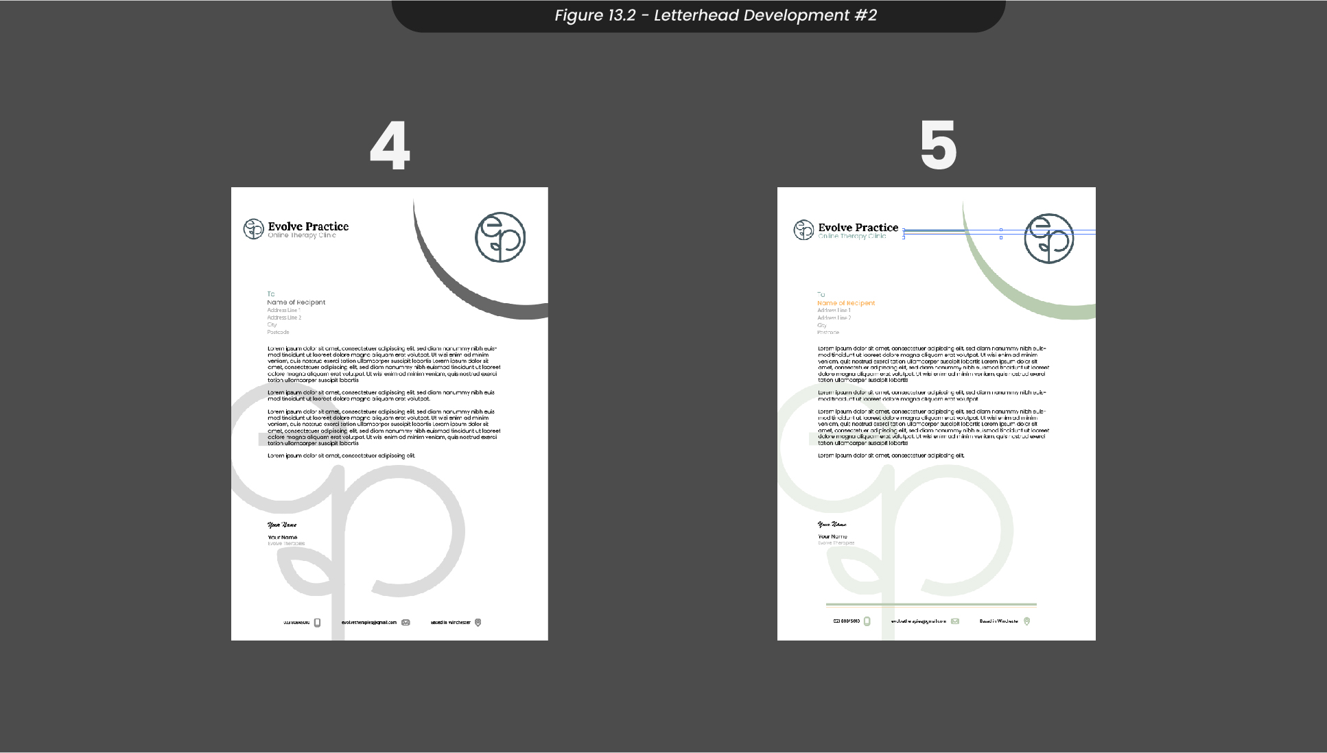
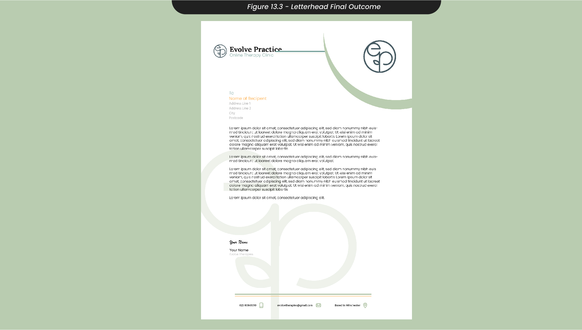
Taking my sketches, I created an artboard in Illustrator for the letterhead, making sure to use CMYK colour profiles as this would be printed (Figure 13.1). I started by adding the logo in the background with an opacity of 30% to add some detail to the background without taking away from the text which is likely to contain important information. I then added the logo again in the top right of the letterhead and added important contact details at the bottom of the letter so recipients can easily find how to reply or get back in contact with any questions or concerns. Finally, I added some dummy text to imitate the letter content along with a signature at the bottom and then added some colour to reflect the rest of the branding. To export this design, I ensured I was saving with a high resolution of 300ppi so that it could be printed in the highest quality (Figure 13.3).
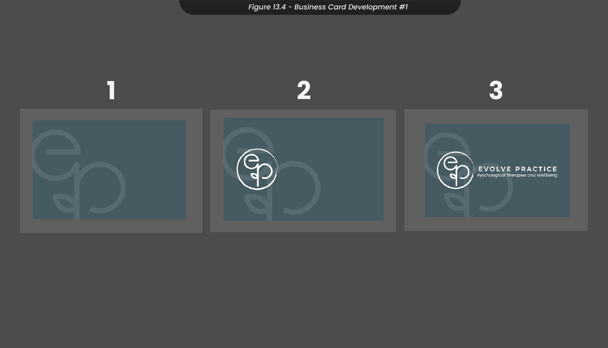
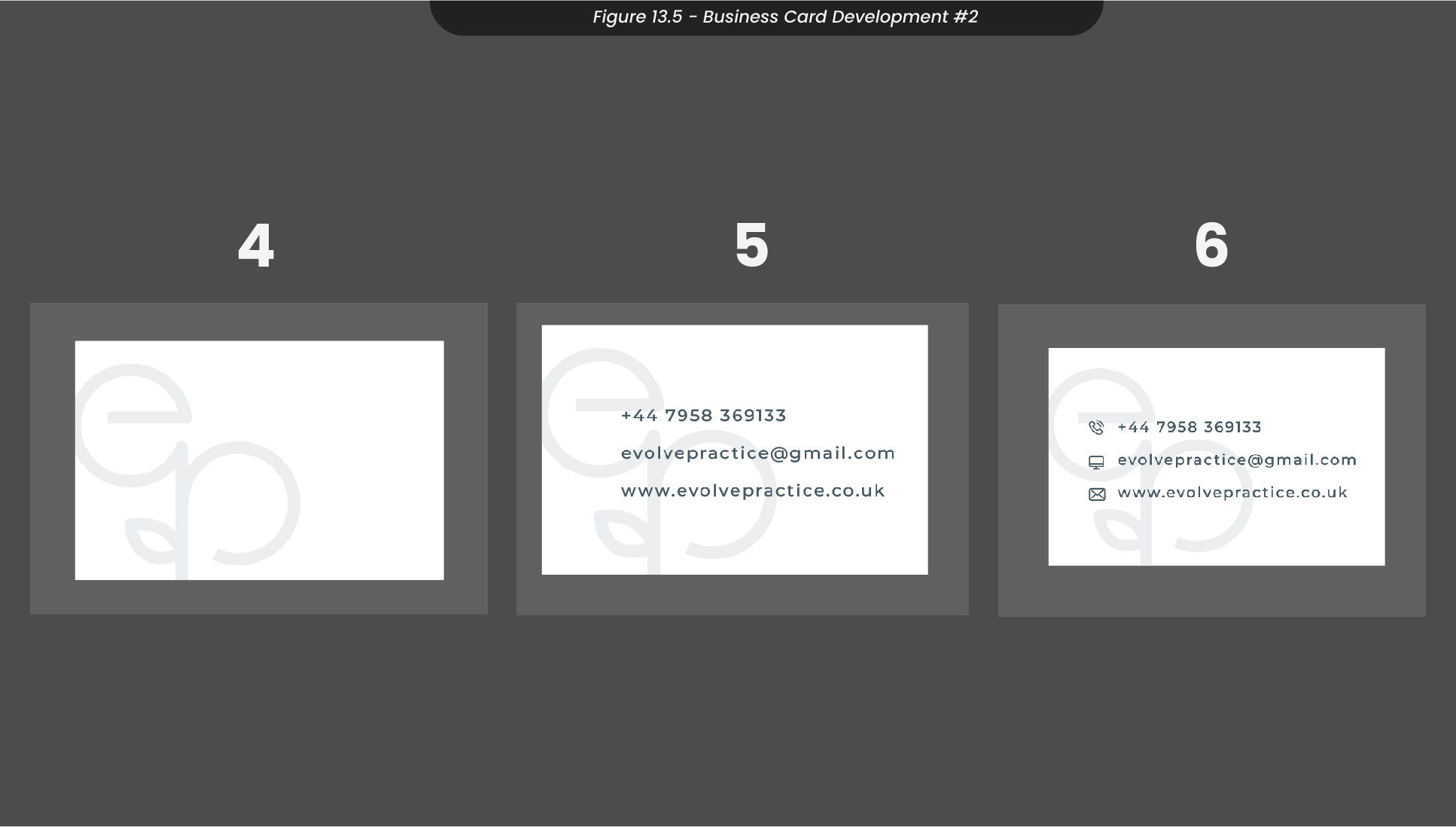
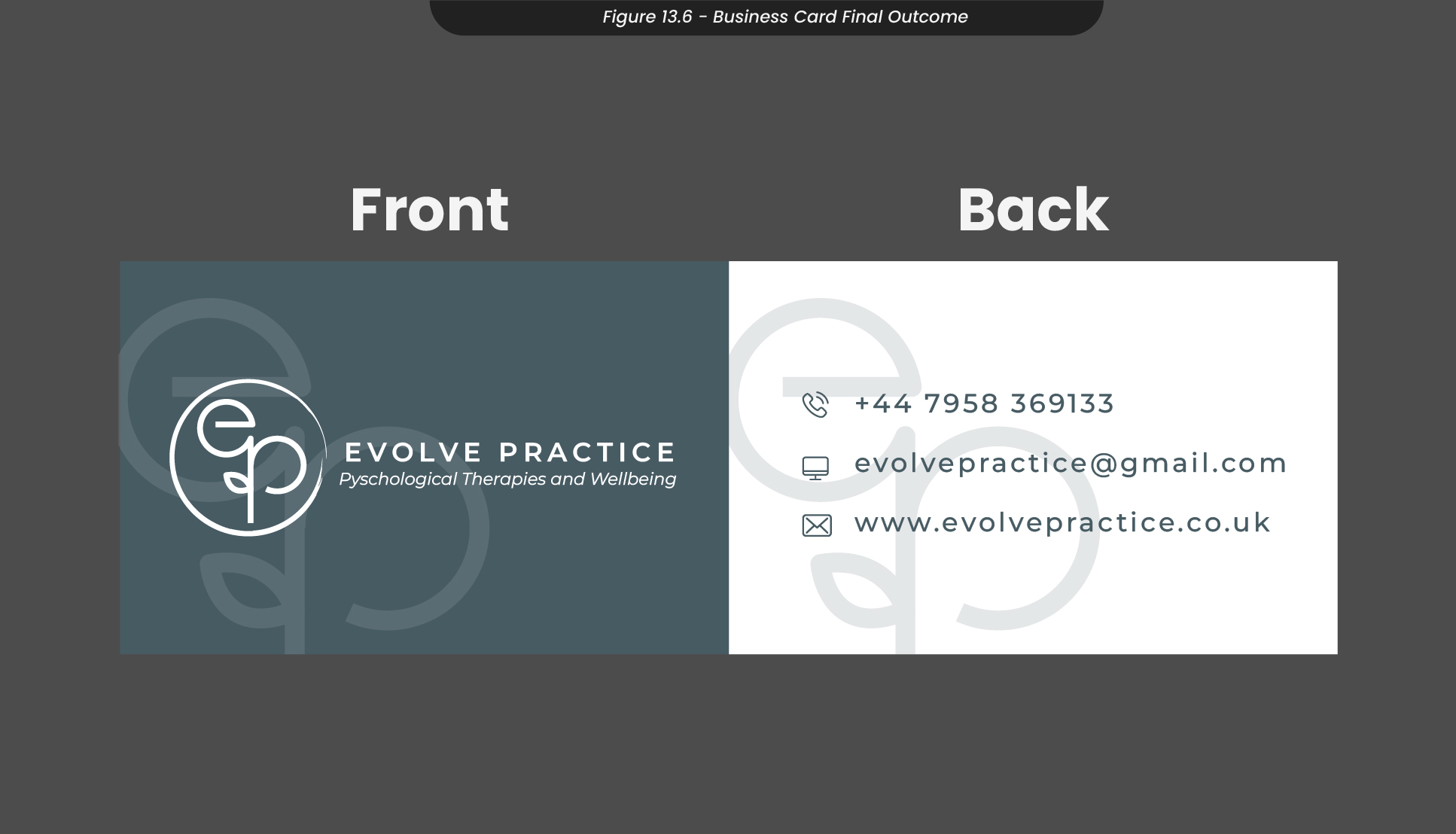
When developing my sketches for the business cards, I used the same technique as I did for the letterhead and ensured I was using a CMYK colour profile (Figure 13.4). I then mimicked a similar design by adding the logo with 30% opacity in the background and adding the logo along with the practice’s name and tagline. On the back of the card (Figure 13.5), I reversed the colours and added the contact details along with icons to clearly indicate what each detail was for. I exported these cards together, again with a high resolution of 300ppi (Figure 13.6).
14. Stationery Mockups
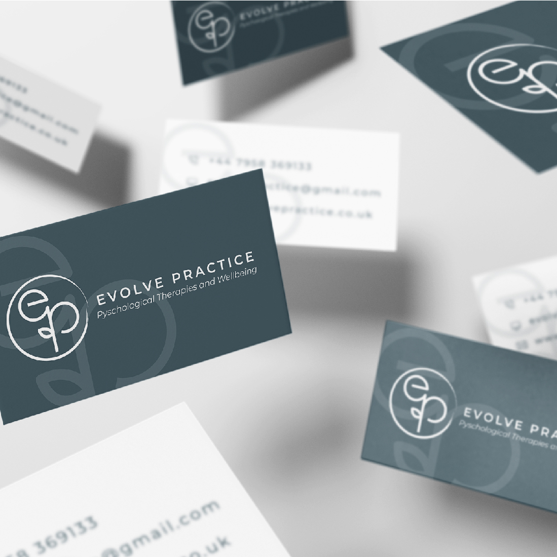
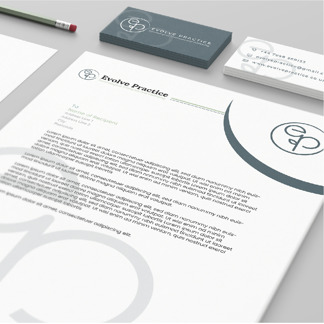
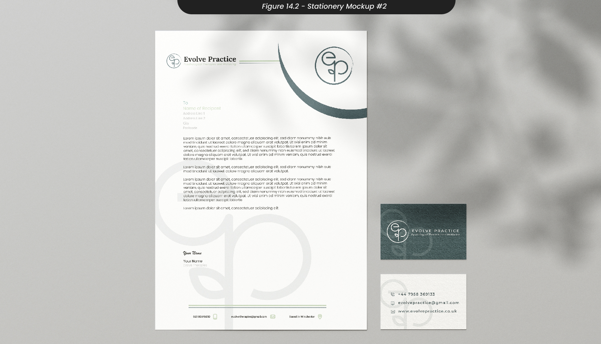
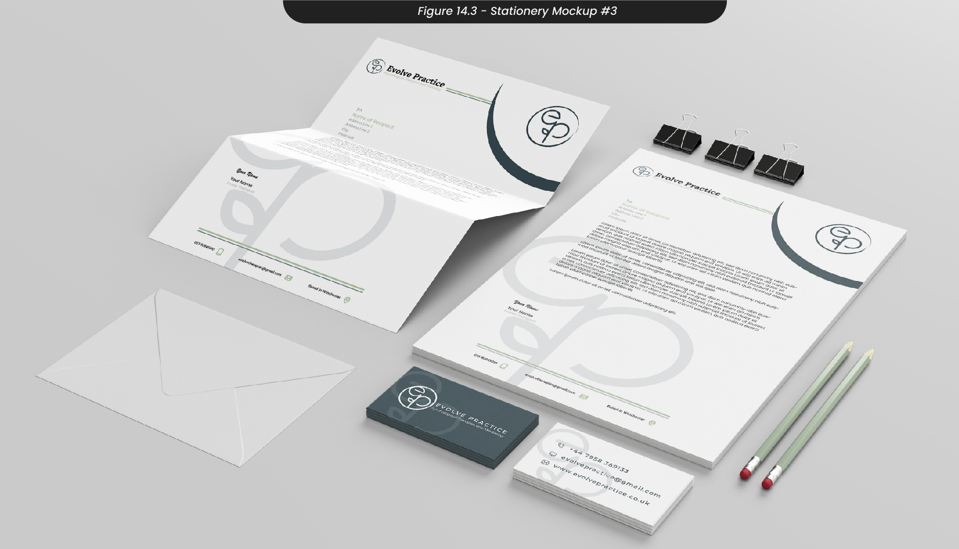
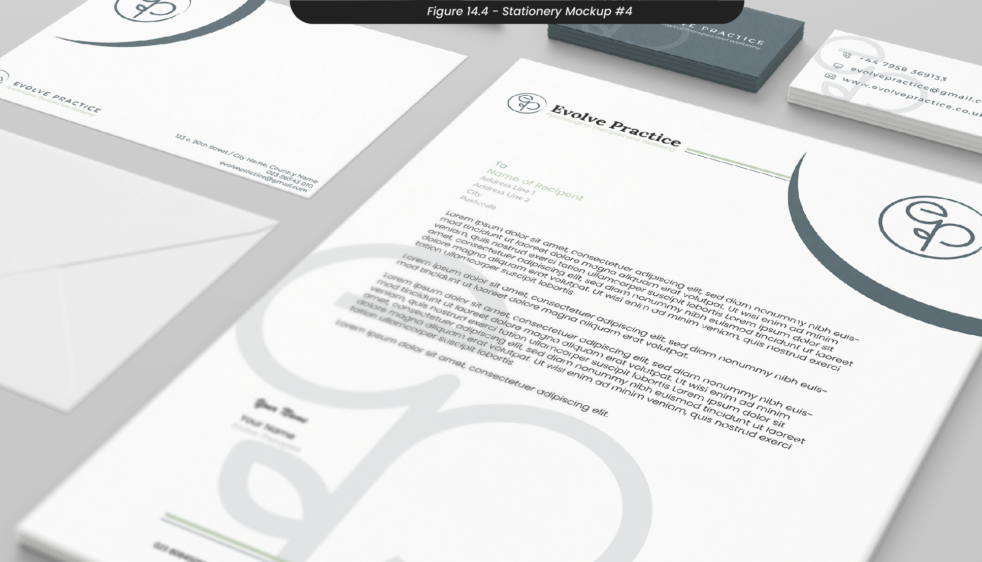
Once I was happy with the outcomes of my print materials, I created some mockups in Photoshop to visualise how these materials would look when printed and distributed for use in the practice and to send out to clients or connections in the industry (Figure 14.1-3).
15. Conclusions
Overall, I’m not happy with my progress or approach to this project. I believe I could have done a lot more in the time I was given but unfortunately didn’t consider that some heavy personal circumstances would prevent me from putting my all into this project. However, I think I was successful in reflecting on the SDG for this module, as I was able to promote mental well-being and sustainability with natural and biophilic design and comforting language. Although I believe I could have achieved more, I think I was successful in creating a brand identity that reflects the values of the client, as the logo incorporates the ‘ep’ initials while still having the iconography of a sprout.
If I was to do this project again, I would engage in more contact with my clients, as our meetings towards the end of the project were incredibly helpful and productive. Although I intended to do this before my unexpected circumstances got in the way, I would establish these meetings early on so that I would have no opportunity to push them back. As I feel I could have added more to this project, I will be working closely with my clients over the summer to create a project that we are all proud of, including a functional website. Therefore, lots of my design decisions for the website are likely to change, as we will be using Squarespace.
Although I will be continuing this project over the summer to get an outcome that I am happy with, I created a handover document folder if anyone else was to continue this project. This will be updated throughout my time on this project, and I look forward to seeing how this brand identity will develop and change over the following weeks..
16. Transmedia Additions
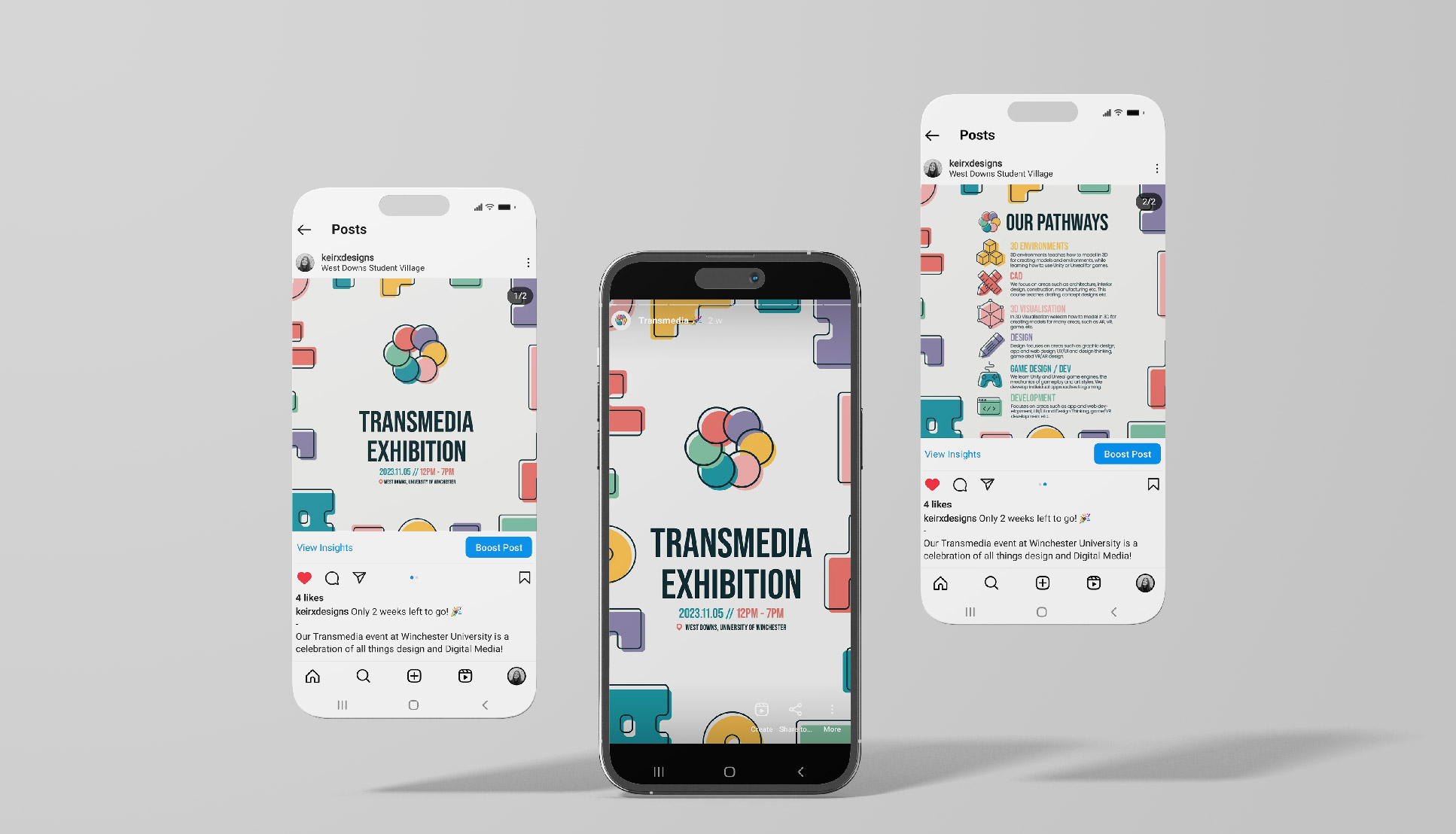
While working on this project and my social media campaign this semester, we were asked to help plan and take on different areas of our end-of-year ‘Transmedia Exhibition’. To see my additions to what I already had from last semester, see section '21' of my Transmedia page.
