1. Introduction to Brief
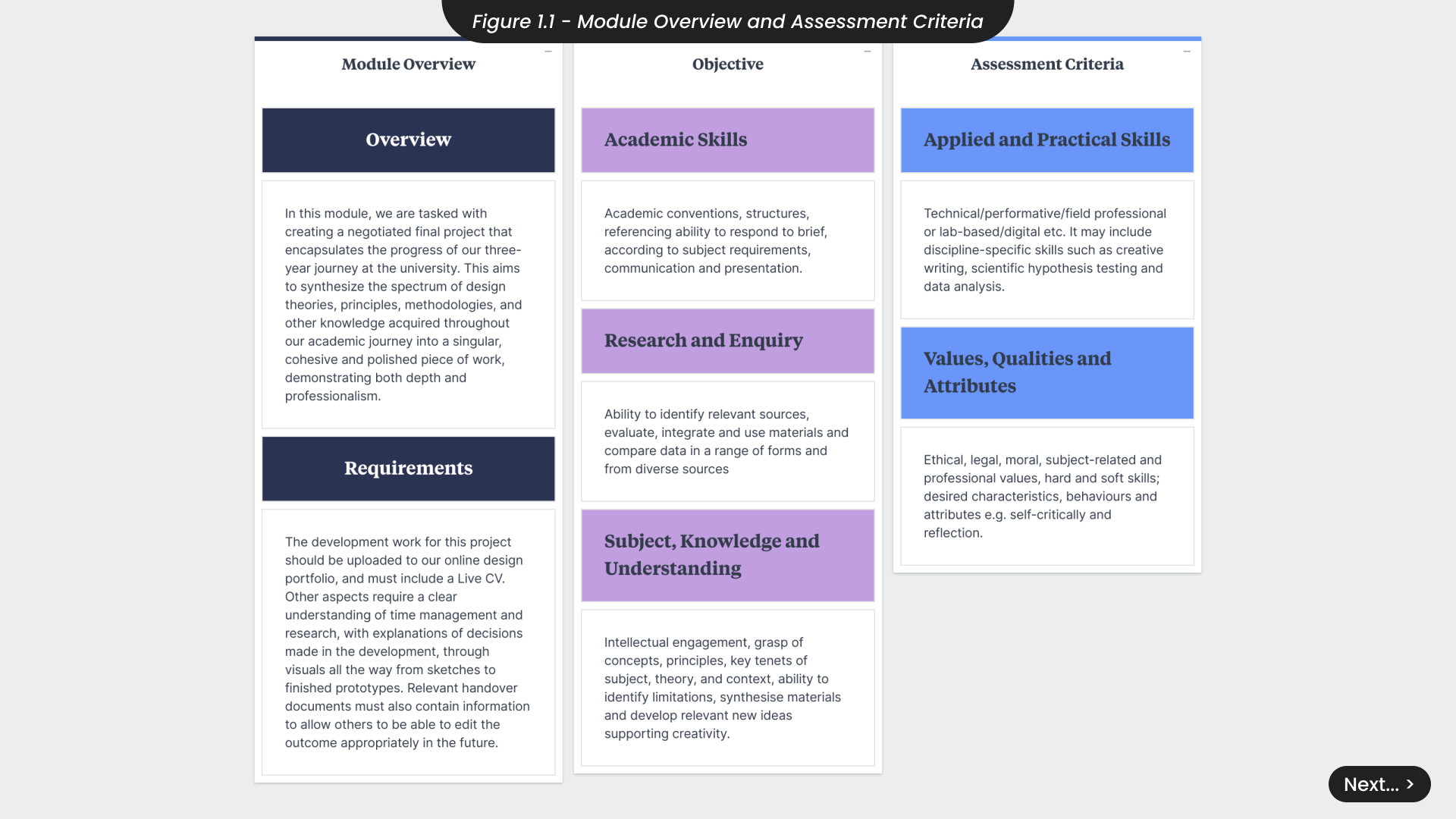
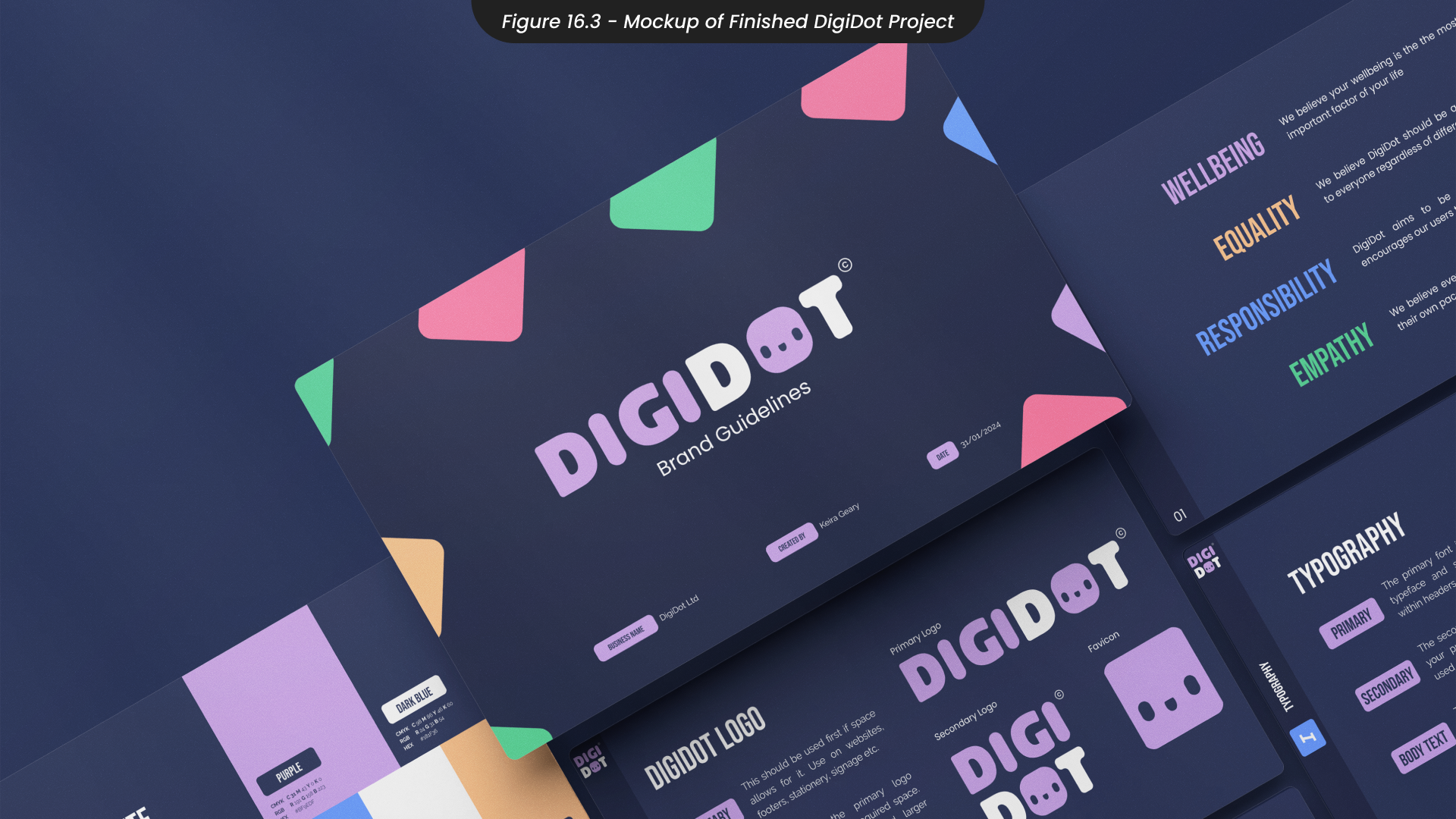
For this module, our task was to craft a negotiated final project that captures the progress of our three-year journey at University (Figure 1.1). This comprehensive project aims to showcase all of the design methods, theories, and principles we have developed, from sketching ideas and brainstorming during the ideation process, to creating polished prototypes with careful consideration for fonts, colours, layouts and more. Accompanying this project will be a handover document that has been crafted to ensure continuity if someone else were to pick this project up in the future.
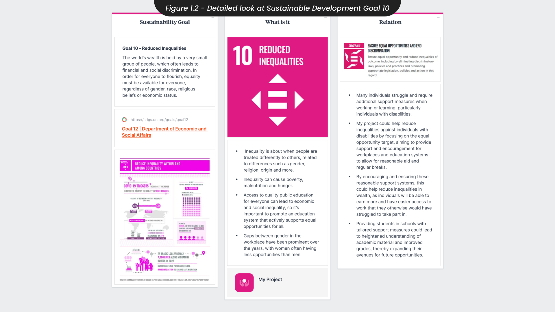
An important element to this module is its connection to the United Nations Sustainability Development Goals, particularly focusing on SDG 10, which aims at reducing inequalities (Figure 1.2). This goal addresses the widespread discrimination faced by many individuals worldwide due to variable factors such as race, religion, gender, disabilities and more. Discrimination can take many forms, from unequal job opportunities to limited access to quality education and social biases.
The objective of SDG 10 is to identify solutions to minimise these inequalities and promote fair access to opportunities for everyone. Throughout our university journey, we’ve been consistently encouraged to integrate sustainability into all of our projects. Therefore, although I will have a primary focus on SDG 10, I intend to incorporate multiple SDGs into this project, reflecting what I have learnt about the importance of sustainability in all projects over the last three years.
2. Brief and Project Exploration
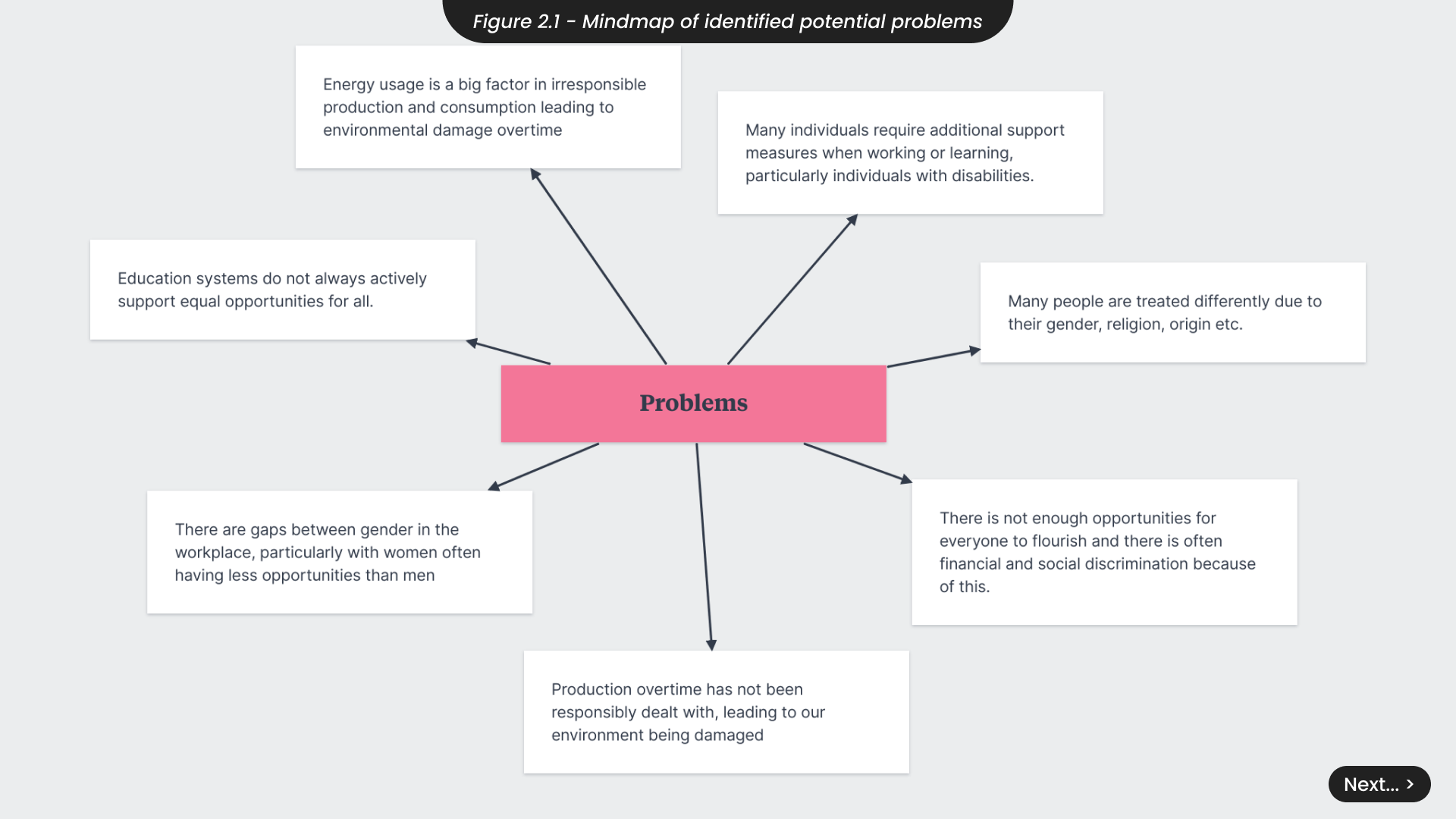
In this project, I have identified several potential problems that I could address (Figure 2.1). These include the lack of opportunities for everyone which often leads to social and financial discrimination. Many individuals with disabilities require additional support in various areas such as education, work, and travel, which they currently do not receive. Furthermore, education systems frequently fail to provide equal opportunities for all students, and irresponsible energy production continues to cause global issues.
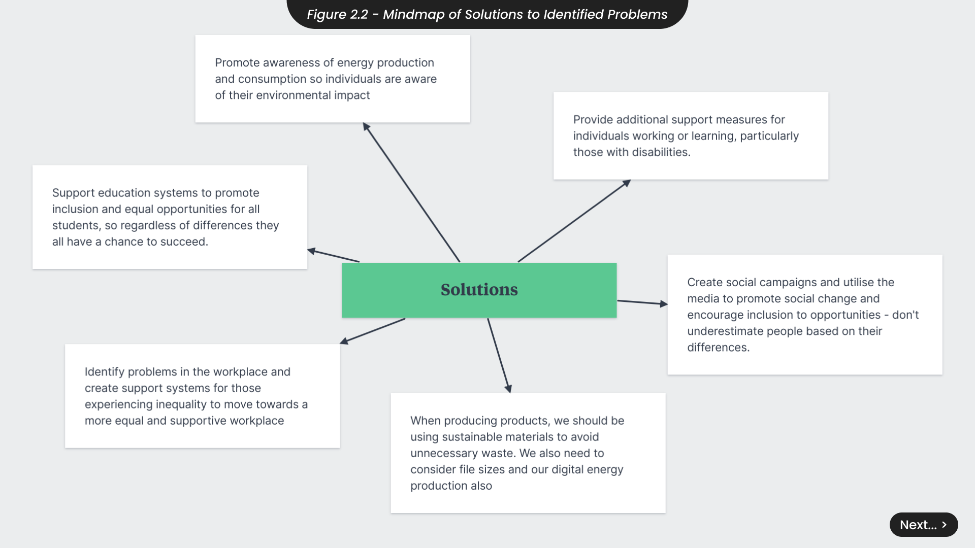
Looking into tackling these issues, I have explored what solutions I could develop over the course of this 12-week project (Figure 2.2). For example, we could promote awareness for responsible energy usage and support education systems in developing unique solutions that cater to the diverse needs of their students. Additionally, we should investigate innovative ways to provide the necessary support measures for individuals with disabilities.
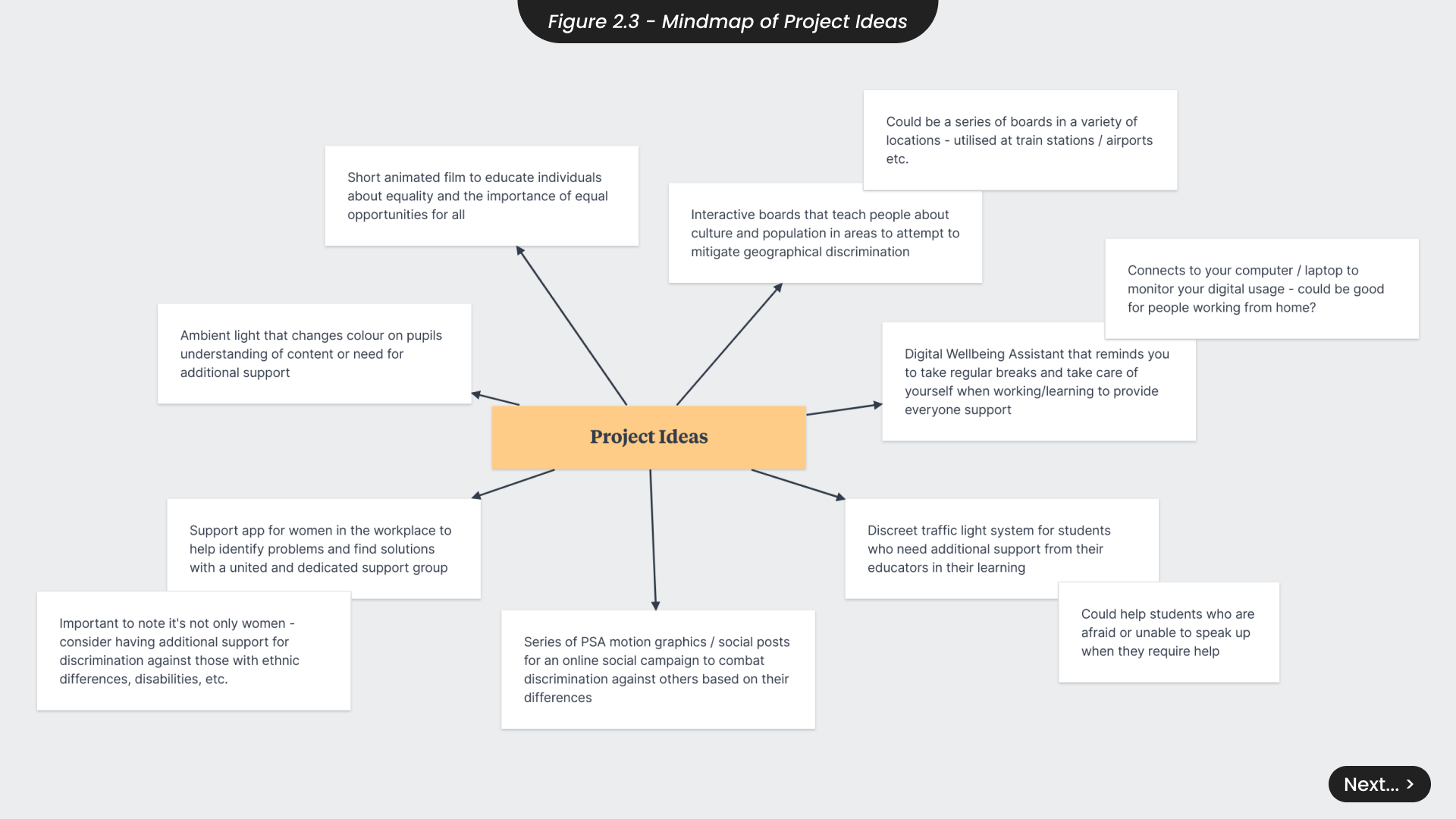
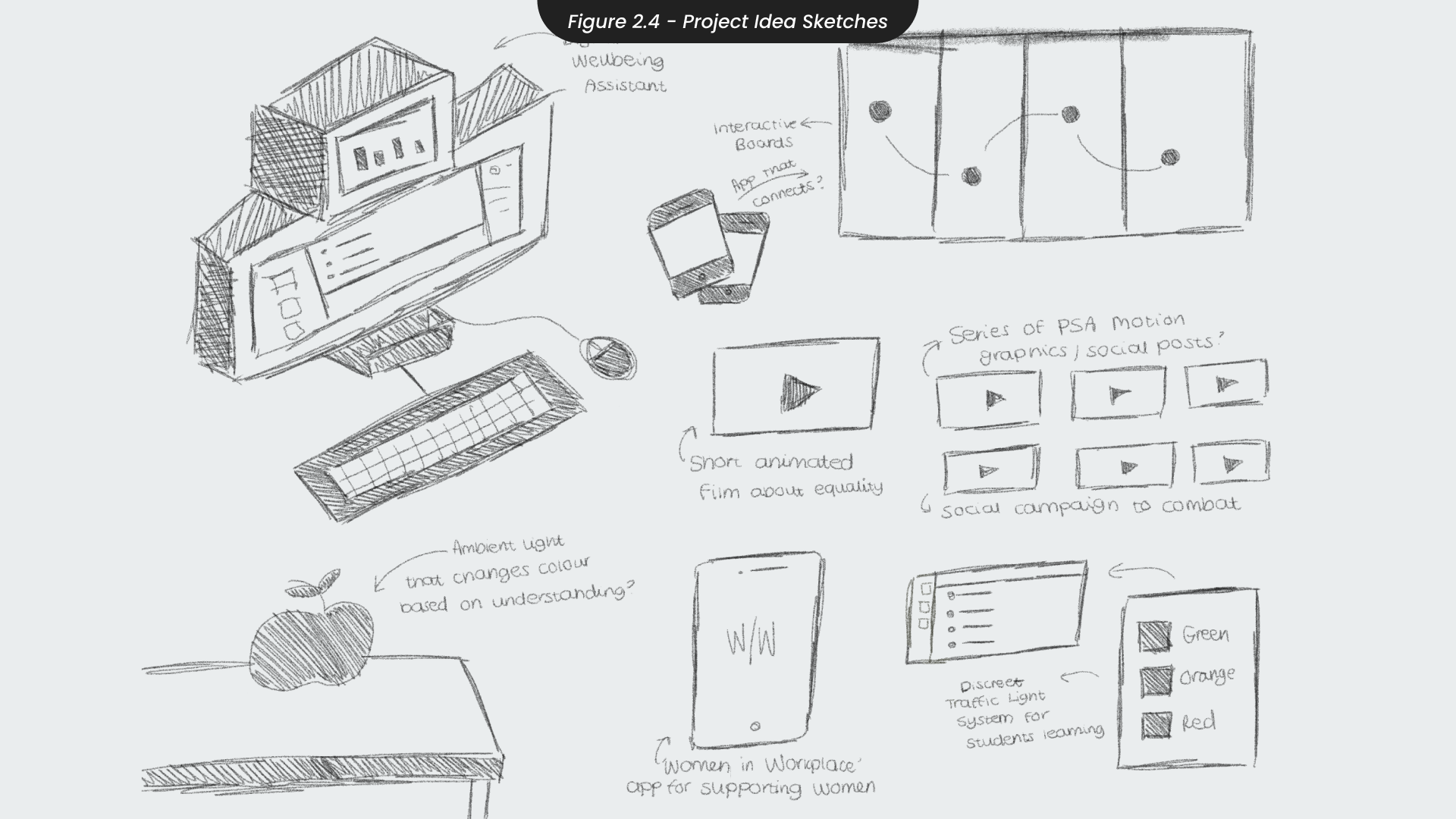
After evaluating the potential problems and solutions for this project, I brainstormed and sketched several ideas to address these issues (Figure 2.3 and 2.4). One idea was to create boards that educate people about local cultures to minimise geographical discrimination, but I decided against it due to the risk of vandalism or ignorance. Another idea as a discreet traffic light system for children in education who require help but are afraid to ask. However, I realized it might not be effective, as teachers would still need to approach the student, making it obvious that the student needs help and potentially causing embarrassment. I also considered developing a support app for women in the workplace, but I felt it did not address the broader issues of race and religion, potentially marginalising further. Ultimately, I decided to move forward with a digital wellbeing assistant that provides additional support discreetly. This project would effectively aid individuals needing extra help in various areas of life, including education and work. However, I believe it is importance to infuse additional solutions, such as promoting responsible energy solutions, to ensure the project remains socially and sustainably aware.
3. Developing project Idea and Time Management
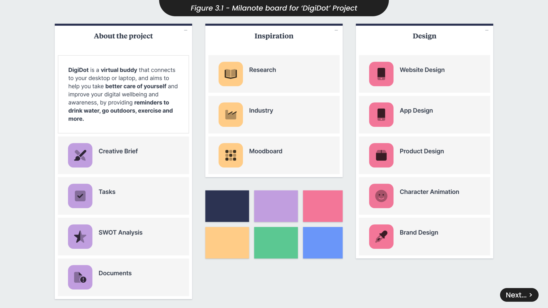
I have chosen to continue with the digital wellbeing assistant project because I feel it tackles a pain point of many individuals, particularly individuals with disabilities. In addition, I also believe this project will help employees who have transitioned into online or hybrid working after a new ‘normal’ emerged after the Covid-19 pandemic. This project, DigiDot, is a virtual buddy that will help you in your journey to better your digital awareness and improve your health and wellbeing. Designed specifically to help you tackle your screen time and establish a better system for taking breaks and taking care of yourself while working remotely, DigiDot will allow you to create custom work modes, set up reminders tailored to your needs and help friends in their online work lives. You can view the project Milanote board here (Figure 3.1) .
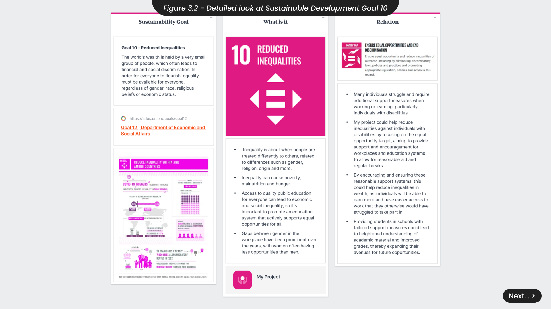
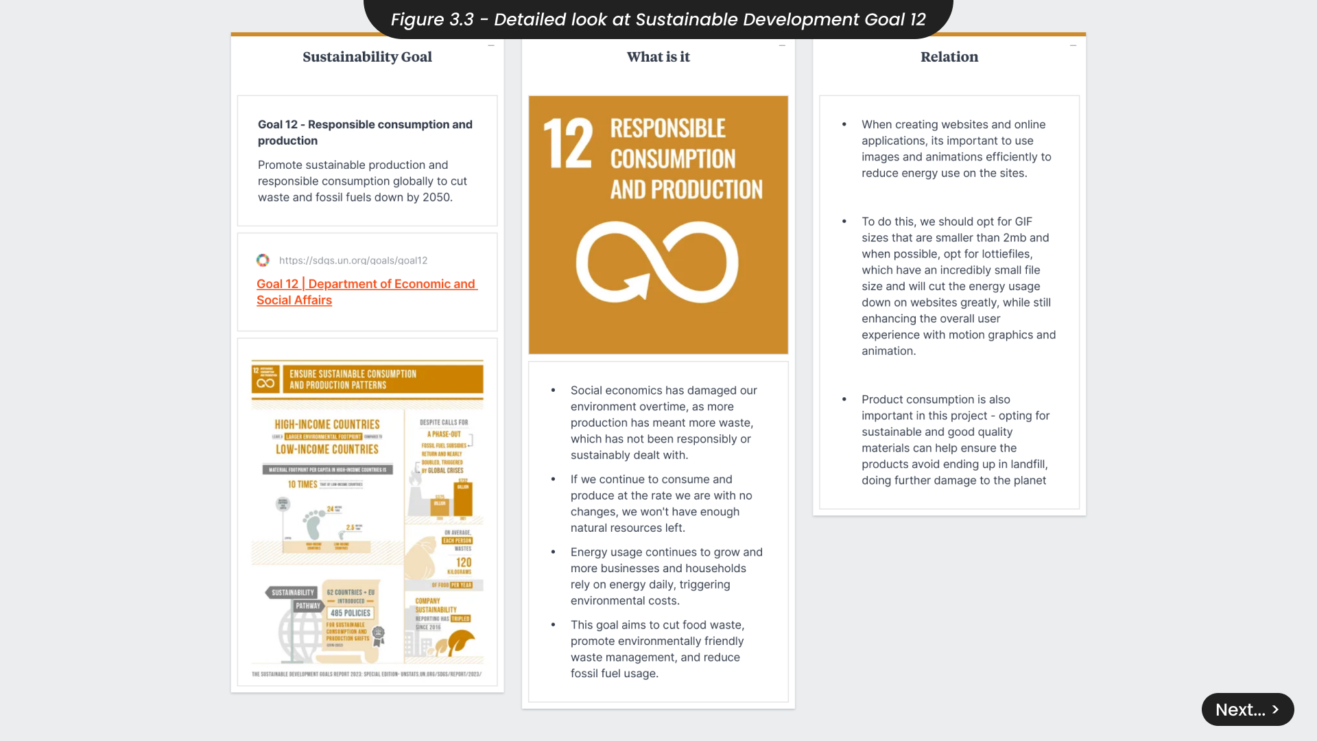
This project aligns with Sustainable Development Goal (SDG) 10 by addressing the additional challenges faced by individuals with disabilities, particularly those working from home who lack immediate access to support (Figure 3.2). By providing reasonable accommodations, the project aims to create a healthier and more inclusive work environment for these individuals. Additionally, this project supports Sustainable Development Goal (SDG) 12 (Figure 3.3) by ensuring that the materials considered for any physical products will be eco-friendly. It also emphasises the importance of optimising digital energy usage, such as through efficient image and animation use, to minimise the environmental impact of the website and online application.
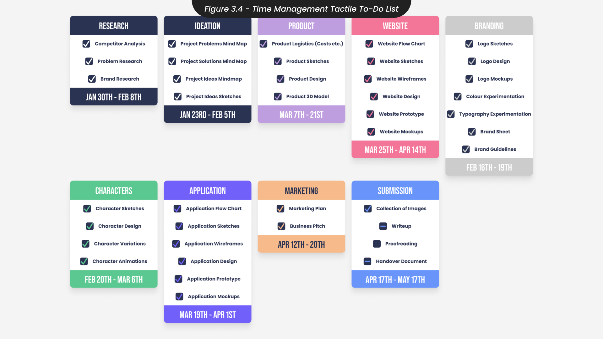
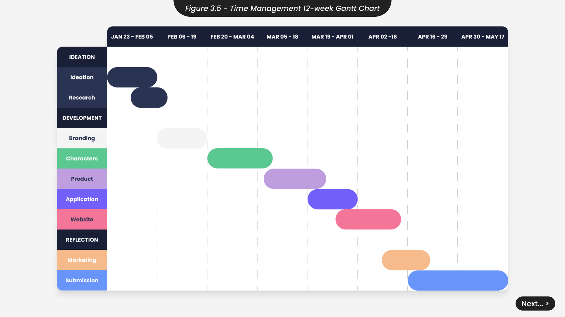
To manage my time effectively, I created a tactile to-do list to identity all the tasks required for this project (Figure 3.4). I then categorised these tasks into groups such as ‘research’, ‘branding’ and more. Viewing these groups as project milestones allowed me to quickly see which ones would require more time and consideration. For instance, recognising that the ‘website’ and ‘application’ milestones involved more intricate tasks than the ‘ideation’ milestone, I allocated more time to these groups. Building on this approach, I developed a Gantt chart to plan out the 12-week timeline (Figure 3.5), ensuring that I accounted for any overlapping tasks that might require materials from one group to start or complete another. The Gantt chart provided a clear overview of my schedule, helping me to quickly see if I was falling behind and needed to implement additional contingency plans.
When planning my time, it’s important to consider the potential risks, particularly since I will also be engaging in other academic endeavours and working outside of the university. One identified risk is technical difficulties. To mitigate this, I will ensure I have access to all necessary software, such as Figma and Adobe applications, and schedule regular backups of all project files. Given my commitments to other modules and external work, it’s crucial to avoid overload by allocating specific time blocks for each project. Implementing productivity techniques such as the Pomodoro Technique will help maintain focus and productivity. Additionally, I must prioritise my health and well-being, accounting for personal or unexpected circumstances. Balancing my time with regular breaks and adjusting the project timeline as needed will help ensure that personal well-being remains a priority.
4. Project and Market Research
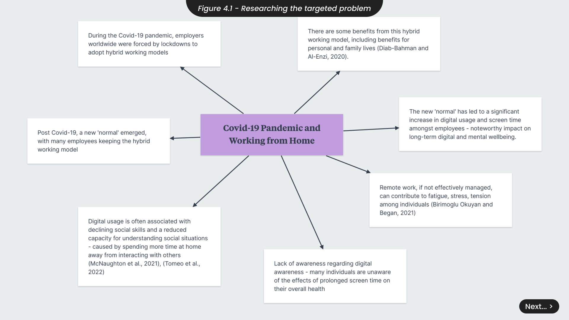
To effectively address the needs of individuals, particularly those with disabilities, working from home and requiring additional support measures, it was essential to thoroughly research this problem (Figure 4.1). During the global Covid-19 pandemic in 2019, employers worldwide adopted hybrid working models due to prolonged lockdowns, allowing employees to transition to remote work. This new normal saw many employees opting for hybrid or remote work due to its benefits for personal and family lives (Diab-Bahman and Al-Enzi, 2020). However, this shift has significantly increased digital usage and screen time, impacting long-term digital and mental wellbeing. McNaughton et al. (2021) found that increased digital usage is associated with declining social skills and a reduced capacity for understanding social situations, due to prolonged isolation. Additionally, Birimoglu Okuyan and Begen (2021) argue that poorly managed remote work can lead to fatigue, stress, and tension, highlighting the need for effective strategies to mitigate these challenges.
It is important to note that individuals with disabilities are severely underrepresented in the workforce, often facing inequality and having fewer opportunities than those without disabilities. Since the pandemic, and with the shift towards working from home, a potential silver lining has emerged for those with disabilities. Studies have observed that people with disabilities are more likely to work from home (Schur, Ameri and Kruse, 2020), which can offer benefits that commuting may not. For instance, working from home can assist individuals with physical disabilities who may find it challenging to travel. However, remote work also presents its own challenges, as many individuals with disabilities might require additional breaks or benefit from a more flexible work schedule (Anand and Sevak, 2017). Therefore, as I progressed with this project, it was crucial to consider features that provide these accommodations, fostering a more inclusive work environment. This approach ensures that employers can better support employees with disabilities, accommodating their needs without unnecessary discrimination (SDG 8 - Decent Work and Economic Growth).
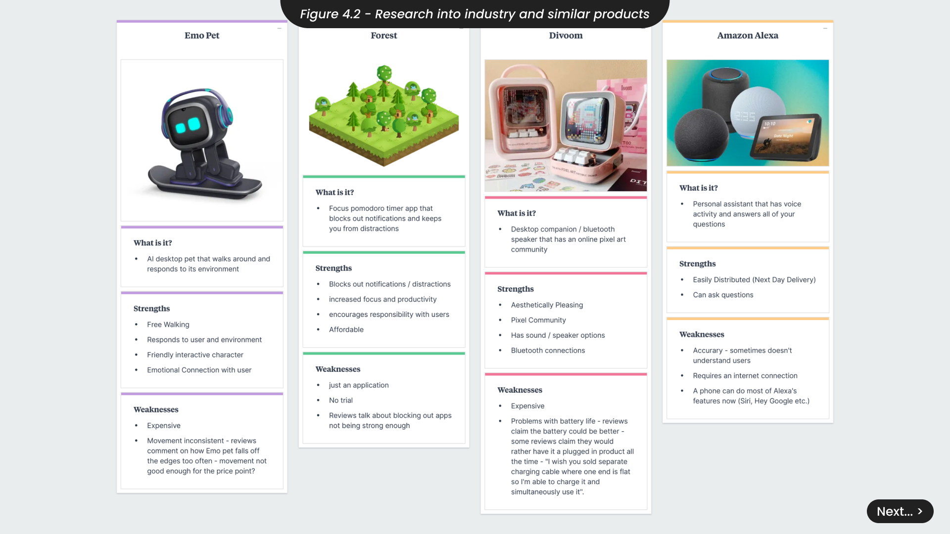
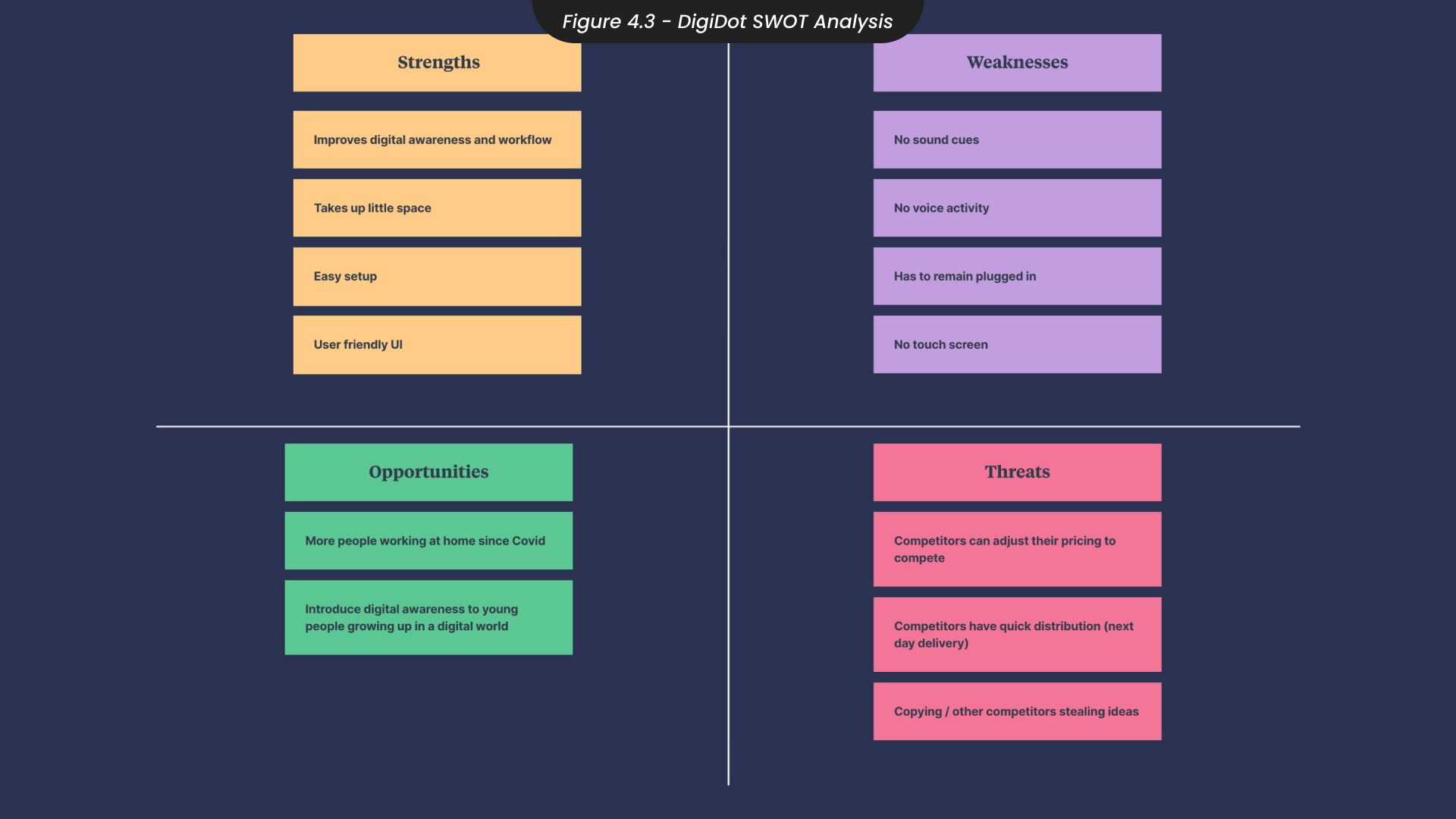
This shift towards widespread remote work due to the Covid-19 pandemic has created opportunities to support and enhance the experiences of individuals working from home, such as developing tools and applications that promote digital wellness, addressing issues such as screen time management, stress, and maintaining a healthy work-life balance. Therefore, to take advantage of these opportunities, a comprehensive analysis of industry competition was essential to build successful design strategies and identity this projects unique selling points (Figure 4.2). Notable contenders in the market, such as Emo Pet and Divoom, also create desk companions with features like customisable designs and online communities. Meanwhile, apps like Forest prioritise productivity by blocking notifications, and Amazon Alexa serves as a voice-activated personal assistant tailored to your individual needs. Although DigiDot does not move around like the Emo Pet, or utilise voice activation like Alexa, it pulls together the strengths of these products while introducing unique features to set it apart. To identity the strengths of DigiDot and remain aware of any potential threats or weaknesses, I engaged in a SWOT analysis (Figure 4.3).
DigiDot enhanced digital awareness and workflow efficiency for remote workers with its compact design and easy ‘plug and play’ setup. Its user-friendly application ensures accessibility. However, it lacks sound cues directly from the product, voice activity and Bluetooth capabilities, relying on a continuous power source and desktop application control. The remote work trend, accelerated by Covid-19, offers significant opportunities for DigiDot by meeting the demand for productivity tools and screen time management education. Yet, it faces threats from competitors with larger financial resources, faster distribution, and the risk of idea replication. Therefore, consistent innovation and protective measures are essential to mitigate these threats and maintain DigiDot’s competitive edge.
5. Target Audience
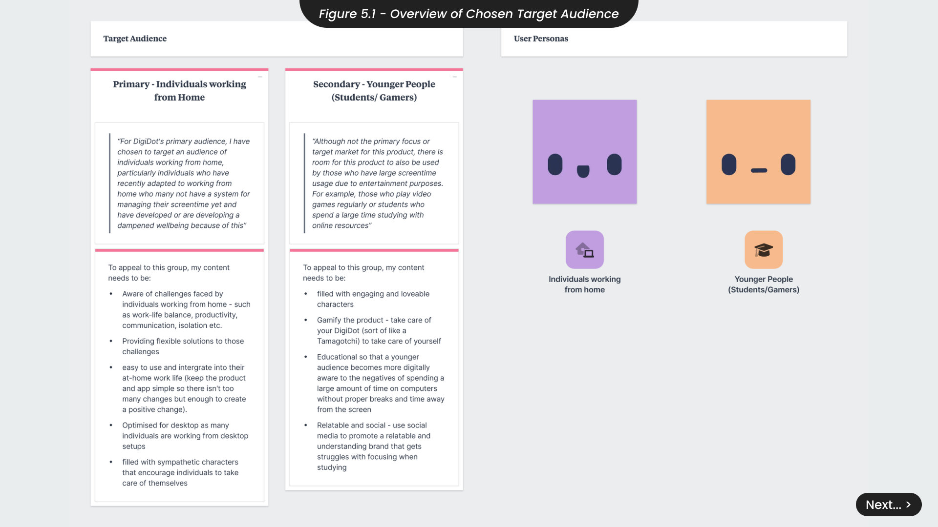
For this project, I aim to target individuals working from home who have not yet implemented a system for managing their screen time and are experiencing negative impacts on their wellbeing (Figure 5.1). Although this is the primary focus, there is also potential to target a secondary audience of students and gamers with high screen time who need a better system for managing their focus and breaks, especially during study sessions or extended gaming periods. To better understand this target audience for DigiDot, I developed user personas to represent the key segments of the market.
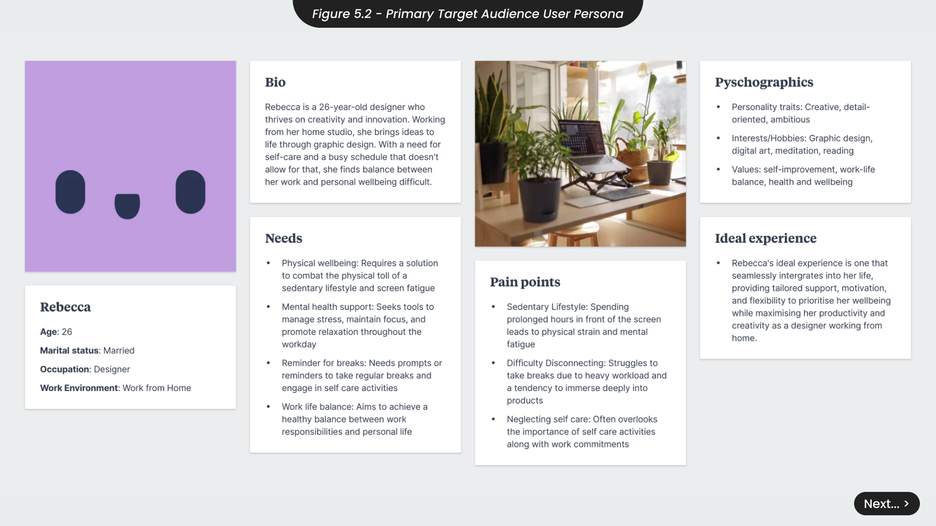
For example, Rebecca is a 26-year-old designer who thrives on creativity and innovation (Figure 5.2). Working from her home studio, she brings ideas to life through graphic design. However, her busy schedule makes it difficult to balance work and personal wellbeing. She needs a solution to combat the physical toll of a sedentary lifestyle and screen fatigue, and tools to manage stress, maintain focus, and promote a more relaxed approach to her workdays. From this, I understand that DigiDot must be optimised for desktop use, incorporate a sympathetic tone that encourages self-care, and include features that address the challenges faced by remote works, such as prompts for regular breaks.
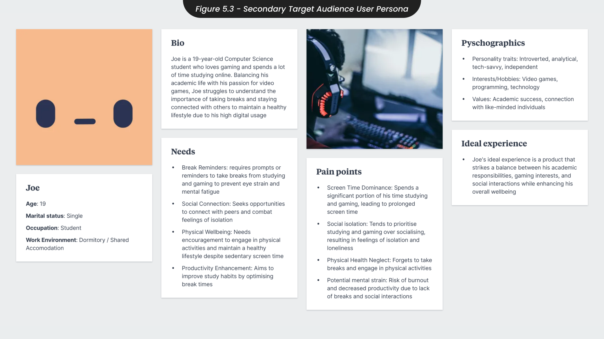
For my secondary audience persona, Joe is a 19-year-old computer science student who loves gaming and spends much of his time studying online (Figure 5.3). Balancing his academic life with his passion for video games, Joe often neglects the importance of taking breaks and staying connected with others, impacting his overall wellbeing. He needs prompts and reminders to take breaks from studying and gaming, opportunities to connect with peers to combat isolation, and encouragement to engage in physical activities outside of his screen time. From this, I understand that DigiDot should be a gamified product that educates young people about digital wellbeing, promotes social interaction, and encourages a balanced lifestyle.
6. Brand Development
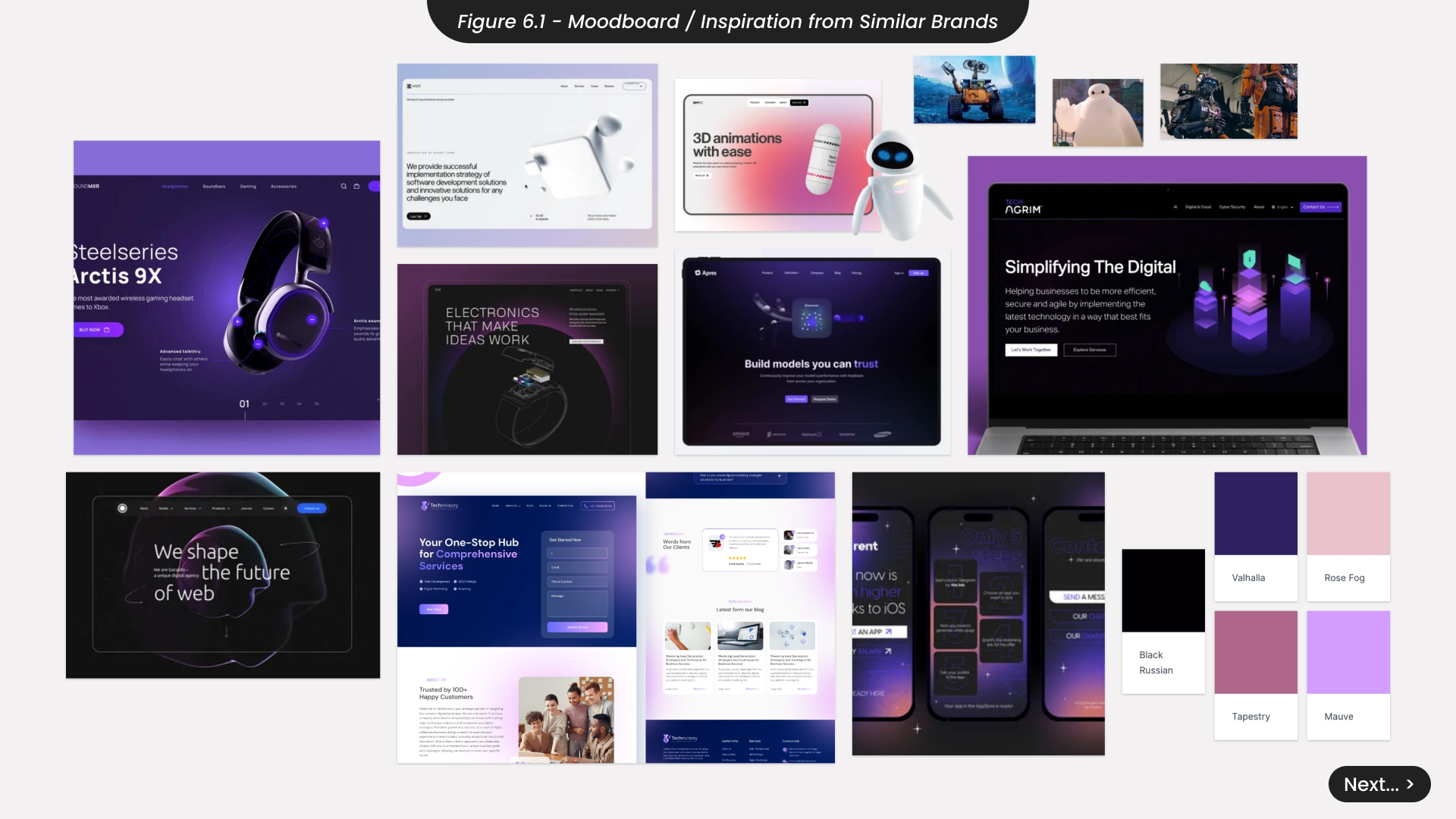
Before creating the visual identity for DigiDot, I decided to develop a brand mood board to define the desired look and feel (Figure 6.1). Drawing inspiration from successful technology companies, I aimed to ensure DigiDot would blend seamlessly into the current market while standing out on its own. I collected images from various online sources, such as Dribbble, Pinterest, and Behance, using targeted search terms related to the technology sector. Through this process, I noticed that purple was a predominant colour in the industry, likely because it is associated with creativity and innovation. I was particularly drawn to images featuring gradients, which conveyed a softer and more calming aesthetic. Additionally, I observed that friendly or sympathetic robot characters often had simple designs with a clear focus on expressive eyes.
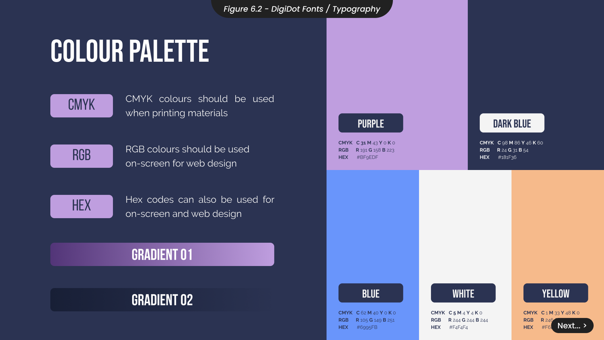
Noticing the trend of darker UIs with purple accents, I chose these two colours as the primary palette for DigiDot (Figure 6.2). However, I also wanted DigiDot to stand out within the market. To achieve this, I experimented with adding secondary complementary colours to the overall palette. These additional colours would be used for customisable themes within the app, accents in social media content, and the website, helping the overall visual identity differentiate itself from the common purple colour scheme in the technology industry. I also created two simple gradients to use throughout the materials, aiming to reflect the product’s gentle focus on enhancing digital and overall wellbeing.
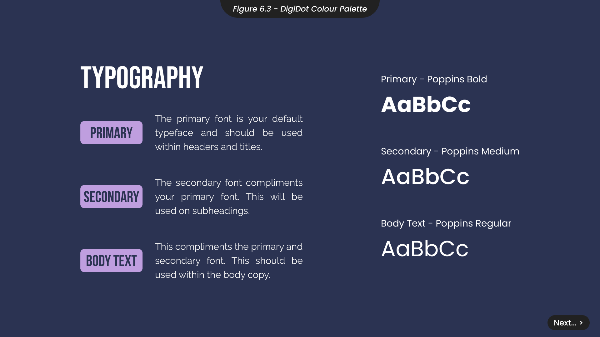
For the typography of DigiDot’s website and desktop application, I chose Poppins to ensure all settings and digital insights are clear and easy to read (Figure 6.3). To maintain visual cohesion, I used different weights of Poppins for headings and subheadings instead of different fonts. This approach keeps the focus on the characters and visual assets without the fonts taking away from their effectiveness.
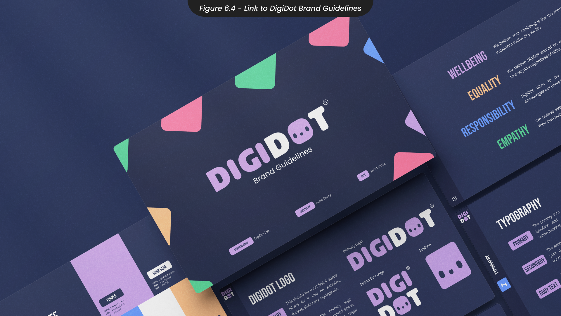
You can view the full DigiDot brand guidelines document here. (Figure 6.4)
7. Logo Design
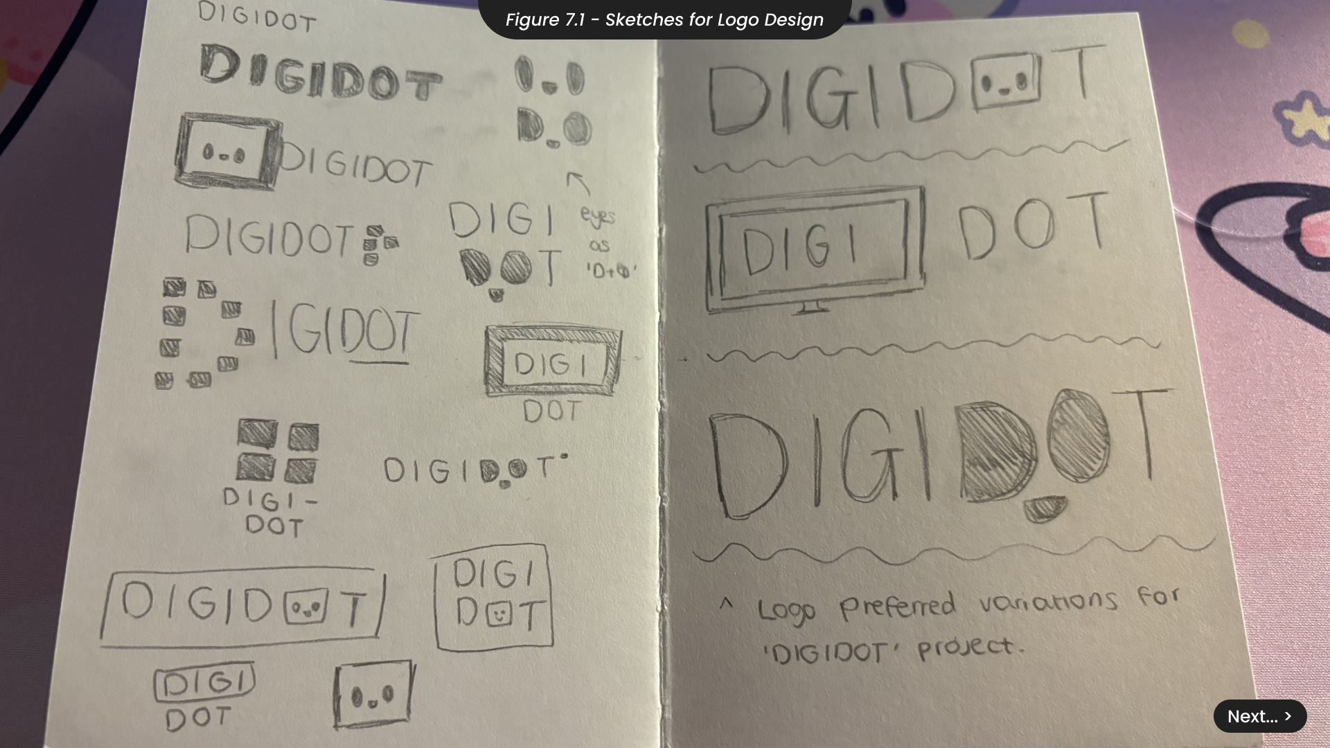
When sketching ideas the logo for DigiDot, I aimed to capture the brand’s friendly and empathetic tone (Figure 7.1). After experimenting with various sketches, I decided against logos incorporating pixels or screens, as they didn’t align with the approachable feel I wanted. Since the DigiDot characters are central to the product, designed to support users during extended screen time, I focused on incorporating these characters into the logo. I noticed the round shapes of the letters ‘D’ and ‘O’ could be used as eyes, leading to several variations that created a face from these letters. I also explored variations where the letter ‘O’ was replaced with the character itself, reinforcing the product’s key visual elements.
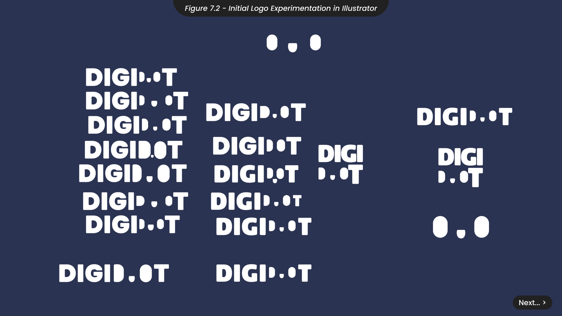
Taking the concept of incorporating the character into the letters of the business name, I created several variations in Illustrator with different character styles (Figure 7.2). I identified a character style that captured the friendly feeling and tone of the project. However, despite multiple variations, I found that this logo idea was difficult to read and couldn’t achieve a balance between clarity and aesthetics. Therefore, I decided to proceed with my other preferred variation, where the character replaces the letter ‘O’.
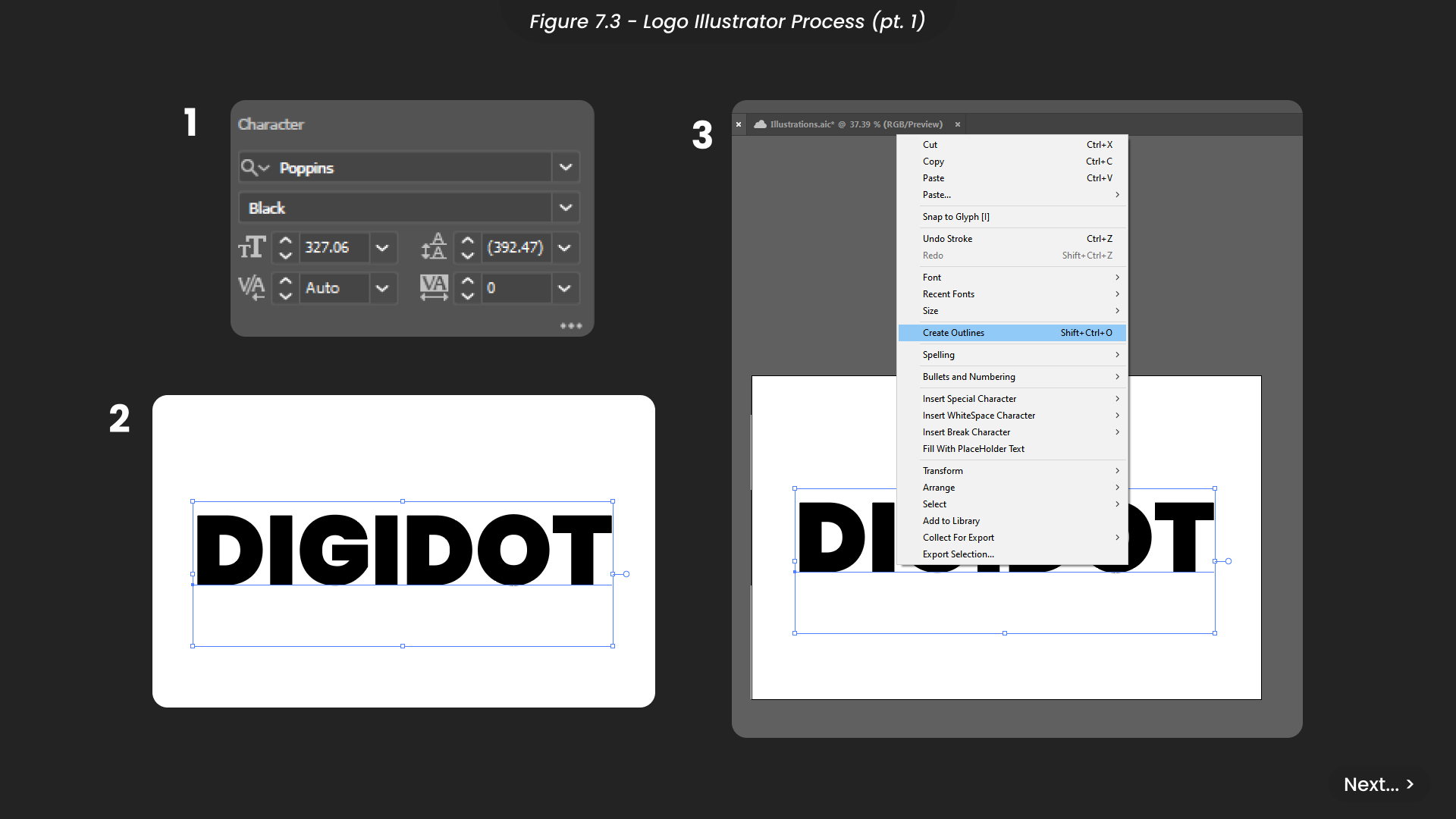
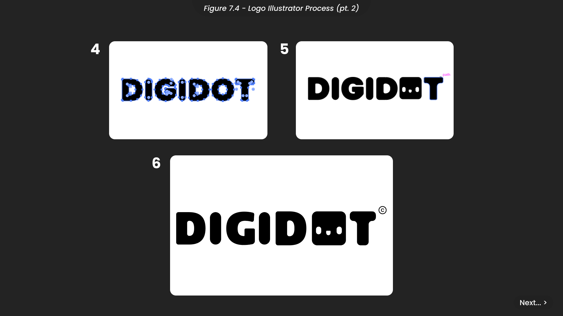
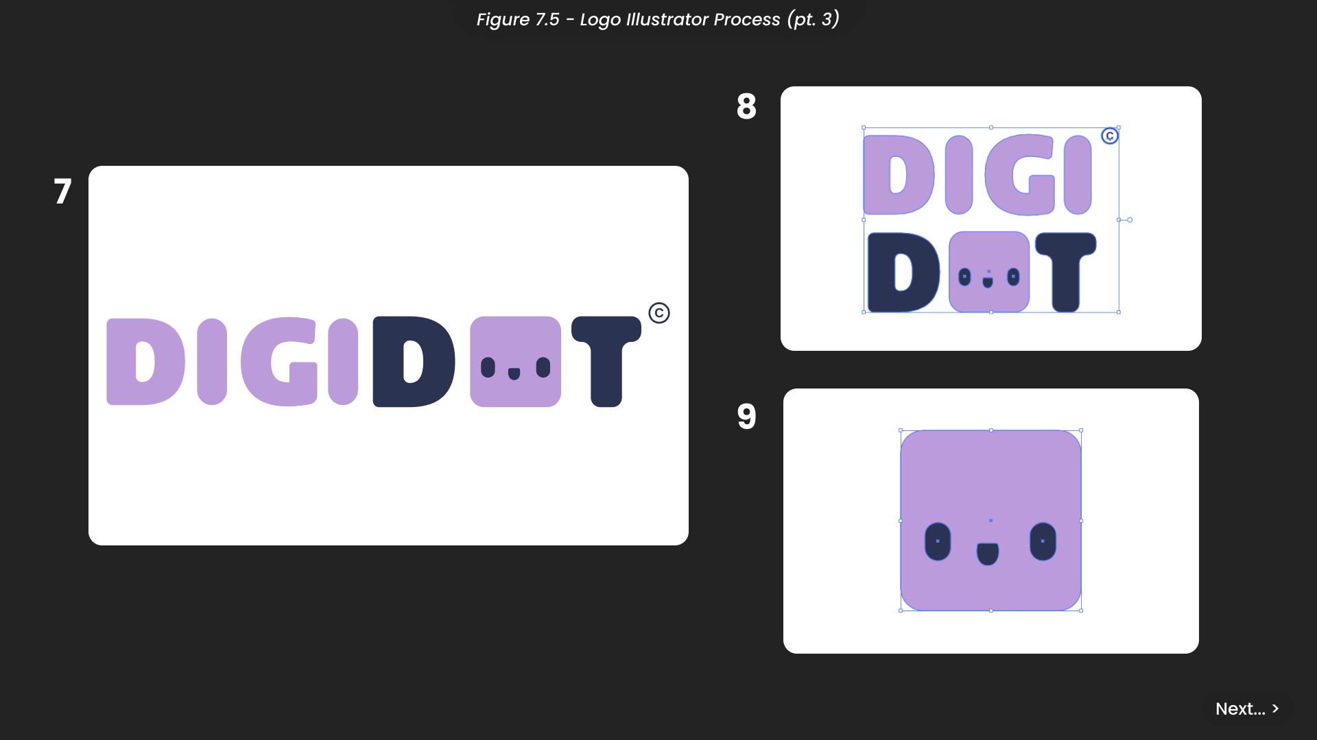
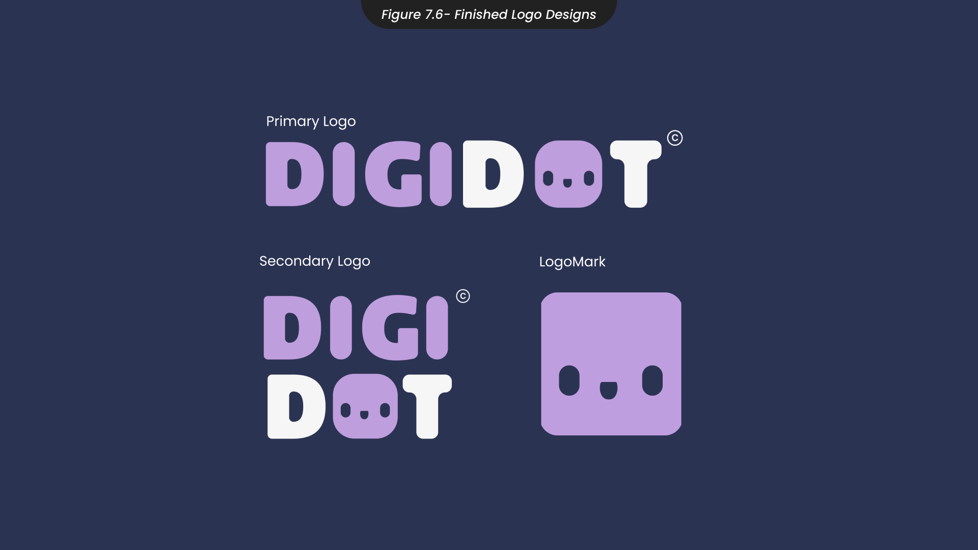
To create the DigiDot logo, I started by using the type tool and the brand font, Poppins, to write the brand name (Figure 7.3). To make the logo distinctive, I wanted to manipulate each letter individually and give them unique shapes. Therefore, I converted the text into editable vectors by creating outlines. Then, I rounded the corners and incorporated the character design from my initial Illustrator experiments to achieve a softer and more approachable feel (Figure 7.4). After refining the letters further, I applied the brand colours, using purple to highlight certain elements, such as ‘Digi’ (short for digital) and the character itself (Figure 7.5). Finally, I experimented with different variations for the secondary logo and logomark to accomodate various usage scenarios. I exported all logo designs in SVG format to ensure they could be scaled infinitely, if needed, without losing quality (Figure 7.6).
8. DigiDot Character Design
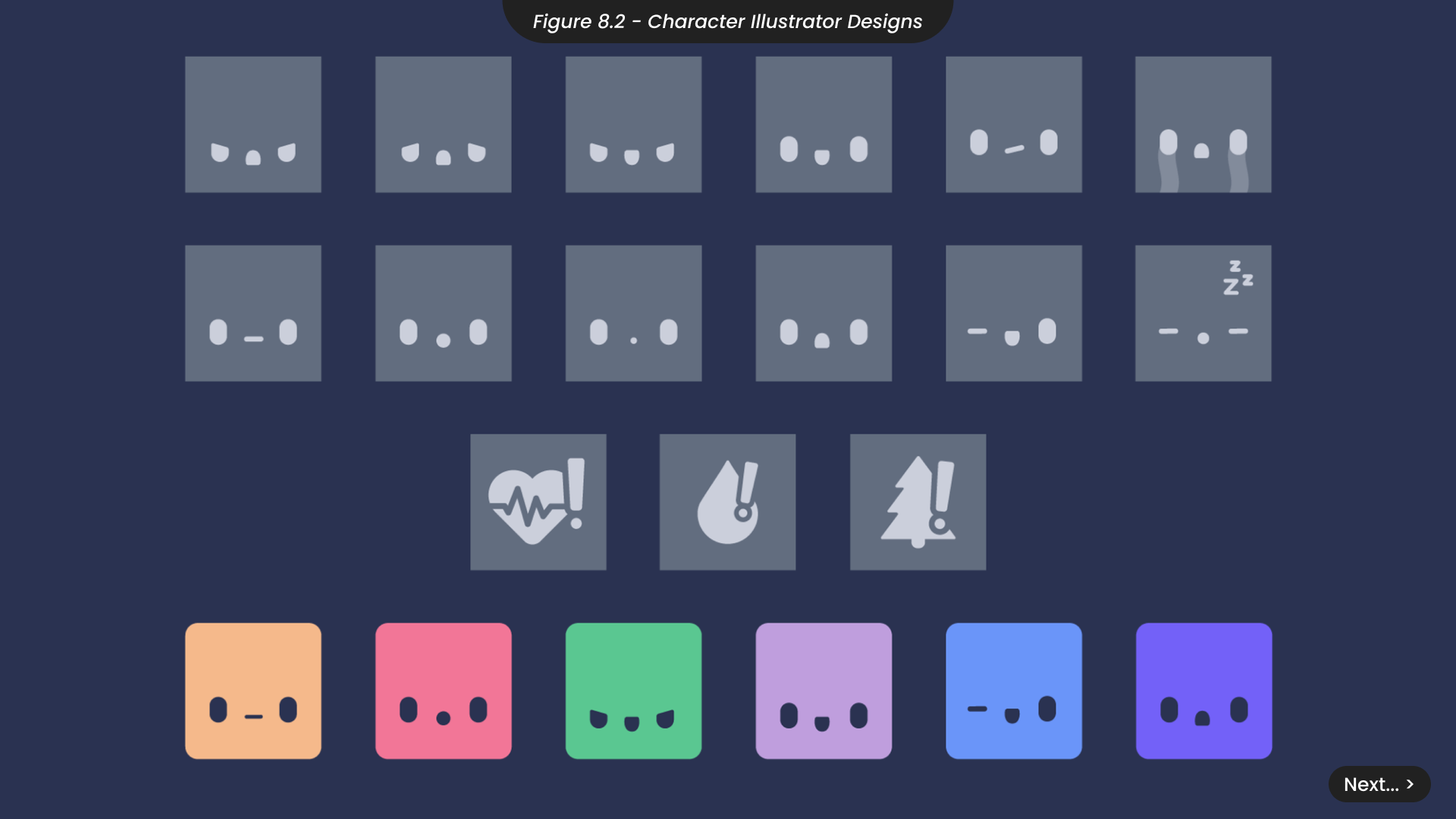
When creating sketches for my DigiDot characters (Figure 8.1), I drew inspiration from my brand mood board, which featured images of robots from various media. I aimed to understand how artists convey emotion through technology to create relatable and empathetic characters. Characters like Eve and Wall-E from ‘Wall-E’ and Baymax from ‘Big Hero 6’ often use a simplistic design, emphasising the eyes to express emotion. This insight led me to focus heavily on the eyes when designing the DigiDot characters.
Initially, I experimented with a more ‘chibi’ style, featuring characters with large circular eyes. However, this rounder style didn’t complement the square screen of the DigiDot device, disrupting visual balance and unity. Consequently, I returned to the style used in the logo and experimented with various facial expressions. Although I considered conveying emotions solely through the eyes, I found it challenging to make the emotions easily readable. Unlike the inspirations I drew from, the larger screen of DigiDot provided more space, allowing me to incorporate additional facial features without sacrificing clarity.
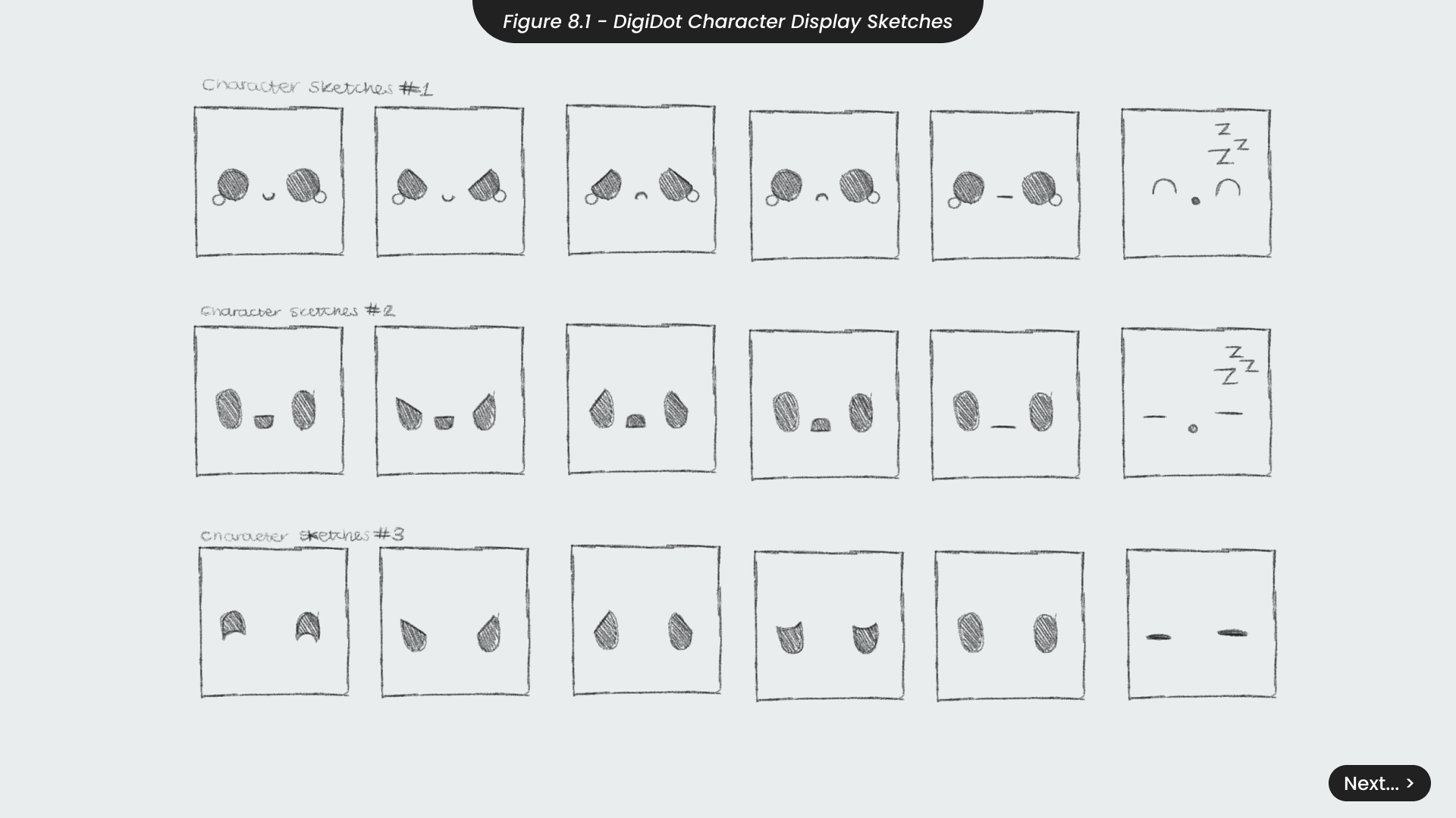
To create these designs in Illustrator (Figure 8.2), I utilised simple shape tools to illustrate each facial expressing, resulting in 12 unique expressions. When displayed on the DigiDot device, these characters will animate and react to your digital usage. For instance, the DigiDot will appear increasingly tired and bored if you spend long periods at your desk, and it will look sad if you haven’t had a drink or exercised in a while. To reinforce these expressions, I designed icons to flash as reminders for exercise, hydration, and outdoor activities, ensuring the messages are clear. I initially created all these designs in black and white to ensure their clarity before incorporating the brand colours. This approach allowed me to focus on perfecting the facial expressions before adding any aesthetic details.
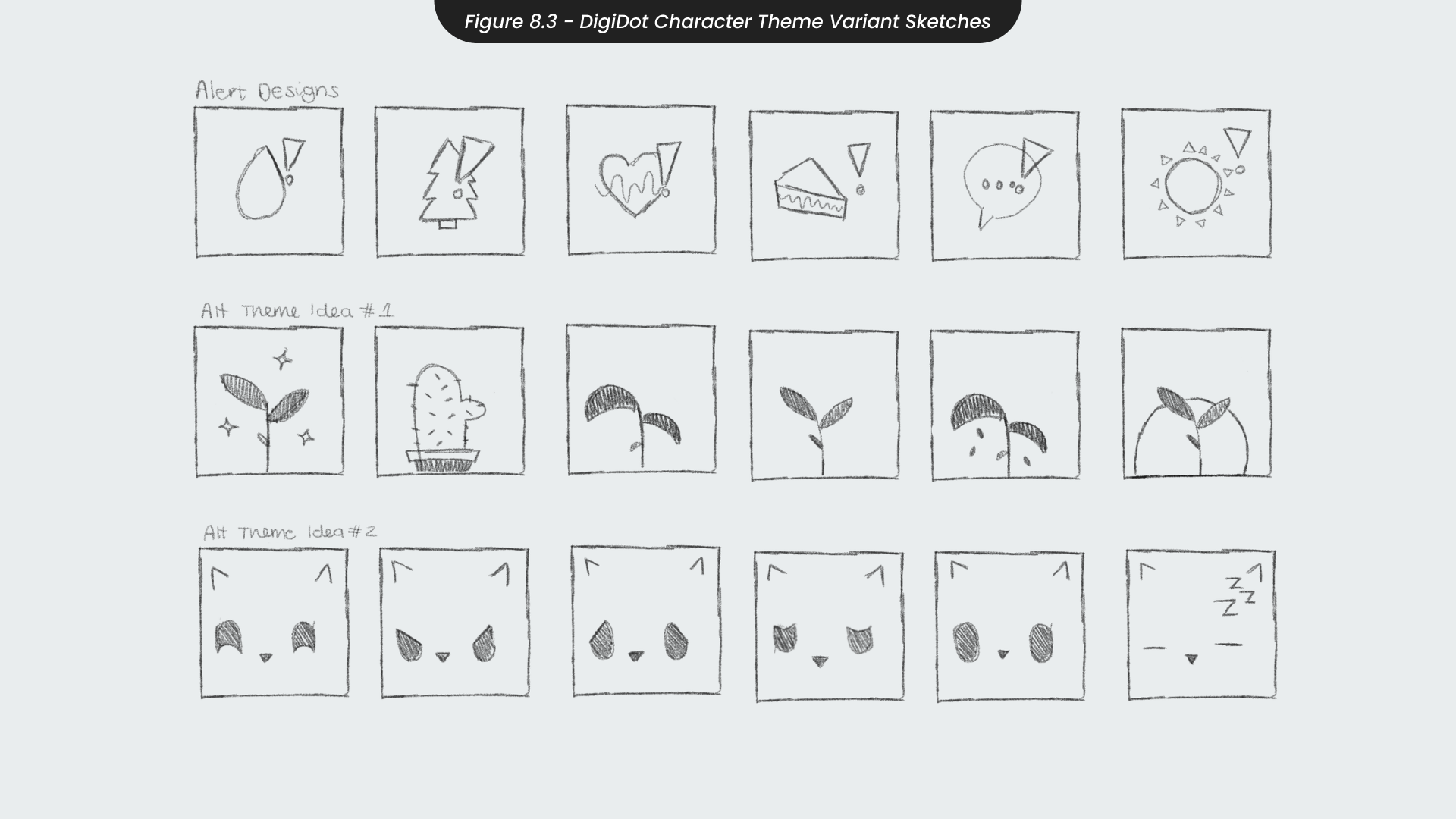
Finally, I aimed to enhance the customisability of the DigiDot device, by sketching additional character themes that users could choose from (Figure 8.3). To start, I created additional icon sketches to complement the existing illustrated versions. I considered that some users might prefer a more minimalistic approach, opting to use only icons without any character. Next, I explored the idea of a non-character ‘character’, such as a plant. Inspired by the app ‘Forest’, I envisioned a plant that could convey emotions: shiny and fully grown when happy, and drooping lower when sad. Additionally, I experimented with transforming existing designs into animal characters, like a cat, by replacing the mouths with noses and adding pointy ears. While these ideas are promising, they represent potential future developments. If I continue this project, these concepts will be explored further to enhance the DigiDot platform and its unique selling points.
9. Character Animation
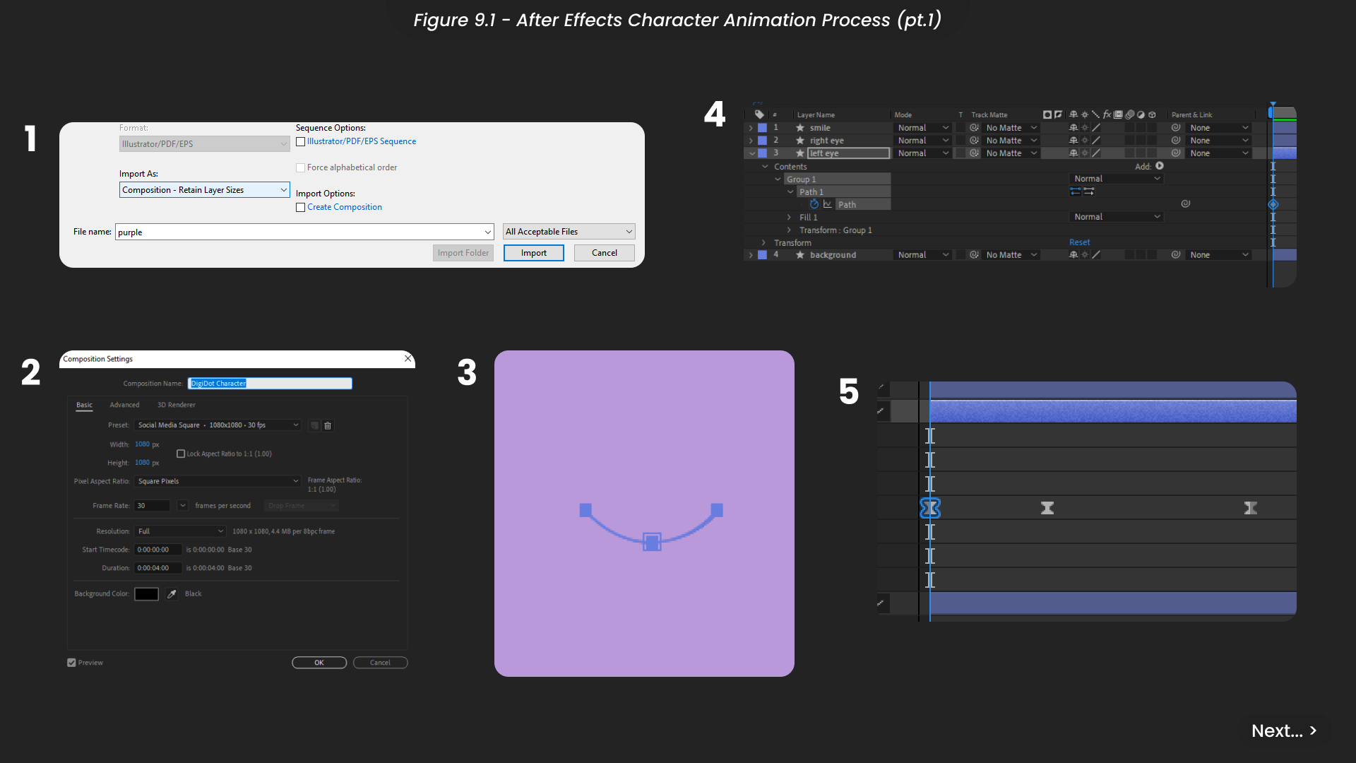
To demonstrate how the characters would animate, I focused on animating the happy ‘default’ character (Figure 9.1). I began by importing the Illustrator file of this design into After Effects, ensuring that the layer sizes were retained so they could be imported as vector shapes. I created a composition with a 1080x1080 resolution at 30fps, which could be scaled down if needed.
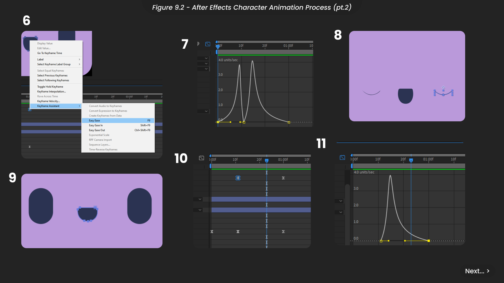
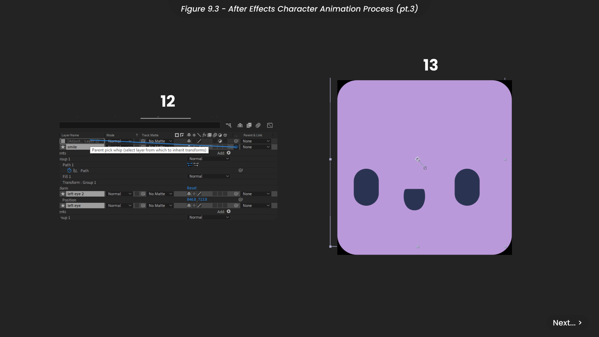
Starting the animation, I keyframed the path of the left eye to open and then fully close into a semi-circle shape, imitating a blink, before opening again. I adjusted the keyframe timing to replicate the natural speed of a blink, which starts fast and slows down as the eye reopens. I then applied an easy ease to these keyframes and edited the speed graph for smoother motion (Figure 9.2). I duplicated this eye animation for the right eye, ensuring the character blinks simultaneously. Next, I animated the mouth to give the character a more dynamic and lively appearance. Similar to the eye animation, I edited the path keyframes of the mouth to shrink after the blink and then expand, syncing these movements with the blinking animation. I also adjusted the speed graph to ensure the mouth animation was smooth and in time with the blinks. To enhance the natural movement of the character’s face, I created an adjustment layer and linked all the facial elements to it (Figure 9.3). I animated the position of this adjustment layer to follow the character’s facial movements, maintaining the timing of the overall animation.
Finally, I exported the animation in GIF format for easy sharing and as a Lottie File to keep the file size small, aligning with responsible production practices (SDG 12).
10. Product Design
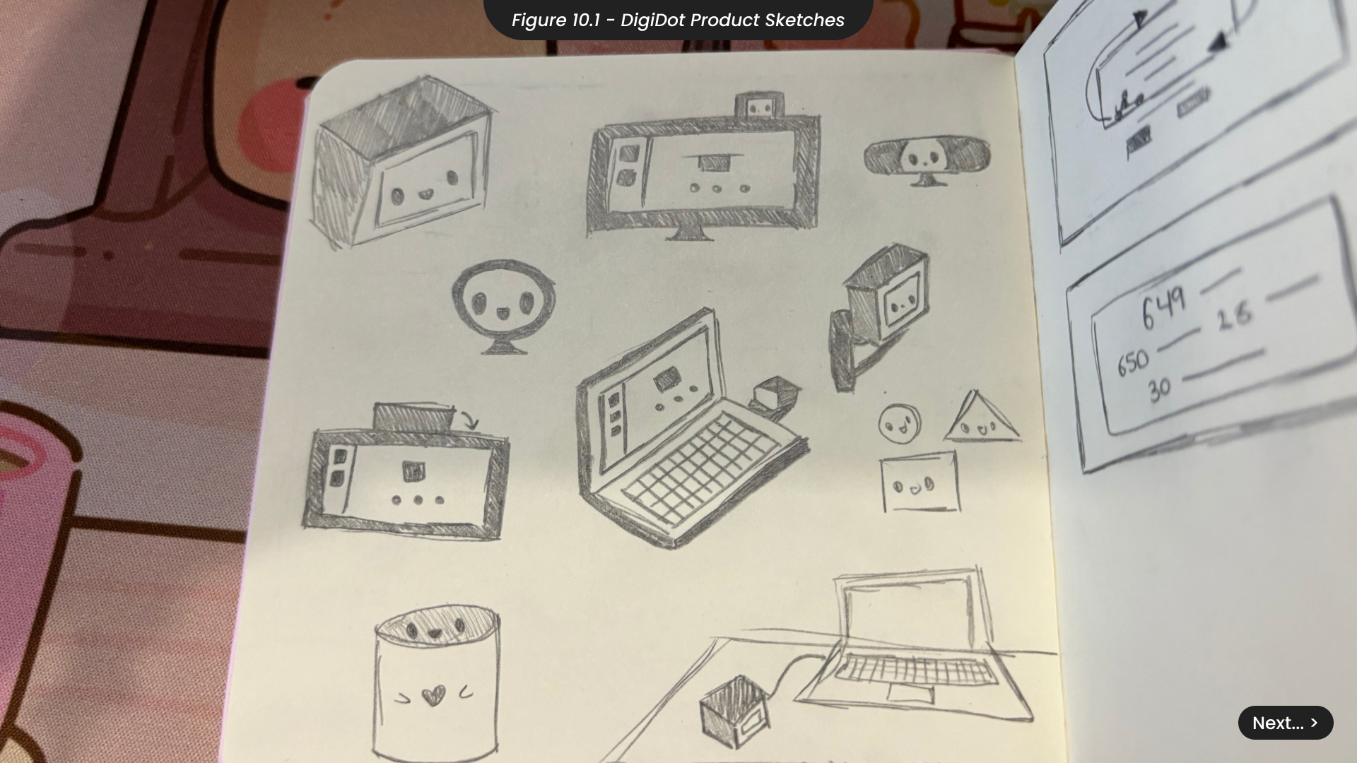
One key component of the DigiDot project is the DigiDot product. When sketching ideas for this product (Figure 10.1), I carefully considered the various ways it could be positioned on a computer or screen and the shapes that would be suitable for these placements. For instance, I explored rounder shapes, similar to those found in some desktop cameras. This shape is proven effective and often fits well atop a desktop screen. However, I found that these designs detracted from the character’s face and disrupted the product’s natural balance. Therefore, I also experimented with more rectangular shapes. Placed next to a rectangular monitor, these square designs create a more cohesive look. What ultimately convinced me of this design was its versatility, as it could be placed not only on a monitor but also on a desk, making it compatible with laptops and other portable desktops.
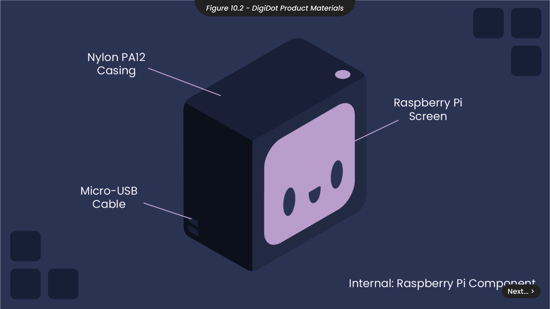
To ensure the DigiDot product was affordable for a diverse range of users needing extra support in their work or digital lifestyles, I researched potential manufacturing materials and costs (Figure 10.2). Based on my findings, using a Raspberry Pi screen and components, along with a micro-USB cable for connection, would total £22.90 per unit. The 3D printing costs for a Nylon PA12 casing, which is stronger and more sustainable than other plastics such as Polypropylene, are £182 for 20 units, resulting in an average cost of £36 per unit, significantly cheaper than other wellbeing and desktop assistants in the market. However, it’s important to note that this product is currently conceptual, and my expertise in production is limited. Therefore, involving product management professionals could lead to more cost-effective and sustainable methods if the project advances further.
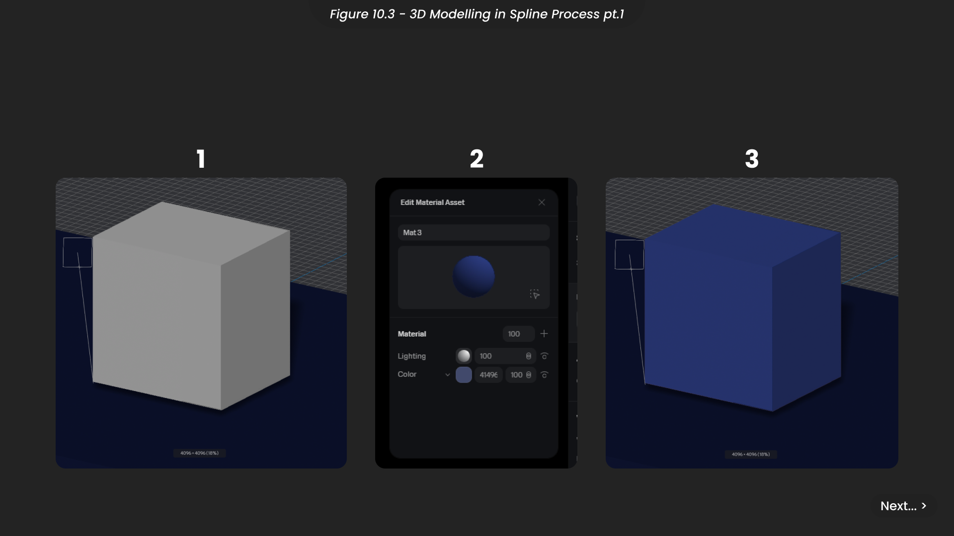
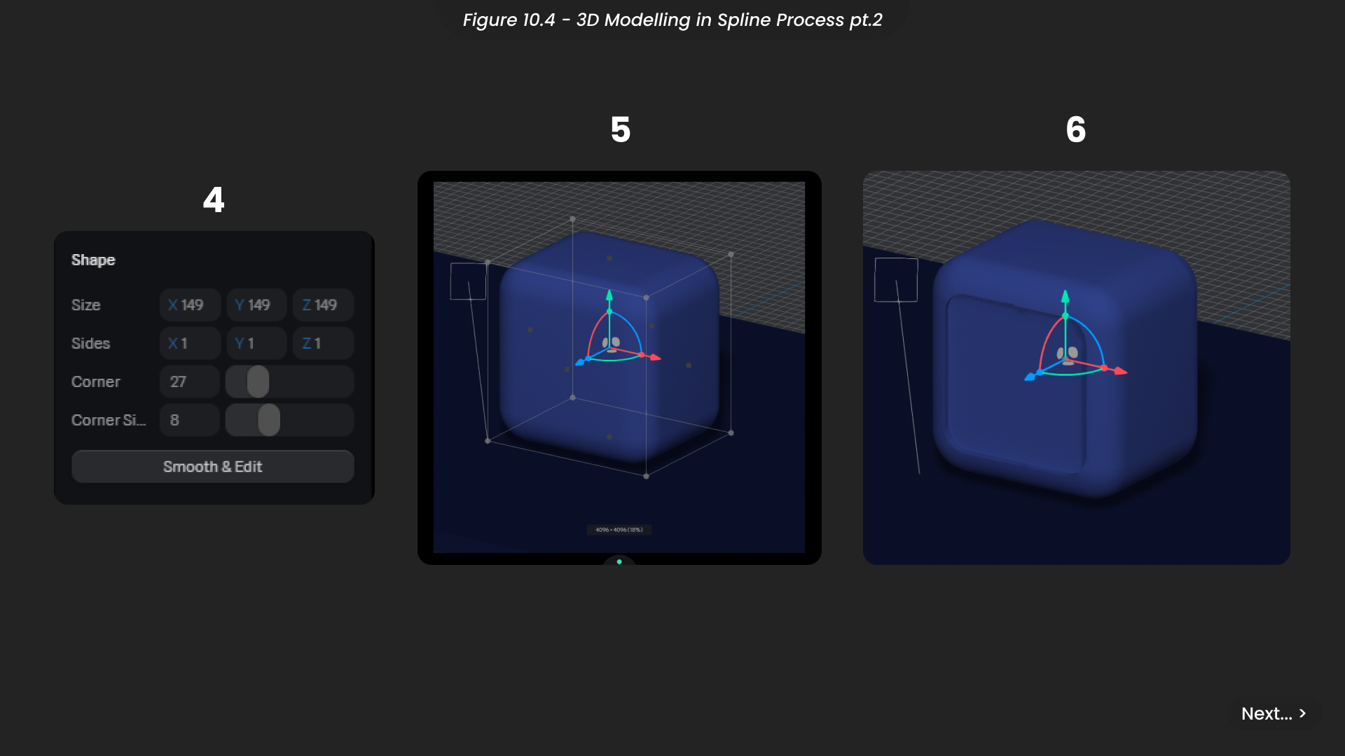
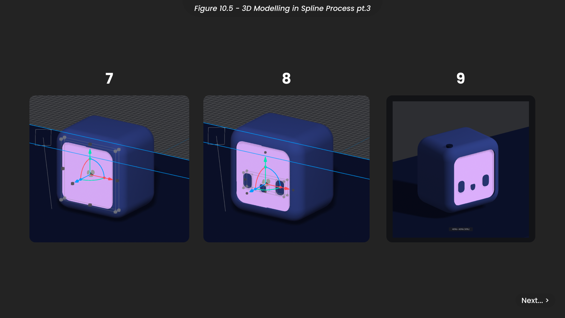
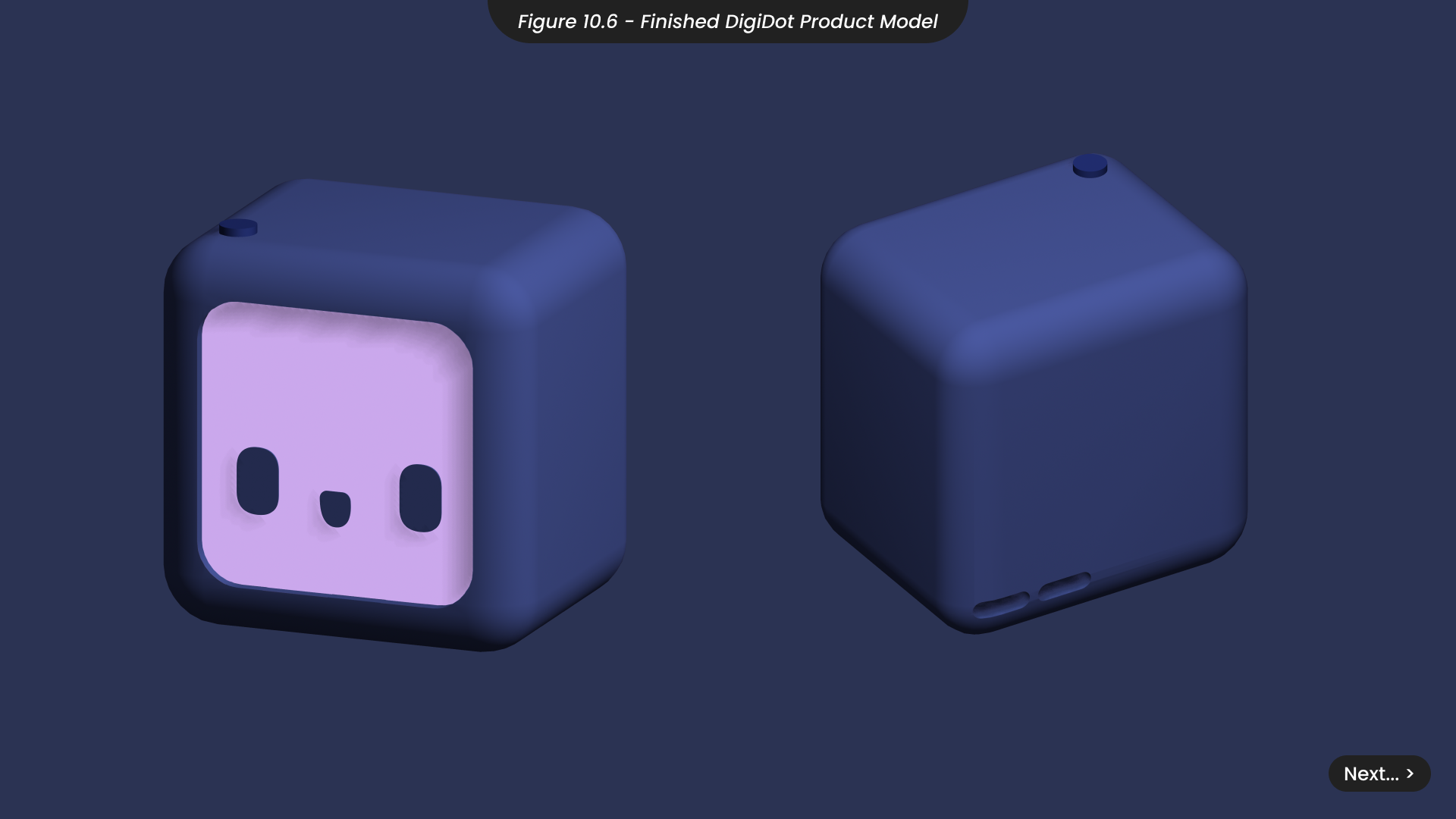
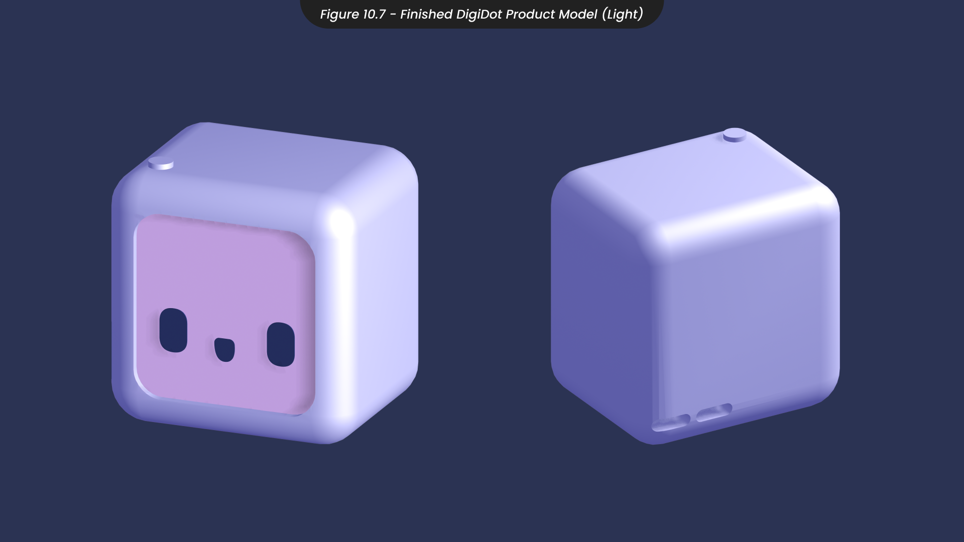
To challenge myself and expand my skillset, I ventured into 3D modelling, an area I had never explored before. Given the simplicity of the product design, I saw this as an opportunity to learn Spline, a 3D modelling software compatible with Webflow, my preferred website development tool. I began by creating a cube and adjusting its dimensions to match the slightly shallower shape of my product design (Figure 10.3). I then applied a material using a darker colour from my brand guidelines for the base casing. To give the device a welcoming tone, consistent with its character design, I softened the edges by adjusting the bevelling in the shape effects panel (Figure 10.4). I used a Boolean shape to subtract from the casing and mark out where the screen would be placed. For the screen itself, I created another shape and positioned it with the marked area of the casing (Figure 10.5). To complete the character’s face, I added flat shapes onto the screen cube. Finally, I enhanced the overall model by adding a light effect and marking out the area for the power button, before exporting the model (Figure 10.5) and creating an inverted ‘light’ version (Figure 10.6).
11. App Sketches and Wireframes
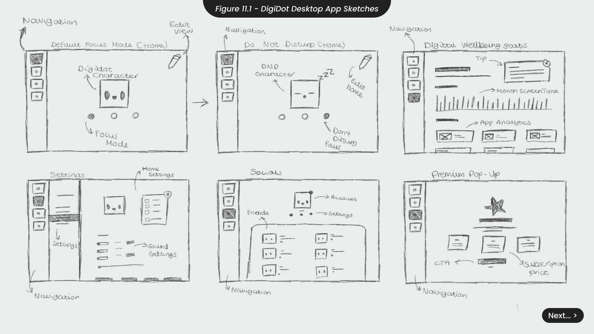
connect to their product on their computer. This application would offer features such as tracking digital analytics, social tabs for reminders and messages to friends, customisable themes and settings, and more. When sketching the UI for this application (Figure 11.1), it was crucial to ensure all pages were clear and easily navigable. This approach would make the application accessible to users of all ages with limited technology skills, assisting anyone who needed it. Additionally, it would benefit individuals with disabilities who find it challenging to learn different software or process complex information, aligning with SDG 10.
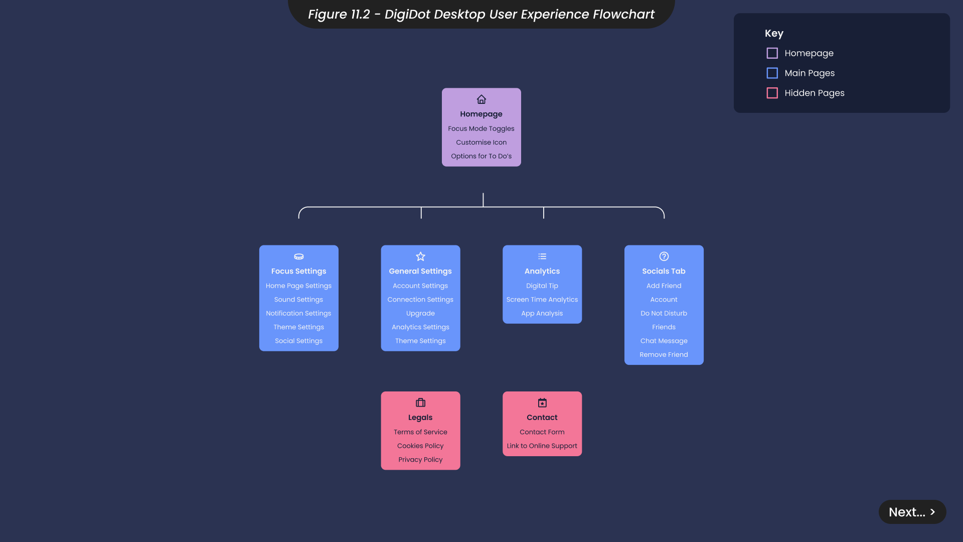
To map out the user experience and journey through the app, and to determine the optimal placement of buttons in the visual hierarchy, I created an app flowchart (Figure 11.2). This tool helped me prioritise UX in the application design. In both application and website design, it is essential to ensure that functionality is clear and intuitive before adding any aesthetic elements, as found with Maslov’s Hierarchy of Needs (Pichère & Cadiat, 2015). Maslow’s hiararchy of needs, Namur: 50minutes.— With this flowchart, I was able to identify which parts of the application needed to be linked directly on the homepage and which parts could be tucked away outside of the main navigation to avoid cognitive overload.
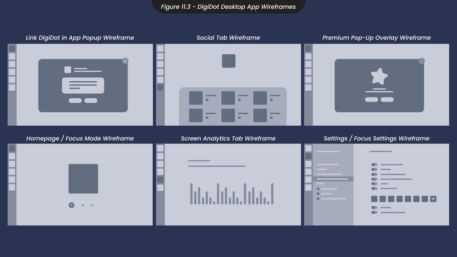
Using insights from the app flowchart and my initial sketches, I moved on to wireframing the application screens in Illustrator (Figure 11.3). For the homepage, I opted for a minimalistic approach, including only the essential buttons and information. This design ensures that users are not overwhelmed with information upon opening the application and can easily navigate to find more details if needed.
I applied this minimalistic design philosophy to the other screens, retaining only necessary information to each page. The settings page presented the greatest challenge, as I aimed to make the focus modes fully customisable to the users’ needs, with options to turn off sounds, adjust notification timings, block other applications and more. To streamline the user experience, I organised these settings into different layers. This allowed users to easily navigate and edit specific settings from a clear sidebar on the left.
To ensure the application was accessible to everyone, including those who might not be able to afford the physical product, this app would be free to use. However, to ensure DigiDot’s financial success through recurring premium subscriptions while demonstrating a commitment to providing affordable options for all users, regardless of their economic status (SDG 10), premium features would be available through a paid subscription. Therefore, I also created a pop-up wireframe for when users interacted with premium features, suggesting they upgrade.
With all wireframes laid out, maintaining a clean and intuitive interface, I moved on to designing and prototyping the app in Figma.
12. Application Design
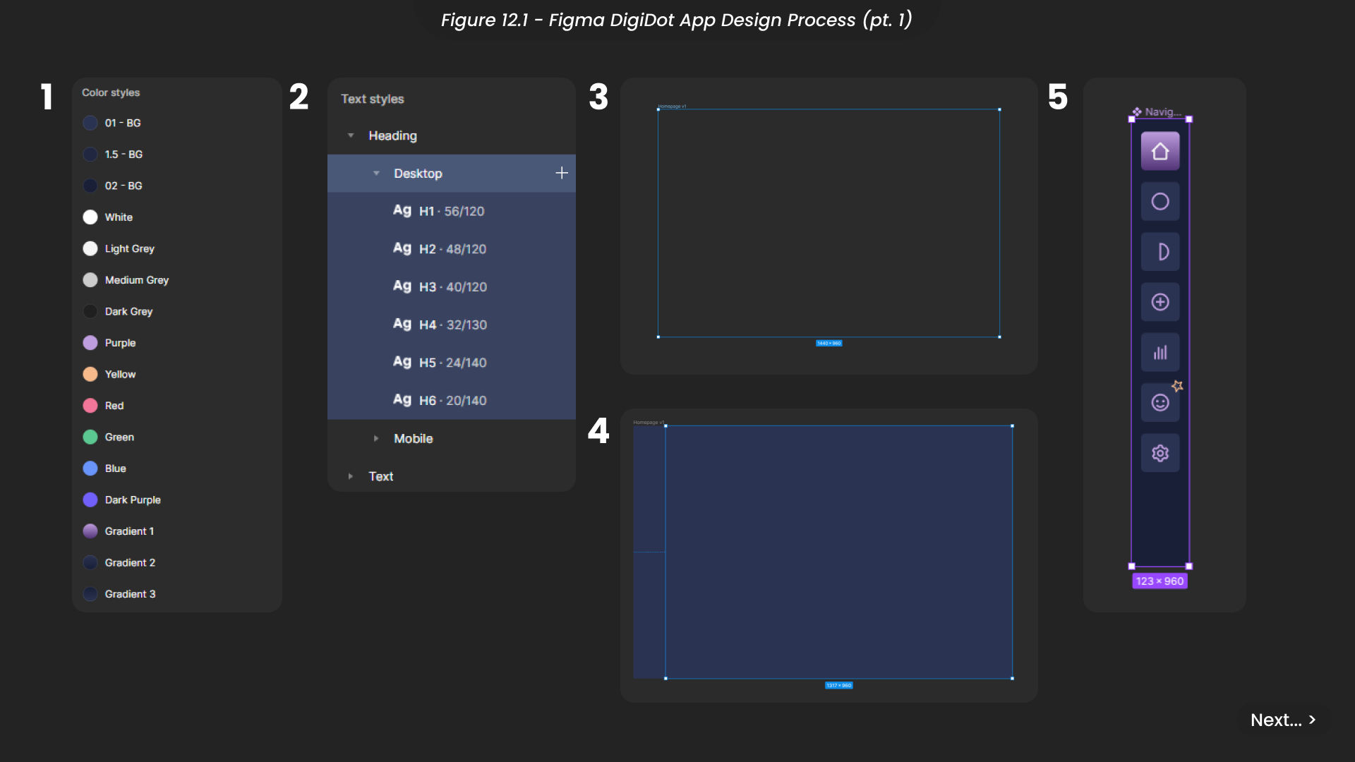
Since Figma is my preferred prototyping tool, I chose to design the DigiDot application in Figma to streamline the transition from initial design to finished prototype. One feature that makes Figma my top choice is the universal styles panel, which allows the creation of styles for colours, typography, and effects in advance, simplifying the design process.
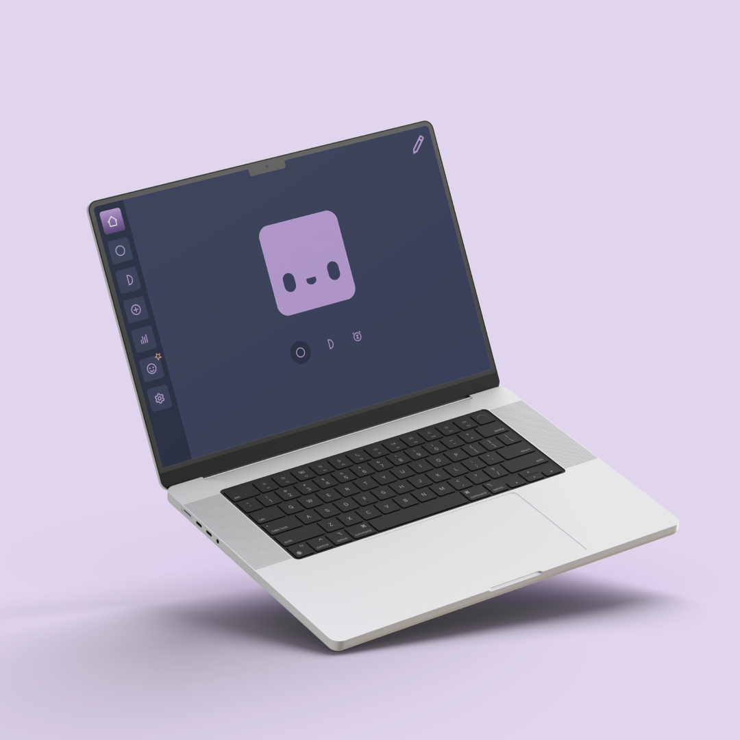
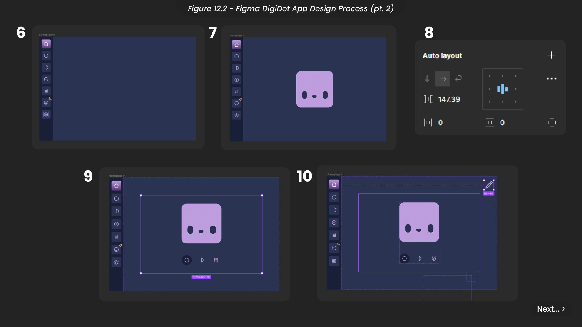
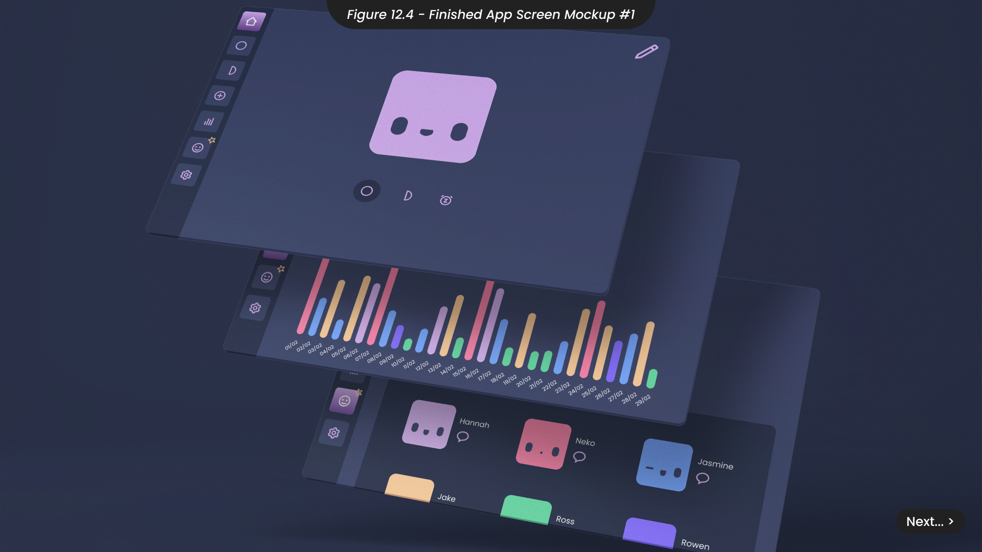
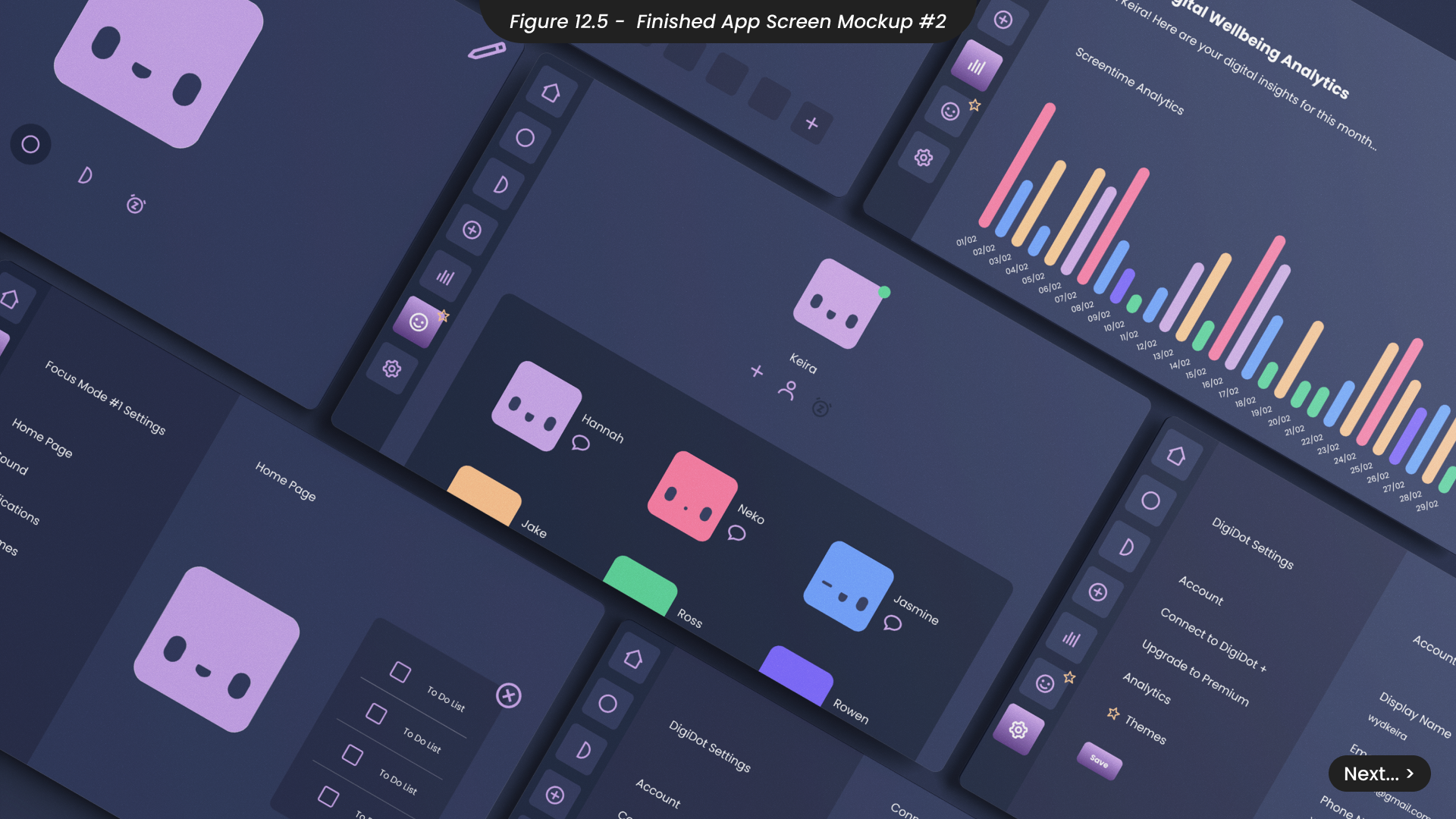
To kick off this design, I first added my brand colours, considering all of the variations needed throughout the application (Figure 12.1). I also applied the brand font, Poppins, to all text styles. Next, I created a frame for the homepage using the desktop screen size presets and designated an area for the navigation menu. Considering later prototyping within the application, I created the navigation bar as a component. This approach ensures that any updates or links between pages can be universally applied, avoiding the need for manual edits each time. I then added the DigiDot character’s face in GIF format (Figure 12.2), which is compatible with Figma, to demonstrate how the character would animate on the homepage.
Using auto layout to keep everything centered, I added buttons for three focus modes. While these modes are customisable, and users can add and rename as many focus modes as they like with unique icons, I decided that the application should launch with two default focus modes and a ‘Do Not Disturb’ mode to provide a seamless user experience for those who prefer to plug in or download their DigiDot and start using it immediately.
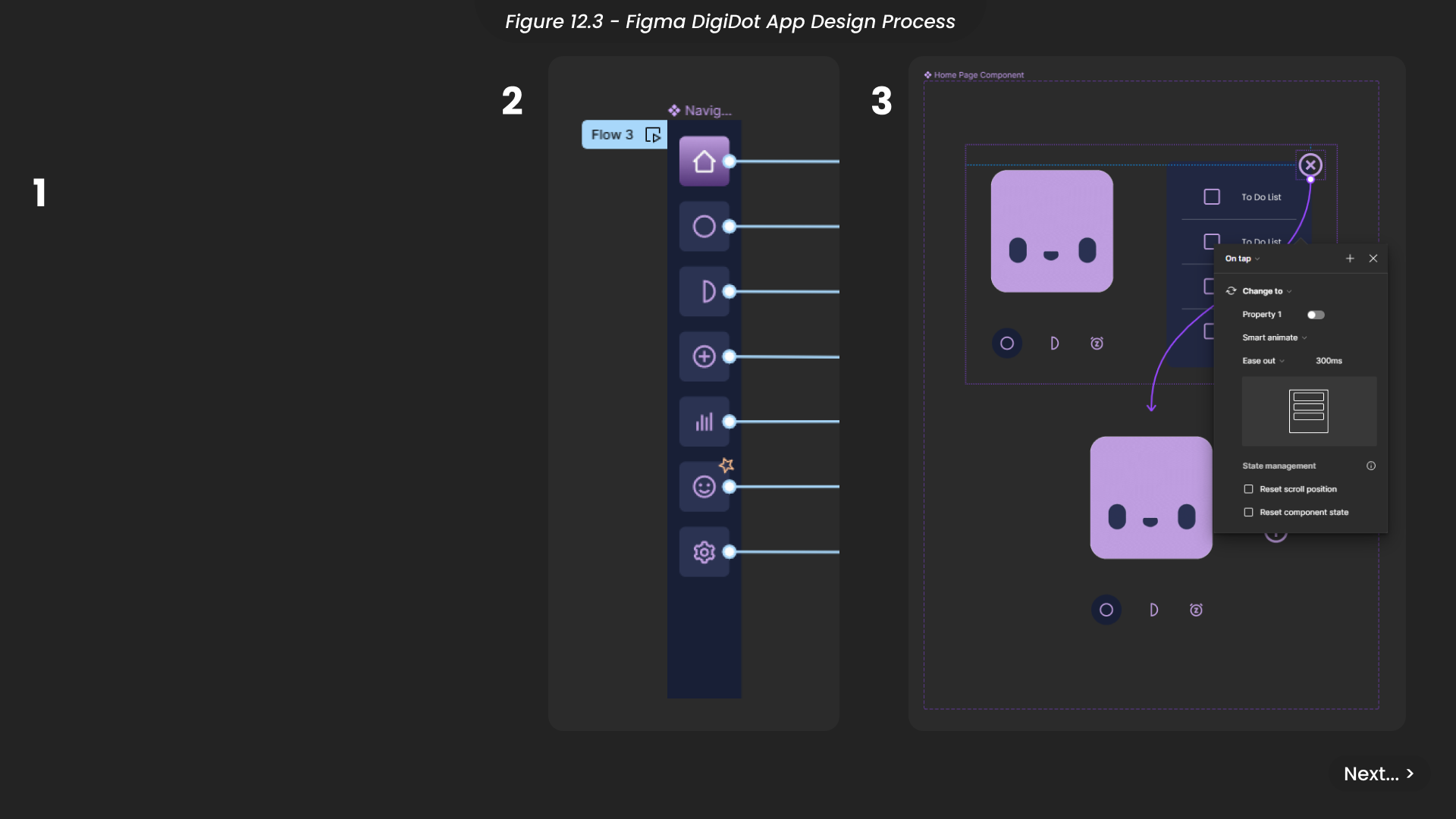
I included an ‘edit’ icon on the homepage, enabling users to quickly add elements not on the homepage by default, such as a to-do list. After designing the remaining pages, I prototyped the navigation component to link all the pages (Figure 12.3), allowing users to experience how the fully developed application would function. Additionally, I animated the edit icon to mimic the process of adding extra elements to the homepage. I continued prototyping the rest of the application design using similar techniques until I was confident that the user experience was intuitive and enjoyable for everyone.
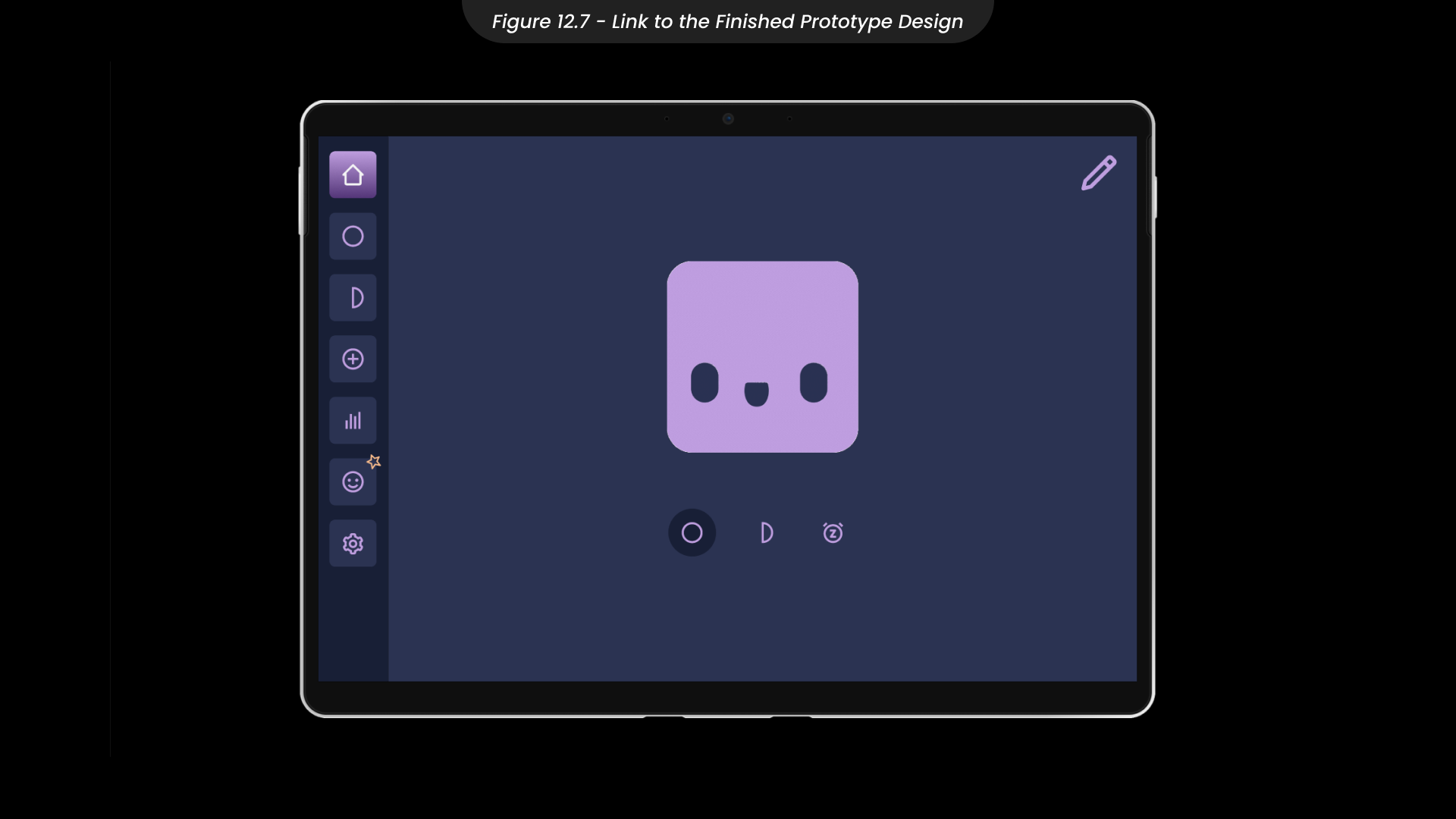
You can explore the finished prototype of the application here.
13. Website Site-Map and Sketches
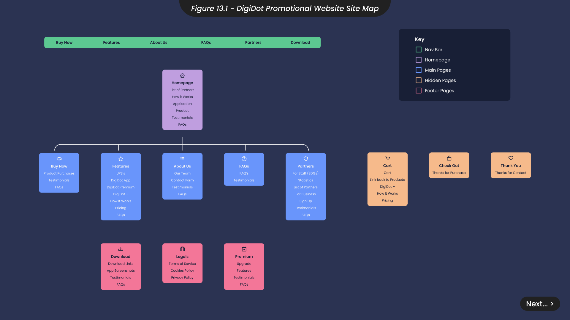
To effectively market the DigiDot application and inform potential users about its benefits for individuals who work from home or have high screen time, creating a website was essential. The website design process mirrored the approach used for the application, prioritising user experience in line with Maslow’s Hierarchy of Needs. I began by creating a site map to outline all the necessary website pages and how they would interconnect, aiming to streamline navigation, minimise clicks, and optimise the user experience for quick access to information (Figure 13.1).
I identified the need for pages detailing the product’s features, purchase options, and subscription details for premium application features. Additionally, I included a page for potential partners, such as businesses interested in bulk purchases, or learning how DigiDot can support a positive workplace for hybrid or online staff (SDG 8). The site map also helped determine which pages were essential for navigation and which could be linked in the footer or accessed online when necessary, such as the product cart.
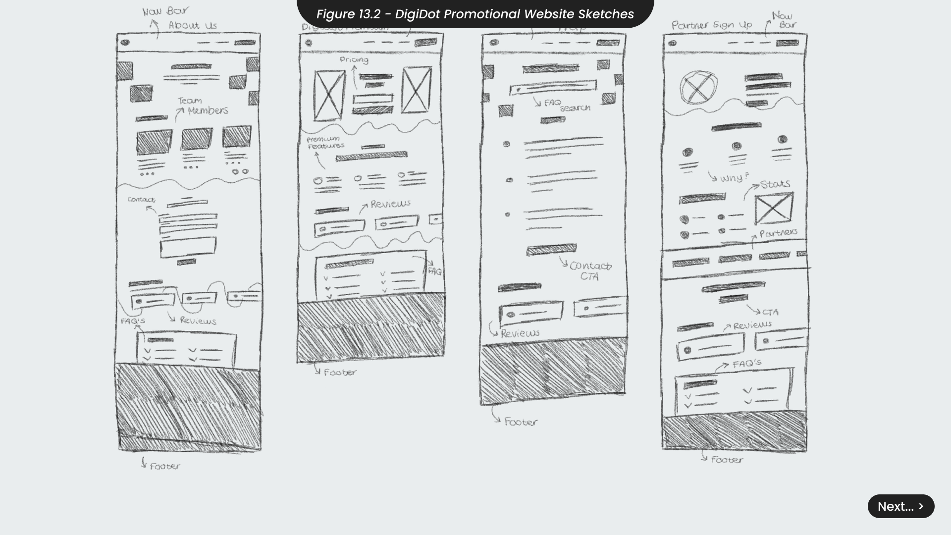
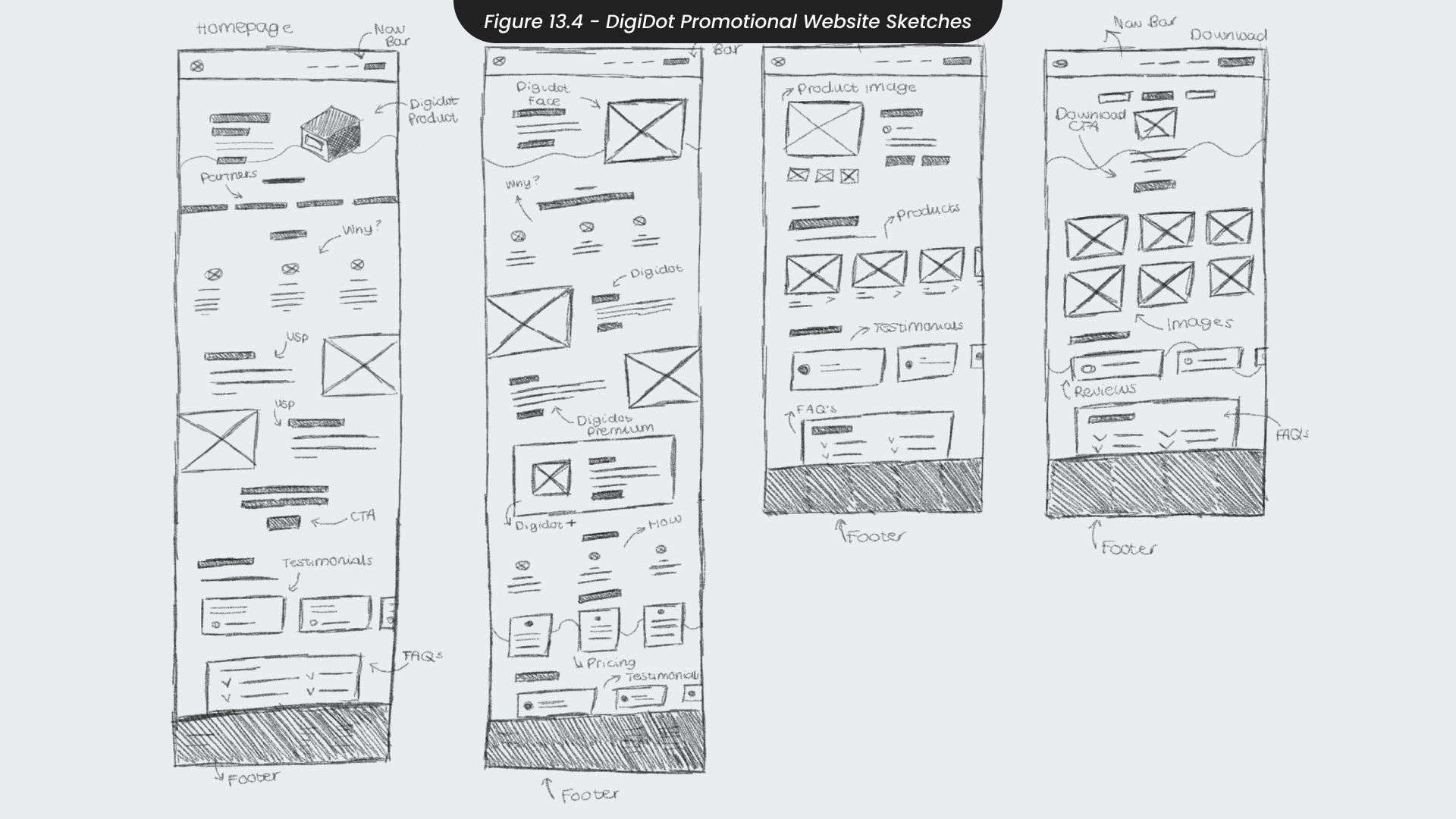
Using insights from the site map, I created sketches for the website, focusing on functionality before aesthetics (Figure 13.2/4). To prevent cognitive overload, I kept information minimal and, when necessary, broke it into sections or bullet points. I utilised space for graphics frequently throughout my sketches, as they can often convey information more effectively and are easier to process, according to scholars such as (Lai et al., 2019) and (Hanif, 2020).
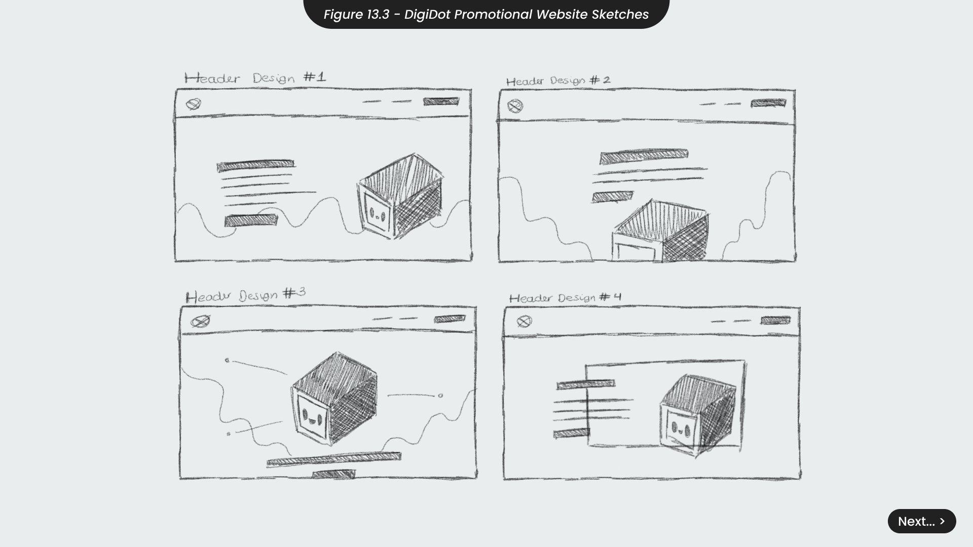
For the homepage sketches (Figure 13.3), I emphasised making DigiDot the bold focal point, as the primary goal was to showcase the product and its features prominently. Despite experimenting with various aesthetics and layout options, DigiDot remained the central element on the homepage to ensure it captured users’ attention immediately. Once I was confident that these sketches provided a solid foundation for the design process, I imported them into Figma to create the full designs.
14.Website Figma Design
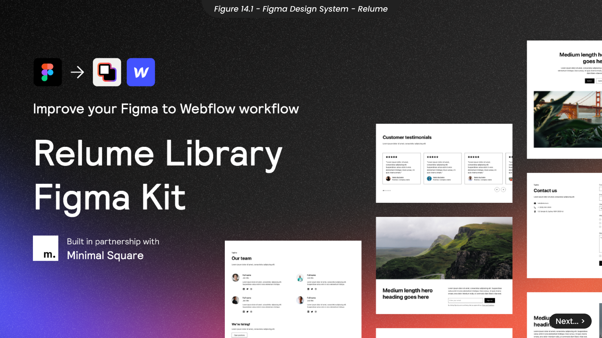
Given that designing the website was nearly a project in itself and time was limited, I decided to utilise the Relume Figma design system (Figure 14.1). This system offers a large library of pre-built components and elements for various website sections, such as testimonials, CTAs and contact forms. Utilising this system saved time on building components and allowed for more time ensuring the website aligned with DigiDot’s brand guidelines. It also streamlined future project phases, as the Relume kit is also available in Webflow, which will save time during development if this project was to continue going forward.
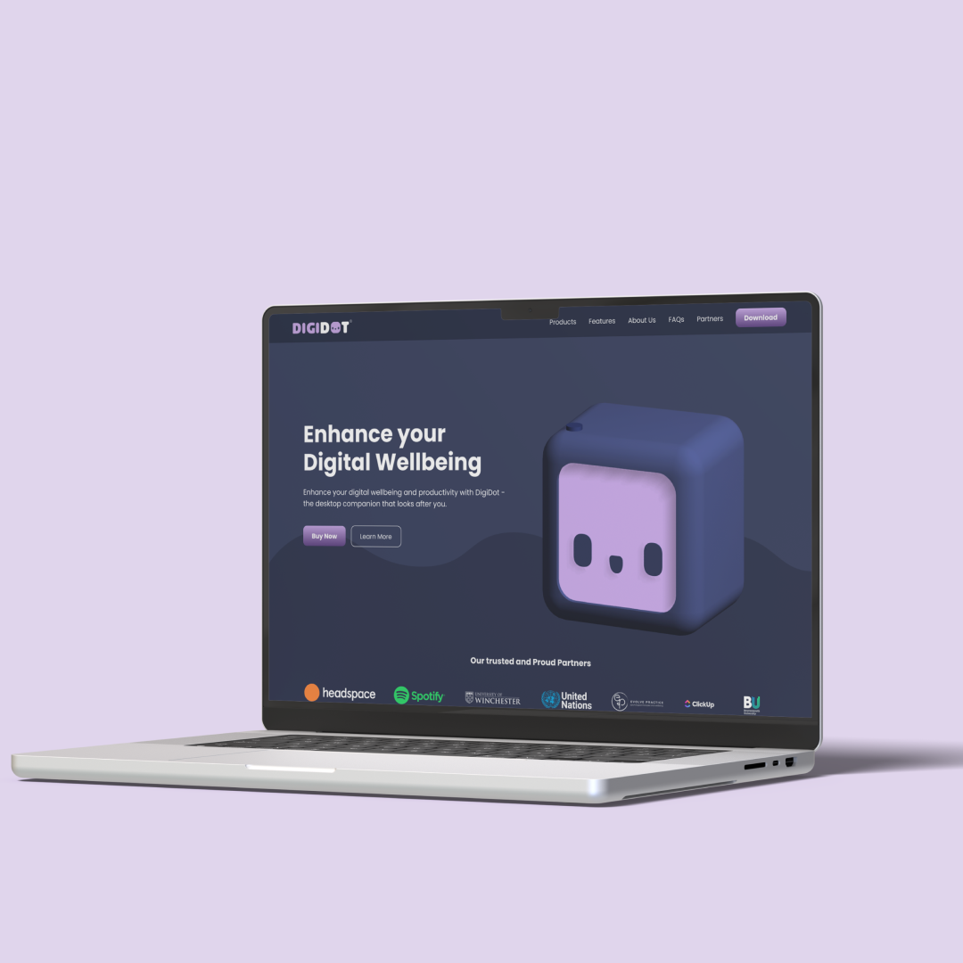
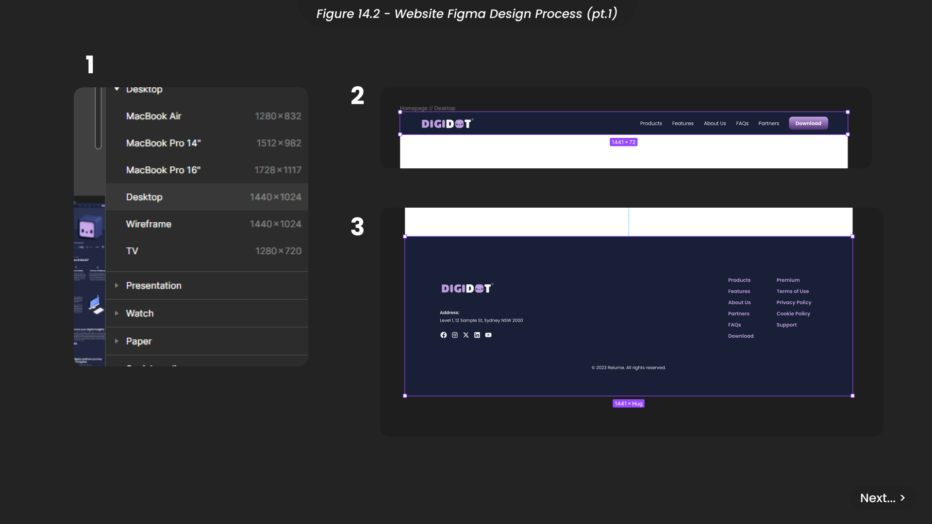
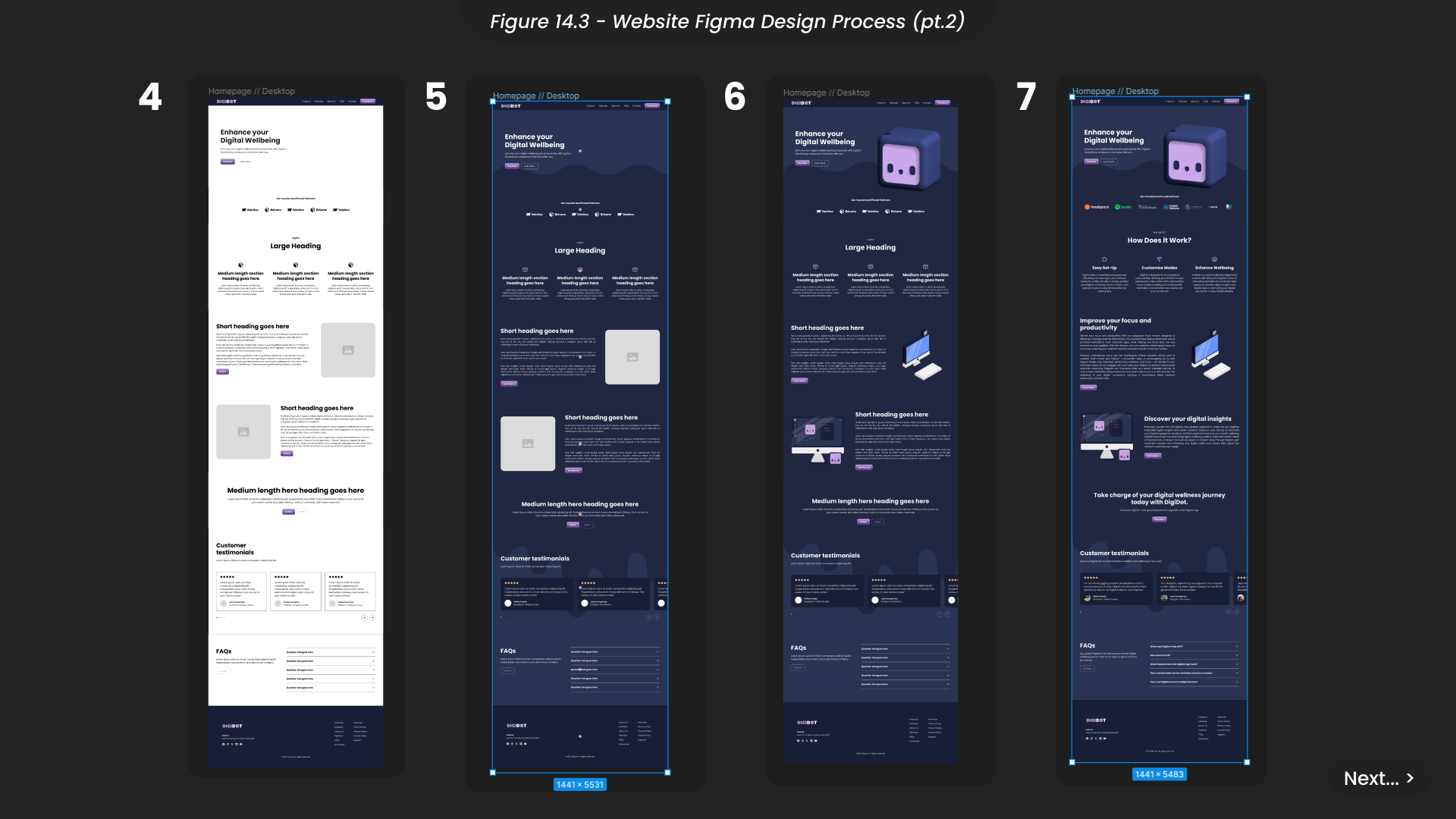
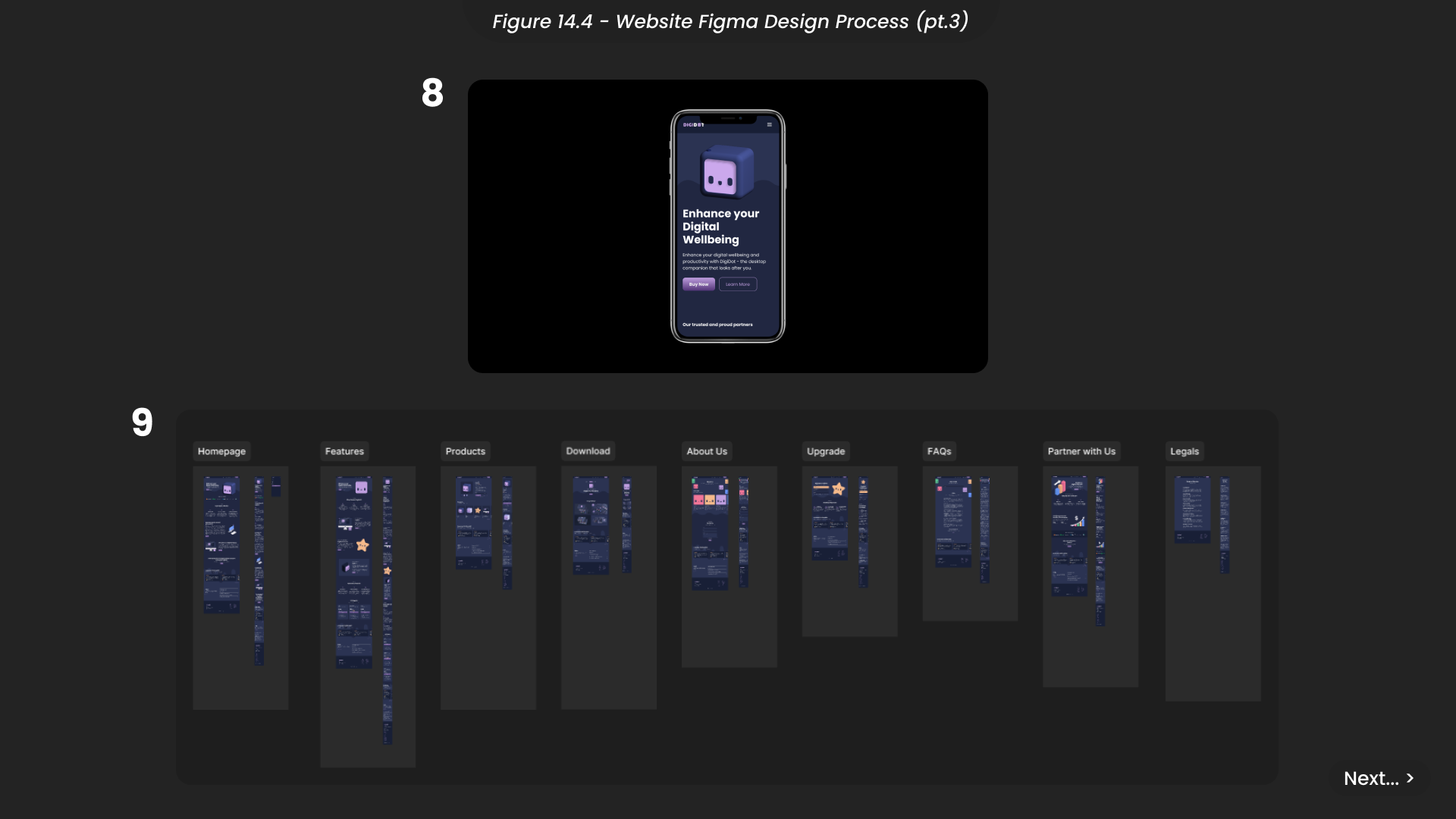
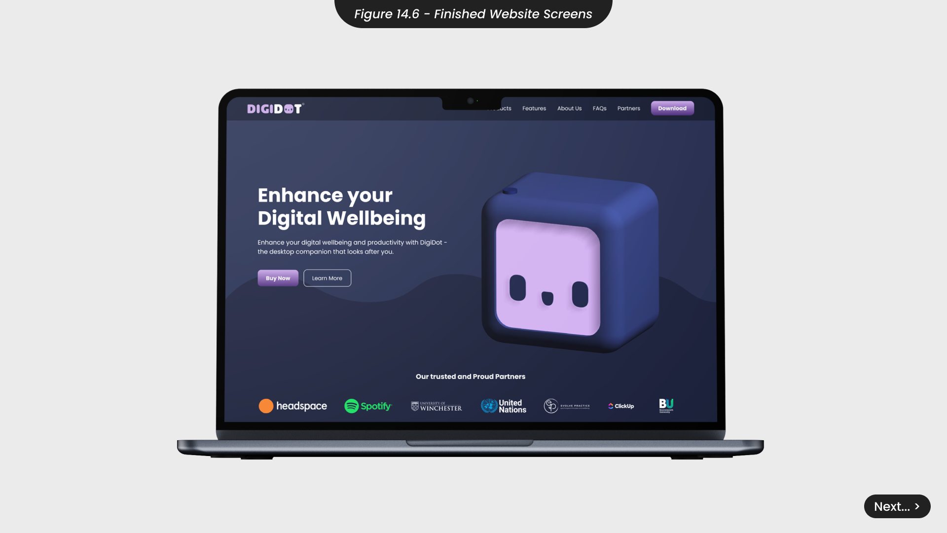
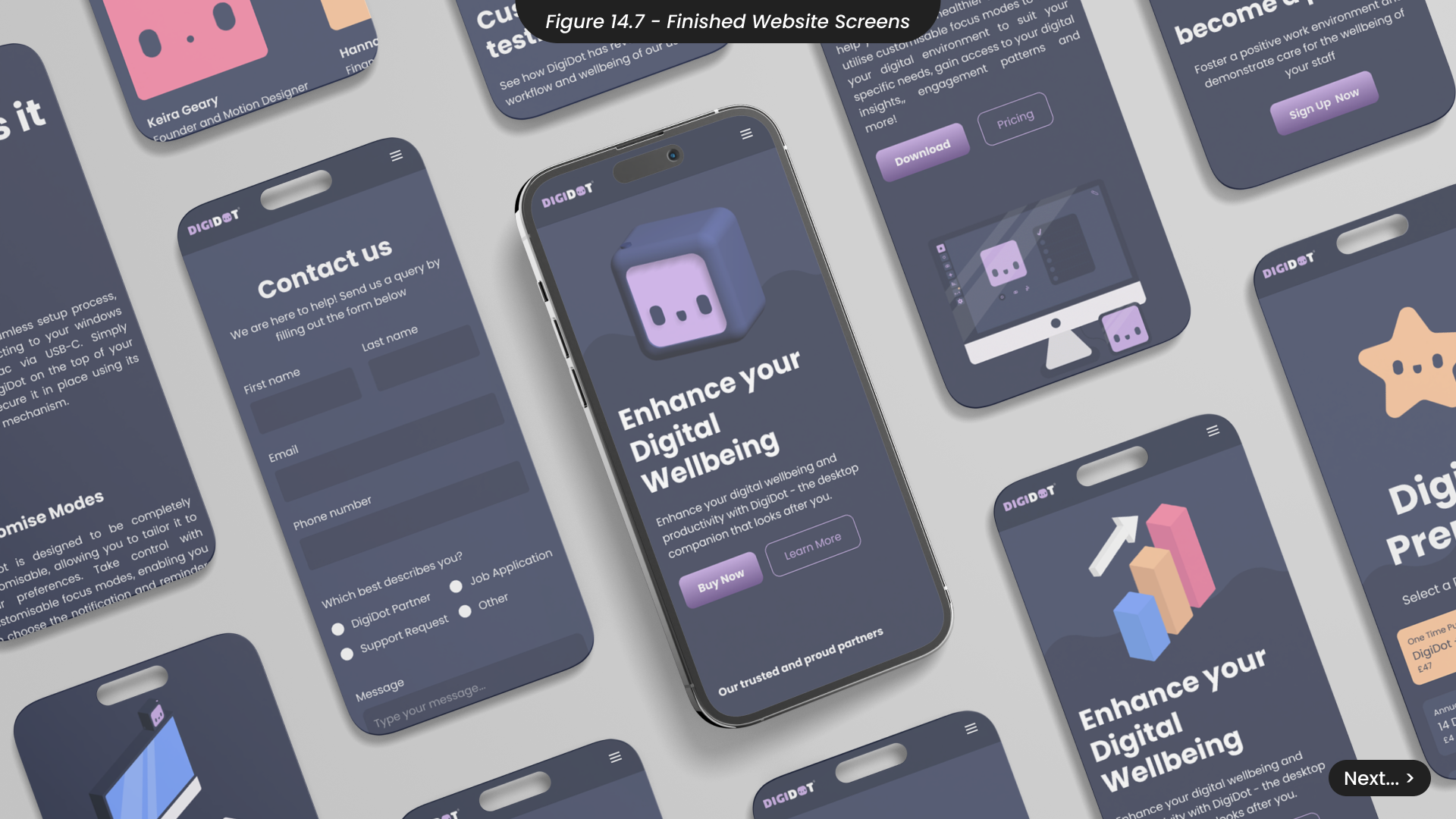
Despite being pre-built, these Relume components are fully customisable, allowing me to maintain complete control over the website design while working more efficiently. I began by selecting navigation and footer components and applying the DigiDot brand guidelines, including the logo, brand colours, and appropriate links (Figure 14.2). Following my initial sketches, I assembled the Relume components and customised them to fit my designs, which often involved modifying or breaking down components within the library (Figure 14.3). These components served as my wireframes, to which I applied the brand colours before adding all images and graphics. After incorporating all necessary text for the homepage, I adapted the design for mobile view, adjusting components to stack vertically and reducing text sizes (Figure 14.4).
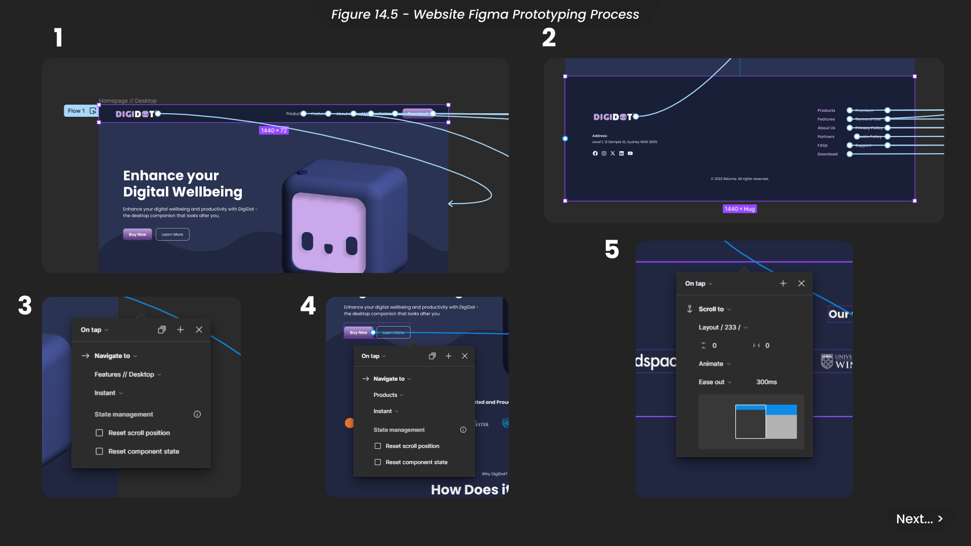
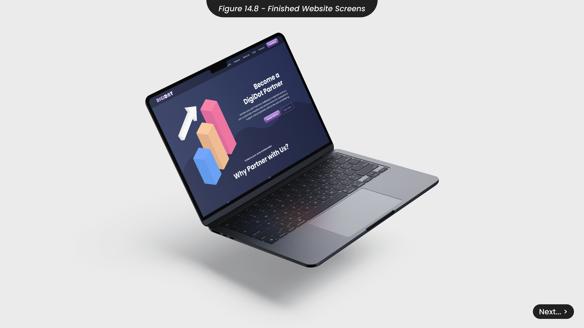
Using the same techniques for all website pages, I meticulously designed each one and grouped them into sections for easier viewing within Figma. This method was informed by my Figma training from last semester and the advanced Figma course on Udemy that I took this semester. To prototype the website and simulate a live experience, I edited the navigation bar and footer components so that all links would animate to their corresponding pages upon tap (Figure 14.5). I then animated all necessary elements throughout the site, ensuring that some buttons caused the page to scroll rather than change.
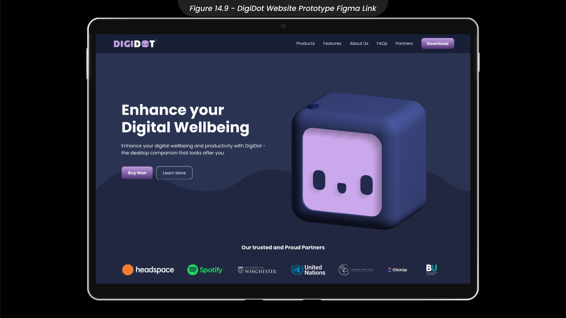
You can view the finished website prototype and explore the DigiDot product here. (Figure 14.9)
15. Marketing Plan and Pitch
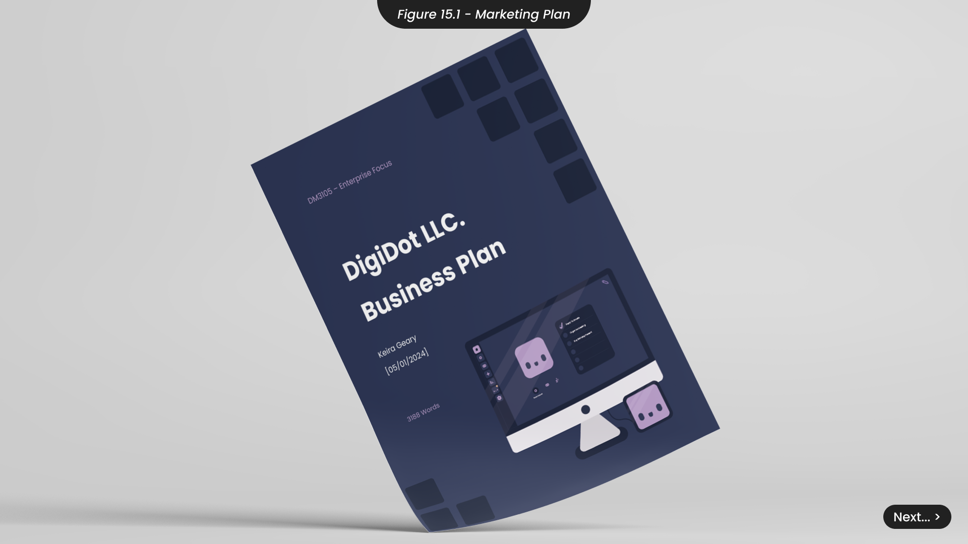
For DigiDot to become a successful product and business beyond University, having a clear marketing strategy and defining goals for at least two years is essential. The DigiDot marketing plan document (Figure 15.1) details crucial aspects of bringing this product to market, including business structure, marketing strategy, financial forecasts, and more.
For instance, DigiDot’s business structure is a Limited Liability Company (LLC), chosen strategically to provide personal liability protection. This legal structure shields personal assets from potential business debts, safeguarding the finances of anyone associated with DigiDot. It also offers versatile ownership arrangements and is cost-effective compared to other business structures. DigiDot plans to build a team of creative individuals to address areas beyond my expertise, such as production and development.
The marketing plan outlines our strategy, emphasising the use of social media to create relatable and empathetic content that communicates our brand’s tone of voice. We also plan to form strategic partnerships with other wellbeing products, such as Headspace, to reinforce our message of improving overall wellbeing.
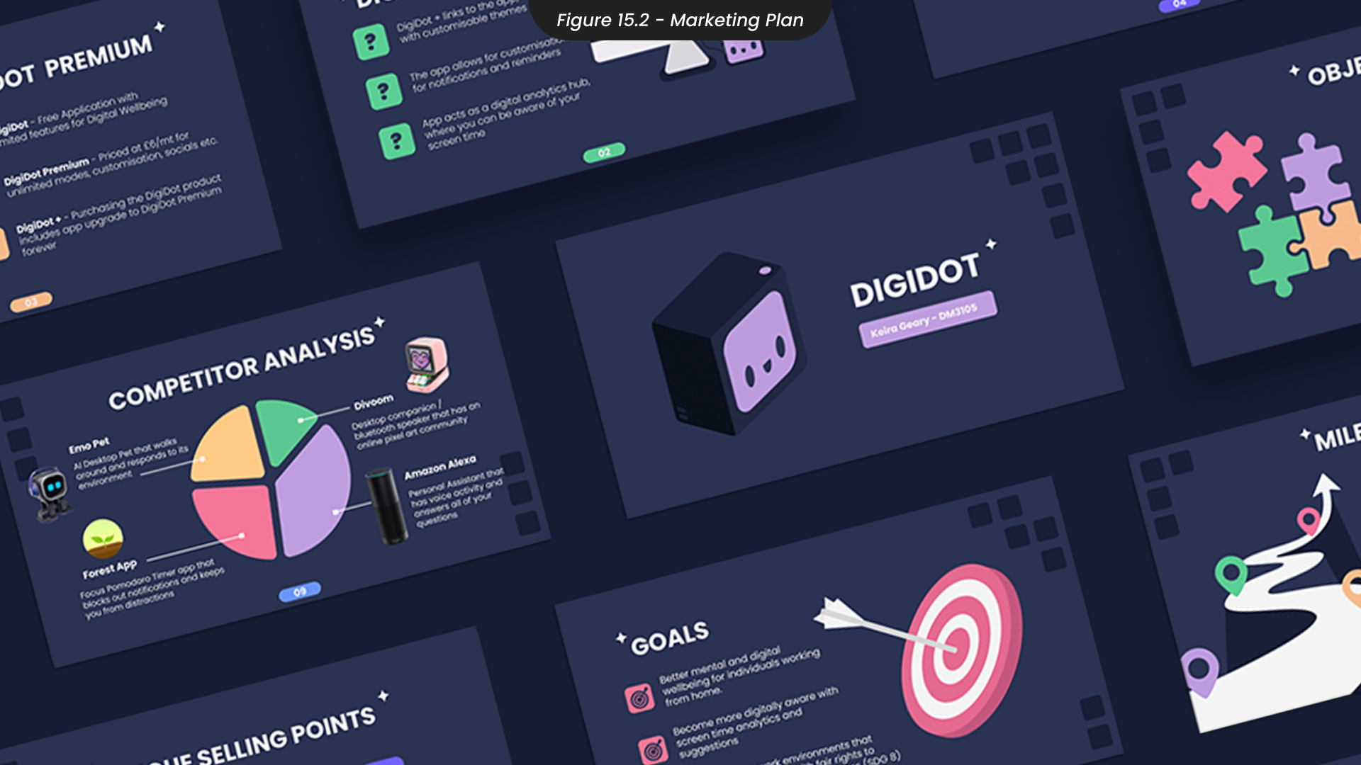
Considering the financial aspect of a startup, the marketing plan includes startup costs and a two-year financial forecast. For potential financial support or investment, I have also created a marketing pitch (Figure 15.2), which can also be found here.
The detailed marketing plan document can be found here.
16. Project Conclusions
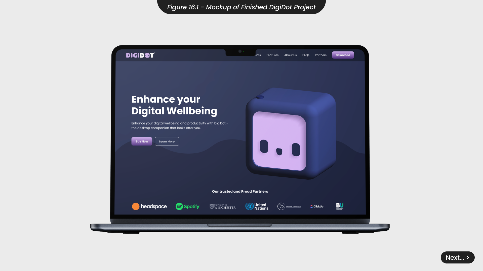
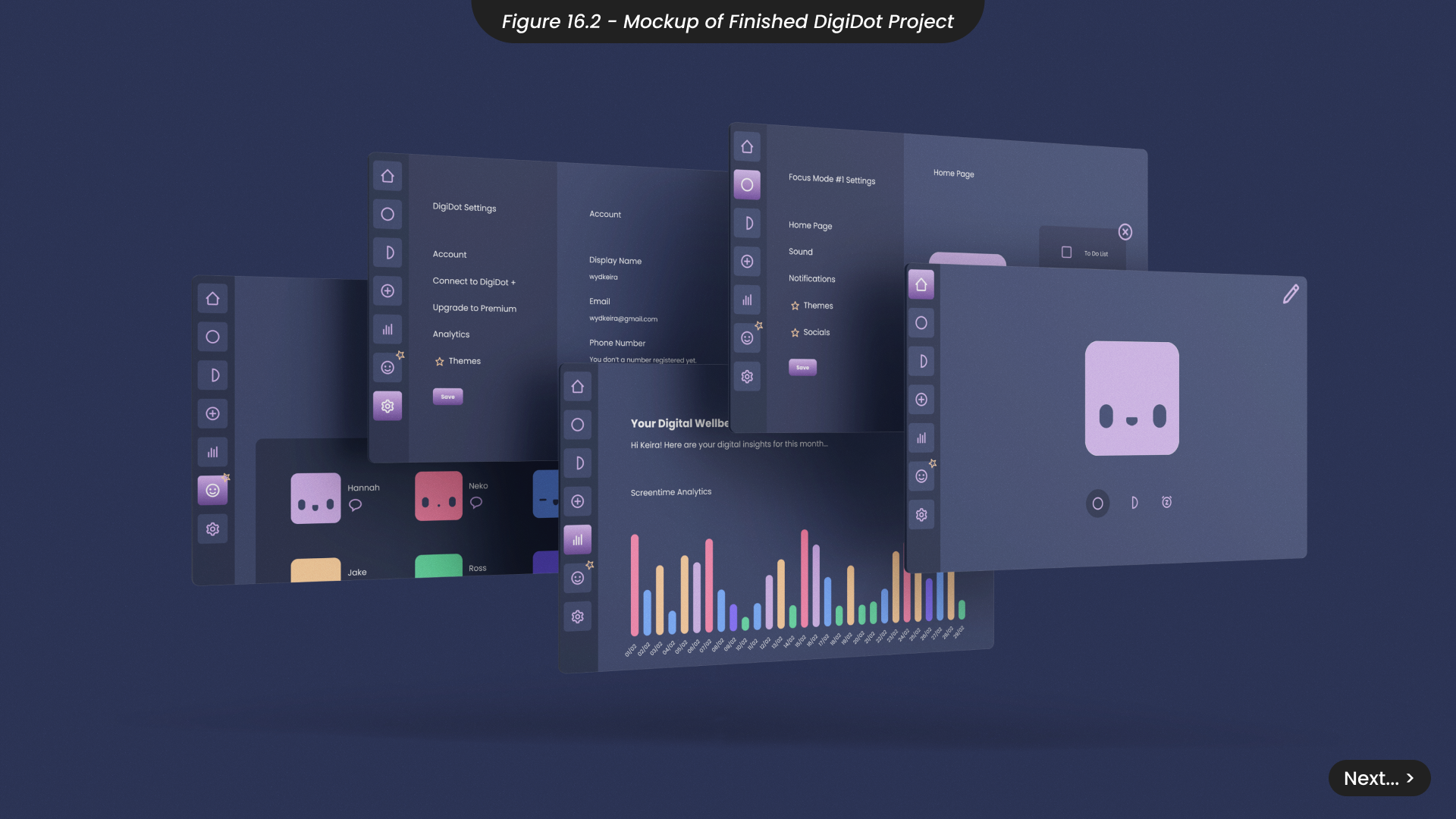
Overall, I believe this project presents a valuable opportunity for further development and market introduction beyond university, offering a unique solution to the digital wellbeing issues that emerged during the Covid-19 pandemic. This project aligns with Sustainable Development Goals, particularly SDG 12 (Responsible Consumption and Production), SDG 8 (Decent Work and Economic Growth), and primarily SDG 10 (Reduced Inequalities). Not only does this project help individuals with disabilities and their ability to work comfortably at home without sacrificing their wellbeing, but also individuals who work from home who may not be able to afford more expensive digital wellbeing tools.
I believe I have effectively targeted my primary audience by utilising user personas to incorporate features tailored to benefit individuals working from home, such as break reminders and digital insights. Strategic partnerships with businesses will also further enhance our reach in the hybrid and remote working space. However, for my secondary audience, expanding marketing efforts to social media if taking this project further will help reach younger demographics more effectively.
Reflecting on my time management during this 12-week project, I met most milestones successfully and used contingency plans when needed. However, I recognise the need for better personal health prioritisation and additional contingency plans. Moving forward, I will incorporate these considerations into my time management strategies and reassess project scopes to accommodate for this.
This project significantly developed my skills, especially in Figma, where I advanced my knowledge of design systems and complicated prototyping. Additionally, I acquired a new skill in 3D modeling, which is a skill I plan to develop in my future as a designer.
Overall, this project has been a rewarding experience for my personal development, and I believe it is a valuable endeavor to invest more time in and fully develop going forward.
References // Bibliography // Marketing Plan // Marketing Pitch // Brand Guidelines
