Mobile Console
(1) Open me in a new tab to read!
Brief and Research
For this project, we have been asked to create a prototype of a mobile game console, starting with an initial concept through to a visual prototype of the device and an interface for the game that will be running on it. Assigned into groups of around five, we were given the first half of the second semester to explore this brief and project as much as possible.
My group for this project was constructed of two designers, a CAD student, a 3D student, and a game designer. My role as a designer saw me paying close attention to UI design, logo design, colour combinations for the console, typefaces, and promotional management.
Target Audience
Starting this project, it was clear the first step would be to think about our target audience, to decide the direction we wanted our console to head in. Our primary audience for this console was young, but we were aiming for the console and game along with it to be enjoyed by everyone. Because of this, we also decided to aim for a secondary older audience and prioritise the ability for anyone to be able to easily understand and pick up the controls and gameplay.
During research for this audience, we found that young audiences value being able to play with their friends, so we knew we needed to create a console that could be shared locally and played by multiple people on the same screen.
As for our console game, we decided the game needed to have an animated style, with a whimsical theme, so that it was lighthearted and fun for all. The game also needed to hit the PEGI 7 rating, as it was intended for a younger audience, so we needed to closely follow the guidelines for this content descriptor. This means that our game content could include very mild forms of violence, but nothing too graphic, as this would fall into the PEGI 12 rating.
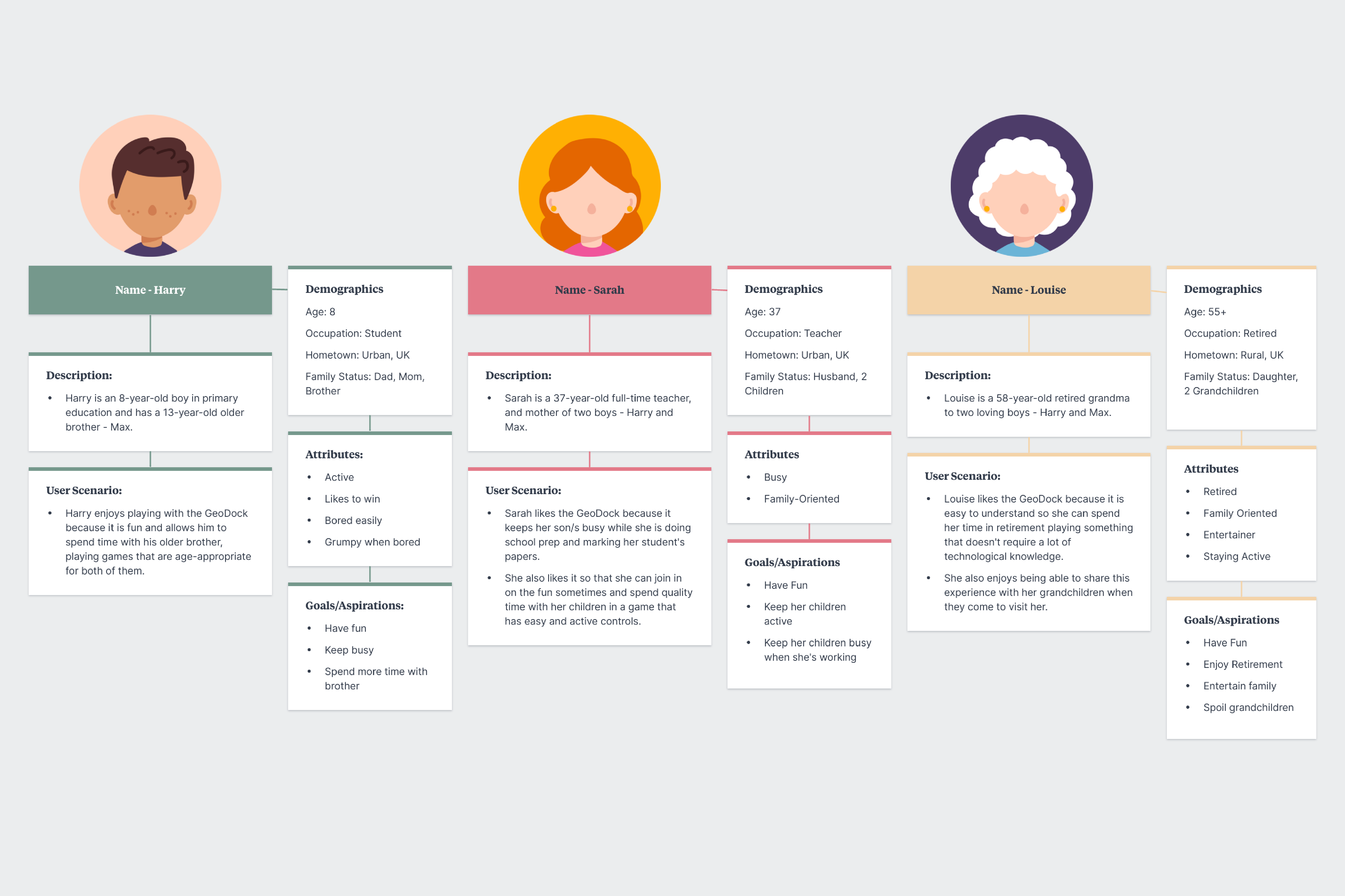
To capture the audience we were designing for, I also created some buyer personas (1). This helped me get a good understanding of the people who would buy our console or game if it were to be produced. The first buyer persona I created was ‘Harry’, an 8-year-old boy in primary education who has a 13-year-old brother. His goals and aspirations were to have fun, keep busy, and spend time with his brother, so the console we were designing needed to allow him to play with his brother easily as well as be engaging and fun.
Another persona I created for this project was ‘Louise’ or ‘Nana’. Louise is a 58-year-old retired grandmother to two loving boys. Her goals and aspirations are to enjoy retirement, entertain her family, and spend time with her grandchildren. This meant that our console needed to allow an older generation to enjoy the game and console too so that they could share it with the younger members of their family.
Something else we needed to keep in mind for this project was the UN’s sustainability goals, Zero Hunger and Infrastructure. As part of the brief, we needed to reflect on these goals so that those who interact with our console or play our game would understand the importance behind them.
With our target audience research in mind, we started to think about consoles and games that would suit our target audience while also including the UN sustainable goals and moved forward to research similar consoles and create our initial ideas.
(2) Nintendo Wii Remote (Wiimote)
Console Research
When researching other portable consoles to find common trends, we found that most mobile consoles had similar controls (D-Pad, joysticks, interact buttons, etc.). Therefore, to keep things consistent and ensure that the console is not too difficult to pick up, we decided to keep the controls very similar on our console too, as users will mostly already be familiar with them.
Thinking about our target audience research, we knew we wanted to create a console that encouraged social gaming and was easy to use, so we looked into consoles that are known for these qualities, the Nintendo Switch and Nintendo Wii.
We found that the switch was great at encouraging social gaming because of its versatile movement. The Switch was able to be played in handheld mode, tabletop mode, and even connected to a screen when docked. This meant that the Switch could be played anywhere in any setting with anyone, which is something we wanted to replicate in our project.
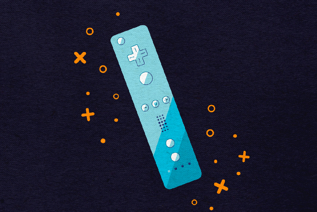
We also found that the Nintendo Wii was known for having simple controls and one-handed controllers (2) with sensors for movement. This made the Wii that much easier to use, allowing for it to be very popular with all ages. As our target audiences ranged from a young generation to an older one, we wanted to use sensors and one-handed controllers in our console as well, as this was a proven method.
Initial Ideas
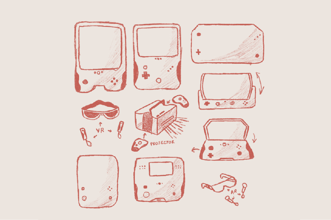
With all of our console research in mind, we started to brainstorm some ideas for our own. Some of the ideas we came up with were glasses, with motion controls and an AR screen built-in, a Gameboy-inspired console with a camera, and a projector for portable and easy use.
We decided not to go forward with the glasses or projector at this stage, as we thought the glasses were a bit too intimidating for those who haven’t used mobile consoles before, and the projector was a bit too heavy to carry around.
We also thought about making a console with a flip screen, similar to the Nintendo DS, but we noticed that flip screens have been on the decline since the 2000s and the popularity of touchscreens has increased. However, we did notice that flip screen smartphones have been gaining popularity recently with phones like the Samsung Galaxy Z Flip and decided that if we were to create a flip screen console, we would need to ensure it is modern and innovative, following this trend with bendable screens. Since none of our team members were familiar with bendable screens, we decided to scrap that idea.
Gameboy Console
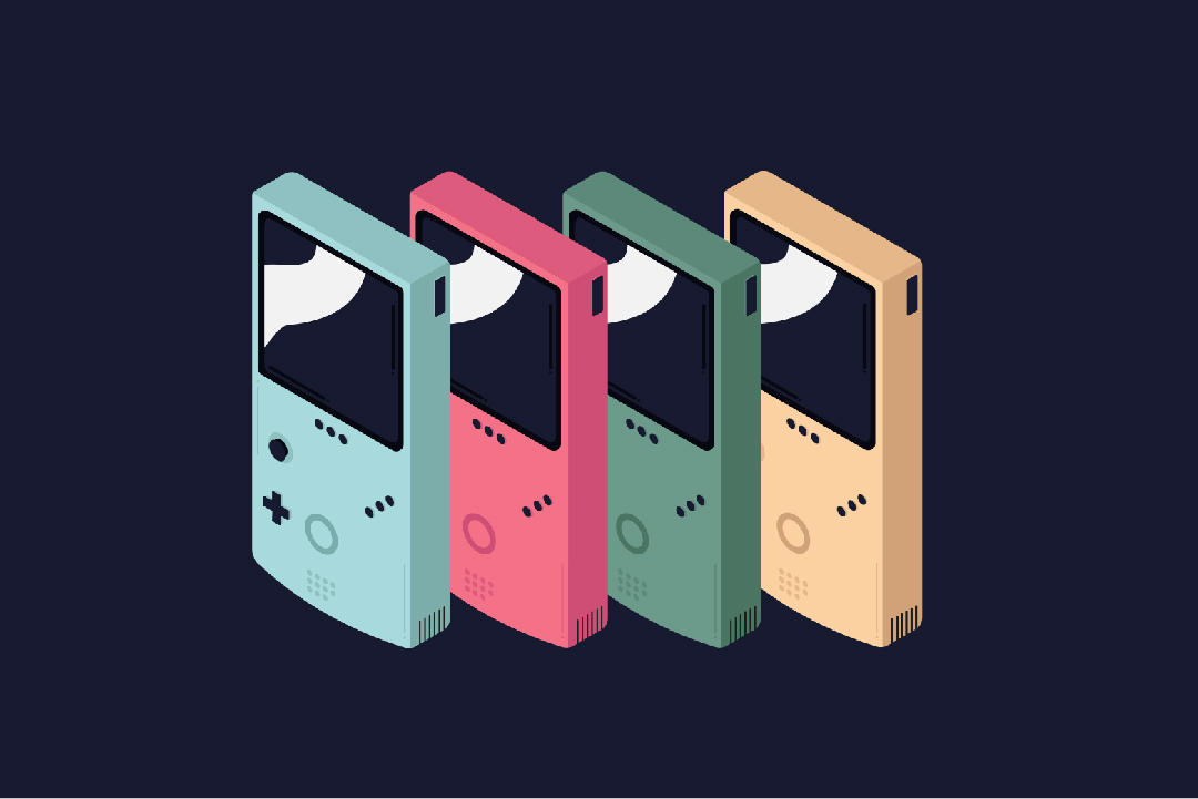
This meant that initially, we were planning on going for a retro Gameboy-inspired console with modern technology, such as AR. This was because we wanted to play off of the nostalgia in our older audience, and create something that they were likely to have been raised on or interacted with before, a Gameboy. We were also planning to push that nostalgia further and create a Tamagotchi for our accompanying game. After designing our Gameboy console, we decided something was missing and it didn’t feel like the right direction for this project.
Therefore, we decided that we wanted to push the innovation behind the console further and revisit some of our initial ideas. Out of the ideas we had come up with, we noticed that none of us had ever seen a projector console done before. This is why we decided to go forward with a projector mobile console.
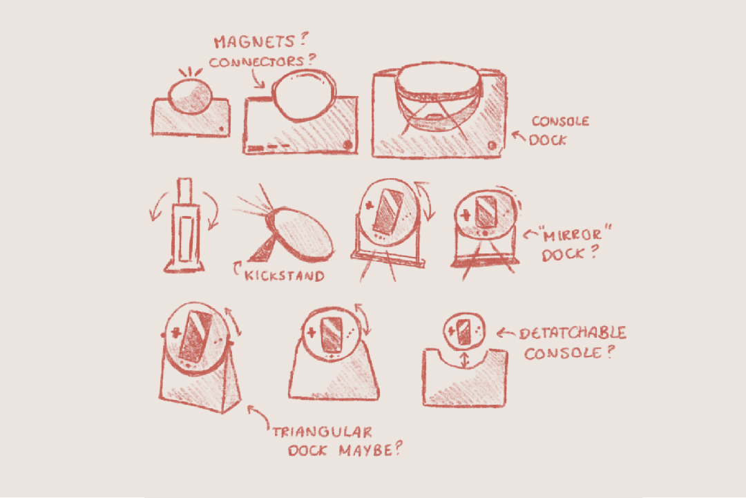
New Console Idea
Since the reason we decided to not create a projector console initially was due to its size and lack of flexibility, we immediately knew this was something we needed to address. Therefore, I created some sketches for a more compact projector, that could dock into a stand when home (similar to the switch) to charge. When sketching, I initially only went for square, block designs as this was what I knew projectors to be, but after nothing seemed to work, I decided to look into a circular shaped console, that could be angled, similar to a table mirror, when projecting. This meant that the console could project onto any surface, including the ceiling, for maximum portability.
The circular shape also came from the sustainability themes behind our console and game, as we thought about having our console resemble the planet in a way, or a globe, which is why it can be spun.
After feedback from my team, we decided that the console should be playable in handheld mode too, as this was a successful method we found in our research process, and sometimes users may want to just play something by themselves. Therefore, we decided to add a screen to our projector that would allow our users to hold the projector and play handheld.
Since we had plans for handheld mode and docked mode, we also thought about ways to play the console in tabletop mode, which would allow users to bring just the console with them instead of the entire dock, as this could be quite inconvenient to carry around all the time. For this, we decided to add a kickstand, as although this wouldn’t have the same flexibility as the dock itself, it would still allow for some direction when projecting the console.
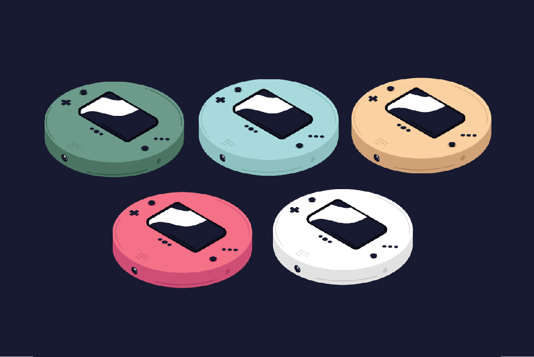
The 'Geo-Dock'
We decided to call our console the 'Geo-Dock', as we felt this reflected the console and its themes of sustainability. The use of 'Geo' represents Geography and the planet, which we felt was a good way to immediately communicate to our audience that this console focuses on sustainable themes and aims to promote the importance of sustainability through both the console and the games on it.
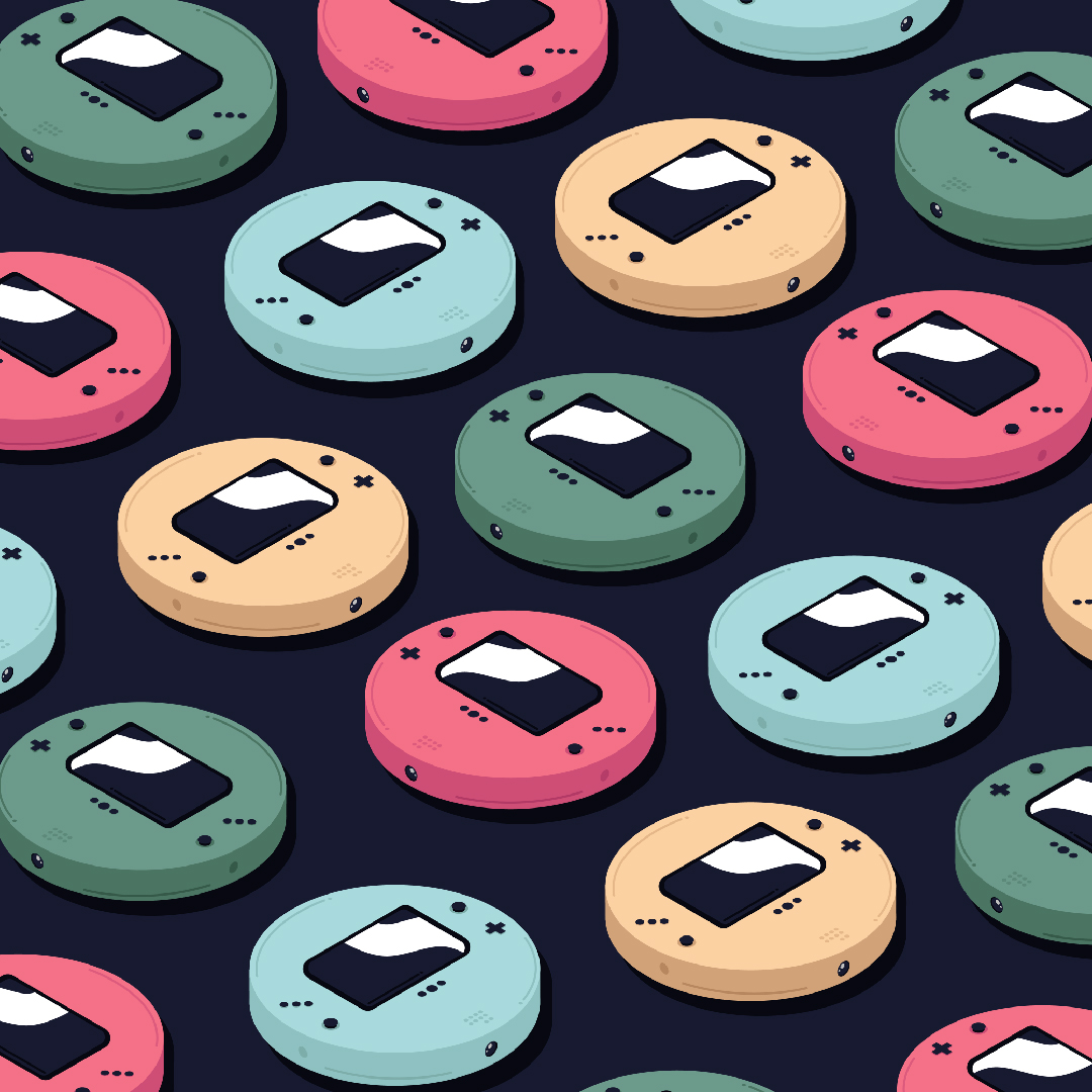
Once we were happy with the design for our console, I moved on to some concept art. This was where I thought about colour palettes and our brand identity, which was my role as a designer in this project.
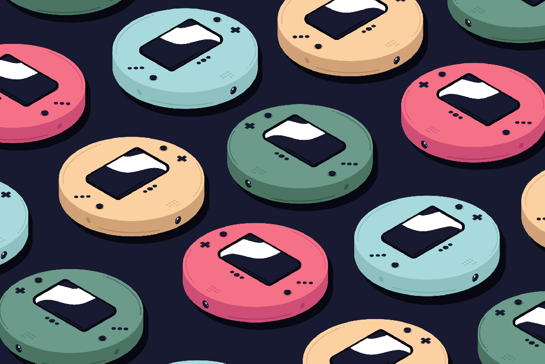
Having a variety of colours allows for those who buy the console to have a sense of choice so that they feel as if their console is their own. Our particular choice of colours though was intended to play on nostalgia and a throwback to the original Gameboy colours, further appealing to our secondary audience, who would have been brought up on these retro consoles. Having simple and solid colours like these also allows for future collectors' editions or limited edition consoles, which is a good way to make money, as many console collectors will buy multiple consoles if they are limited edition.
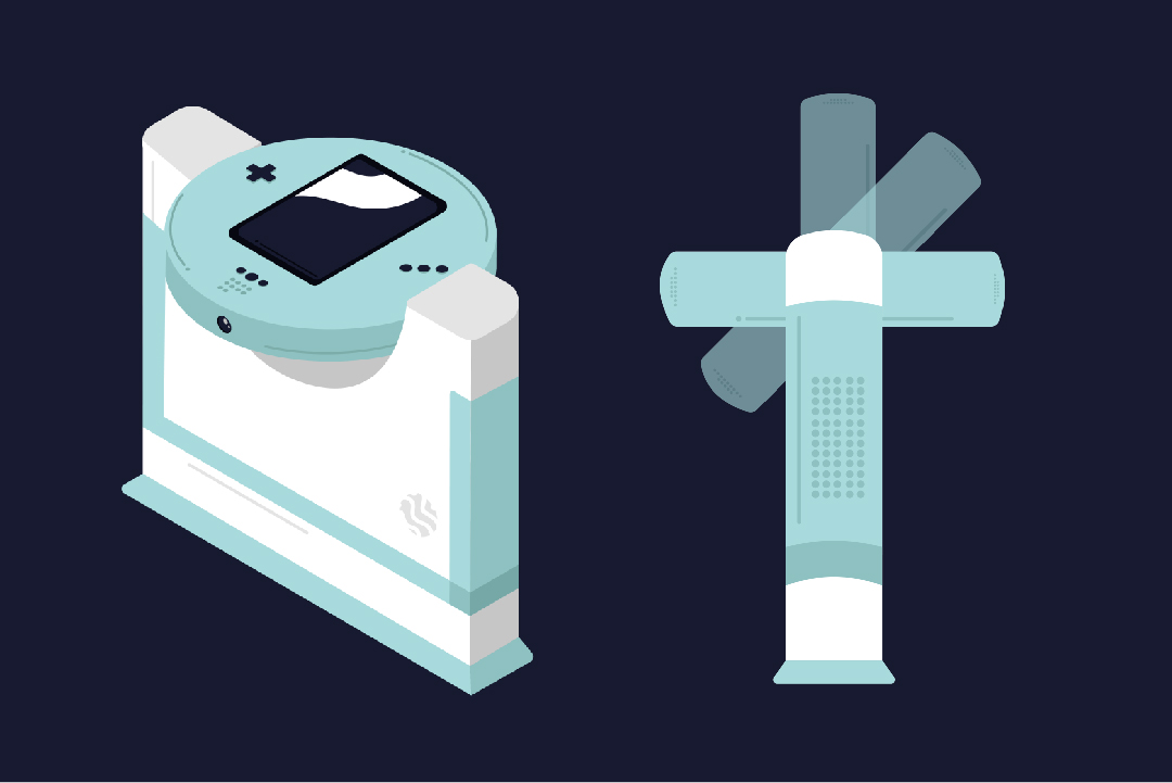
Dock For Console
Something else we needed to put thought into was the dock and controllers, as where our console was a projector and would primarily be in a stationary position when in use, the controllers needed to be external. After working with the team’s CAD student a little closer, we decided to have a dock that had space for our console’s controllers to slot in.
As a team we decided to leave the dock design with our CAD student, as their role was to ensure our console was ergonomically suitable for our target audience.
For this part of the project, I joined in with my team for feedback and testing when holding the controllers and console after they were 3D printed.
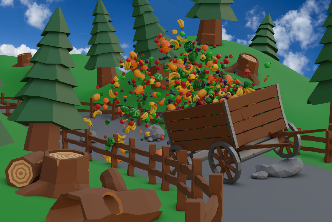
(3) Race Not, Want Not - modelled by Kevin Taylor
Game Ideas
Once we had established our console, we started to put some real thought into the launch title. We knew that with one of the key focuses of our console being to encourage social gaming, and this game being promoted alongside the release of the console, we wanted the game to be a collection of minigames that matched the brand of the console. An example of something similar would be '1-2-Switch' which was released with the Nintendo Switch in 2017. The name we came up with for this game was 'Geo-Party', to match our console and communicate to our audience that it is a party game, meant for social settings.
Part of the brief for this project was to ensure our console and game reflected the UN sustainability goals 2 and 9, Zero Hunger and Infrastructure, which aim to encourage innovation, resillient infrastructure, and sustainable agriculture against food waste. Therefore, we came up with a minigame for each that would be playable in our launch title.
For Zero Hunger, we decided to create a minigame called 'Race Not, Want Not' (3), where the players would race in a cart racing game. The game aims to win the race, while also attempting to keep as much food as possible in the back of your cart by avoiding obstacles that when bumped into, would send food flying. This would promote Zero Hunger and the importance of not wasting food, while also promoting sustainable agriculture as the food in the card would be fruits and vegetables.
For Infrastructure, we decided to go forward with a minigame called 'Build Back Better', where the players would stack blocks to create a tower. Throughout the minigame, the wind would blow at an increasing rate, attempting to knock your tower over. The goal is to keep your tower up for as long as possible. This would encourage innovation and infrastructure, as the player with the most resilient infrastructure wins this minigame.
Logo Sketches
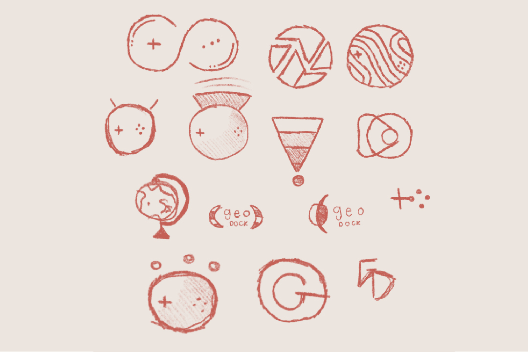
When designing the logo for our console, I knew I wanted to resemble the console in some way and make sure that it was clear our project was a technology product. Some ideas I had when sketching were circular logos to match the console, earth designs to represent sustainability, and logos that experimented with projection to show our console was a projector.
After feedback from my team, we decided not to use logos with any text in them, as we wanted our logo to be used as an icon on both the console and the UI where needed. We also decided not to use the logo that resembled the infinity sign, despite our initial interest in it, as we thought it was too complicated and not recognisable enough as a brand logo.
Logo Design
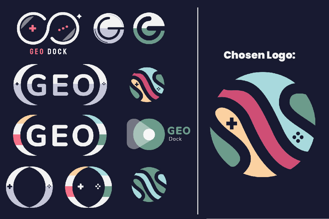
We thought the logo we decided to use incorporated sustainability to hit our sustainability goal, while also resembling the circular shape of the console and reflecting the console's controls, communicating that our brand is a console for gaming.
The logo also incorporated the colour options of the console, making the colour palette for the brand stronger. Something I liked about this particular logo over the rest was how simple the design was, which allowed for it to be etched into the console, which is a technique many other consoles use (such as the Nintendo Switch, PlayStation etc.) It could also be displayed in a black and white setting, without losing any recognisability.
UI Research
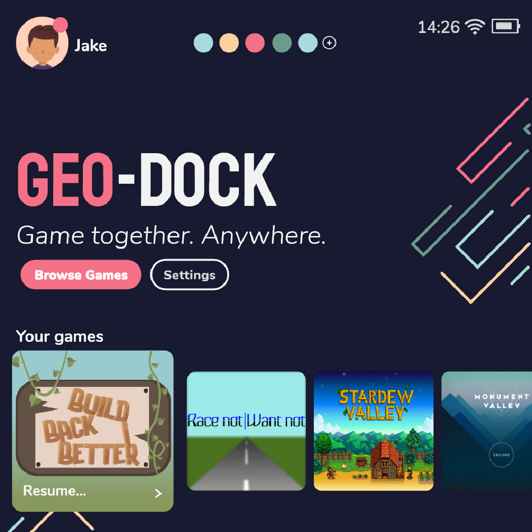
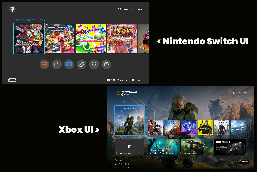
Before designing the UI for the console, I felt it was important to research common trends used for the UI of other consoles. When doing this, I found that on almost all consoles, the games that you have downloaded are immediately accessible from the first page or screen of the UI. Out of these games, the most recently played or the game in the cartridge if the console has physical copies, is always prioritised in this list.
Something else I also noticed that I thought was interesting was that the store for digital copies of games is usually tucked away, but still accessible from the first page with the use of a store button, or an option to browse games. This way, the console doesn’t feel like the console is constantly marketing new games to its users, which could be annoying, but users still are reminded of new games each time they open the console.
There is also often a social tab, or user profile accessible on the UI to view your profile settings and friends list. This is important for me to remember when designing the UI for the ‘Geo-Dock’, as one of the key focuses of our console is encouraging social gaming.
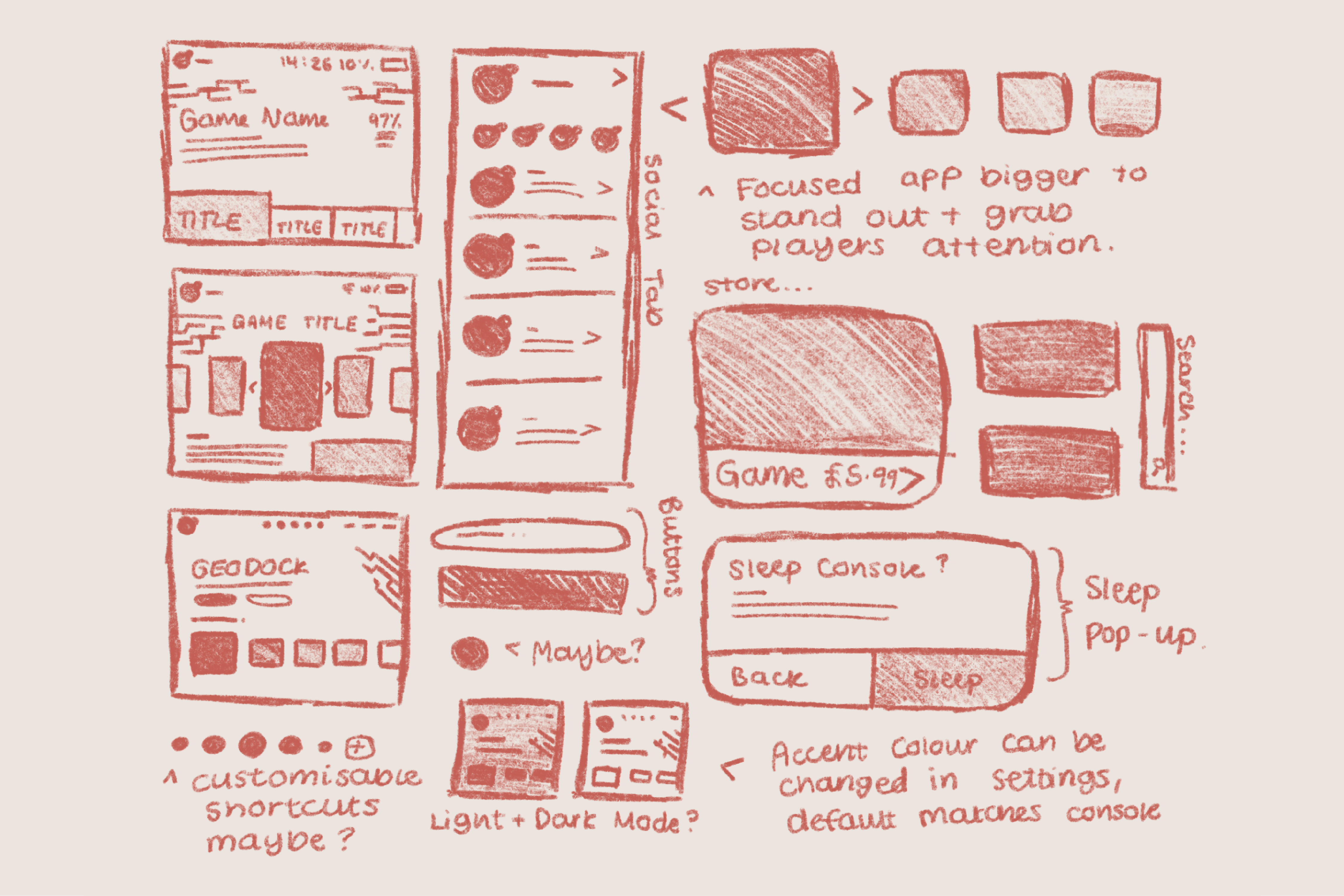
Once I was happy with the research I had collected, I created some sketches of some stages and scenes of the UI that I wanted to design and prototype.
UI Sketches
Once we had established our console, we started to put some real thought into the launch title. We knew that with one of the key focuses of our console being to encourage social gaming, and this game being promoted alongside the release of the console, we wanted the game to be a collection of minigames that matched the brand of the console. An example of something similar would be '1-2-Switch' which was released with the Nintendo Switch in 2017. The name we came up with for this game was 'Geo-Party', to match our console and communicate to our audience that it is a party game, meant for social settings.
Part of the brief for this project was to ensure our console and game reflected the UN sustainability goals 2 and 9, Zero Hunger and Infrastructure. Therefore, we came up with a minigame for each that would be playable in our launch title.
For Zero Hunger, we decided to create a minigame called 'Race Not, Want Not', where the players would race in a cart racing game. The game aims to win the race, while also attempting to keep as much food as possible in the back of your cart by avoiding obstacles that when bumped into, would send food flying. This would promote Zero Hunger and the importance of not wasting food, while also promoting sustainable agriculture as the food in the card would be fruits and vegetables.
For Infrastructure, we decided to go forward with a minigame called 'Build Back Better', where the players would stack blocks to create a tower. Throughout the minigame, the wind would blow at an increasing rate, attempting to knock your tower over. The goal is to keep your tower up for as long as possible. This would encourage innovation and infrastructure, as the player with the most resilient infrastructure wins this minigame.
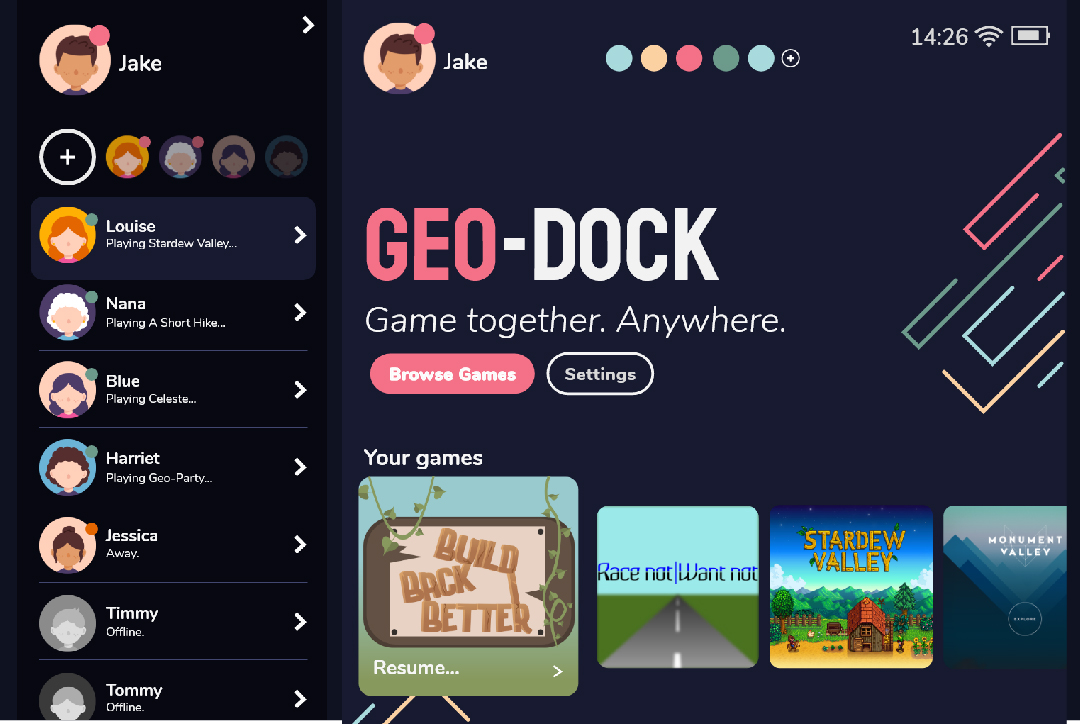
UI Design
To design this UI, I wanted to try something different and expand my software knowledge by prototyping my design in Adobe XD to function the way it would if it was to be used as intended on the console. To do this, I used Illustrator to design my UI, as this was the program I was most familiar with, keeping in mind all of the components I would need when prototyping.
Although I could have designed my UI in Adobe XD from the start, I didn’t want to overwhelm myself with too many new things to learn in software I wasn’t yet familiar with, so I stuck with Illustrator and imported my artboards to Adobe XD when I was ready to prototype.
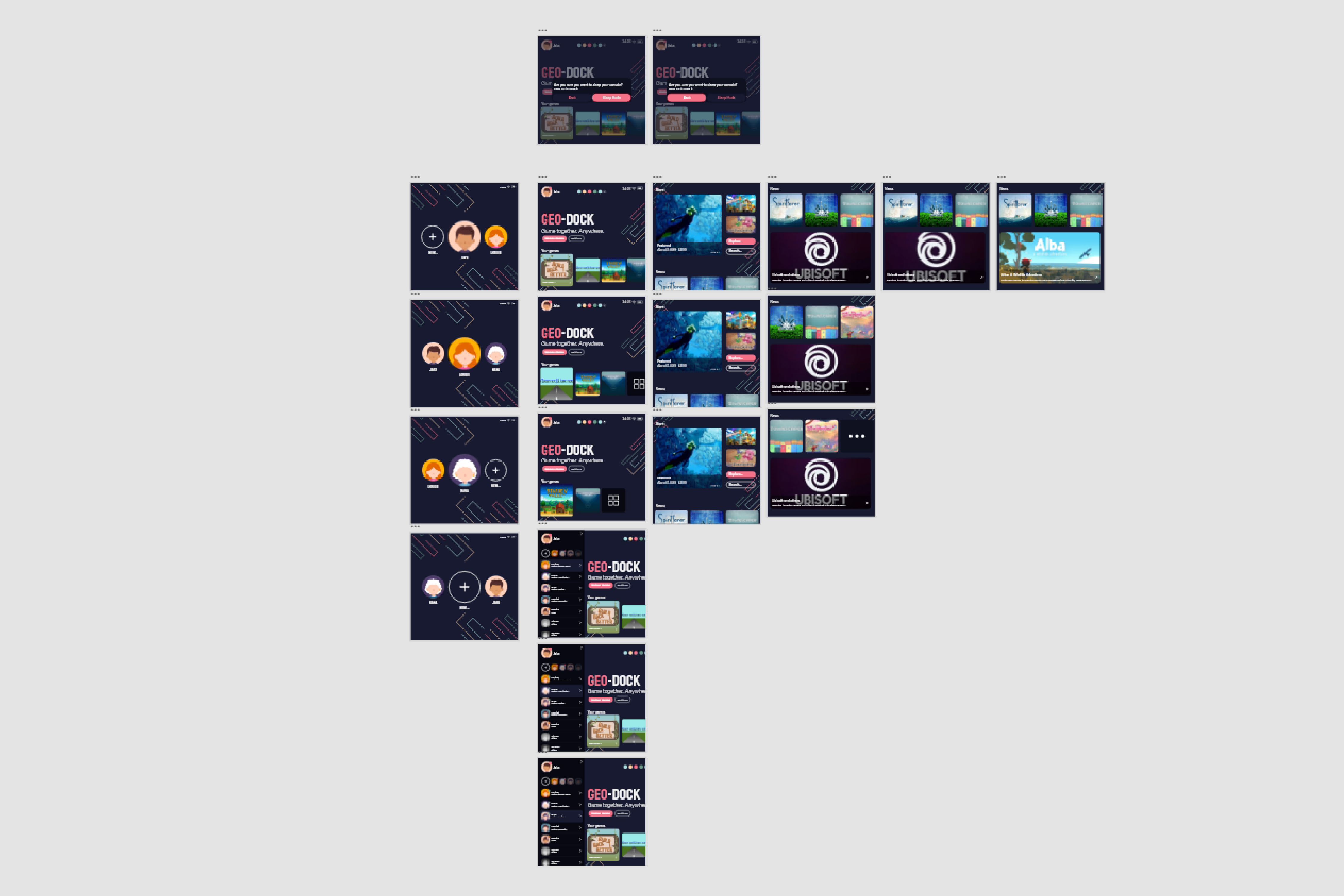
Prototyping
Since I was brand new to this software, I had to adjust to the software, which initially was quite difficult. However, the more I practised with it, the easier it became.
The first thing I did after importing my Illustrator artboards into Adobe XD was grouped into flows, meaning that all of the artboards that were on the same page in the UI were grouped. This helped me visualise a storyboard of the UI so that I could easily see the different stages that I needed to link together. I also grouped all of the related components to help make the process of adding interactions between them much smoother.
The hardest part for me when prototyping was adding interactions and animations between the components, as the more I added the more complicated it became. To overcome this, I focused on one flow and one set of components at a time. Since I wanted to give my demo the feel of a console, I decided to use triggers for keys and gamepads, as this would allow the demo to be controlled with a console controller or gamepad. However, I did also enable tap triggers too so that users could easily navigate with a mouse if they didn't have a controller wired up or on hand.
The live demo for this console UI can be found here.
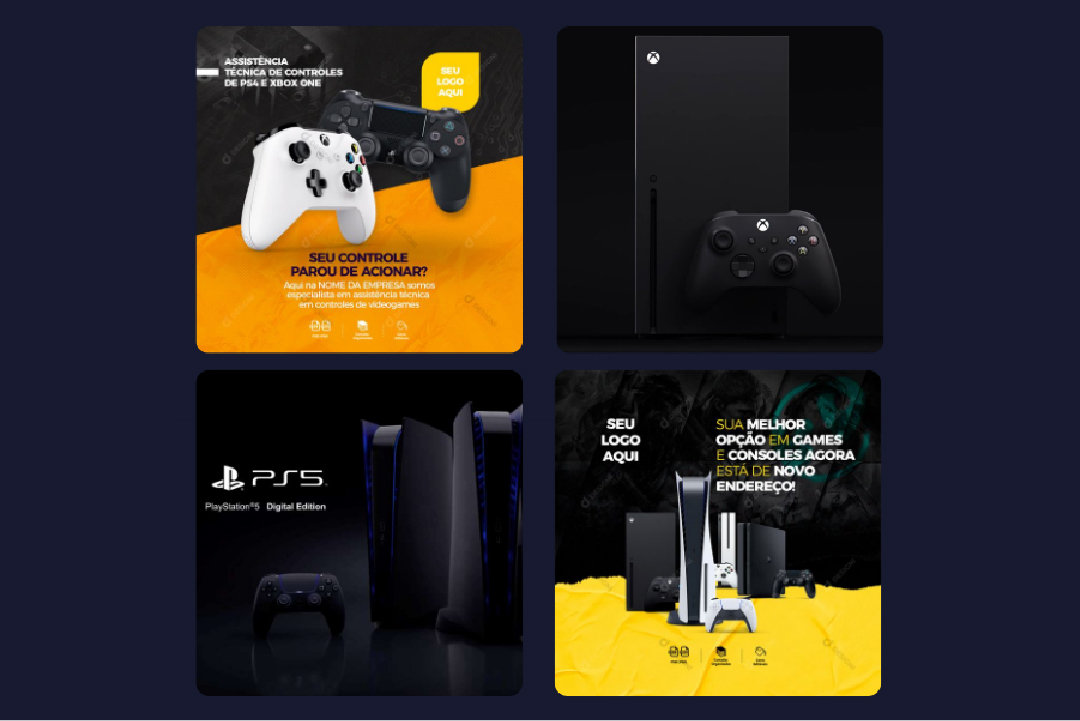
(4) Promotional Designs from Other Companies
Promotional Designs - Research
Another part of my role as a designer was to create social media posts to promote our console and the accompanying game that goes along with it. To start this process, I did some research (4) and created a Pinterest board of other promotional designs for consoles, to identify common trends and find inspiration for my designs.
During this process, I found that promotional designs for gaming consoles often have a central focus on the console itself. These designs also often have an accent colour along with a dark background or main colour that matches the brand colours. I found that it was quite rare for these designs to have a light theme, which helped my understanding of console brands and how they often have a dark colour theme.
The last common trend I found amongst these promotional designs for products is that they often had USPs (Unique Selling Points) listed on the page. This made it clear to their target audiences why they should buy their product, and is, therefore, an important part of the design. I will need to keep this in mind when moving on to design my promotional posts.
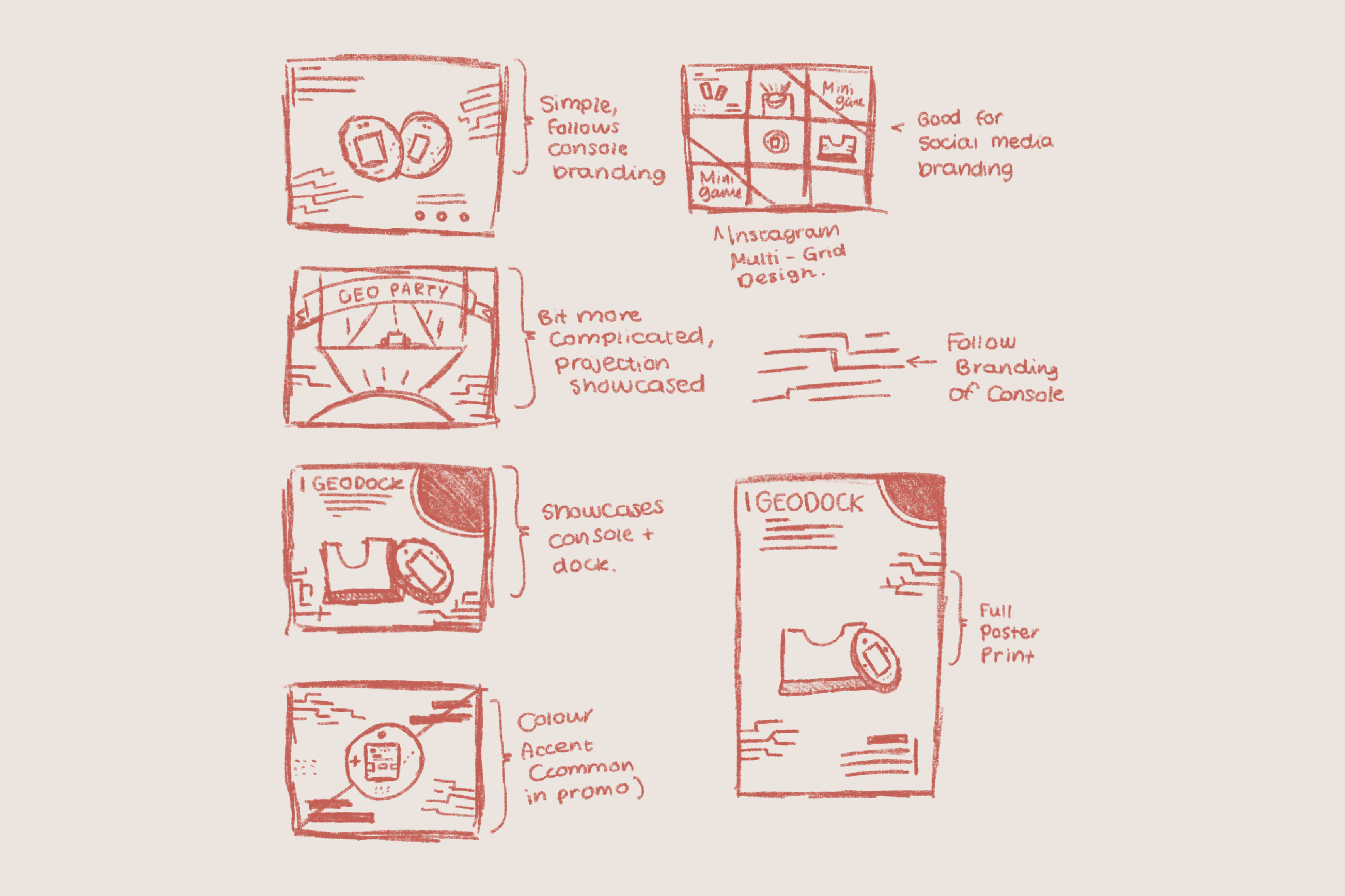
(5) Promotional Design Sketches
Promotional Designs - Sketches
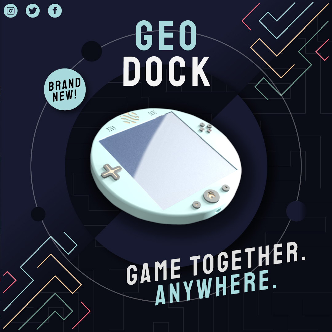
After researching, I moved on to create some sketches in Procreate on my iPad for my designs Similar to some of the posts I had drawn inspiration from, I kept the focus on the console by placing it in the centre of the composition. Since our console had a circular shape, I wanted to complement that by using similar shapes or leading lines in the surrounding space.
Since a lot of promotional content is often uploaded to Instagram, I decided to keep my composition sizes square, as this is the standard post size for Instagram. However, I also made sure to keep in mind that a lot of companies also post to their stories, or create Instagram reels for their promotional content, so I played around with some vertical designs as well.
Once I was happy with the sketches I had made, I opened up Illustrator and started to design.
Promotional Designs
Something important for me throughout this whole process was to ensure the brand identity I had created for our console was consistent, so the first thing I did in Illustrator was laid down a base colour that matched the console UI.
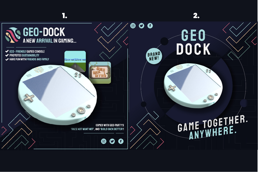
The first promotional design I created had USPs listed and the accompanying games above the console itself, following the trends I had found when researching other companies' promotional designs. I also made sure to add the logo to keep the brand consistent and recognisable, with a central focus on the console itself, modelled by our team's CAD student.
The second design I created, although similar to the first, I think was more balanced, as it incorporated the circular shape of our console. It also includes our console tagline: ‘Game together. Anywhere.’ I also decided for both of the designs to add a sticker that says ‘Brand New’ to peak the interest of our target audience and their interest in new technology.
Reflection of Project
Happy with the outcome of this project, for the most part, think it was successful in relating to the brief as well as improving my design knowledge and strengthening my skills. For example, throughout this project, I learned a lot about working in programs I am not familiar with, improving my design skills. This will be very useful going forward, as I am now able to use prototyping tools as an option in my design process, if designing a product with user interaction, such as an app. My communication skills were also strengthened further than in the first semester, as we had one team member who could not attend many in-person sessions, so we had to adapt and strengthen our communication online.
This project reflects the brief as we have worked together to create a sustainable game and highly portable console, right the way from an initial concept through to a visual prototype. The game we have created reflects the UN sustainability development goals for zero hunger and infrastructure, through the subtle use of minigames, so that a young audience can learn about these goals through simple entertainment. The logo I designed also reflected a sustainable approach to this project, as it was made to resemble a planet and communicate to the audience that one of our priorities was sustainability.
The ‘Geo-Dock’ and accompanying game ‘Geo-Party’ appeal to the target audience we had set for ourselves as we made sure the controls were easy to understand for both young generations and older generations. We also made sure the game was created in an appropriate style, to reach the correct rating for our target audience.
If I was to do this project again, I would make strengthen my organizational skills as a team leader. As we were doing a lot of our project online, including all of our team members, it was important to ensure all of our resources were organized and updated regularly, which I fell behind on over the six weeks. To do this next time, I will set some time aside at the end of each week throughout the project to review the resources uploaded and ensure they are the correct ones with the correct quality.
