Environmental Poster
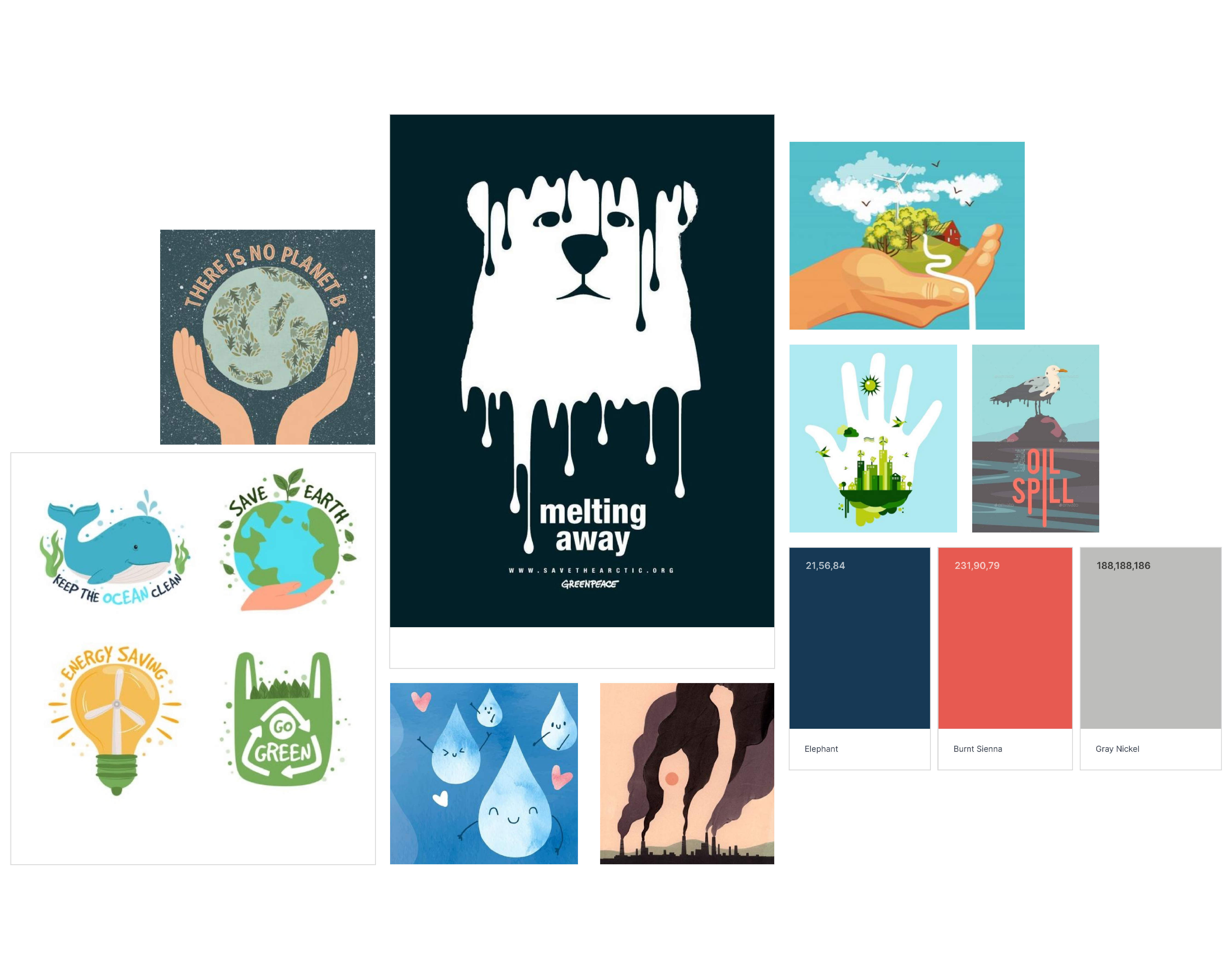
(1) Poster Moodboard
Brief and Research
When starting this weekly task, we were given a brief to sketch and design an environmentally aware poster that explores the layout design principle. To research this poster, I created a mood board on my chosen project planning tool, Milanote, of other posters that communicate similar messages and looked at common themes (1).
I found that in poster design, there is often minimal information, catchy and emotive language or slogans and links to sites. They also often make use of negative space and perception to create some interesting designs and catch the eye of anyone walking by.
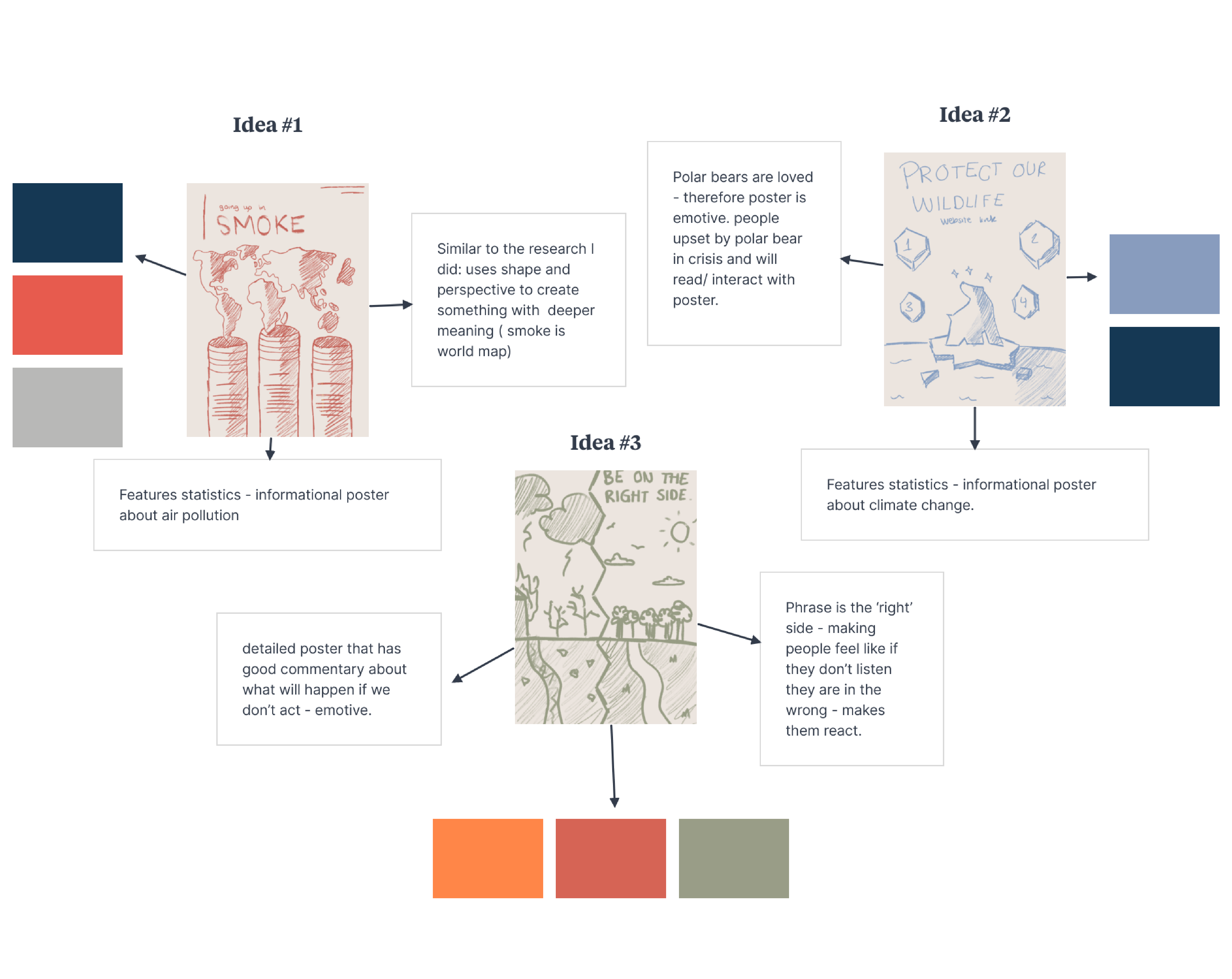
(2) Poster Initial Ideas
Initial Ideas
These observations of poster design in mass media guided me through my initial sketching process and helped me establish some ideas (2).
The first idea I had was a split poster that had one side as a paradise in a perfect ‘idyllic’ world, with sunny skies and fully grown trees. The other side of the poster would be a dystopian world with hellish landscapes, fire and stormy skies. Having these two sides on the poster would help create an emotive response as it would encourage viewers to be on the ‘right’ side, and help limit climate change. The second idea I had was an iceberg poster with a polar bear on a melting, broken iceberg, surrounded by other icebergs with information on climate change and how important it is that we act. Similar to the first, this idea is emotive and would make viewers care about the polar bear, and in effect, about climate change. The final idea, and the idea I decided to continue developing in this project, was a smokestack poster that emits smoke in the shape of the world map. This poster would use perception to create an interesting observation on pollution. This poster would encourage those viewing to care about pollution, as it would encourage them to care about their world ‘going up in smoke'.
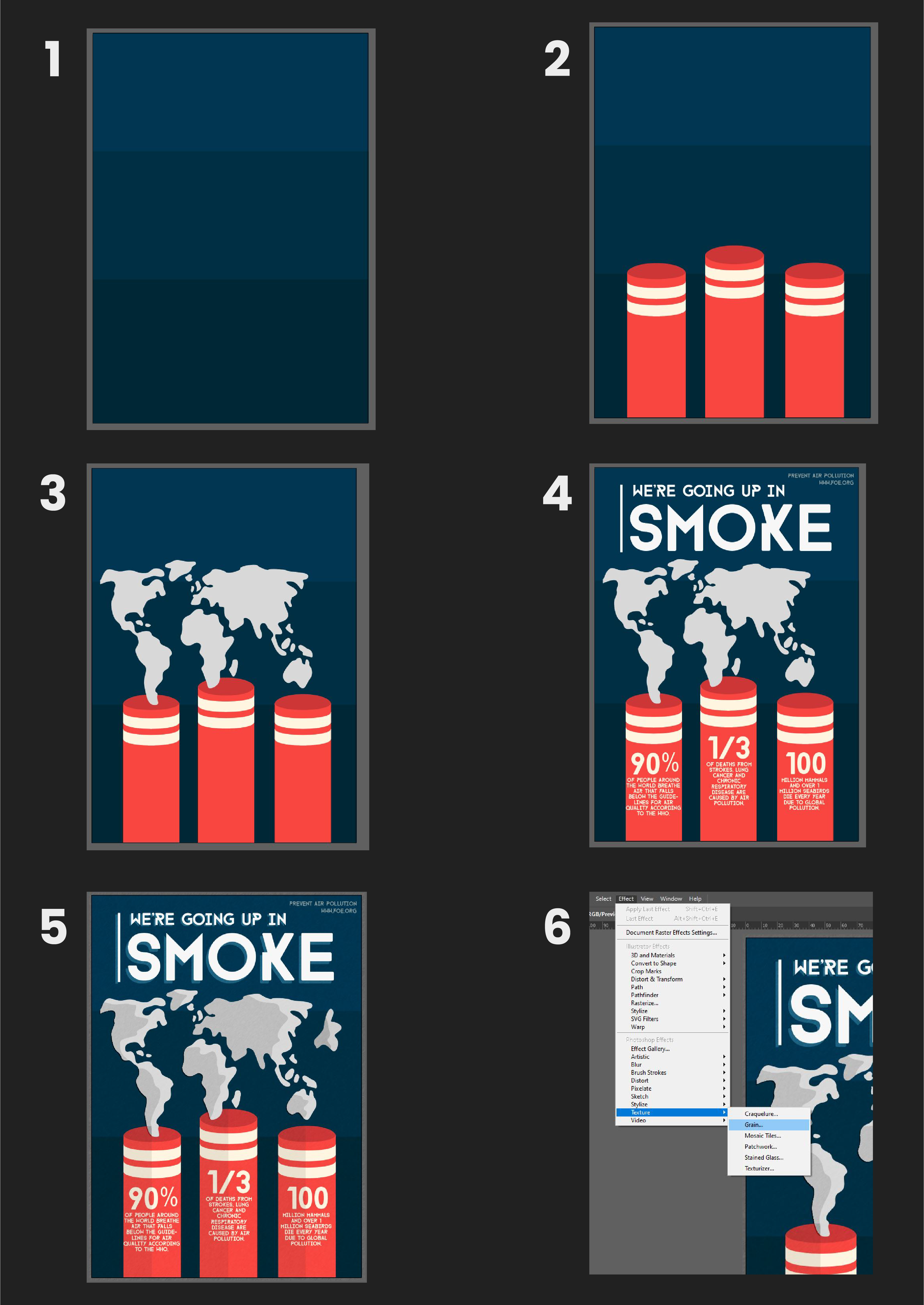
Poster Design Process
Project Development - Illustrator
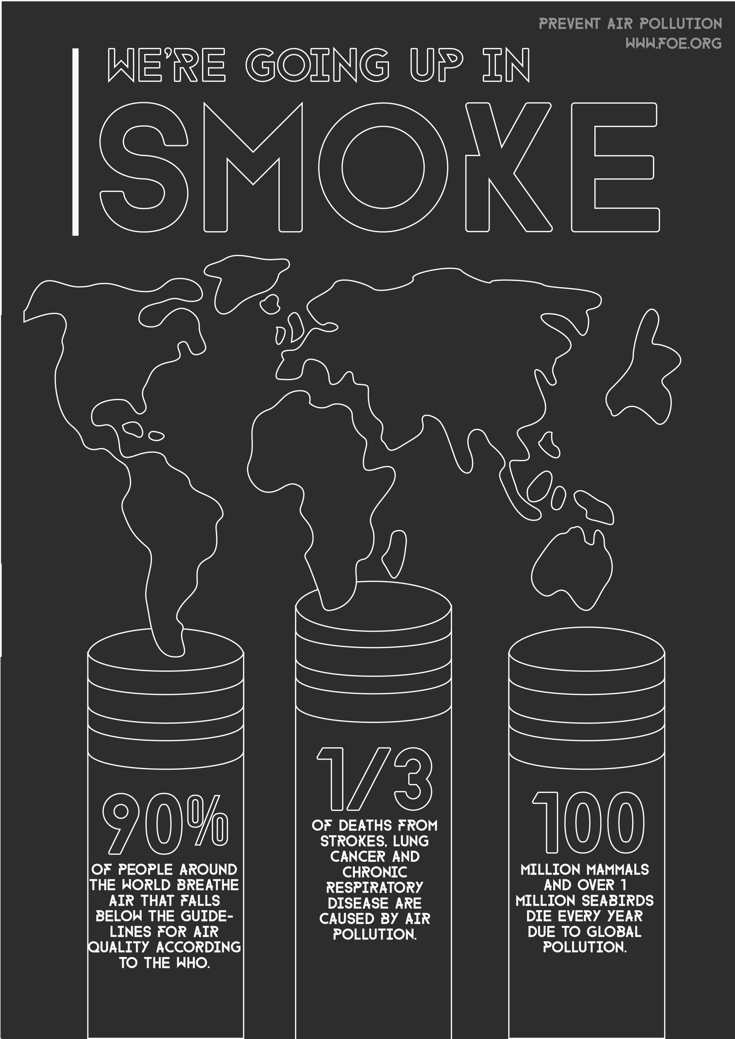
After establishing an idea I wanted to design and develop, I decided to start working in Illustrator as this was the program I was most familiar with and I wanted to use this task to solidify my understanding of the software instead of learning a new one. I started by creating the background of my poster, by layering blocks of colour (1). This adds some detail to the background, instead of it remaining very plain and simple. Then I created three smokestacks using the rectangle tool, before adjusting the edges with the direct selection tool to have them appear as cylinders. To further this effect, I added stripes to my smokestacks and rounded these off as well (2).
After creating the smokestacks, I moved on to creating the outline of the world map before assigning a grey fill to make this map look like smoke above the smokestacks (3). Once I was happy with the vector illustrations on my poster, I needed to add some text and information, such as the statistics on the smokestacks, to ensure my poster was informative (4). When adding text, I made sure to pay close attention to the size and layout to draw attention to the important parts of the poster, as this was the intention behind this project brief. I also made sure to use a bold and striking font to create a sense of urgency and importance to the information.
After settling on the design of my poster, I wanted to add some more details, such as shadows and highlights. To do this, I added a drop shadow to my text and duplicated my illustrations in a darker colour to create shadows on the smokestacks and smoke (5). Finally, I added some texture to my poster using the grain tool to allow my design to appear printed, even if it would only ever be seen digitally (6,7,8). I exported this as a high-quality JPEG ready for print, as posters would be printed.
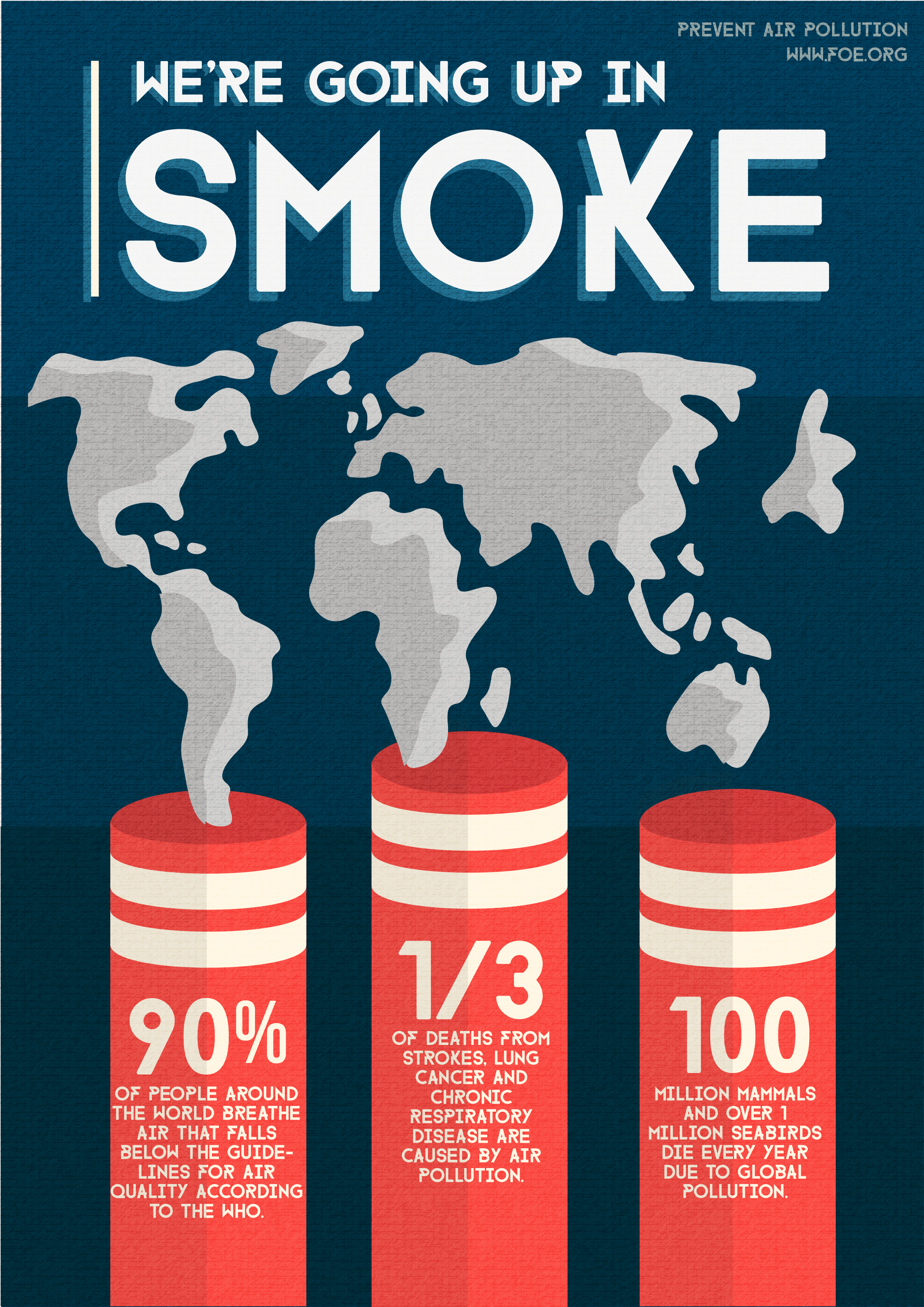
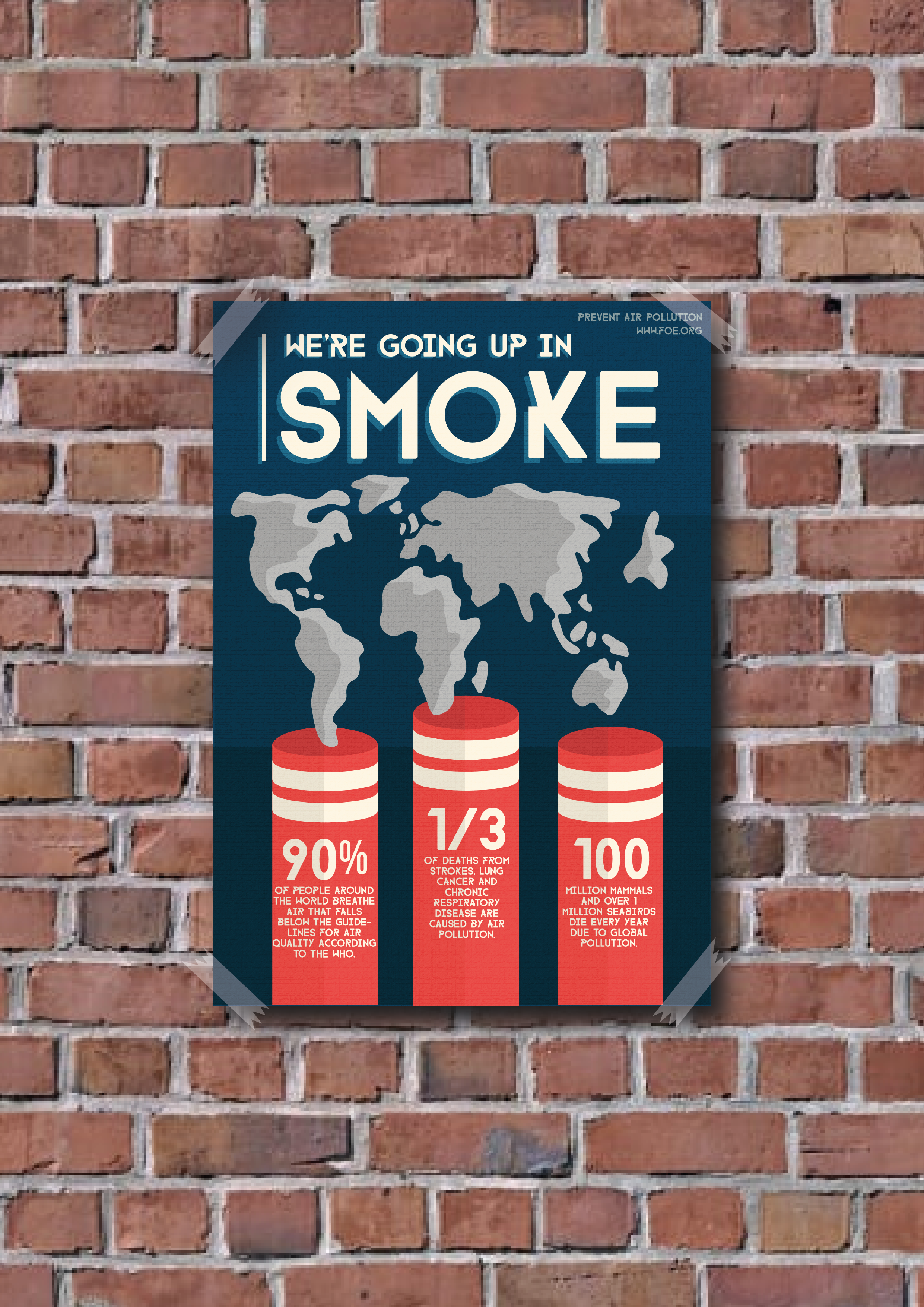
(3) Finished Poster
Reflection of Project
After finishing this task, I am happy with the outcome of this project, even if it still feels like it may be a little simple and lacking detail. This poster reflects the brief exploring layout as it focuses on positioning things so that the viewer naturally sees the information in order of importance, the slogan first, then the statistics, and then the link to the website. If I was to work on this again going forward I would look at introducing more detailed illustrations and focus on making the smoke feel more like smoke and less like a flat illustration.
