Typography Animation
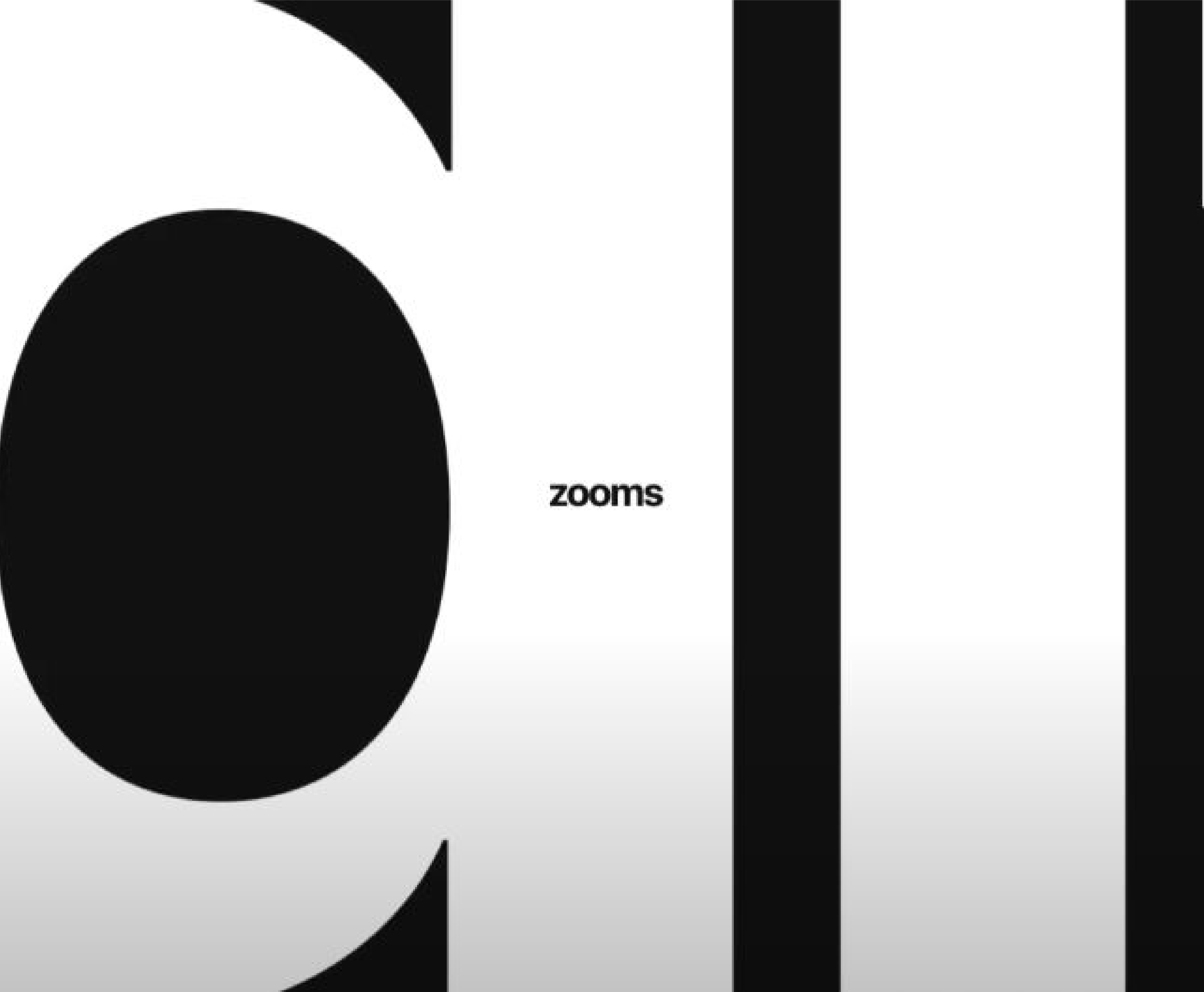
(1) Apple 'Don't Blink' 2016
Brief and Research
For this project, we were asked to focus on typography to "design and produce a viral animation/commercial" where the fonts used represent the words meanings and explores a variety of graphical styles. Before planning my own, I decided to do some research into trends of kinetic typography that I could use to influence my project, and discovered a few trends that I found notable.
Honda's 'Keep Up' advert from 2015 uses a fast-paced kinetic typography trend to translate a message of speed, so that viewers would associate Honda cars with being better and faster than their competition. Another trend I found when researching kinetic typography in advertising was in Apple's 'Don't Blink' advert from 2016 (1). This advert uses it's graphical style and animation techniques to reflect the words meaning throughout the video. For example, when the text reads "digital zooms", it is animated to zoom in. This is a successful kinetic typography technique because the movement on the screen matching the words meaning enthrals and excited viewers, as well as sticking in their brains, as we tend to remember kinetic content more than static.
Something to note for my project, however, is that these desired outcomes are unlikely to happen if the font is too hard to read or doesn't match the brands message, so it is important that I choose the right font when animating.
(2) Storyboarding Project
Storyboarding
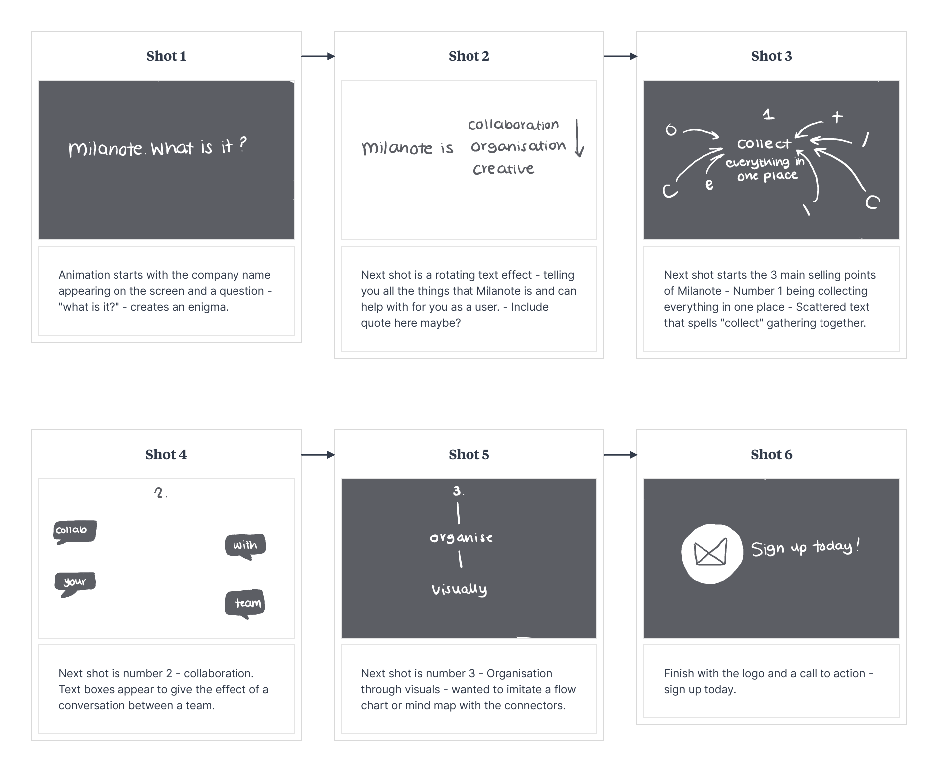
Since this project was an animation, I decided the best way to plan for it, was to create a storyboard that statically shows the different shots I wanted to produce (2). This would also allow me to focus on the different ways I wanted to animate each part. Immediately, I was picturing a very simple composition, where only text and maybe a few non-distracting icons are used, as typography is the focal point of this project and too many icons or digital assets may distract from this. For my project, I decided to create a commercial for a tool I use everyday: Milanote.
Milanote is a tool used by creative individuals to brainstorm, plan, develop and share their ideas and design process, and since I am a consumer of this brand, I felt I could accurately represent and interpret their message, which I would not be able to do for other brands as successfully. When storyboarding, I thought carefully about each shot I wanted to produce in my animation. I started by thinking about what I wanted to say with each shot, and how I would translate that through kinetic typography.
For example, for one shot I wanted to explain how Milanote is a good tool for collecting all of your thoughts, ideas and notes in one place, so I decided to scatter each letter and 'collect' them together through a simple animation. Since my storyboard is static, I needed to ensure it was clear what I wanted to do when creating my commercial. I decided to show this through sketching arrows from where the letters would start to where they would end up after keyframing them in After Effects. This allows me to see exactly what I want when I get round to animating, and makes the process between sketching and creating much smoother. Some other ideas I had for shots in my animation was a flipping/ rotating text animation when explaining what Milanote is in the second shot, as this also tells the viewer that Milanote is a flexible tool and can change depending on what you need it to be for you and your process.
(3) Research of Brand and Fonts
Brand Research, Fonts and Programs
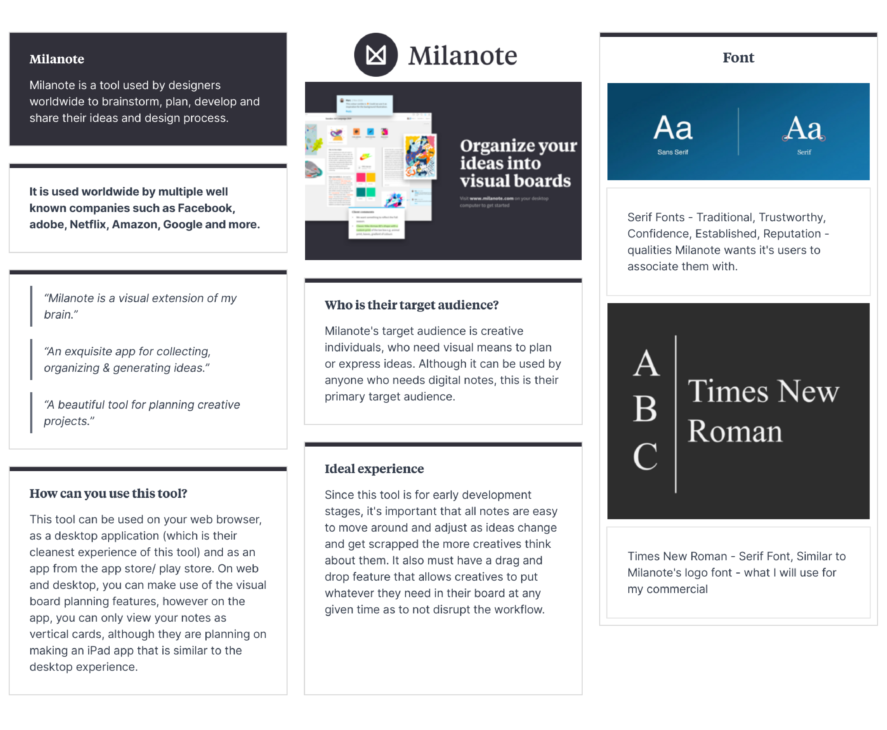
Since I am basing this commercial off of a real company, I felt it was important to do some research into them and what they offer to their consumers so that I could accurately capture this message in my commercial. To do this, I used Milanote to create a research board (3) where I could record my research visually. I looked at Milanote's target audience, and what would be important to them as consumers so that I could use this knowledge and showcase these things in my animation.
When looking into fonts to use in my commercial, I immediately knew I wanted to use a serif font, as not only is the Milanote logo a serif font, they also represent confidence and trust. These qualities are something Milanote as a company would want it's consumers to associate them with, so a serif font was the obvious choice for this project. A serif font that is easily recognisable and widely used is 'Times New Roman', so for the purpose of reputation and establishment, this is the font I decided to use. Finally, before moving onto creating and animating my kinetic typography commercial, I thought about what programs I would be working with. To animate, I will be using Adobe After Effects, as I have some knowledge in this program and am familiar with keyframes and editing graphs, which will help when animating my text and creating smooth kinetic transitions and effects. I decided the program I would use to illustrate any icons or logos would be Illustrator as this is the program I am most familiar with in making static illustrations, and I can easily import the assets I create into after effects using the 'import file' feature.
Project Development - Illustrator
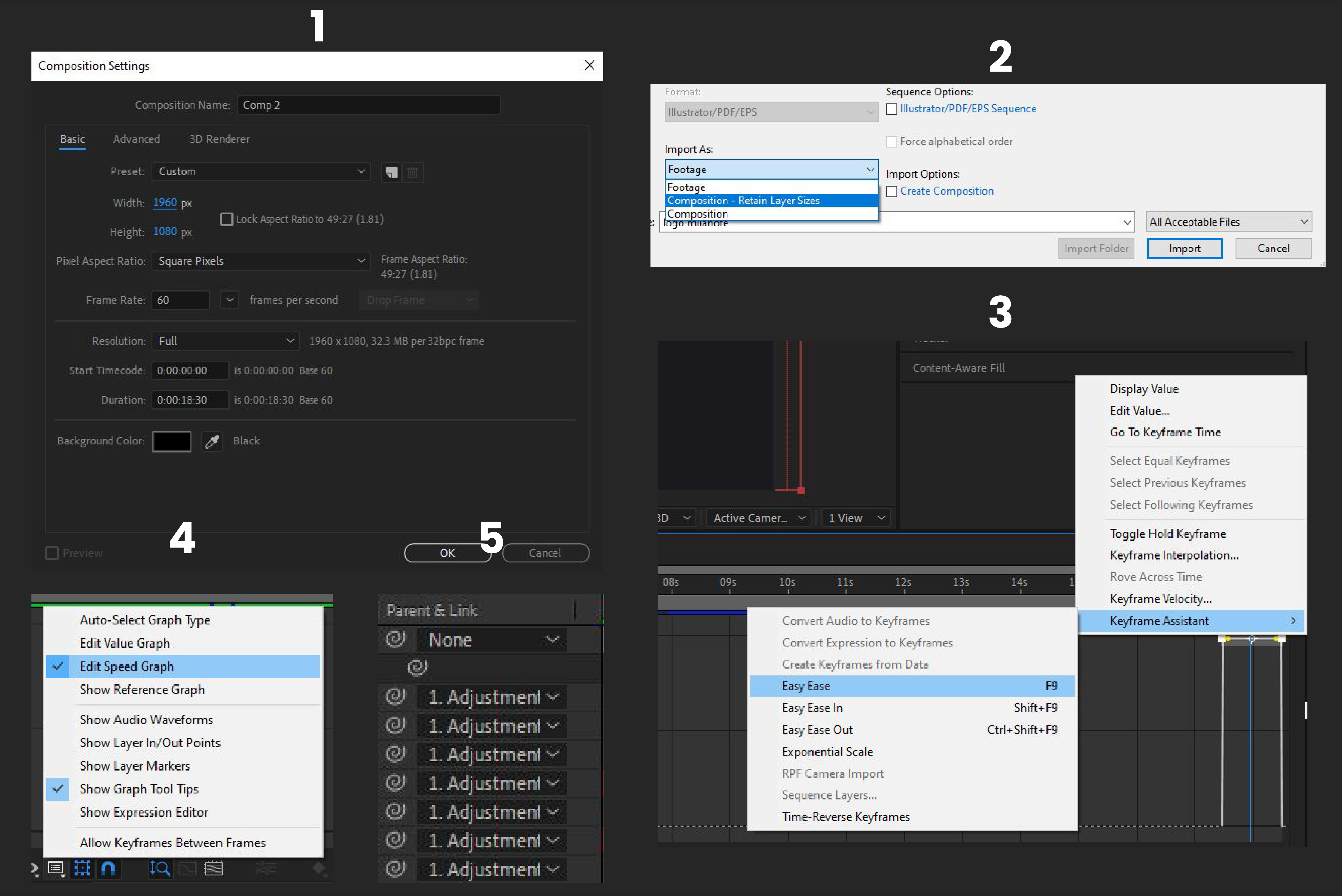
Now that it was time to start creating my commercial, I started by creating a few icons I would need in Adobe Illustrator. For example, I already knew I would need Milanote's logo for the last shot of my animation, and a speech bubble to use for my collaboration shot from my storyboard. To do this, I used the pen tool and basic shape tools, and then once I was happy with my icons, saved them as Illustrator files to a folder dedicated to this project. Saving these files as Illustrator files allows me to import them directly into After Effects using the 'import file' feature (2), so that I can retain their layer sizes and edit them as shapes in after effects, which I wouldn't be able to do as easily if they were imported as PNG's.
Project Development - After Effects
To set up my composition in Adobe After Effects, I used a composition size of 1920x1080px, with 60fps (1) which will allow my kinetic typography to appear smooth and seamless. This is important as it allows the animation to be satisfying and visually pleasing to look at, encouraging viewers to keep watching and giving them a pleasant viewing experience.
Before animating anything, I wanted to make sure I had all of the frames from my storyboard on my timeline. Therefore, I created solid layers and text layers and placed them in my workspace depending on when I wanted the frame to play, allowing me to focus on the main details in each frame before they were animated.
Once everything was in it's right place, it was time to start keyframing and animating everything! For my first shot, I wanted to start the animation with the text appearing or bouncing in. This was relatively easy to animate, as all I needed to do was keyframe the scale of the text from a small size to a larger one. To create a smoother animation, I highlighted both of my keyframes, applied easy ease to them (3) and loaded up the graph editor. Personally when animating keyframes, I prefer to edit the speed graph (4) rather than the value graph, as i find it easier to work with. However, if I was doing something a little more complicated, I would use the value graph as it would allow me to be more precise. I then animated the next text layer "what is it?" to bounce up, which I did by using the range selector and masking the layer.
Once my animations for the first shot were in place, I applied an adjustment layer over the top and made it a parent layer to all of my first shot layers (5). This meant that if I was to adjust any properties, such as scaling or rotation, it would adjust the layers linked to it as well, ensuring that all of the spacing and sizing between each layer would remain proportionate. Using this technique, I adjusted the position on my adjustment layer to follow the "what is it?" text as it appeared. By doing this, it allows the viewer to focus on this new text, and creates an enigma as the viewer will ask themselves this question.
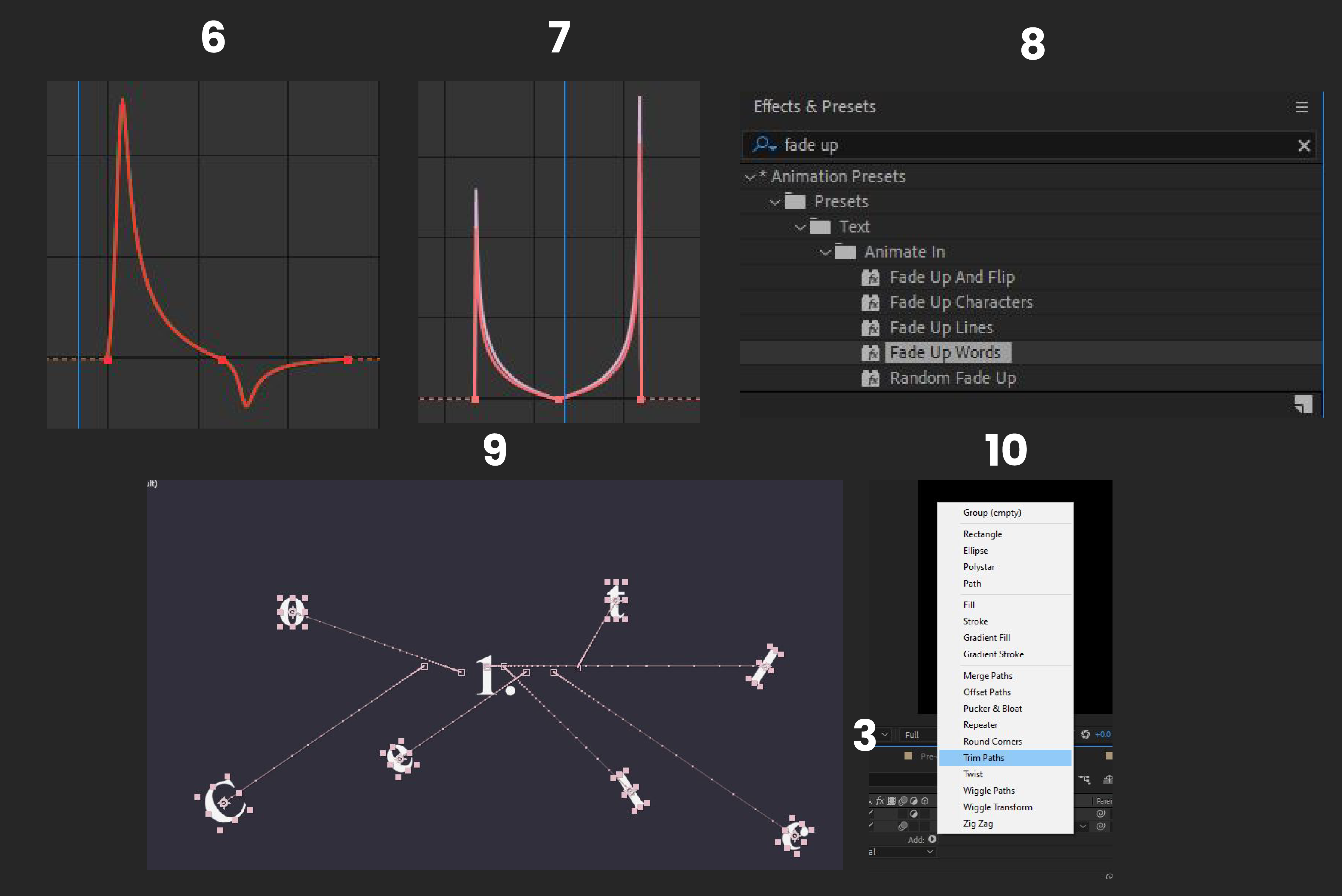
For the next shot in my animation, I converted my text layers to 3D text layers, so that I could rotate them along their X axis and create a 'rotating' text effect. To do this, I added two keyframes on my layers X rotation at the start of my layer to make it look like it was rotating in, and did the same thing towards the end of my layer to make it look like it was rotating out. Using the knowledge from my graph edit in the first shot (6), I used the speed graph editor to animate these keyframes and make them much smoother (7). I copied and pasted these keyframes onto my two other text layers, so that the rotation appeared continuous and to ensure the timing on each layer matched.
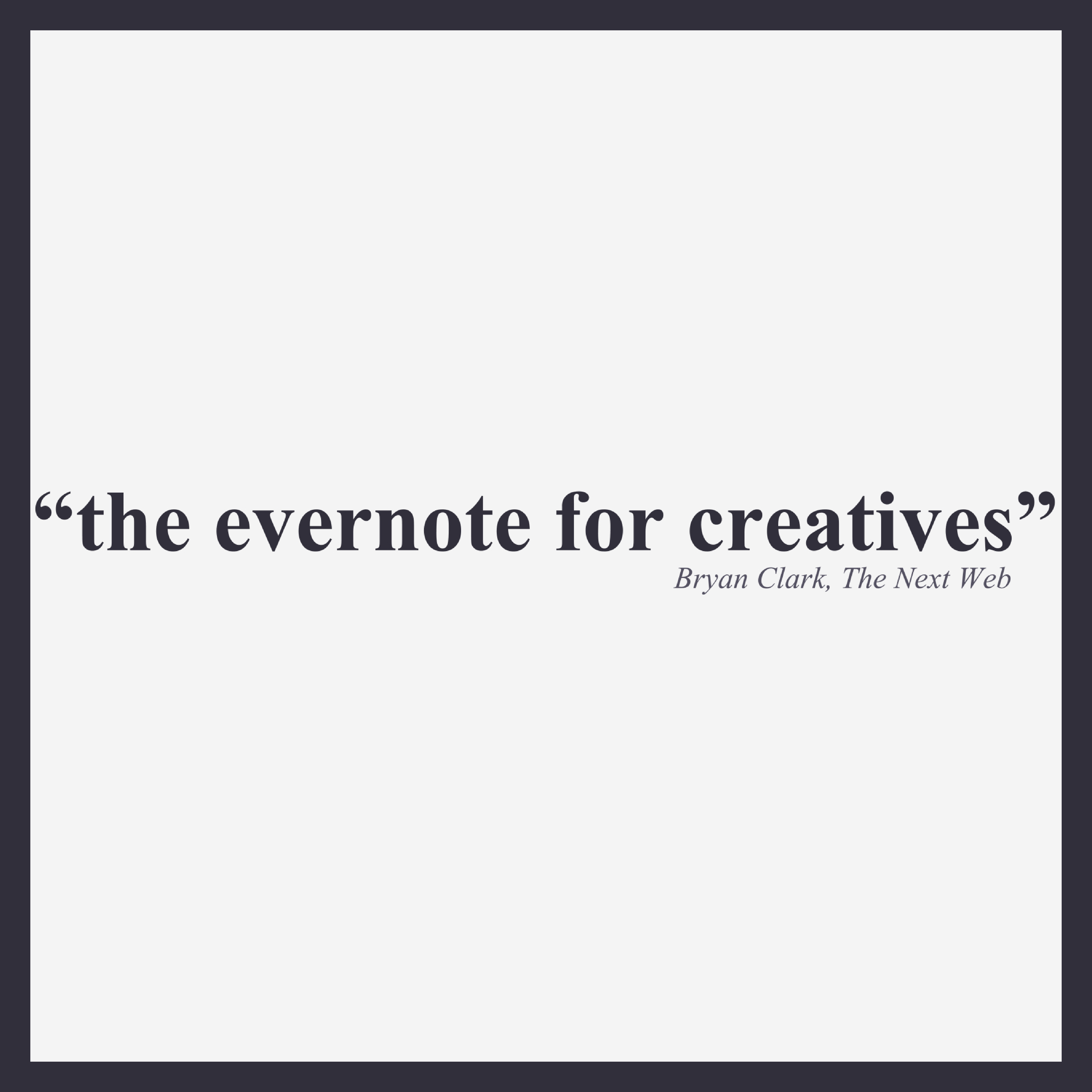
In this part of my animation, I decided to add a quote from the Milanote website - "the Evernote for creatives". To animate this, I used the same technique from shot one, with an adjustment to slide the composition along. I chose to add this quote because it helps give makes the brand feel more established, and since it is from someone who did not work on the tool, it allows the viewer to put their trust in this company.
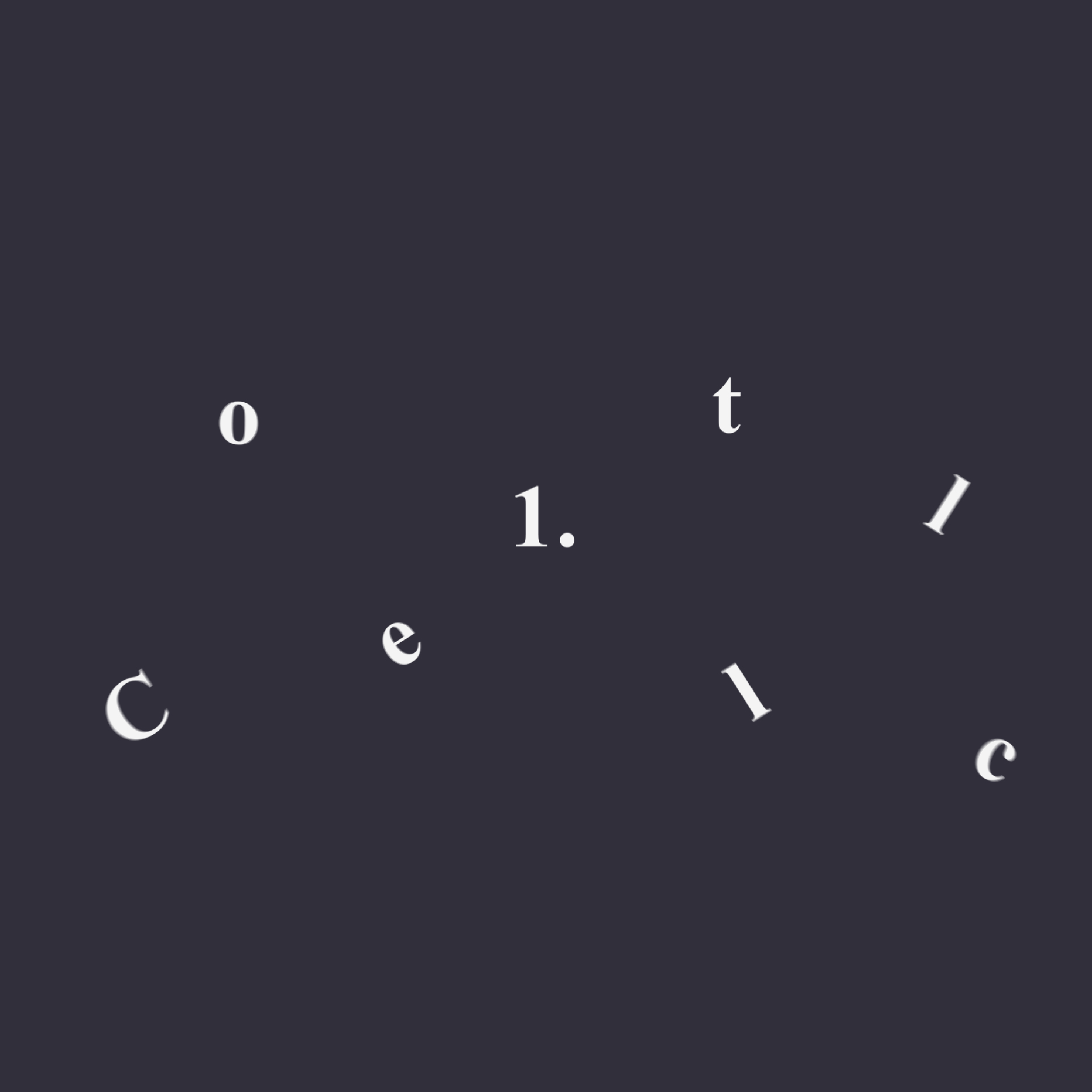
The next shot of my commercial included an animation that I feel accurately represents the words meaning and relates to the brief of this project well. This shot shows the words 'collect everything in one place', which is animated by the letters in 'collect' initially being scattered around the screen, before gathering or 'collecting' in the middle to reveal the word.
I created this animation by working backwards. I started by arranging the letters in their correct place, and then scattering them around the screen at the start of the layer, placing a position keyframe for each part (9). This allows the letters to start scattered and move to their correct position as the timeline moves forward. Since this was the main animation I wanted to focus on in this shot, I used a simple fade in animation (8) for the rest of the text, so it wouldn't distract.
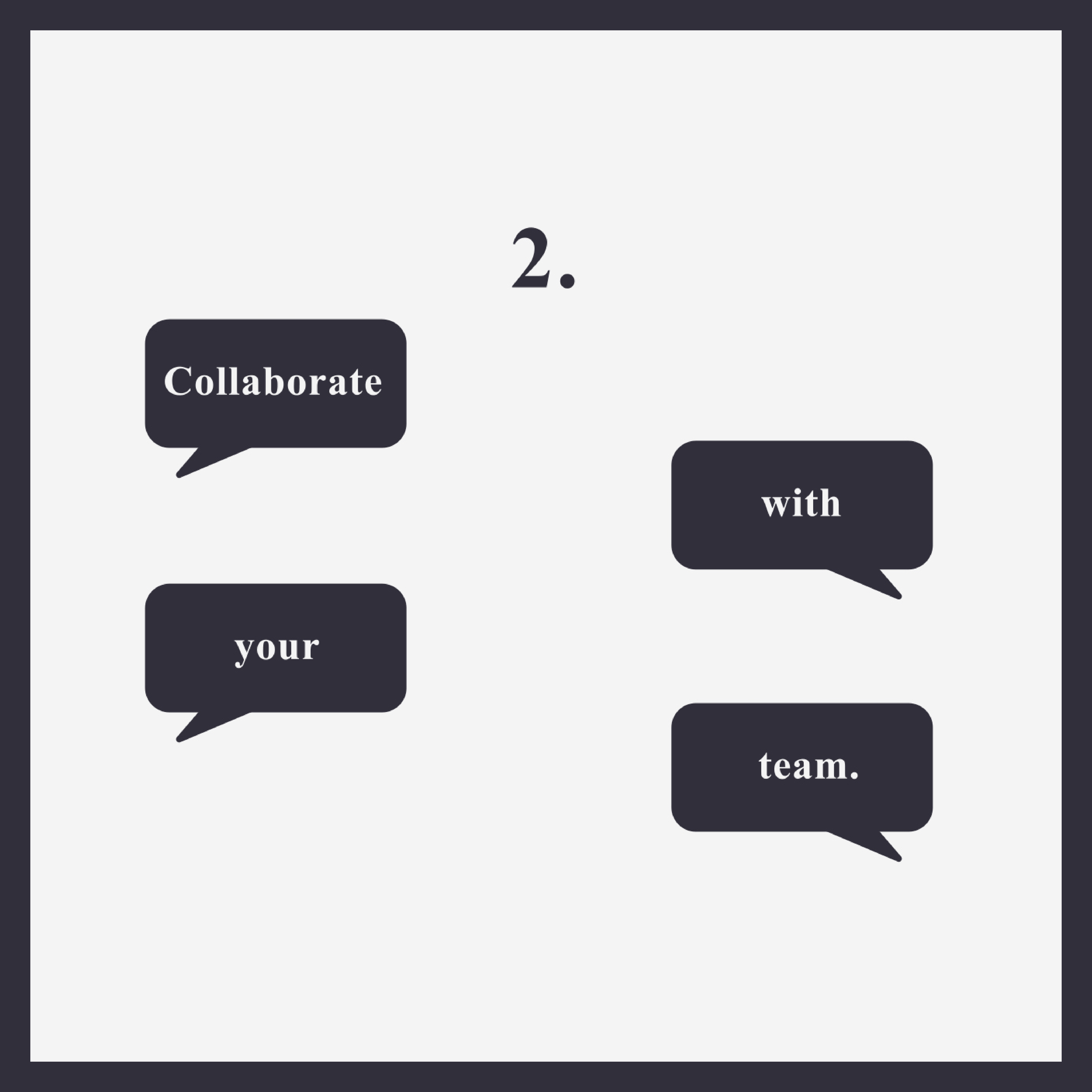
For the 'Collaborate with your team' shot, I wanted to animate a conversation using speech bubbles so that anyone watching would see that this tool is good for helping you communicate and connect with your team if you are working on group projects together. I did this by arranging my text layers over my speech bubbles and using an adjustment layer for each one to have them scale up. Since these were messages, I wanted them to scale up from the corners of the shape. In order to do this, I adjusted my anchor position to sit in the bottom corner, rather than the centre of the shape like it is usually.
Finally, my last shot displays the words 'Organise visually'. For me, visually organising my thoughts often results in flow charts and mind maps, so this is something I wanted to translate when animating these words. To do this, I created simple lines that connected the two words using the pen tool in after effects, to imitate the line connections often used in flow charts and mind maps. To animate them, I used the trim paths tool (10) attached to my line shape layers and keyframed the start and end position so that they appeared to extend, or be 'drawn'. After this, I added another adjustment layer as a parent, and keyframed it's position to follow the text as it appeared, similarly to the technique I used in my first shot. Once this was done, I faded it out and used the same animation style from the start of my commercial to animate the logo and a call to action - "sign up today".
When exporting my video, I thought about what it would look like when displayed on my website, as this would be the main way it would be viewed. Since a lot of parts in the video have a white background, I decided it would be wise to add a border to my animation so that these parts wouldn't blend in with the white background of my website. Once I had decided this, I exported my video as an .mp4 file and used a high bitrate when rendering to retain video quality.
Final Kinetic Typography Animation
Reflection of Project
I am very happy with the outcome of my animation, particularly with how smooth all of the animations appear. I have learned a few techniques with keyframes throughout this project, such as editing multiple groups of keyframes in the graph editor to save time and match their timings up accurately, which will help me when working with animation or After Effects in the future.
I feel as if this project reflects the brief given and explores the different trends in kinetic typography. For the brief, we were asked to create a commercial where the type empathises with the words meanings. Since the words used in my animation were professional, such as "organise" and "collaborate", I used the font 'Times New Roman', a serif font, to reinforce this professionalism. In my 'collaboration' and 'collection' shots, I have animated the words to reiterate their meanings. Therefore, I feel I have successfully followed the brief through both my font choice and my animation techniques.
Reflecting on the research I did on kinetic typography early in this project, I believe I successfully used the trends I discovered. For example, the fast-paced typography trend in Honda's 'Keep Up' advert, and mirroring the words meanings through animation from Apple's 'Don't Blink' advert.
If I was to do this project again, I would like to explore some more 3D text effects to really push my knowledge of animating in 3D, as I feel this is one of my weaker areas in After Effects and would be helpful when working in this program in the future. I would also explore using multiple fonts, instead of just one, to really push the exploration of typeface in kinetic animations.
