1. Brief Exploration
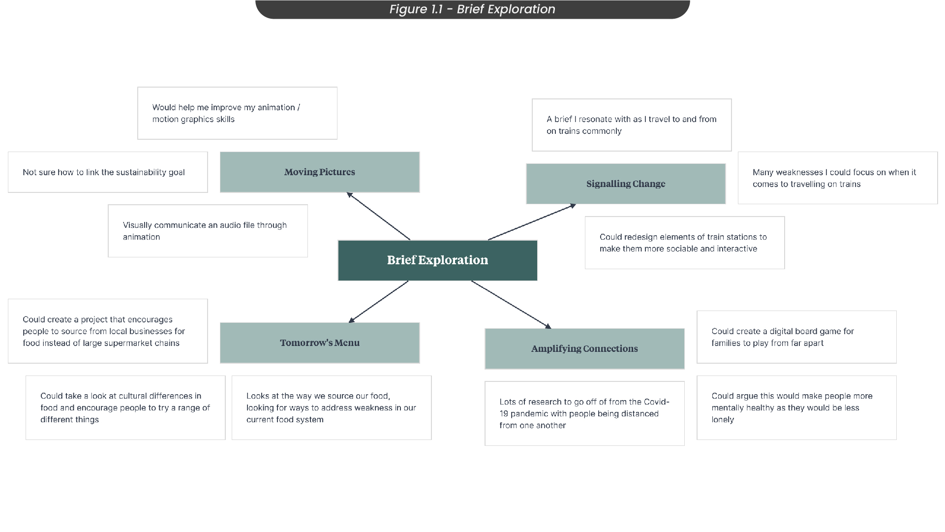
The RSA student awards is a competition that invites students to tackle social, environmental, and economical issues by developing creative solutions that could shift the system and change the world. For this competition, students can choose from a set of briefs that detail different systems that have weaknesses. From these briefs, I created a mindmap of the briefs I were interested in (Figure 1.1). For example, I looked into the following briefs:
‘Moving Pictures’ would have allowed me to improve my motion graphics and animation skills, but I struggled with understanding how to link to the sustainability goal and I didn’t feel any drive or connection with either of the audio files in this brief.
‘Amplifying connections’ inspired me as it got me thinking about connecting people across the world, helping them feel less lonely. I had lots of ideas for this brief and almost chose to continue with this one.
‘Signalling change’ was a brief I resonated with as I travel to and from the university by train and often use the train for my travel. Therefore, I had plenty of opportunities to research by observation, and also had an amount of knowledge based on my own experiences. I was inspired by this project to find a way to make travelling by train a more sociable and interactive experience. This was the brief I decided to take forward throughout the semester.
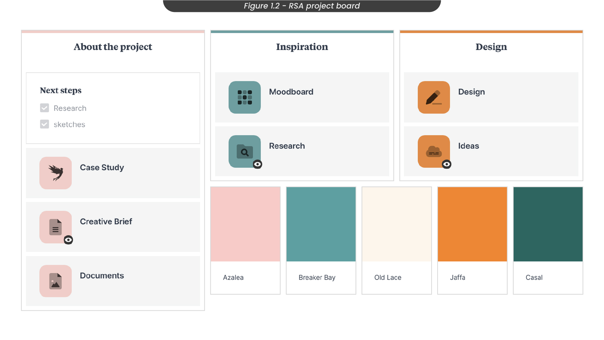
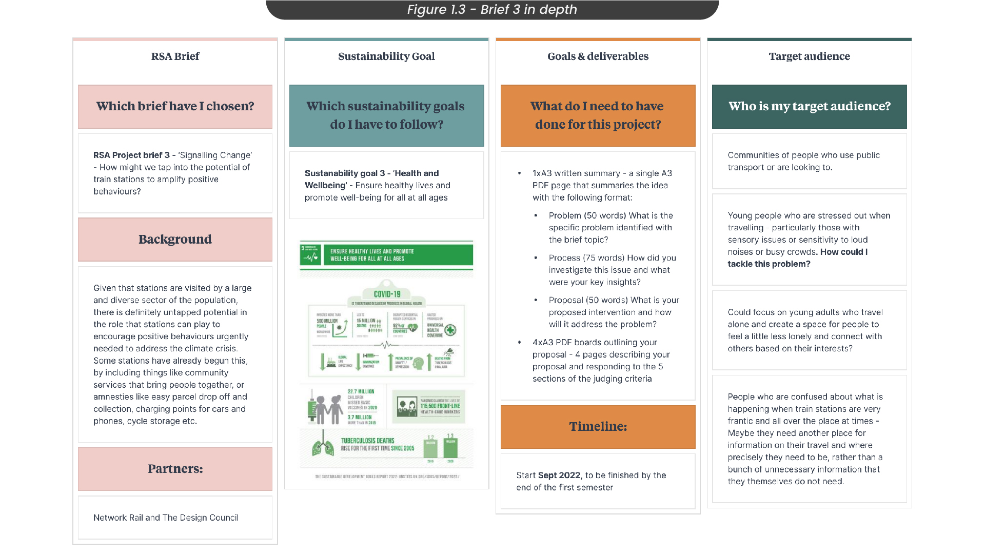
Once I had chosen my brief, I started by creating a board on ‘Milanote’, where I could organise and collect all of my ideas and thoughts in one place (Figure 1.2). I find this is the project planning tool that works for me. Here is where I was able to take a deeper look at what brief 3 was asking for (Figure 1.3), to set realistic expectations of what I needed to accomplish, including the RSA requirements. I had to keep in mind the UN sustainability goal I needed to target in this project, Health and well-being.
2. Identifying the Problems
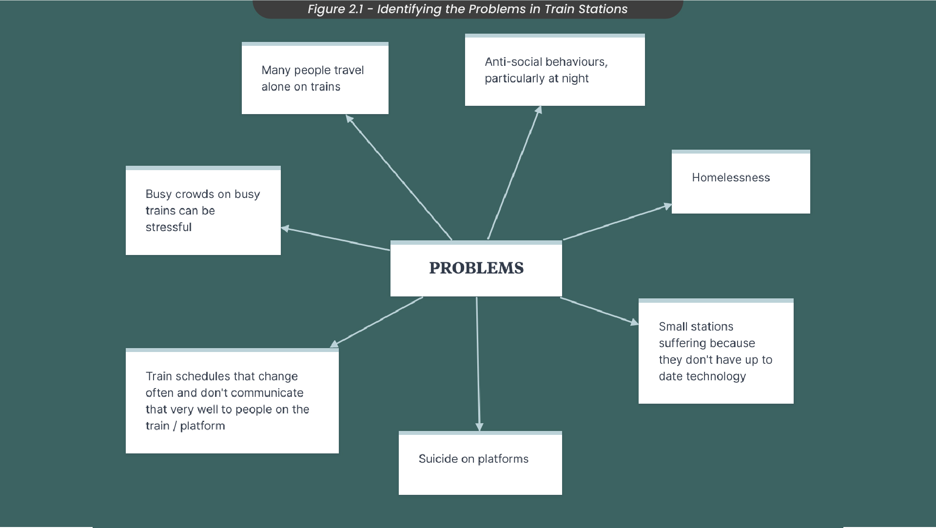
As the RSA student brief, I had chosen aims to tackle weaknesses in train stations, so it was important I looked at some of the common problems affecting them (Figure 2.1). For example, some of the problems I had identified from observation and talking to other people included busy crowds, homelessness, anti-social behaviours, suicide and loneliness while travelling alone.
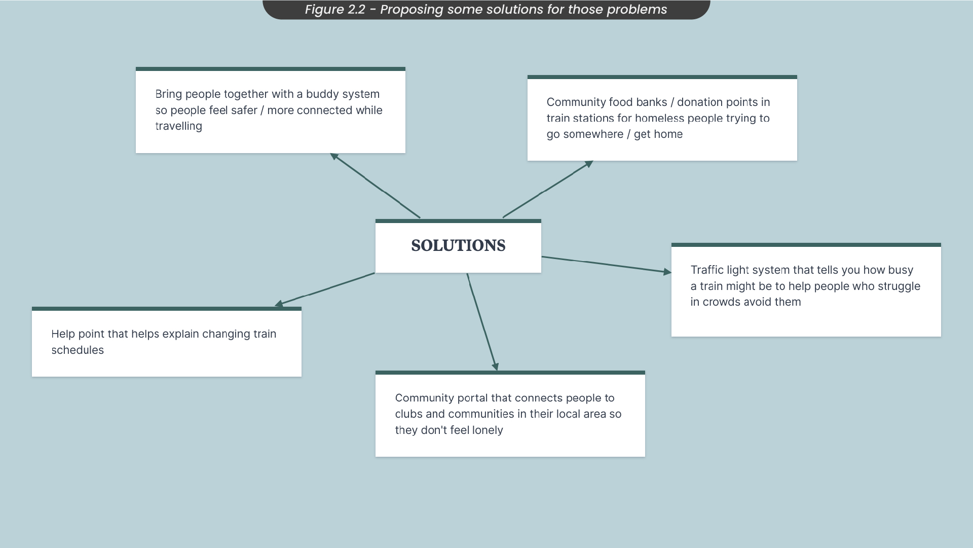
With these in mind, I started mind-mapping some solutions (Figure 2.2). For example, I thought of maybe having a traffic light system that tells you how busy trains are to help people who struggle in crowds to avoid them or a community app that connects you to other people so you don’t feel alone and can travel with other people.
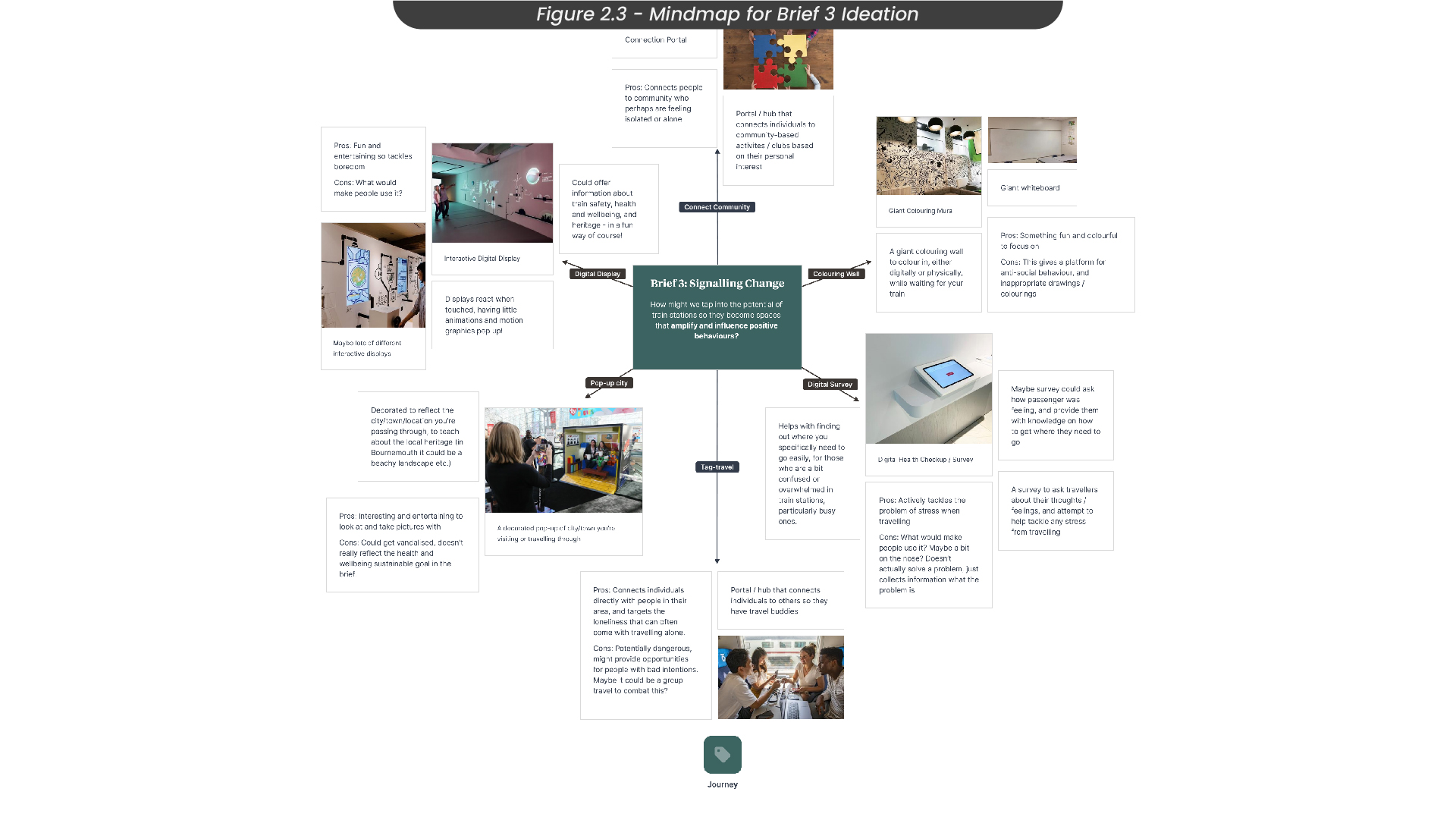
Focusing on my solutions, I started to brainstorm some project ideas (Figure 2.3). For example, I thought of developing an interactive digital display that offered information about train safety, health and well-being, heritage etc. in an interactive and fun way. However, I struggled to see how people would go up to it and use it, as people might be worried about missing their trains. Another idea I came up with was a community connection portal that would connect people to communities in their local area. I thought this was a strong idea but didn’t focus enough on train stations which my brief was specifically looking for. Therefore, I adjusted this idea slightly to an app that would connect individuals to other people in their area who are taking the same or similar train routes at the same time so that they no longer have to travel alone.
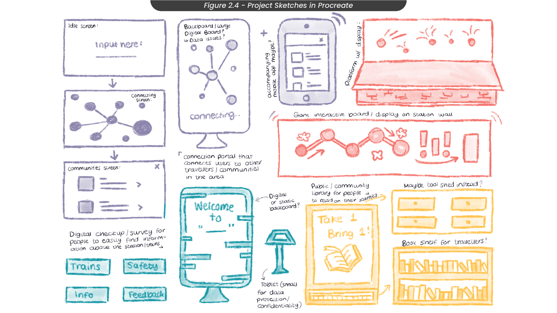
To help visualise these solutions and project ideas, I sketched them out in Procreate, annotating them and colour-coding them by idea (Figure 2.4).
3. Project Ideation
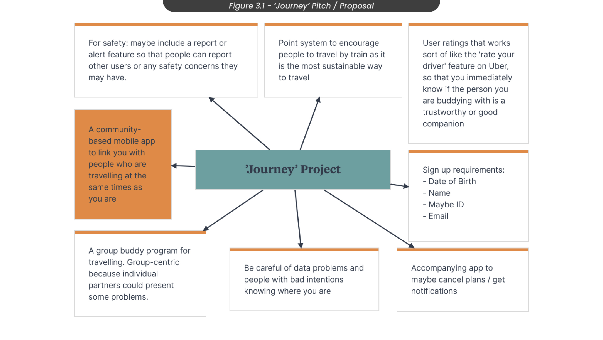
I decided I liked the idea of a mobile app that connects individuals who travel alone to other people in their area who are taking the same or similar journey, so I created a mindmap where I brainstormed some other ideas to properly develop my idea (Figure 3.1). For example, I thought about adding a point system that gives you rewards based on how many miles you have travelled and a rate your buddy feature that lets other people know if you are a trustworthy companion to travel with, similar to the rate your driver feature on ‘Uber’.
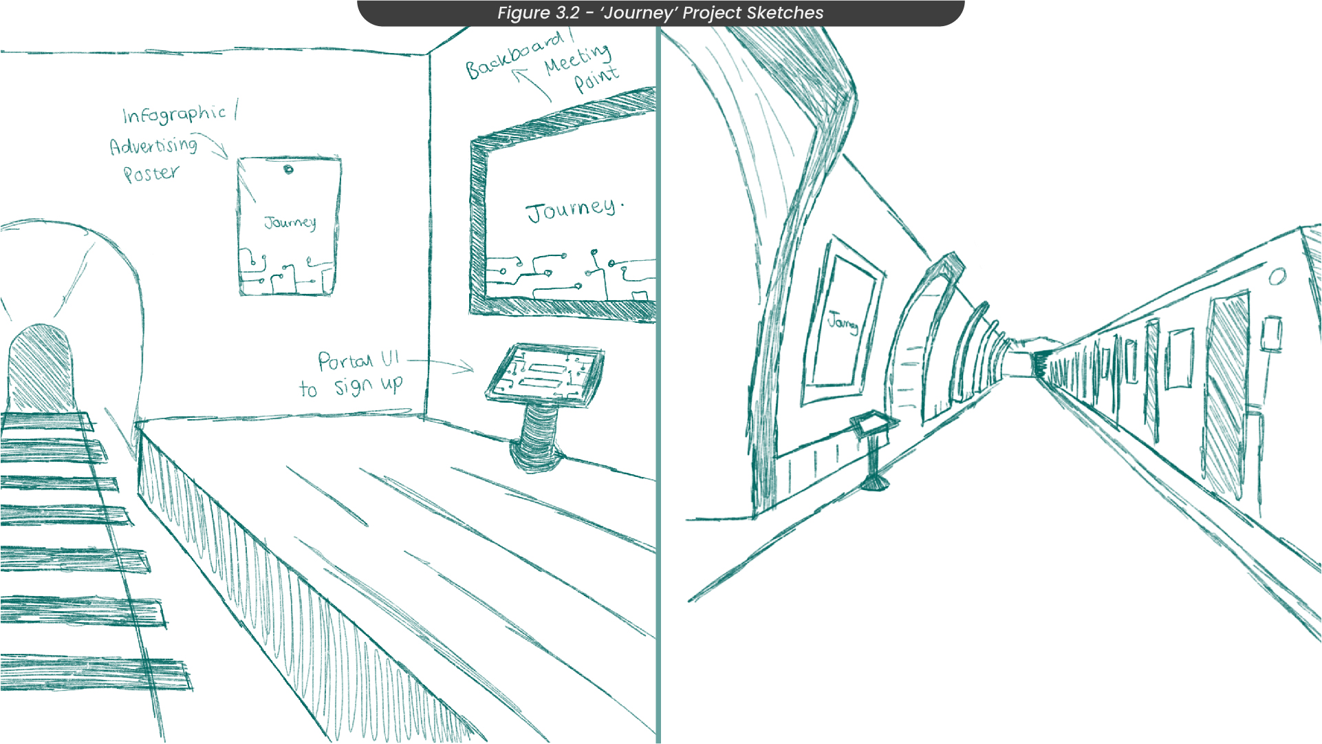
I sketched my project idea out in ‘Procreate’ to visualise how it would sit on a train platform so that people could interact with it and sign up for the app right there and then (Figure 3.2). This stand could also act as a natural meeting point so that people who match as travel companions don’t have to organise a separate meeting point, which is also a lot safer as train guards would be aware of where these meetups take place if anything was to go wrong.
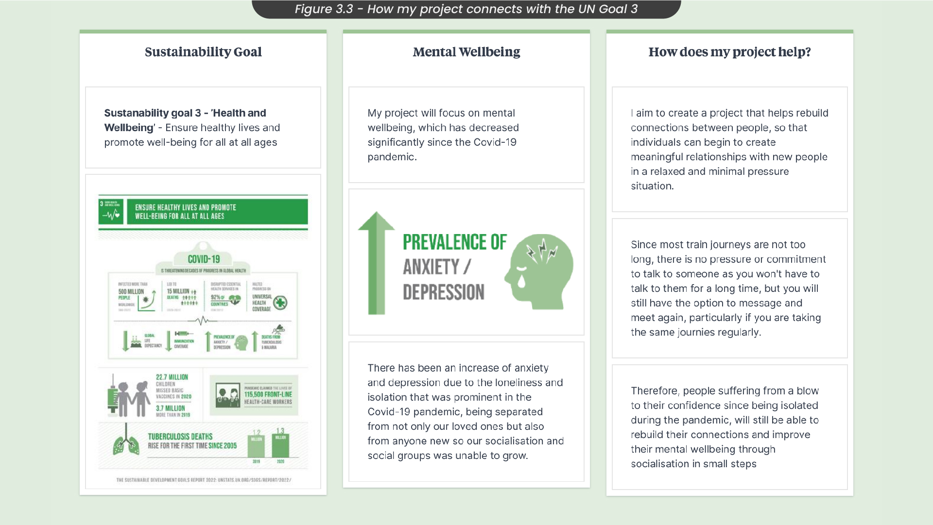
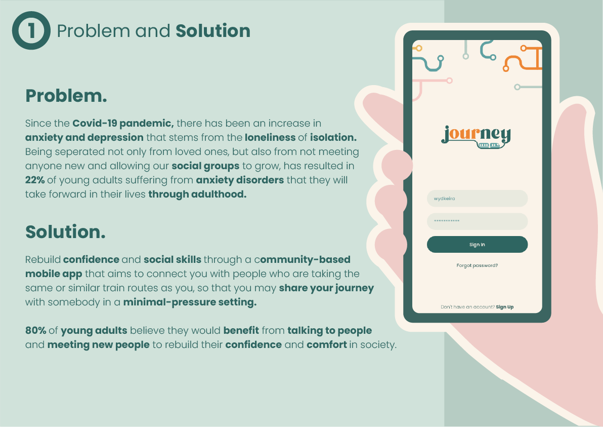
Since I had to link this project to the UN sustainability goal 3 - Good health and well-being, it was important to consider how my project targeted the well-being of my target audience (Figure 3.3). My project links to ‘good health and well-being’ as it focuses on the mental well-being of people travelling alone, which can often be lonely and isolating. This is especially important now, as there has been an increase in anxiety and depression due to the isolation from the Covid-19 pandemic, which the sustainable goal details. I aim to create a project that helps rebuild connections between people that were lost during the pandemic so that individuals can create meaningful relationships with new people in a relaxed and minimal-pressure situation.
4. Project Research
While working on my project throughout the first semester, I also built a case study with research that would aid this project. My case study asked “how can encouraging social behaviours improve overall mental health and well-being?” and aims to find the benefits of spending time with others. I conducted both primary and secondary research to ensure my research was thorough and relevant.
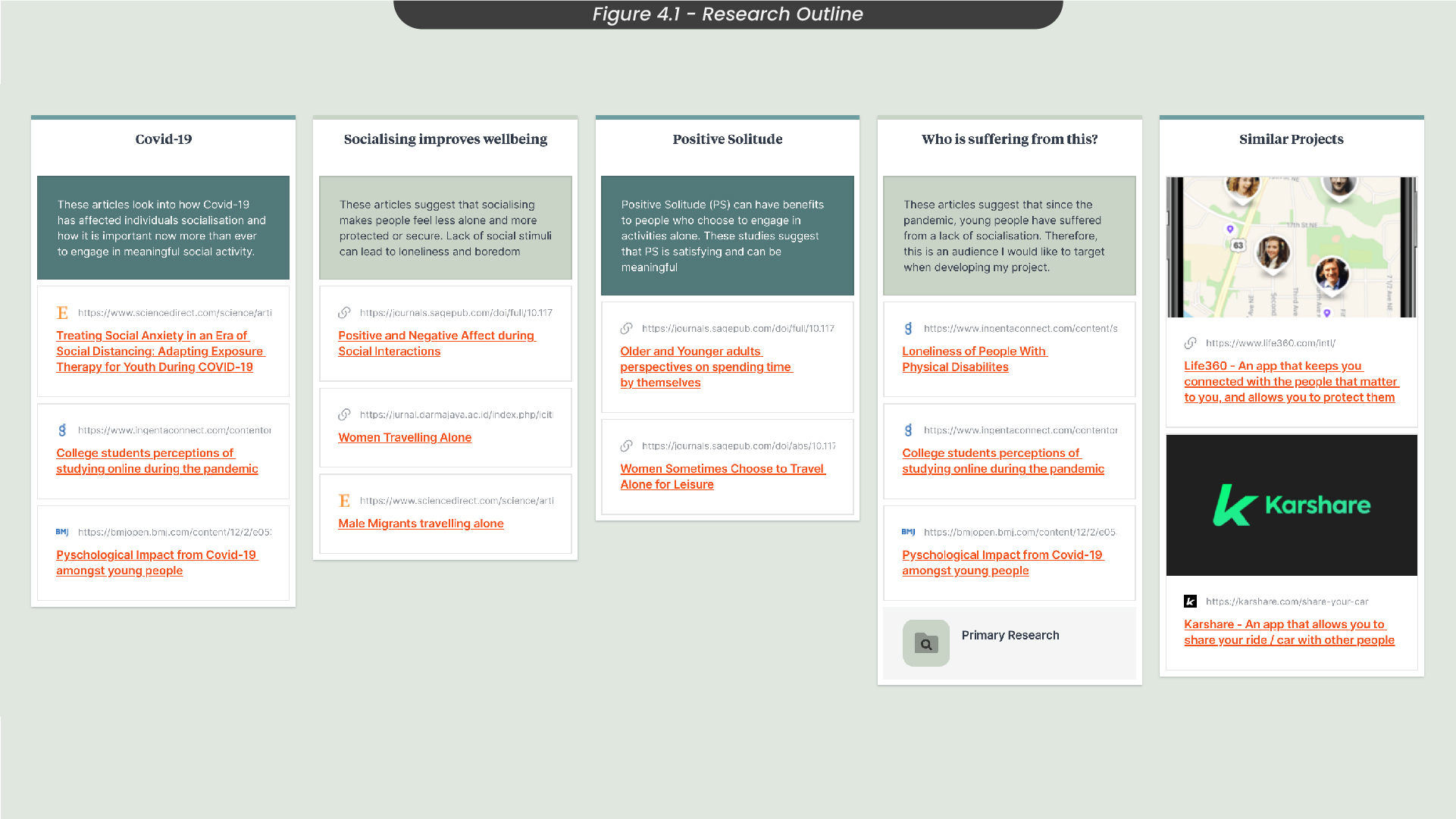
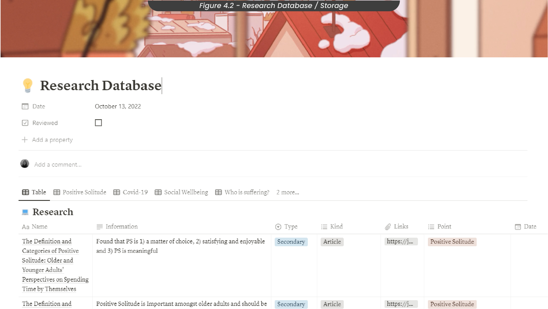
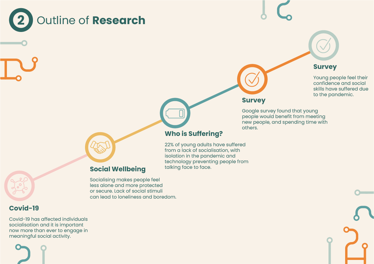
For my secondary research, I looked into isolation and the effects lockdown had on people's confidence, social skills and mental well-being (Figure 4.1). I also looked at who is suffering from this lack of socialisation and found that young people are suffering the most as they have missed out on socialising with their peers during the pandemic, along with technology becoming a barrier that prevents people from talking face-to-face. Since I didn’t want to show any bias in my case study, I also looked at some counter-arguments, such as how positive solitude is also important to people, as it allows them to engage in self-reflection and growth on their own. I created a database for all of my research on my University Notion page, where I keep track of all of my notes from my lectures so that I could keep all of my articles and quotes organised (Figure 4.2).
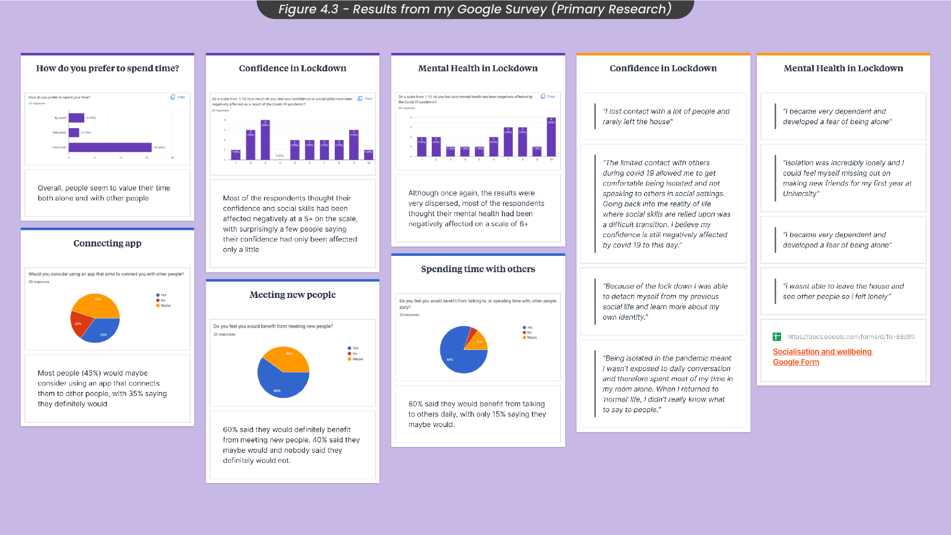
For my primary research, I conducted a Google survey which I sent out to mainly young people, as this would be my primary target audience. Out of the 20 responses I got, most people said they have suffered from a lack of socialisation during the pandemic, and believe they would benefit from meeting new people or spending time with people daily. See Figure 4.3 for other results and charts.
5. Target Audience
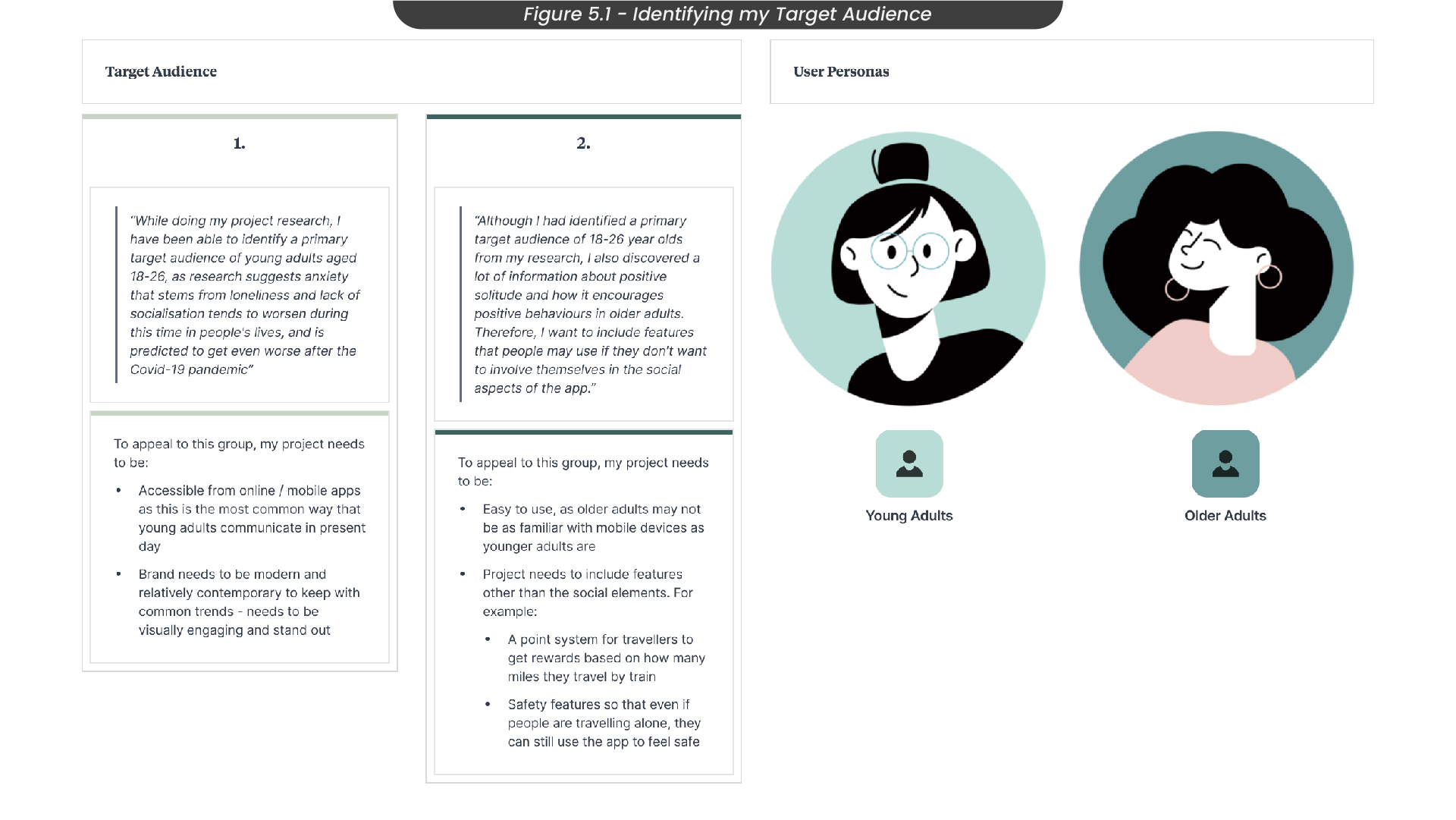
For this project, I needed to identify a target audience so that my app design could be designed in a much more targeted way (Figure 5.1). From my research, I knew that young adults were the ones suffering the most from a lack of socialisation, so I chose this age range as my primary audience. To appeal to this audience, my project needed to be accessible from mobile devices, as this is the most common way that young people communicate. It also needs to have a modern and relatively contemporary style to keep up with common trends. I chose older adults as my secondary target audience, as both my primary and secondary research told me that older adults value their time alone and positive solitude is an important factor I needed to consider. Therefore, although my app is a community-focused concept, it also needs to include features that allow people who want to be alone while travelling to still use it.
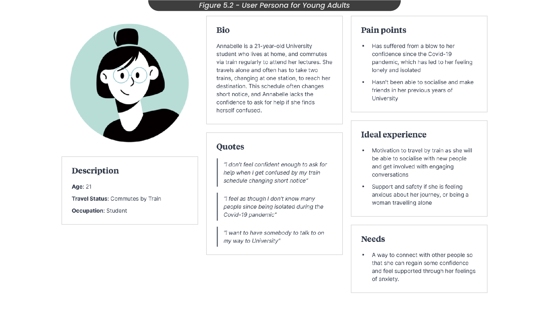
To truly understand my primary target audience, I created a user persona to create realistic outlines (Figure 5.2). Here I considered pain points and the needs or ideal experience of young adults. For example, using knowledge from my primary and secondary research, I noted how this persona would have struggled with confidence from being isolated in covid-19, and how they need a way to connect with other people so they can regain some confidence and feel supported through their feelings of anxiety.
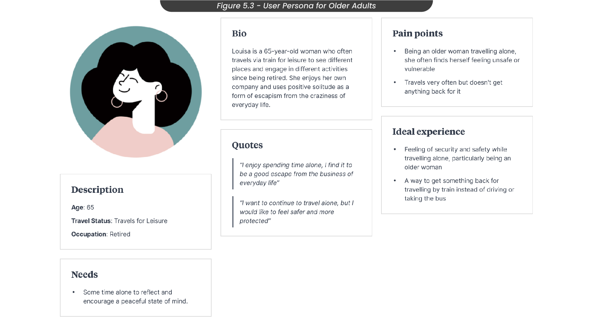
I also created a user persona for my secondary target audience, older adults (Figure 5.3). Here, I also considered their pain points, such as women travelling alone and often feeling unsafe or vulnerable. Therefore, this persona's ideal experience would be to feel secure and safe while travelling.
6. Branding
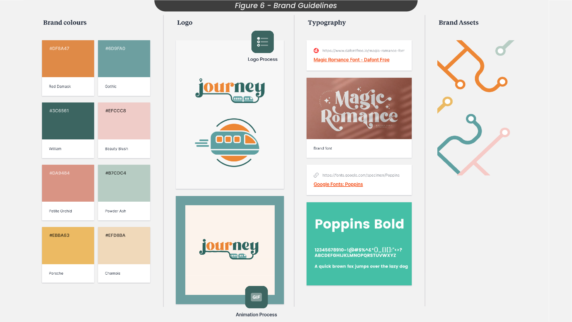
When building the brand guidelines for this project, I made sure to consider my colour choices and fonts (Figure 6). I decided to use green as a primary colour in my branding, as this is the main colour for ‘Trainline’, the app where you can buy tickets for your travel, and I wanted my app to feel familiar with travelling by train. I chose orange as another primary colour, as green and orange are complementary colours, so pairing these two colours together works well. For my fonts, I decided to use a serif font called ‘Magic Romance’, as serif fonts are usually considered to be friendly, unique and expressive. This allows users to feel more relaxed while using the app and understand that the other people on the app are also friendly, just like the font. I also decided to use Poppins for all of the paragraphs or small text on my app designs, as this font is easily readable and widely used so it is familiar and not difficult to adjust to as a user.
7. Logo Sketches
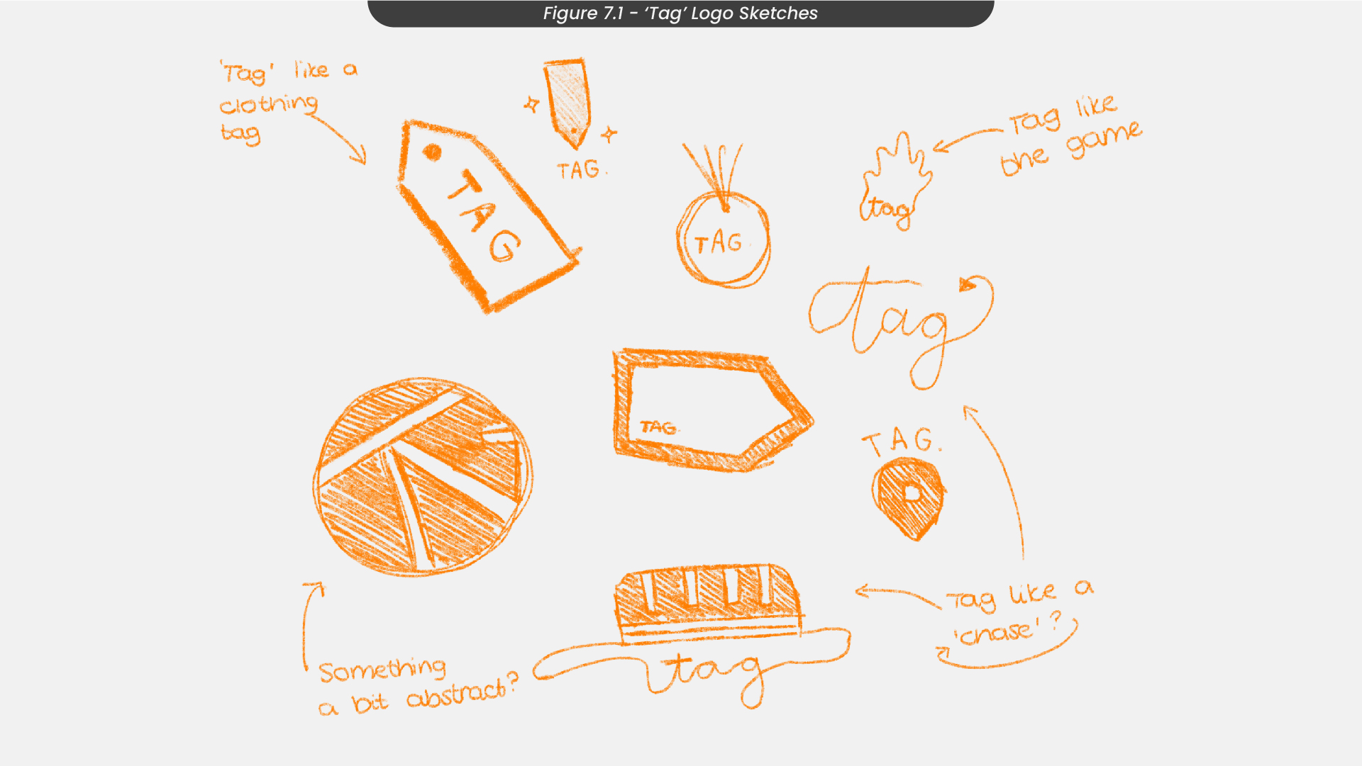
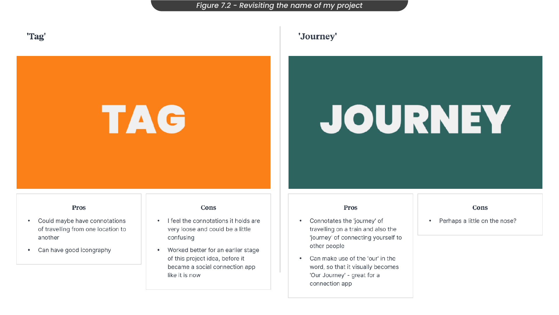
To start my design process, I started sketching some logo ideas. In the early stages of this project, my app was called ‘Tag’, as my original concept was to have people pass off their buddies to the next person throughout their journies. However, I felt this made the process a little longer and required travellers to stay on their trains longer than they intended to, taking the minimal-pressure feeling out of it. For this original name though, I sketched some logo ideas in Procreate, using different iconography that represented the word ‘tag’, such as clothing tags, the children's game ‘Tag’, and arrows (Figure 7.1).
However, as my project developed, I revisited the name of my mobile app and came up with the name ‘Journey’ (Figure 7.2). I felt this name captured not only the journey of your train route but also the journey of reconnecting with other people. I also saw an opportunity with this to isolate the ‘our’ so that the word visually became more like ‘our journey’, to capture the community-based theming of the app.
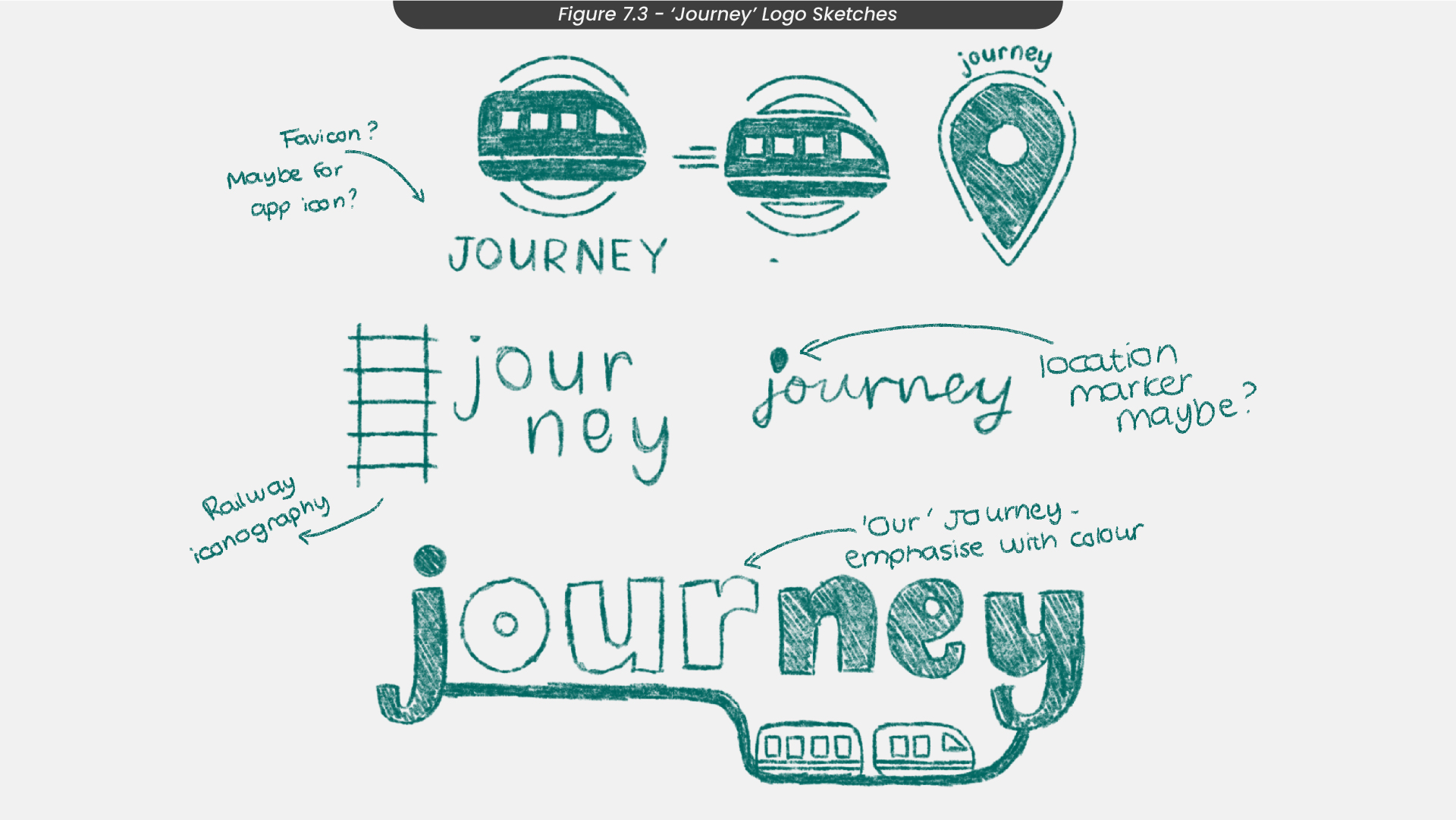
Once I had decided to switch to the name ‘Journey’ for this project, I sketched out some logos for this new word (Figure 7.3). For example, I used some train transport iconography, such as trains and railway tracks, so that the logo instantly communicated the idea of trains and users would immediately know what the app was for. I thought I could emphasise the ‘our’ in the word ‘journey’ with colour, using that orange to compliment the greens.
8. Logo Development
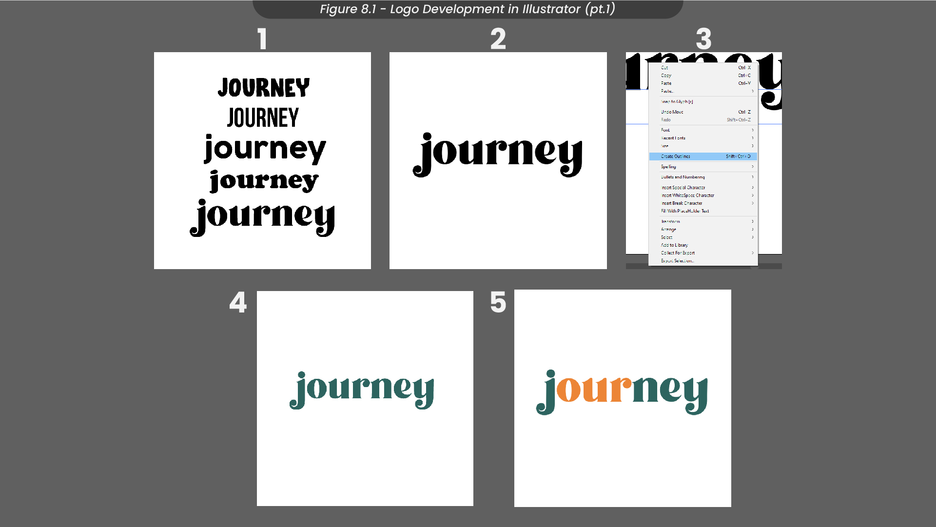
To develop this logo, I first created a composition in Illustrator of 1080 x 1080px and then created a text layer with the word ‘Journey’ (Figure 8.1). Although I had already looked at the fonts I wanted to use in this project, I wanted to make sure it was the font that felt the most inviting and friendly, so I compared it to others and asked a few people which one they preferred, to which they replied the original font I had chosen. So that I could work with the text layer a little easier, I converted it to a shape layer. From here, I changed the colour to the primary green I had chosen from my colour palette and changed the ‘our’ to the complementary orange I had chosen.
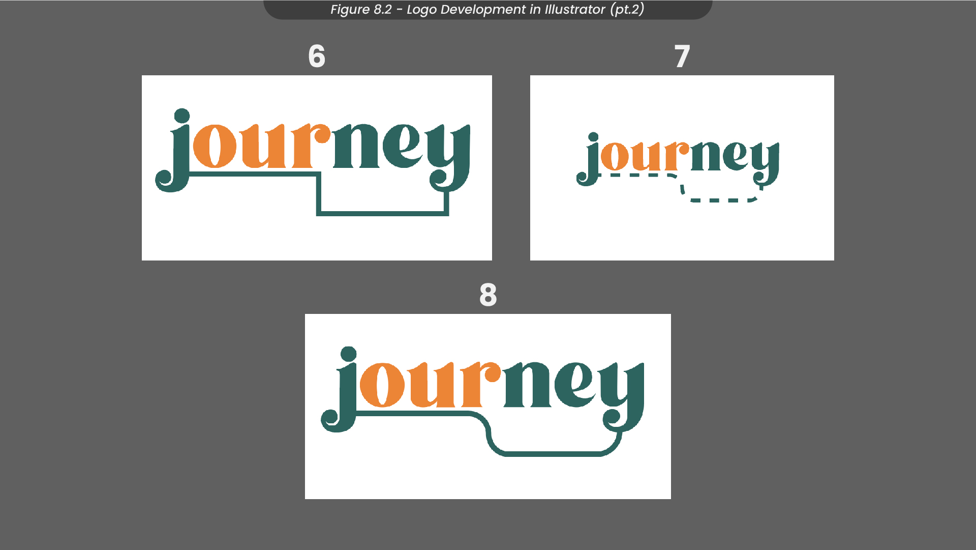
After finishing the text for my logo, I moved on to creating a track to connect the ‘J’ and the ‘y’ (Figure 8.2). Instead of making just a straight line, I added a slight bend, so that only the ‘our’ was underlined, to further draw attention to it. I then experimented with making this line dashed, but I thought it looked quite messy, so instead I kept it a solid line and rounded the corners instead, as train routes don’t have sharp bends.
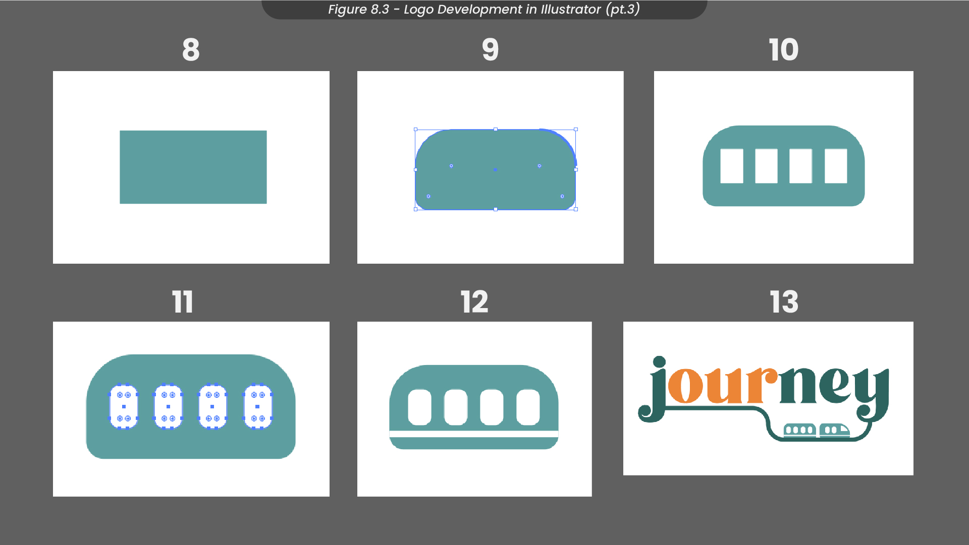
The last thing to add to my logo, referencing my sketch earlier on, was the train carriage (Figure 8.3). To make this, I first added a rectangular shape layer and slightly rounded the corner points so it appeared more like a carriage than a box. I then added some white boxes over the top and spaced them out evenly to look like windows. Since everything else had been rounded out, I decided to smooth out the corners of the windows too, so everything was cohesive. Finally, I added a white stripe to the bottom of the train carriage, just to add some more detail. Finally, I added this carriage to my original logo along the route I had created earlier on.
9. Logo Animation Development
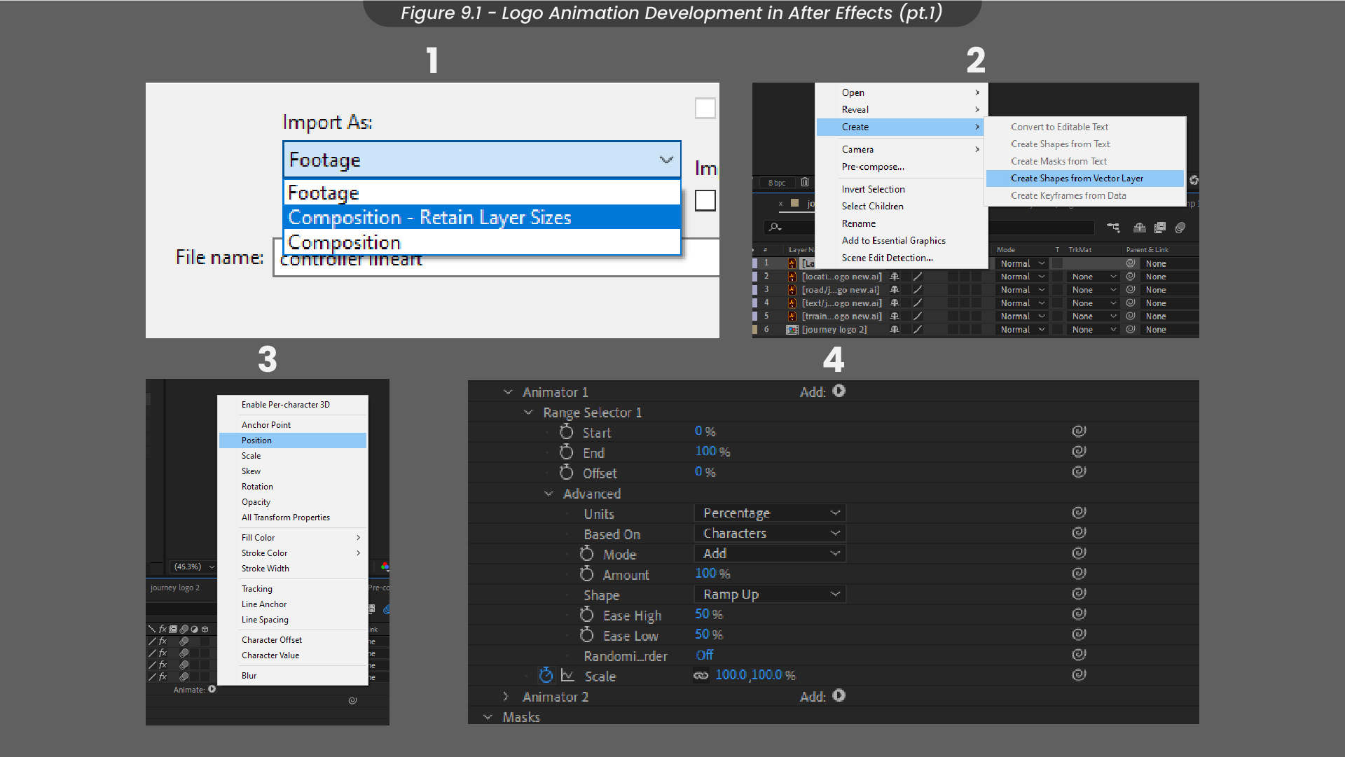
Since one of my personal goals, this semester was to strengthen my animation skills and knowledge of after effects, I decided to animate my logo (Figure 9.1). To start, I imported my Illustrator file into After Effects, retaining the layer sizes so that I could animate each layer instead of having a flat illustration to work with. I then converted my text to a text layer and my train route to a shape layer, to make them easier to animate in After Effects. Starting with the text, I added a position animator and made sure it was set to characters so that each character would animate instead of the entire word. I keyframed these characters to drop down and then fly up using the range selector.
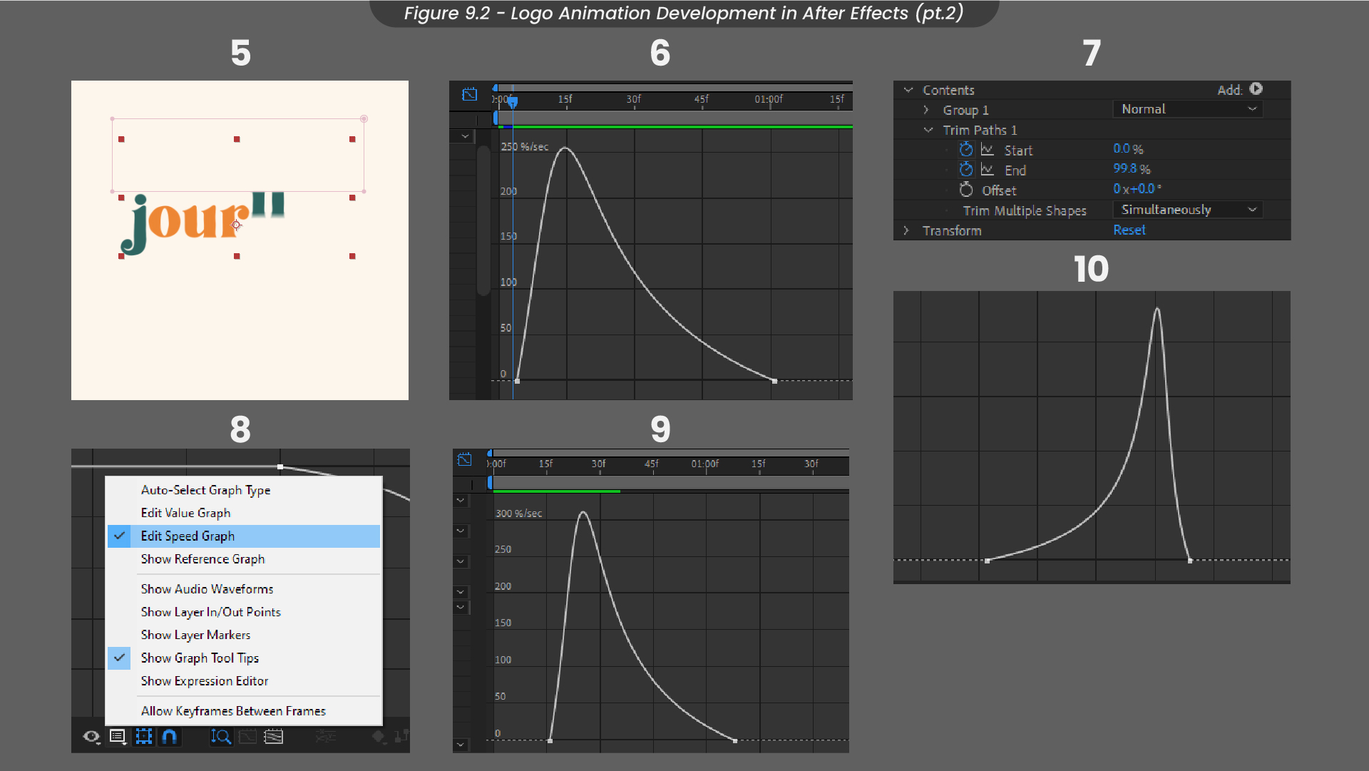
Next, I added a mask just above my text layer, so that the text would disappear when it was above its centre position (Figure 9.2). I adjusted my keyframes for this animation using easy ease and the speed graph, as I find this makes the animation appear much smoother. Once the text was finished, I started working on the road that connects the ‘j’ and the ‘y’. I added trim paths effects and then used offset keyframes to make it look like it was being drawn in. Similar to my text layers, I also used speed graphs and easy ease to keep the animation looking smooth and consistent.
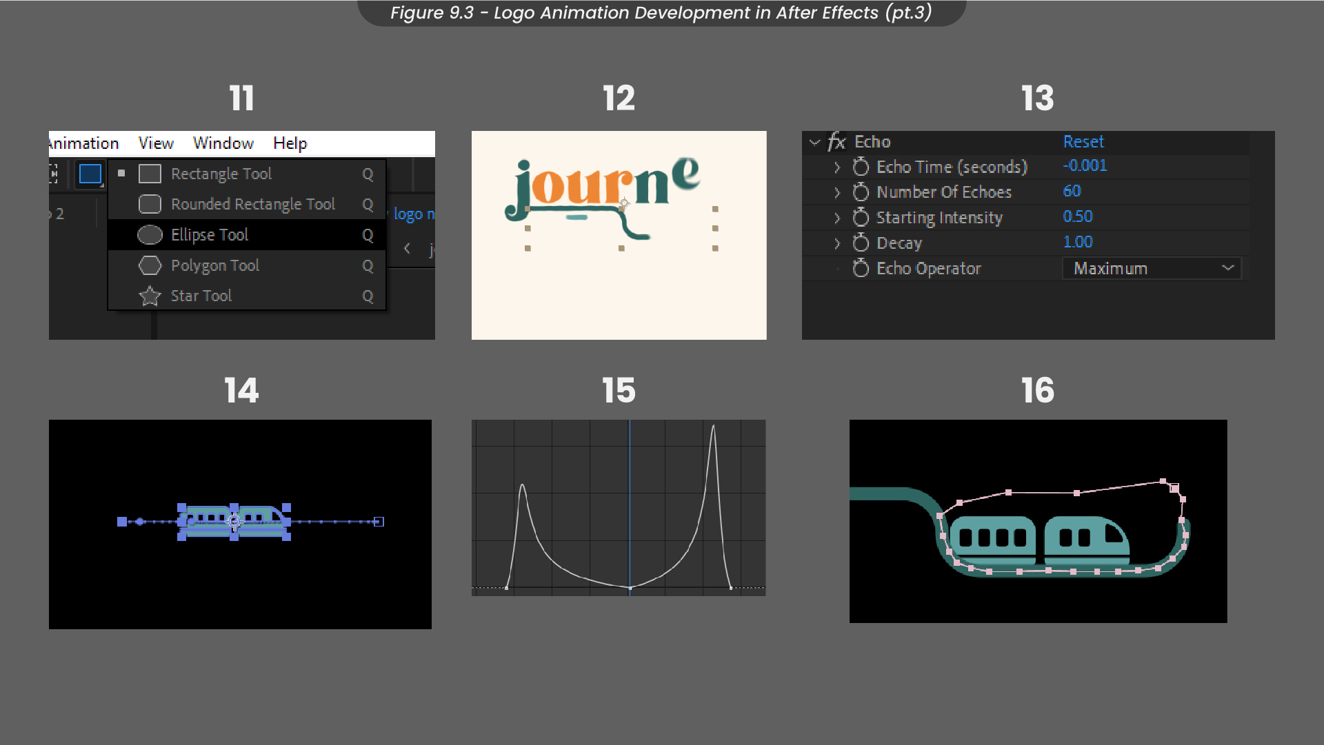
Next, I added some trails to the road using an ellipse shape layer (Figure 9.3). I keyframed the position of this circle to trail slightly behind the line, before adding the echo effect to extend the trail. Next, I animated the train by keyframing its position along the road. Using the speed graph and easy ease again, I edited the graph of these keyframes so that the animation would speed up at the start, slow down in the middle and then speed back up at the end. Since I only wanted the train to appear along the lower part of the track, I added an adjustment layer mask over the train so that it wouldn’t go over the road and would stay within that space only.
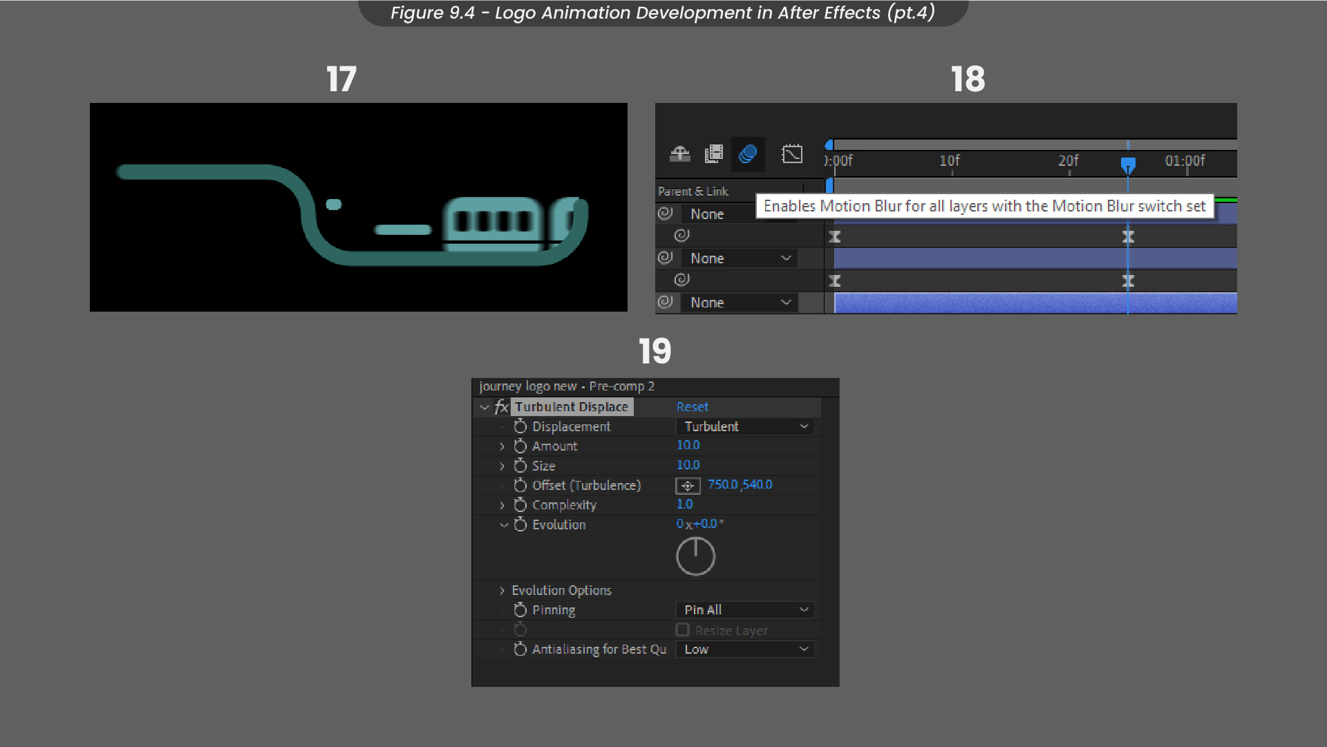
Finally, I scaled down some of those trails from before to trail behind the train as it sped out of the frame (Figure 9.4). To make the animation appear more friendly, I added a displacement map to add a jitter effect. I thought this train and road cycle would make a good loop for loading screens within the app.

10. Logo Animation
After finishing my animation, I exported it with the After Effects built in render queue as a WebM file, so that I could maintain transparency in the background if I was to use it on my application. Above is the finished result.
11. App Sketches
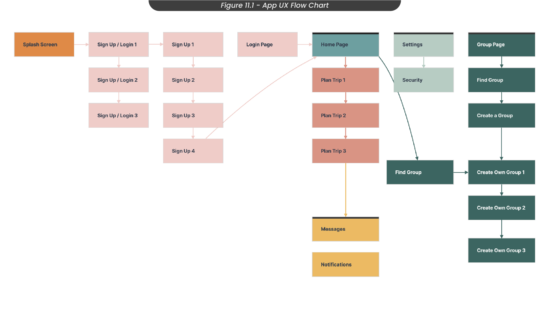
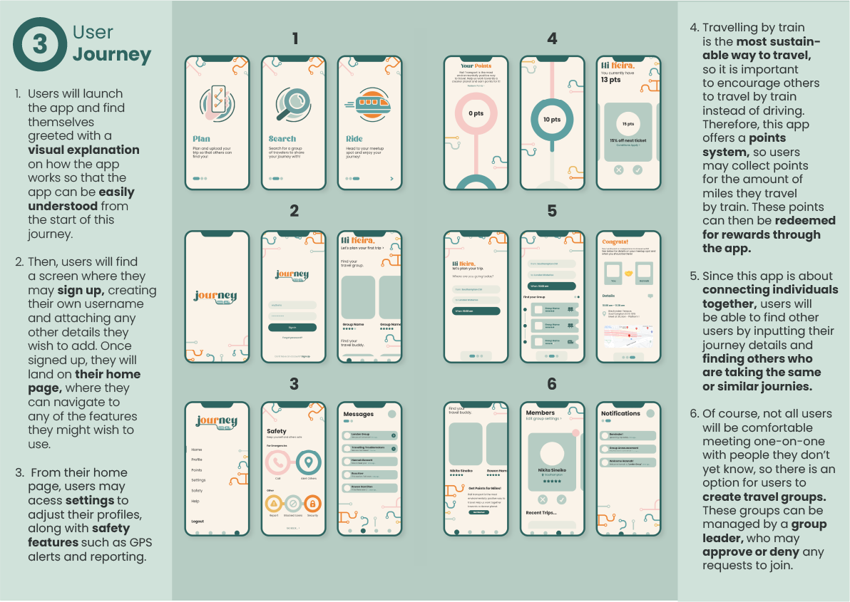
To start designing my app screens, I needed to understand the user journey behind them. Therefore, I created a user journey flow chart in Milanote to visualise how users would use my app and how each screen would link together (Figure 11.1). For example, I knew that users would launch the app to find a signup or login screen, and this would then take them to the home page. From the home page, they would be able to access the plan trip pages and the group pages. I then colour-coded each set of pages so that I could see how many screens I needed to make for each part.
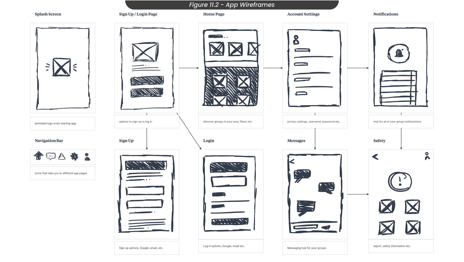
With this user journey in mind, I went on to wireframe my app designs (Figure 11.2). Here is where I was able to establish what information needed to be on each screen without adding any styling or design just yet. This was important, as with UX design, the functionality of the product comes before the aesthetics.
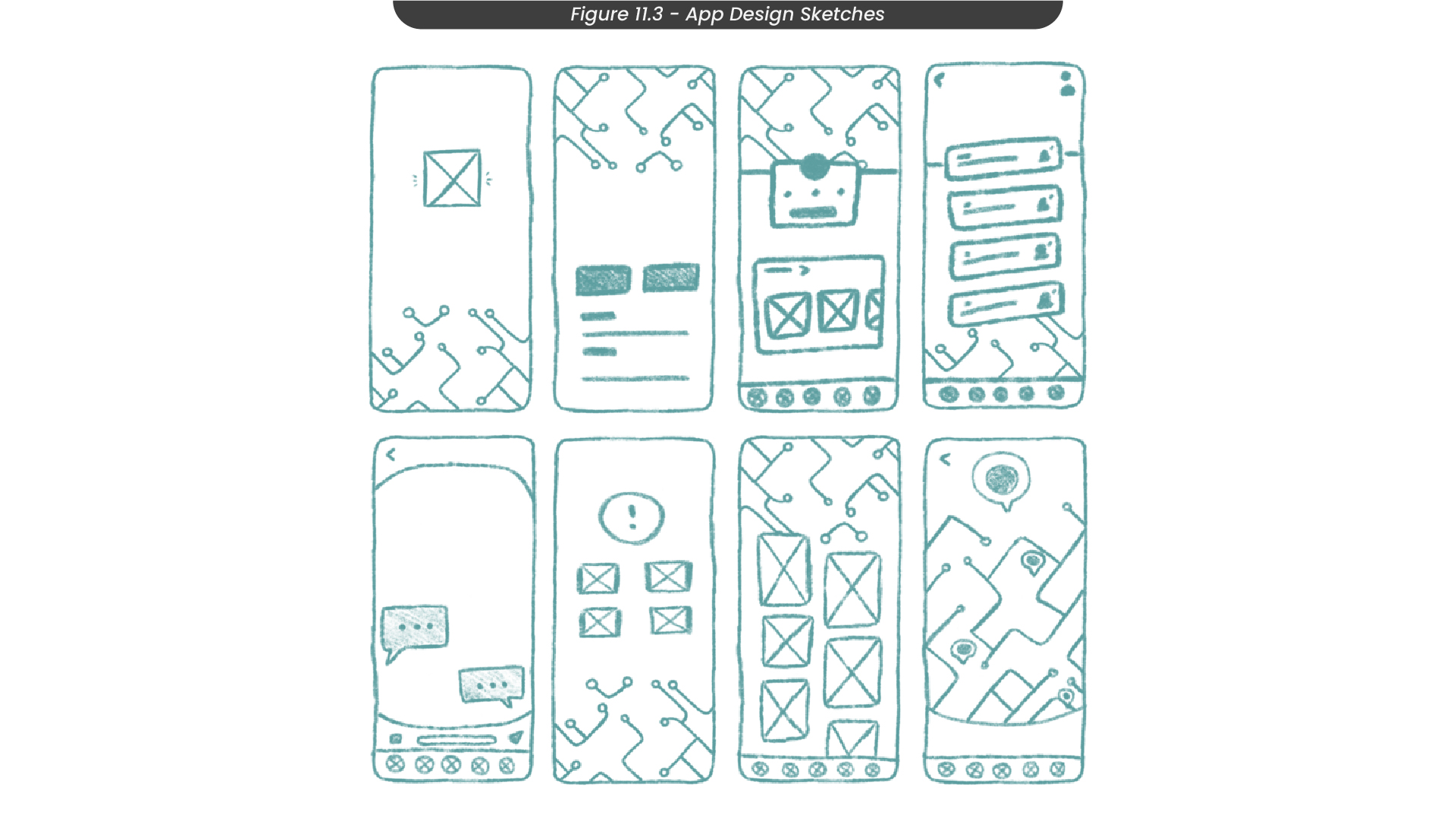
Once I had a strong understanding of how my app would function and flow from one screen to the next, I could move on to sketching some designs (Figure 11.3). I knew I wanted my design style to reflect trains so that users would instantly familiarise it with train travel, so I decided to create some train lines as brand assets, similar to the ones on the London underground map. I also made sure to consider the visual hierarchy and scaling of my content.
12. App Designs
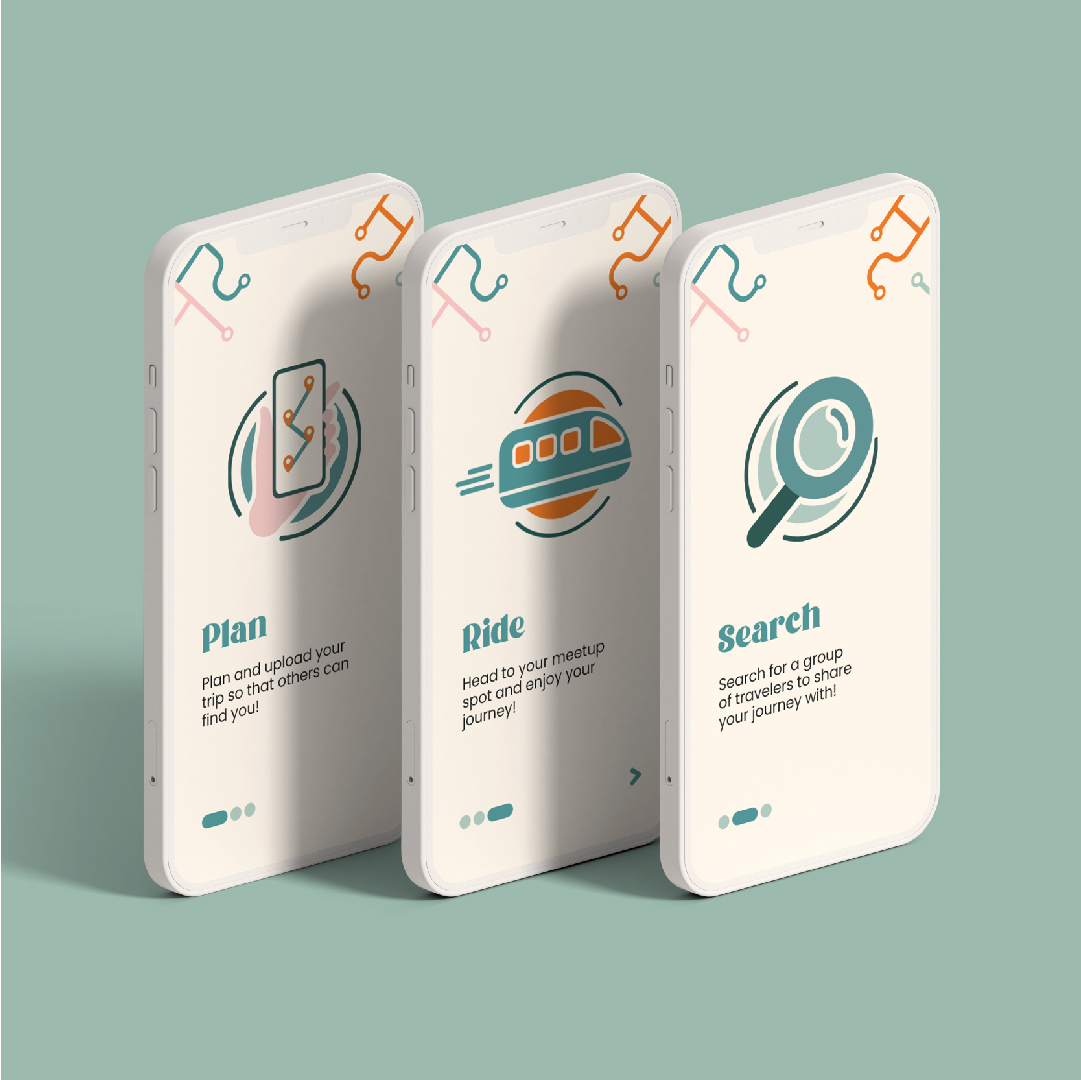
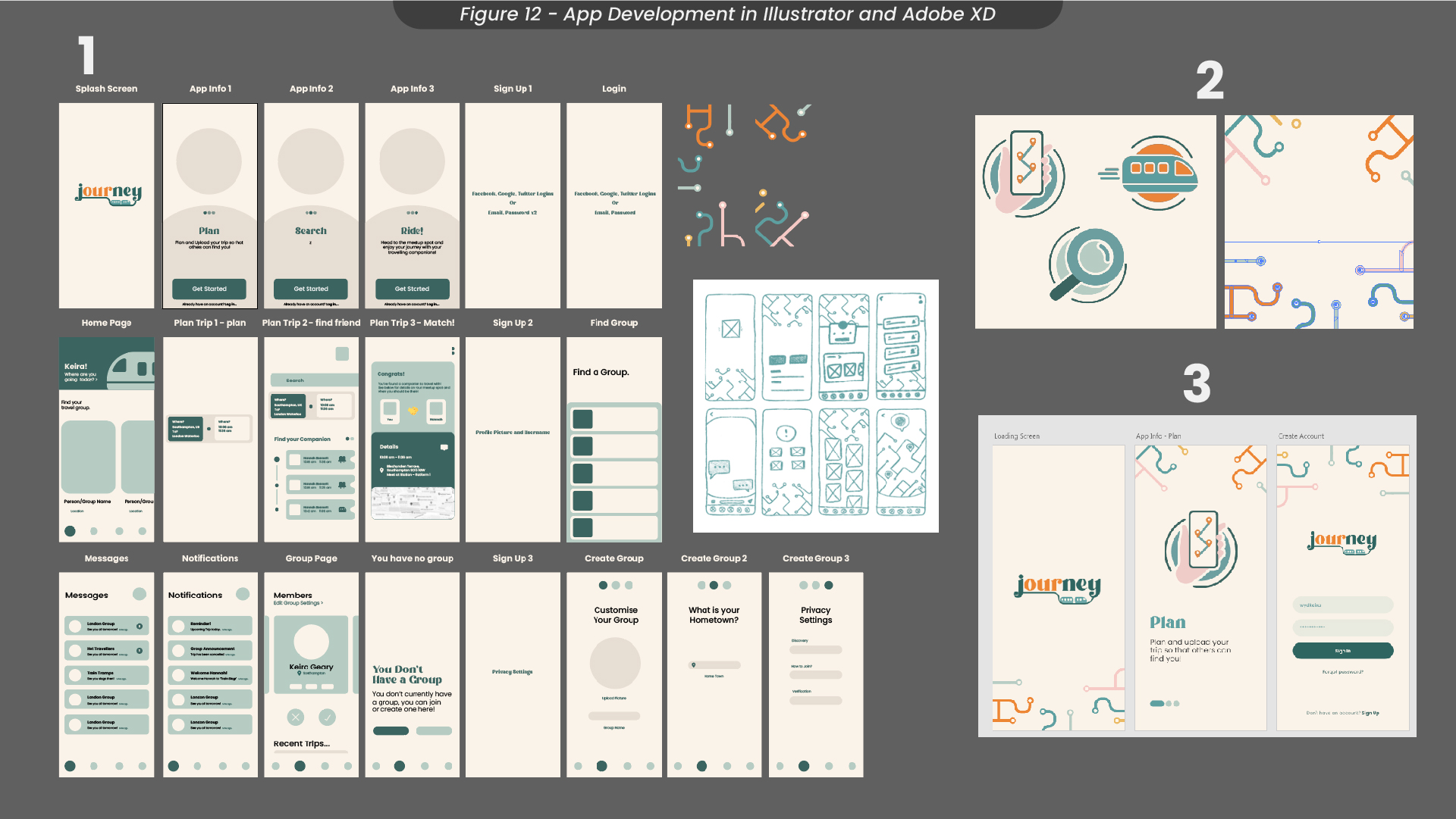
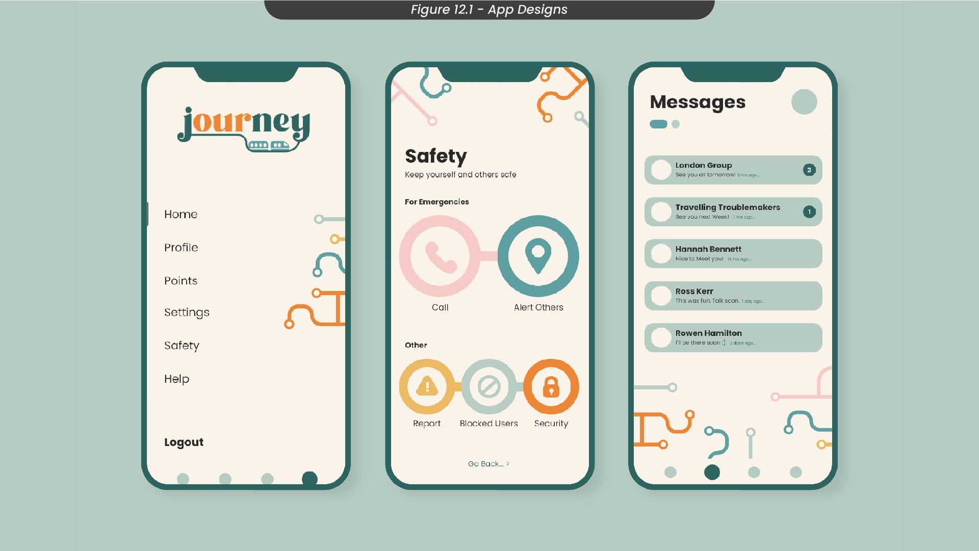
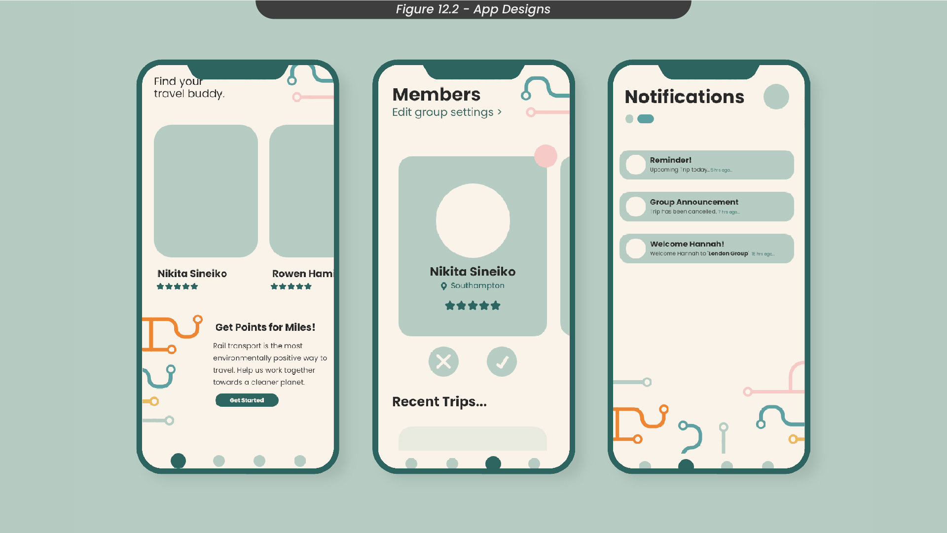
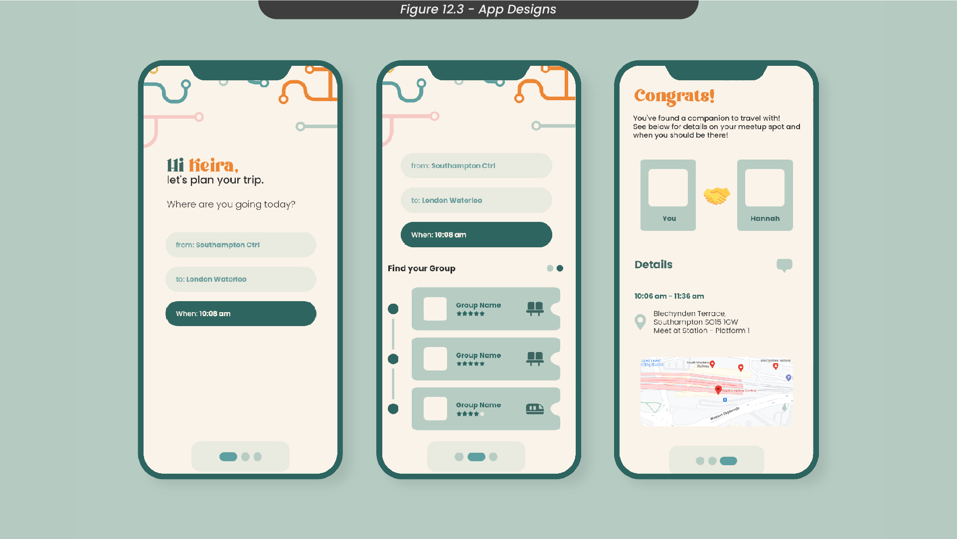
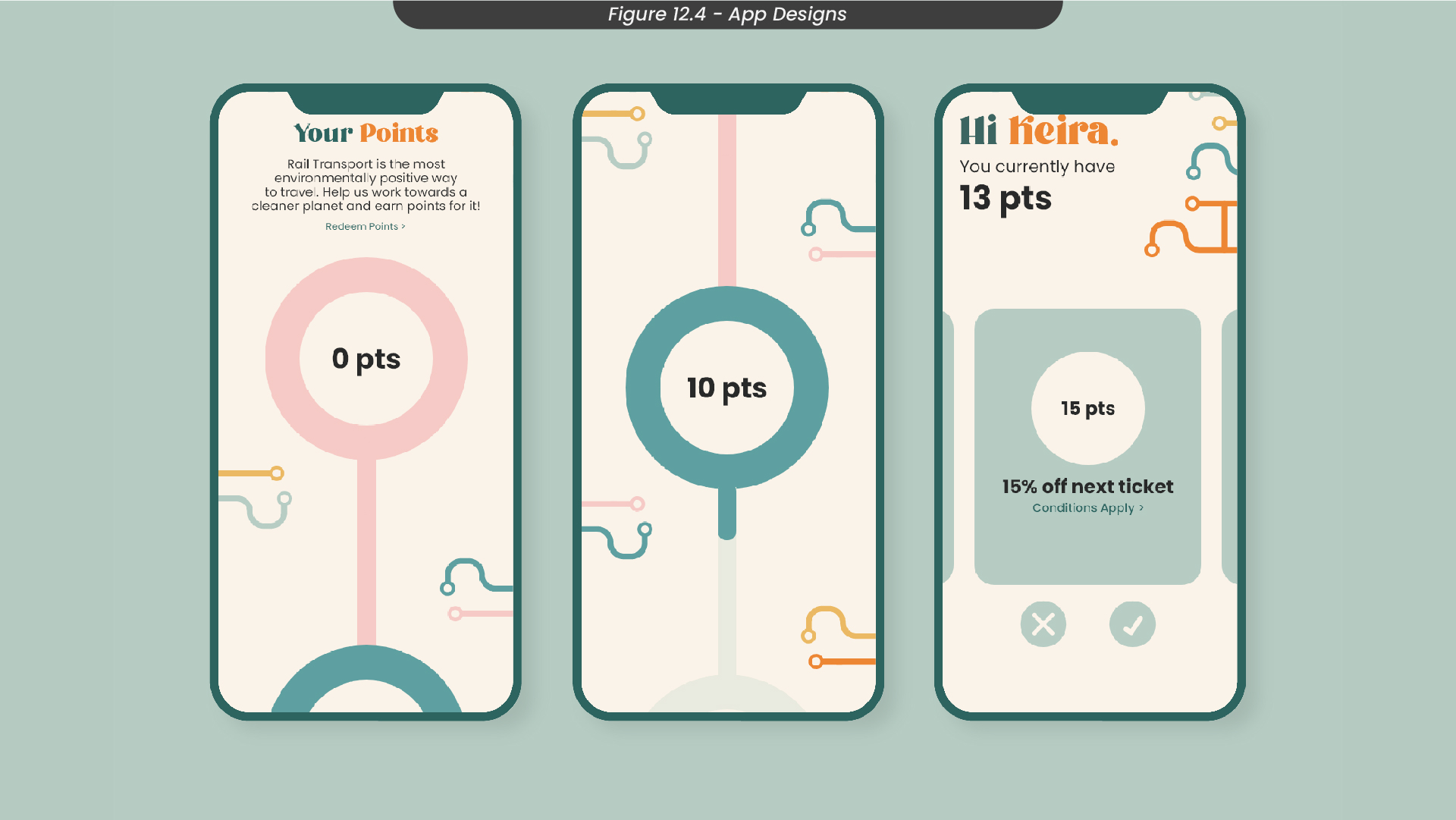
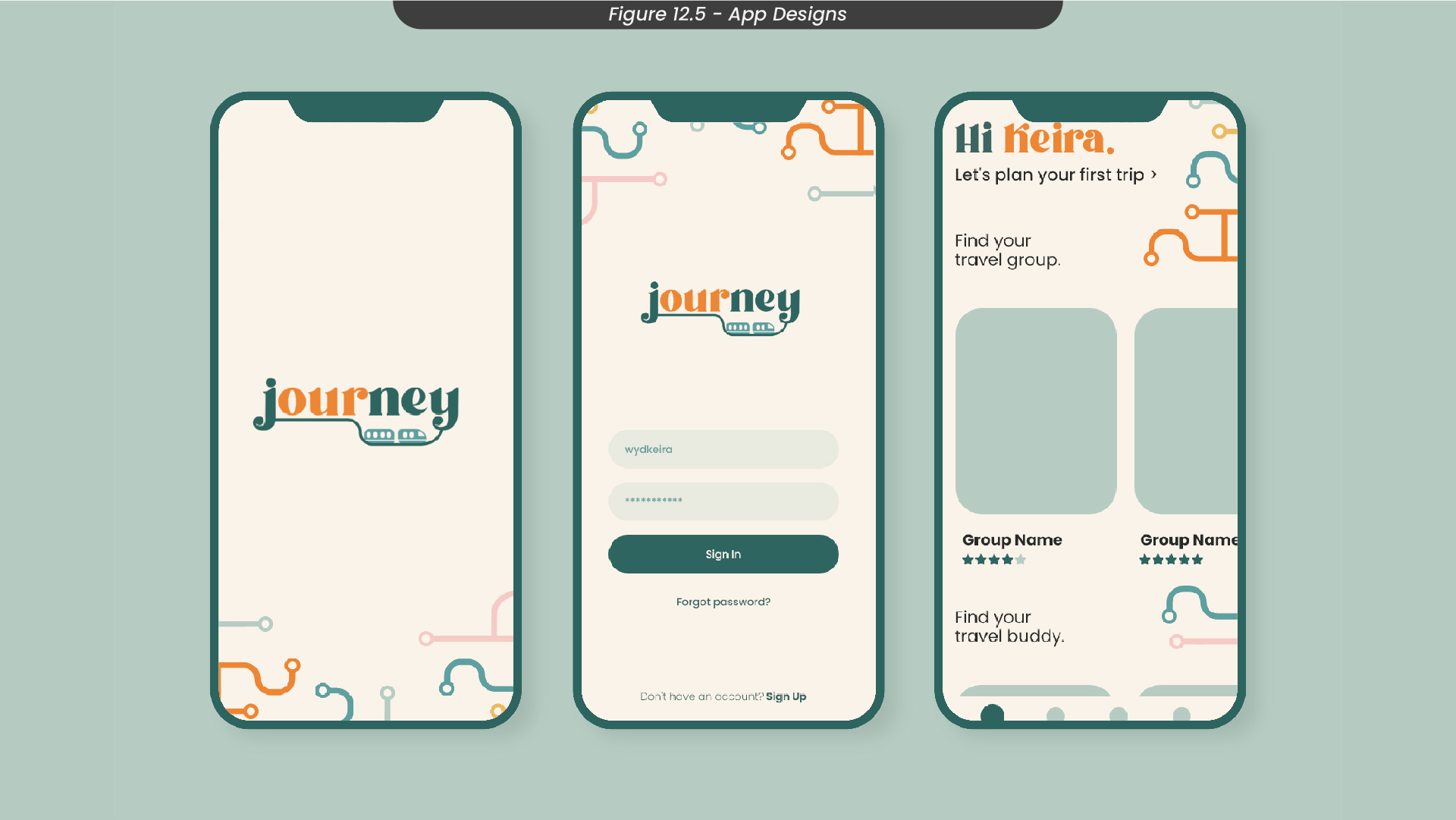
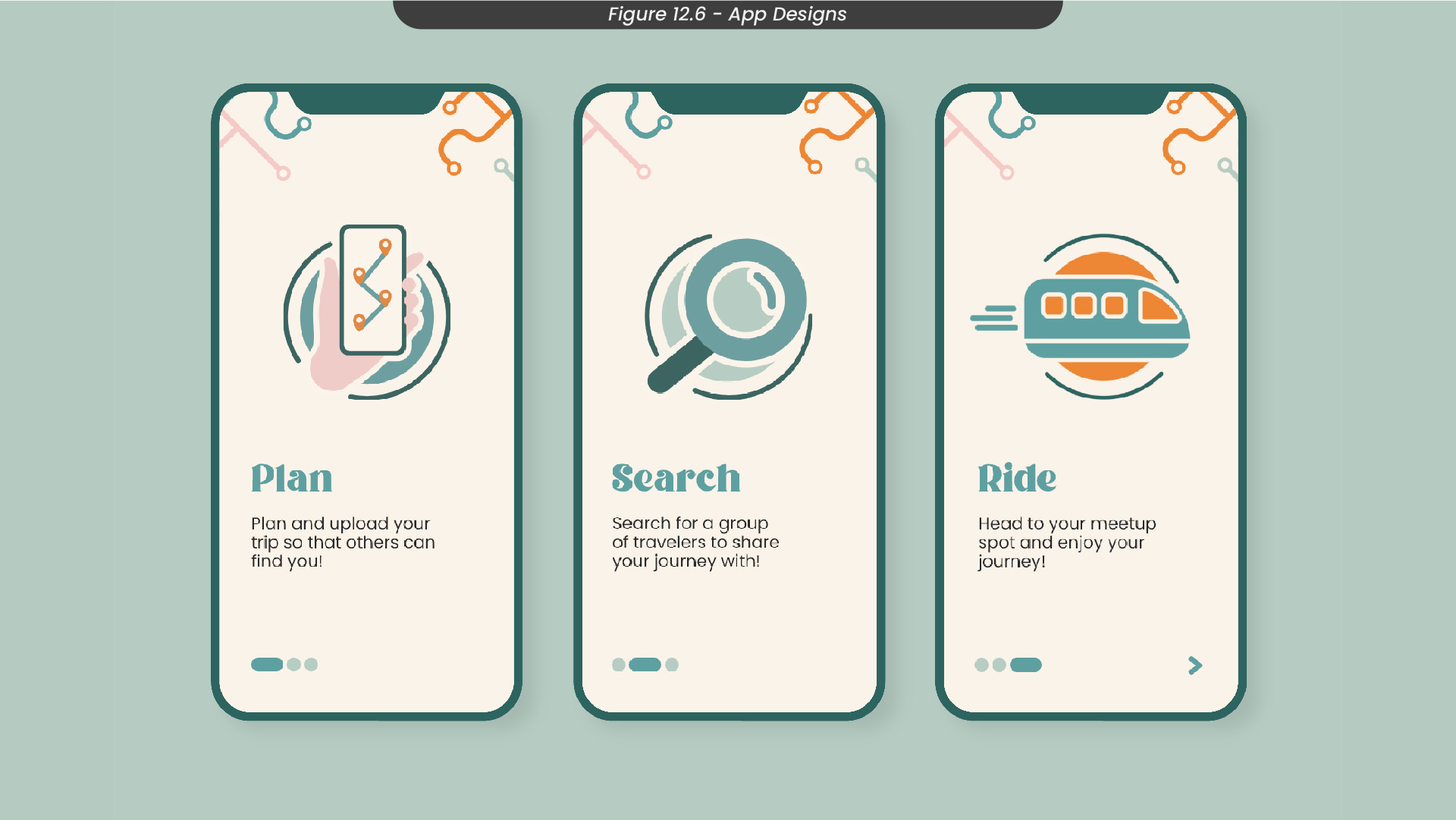
To design my app screens, I started by blocking out the layout of each screen in Illustrator (Figure 12). Here, I didn’t add too much content or colour, as I knew I would need to add these parts in Adobe XD so that I could prototype each element individually. If I did everything in Illustrator, the transitions between each screen in my prototype would just fade or cut, there wouldn’t be any dynamic animations. I then illustrated some icons to use for the welcome pages, to help visualise how the app works. I also created my train line assets also in Illustrator, so I could just copy and paste them when I needed to. Finally, I created all of my screens in Adobe XD, making sure to group each set of elements to prototype efficiently later on.
Figure 12.1 - Settings page, safety features, messages page
Figure 12.2 - Travel buddy explore page, group settings page, notifications page
Figure 12.3 - Plan your trip step by step pages
Figure 12.4 - Point system pages
Figure 12.5 - Splash screen, sign in page, home page
Figure 12.6 - Welcome instruction pages
13. App Mockups
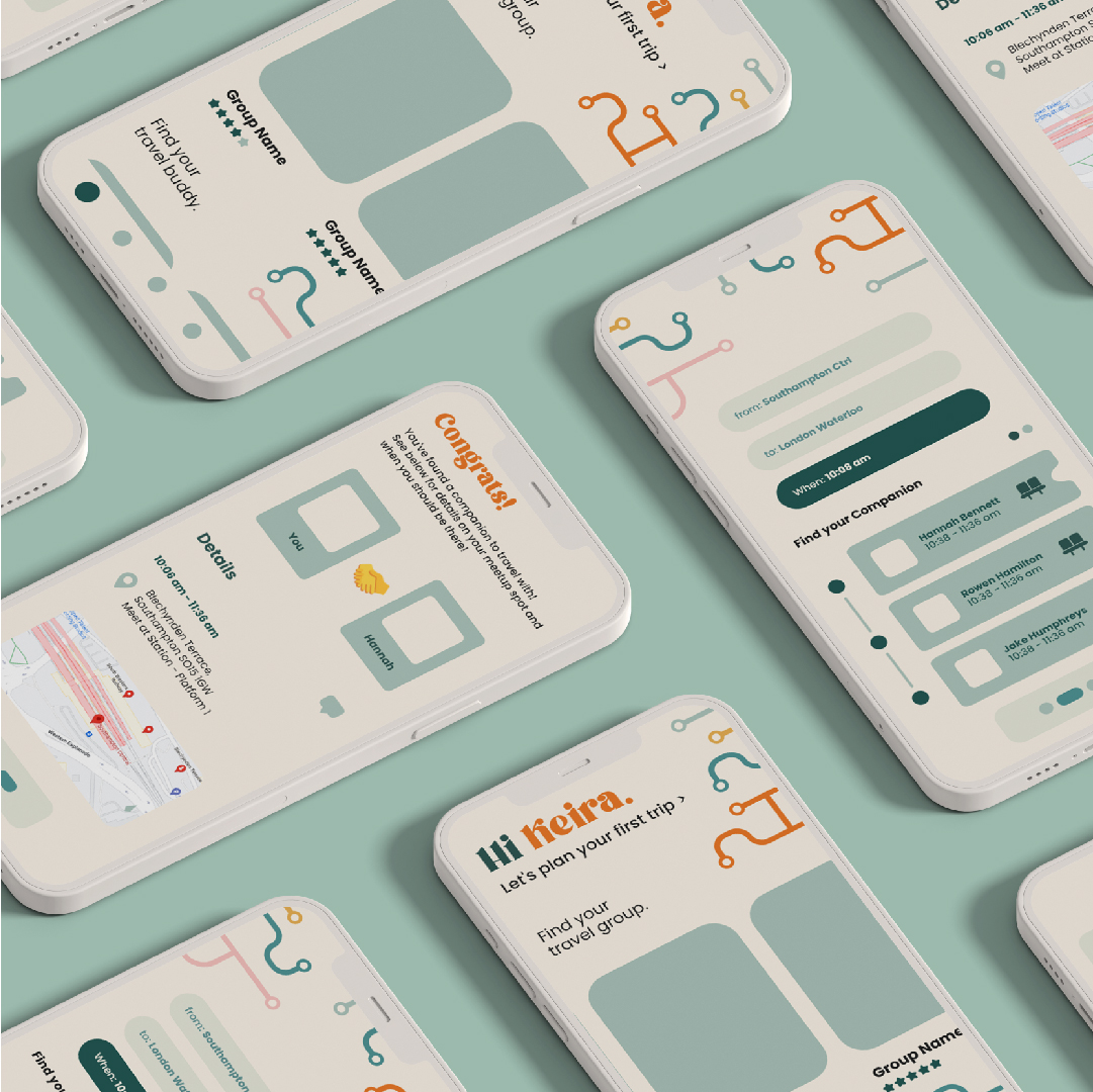
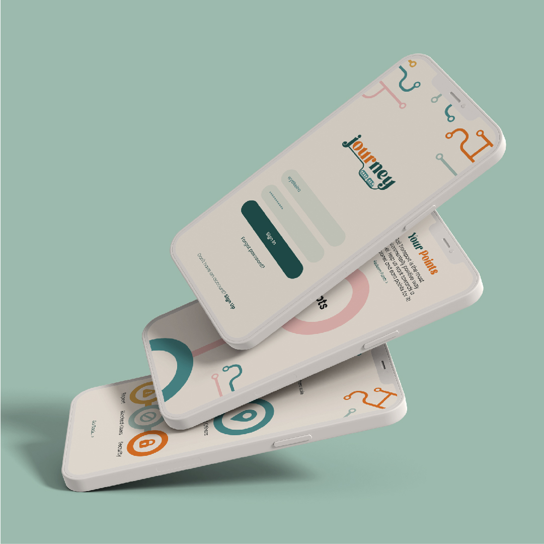
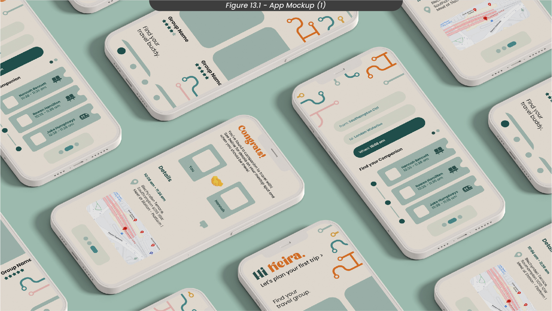
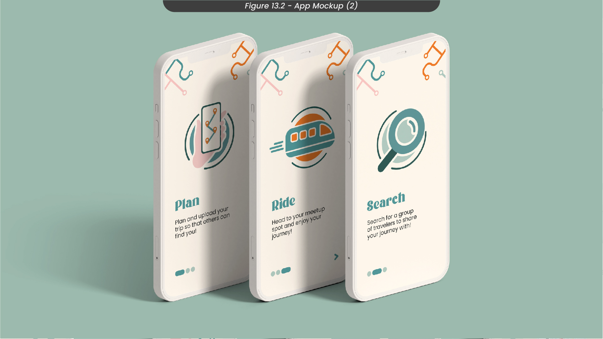
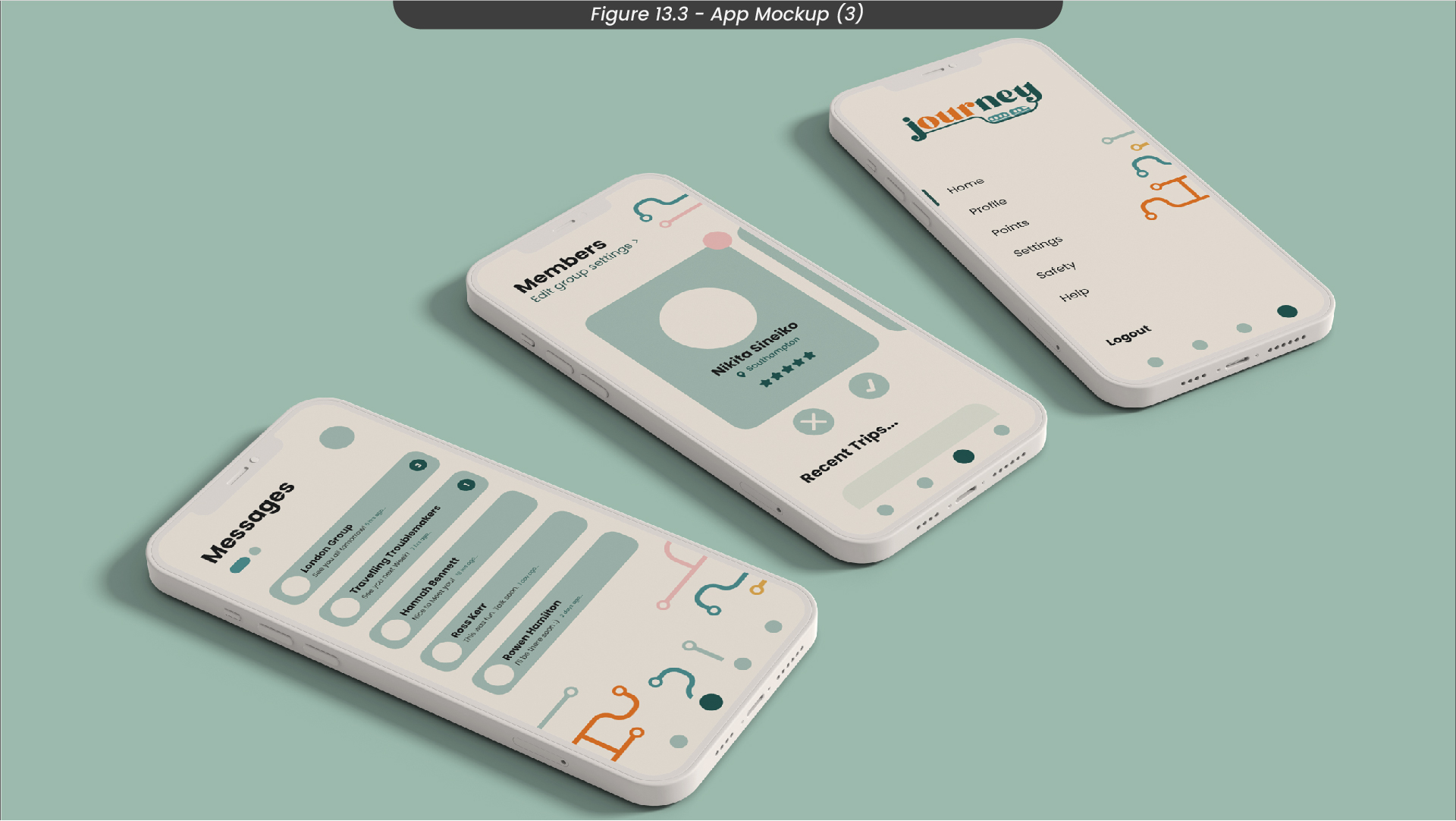
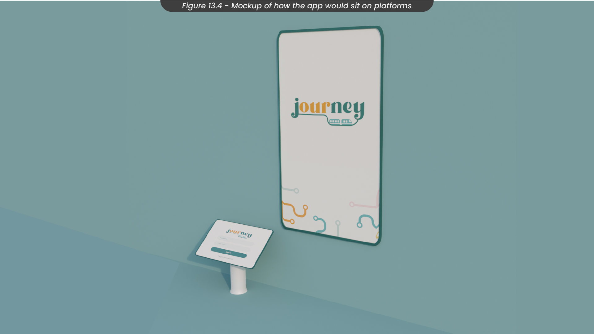
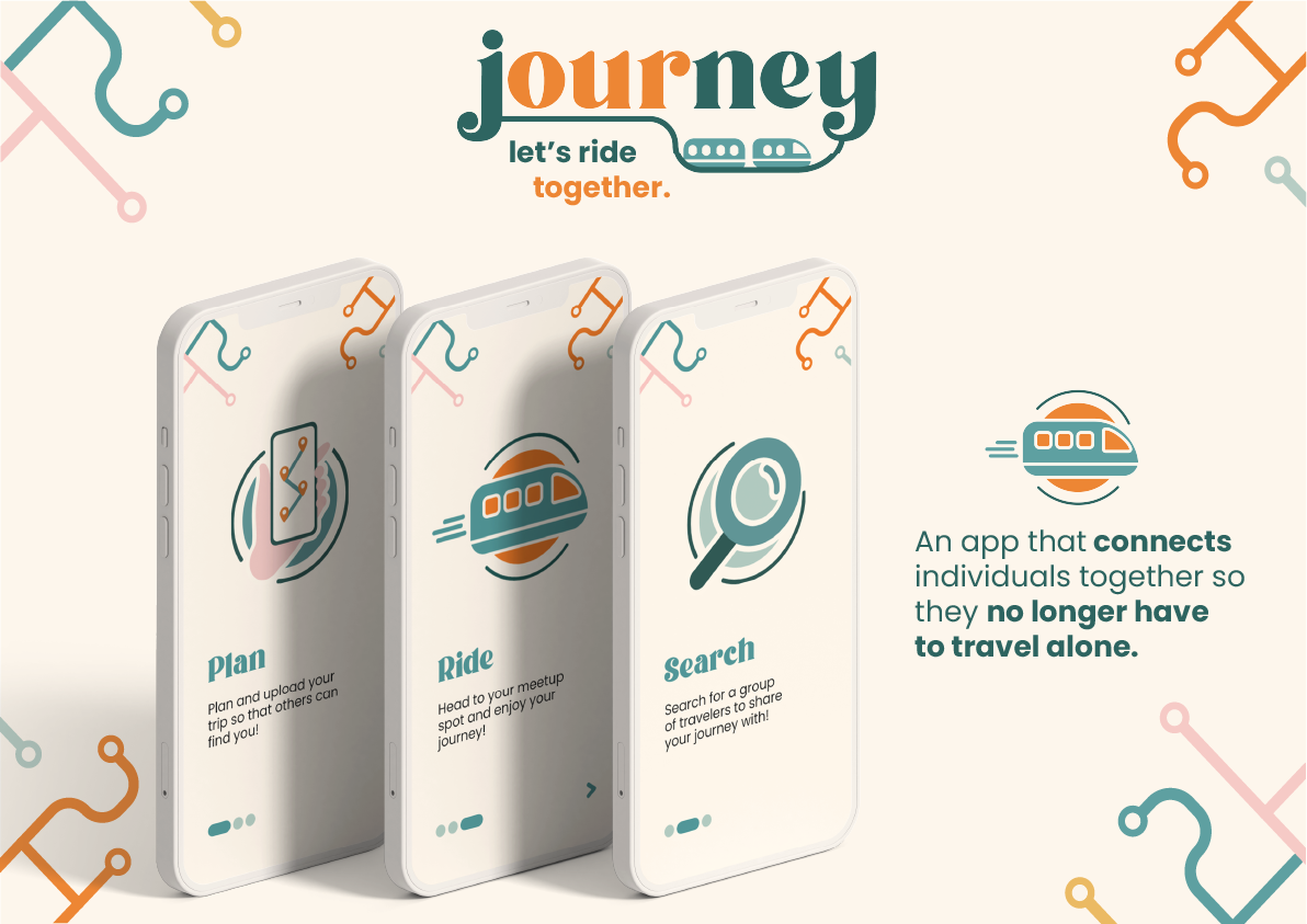
To showcase how these app screens would look on a mobile phone, I created some mockups in Photoshop (Figure 13.1-3). I also worked with a 3D student from the third year to create a simple mockup of how the app would look on a train platform (Figure 13.4).
14. App Prototype Development
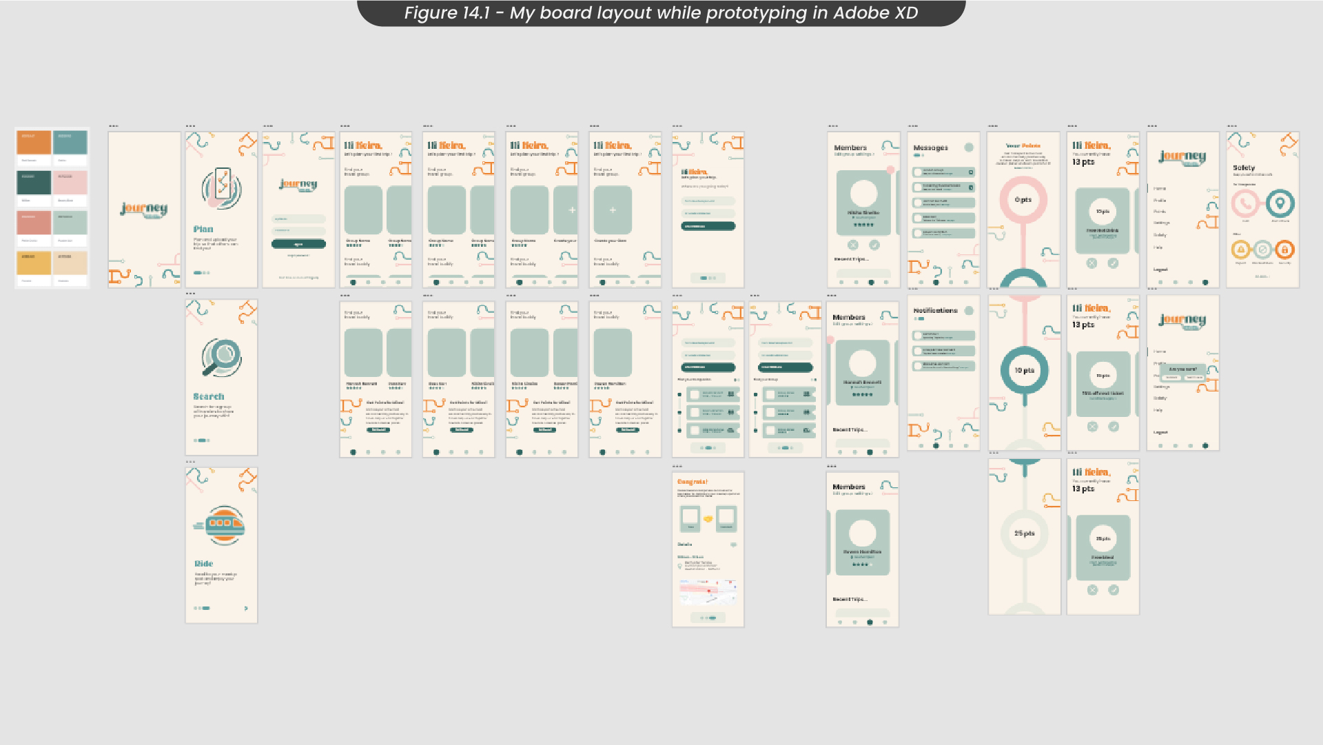
After designing my app screens in Illustrator and Adobe XD, I moved on to create a working prototype. To make this process easier, I grouped all of my screens by type and kept my board layout organised (Figure 14.1).
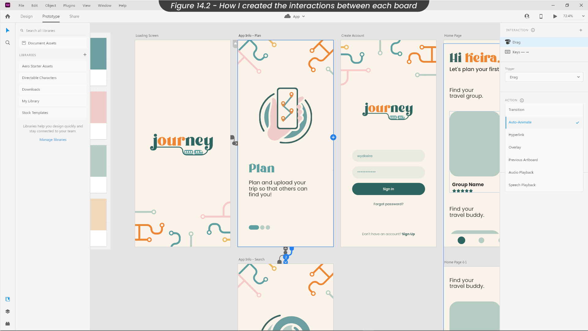
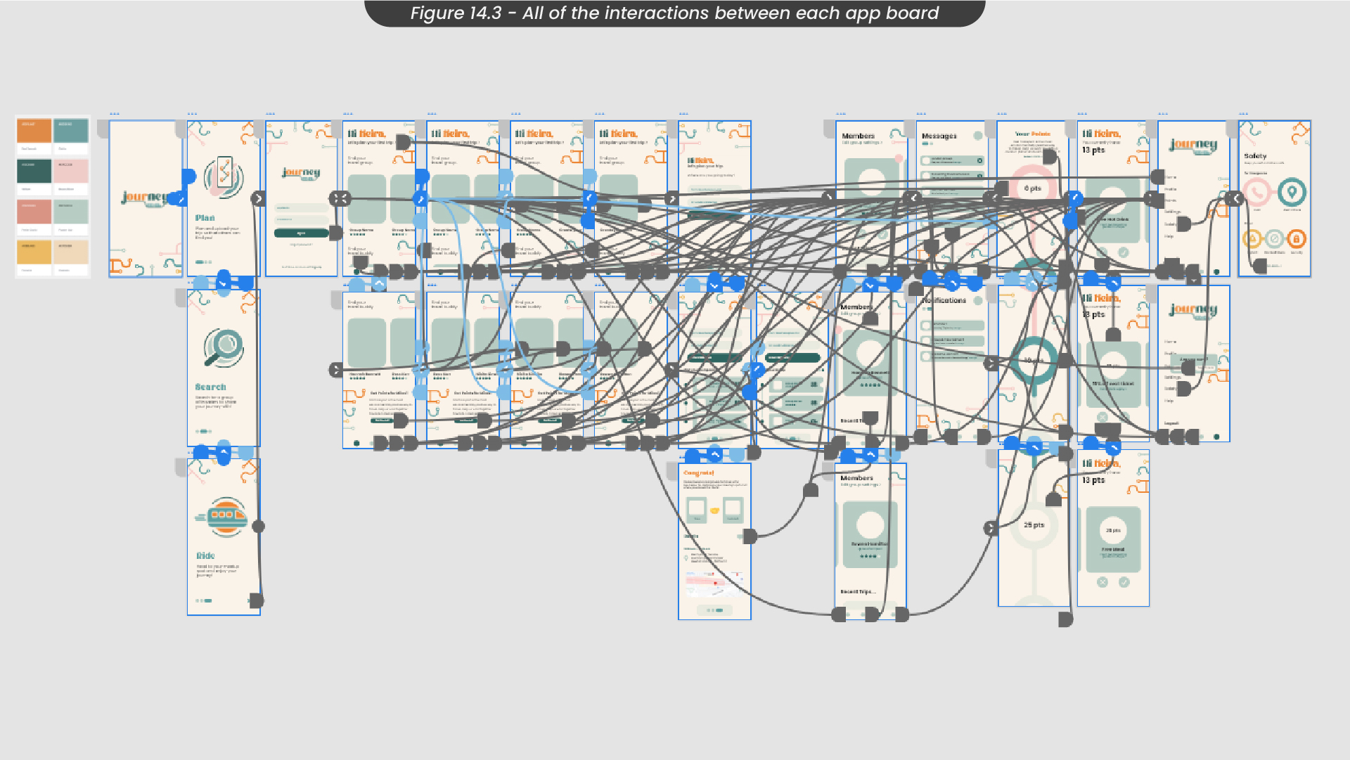
To allow for each button or element to be interacted with, I added connectors between each screen, and created an interaction for touch, keyboard and mouse controls (Figure 14.2). I ensured the action for most of my transitions was auto-animate, and that the transition time was around 0.3 seconds. Therefore, the transitions felt smooth and realistic, as if you were using a real application on your phone. By the end of this process, my prototype board was very messy, as there were a lot of interactions connecting all of the screens (Figure 14.3)!
15. Prototype Demo
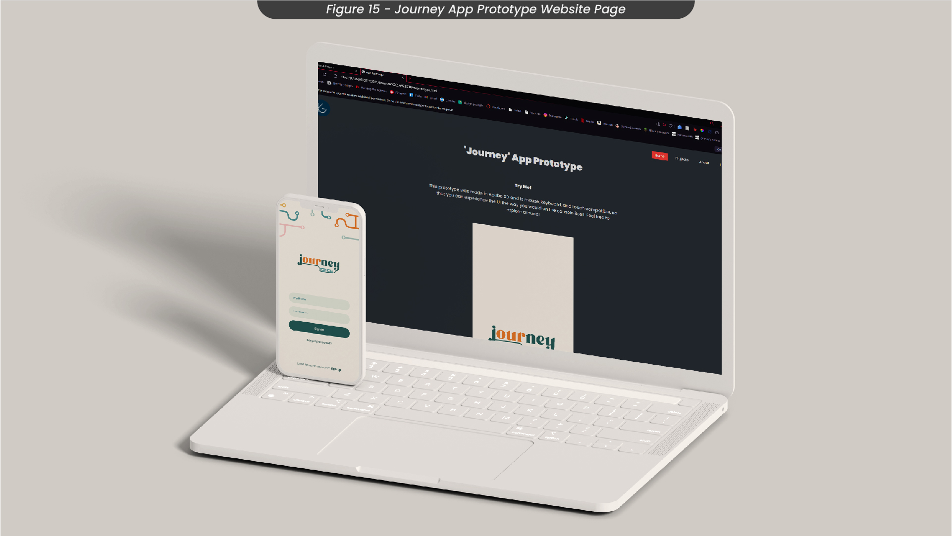
To see a live version of the Adobe XD prototype for my app ‘Journey’, see here. This prototype supports mouse controls, touch controls and keyboard controls.
16. Conclusions
Overall, I am happy with my progress in this project and think it was successful in relating to the brief I had chosen, as well as improving my knowledge of UI and app design. For example, over the course of this project, I learnt a lot about the importance of layout and visual hierarchy in UI design. This will be very useful to me going forward, as I am now able to work with apps and prototyping more efficiently as I know the steps I need to take to produce a successful project. This project also taught me some valuable lessons about research and how important research is to aiding design. To give an example, I found a lot of research about positive solitude which informed me that a lot of people do value their own time and I would need to create other features on the app for it to have wide usage.
This project succeeded in targeting the United Nations' sustainable goal 3 - ‘Good Health and Wellbeing’, which was one of the brief requirements, as it targeted the mental well-being of individuals who have suffered from a lack of socialisation due to the pandemic. Encouraging people to communicate and spend time with one another, as well as meeting new people often in their lives helps improve mental well-being, as found out during my research stage. The effect covid-19 had on society is detailed greatly in the UN sustainability goal, so it was important I took this into account during my project.
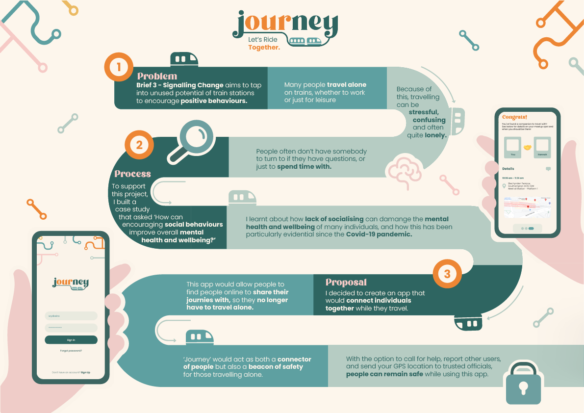
If I were to submit this project to the RSA student awards, I would improve it by displaying my research more effectively, as there was a lot of thought behind this project. I would also add an A3 board, as these boards were part of the RSA submission guidelines, that details the social and environmental impact this project has, so that this project's innovative approach to the weaknesses in society, particularly train stations, is more evident to the judging panel. Download my A3 RSA boards here.
