1. Introduction to Placement and Job Roles
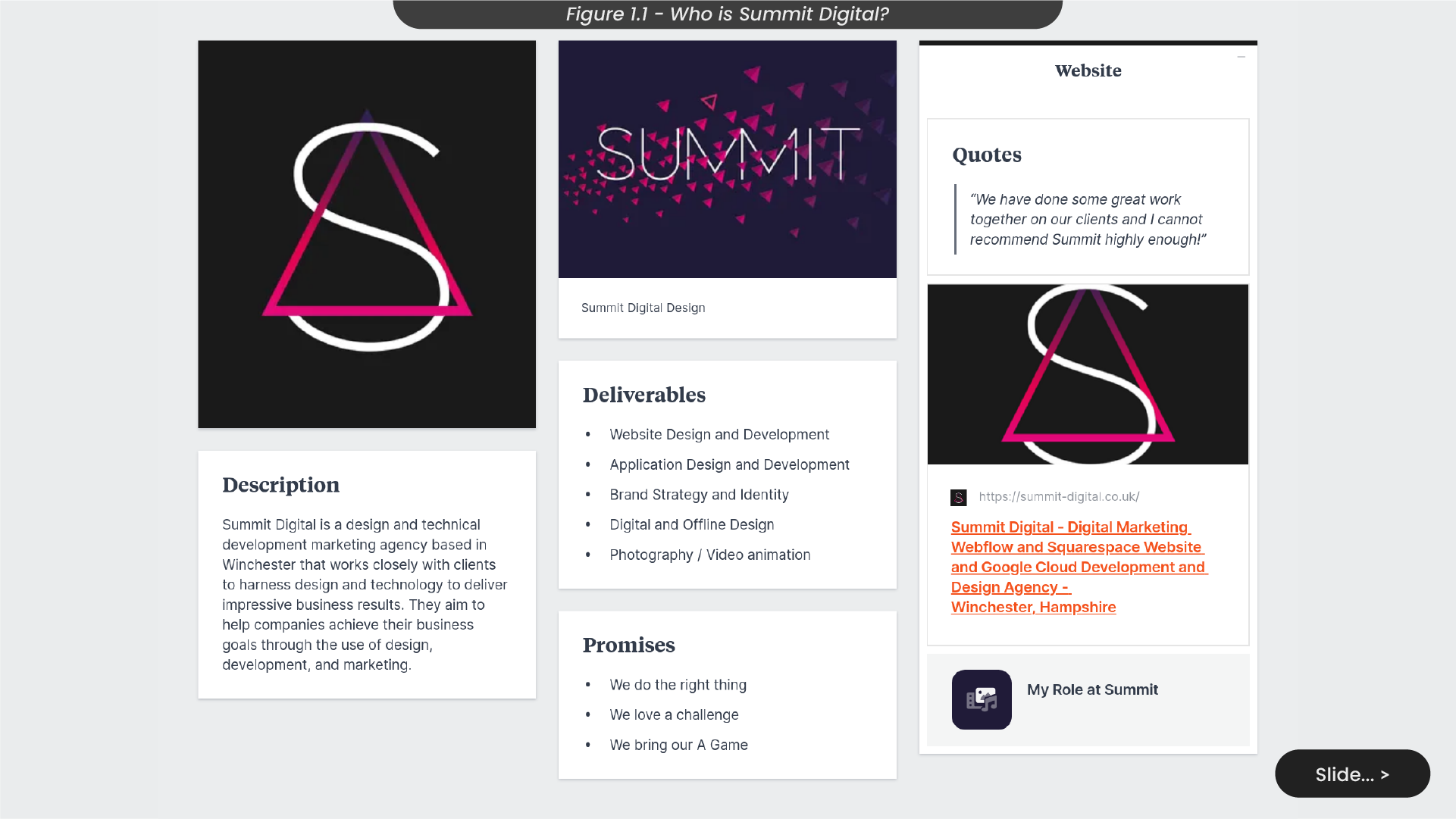
In my first semester of the concluding year at the University of Winchester, I’ll be on a design placement with Summit Digital, a leading marketing agency in Winchester (Figure 1.1). Specialising in design and technical development, Summit Digital collaborates actively with clients to achieve their business objectives. Within this dynamic environment, I’ll work alongside a professional team known for crafting compelling content and innovative strategies, covering website and application design, digital and physical design, and engaging photography and video animations.
Summit Digital stands out for its commitment to its core values: doing the right thing, embracing challenges, and always bringing their A-game. Excited to be a part of this vibrant team, I aim to gain valuable insights and experiences during my placement.
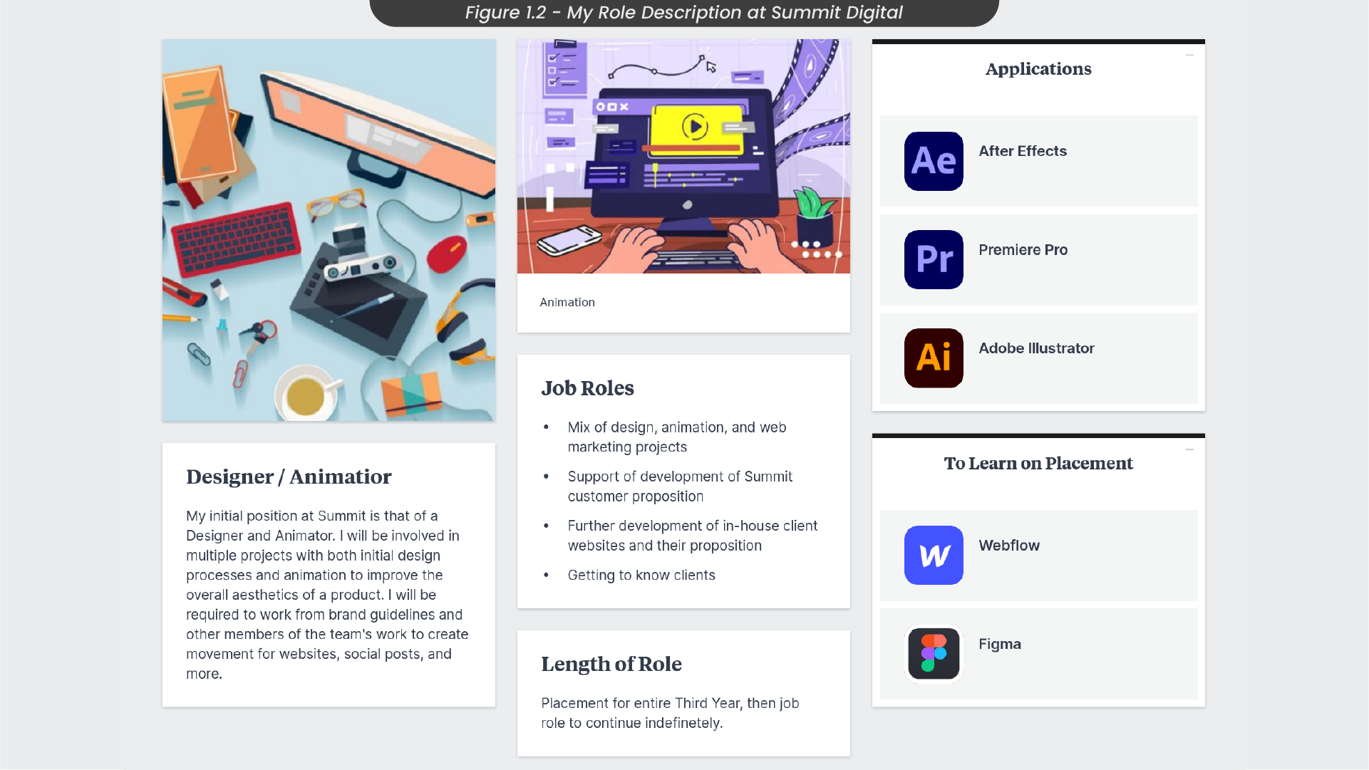
During my placement at Summit Digital, I will fulfill roles as a Designer and Animator contributing to projects, enhancing websites and social posts with animated elements (Figure 1.2). I’ll use tools like After Effects and Adobe Illustrator, while also exploring Figma and Webflow to broaden my skill set. This immersive experience, spanning my entire third year at University, is a stepping stone towards a potential full-time role post-graduation.
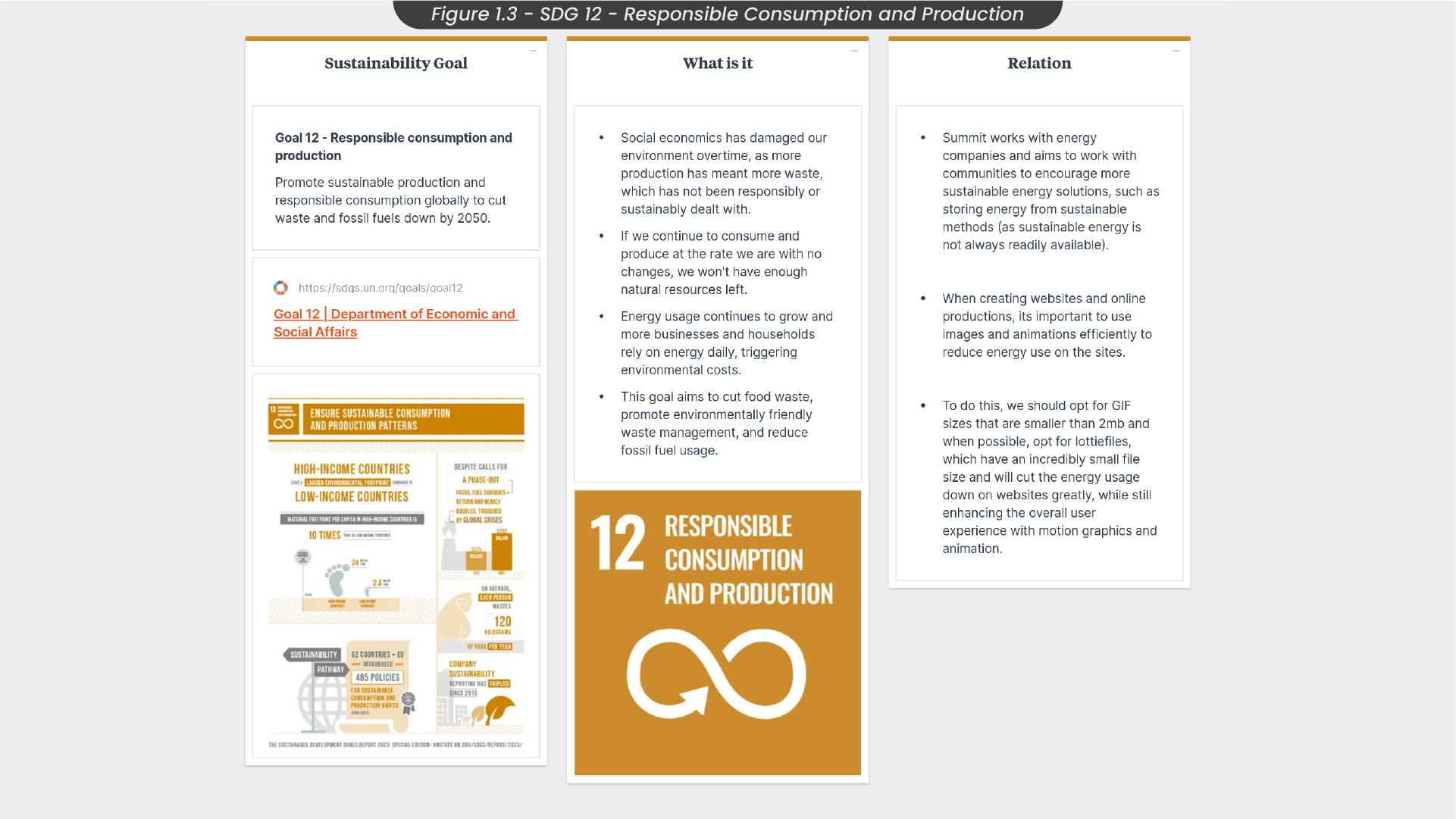
During my placement, I will be mindful of UN sustainable Development Goal 12 (SDG 12), emphasising responsible consumption and production (Figure 1.3). This goal targets global sustainability, aiming to reduce waste and fossil fuel consumption by 2050. Recognising the environmental impact of unchecked production, I will engage with Summit’s energy clients, who promote sustainable energy solutions within communities.
Considering the environmental costs associated with energy usage, I will attempt to be mindful of efficient practices in website and online production. This involves opting for smaller-sized GIFs (below 2mb) and prioritising lottiefiles when possible, significantly reducing energy consumption on websites, as lottiefiles are often incredibly small file sizes (under 100kb).
2. Personal Goals and Quarterly Rocks
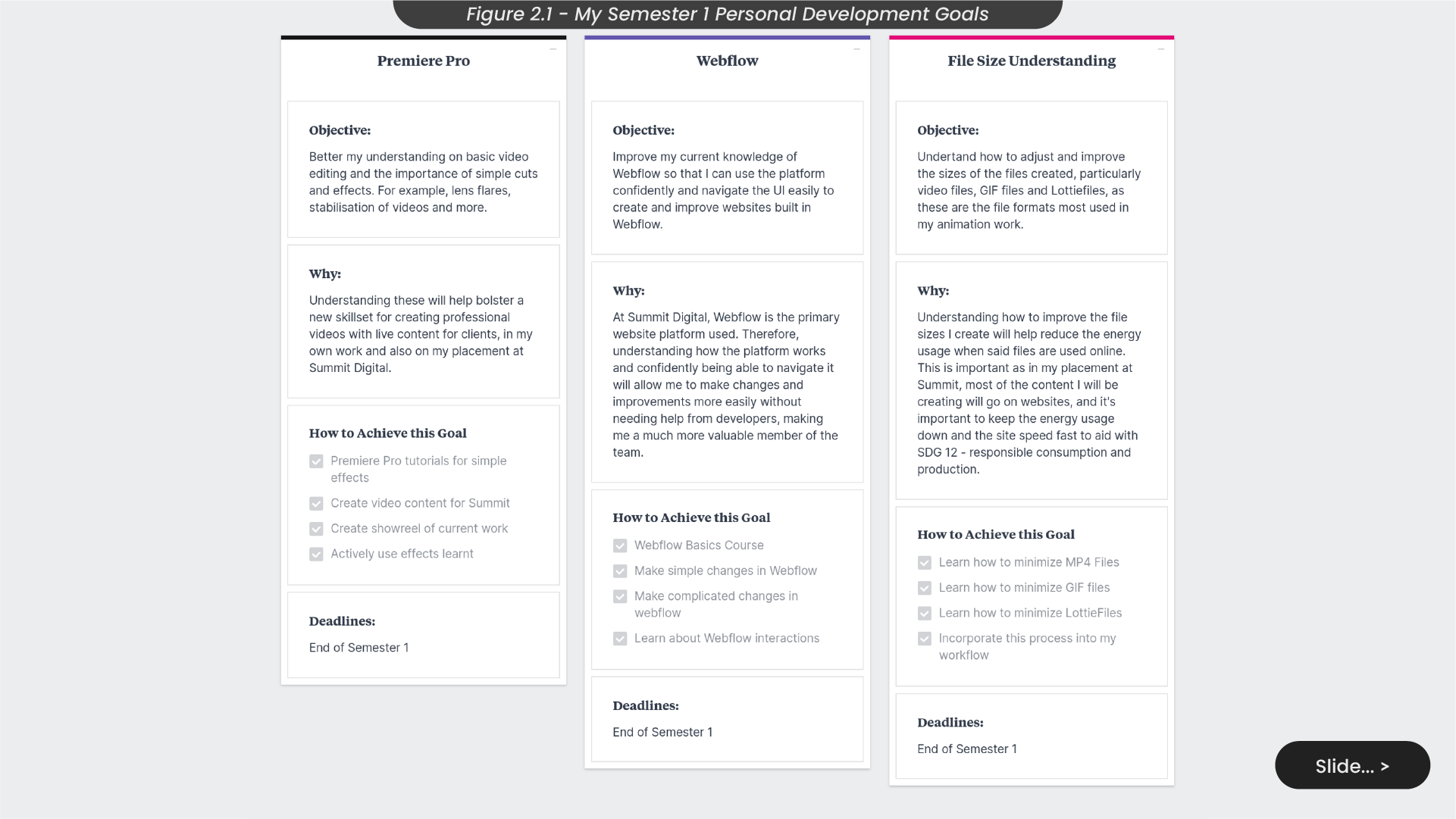
This semester, I’m focused on enhancing my skills in Premiere Pro, Webflow, and file size optimisation (Figure 2.1). I’ll achieve this by engaging in tutorials and applying effects learnt in Summit Premiere Pro projects. Additionally, I aim to participate in a Webflow basics course, contribute to Summit’s Webflow projects, and learn about Webflow interactions. To understand file sizes better, I’ll work on minimising MP4, GIF and Lottiefiles and integrate these practices into my workflow. These goals aim to elevate my proficiency and contribute effectively to Summit Digital projects as well as personal projects going forward.
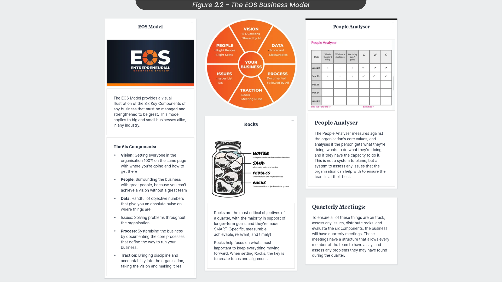
Summit Digital adheres to the EOS business model, emphasising key components for business success (Figure 2.2). Quarterly meetings are important, serving as checkpoints throughout the year for aligning with the business vision, addressing issues within the organisation, and tracking progress on individual ‘rocks’. These rocks represent larger tasks allocated to the team at the beginning of a quarter, encouraging concentrated efforts on these significant objectives throughout the entire quarter.
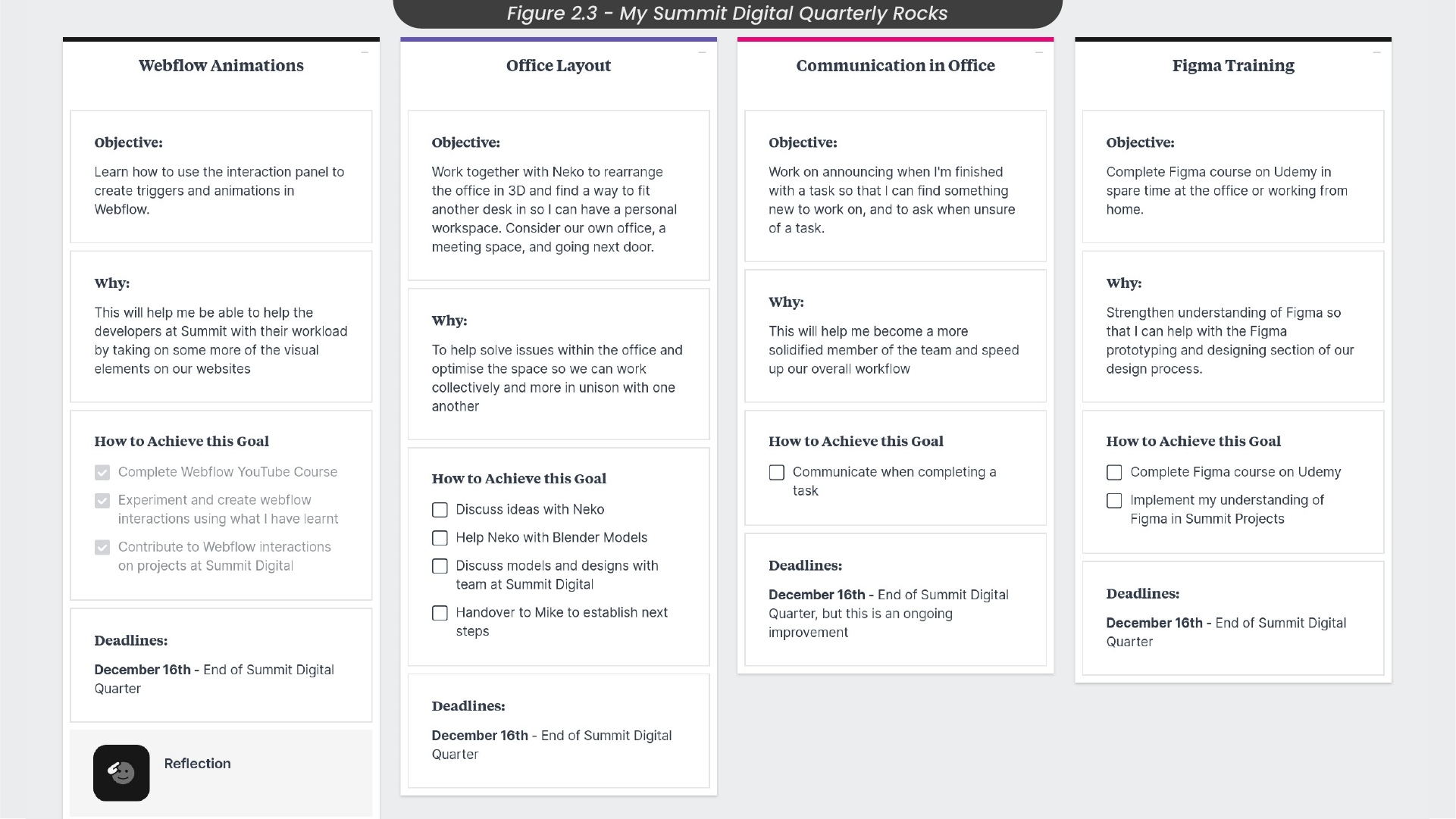
During this quarter, my assigned individual rocks encompass learning Webflow interactions, collaborating with a 3D designer on a new layout for our office, enhancing my communication with the team, and completing Figma training on Udemy (Figure 2.3). To achieve proficiency in Webflow interactions, I plan to complete the Webflow Youtube course on interactions and actively contribute to Webflow projects at Summit Digital. For the Office layout, I’ll engage in discussions with our 3D designer, assist in creating 3D models and collaborate with the Summit team for their thoughts. Improving communication involves seeking clarification when uncertain about tasks and communicating when I have completed a task, handing off to the next person. Lastly, for Figma training, I aim to complete the assigned course and apply my newfound understanding in Figma Summit projects.
3. Time Management
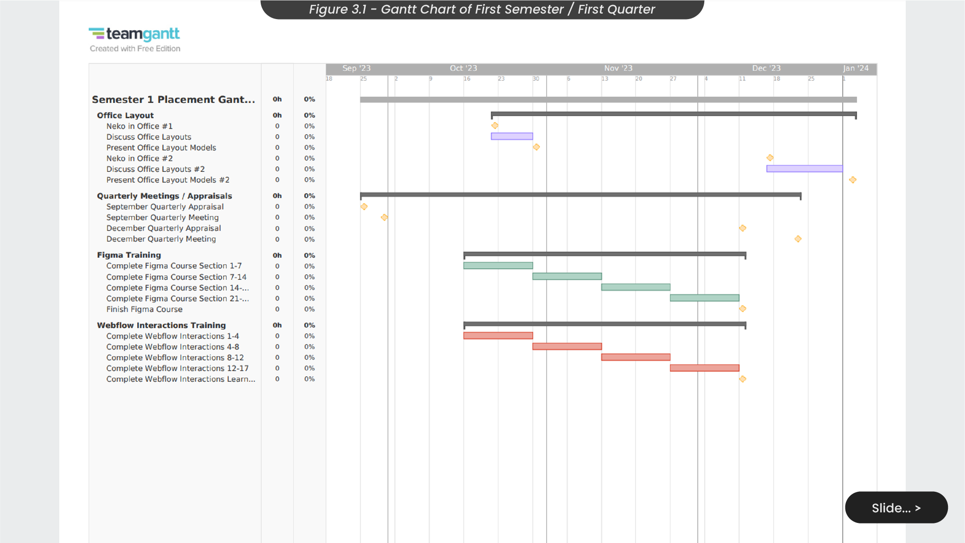
In the first semester/quarter, I employed a Gantt chart to manage time (Figure 3.1). However, it’s worth noting that my weekly projects are unpredictable, so this Gantt chart is tailored exclusively around personal goals and quarterly rocks. This chart included essential dates like quarterly meetings and appraisals. To maintain training progress from October to November, I allocated two-week blocks to work on a dedicated amount of sections in my Figma and Webflow training. Noteworthy dates for our 3D designer were noted for strategic planning in the Office Layout project. Though not project-specific, this Gantt chart provided a quick overview of significant elements and dates, assisting in staying on track throughout the quarter.
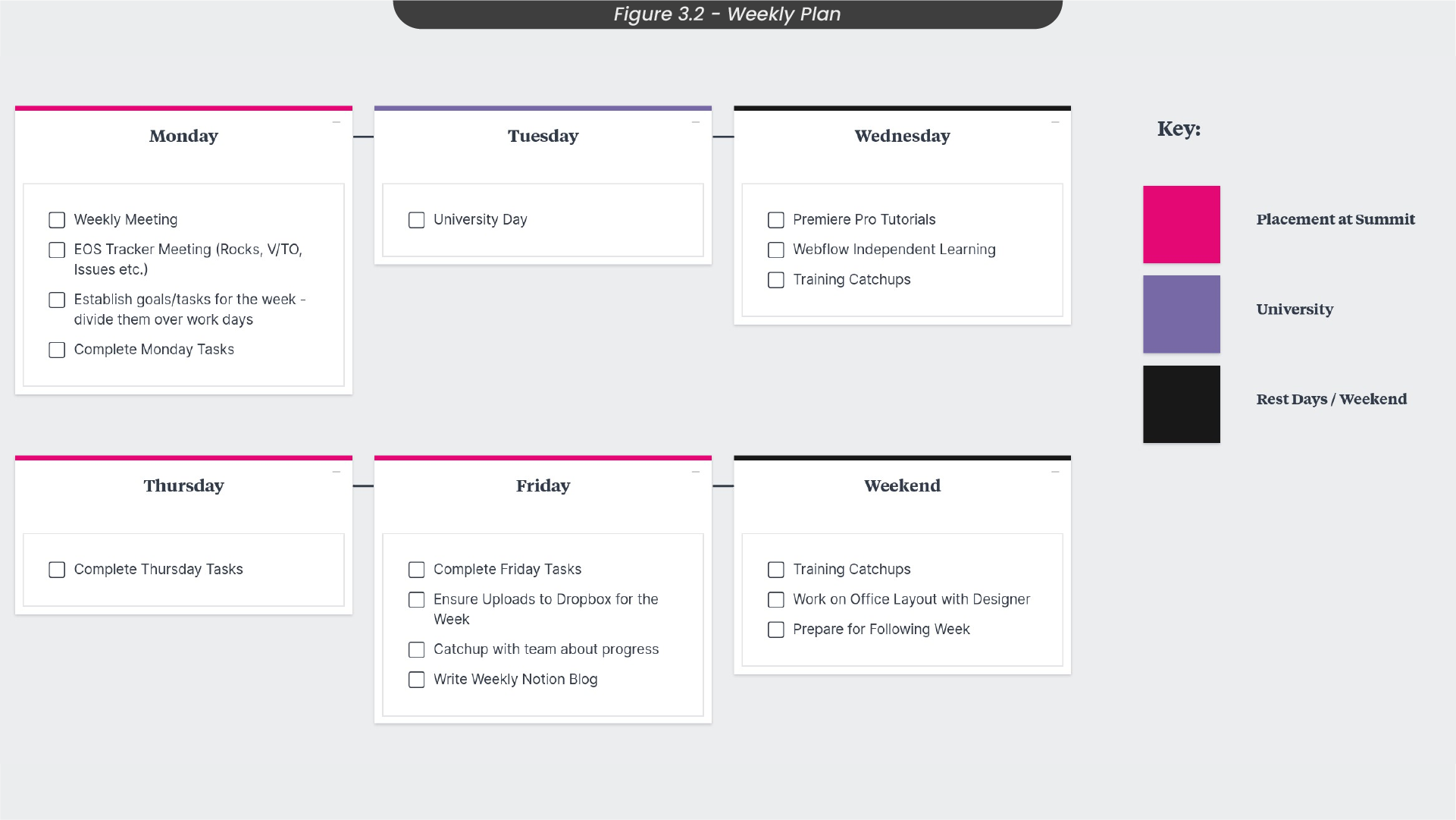
Given the unpredictability of my weekly projects and tasks, I opted to create a comprehensive weekly planner to provide some structure (Figure 3.2). This planner includes a list of general weekly tasks and meetings, allowing me to allocate time not only for my placement projects but also for personal work and university commitments. For instance, Mondays involve weekly and EOS meetings, reducing available time for projects. Wednesdays, being free from work or University commitments, serve as catch-up and personal learning days. On Fridays, I noted to remember to write my weekly Notion blog update to document and track my roles at the placement. This approach ensures better organisation and flexibility when dealing with diverse and unexpected projects.
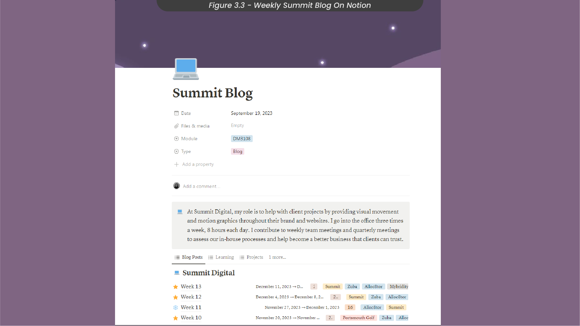
Throughout my placement, I will be keeping track of my job roles in a weekly blog on Notion (Figure 3.3), which can be found here. As I will be involved in a large variety of projects with intricate design processes each time, I have also created a password-protected Milanote board with more in-depth looks at each of my projects, which can be found here.
4. S4 Energy Brief, Research and Moodboard
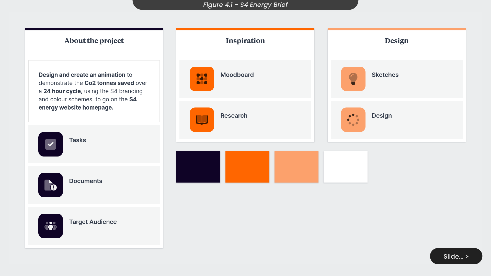
One of the many projects I have contributed to involves the creation of an animation that visually communicates the amount of Co2 tonnes saved over a 24-hour cycle for an energy storage website (Figure 4.1) Given its prominent placement on the homepage, aligning the animation to the appropriate branding and colour schemes was important, to ensure a cohesive brand representation across the entire website.
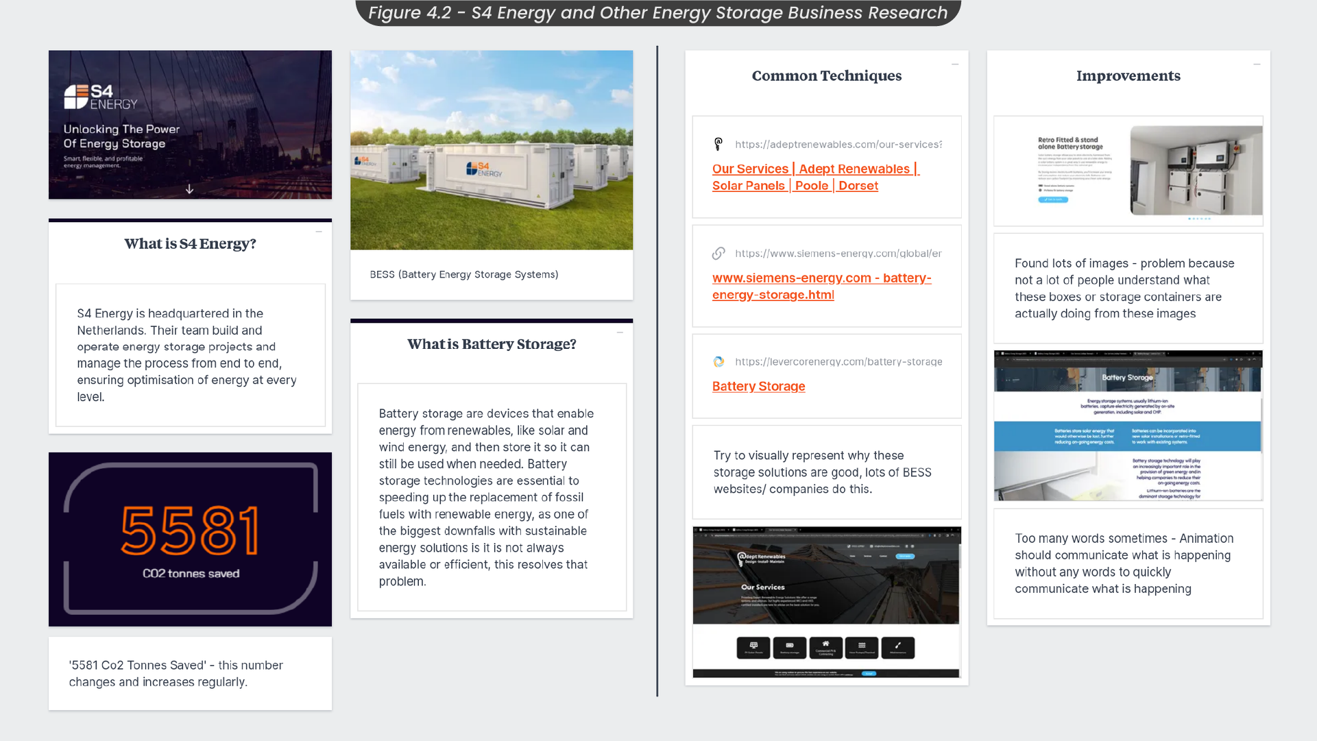
To effectively design and animate for this energy storage organisation, I analyzed the company itself and compared them with similar organisations to identify successful practices and areas of improvement (Figure 4.2) This company specialises in building and operating battery energy storage projects, encouraging more sustainable consumption of energy. This company makes a sustainable client for Summit to work with and in turn, actively supports SDG 12, responsible consumption and production.
Observing industry trends, I noted that successful energy storage companies, such as Adept Renewables, prioritise visually communicating their solutions. Therefore, my animated project aims to blend in with this trend, offering a visually appealing representation on the website. Unlike some competitors who rely on excessive text and images, I am mindful to ensure clarity and effective communication in the animation, specifically illustrating the amount of Co2 tonnes saved over a 24-hour cycle.
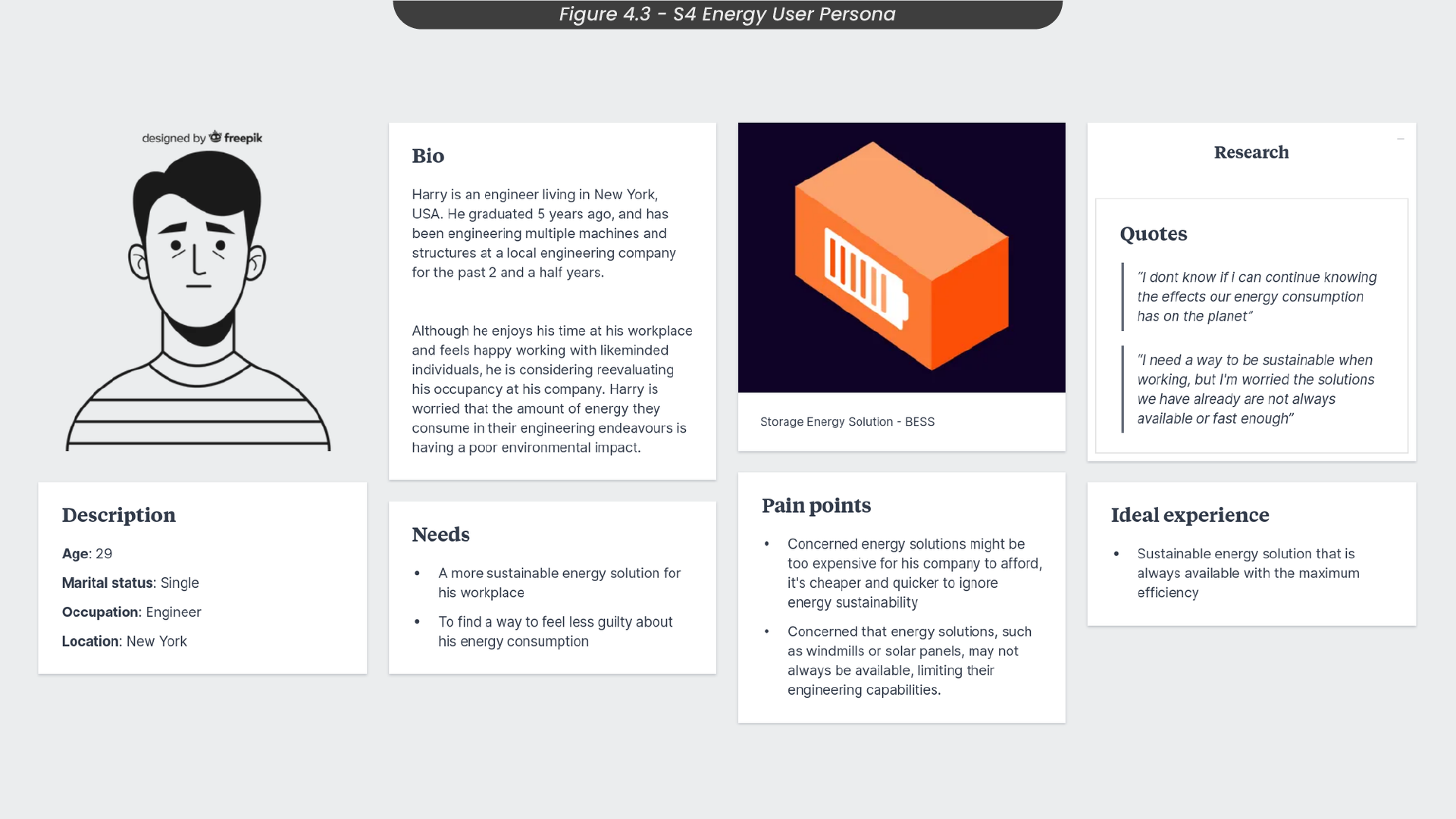
To grasp the essence of the company, I dived into understanding its target audience. Crafting a user persona (Figure 4.3) was instrumental in comprehending the needs and pain points of potential users, shedding light on their motivations for engaging with this energy solution provider. Take Harry, an engineer residing in New York, for example. Concerned about the environmental impact of his company’s energy consumption, he is reevaluating his practices. Harry envisions an ideal experience with a sustainable energy solution that is consistently available and at its maximum efficiency. This insight emphasises the importance of showcasing Co2 savings in my animation to visually communicate on the website homepage.
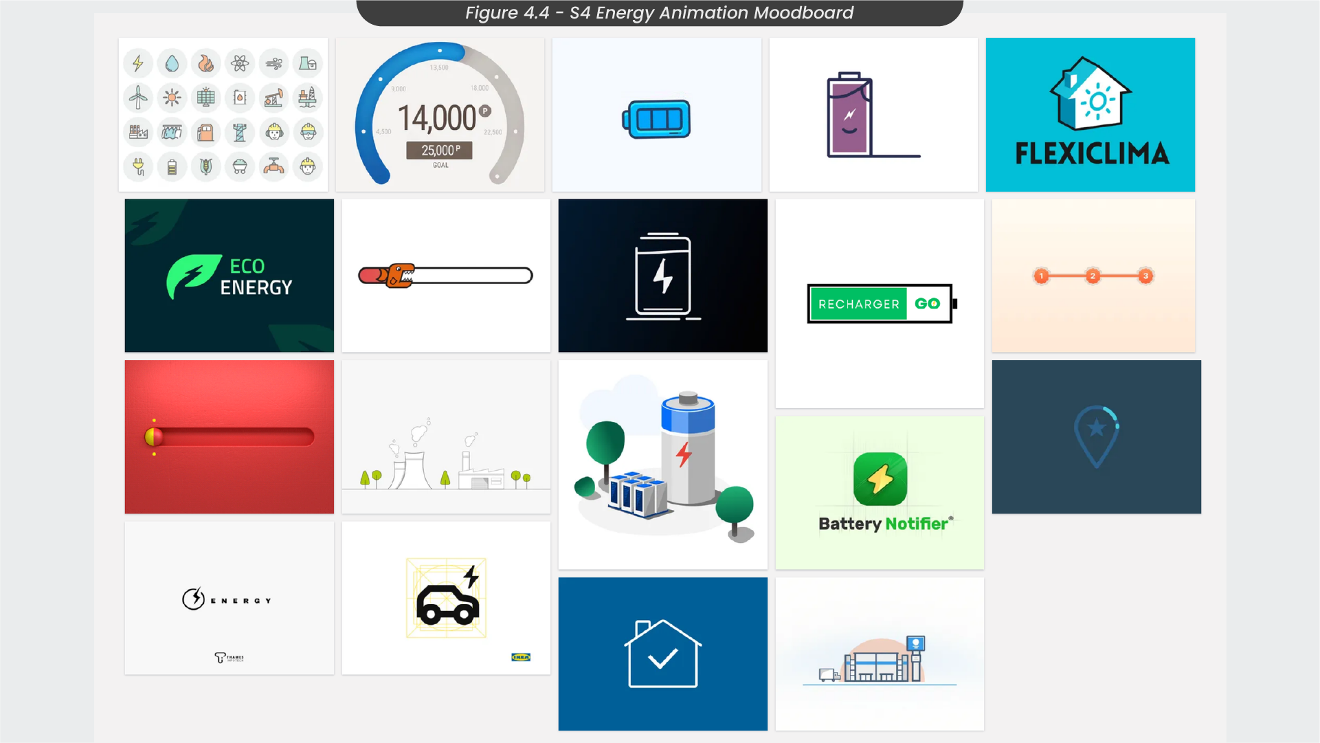
Starting the design process of this project, I gathered a collection of images in a moodboard of ideas and styles that I liked and thought would visually represent this organisation successfully to gain inspiration (Figure 4.4). I felt that to create a successful animation for visual communication, I should go with a more simple and easy-to-digest style. Therefore, the images I picked out for my moodboard had simpler styles and colour schemes. I also gravitated towards energy icons such as lightning and batteries, as I wanted to see how other energy representation was designed to remain consistent in my creation.
5. Skeches and Illustration Process
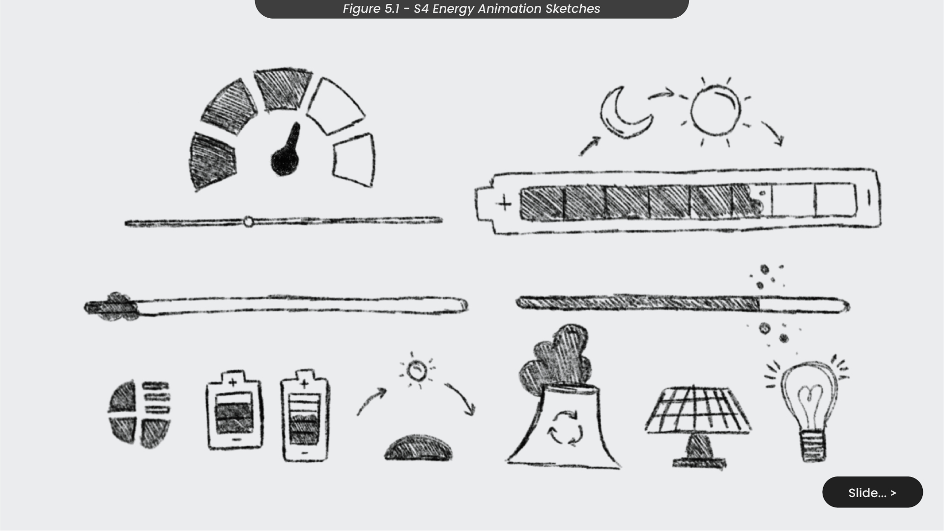
With inspiration flowing, I started to explore animation concepts with some sketches (Figure 5.1) . Following my moodboard, I opted for a simpler style, focusing on sketching icons rather than elaborate animated scenes. One initial notion involved crafting a bar gradually filling with Co2 particles. However, upon reflection, I found this concept was too minimalistic, failing to communicate the message and appearing to just be a simple loading bar, risking turning users away.
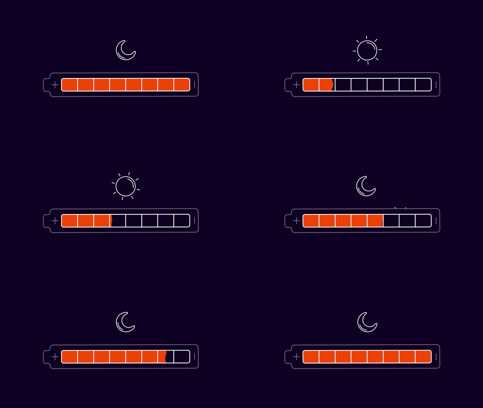
A more captivating concept that resonated with me from my sketches was a battery that would fill up over time, accompanied by a dynamic animation of a changing sun and moon overhead, symbolising the continuous 24-hour cycle. Another appealing idea centred around an interactive energy meter that accumulates over time, allowing users to actively engage with and visually see the increase in Co2 tonnes saved on the live site.
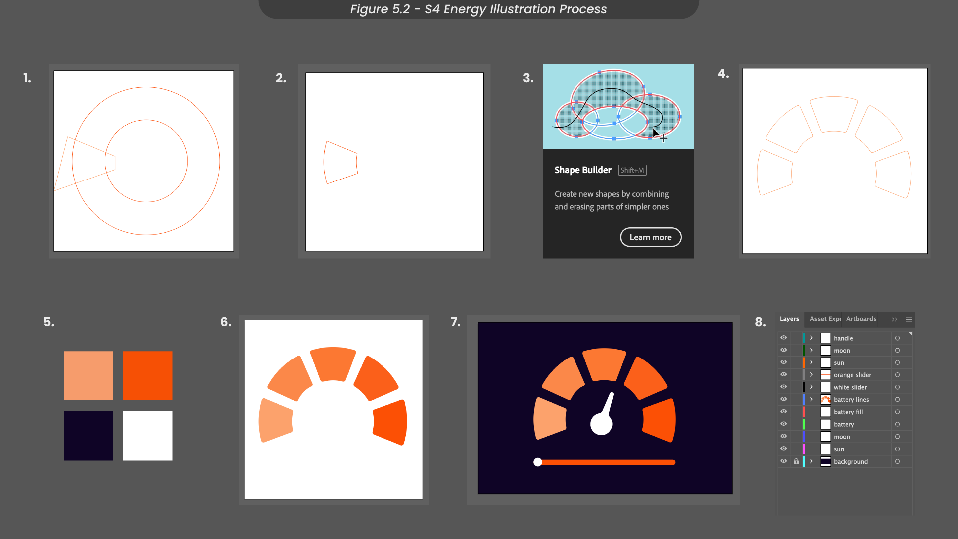
With some ideas I wanted to take further, I began designing these sketches in Illustrator (Figure 5.2) . To craft the design for the energy meter, I initiated by using the ellipse tool to generate two circles, marking out the section I wanted to keep with the pen tool. The excess shapes were then removed using the shape builder tool, leaving only the intended segment. Then, I duplicated and evenly rotated this shaped section to form a complete semi-circle. Aligning with the energy company’s brand colours, I introduced a gradient ranging from the lightest to the darkest orange hues within the shapes, ensuring brand consistency. Finally, Additional elements, such as the pointer and interactive bar, were then incorporated to enhance the overall design. To streamline the animation process, I separated the layers to enable individual-layer animation in After Effects.
Breakdowns on how I created the battery illustration in Adobe Illustrator can be found on my project Milanote board, here.
6. After Effects Animation Process
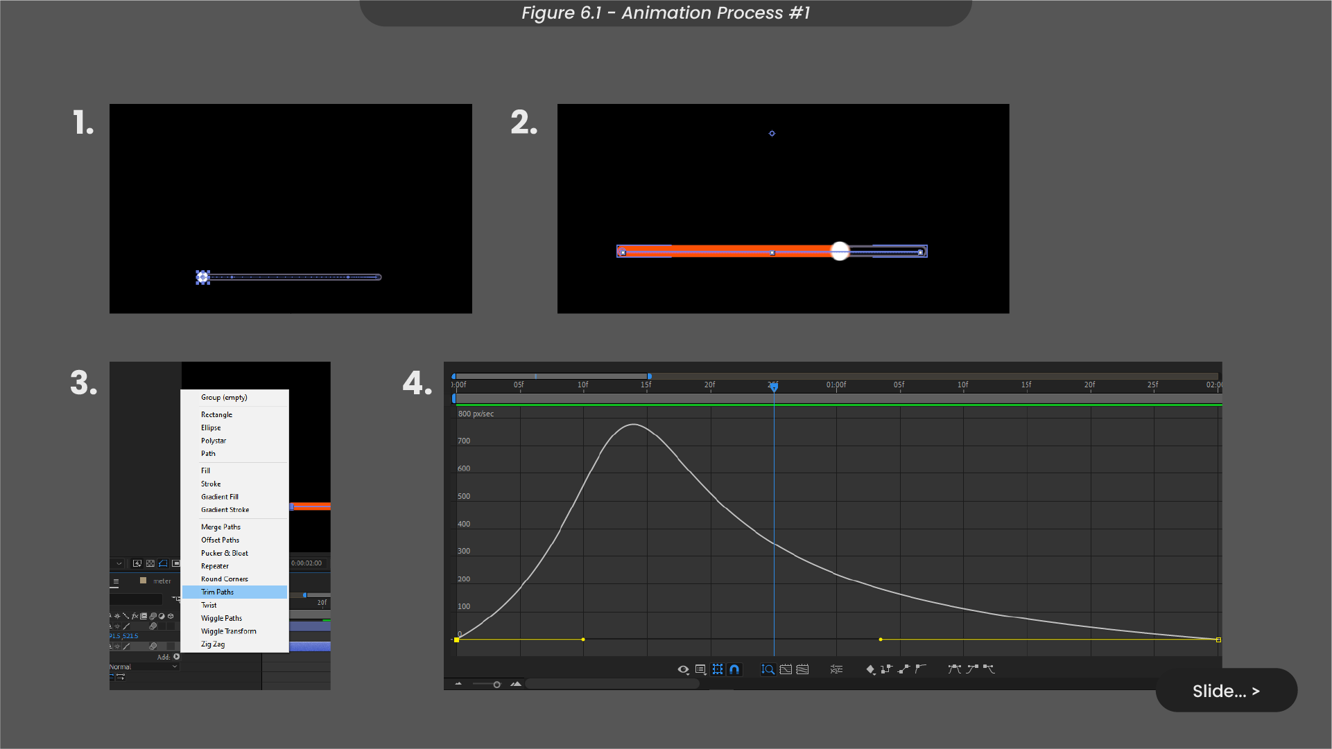
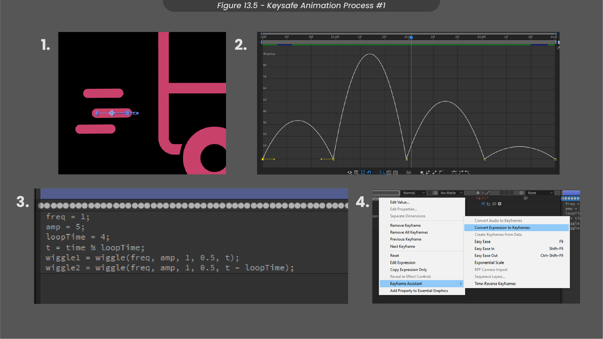
Commencing the animation process (Figure 6.1), I started by keyframing the movement of the interactive bar’s handle, creating a path from the left to the right. Subsequently, I utlised trim paths to animate the bars fill, synchronising its progression with the handle’s movement. To enhance fluidity, I adjusted the speed graph using ease ease.
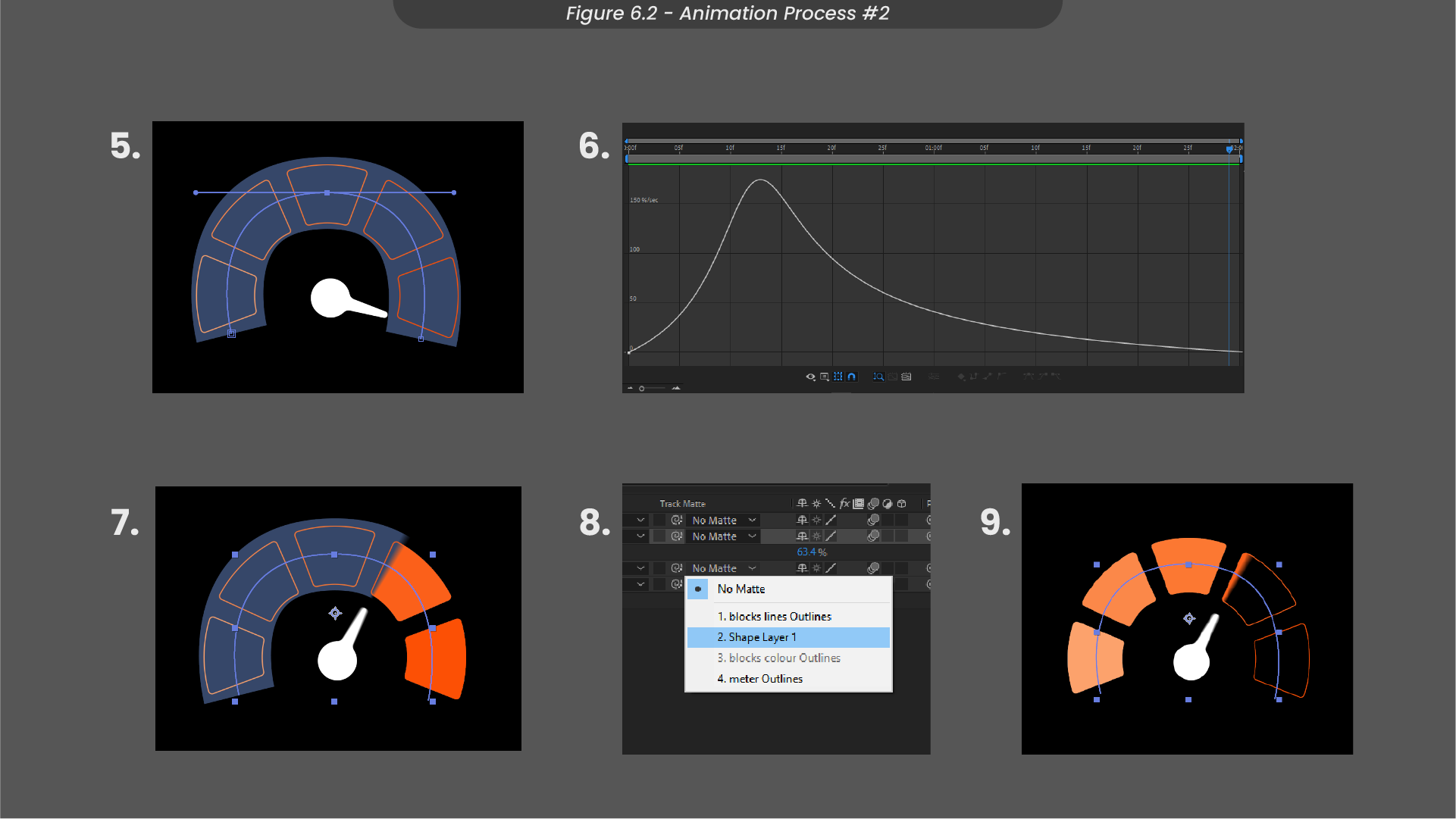
For the meter’s animation (Figure 6.2), I created a stroke shape to envelop the semi-circle of shapes. I then animated its trim path, smoothly covering the meter shapes from left to right. Employing this stroke layer as a track matte ensured a gradual reveal of the shapes, creating the illustration of the filling meter.
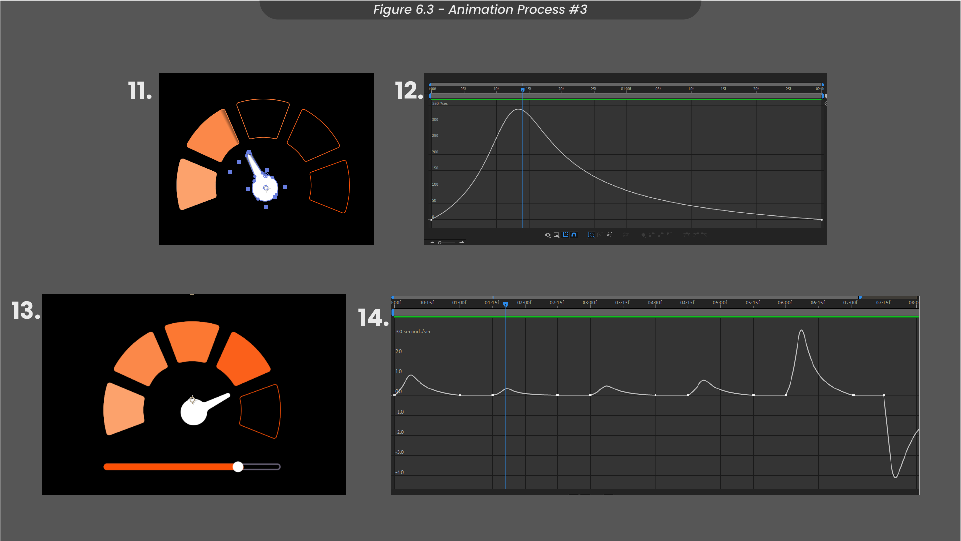
I then animated the pointer’s rotation with keyframes, and further speed graph adjustments to polish the animation (Figure 6.3). Bringing all of the elements together in a precomposition, I then adjusted the time-remapping to allow the meter to fill up in sections, syncing with the handlebar, achieving a cleared visual transition before looping seamlessly back to the starting point. Finally, I exported this icon as a Lottiefile and GIF to upload to the organisation's Dropbox.
Breakdowns on how I created the battery animation in After Effects can be found in my project Milanote board, here.
7. Client Feedback and Amendments
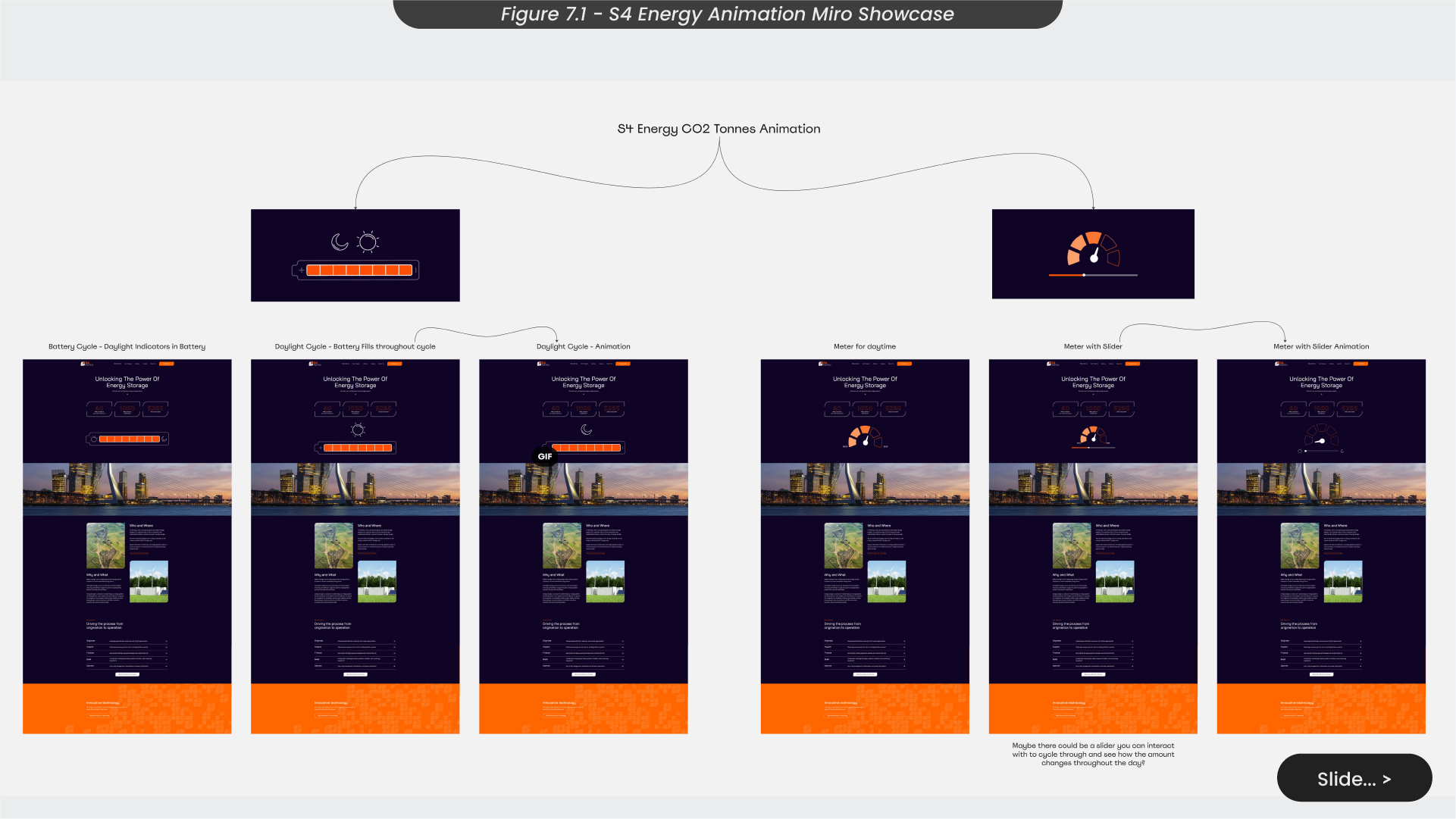
In any client project, soliciting and incorporating feedback is a crucial and integral phase of the process. To facilitate this, I created a presentation board on Miro, featuring both animations for the client to review (Figure 7.1). As I would not be present in the meeting with Summit and the energy organisation, I ensured my thought processes were clear through comprehensive descriptions.
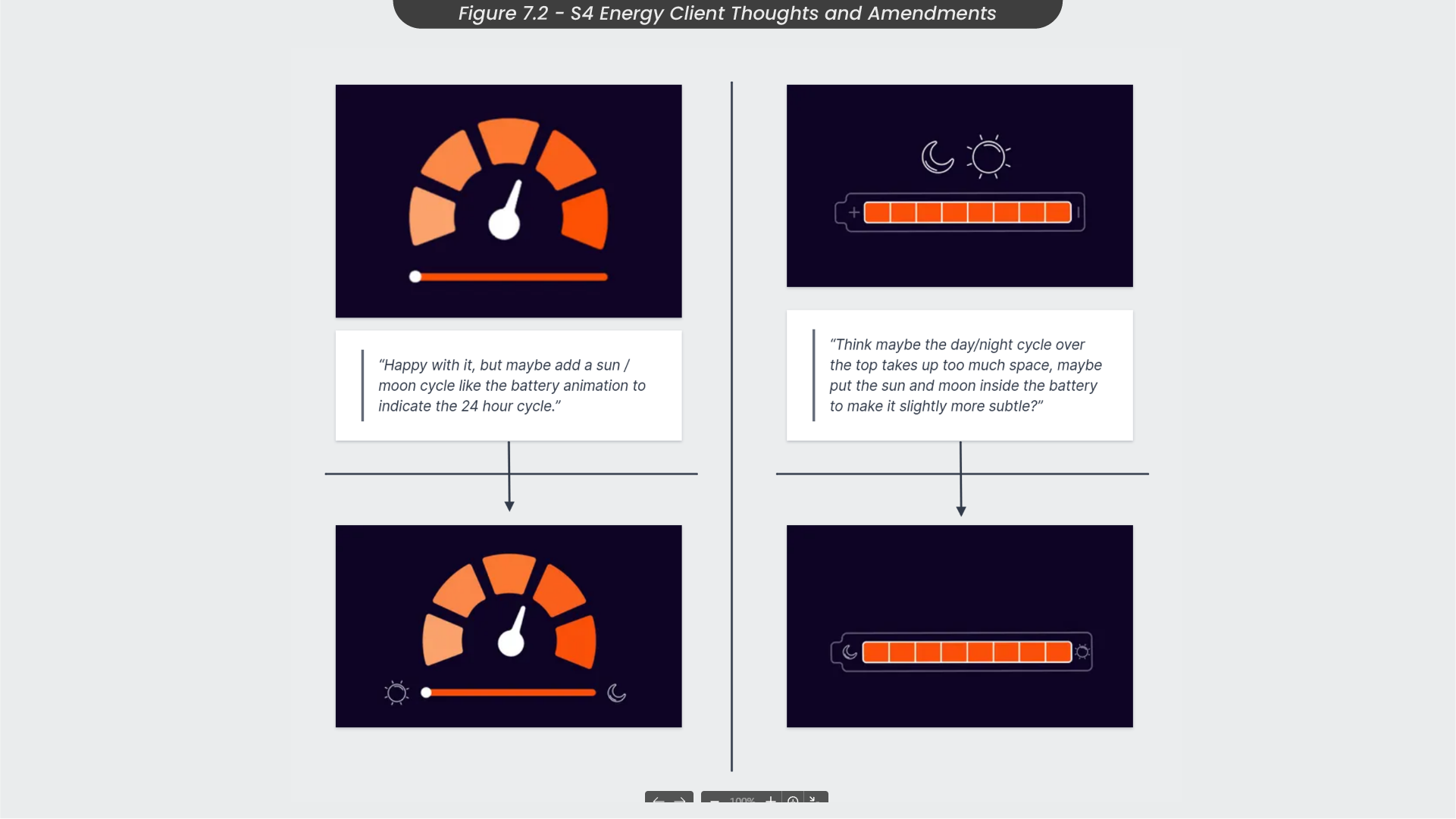
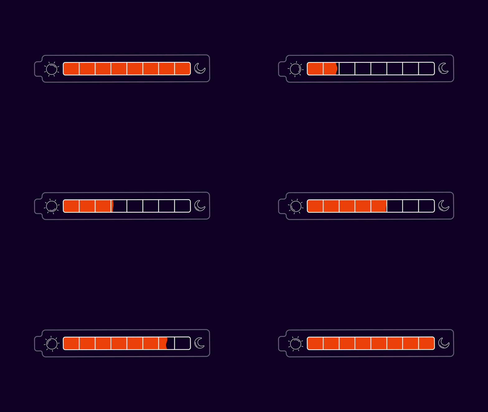
Feedback received from the Miro board highlighted the suggestion to incorporate a sun and moon into the meter, mirroring the design in the battery animation to emphasise the 24-hour cycle. Additionally, the clients expressed interest in exploring a version of the battery animation where the sun and moon were positioned within the battery, optimising space on the homepage (Figure 7.1). Therefore, I headed back to After Effects to make these adjustments before sending them back to the clients to be signed off.
Concluding this project, I consider the animation largely successful in conveying its intended message. Although, looking back, incorporating a visually impactful representation of Co2 could have enhanced clarity of the Co2 tonnes saved. Additionally, the absence of real statistical information is a notable drawback, prompting consideration for regularly updated text on the live site to reflect dynamic statistics.
Throughout this endeavour, I acquired valuable skills in utilising time remapping for animating timings, eliminating the need for manual adjustments of individual keyframes. This streamlined approach will, when possible, significantly improve the efficiency of my animation processes going forward.
In responding to client feedback, I believe I demonstrated a responsive approach by promptly implementing changes for review. This responsiveness reflects my commitment to ensuring client satisfaction and swiftly adapting to their evolving needs.
8. Summit Christmas Brief and Moodboard
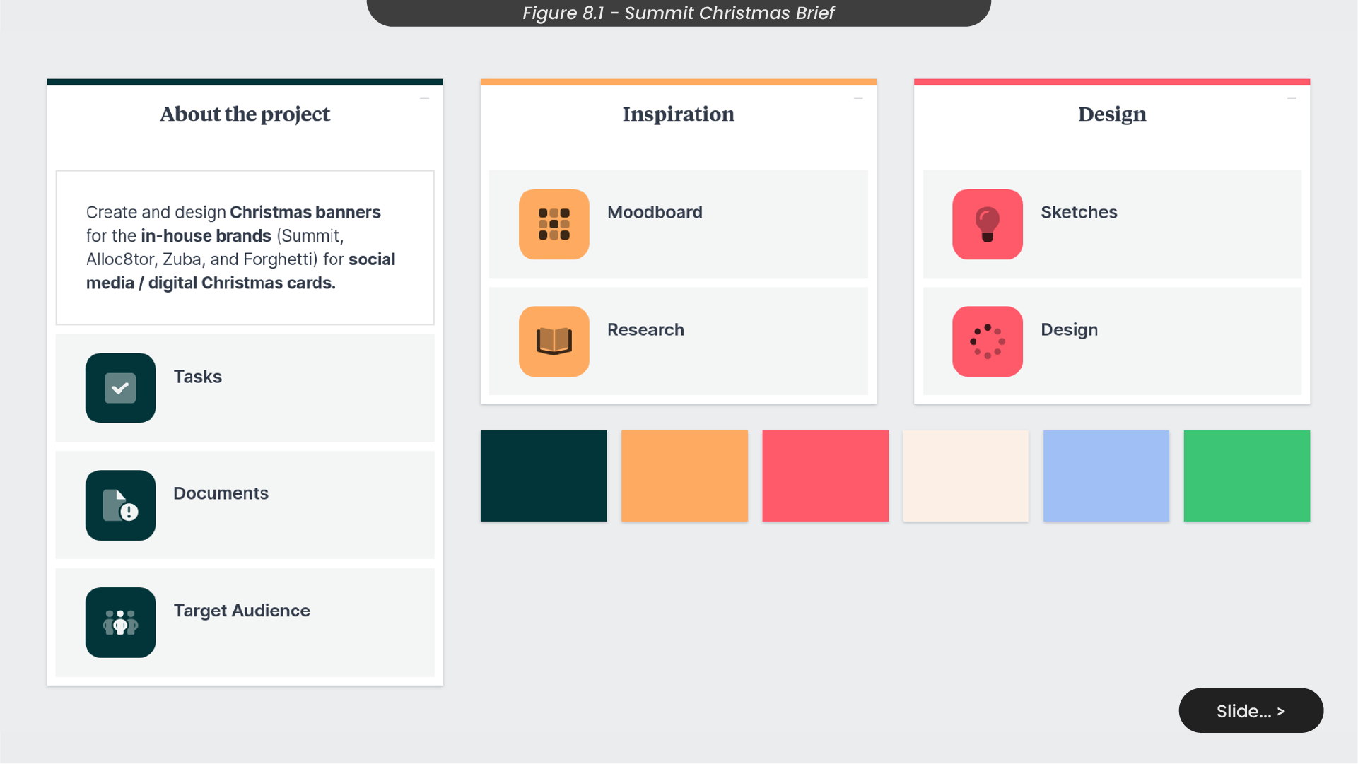
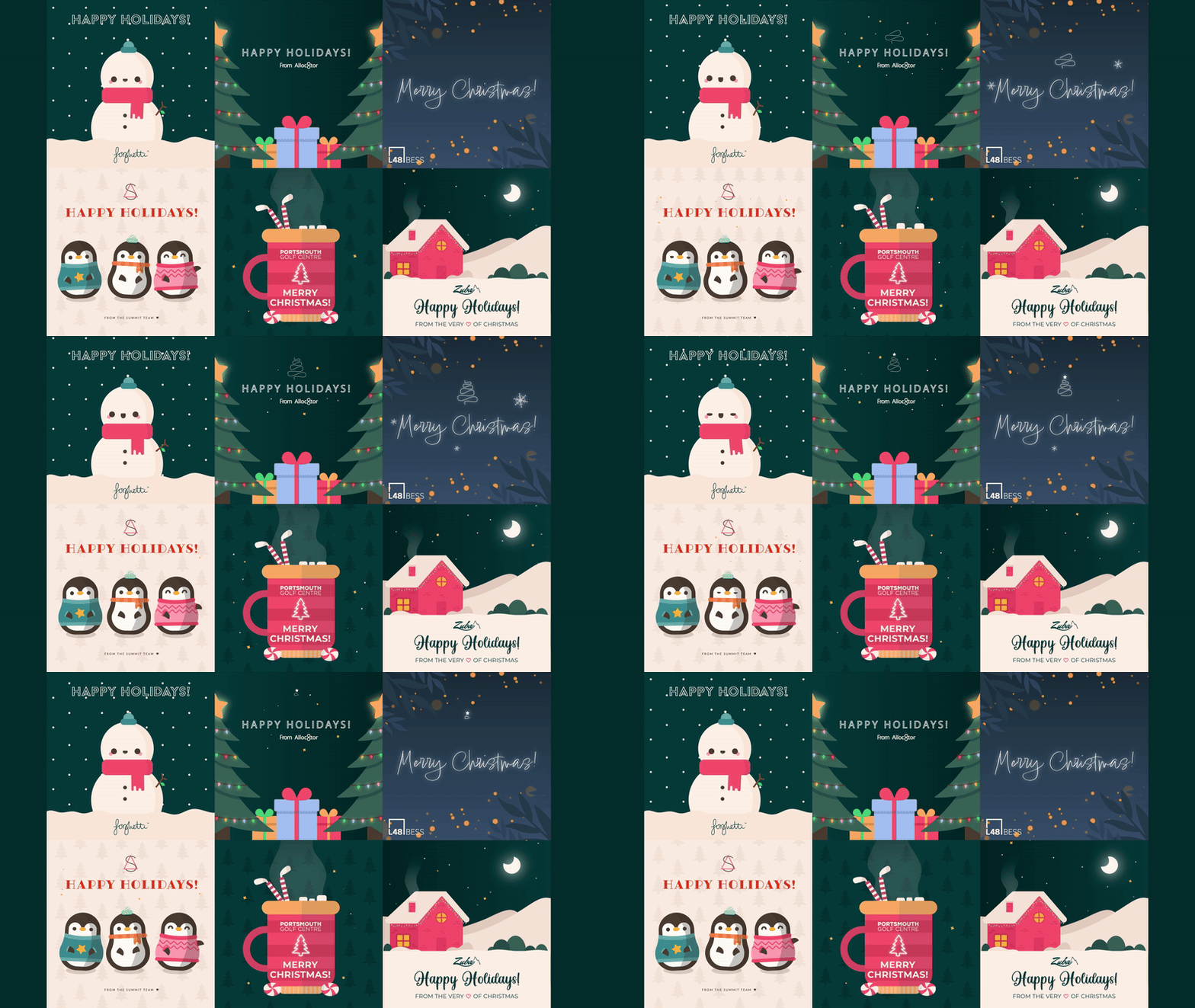
During my placement, another project I undertook was a project that involved crafting and designing Christmas banners and social posts to promote Summit’s in-house brands, including Summit Digital, Alloc8tor, Zuba and Forghetti (Figure 8.1). This larger project spanned multiple weeks leading up to the Christmas season, inviting a creative approach and offering a platform for my personal style to shine through.
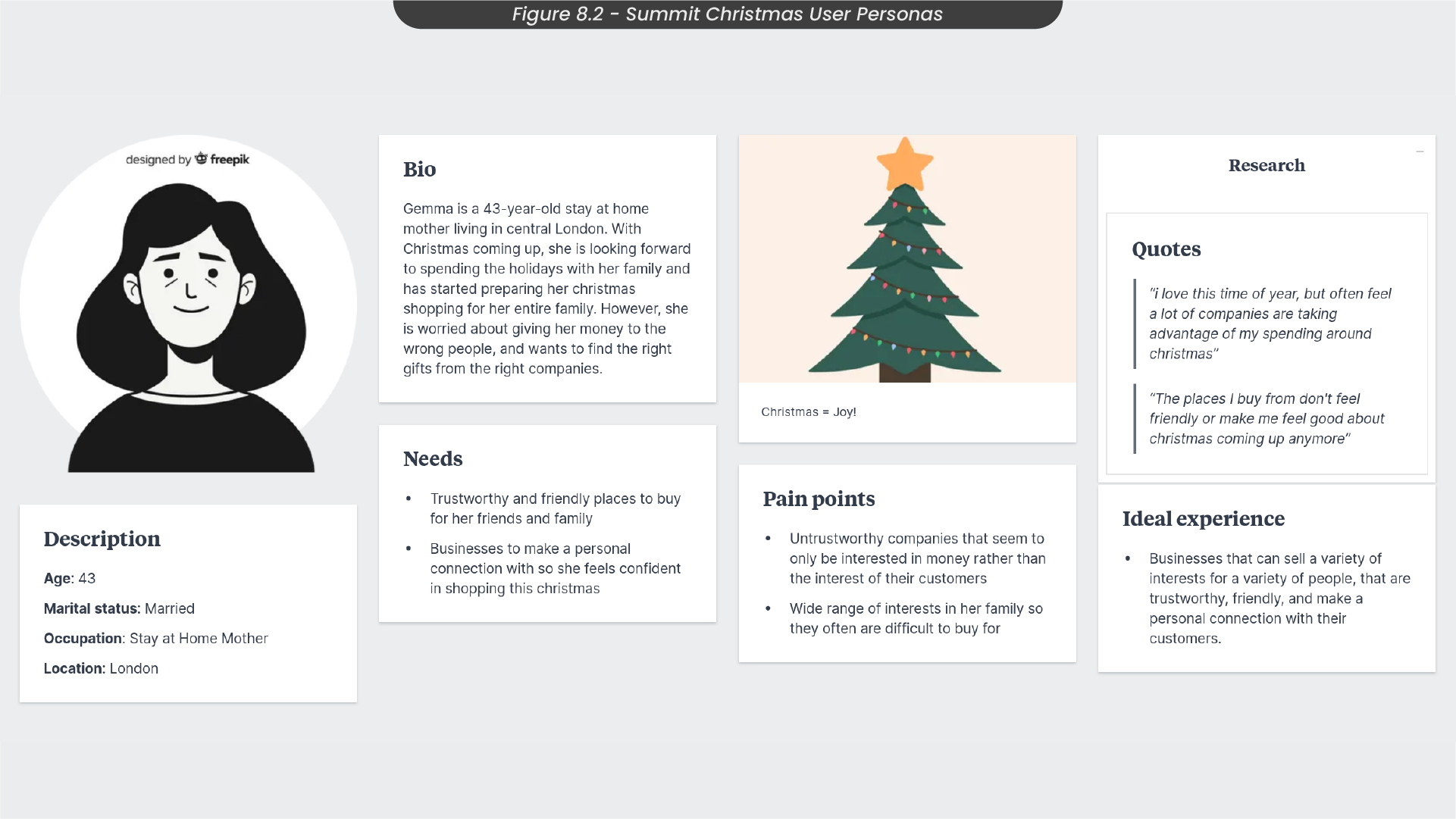
Before embarking on this project, I created a user persona to dive into the effectiveness of Christmas posts and understand why people tend to respond more to holiday advertisements than regular ones (Figure 8.2). Take Gemma, a 43-year-old stay-at-home mother in central London, for example. As the holiday season approaches, she eagerly anticipates spending time with her family and has initiated her Christmas shopping. However, she has concerns about entrusting her money to reliable sources and seeks the perfect gifts from trustworthy companies. Gemma’s ideal experience involves engaging with a friendly establishment that shares her love for the festive period, offering a diverse range of products and striving to establish a personal connection with its customers. This process helps to identify the need for Christmas advertising that reflects the organisation’s friendly and inviting personality.
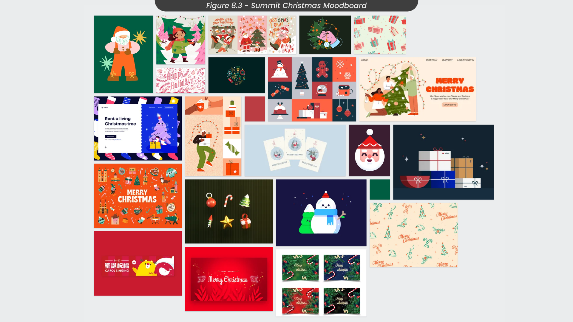
Initiating the ideation phase for this project, I collected a variety of images from platforms like Pinterest and Dribbble to construct a visual blueprint for my creative journey (Figure 8.3). Notably, I observed that the Christmas designs that captivated me featured vibrant colour schemes and endearing, friendly characters. These designs were characterised by intricate details, accompanied by sparkles and confetti, collectively creating an inviting and festive atmosphere.
9. Sketches and Illustrator Process
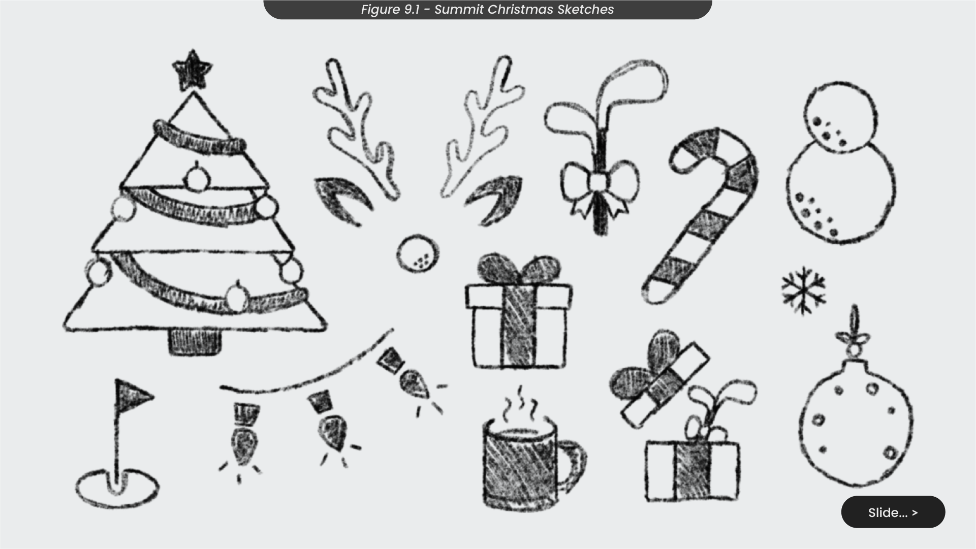
In the initial sketching phase, I opted to create Christmas icons and objects, including trees, presents and lights (Figure 9.1). Given that one of the companies I was designing for was related to golf, I also introduced golf-inspired sketches like Rudolph with a golf ball nose and golf club Christmas presents.
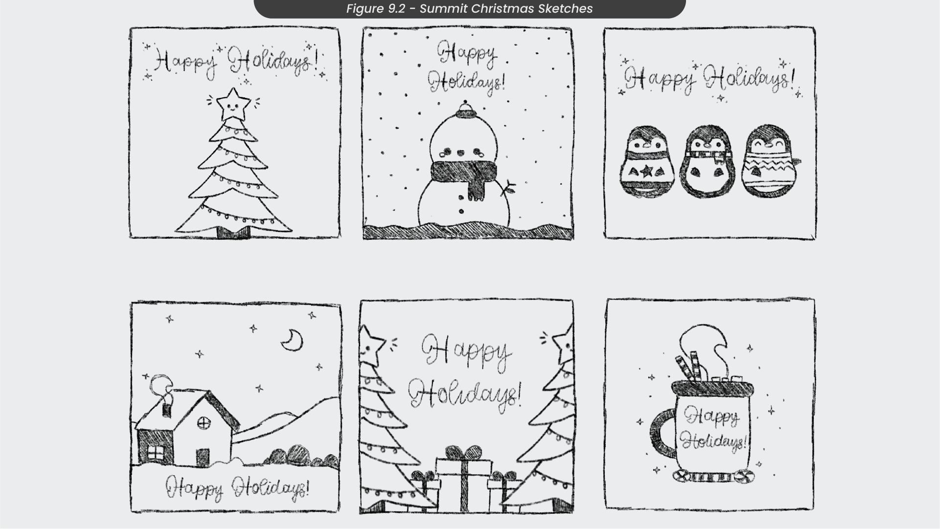
Utilising these individual elements, I progressed to sketching complete Christmas scenes (Figure 9.2). Reflecting the trends and preferences identified in my moodboard, I sketched some whimsical festive characters like a snowman and some winter-dressed penguins. I liked these designs as the friendly characters would hopefully mirror the organisation’s friendly personalities. However, I set aside the single Christmas tree sketch as I felt it was too simplistic and plain
For the golf company’s design, I chose to advance the concept of the hot chocolate mug. Considering the festive season can bring chilly weather to the golf course, I aimed to underscore the organisation’s friendly persona by portraying a welcoming atmosphere. The hot chocolate mug sketch symbolises an inviting gesture, for golfers to come in and enjoy a comforting cup of hot chocolate, to warm up during their golfing experience. As I created many designs for this one project, I’m going to demonstrate my creation process using this sketch.
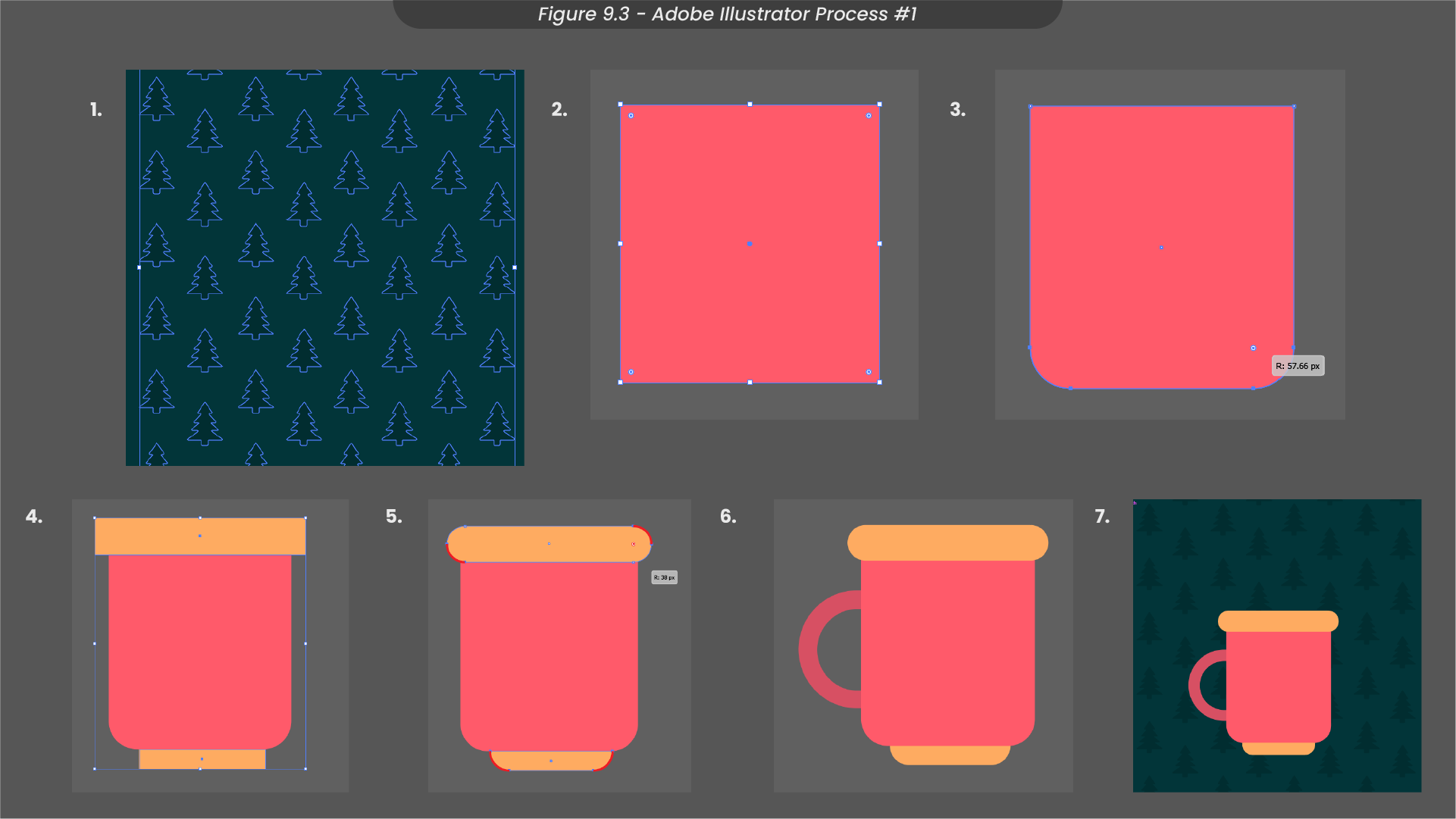
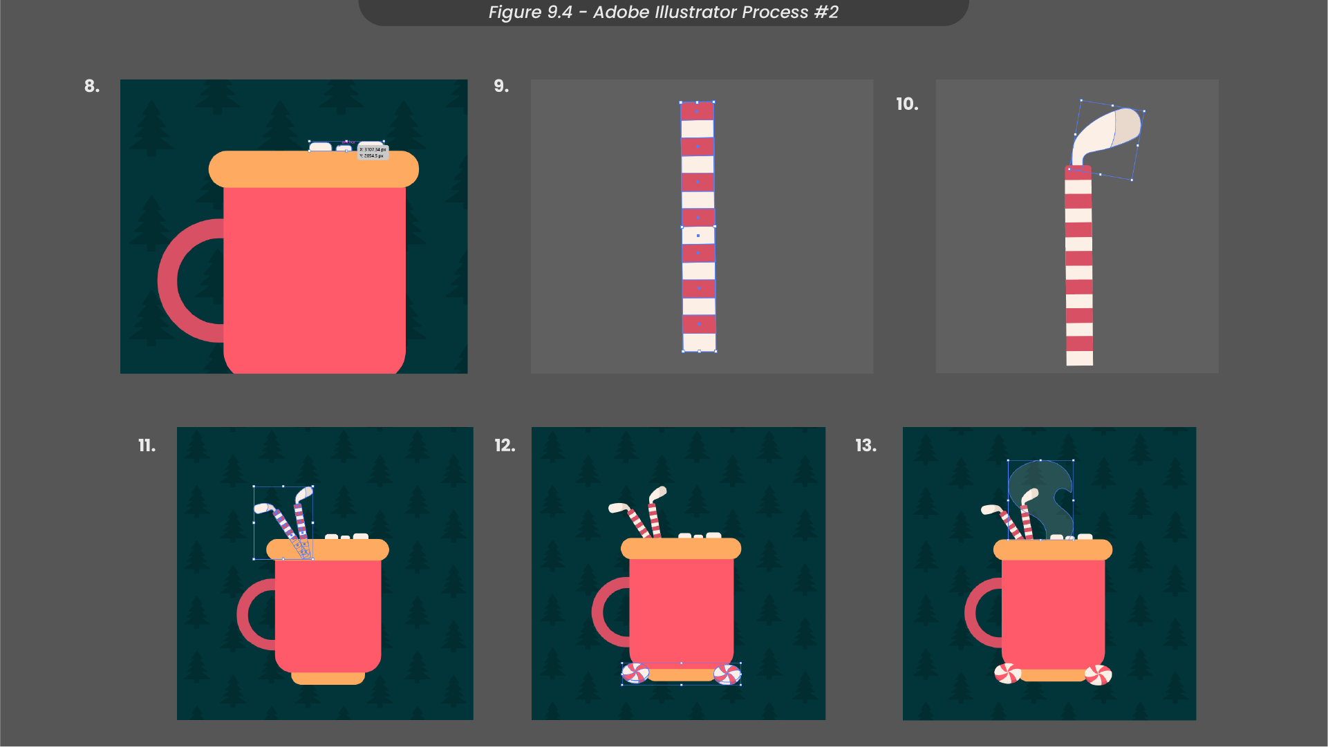
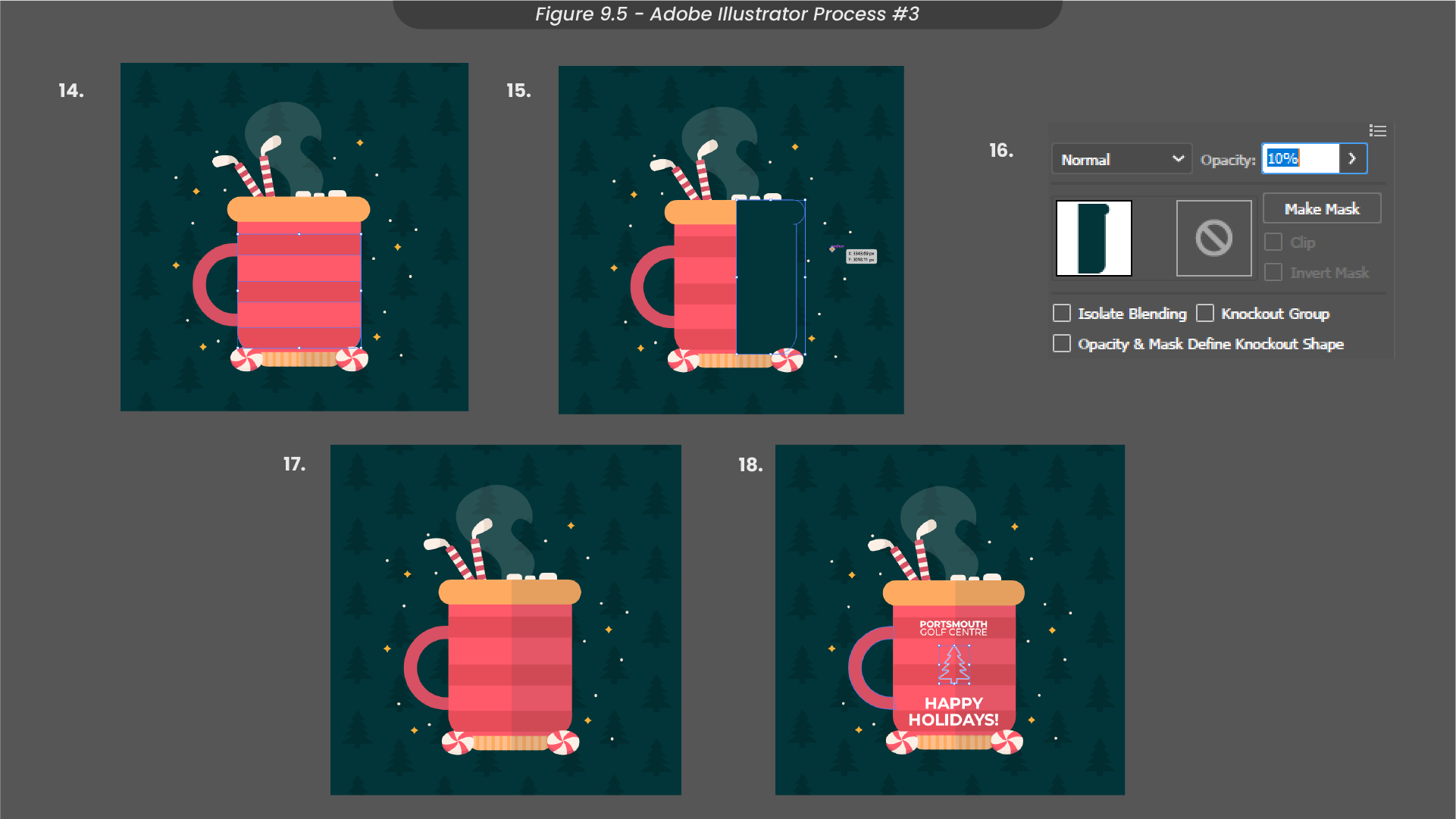
In Illustrator, I initiated the design by subtly overlaying a Christmas tree pattern on the background (Figure 9.3). For the mug, I shaped a rounded rectangular body, adding a rounded rim, base, and handle. To fill the mug I created marshmallows using the rectangle tool and some candy cane straws using rectangle stripes and a clipping mask, before turning these candy canes into candy cane golf clubs (Figure 9.4). I then enhanced the foreground with some peppermint illustrations. To create the illusion of a full hot chocolate mug, I introduced a steam effect with the pen tool, adjusting the opacity of my shape to 10%. To improve the illustration, I added some stripes to the mug and confetti around the scene (Figure 9.5). Finally, I incorporated a subtle shadow on the mug using the rectangle and shape builder tool before including text and a Christmas tree decal for a charming finish.
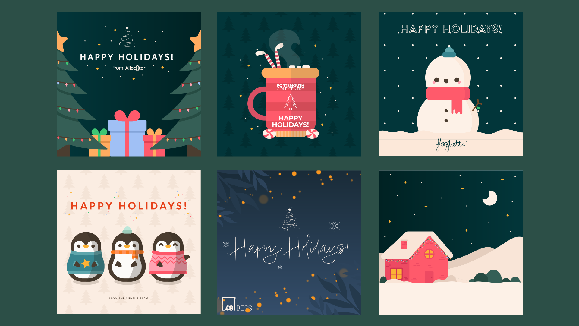
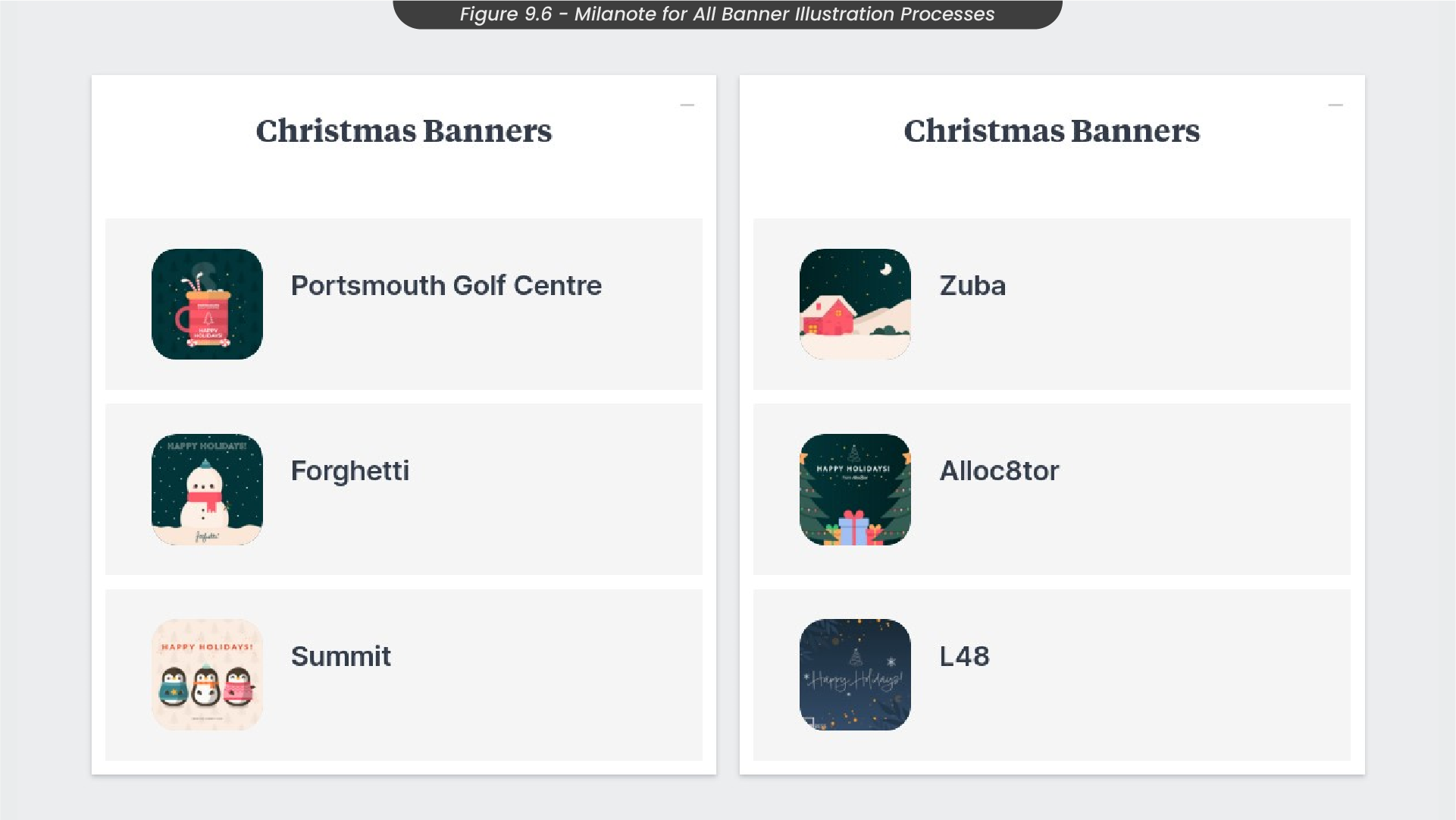
Detailed processes on how I created the other Christmas Illustrations in Adobe Illustrator can be found in my Milanote board for this project (Figure 9.6) here.
10. After Effects Animation Process
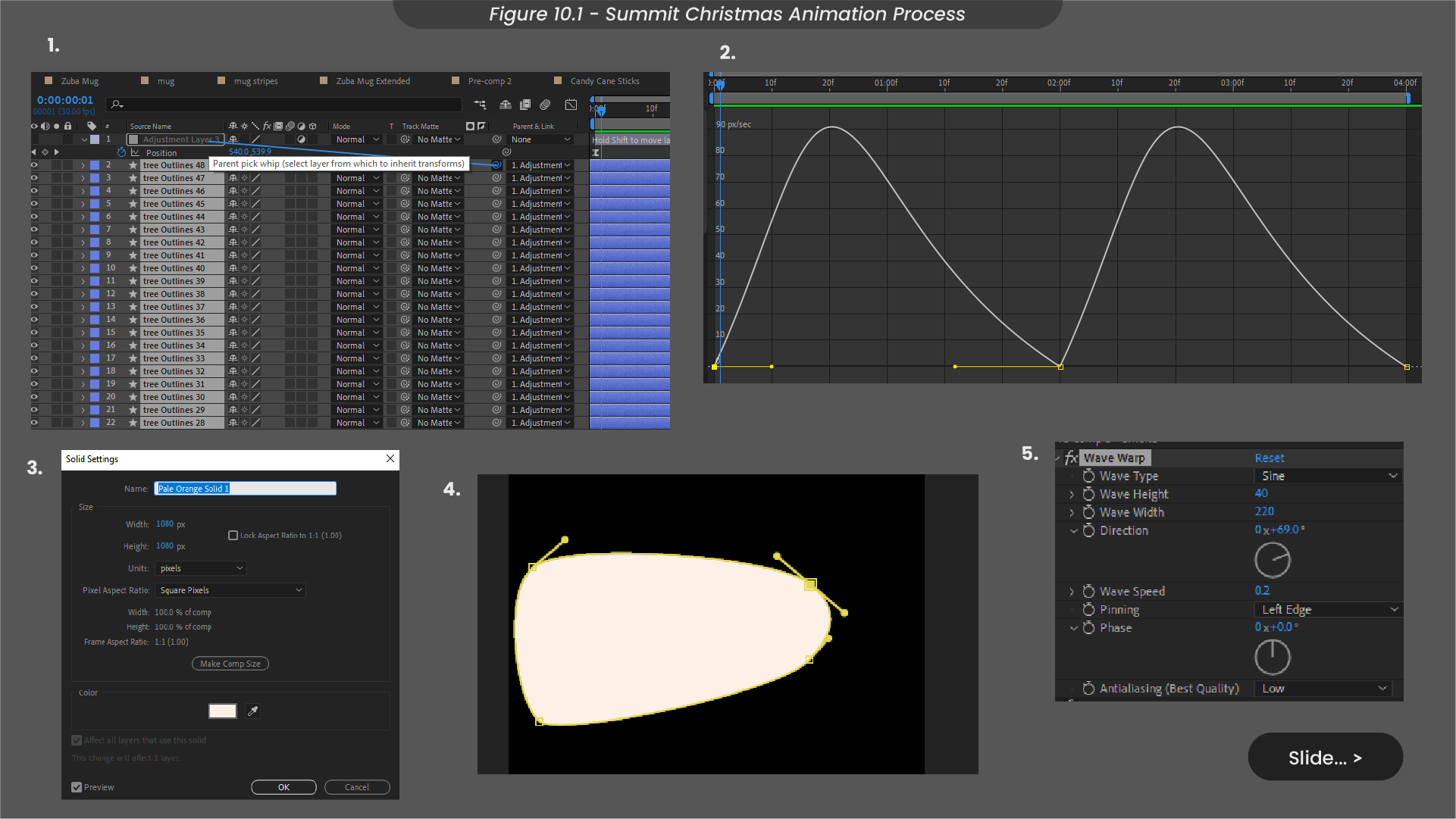
When animating this design in After Effects, I started by animating the patterned background (Figure 10.1). To achieve this, I grouped individual Christmas trees under an adjustment layer, manipulating its position to create an up-and-down loop. Ensuring smoothness, I fine-tuned the speed graph using easy ease. Moving on to the steam animation, I began by masking a solid into a wider shape at the bottom (where the mug would be) and tapered it towards the top. Applying a wave warp effect added realism to the steam's edges.
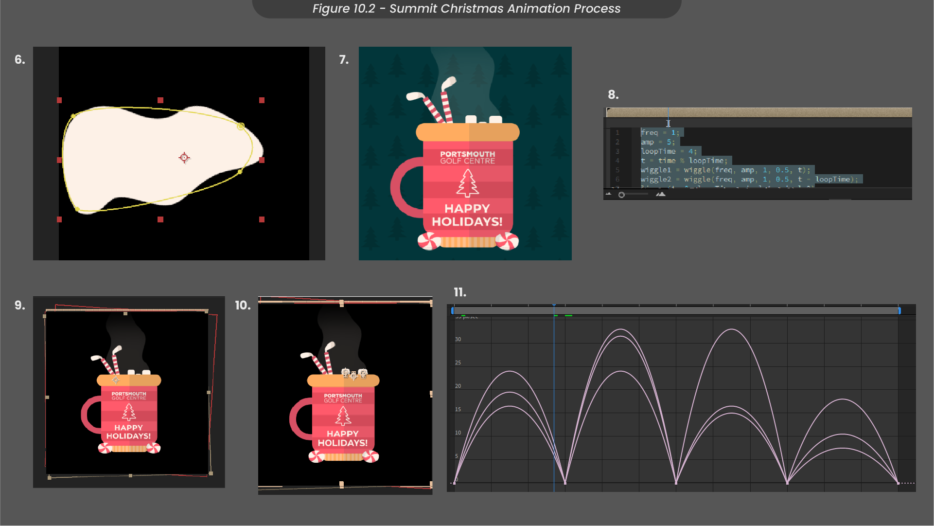
Upon integrating this steam shape into the mug, I adjusted the opacity for seamless blending with the rest of the scene (Figure 10.2). To animate the candy cane straws, I employed a wiggle expression giving the illusion of them floating around in the hot chocolate. For the marshmallows, I individually animated their positions with an easy ease speed graph, providing a gentle floating effect.
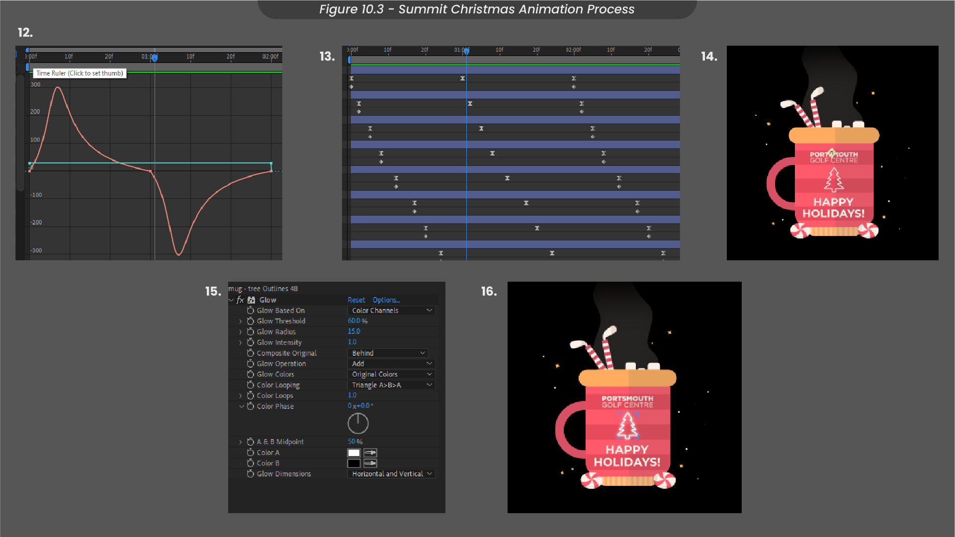
Animating the sparkles and confetti involved a straightforward scale animation, with easy ease adjustments, applied to each element individually (Figure 10.3). I then distorted their timings to introduce a staggered entrance. To make the whole animation feel more vibrant, I added a glow effect to the sparkles and the front decal of the mug. The final touch involved exporting the animation as an MP4 for Instagram and a GIF for a digital Christmas card.
11. Amendments and Conclusions
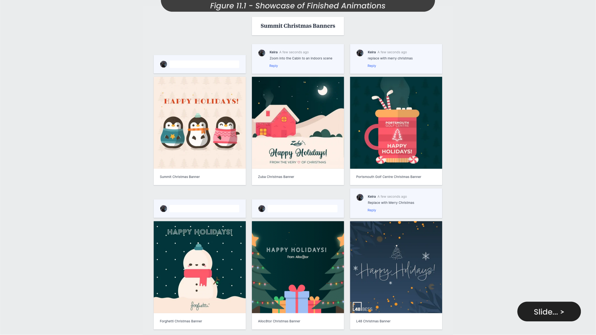
To seek out feedback for this project and facilitate the process of making necessary amendments, I created a dedicated board on Milanote to showcase my completed animations (Figure 11.1). Subsequently, I shared this board among the Summit Digital team to gather in-house feedback, and I presented the specific designs to their respective clients. To ensure an organised review process, I designated space for comments to have all feedback documented for review.
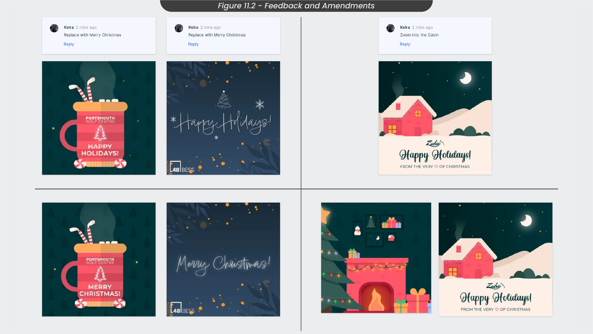
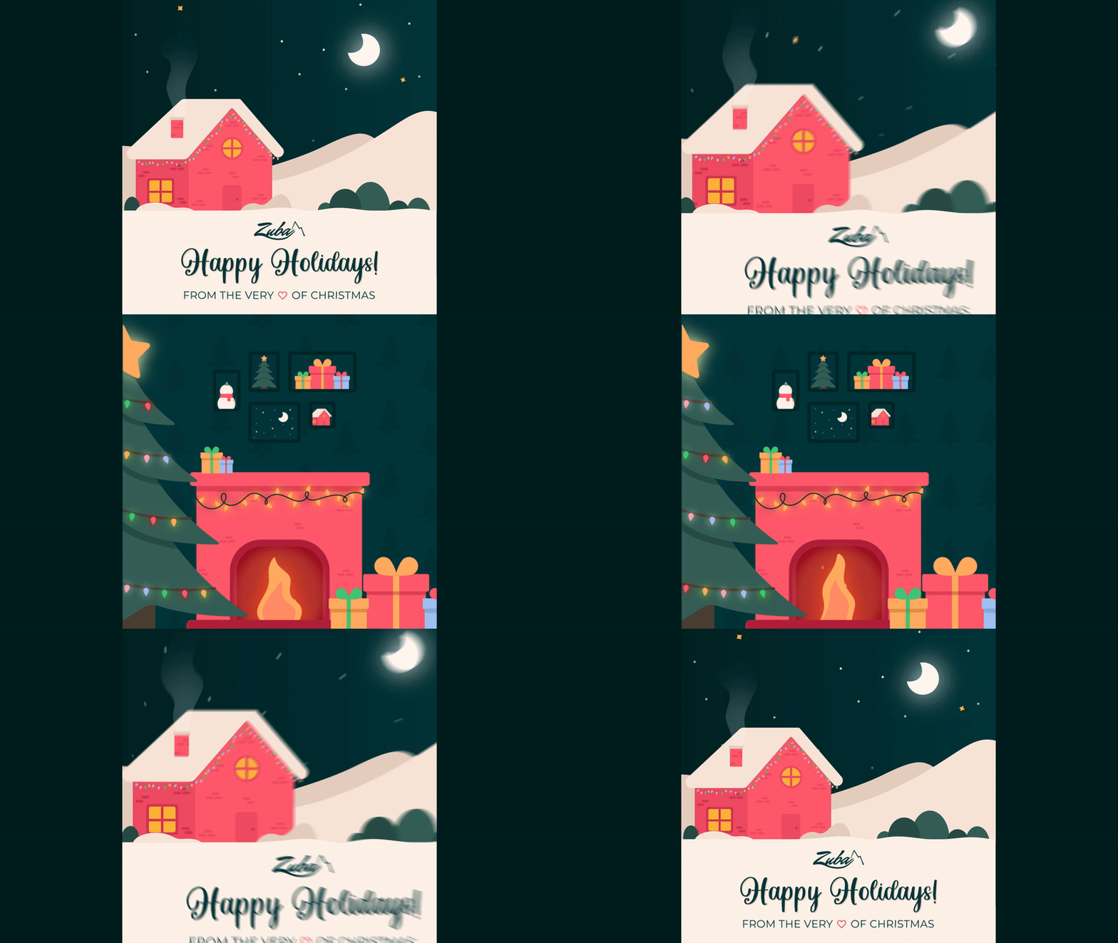
Both the Summit team and clients provided feedback suggesting a modification of the phrase ‘happy holidays’ to ‘merry Christmas’ in certain designs, as those clients found the former to be too American (Figure 11.2). Additionally, a Summit designer proposed an insightful enhancement for the Zuba animation, featuring a cabin in a showy landscape. In response to this feedback, I revisited After Effects to implement the necessary text changes, and created an illustrated indoor scene to animate and integrate into the Zuba animation.
I thoroughly enjoyed working on this project, as it has allowed me to delve into my personal design style. The encouragement from the Summit team to approach the brief with creative freedom was particularly inspiring. Designing for a diverse range of clients not only allowed me to tap into different creative requirements but also provided a valuable learning experience.
Throughout the project, I learnt valuable skills in utilising various effects in After Effects, such as wave warp, to distort shape layers and create realistic movement for designs like smoke, steam, fire, and gas. While reflecting on the project, I recognise that further exploration of text effects and the incorporation of more unique messages could have enhanced the overall project by creating greater differentiation between designs. Moving forward, I aim to expand my creative toolkit and push the boundaries to elevate further projects.
12. Icon Animation Briefs and Ideas
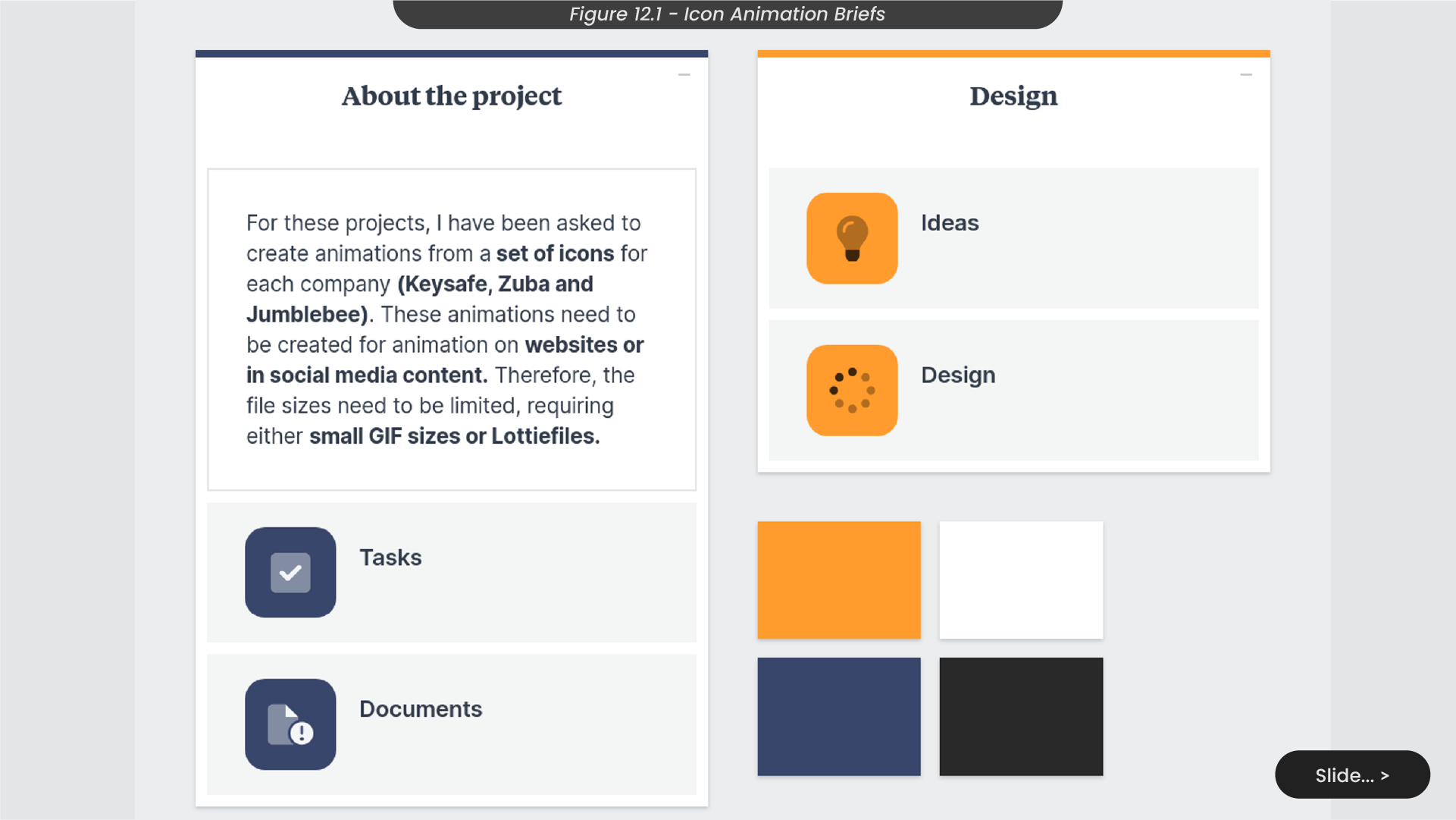
During my placement, my role extended beyond the creation and animation of my own designs. As a motion designer, I was entrusted with the collaborative task of working alongside other designers who had previously crafted static icons and illustrations. My responsibility was to translate their static visuals into dynamic animations using After Effects (Figure 12.1). An example of this collaborative effort was my role in bringing a set of pre-designed icons for projects such as Jumblebee, Zuba, and keysafe, to life. In executing these assignments, I engaged in detailed discussions with the designers to comprehend their ideas and creative vision before modifying their illustrator files to align with my animation processes. The animated outcomes were then tailored for diverse platforms, including social media, company websites, emails and more.
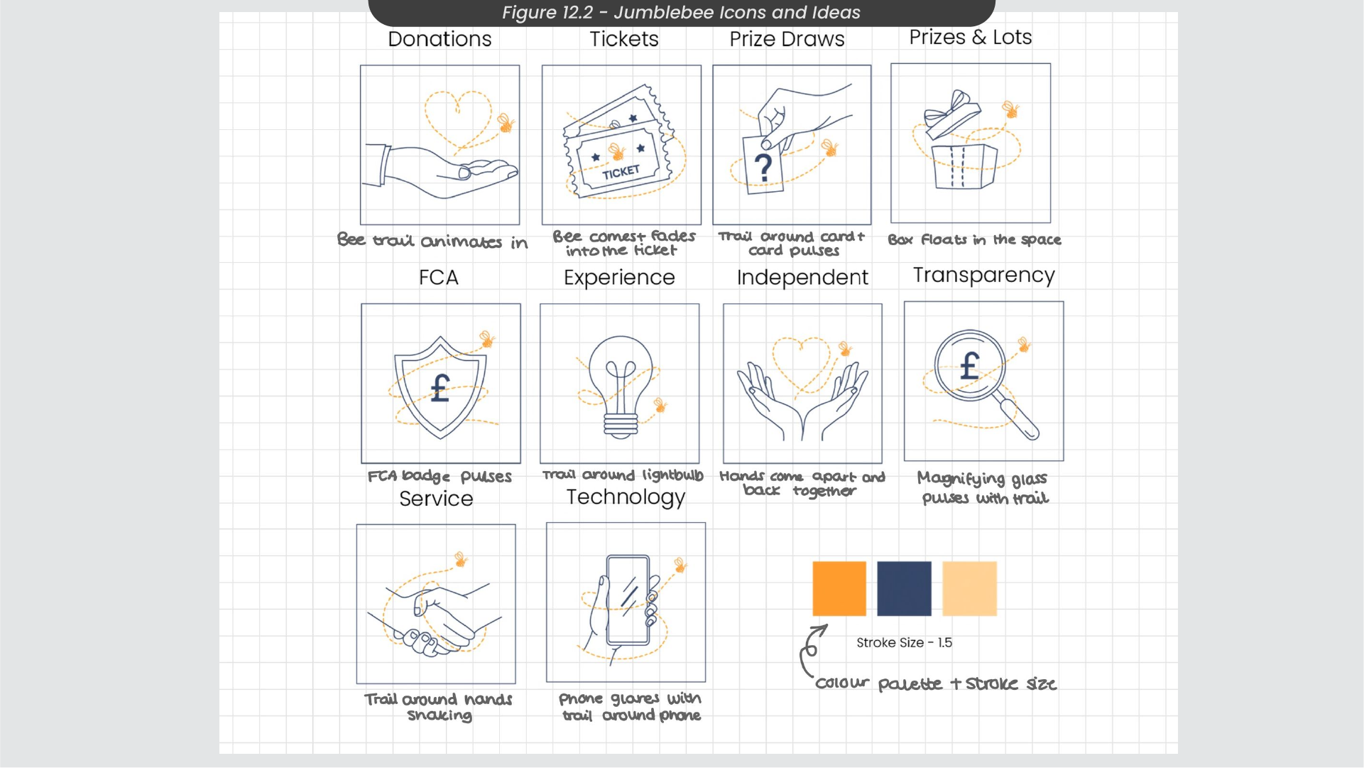
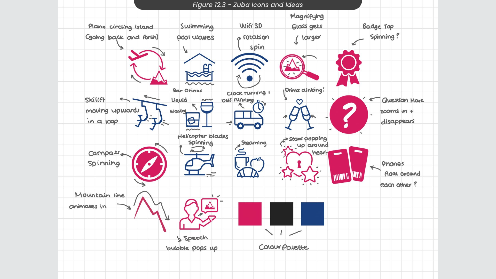
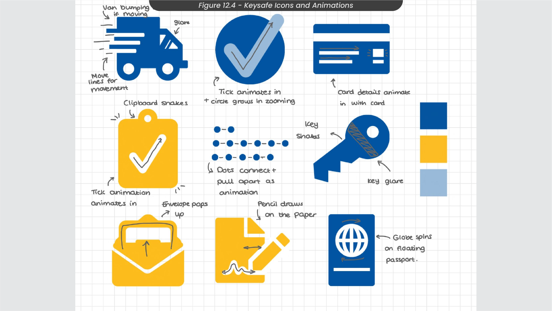
Adopting the visions from the original designer after communicating with them about their own ideas for their static graphics, I engaged in a brainstorming process where I annotated my ideas over the original icon sets. For instance, with the Jumblebee icon designs (Figure 12.2), I imagined an animation on the handshake icon where the hands subtly shook by animating their positions, synchronising with the bee’s flight around them. In the case of Keysafe (Figure 12.3), I envisioned the van icon’s driving lines moving back and forth while the van simultaneously bounded up and down, conveying the sense of motion assosiated with driving. Similarly, for the Zuba icons (Figure 12.4), I envisioned the compass icon executing a repetitive spinning motion, with the needle turning in the middle. These enhancements aimed to not only fulfill the original designer’s visions, but also to contribute to a visually engaging animated representation for these companies.
13. Icon After Effects Animation Processes
This project involved a substantial number of animations and each brand’s set of icons adhered to similar animation processes to ensure cohesiveness and visual consistency throughout. To illustrate these processes, I picked an animation from each set.
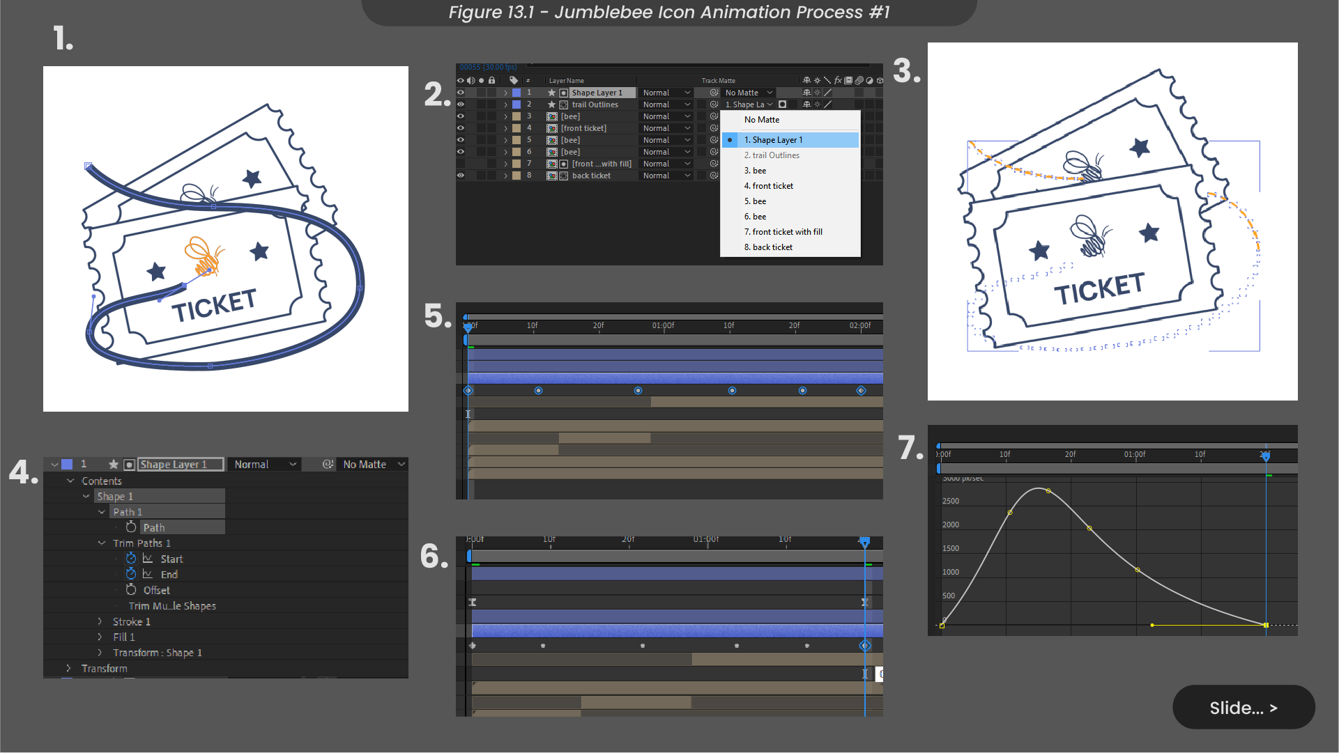
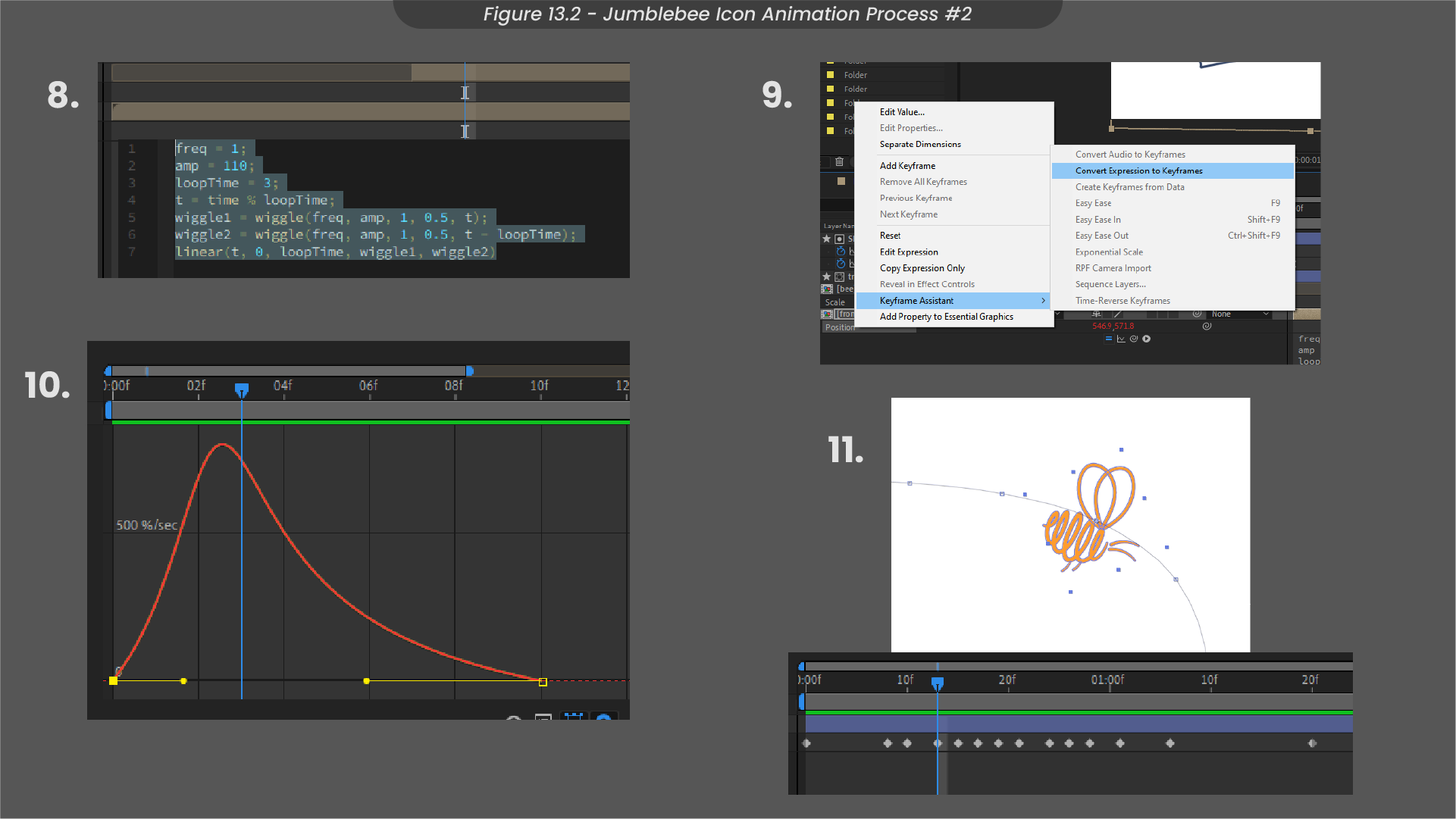
For the Jumblebee animation, I focused on the tickets icon (Figure 13.1). Initially, I employed After Effects to trace the bee trail with a stroke layer, animating its trim paths from one end to the other. By applying this stroke layer as a track matte to the bee trail, the trail became visible only when the stroke layer animated over it. To synchronise the bee’s movement with the flight trail, I duplicated and pasted the path onto the bee’s position. Aligning the keyframes for both,I ensured simultaneous animations and enhanced the smoothness of the motion by adjusting the speed graph using easy ease. For a floating effect on the tickets, I applied a wiggle expression to the position and rotation, later converting them to keyframes to meet file constraints, as I intended to export this as a Lottiefile (Figure 13.2). Finally, I animated the bee’s rotation along the trail, ensuring it faced the direction of its travel.
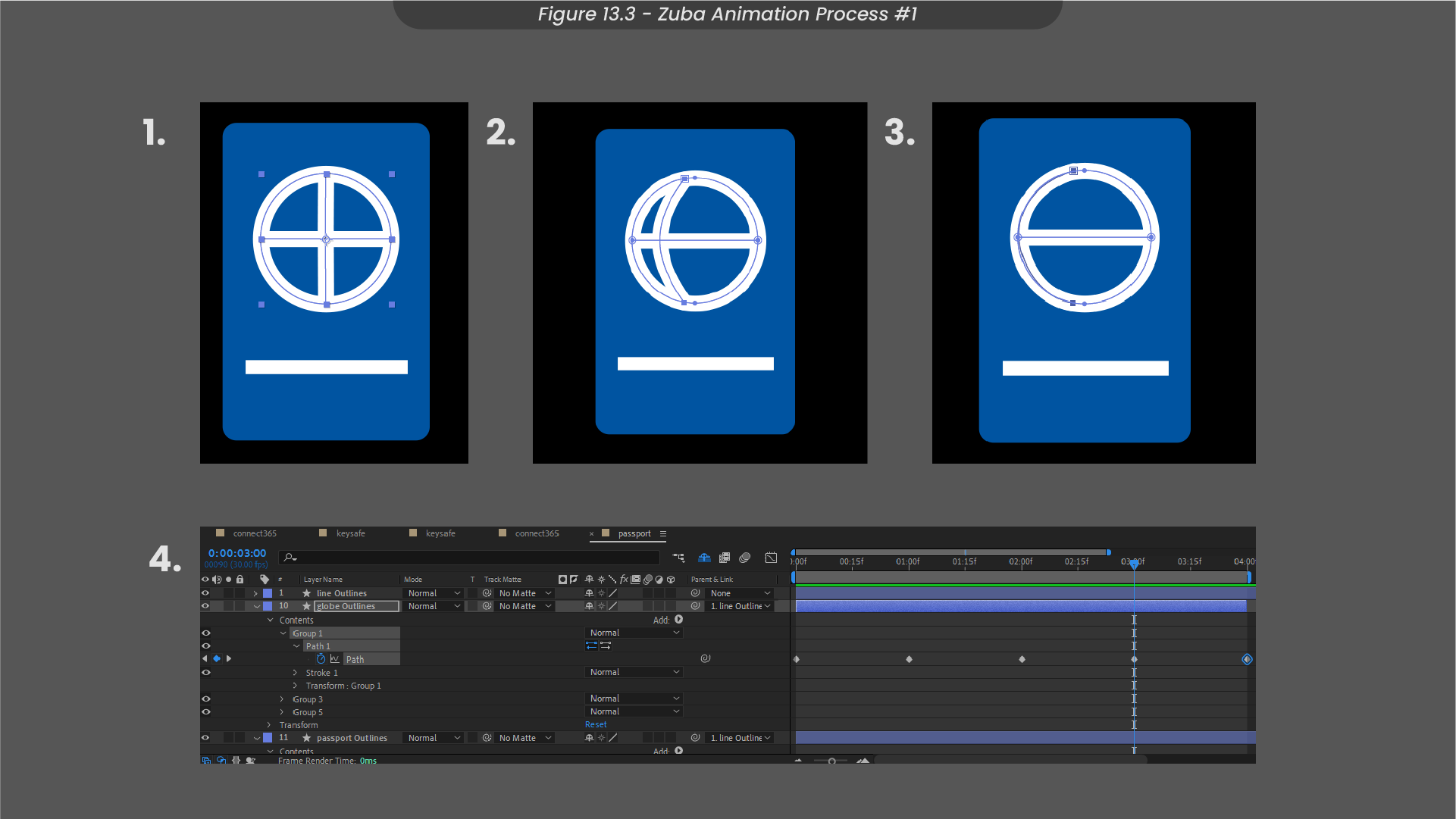
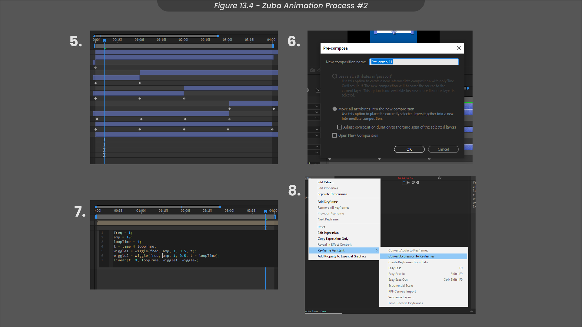
For the Keysafe animation, my focus was on animating the passport icon (Figure 13.3). The process began by creating a line down the centre of the globe using a stroke layer. To achieve a dynamic rotation effect, I crafted a series of path stages by bending the line animation slightly towards one side and then repeating the process on the other side, forming a sequence around the full circle. When animated between these path keyframes, the line appeared to move around the globe. To simulate a continuous globe rotation, I duplicated and slightly staggered the timings of this line animation (Figure 13.4), creating the illusion of multiple lines spinning around the globe repeatedly. Precomposing all of these elements, I then added a wiggle expression to the position and rotation, creating a subtle floating effect to the passport. In line with file size considerations, I converted the expression to keyframes, as Lottiefiles are incompatible with expressions.
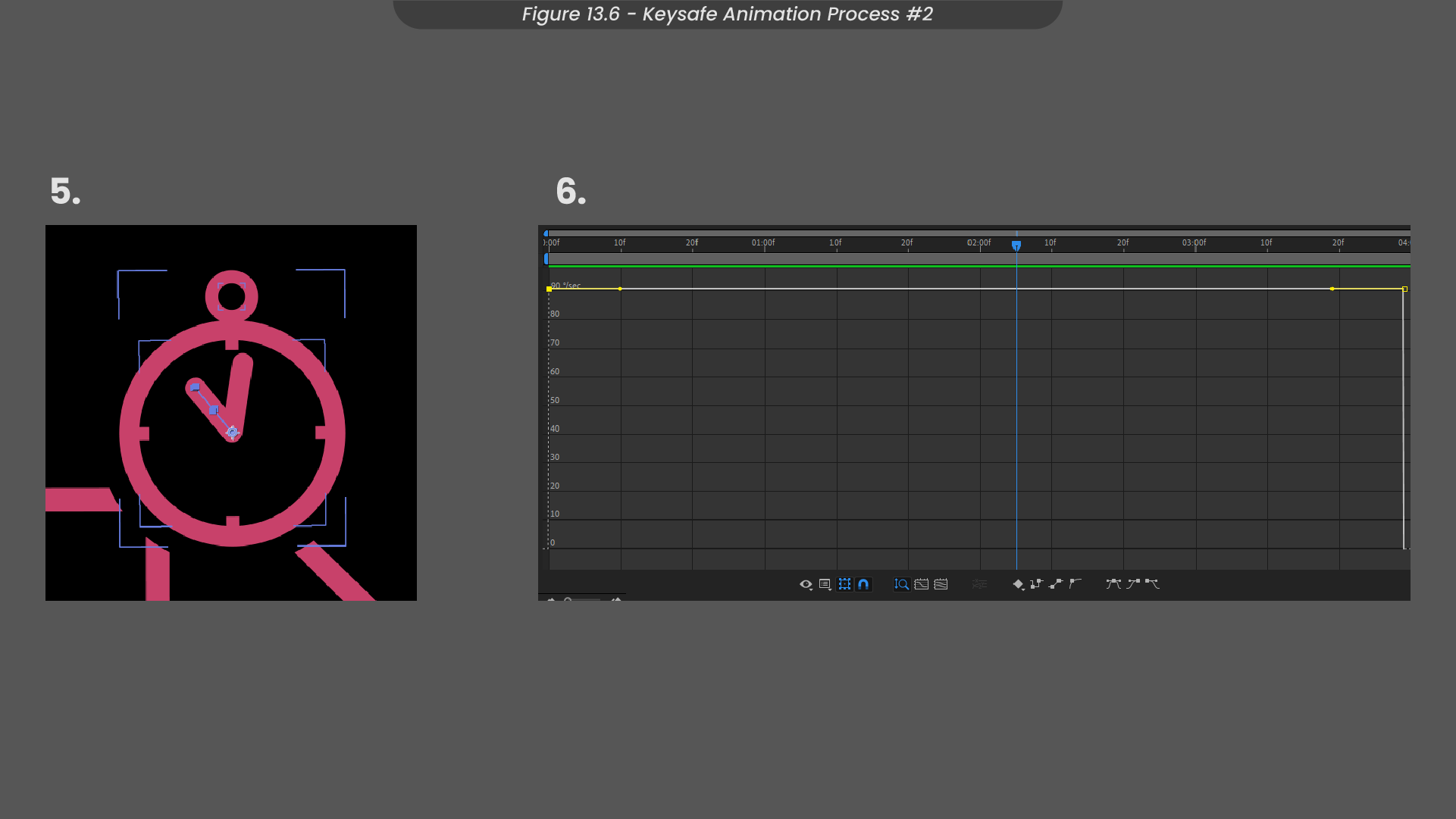
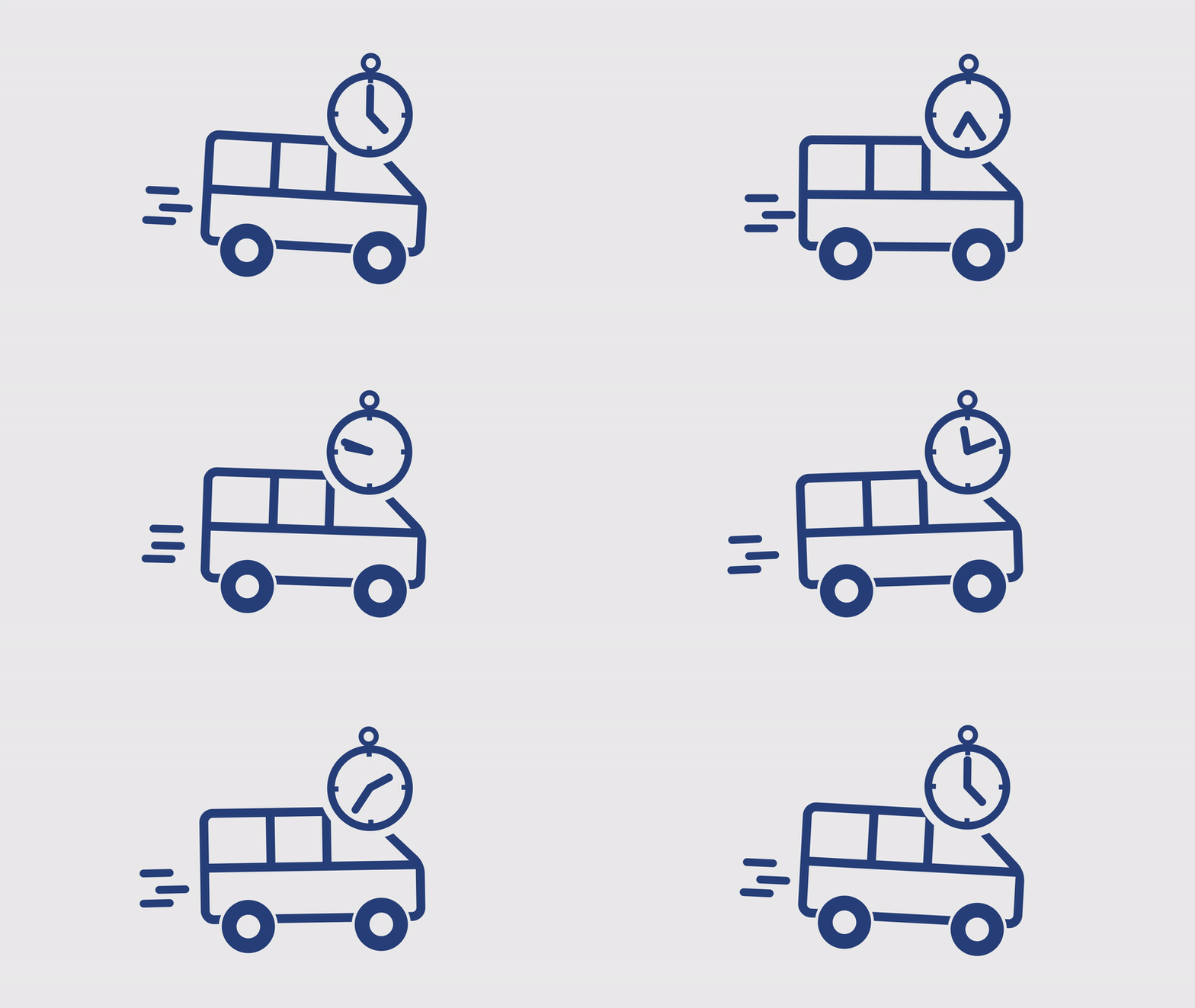
To represent the Zuba animations, I am focusing on my process for the bus times icon (Figure 13.5). Initiating the process, I animated the lines trailing behind the bus, orchestrating a back-and-forth movement to imitate the sense of the bus driving. To refine this motion, I fine-tuned the speed graph of these keyframes using easy ease, ensuring a more fluid animation. Just like the approach to the other icon sets, I applied a wiggle expression to the clock and bus, later converting the expression to keyframes for Lottiefile compatibility. Moving on, the clock hands were animated by setting the anchor point at the clock’s centre before employing a straightforward 360-degree rotation (Figure 13.6). To sustain a continuous animation, I left these keyframes untouched.
14. File Formats and Conclusions
Prioritising responsible consumption and production practices, I took measures to minimise file sizes in projects featuring multiple animated assets for website utilisation, such as these. Therefore, I focused on animating for Lottiefiles, a filetype purposefully engineered to be considerably smaller compared to alternatives such as MP4s and GIF formats.
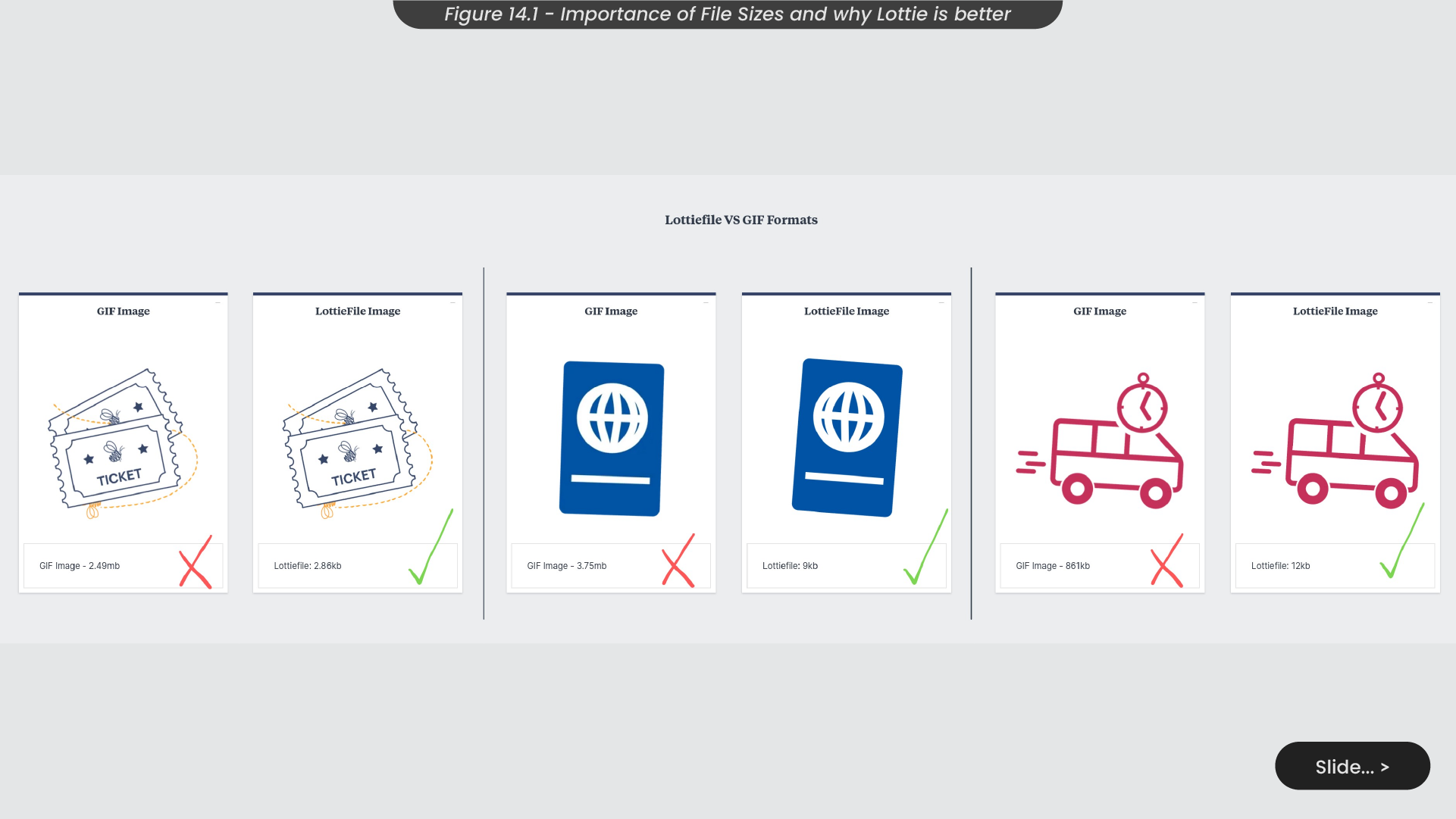
To ensure this was the most responsible choice for export, I conducted a comparison of the file sizes between Lottiefiles and GIFs for identical animations (Figure 14.1). In the case of the Jumblebee icon animation, the GIF file weighed in at 2,49mb, whereas the Lottiefile was a mere 2.86kb. This compelling contrast proves the clear superiority of Lottiefiles as the optimal file type for web applications. This trend was consistent across my other icon examples, revealing Lottiefiles consistently surpassing GIFs by over 90% in size reduction. Opting for these smaller file types on websites aligns with Sustainable Development Goal 12 (SDG 12) by fostering responsible consumption and production. By reducing file sizes, websites contribute to a reduced carbon footprint, as the amount of Co2 emissions is directly correlated with the electricity required for data transfer.
In summary, I found satisfaction in engaging with these projects and feel they were successful in aiding my animation consistency. This consistency enabled me to craft a diverse set of animations that maintain cohesive styles and effects, contributing significantly to the distinct brand identities of numerous companies. This multifaceted collaboration not only showcased my proficiency in animation but also demonstrated my ability to integrate seamlessly into a team, as working with like-minded designers allowed me to bring their design concepts to life effectively.
To enhance these projects further, an exploration of additional 3D effects could have added more visual interest into each icon and pushed my abilities and skills further. These projects bolstered my understanding of file sizes, encouraging me to make a more focused commitment to sustainable design processes. This newfound awareness ensures that I approach animation with considerations for environmental impact, acknowledging that while Lottiefiles may present certain limitations, using them still proves worthwhile for the substantial reduction in file sizes.
15. Figma Udemy Course
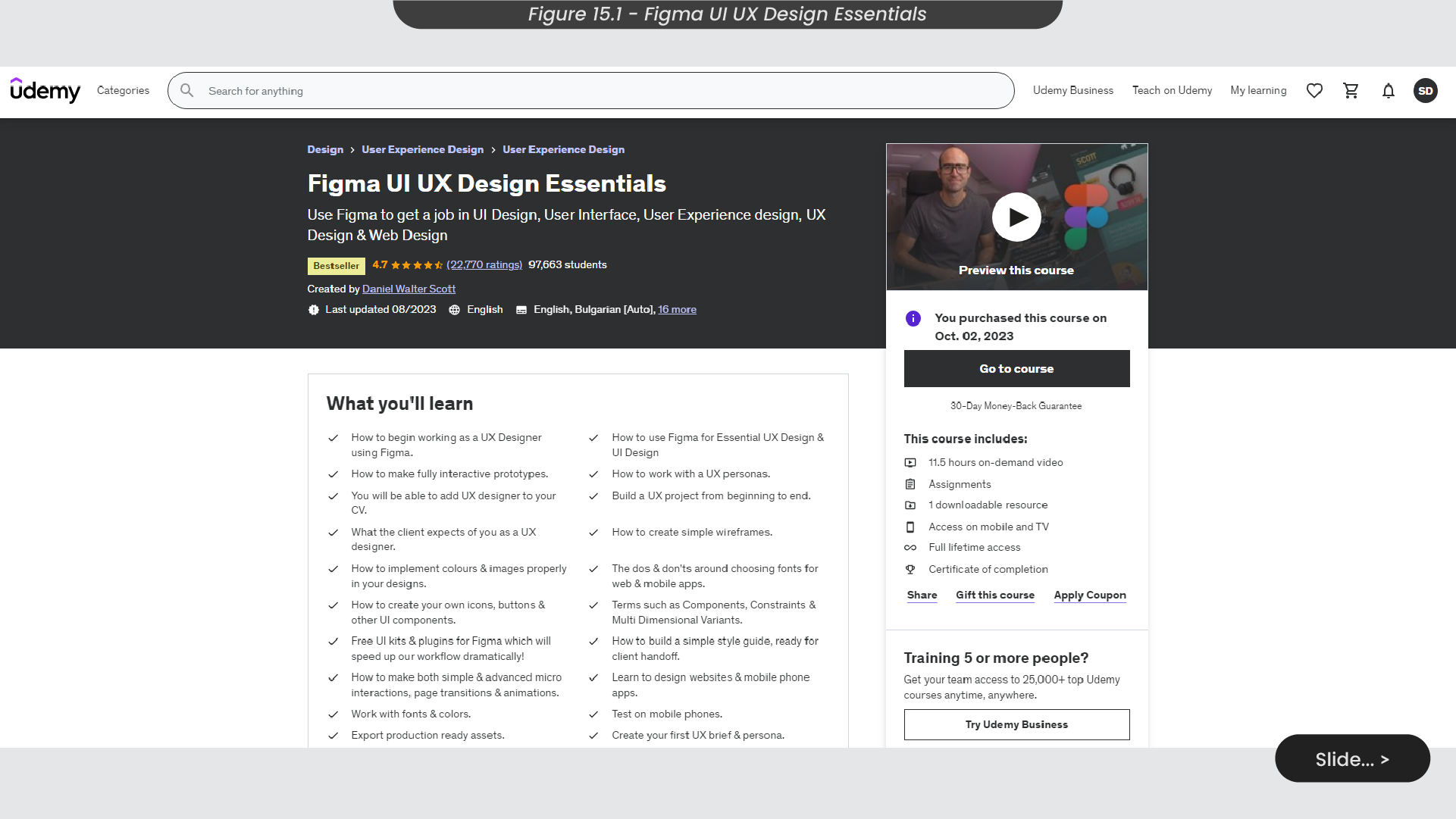
During this business quarter, a key rock for me was to engage in the assigned Figma course on Udemy during any available downtime at work, particularly when not occupied with other projects or awaiting the next task. The course, “Figma UI UX Design Essentials” by Daniel Walter Scott, aims to guide how to begin working as a UX designer in Figma and constructing simple interactive prototypes (Figure 15.1). The intention of this training is to equip me with the fundamental skills in Figma, empowering me to actively contribute to the designing and prototyping aspects of our design processes at Summit Digital.
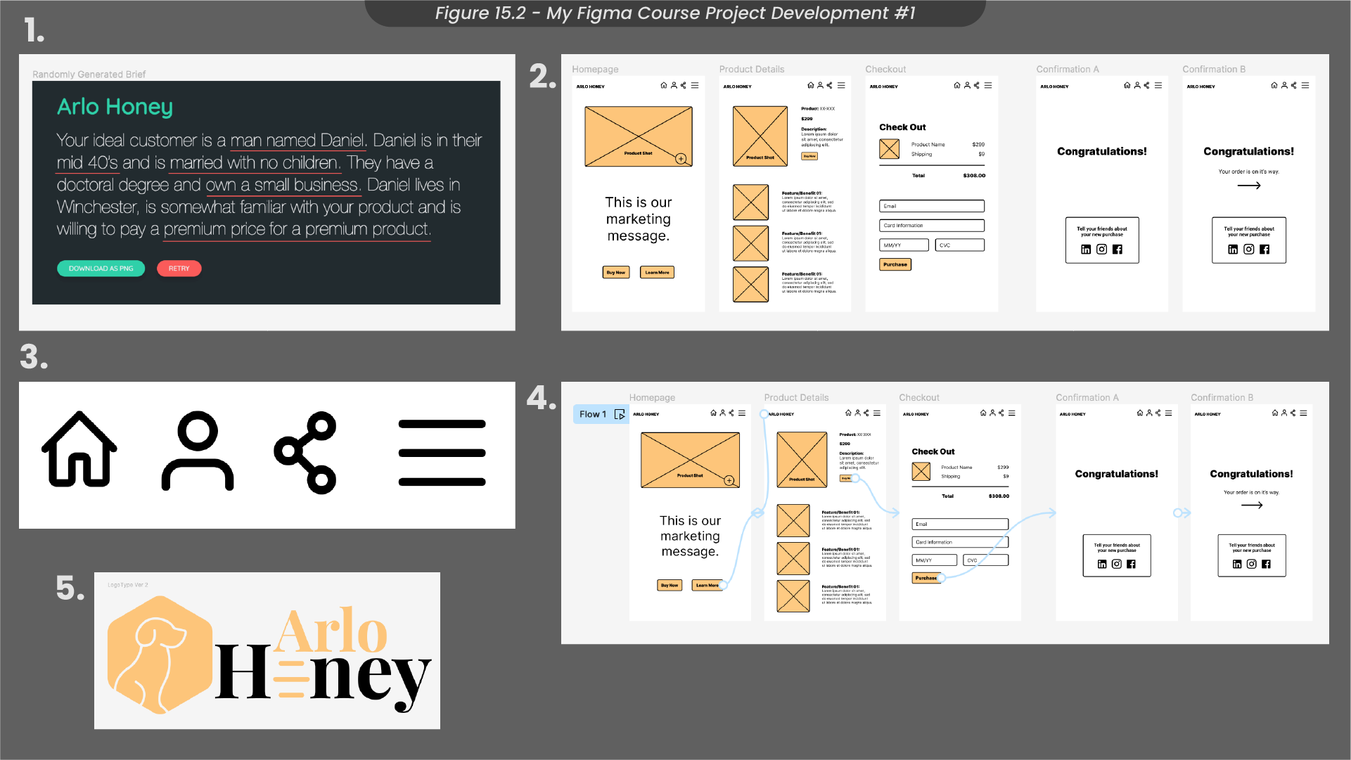
Throughout the course, I learnt how to craft effective design briefs by generating target audience personas using a random generator (Figure 15.2). This skill will be helpful when approaching training or passion projects, enabling me to continually enhance my ability to work from a well-structured brief. Additionally, I dived into the processes of Figma by learning how to construct simple wireframes using frames and components. Expanding beyond my previous vector design proficiency in Illustrator, I harnessed the design tools in Figma to create a collection of icons and a logo tailored to the randomly generated brief. One standout aspect of the Udemy course was diving into the realm of prototyping, which aligns with my role as an animator in potential Summit Digital projects.
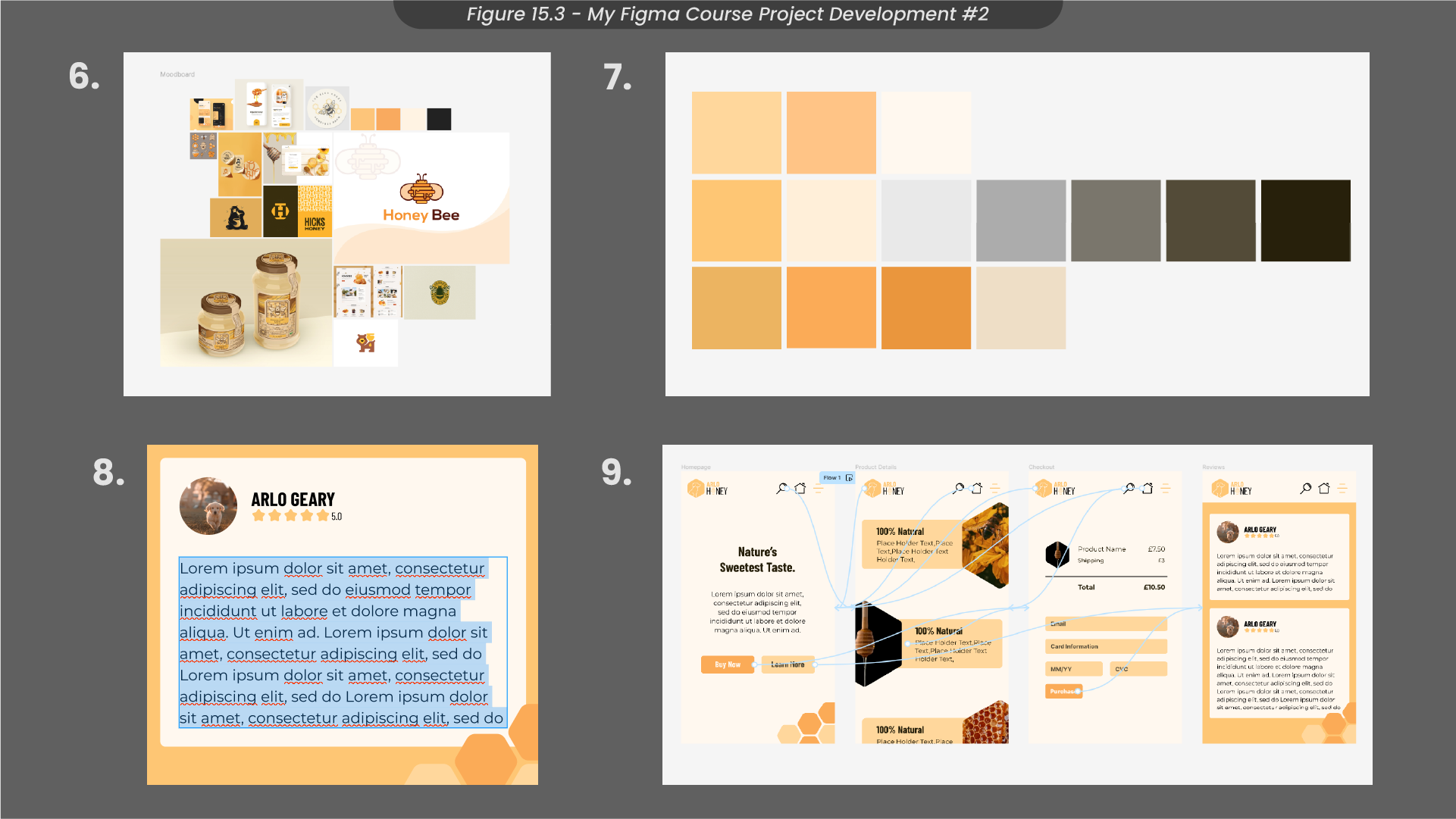
This training not only deepened my understanding of wireframing and prototyping in Figma, but also fortified my initial design processes (Figure 15.3). I expanded my skills in creating Hi-Fi prototypes, refining techniques such as organising moodboard based on standout designs. I was able to craft colour palettes with a more diverse range by utilising gradients and blending colours. Additionally, when creating my Hi-Fi prototype, I learned how to create resizable boxes with text using auto-layout - a skill particularly useful for dynamic designs that undergo frequent live content updates.
Overall, this course has significantly broadened my vector design skills which could prove helpful when designing niche projects that require unique software skills. Moreover, the diverse range of skills acquired has not only refined my initial design processes but has also elevated my proficiency in prototyping within Figma, encouraging a newfound confidence in helping with Figma projects at Summit Digital going forward.
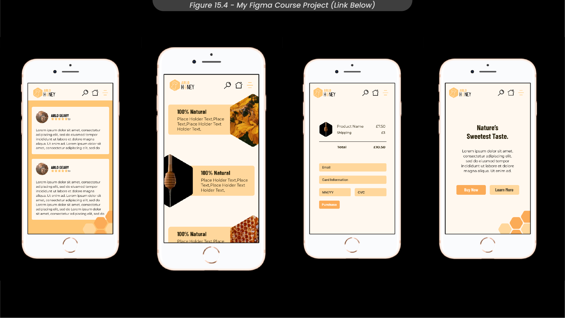
Throughout the duration of the project, I followed the time management plan I had created earlier in the placement, utilising my weekly plan and Gantt chart. This approach proved instrumental in keeping me of track, especially considering the generous time allocation, allowing me the flexibility to get back on track if I fell behind. To view my finished project for this Figma training course (Figure 15.4), a link can be found here.
16. Webflow Youtube Course
Another pivotal goal set for me during this business quarter was to successfully finish the Webflow “Intro to Interactions” course available on Youtube (Figure 16.1). This course aimed to enhance my comprehension of Webflow interactions and live animations for websites, such as elements like scrolling animations and those triggered by user clicks. The instructional content dissected various interaction processes, providing a comprehensive series of guided examples and walkthroughs.
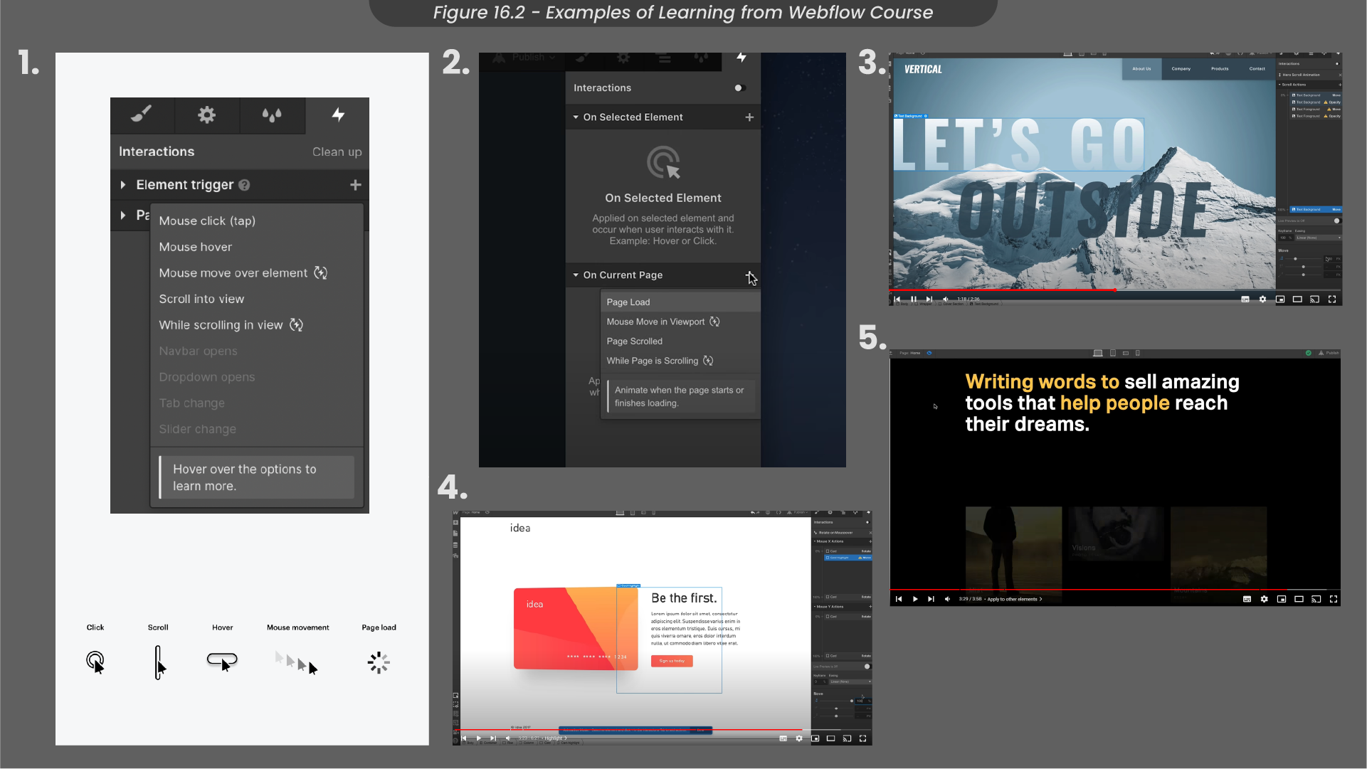
Throughout the course, I gained insights about the two primary ways Webflow can create animations - creating triggers and animating on the timeline (Figure 16.2). There are two different types of triggers, element triggers and page triggers. Element triggers are activated when users interact with specific elements, such as hovering or clicking. On the other hand, page triggers initiate animations in response to changes in the page, such as the page being loaded.
Guided by walkthroughs, I learned practical examples of these concepts. For instance, I discovered how to create an element that rotates upon being hovered over. This involves applying the interaction ‘mouse move over element’ to the selected element and defining keyframes for x and y rotations in the interactions panel, aligning with the mouse’s position over the element. Additionally, the course covered other examples like a horizontal movement interaction, achieved by creating a page trigger tied to page scrolling, and a reveal elements interaction, executed by selecting an element trigger named ‘scroll into view’.
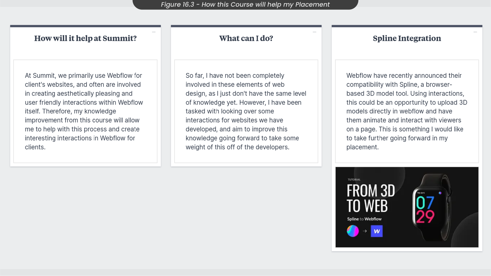
Overall, I have gained valuable introductory knowledge in Webflow interactions and am eager to contribute to Summit projects that involve enhancing the overall user experience through micro-animations on websites. Participating in this course will enable me to align more closely with the Summit Digital team (Figure 16.3), as I haven’t been fully immersed in these aspects of web design until now. With this newfound knowledge, I can assess the fluidity of our interactions, and with continued learning during my placement, potentially assume a more significant role in managing interactions to relieve some workload from our developers.
17. Reflection of Semester 1 Placement
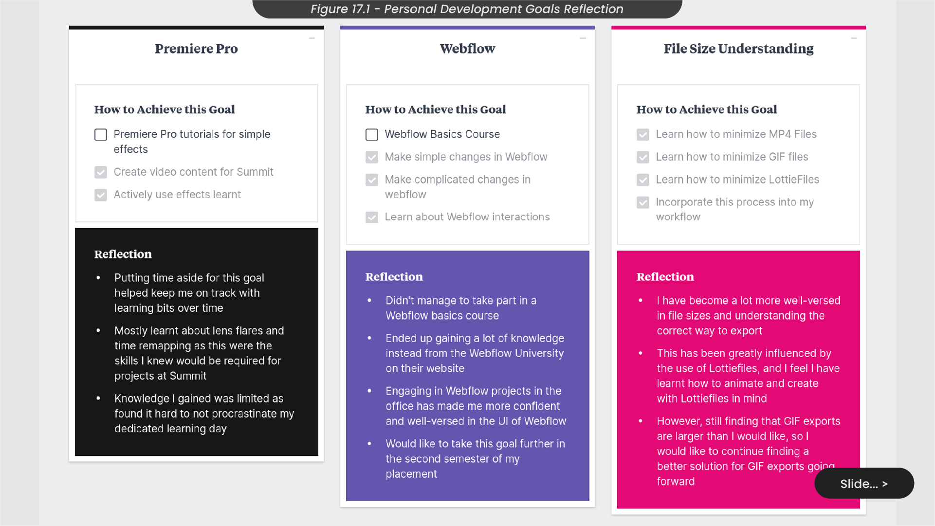
Reviewing my personal development goals at the start of this placement (Figure 17.1), I believe I have successfully deepened my understanding of file sizes, notably optimising exports using tools like Lottiefiles. This helped me recognise the goal of understanding and reflecting SDG 12, responsible consumption and production. Achieving my Premiere Pro goal involved hands-on Summit Digital projects, covering aspects like lens flares and time remapping. Similarly, in Webflow, practical adjustments during Summit Digital’s website projects significantly boosted my skills and confidence in navigating the UI as I now have the skills to make simple changes when needed. However, I faced challenges in adhering to my planned learning day, struggling with personal procrastination. To address this, I recognise the need for a dedicated day outside of work, as I believe this is what caused an increased amount of procrastination this semester.
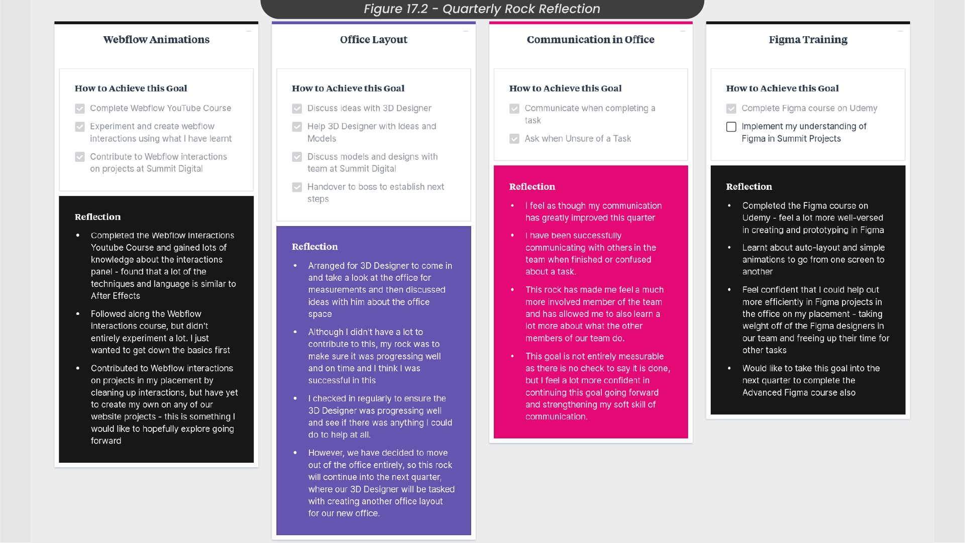
Upon reviewing my assigned rocks at the start of this placement (Figure 17.2), I believe I have been successful in accomplishing all of my tasks. This success is due to my attention to the outlined objectives and the time management planning reflected in my Gantt chart and weekly plan. Notably, I successfully completed the assigned Webflow and Figma courses within the designated time frames, significantly enhancing my proficiency in Webflow interactions and Figma prototyping. This newfound knowledge will undoubtedly contribute to my design processes and future endeavours at Summit Digital. Also, I feel as though I have improved my communication within the office, fostering a sense of active participation and integration within the team. This enhanced communication has not only made me feel more connected but has also deepened my understanding of the diverse roles played by each team member.
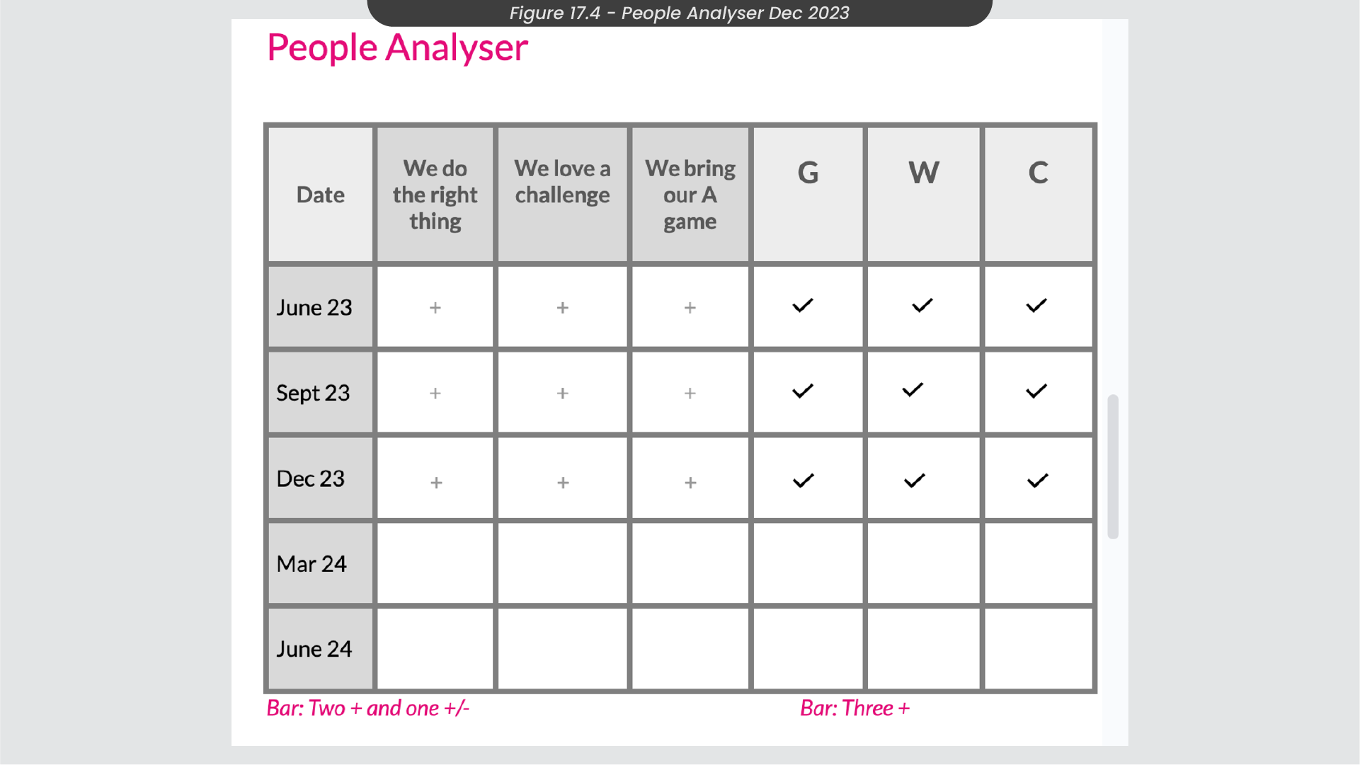
At the end of the business quarter, my quarterly appraisals highlighted successful progress in my assigned objectives, including rock progression and the EOS people analyser. My team leader at Summit Digital affirmed my effective time management and team awareness. The people analyser evaluation at the start of the quarter, in September (Figure 17.3), confirmed my continued alignment with the company’s values, making me the right fit for the team. At the end of the quarter, in December, I was evaluated very similarly (Figure 17.4).
As I conclude my first semester in this placement, I’m eager to build upon this success and embrace new challenges in the upcoming semester. Looking ahead, our discussions centered on advancing my training in Webflow and Figma. Recognising the need for more advanced knowledge, we explored enrolling in advanced courses for Figma and utilising online learning materials to deepen my understanding in Webflow, reflecting my commitment to continous improvement and pushing creative boundaries.
Where I have taken part in multiple projects and have been involved in various roles throughout this placement, I have decided to compile all of my work and necessary related files into a password protected handover document if someone were to adjust any of these animation projects going forward, which can be found here.
You can also find my NLT form propsals for Semester 1 and Semester 2 from my second year study plan here:
Semester 1 NLT Form
Semester 2 NLT Form

