Nature Trail App Design
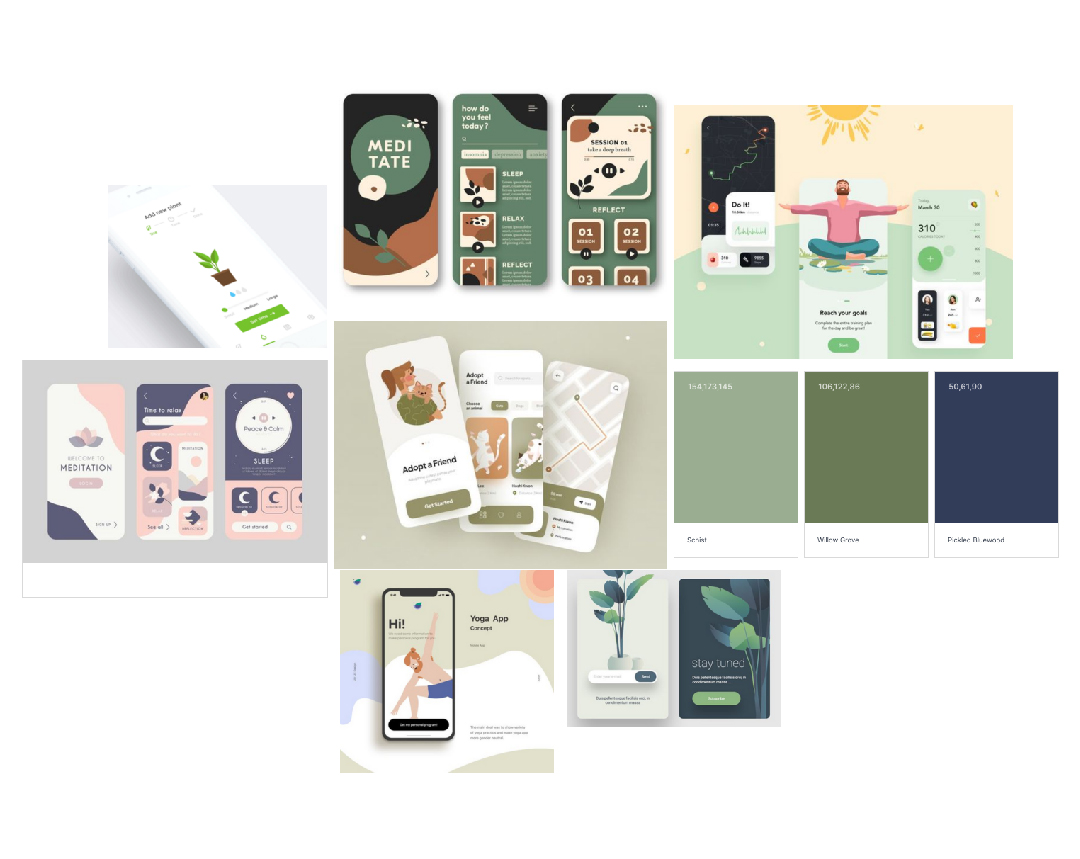
(1) App UI Moodboard
Brief and Inspiration
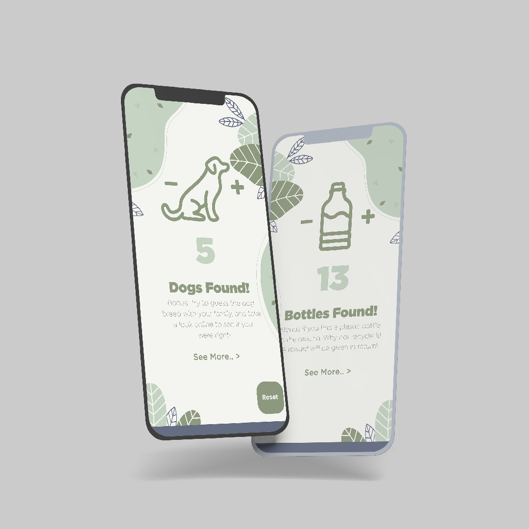
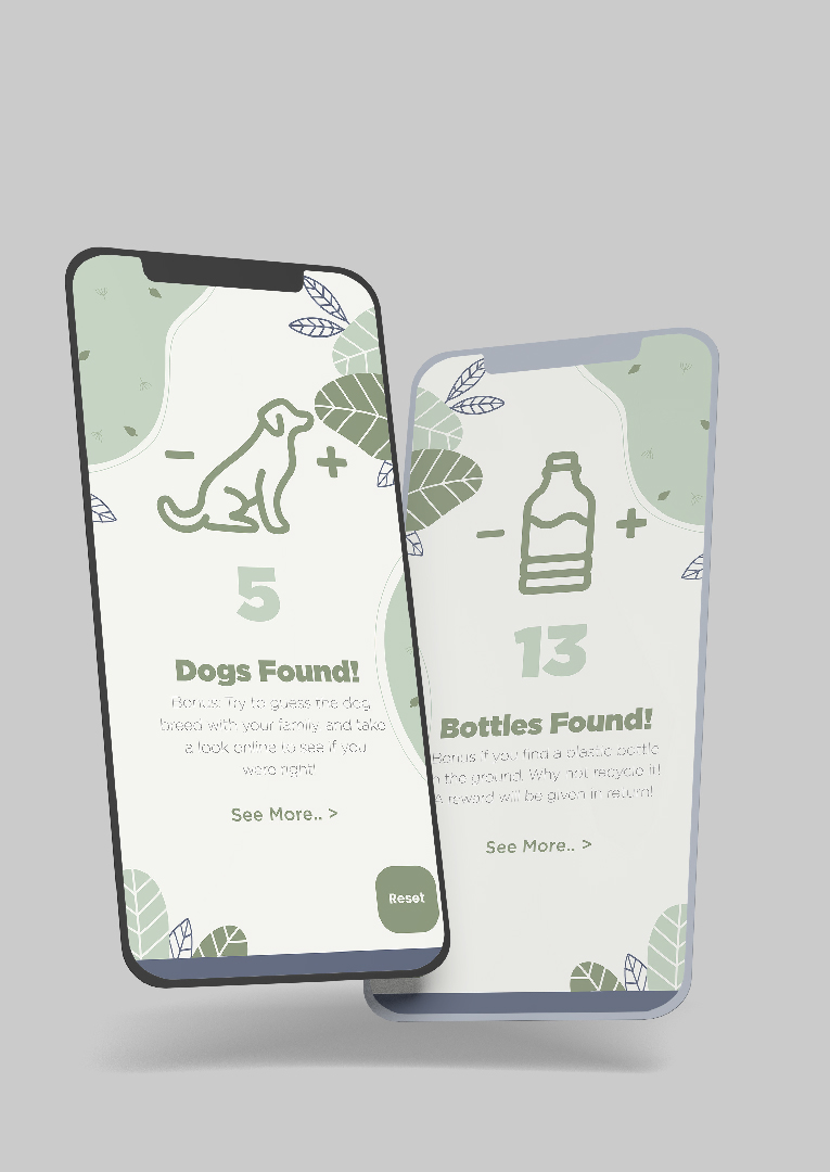
While working on my own projects in the second semester, I decided to take on a side project helping a few second years with their project. The brief for this project was to create an app for a nature trail in River Hamble Country Park, called RHCP Adventure, that uses AR features and aims to give a fun, engaging and informative experience for families with younger children.
My role in this project was to help design interactive UI for users to keep track of how many dogs and bottles they saw on their walk. To get inspiration for this project, and understand how other apps have been designed so I can use similar trends when creating my own, I created a Pinterest board with app UI that interested me, looking specifically for a more serene and natural aesthetic to match the theme of a nature trail. Using these, I created a mood board (1) on my project planning tool, Milanote. The link to this project's Milanote board can be found here.
I found that many similar apps had an illustration as the primary focus on the composition, to engage their audiences and reflect the apps theme. This is something I will keep in mind when designing my own app screens.
(2) App Initial Ideas
Initial Ideas
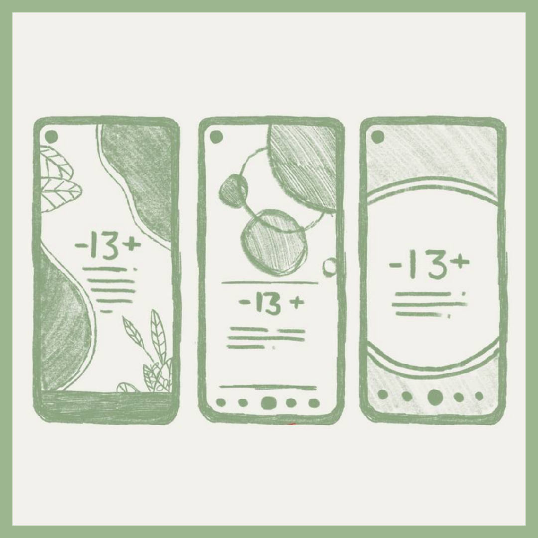
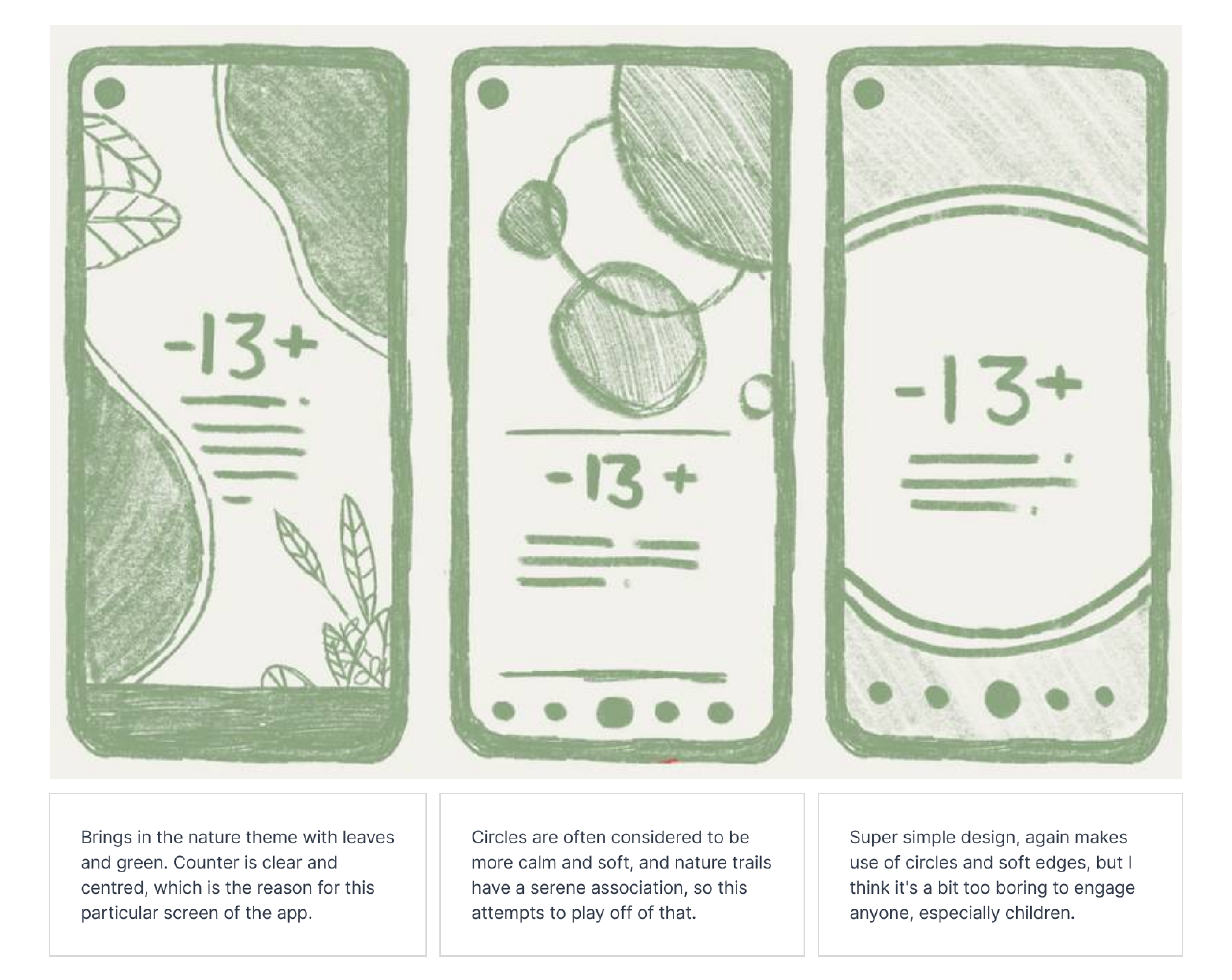
After collecting inspiration and researching other app designs for common themes, I started sketching some ideas for this project (2).
The first idea I had for this project was a nature-themed app design with overgrown leaves on the edges of the composition, with the counter for the dogs and bottles clearly centred, since this is the main focus of my part of the app. This design also leaves room for animating the leaves to further interest users, which is eye-catching and considered relaxing to watch. This is the design we went with, for these reasons.
The second idea I had for this project included circles or bubbles in the background, as circles are often considered softer and more delicate than shapes with harsh corners. This plays off the serene feeling of a nature trail. However, we decided this design resembled more of a water-themed app, such as a water tracker, rather than a nature app, due to the bubble-like shapes.
The third idea I had for this project was a super simple design, also making sure of round shapes and soft edges. We decided this design was too boring to engage anyone, as not much is happening and it won't engage families, especially children.
App Design Process
App Design - Illustrator
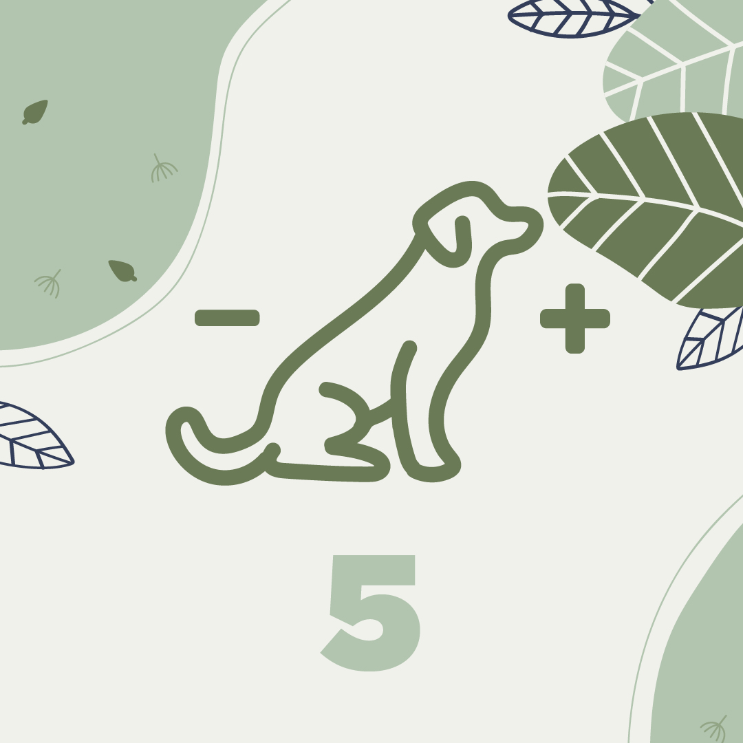
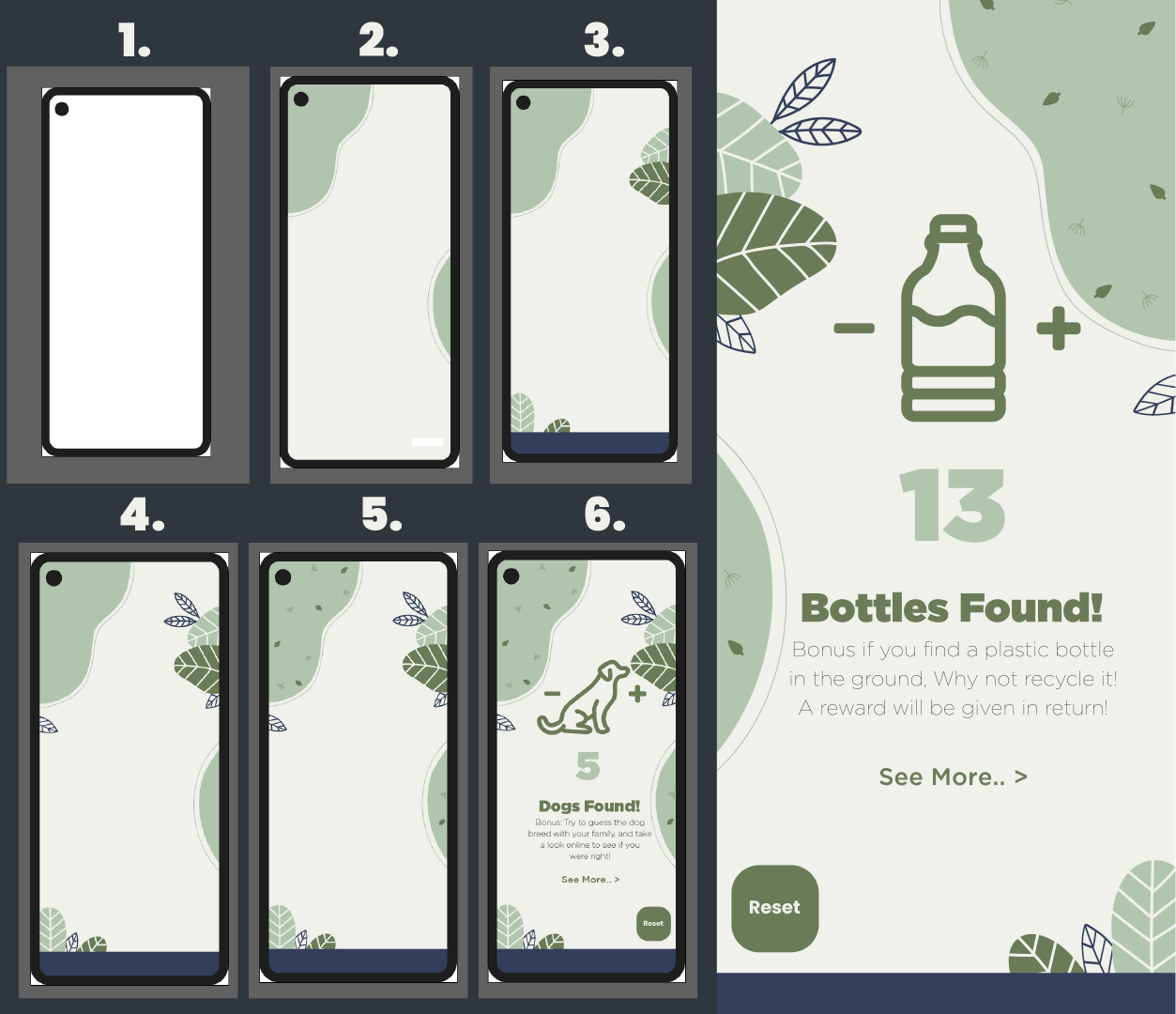
To start developing my sketch into a finished app design, I started by opening Illustrator and creating a standard phone screen composition size, as this app would be used mostly by mobile phones. I then created a phone screen out of vectors to visualise how the app would look on a phone (1). Next, I added the background shapes, with soft edges for a more delicate feel, to make the background a little more interesting and eye-catching (2). I also made the background slightly off-white, so it was easier on the user's eye.
Once I had my background established, I began adding some details, such as some big leaves around the edges of the composition (3), bringing in the nature theme a little more explicitly. To further this, I added some smaller leaves using the accent colour from the navigation bar (4), to enhance the colour scheme and liven up the scene. At this point, I decided the background shapes looked too plain compared to the details on the leaves, so I added some leaf decals (5) in the foreground to make them a little more interesting.
Finally, I added the text and the counter in the middle (6), making sure all of the interactable components, such as the buttons and links, were on different layers so the second years could easily make them function in the app..
