1. Brief Exploration
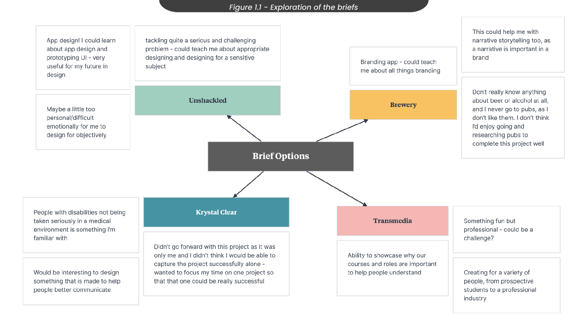
Before starting this project, I explored the briefs that were presented to decide on the project I wanted to be involved with throughout the first semester (Figure 1.1). I chose to look only at the briefs that focused on branding and visual identities, as I felt these briefs would provide the most useful knowledge that I could take forward with me in my future as a designer. For example, I looked at briefs like ‘Unshackled’ and ‘Kyrstal Klear’, as these projects would help me understand how to design visual identities for sensitive topics. However, as I had already decided I would be creating an app for my RSA project, I decided to go forward with the ‘Transmedia 2023’ brief so that I could develop a wider set of skills throughout my first semester.
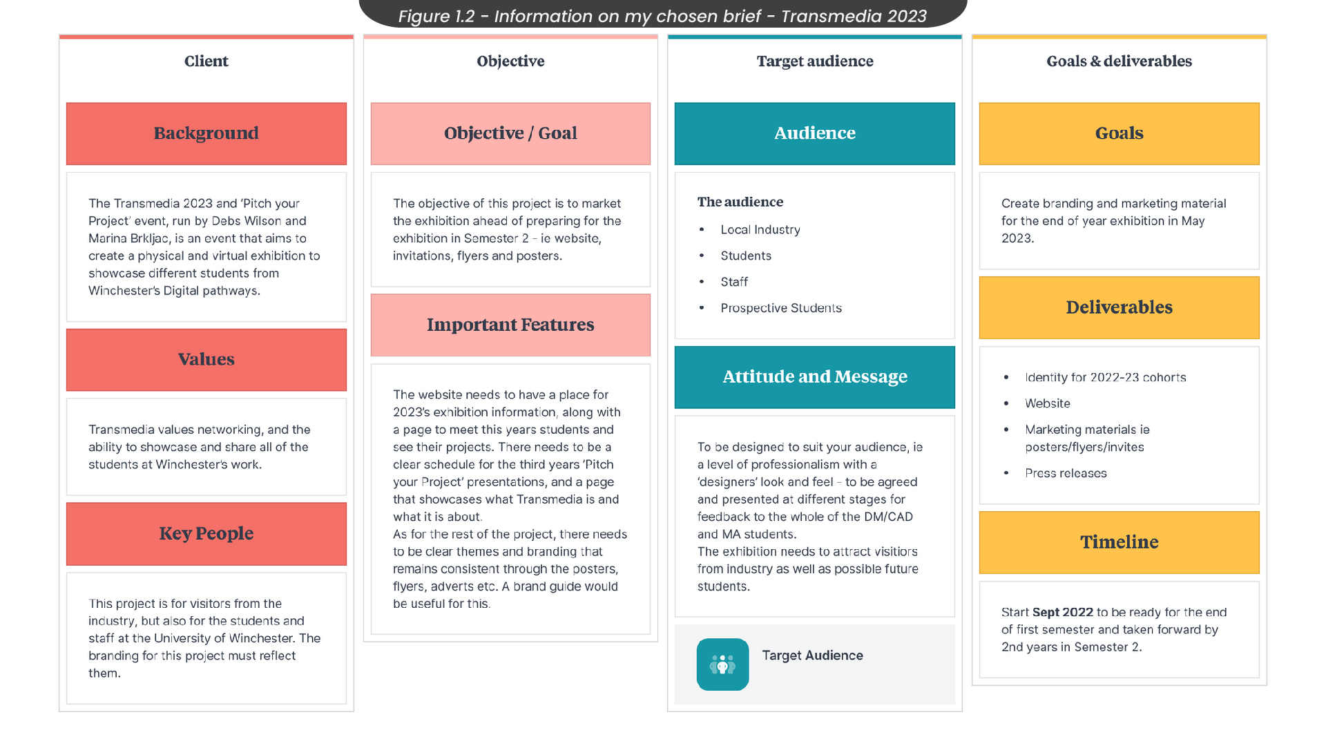
Once I had decided I would go forward with creating the visual identity for the 2022/23 cohorts of digital media at the Transmedia Exhibition, I took a deeper look into what the brief was asking for (figure 1.2). Here, I did some research into the background of Transmedia and the values the event holds. I also made sure to take note of all of the goals and deliverables expected to be completed in this project over the semester, so that it would be clear to me how much of a workload I would be taking on.
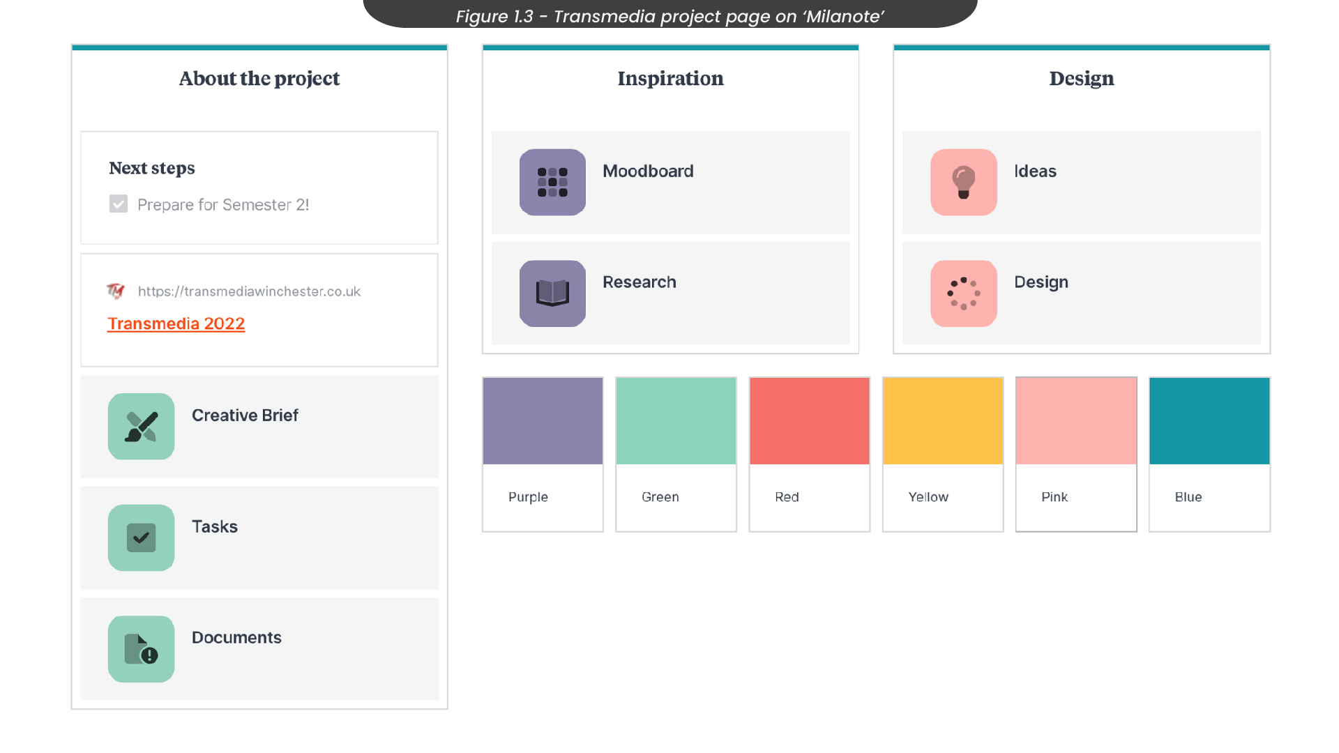
Before moving on to planning out the project, I set up a project board in ‘Milanote’, as this is my preferred project planning tool (Figure 1.3). I ensured this board was shareable with other members of my group, as this was a group project and we needed to collaborate frequently on all elements of this project for it to be successful. The link to this board can be found here.
2. Planning the Project
Other than myself, two other people were interested in working on the Transmedia 2023 visual identity. Our group was compiled of two designers and one game developer, so the first thing we set out to do was set up project and communication tools (Figure 2.1) so that we could all keep on track and be informed about each other’s process throughout the semester. For communication, we decided to create a discord server, as here we could organize our thoughts by creating separate channels and threads. We also decided to create a collaborative Pinterest board, where we could share images to build our mood boards and find a common style we all liked so that our identity would remain consistent.
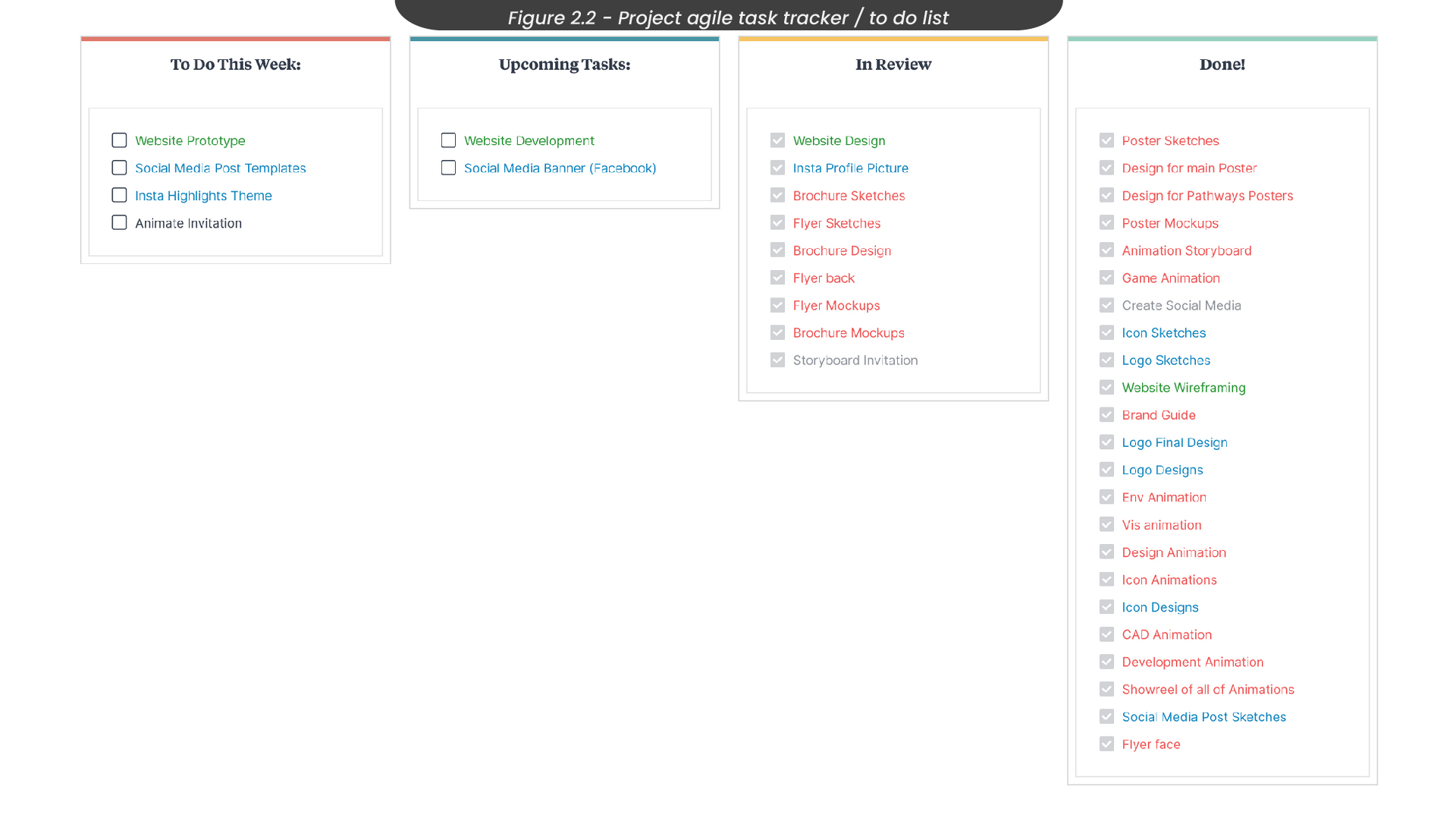
Once we had set up all of the tools we aimed to use throughout our project, the next step was to divide the tasks among us, based on our pathways. To do this, I created a task tracker (Figure 2.2), where we could keep an eye on what needed to be done in our current week and any upcoming tasks we should be aware of. Applying Belbin’s ‘Team Roles’ theory, my primary team role of ‘completer/finisher’ seemed to play a part in this project, as I found myself overlooking all of these tasks and ensuring they were finished.
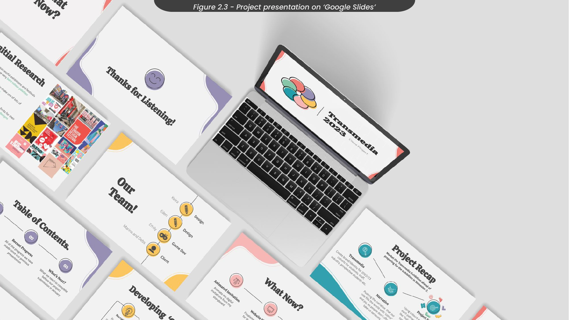
Another way we stayed on track was by updating our project presentations (Figure 2.3) periodically throughout the semester, as this allowed us to organize our thoughts more compactly. These presentations were also helpful tools when setting up meetings with our client, as we were able to show her our progress efficiently.
3. Project Research
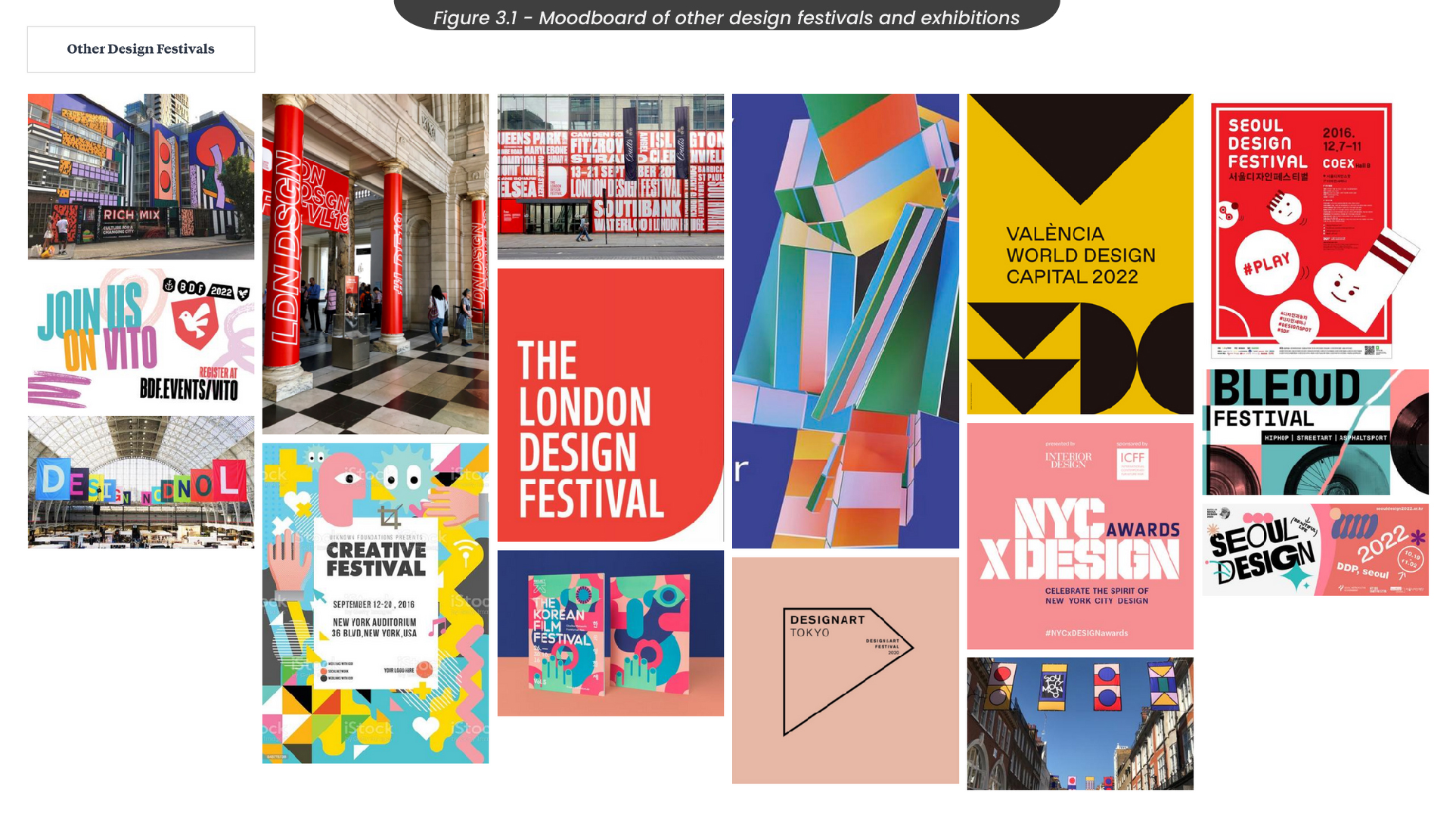
To research this project, we started by looking at other design festivals and exhibitions to identify what makes them successful, so that we might replicate these techniques when designing our own. To do this, I created a mood board (Figure 3.1) of the visual identities of a variety of exhibitions from recent years, such as the London Design Festival, the Birmingham Design Festival, and the Seoul Design Festival.
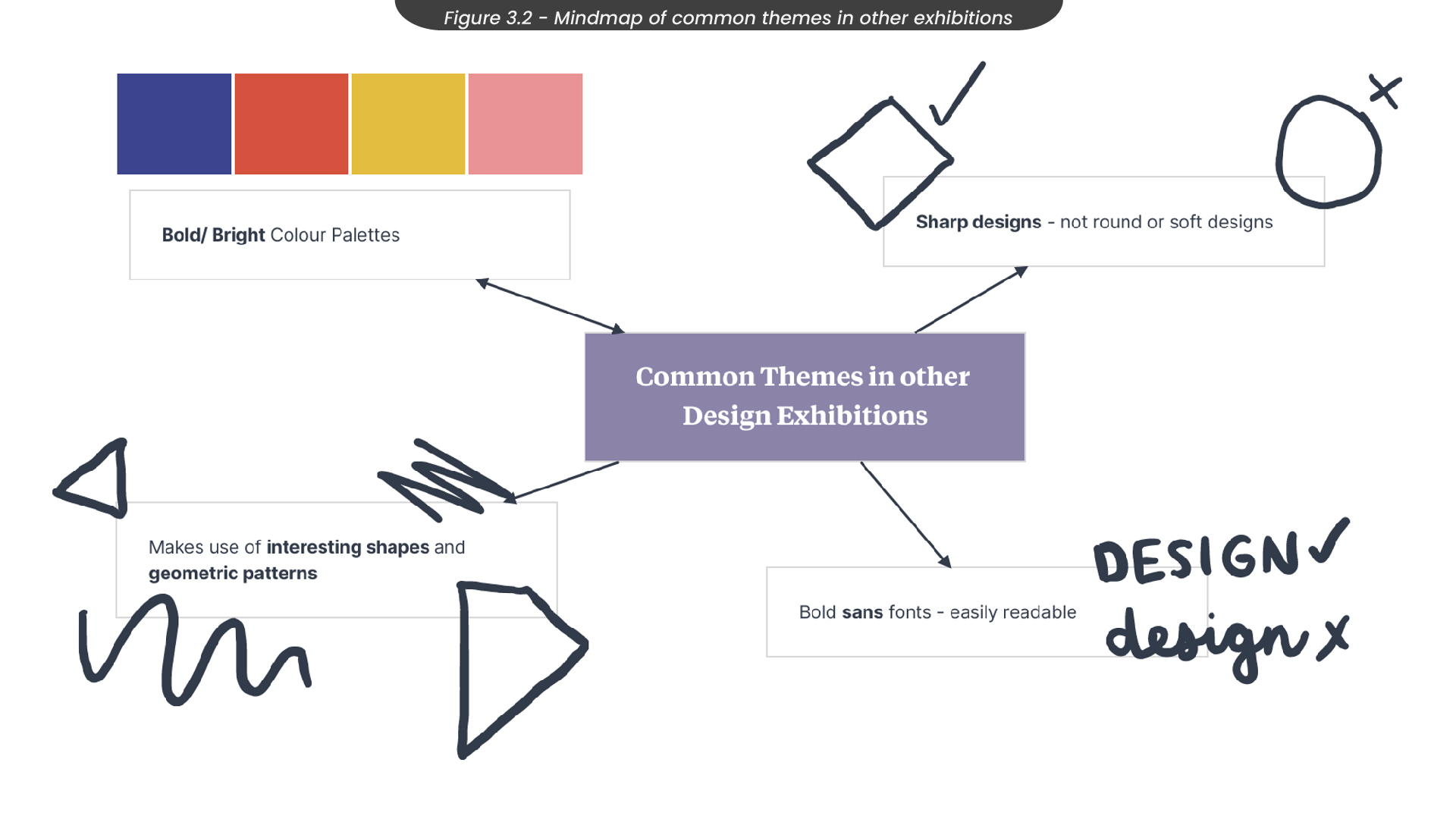
From this, I found a variety of common techniques that seemed to be used throughout almost all of these exhibitions (Figure 3.2). For example, I found that their visuals tended to have bright, bold colours, and they often made use of geometric shapes and patterns. Most of the exhibitions I looked at also used bold sans fonts, rather than serif fonts.
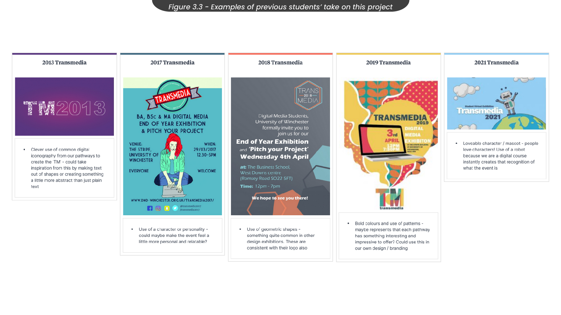
As a group, we decided it was important to consider the background of the ‘Transmedia Exhibition’. Therefore, we looked through the previous students' approaches to the same project to see what was successful in the past (Figure 3.3). For example, we found that the 2018 approach to this project also made use of geometric shapes, which is a common technique in other exhibitions and something we were considering using for our approach..
4. Project Ideas
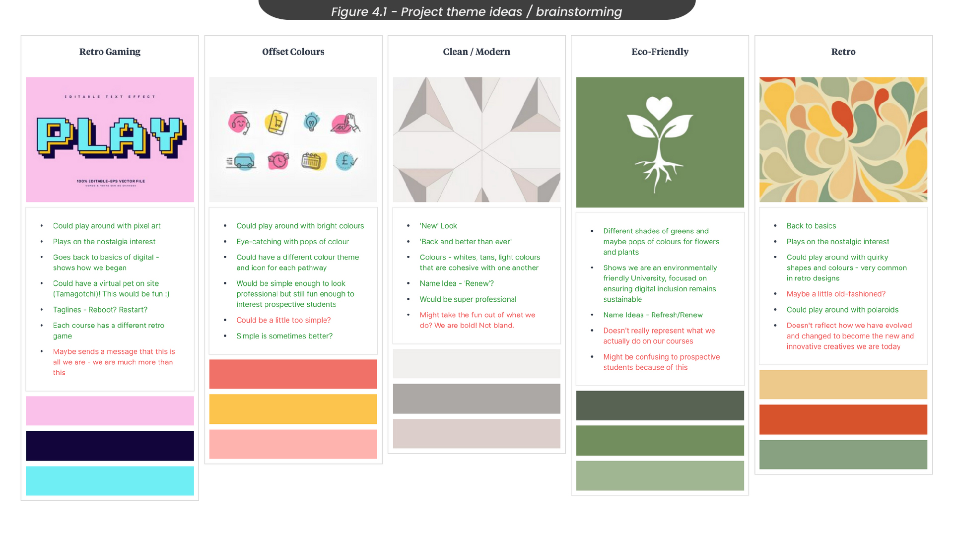
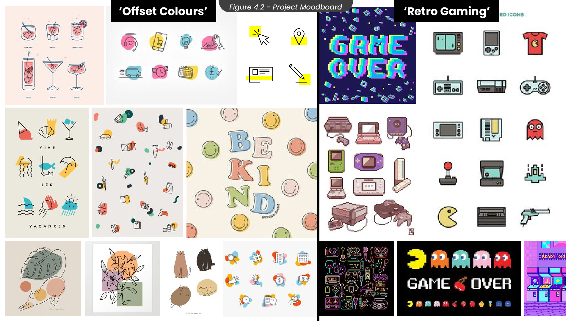
During one of our group collaborative sessions at the start of the semester, we brainstormed a variety of different styles we could use in this project (Figure 4.1). For example, we thought about creating a visual identity that was clean and modern, as this would look professional and allow people to take us seriously. However, we felt this style took the fun out of what we do and didn’t showcase the creativity that comes with our roles as designers. Therefore, we also looked at ‘retro’ styles, as these often have fun patterns and bursts of colour. Although this style would have allowed us to explore shapes and interesting patterns, we felt this style didn’t capture how we have evolved and become the innovative designers we are today. The two ideas we decided to look further into were ‘retro gaming’ and ‘offset colours’, as these styles were both colourful and bold, which is something we found was common with successful design exhibitions.
Taking images from our collaborative Pinterest boards, we started to build some mood boards for these styles (Figure 4.3), so that we were able to visualise the direction we wanted the project to go in.
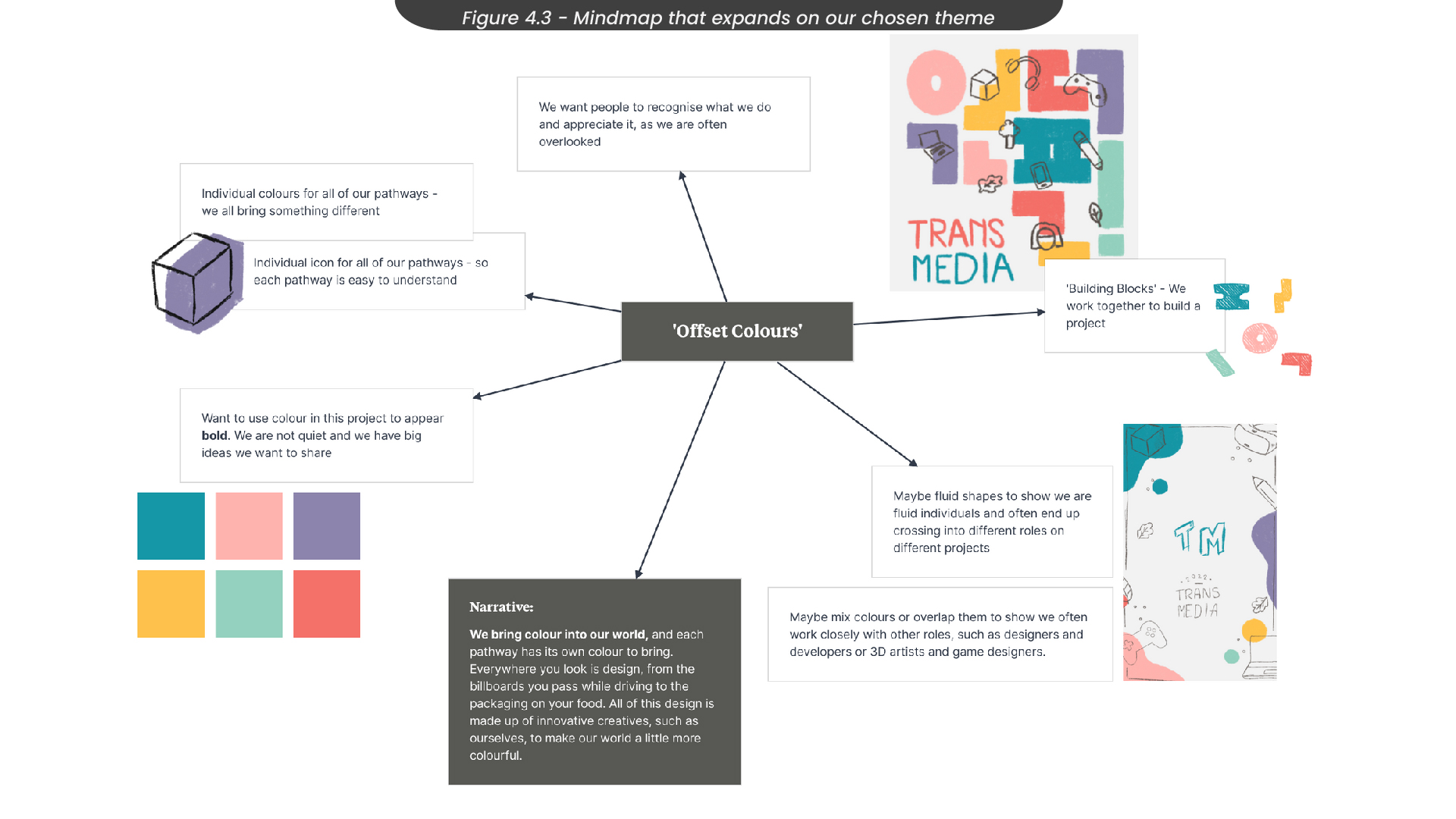
We decided that the ‘offset colours’ style was our favourite, as it was fun and colourful while also maintaining professionalism, which we felt the ‘retro gaming’ style lacked. With this in mind, we created a mindmap to take a deeper dive into this style (Figure 4.3). For our narrative, we wanted to capture how all of our pathways bring something new and unique to the world around us, and without our contributions, the world would be a lot less colourful. Our client, Marina, helped us with this by showing us a Ted Talk by Ingrid Fetell Lee: "Where Joy Hides and How to Find it", which talks about how design is everywhere and provides us with happiness and creativity everywhere we go. Since we knew we wanted to make use of shapes in this project, we looked at how we could use them to support our narrative. For example, we thought of using fluid shapes that mix, to show that we often cross over and work very closely with other pathways. Or perhaps we could use shapes that slot together like building blocks, to show we work together and offer our insight to build and collaborate on a project, like pieces of a puzzle.
5. Target Audience
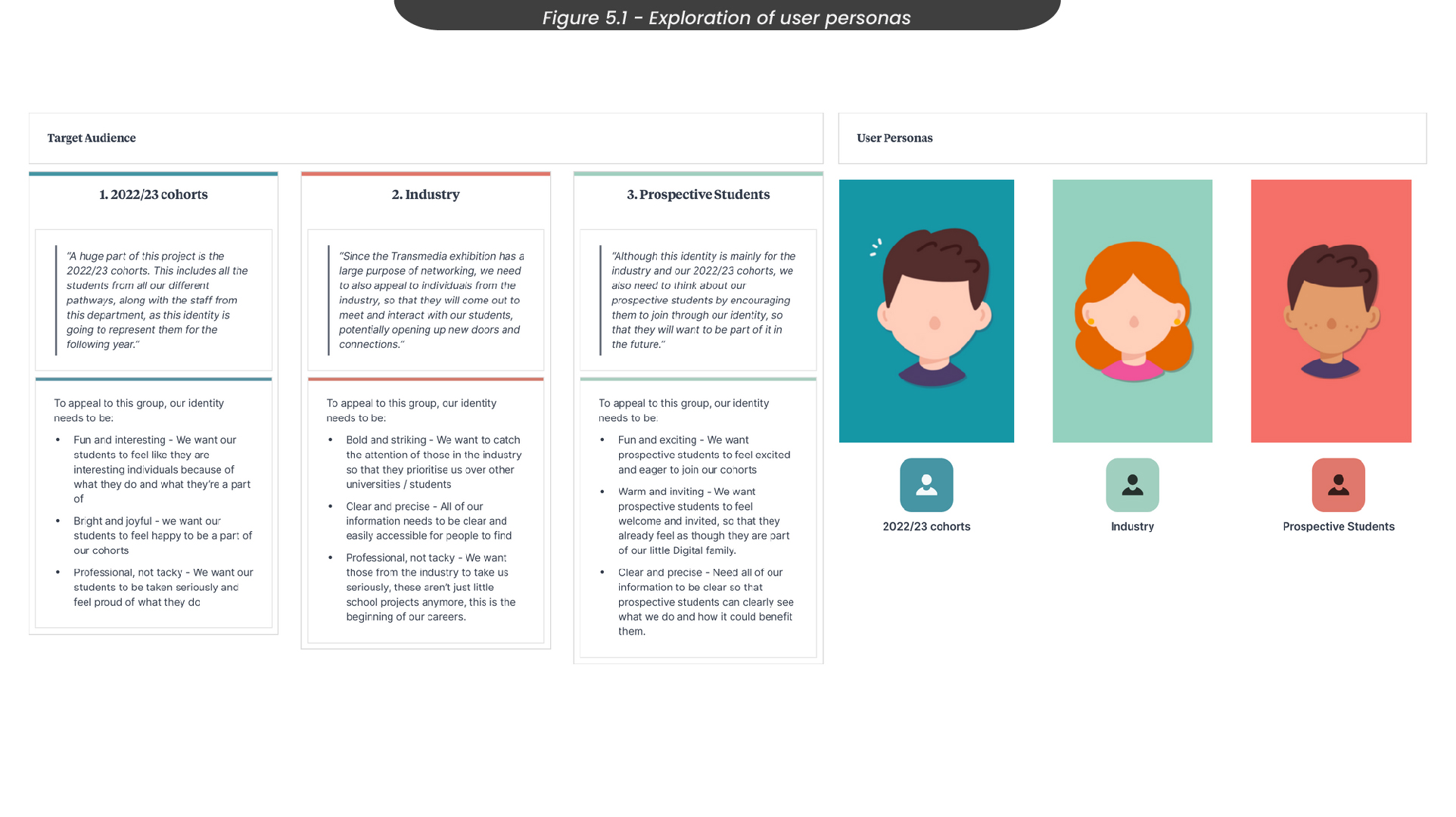
Of course, our opinion on what style looks the best was not the only opinion that mattered. This project was built for a variety of people to engage in, from professional industry to prospective students. Therefore, it was important for us to consider how they would feel about our visual identity (Figure 5.1).
2022/23 cohorts - To appeal to our 2022/23 cohorts, we need to be fun and interesting, as we want our students to feel like interesting individuals and be happy to be a part of Digital Media.
Industry - To appeal to the industry, we need to be professional, so that they take us seriously and can see that we are capable of taking this further than our courses.
Prospective Students - To appeal to prospective students, we need to be colourful and exciting, so that they feel excited and eager to join us in the following years.
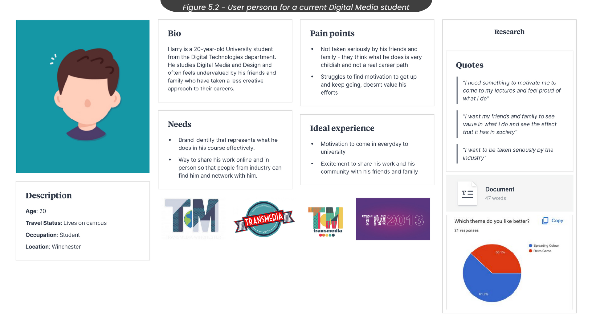
To understand our target audience, I created user personas for each group, starting with the 2022/23 cohorts (Figure 5.2). Here I was able to create a realistic representation of my primary audience, exploring their needs and pain points so that I could target those areas effectively when designing. For example, I considered how current students might not be taken seriously by their friends and family, and would like an opportunity to share their work and feel proud to do so.
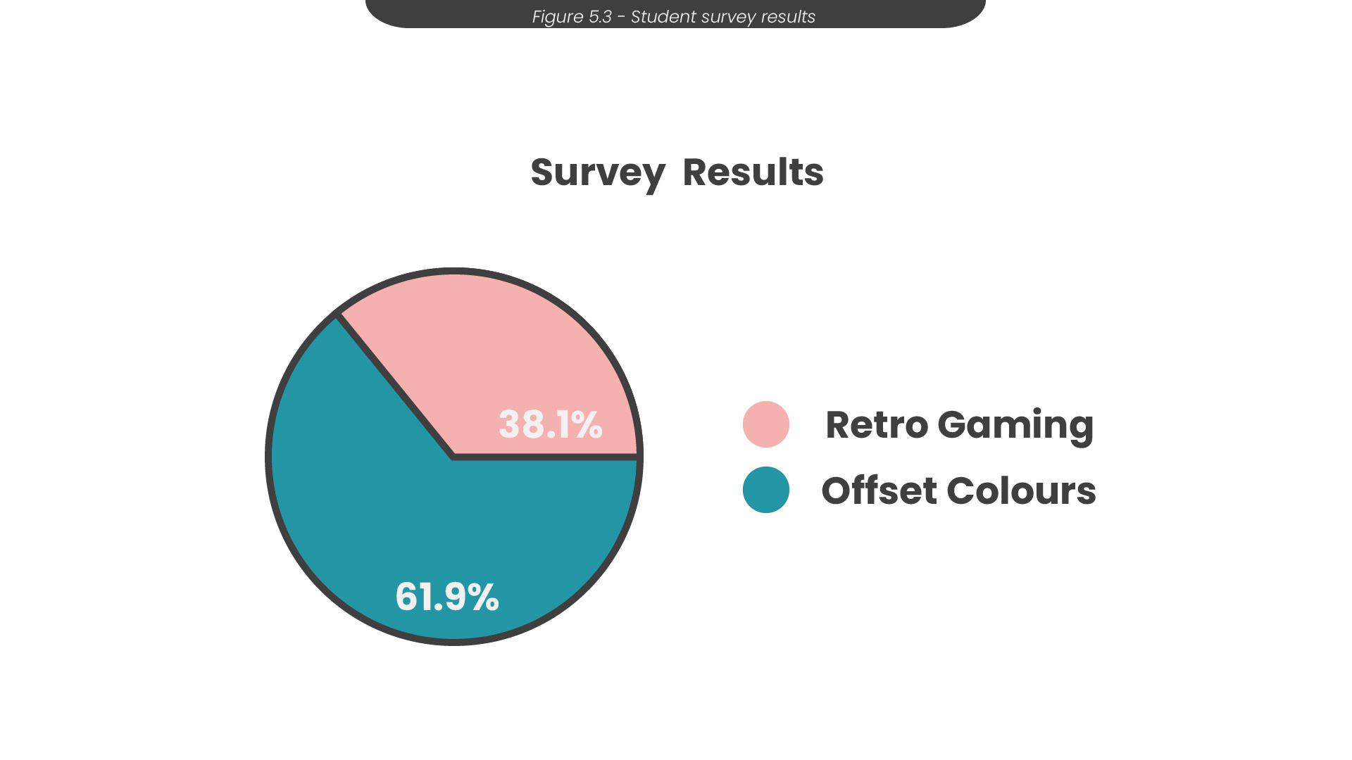
Since this project set out to represent the current students of ‘Digital Media’, we felt it was important to ask them directly through a google survey which style they preferred out of the two we had taken forward. Out of the 21 responses we received, almost 62% said they preferred the ‘offset colours’ style (Figure 5.3). Therefore, we decided to completely focus on our ‘offset colours’ idea and move forward to developing our project and marketing materials.
6. Branding
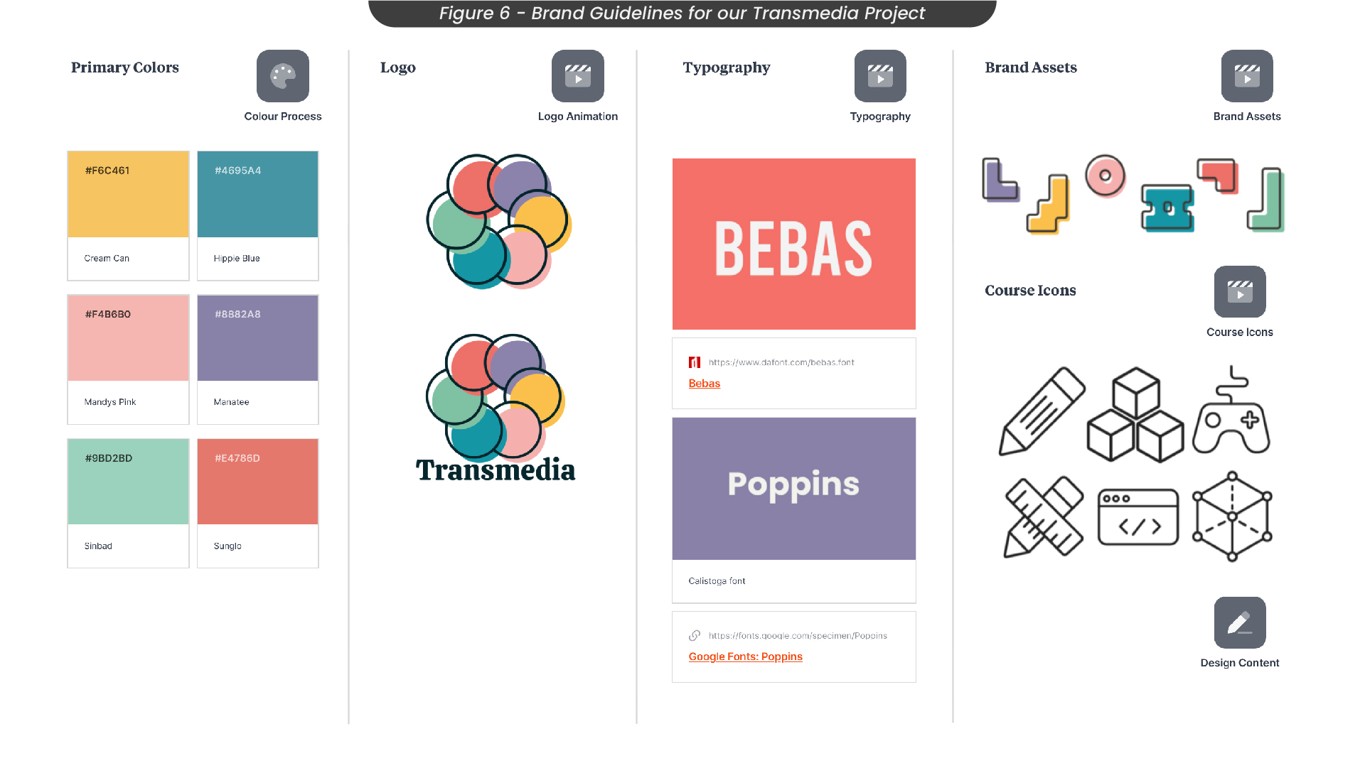
As this project heavily relied on a strong visual identity, it was important that we created a set of brand guidelines that were simple and clear to follow (Figure 6). Here is where we decided on the colours and fonts we would use throughout our design process.
After discovering that other design exhibitions often used bright and bolder colour palettes, we decided to go with a colour palette that was fun and bright, assigning one colour to each pathway so that each course had its own unique identity, following the narrative that we all bring something different to our projects.
Following the trends of other successful exhibitions again, we decided to use a strong serif font as our primary font throughout our designs, as we felt this would help the content and information stand out so that all of our materials would be clear and interesting from the start.
7. Poster Ideas and Sketches
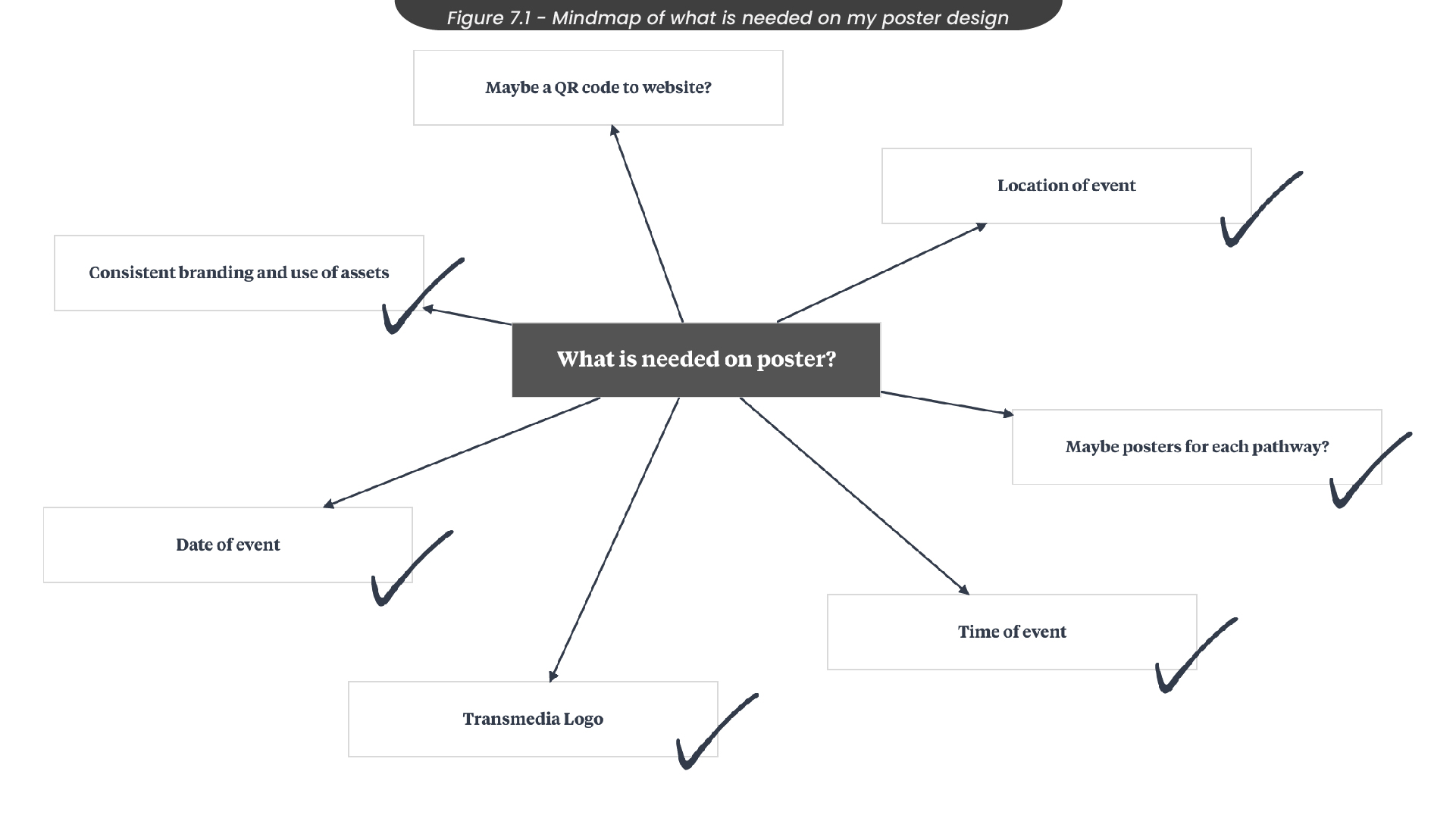
One of the roles I filled in this project was creating posters to market the event. To start this process, I created a mindmap that outlined what would be needed on the posters, from the date of the event to the consistency of the branding (Figure 7.1). I then used this mindmap as a mini checklist when moving on to sketching and designing, to make sure I had everything I needed.
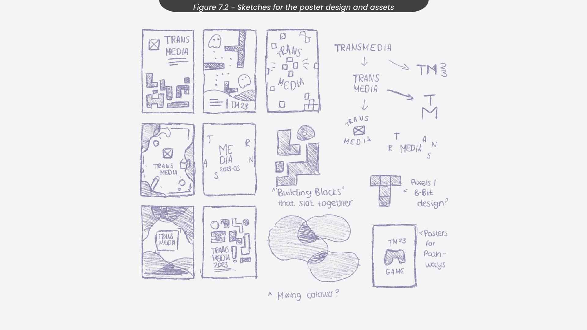
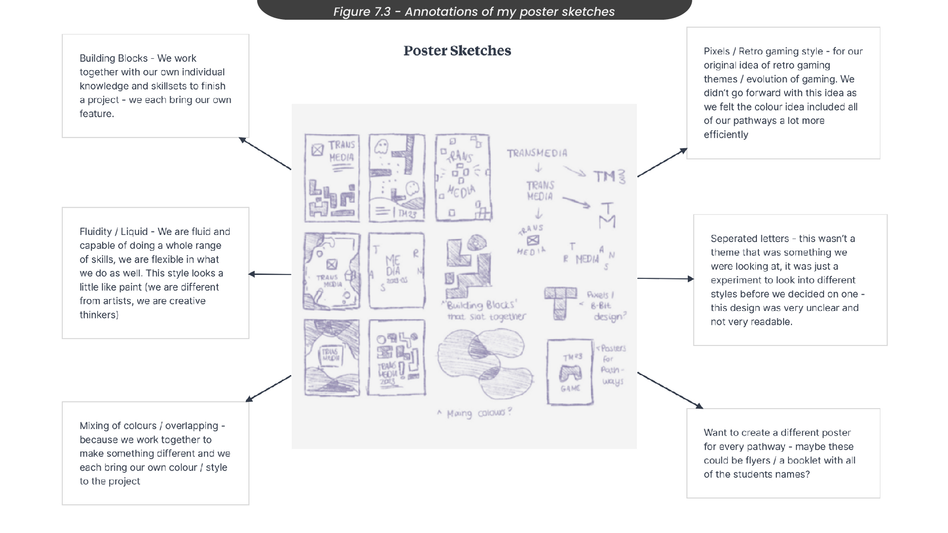
When sketching these poster ideas, I made sketches in Procreate on my iPad for both offset colours and retro gaming, as I started this process while surveying other students about their preferred style (Figure 7.2). I then annotated these sketches in Milanote (Figure 7.3), where I decided I wanted to create a different poster for each pathway, which could be used as flyers or a booklet with all of the students from each pathway. For some of my poster sketches, I tried to use shapes that flowed and mixed, as this was an idea we had in our ideation process. However, I found that this style ended up looking too soft, as they had smooth edges. This didn’t communicate that ‘bold’ effect we were going for. Therefore, I also looked at creating shapes that looked like building blocks, which was another idea we had earlier on. These had a lot harsher edges and in my opinion, communicated a striking effect. Because of this, we decided to use this style going forward.
8. Poster Development
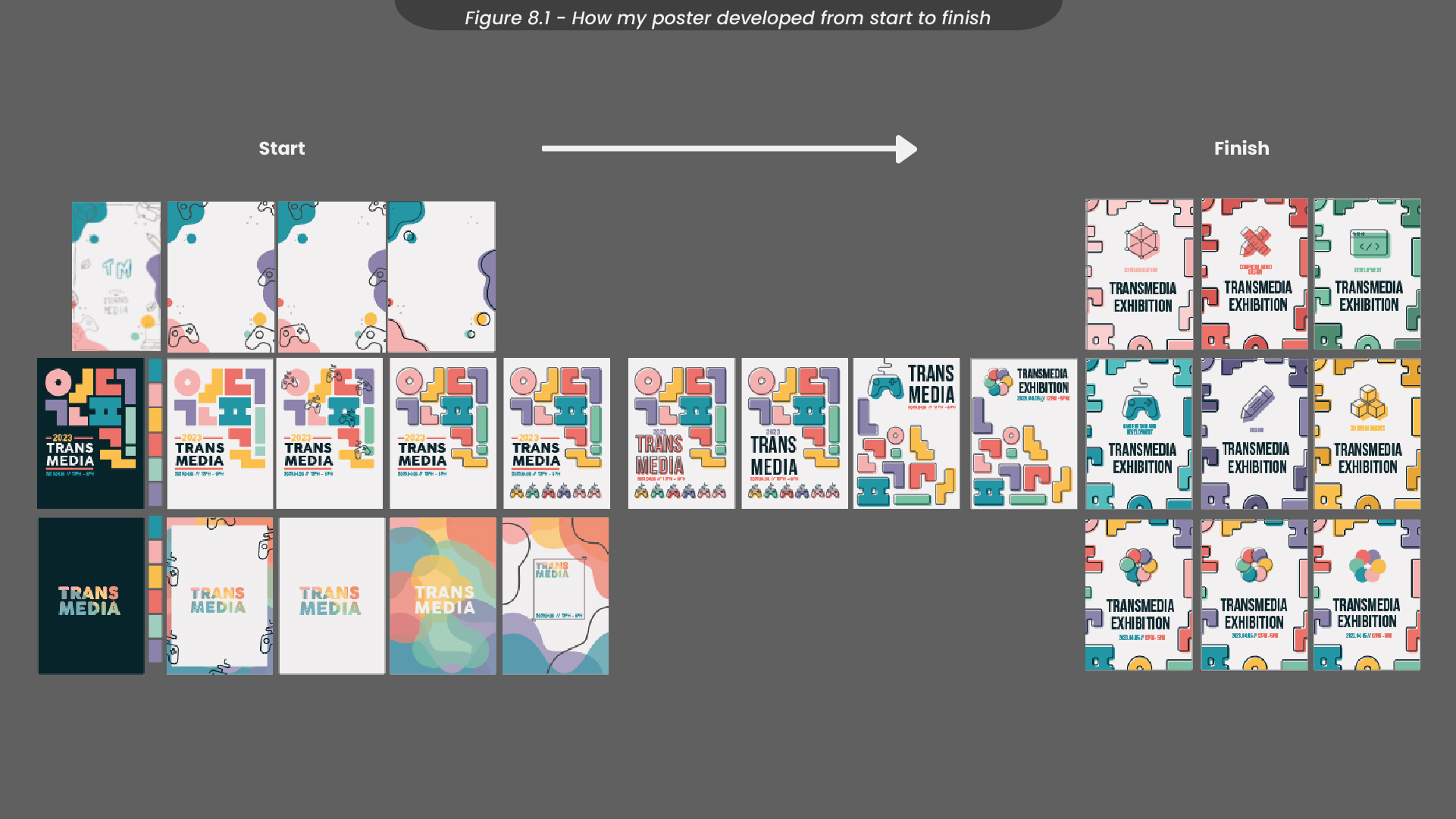
To design my posters, I first created an A3 composition in Illustrator with CMYK colour settings, as this was designed to be printed. This was a long process, as I originally was working on three different poster designs at once so that I could truly capture the narrative and theme we were going for in this project. To see how my posters developed from start to finish, see Figure 8.1.
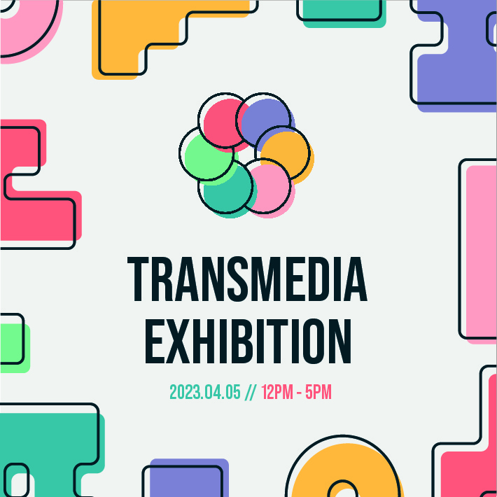
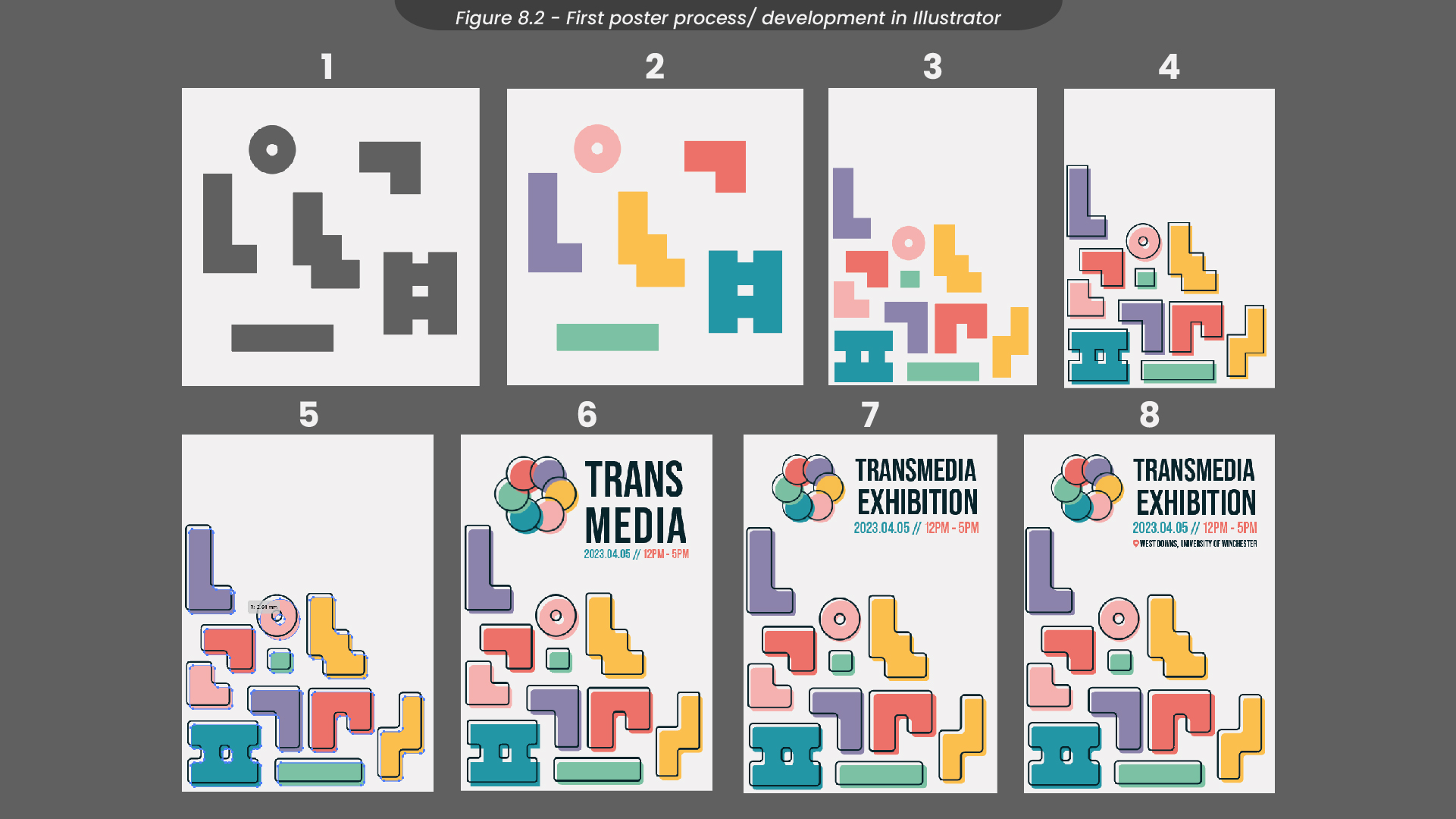
For my first final poster, I started by creating the shapes I would use to look like building blocks (Figure 8.2). Then, I filled those in with the colours from the colour palette we had chosen in our brand guidelines, before arranging them in the corner. Originally, I had them in the top right corner of the composition, but I found this appeared quite top-heavy, and the layout wasn’t visually pleasing because of this. Next, I duplicated all of my shapes and turned them into outlines by removing the fill and adding a stroke. Slightly shifting all of these outlines above and to the left of the original shapes, I created an offset effect, similar to the style from our mood boards in our ideation process. I decided the corners of the shapes looked quite jarring, so I slightly rounded them off, while still maintaining their blocky look. To finish this design I added the exhibition name and the date/time of the event in the font we had chosen in the brand guidelines. I also added our logo, made by the other designer in our group. When presenting this poster to the rest of my cohort, I received some feedback that having the word ‘Transmedia’ split in half didn’t communicate the message we intended it to, so I changed this title to say ‘Transmedia Exhibition’ instead, as I found just the word ‘Transmedia’ distorted the visual hierarchy of the poster. Finally, I added the location of the event and exported this finished poster.
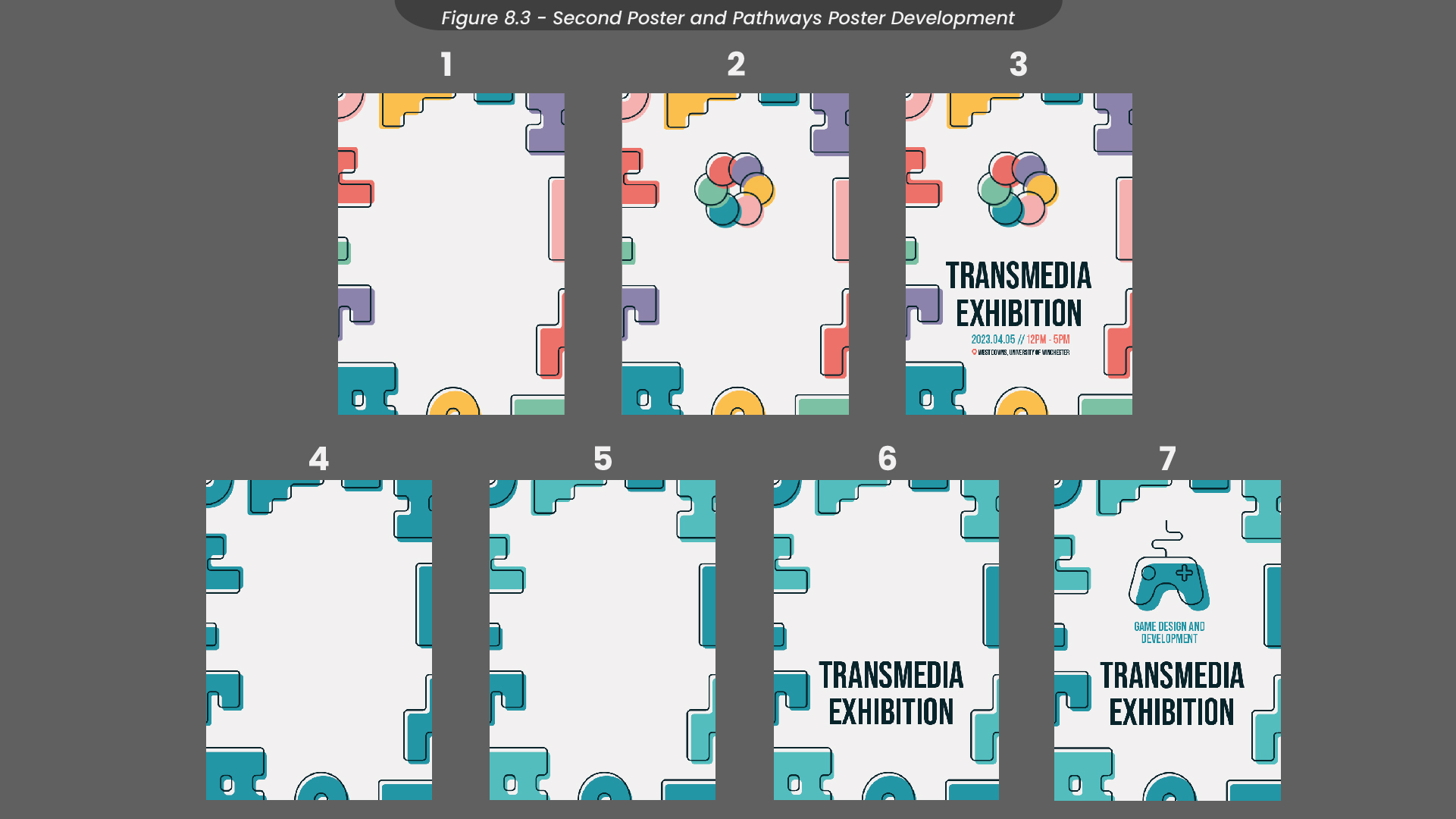
For my second final poster and the pathways posters (Figure 8.3), I started by rearranging the shapes I had from my first poster so they acted as a border around the poster. Next, I added the logo and the text, similar to the first poster I had made. For the pathways posters, I changed the colours of the shapes to match the colours for each pathway. I then adjusted some of those shapes to be a slightly lighter shade of that colour, just to add some differentiation and detail. I added the text and the icons, before exporting both of these posters.
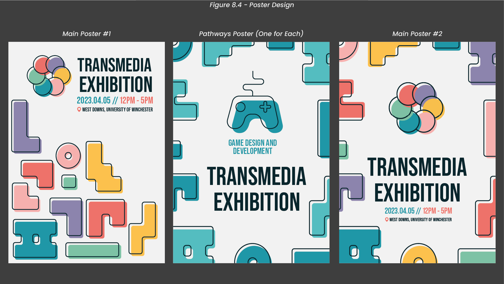
See Figure 8.4 for my finished posters.
9. Poster Mockups
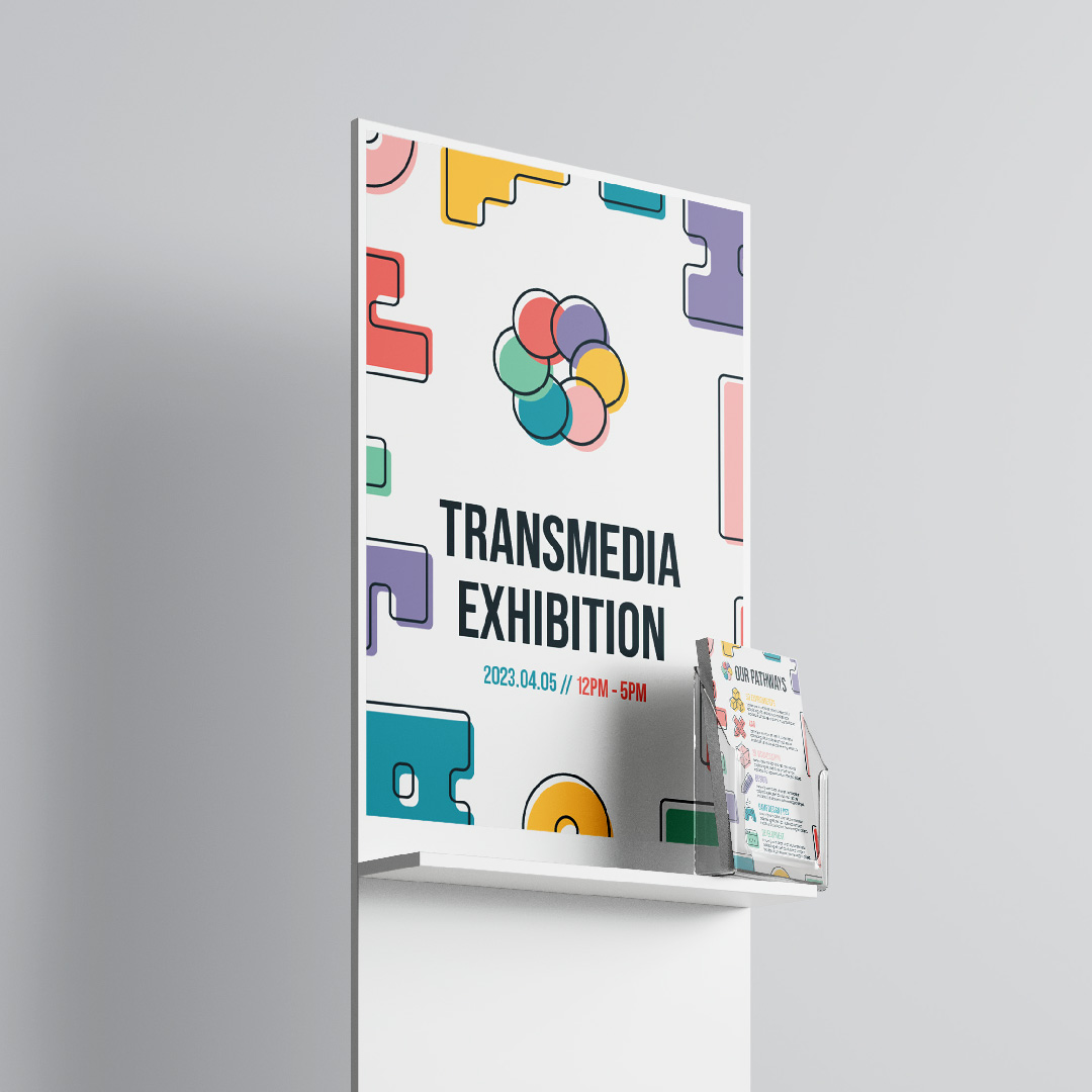
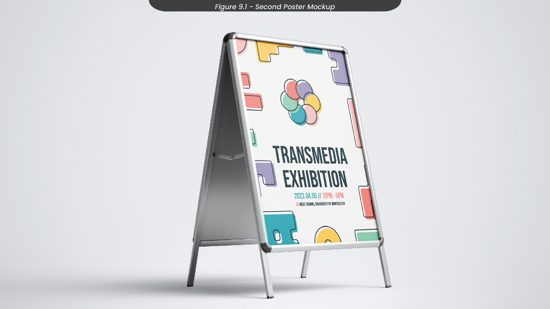
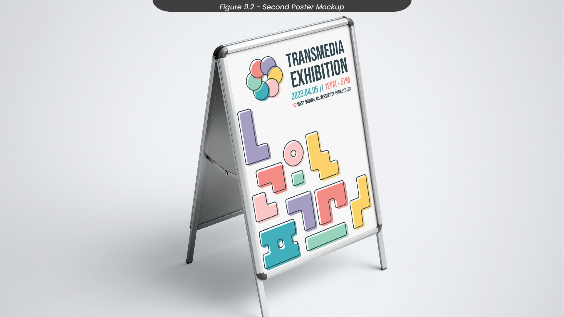
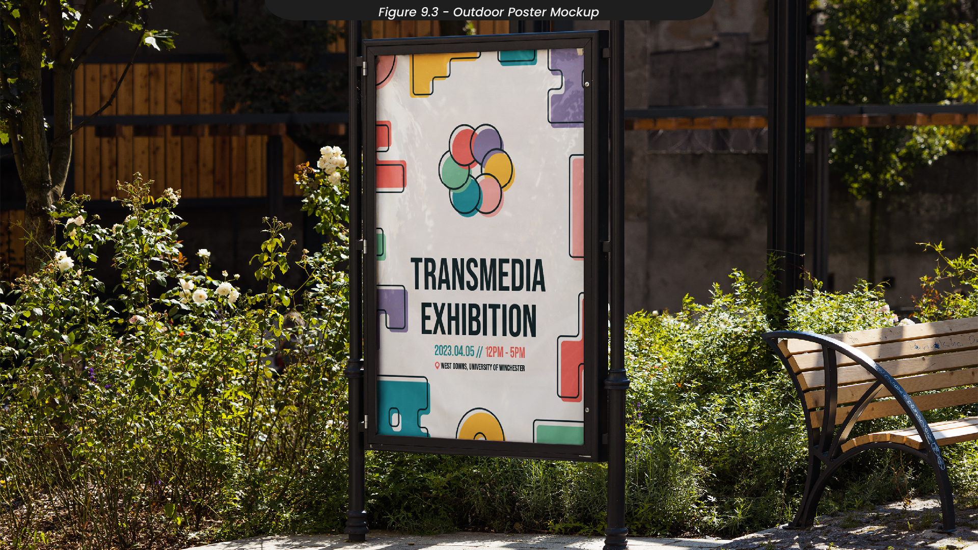
To visualise how these posters would look after they were printed and displayed, I created some mockups in Photoshop, importing my poster designs (Figure 9.1-3).
10. Flyer Sketches
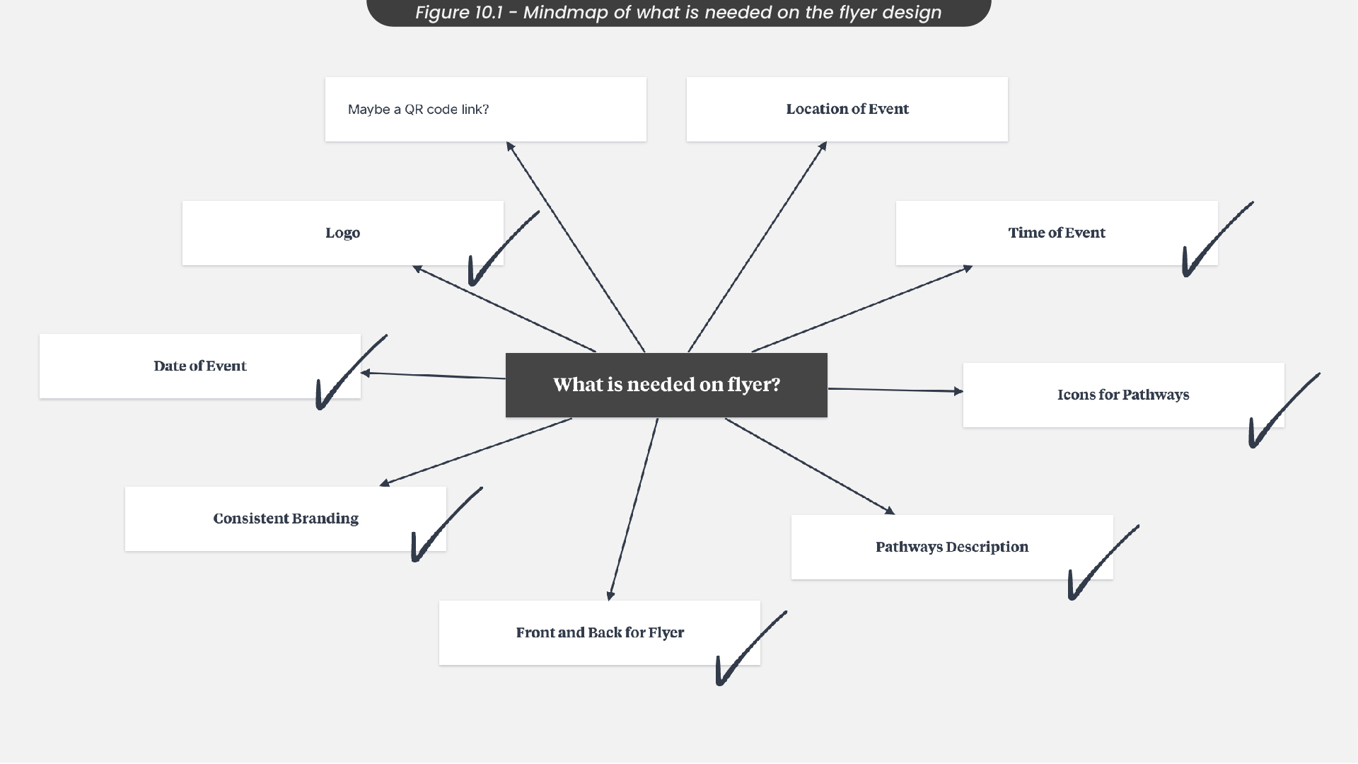
Moving on to creating some flyers for the event, I decided to use the same design process as I did for the posters, as this process worked efficiently for me. Therefore, I started by creating a mindmap for what I needed on the flyers and using it as a mini checklist when sketching and designing (Figure 10.1). For example, I knew from this mindmap that I needed descriptions of all of the pathways in Digital Media, along with the icons.
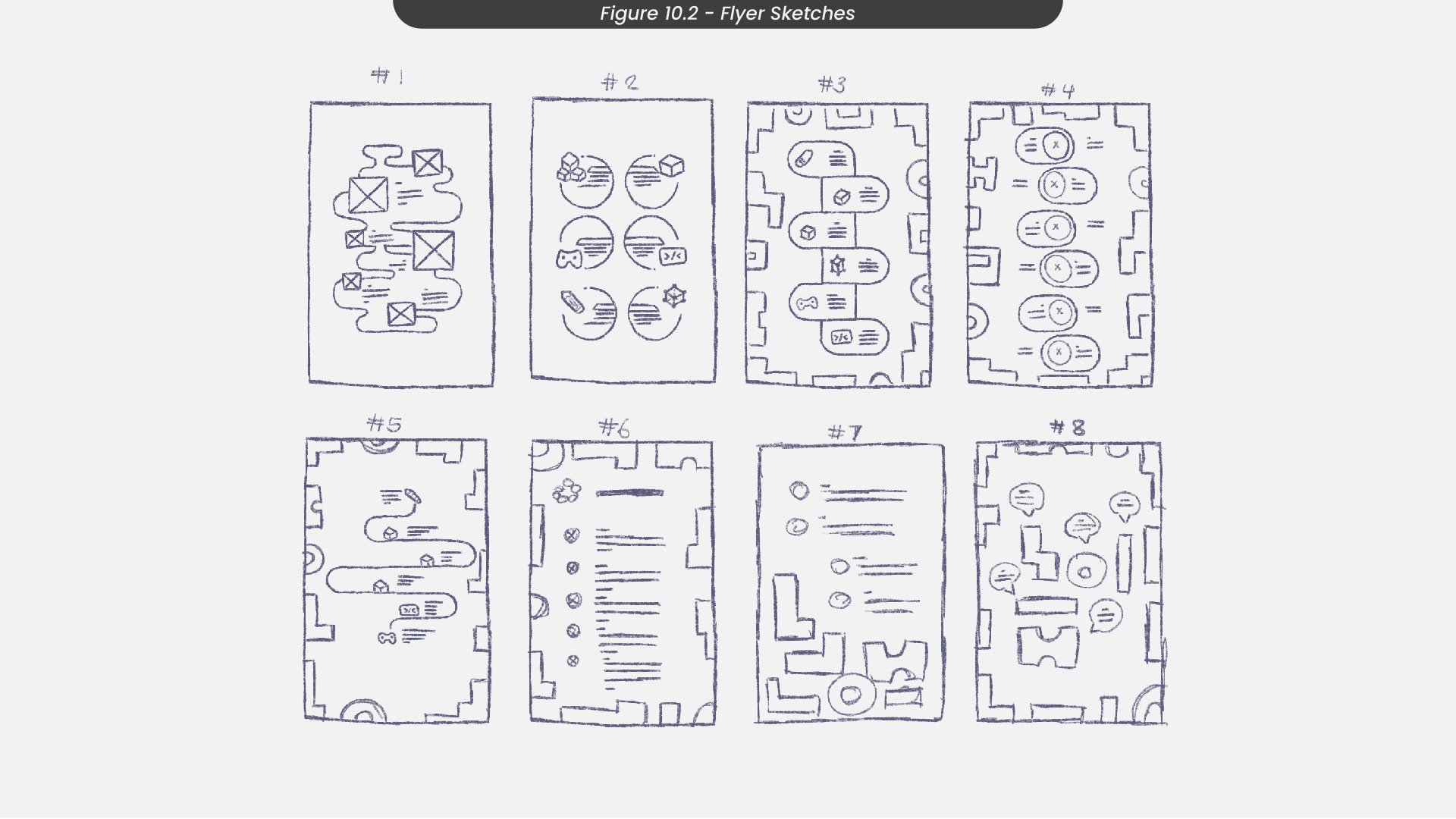
With this in mind, I moved on to sketch out some flyer ideas in Procreate (Figure 10.2). As I had already designed posters for this project, I didn’t need to create the front of the flyer as I could just use the poster designs to keep the branding and style consistent. I decided to put all of the pathways on the back of the poster with information about each one so that visitors at the event would have an easy way of seeing what each role has to offer. This could be handy for both visitors from the industry and prospective students.
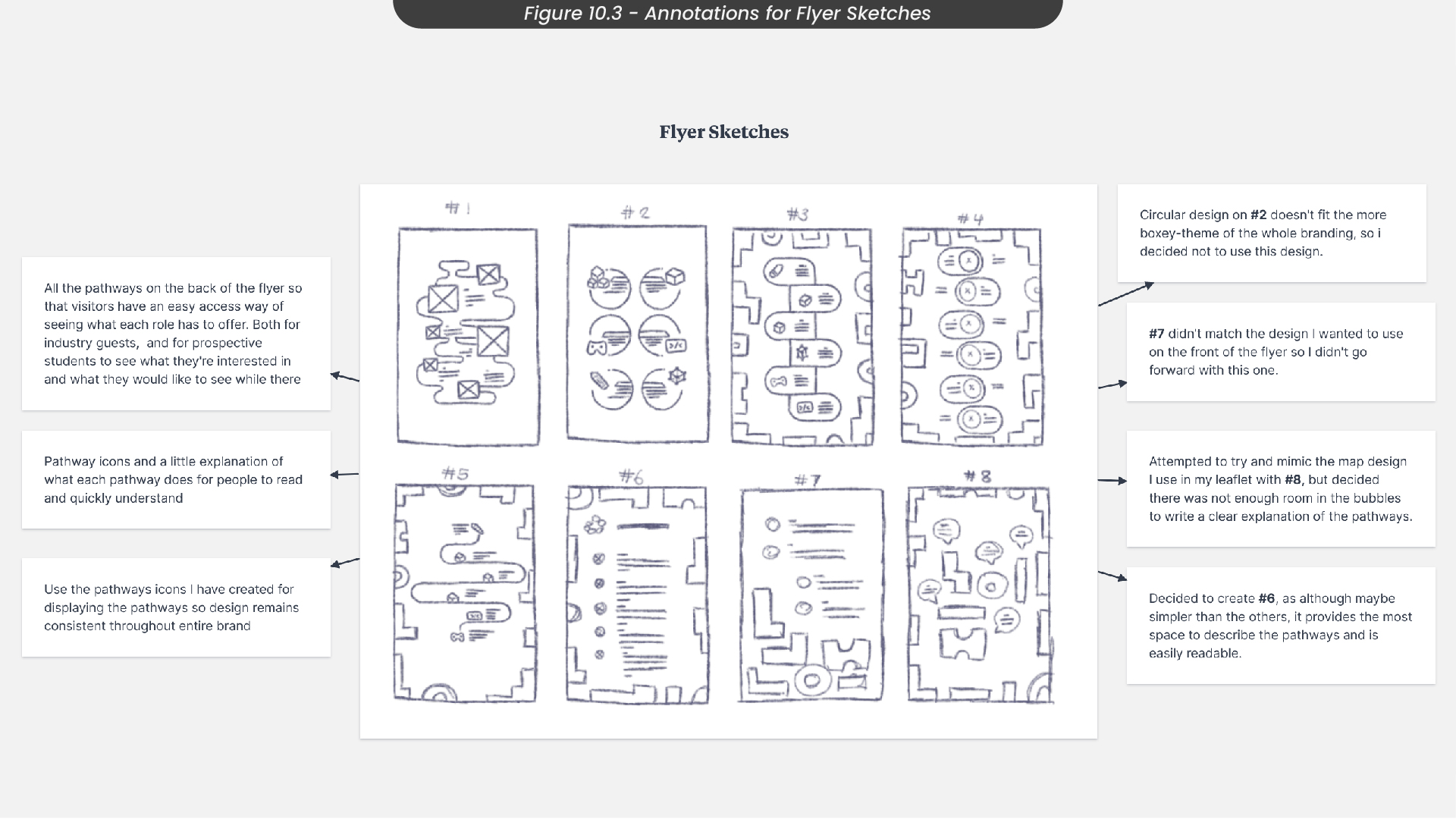
While annotating these sketches (Figure 10.3), I noted that the circular designs from some of the sketches I had drawn didn’t fit the style of our branding, so I decided not to use these ideas. I also mentioned how some of the sketches didn’t provide enough room for information to be written, so would be difficult to understand as the text would either be too small, or there wouldn’t be enough information to communicate what each pathway does. Therefore, I decided to go with the sketch titled ‘#6’, as this one, although simpler than the others, provided the most space to describe the pathways and is easily readable.
11. Flyer Development
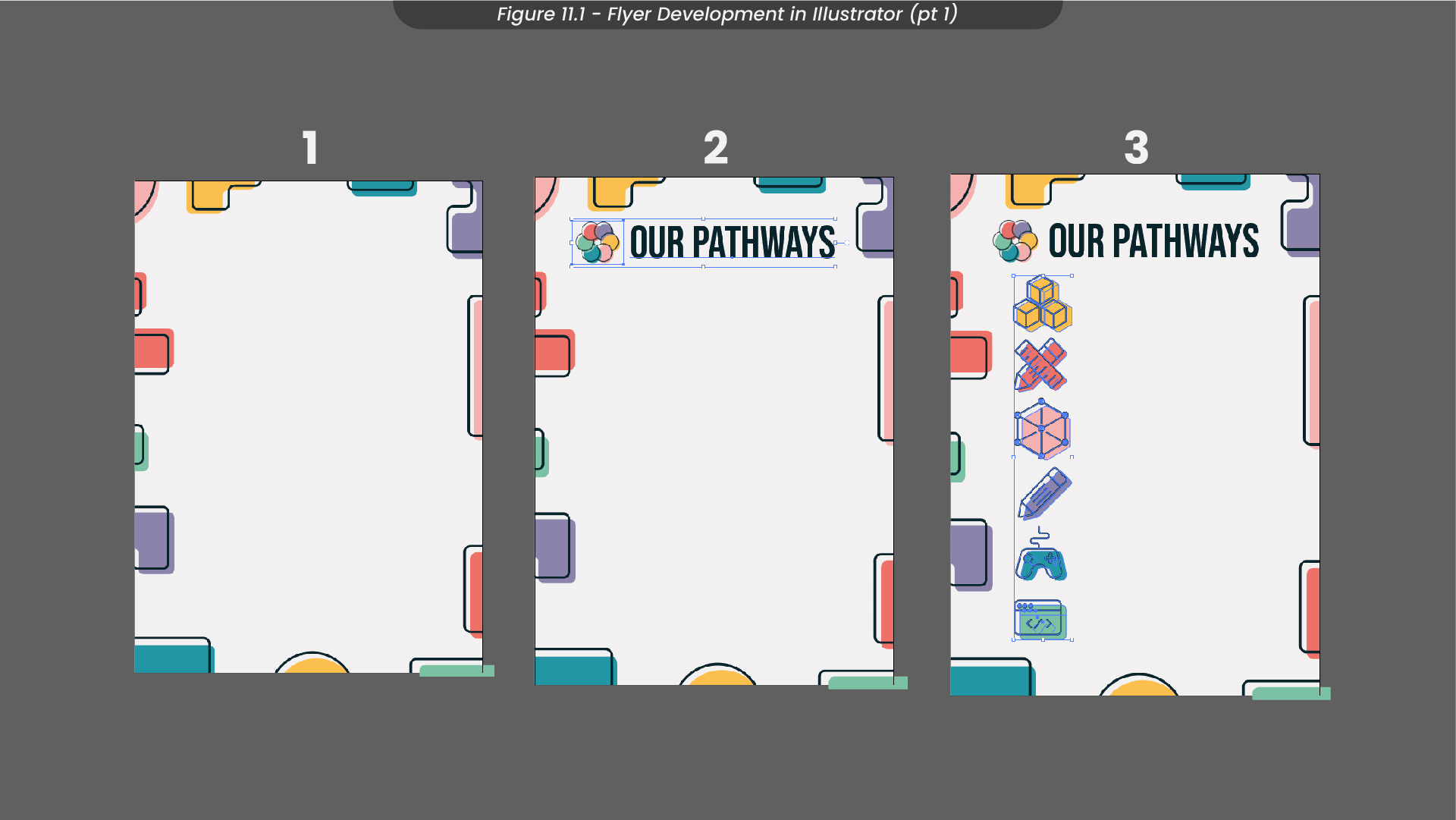
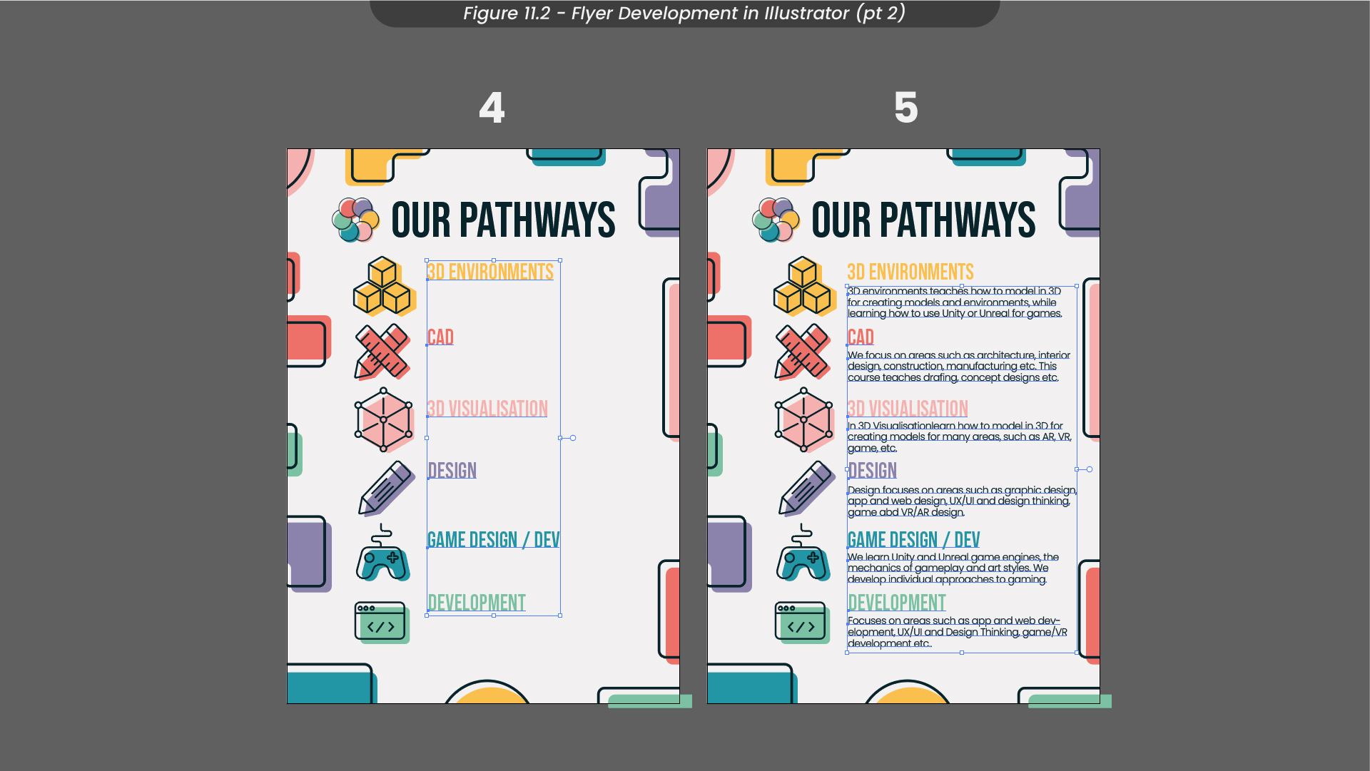
When designing these flyers, I decided to push the shapes around the border a little further out to provide more space in the centre of the page for information about the pathways (Figure 11.1). Next, I added our logo and a title that immediately told the reader what was on the page, before adding in the icons I created for each pathway. For the icons, I used a similar technique that I used for the shapes, by adding colour behind the outlines and slightly offsetting them. Next (Figure 11.2), I added titles for each of the pathways using the same font we have been using for our marketing materials, matching their colours to the icons. Finally, I added a description for each pathway, combining my knowledge about each pathway and information I had gathered from my peers on their pathways.
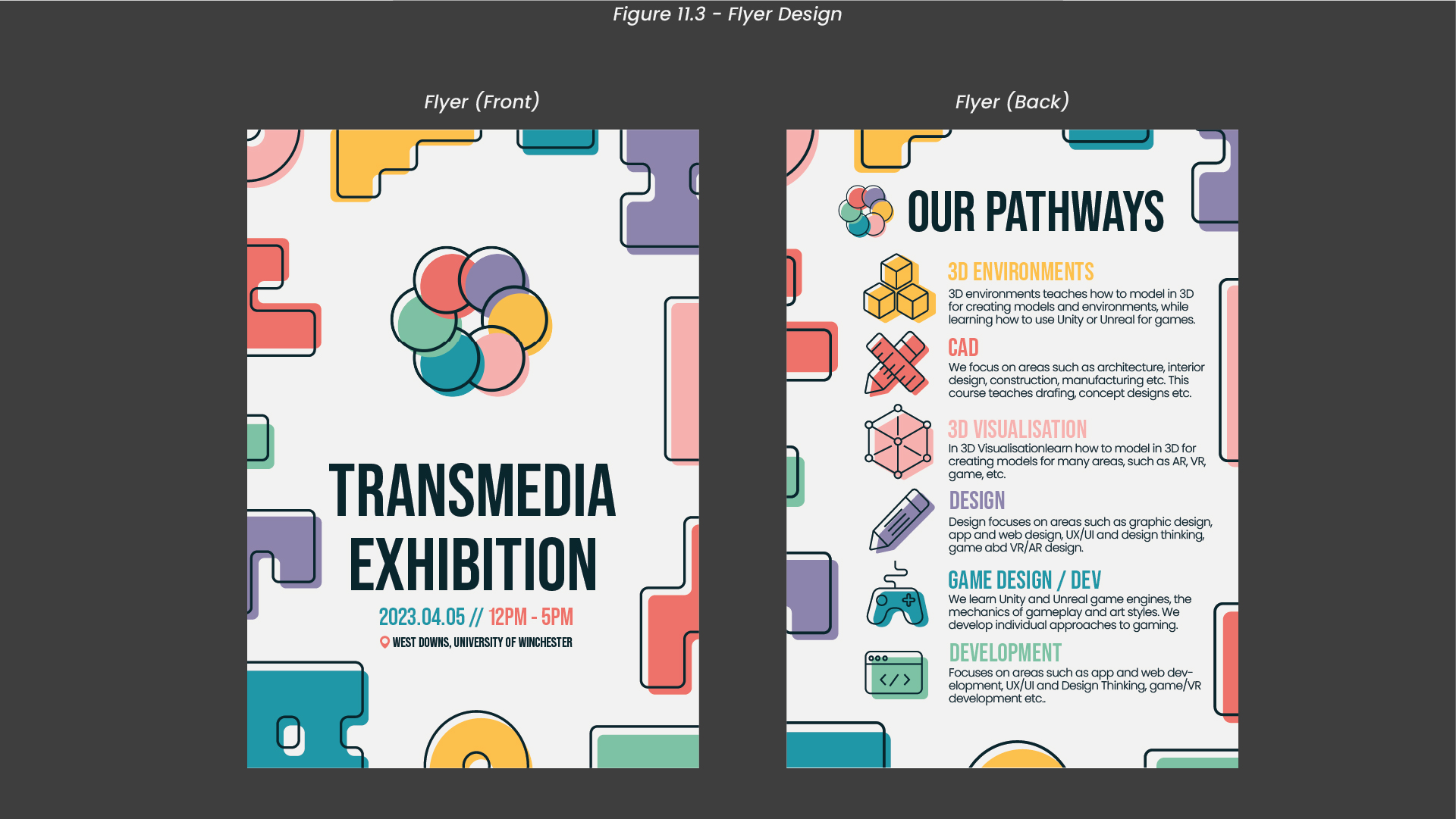
Once I had finished designing my flyers, I exported my compositions with a CMYK colour profile, as they would go on to be printed (Figure 11.3).
12. Flyer Mockups
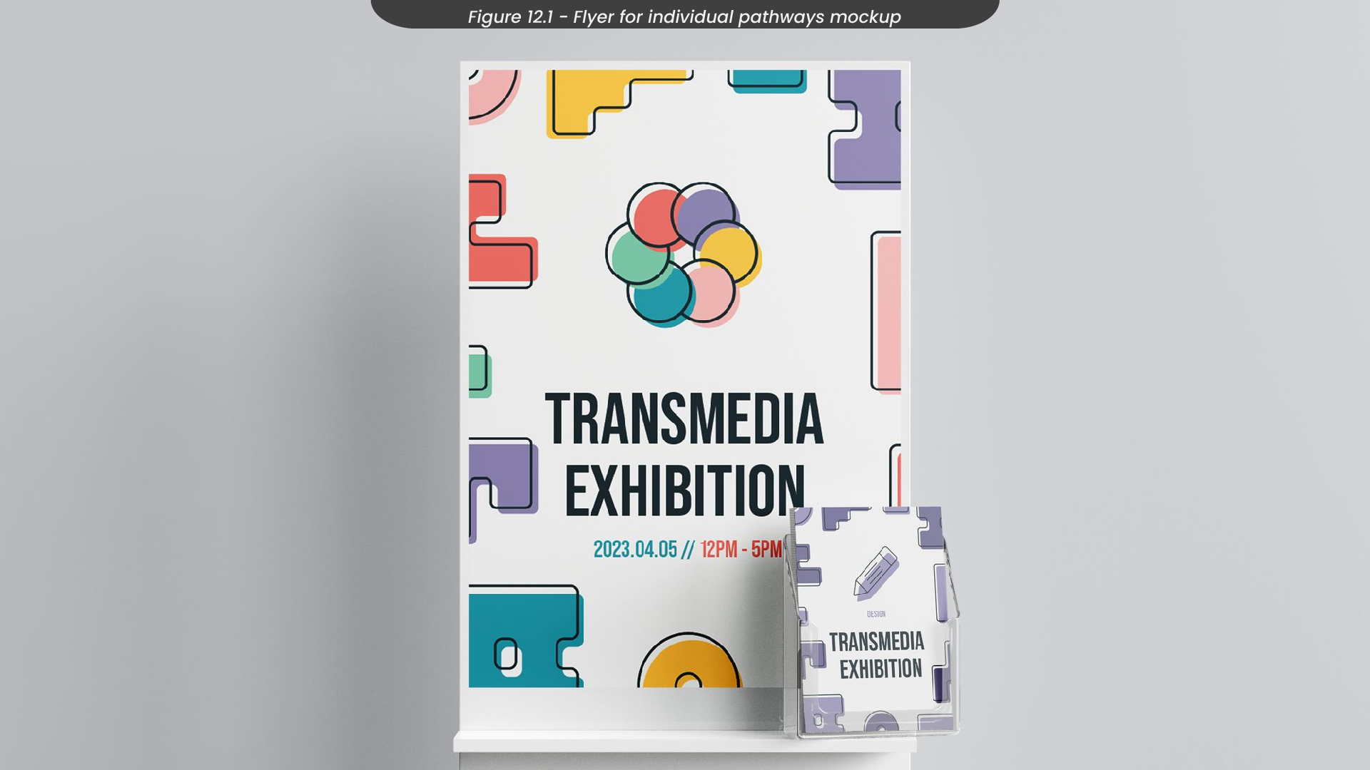
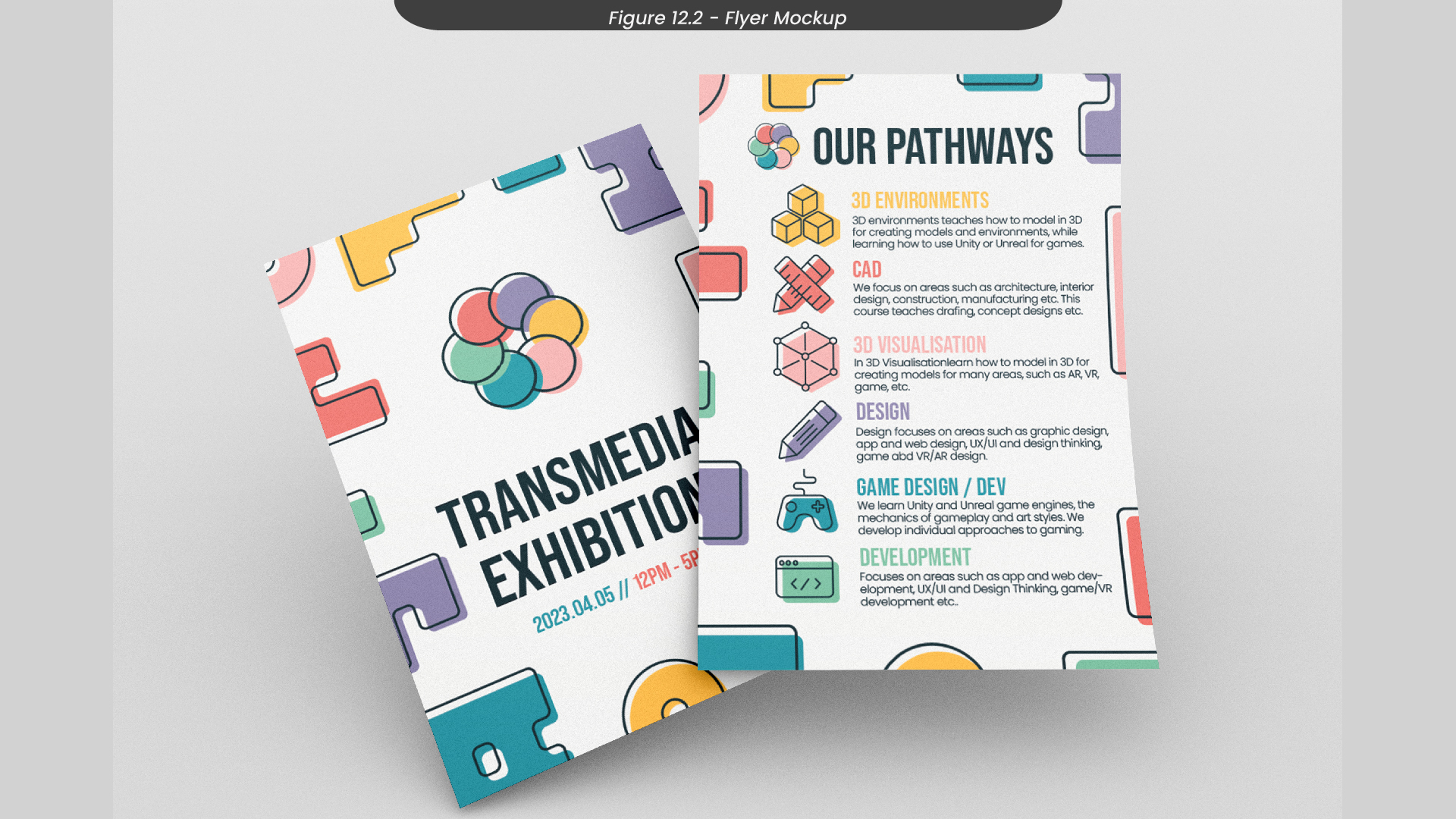
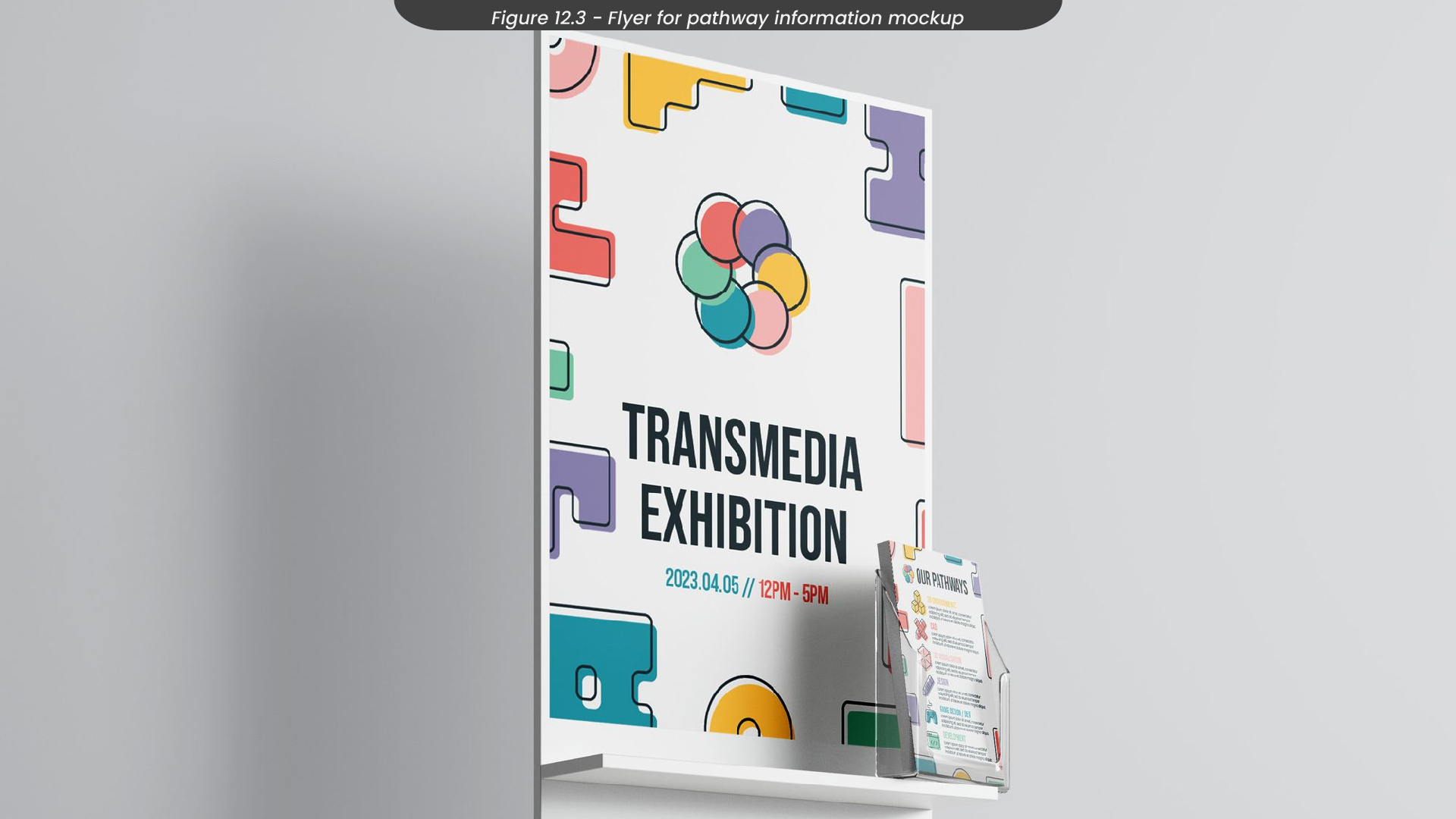
To visualise how my mockups would look after being printed, I created some mockups for them in Photoshop (Figure 12.1-3).
13. Leaflet Sketches
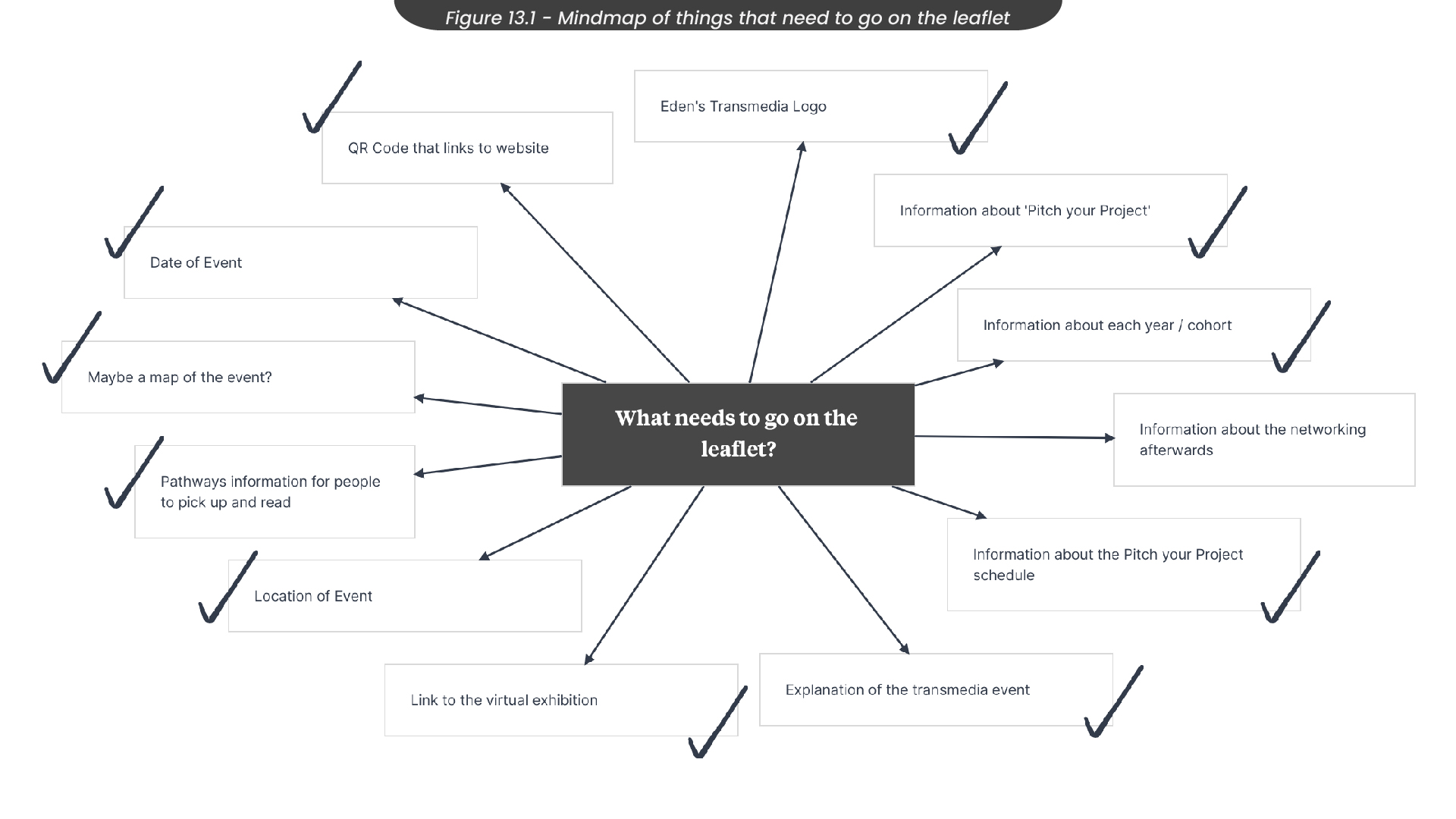
Another design role I had for this project was to create leaflets to hand out at the Transmedia event in May. Therefore, I created another mindmap with everything I would need on the leaflet so that I could keep it in mind when sketching and designing (Figure 13.1). For example, I knew that I needed information about each of the years' projects that were being showcased, such as the ‘Pitch your Project’ schedule from the third year. I also knew I wanted to include a QR code that linked to the Transmedia website, along with a QR code that linked directly to the virtual exhibition also. Something I wanted to include in this leaflet was a scavenger hunt, where visitors would get stamps or stickers when interacting with projects or students, to encourage visitors to interact with everyone and not just the ones on their route.
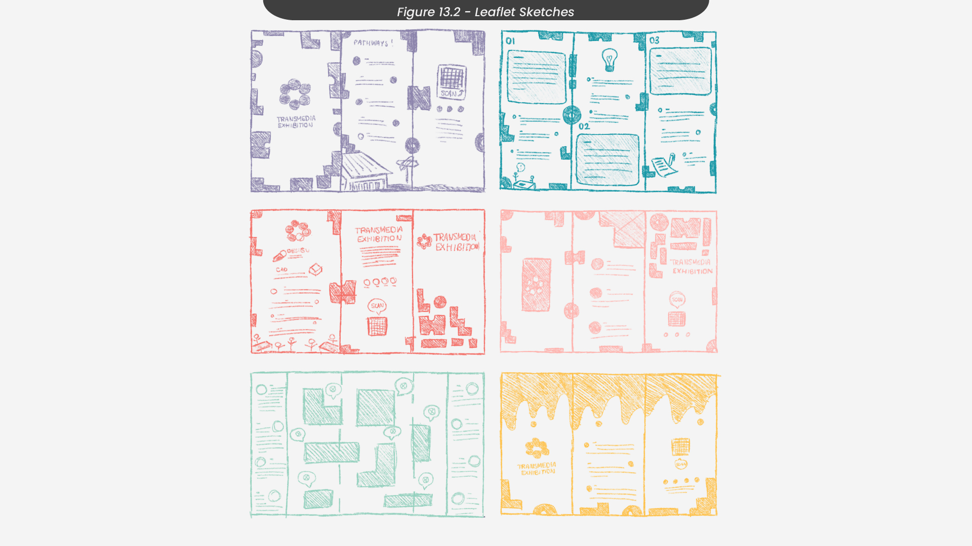
Moving on to sketching in Procreate Figure 13.2), I thought about the information from my mind map and made sure to include everything in my sketches. To do this, I have every side of the leaflet its own set of information from the mindmap so that the leaflet would read nicely but still communicate all the information it needed to. I decided I wanted to create a tri-fold leaflet, as I felt this allowed enough sides for the information it needed, without overwhelming the reader.
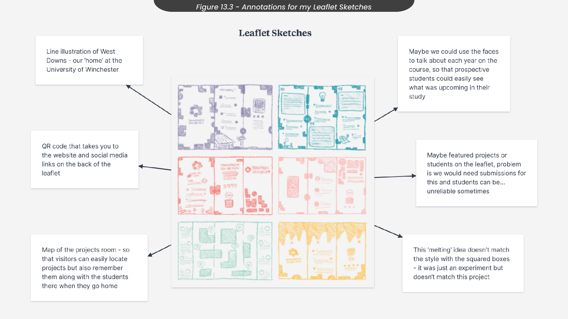
I then annotated these sketches in Milanote, where I noted how some of my sketches didn’t match the style of our project, such as the yellow ‘melting’ sketch (Figure 13.3). Since this melting effect had round edges, it didn’t match the blocky effect from our project style, messing with the consistency of the brand we had created. I also sketched an idea for the inside of the leaflet, where there would be a map of the room where the first years display their interactive projects. I liked this idea, as it would allow visitors to easily locate projects but also remember them along with the students behind them when they got home, as they could take their leaflets with them. Here is where I thought about having bubbles where visitors could put stickers once they had interacted with these projects.
14. Leaflet Development
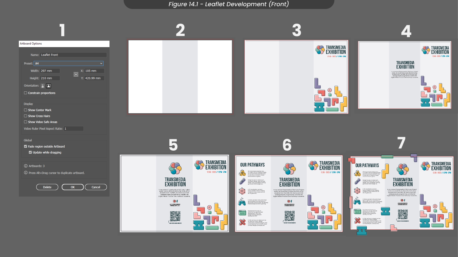
To design these leaflets, I first created an A4 composition with a CMYK profile, as this leaflet would later be printed for the event (Figure 14.1). I also decided to add a bleed around the edge of the composition to allow for any printing errors, so none of the information or design would be cut off. Next, I split the leaflet into three equal segments, so it could be folded along those lines. Since I already had a design for my posters that would work here, I took that design and arranged the assets and text to fit nicely on the front page.
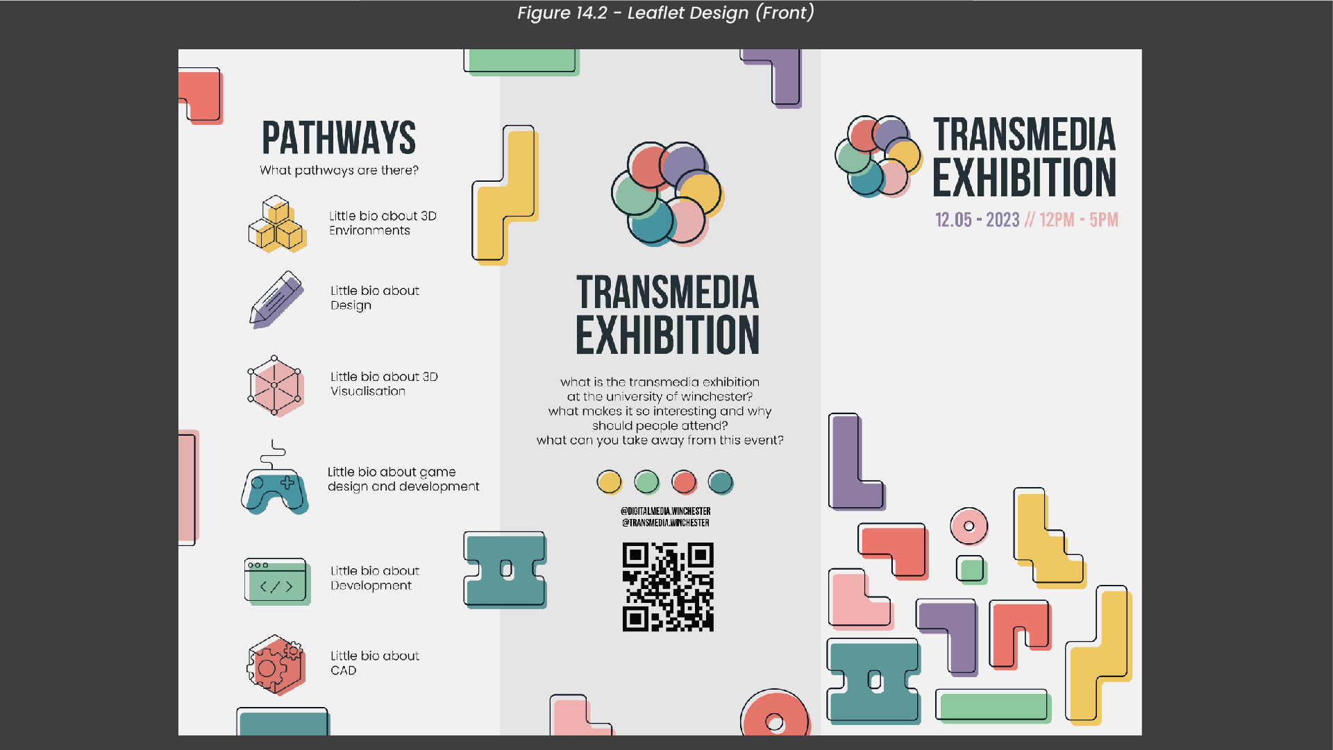
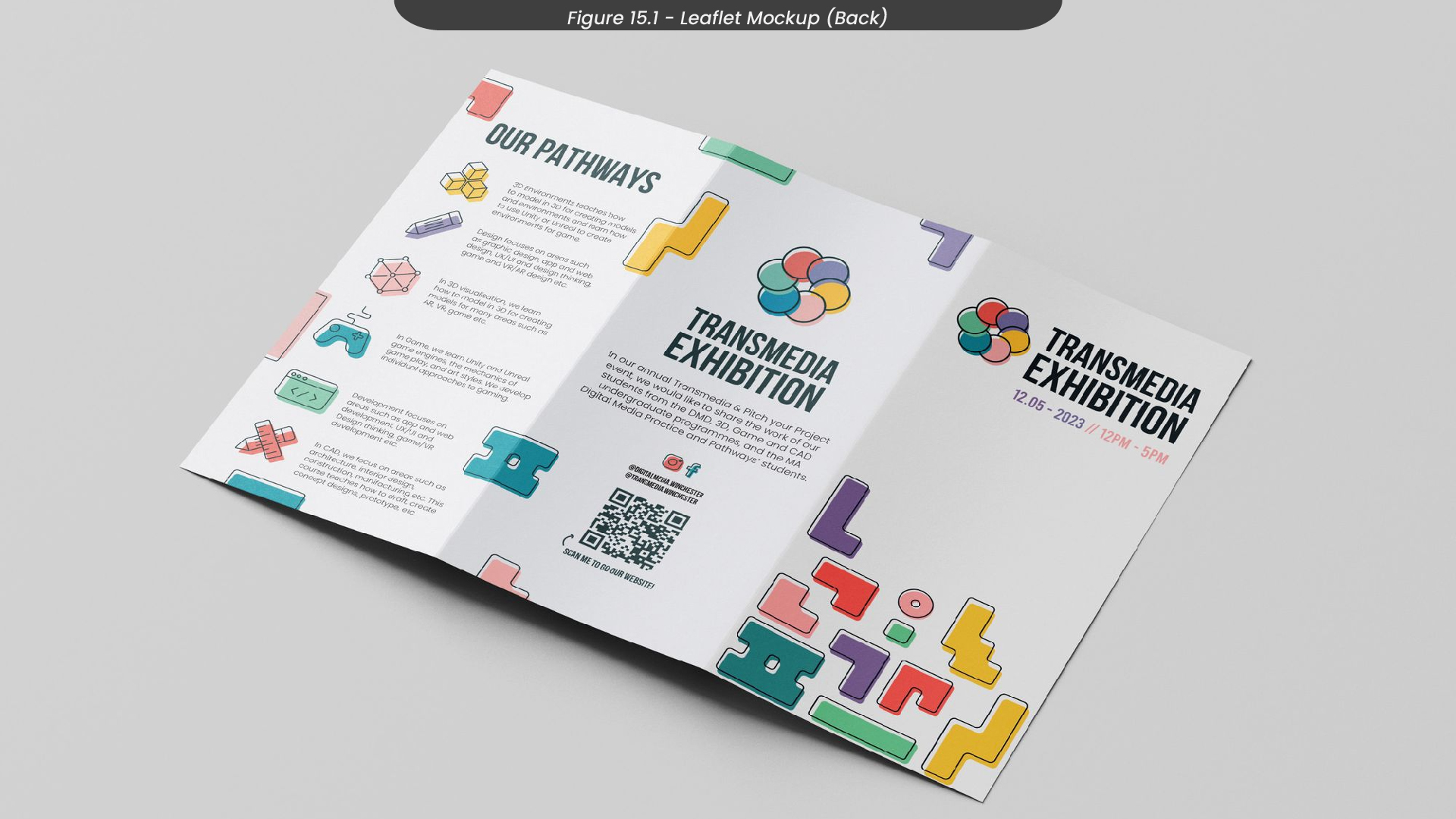
Since the information was the most important element of this leaflet, I added the text and a description of the event on the back of the leaflet first, using the font Poppins as this font is easily readable, even when the font size is small on the page. Filling in the rest of the back design, I added a QR code that would link to the website, along with social media information for people to find on their devices.
For the middle page, I decided to add the pathways information from my flyers so visitors would have a quick reference to what each pathway does. To finish this side of the leaflet design, I added in some of the ‘block’ shapes around the outside of the sides, as I felt they were looking a little empty and didn’t match the colourful front of the leaflet as much as I would have liked. I then exported this leaflet with a resolution of 300 pixels, as this design needed to maintain its quality when printed (Figure 14.2).
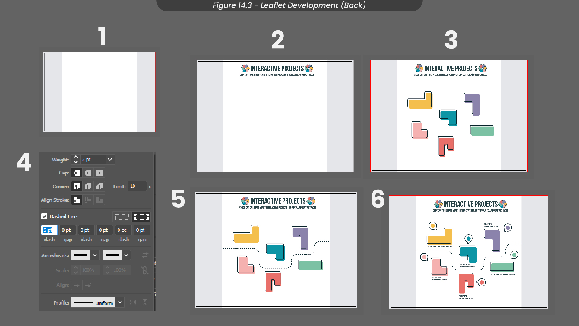
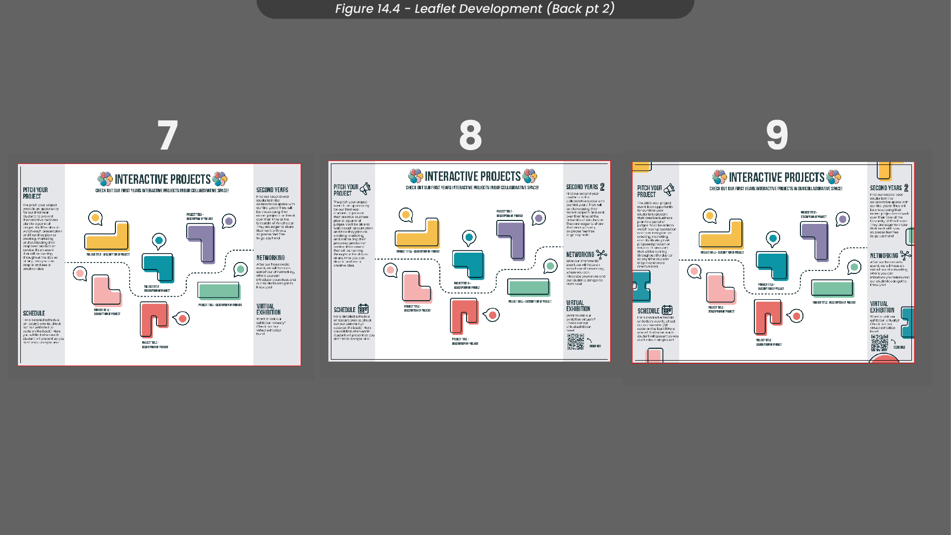
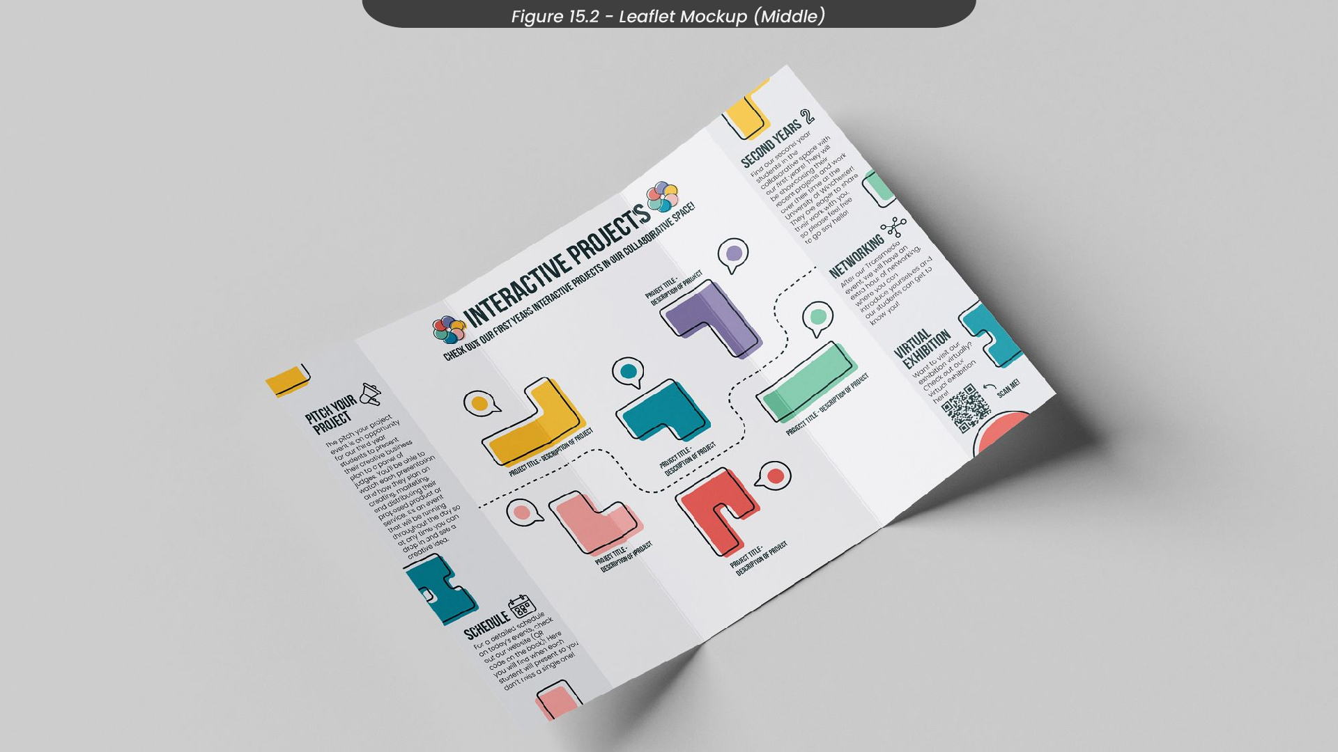
For the inside of the leaflet, I started by duplicating the composition from my first side and considering space on the sides for the information I needed (Figure 14.3). Then, I added a title and description for the ‘interactive projects’ which would be displayed in the middle of this leaflet in the form of a map. I decided to use the ‘block’ shapes we had been using in all of our marketing materials as the tables where the projects would be displayed, to ensure consistency. This was subject to change, however, as at this point we haven’t planned the layout of the event and we don’t know how everything will be organised. Despite this, I added a stroke through the shapes to represent a route that the visitor would take, and converted it to a dashed line, to give it a road-like effect. To finish the middle of this leaflet, I added text where the project information could be displayed, along with bubbles where visitors could put their stickers from the scavenger hunt.
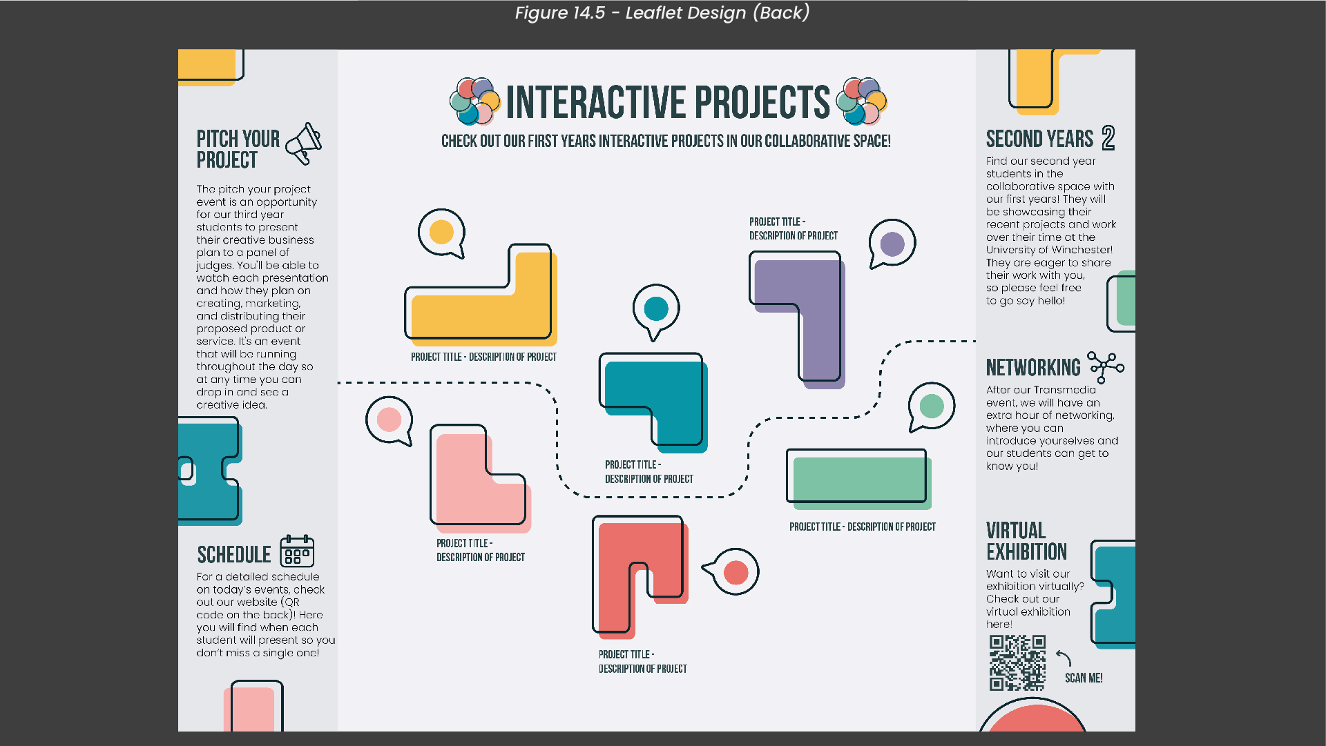
Finally, I added information about the pitch your project schedule, the second years, networking and more to the sides of the inside (Figure 14.4). I also decided to add icons for each title to help soften the overwhelming amount of words. Similar to the front of this leaflet, I added our block shapes around the outside of the leaflet to bring some of that colour and brand consistency in. I exported this side of the leaflet with a resolution of 300 pixels, the same as the first side (Figure 14.5).
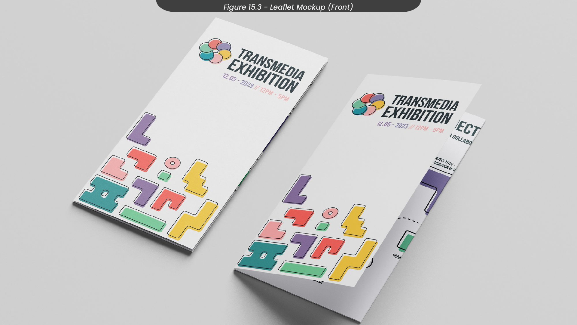
15. Leaflet Mockups
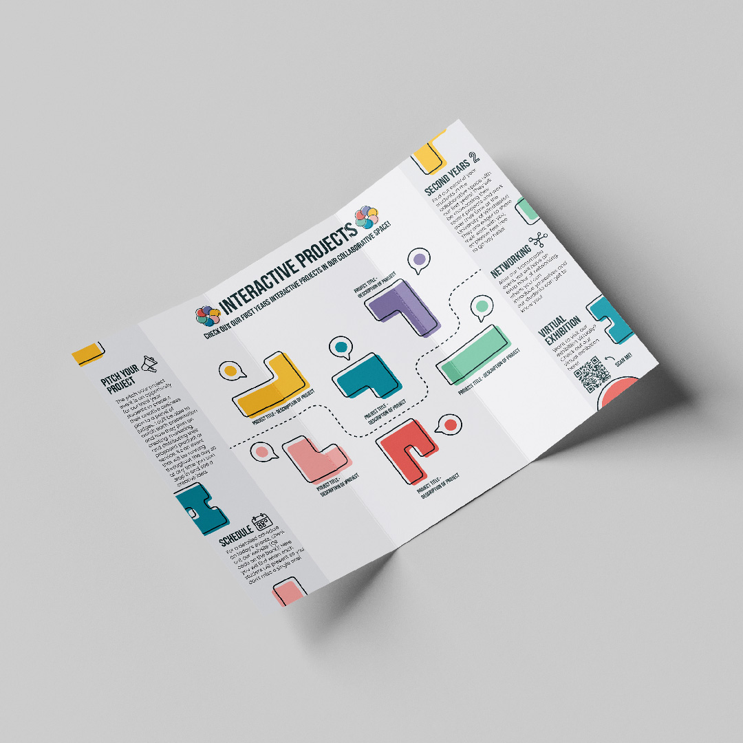
To visualise how this leaflet would look after being printed for the event, I created some mockups in Photoshop (Figure 15.1-3).
16. Icon Sketches
To create icons for the pathways, we started by creating a mindmap with ideas for each pathway (Figure 16.1). For example, I thought about what makes me think of each role, such as pencils and the pen tool in Illustrator for designers, or game controllers and headsets for game designers and developers. However, we decided to also ask our peers who are from different pathways to get a true idea of what represents each pathway, as we only know so much as designers.
With these in mind, I moved on to sketching some icon ideas in Procreate, where I combined lots of the ideas we had in our mindmap (Figure 16.2). For example, I created laptops and boxes with cogs on them for CAD, and multiple cubes for 3D environments and visualisation. I tried to create multiple sketches and icons for each pathway so that I could get a true idea of what each pathway does through a single icon. However, I did struggle with this for some of the pathways, such as development and design.
Asking my group and other students in my class, we chose an icon for each pathway that I would go on to develop in Illustrator. For example, we chose a game controller for game design/development, as controllers are immediately recognisable as video games and communicate what the pathway focuses on instantly. For design, we decided to go with a pencil over a paintbrush, as we felt the paintbrush implied more on an art course than a design course, and design and art often get muddled up or grouped together, even though they are very different. See Figure 16.3 for each chosen pathway.
17. Icon Designs
To develop each icon, I created a square composition to keep all of the proportions of my icons similar, which allowed all of my icons to match and look good as a set together (Figure 17.1). I then chose to create my outlines using a stroke of 10pt, with both rounded corners and caps, as this would keep all of my icons consistently the same size and weight. Since I created six icons and they all had similar development processes, I have decided to only talk in detail about one of these. To create my design icon, I started by adding a rectangular shape using the shape tool. Next, I added a line at the top of this box to create the eraser of the pencil. To add some detail, I drew some lines to the body of the pencil using the pen tool, before adding a triangular shape at the end of the pencil to act as the point. Finally, I rounded off the eraser's corners, as I felt the eraser felt quite jarring in comparison with the point of the pencil, which was a lot softer.
After finishing all of my icons designs in Illustrator, I presented them to the rest of my cohort. Here, I received feedback from one CAD student that the CAD icon didn’t represent their pathway as they imagined. I took this feedback and created an alternative CAD icon (Figure 17.2), which I then presented to my cohort again. Here, our group asked the CAD students through the form of a google survey which icon they felt represented them more accurately. Surprisingly, the majority of students said they preferred the original and didn’t understand why the change was suggested. Therefore, we kept the original icon for CAD. To see how the icons would look with their pathway colours in the same style as the rest of our brand, see figure 17.3.
18. Icon Animation Development
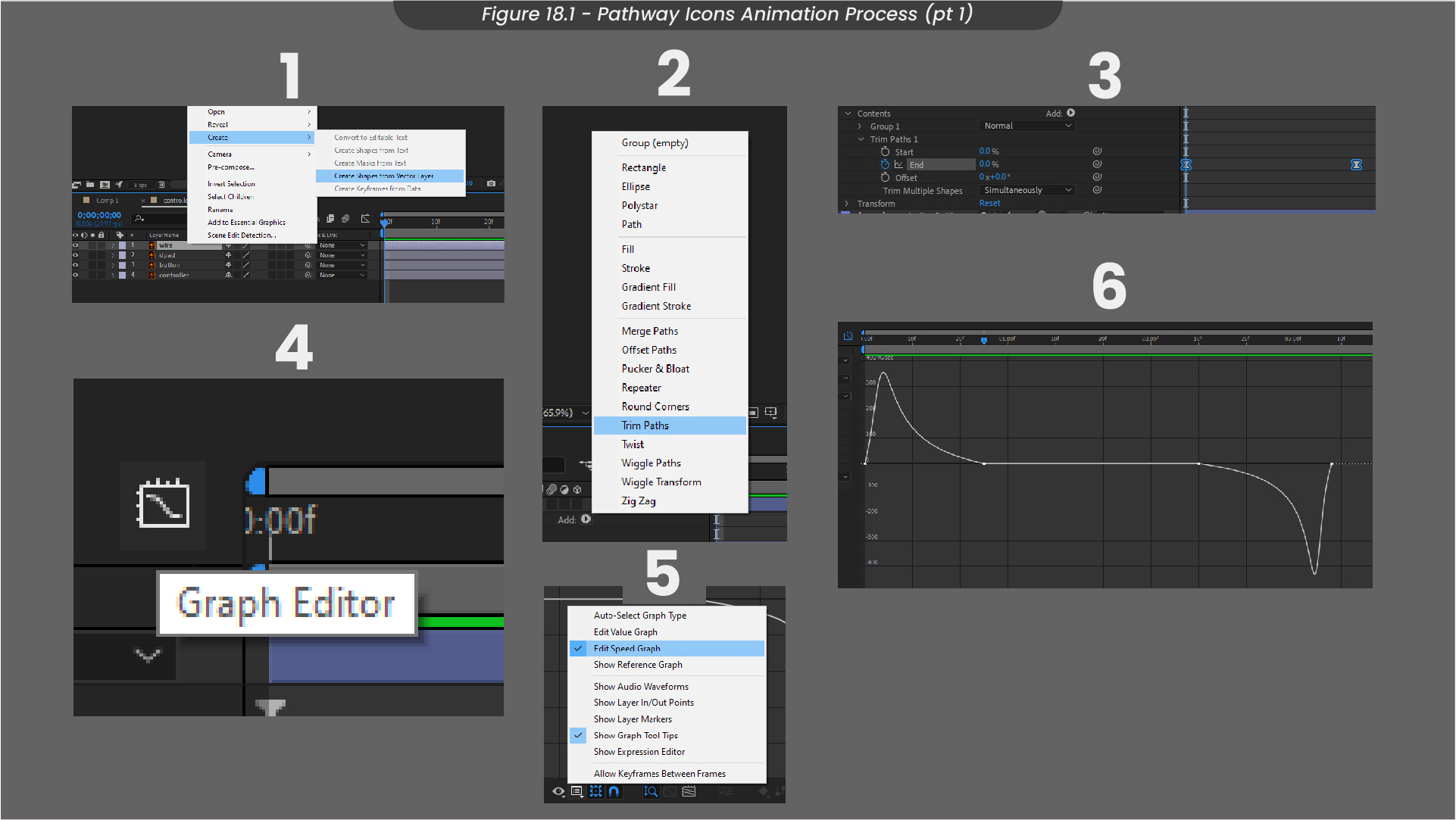
With these icon designs finished in Illustrator, I decided to animate them in After Effects, to act upon one of my goals to improve my animation and motion graphics skills this semester. Firstly I imported my Illustrator file into my After Effects composition, making sure to retain my layer sizes so that I could animate each individual layer rather than a flat image (Figure 18.1). I then highlighted all of my layers and converted them to shapes, so that I could adjust any of the stroke sizes or shapes if I needed to. To begin animating each line, I added a trim paths animation to each outline and keyframes the end from 0% to 100%. This allowed the line to animate as if it was being drawn. Next, I adjusted these keyframes using the graph editor, editing the speed graph as I feel this graph allows for the smoothest animations. I edited the graph so that it would animate quickly in, slow down and then speed up when animating out.
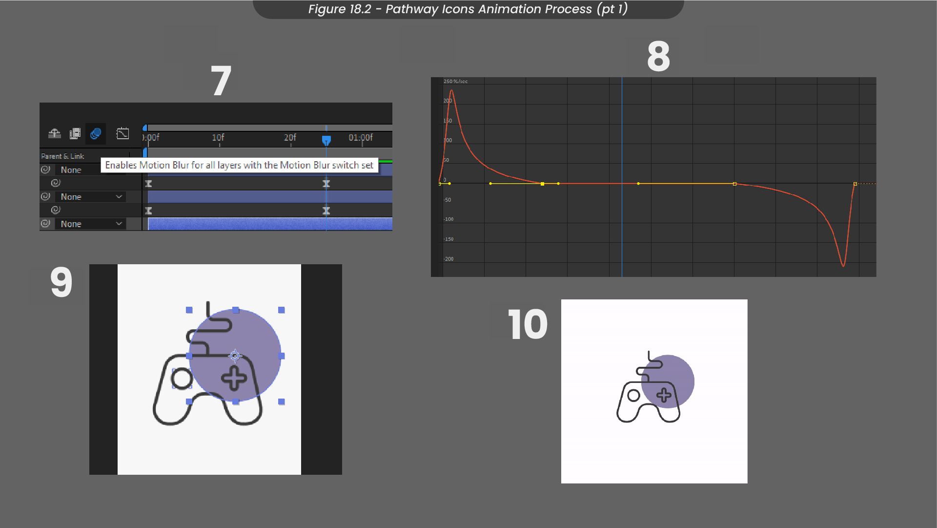
To add the colour for each pathway, I created a circle that would appear behind the icons as they animate in (Figure 18.2). To do this, I added a circular shape layer and animated some keyframes for the scaling, so it would zoom in and then zoom out alongside the outline animation. Next, I edited the speed graph to match the outline animations so it would be completed in time. Finally, I placed all of my icon animations together in the composition and exported them as a WebM file to be displayed on my website. We could use this animation showreel on the Transmedia website, as animation and visual movement on websites can be more engaging for users than still content.
19. Animation Showreel
Above are my finished icon animations. Although simple, I think they could be used to engage viewers or visitors on the website, as they loop and are satisfying to watch.
20. Project Reflection
Overall, I am happy with my contributions to this project and I think it was successful in relating to the brief as well as improving my design knowledge and strengthening my skills. For example, throughout this project, I learned a lot about applying design principles to marketing materials, and how to create files for print. This project also taught me how to create a brand that remains consistent throughout all materials, which will be very useful to take forward in my future career as a designer. I am happy with the communication and collaboration made with my group, and believe it was more successful than previous projects as we were in contact across all different elements of the project and had worked closely with our client to create a project we were all proud of.
This project successfully appeals to our target audience of industry, prospective students, and the 2022/23 cohorts, as we often asked for feedback and acted upon it. I think we successfully involved other students in this project and were able to collaborate widely with insights from a variety of pathways, allowing for this project to be something we are happy to represent us.
If I was to do this project again, I would expand to creating more digital marketing materials, rather than exclusively printable marketing materials. Since this is a digital event, an animated invitation or video for the website would be really helpful to engage our audiences. However, I am planning on continuing to work on this project right up until the event takes place in May, and I am determined to create an animated invitation and work closely with our client to create social media posts that encourage people from outside of our University to attend.
21. Semester Two Additions
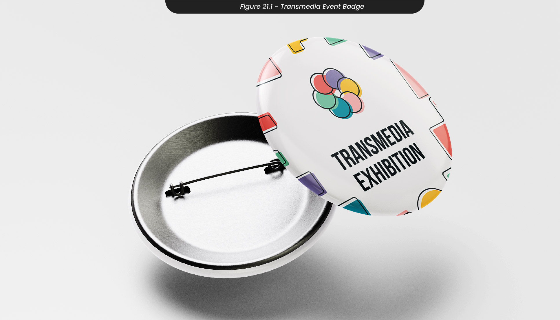
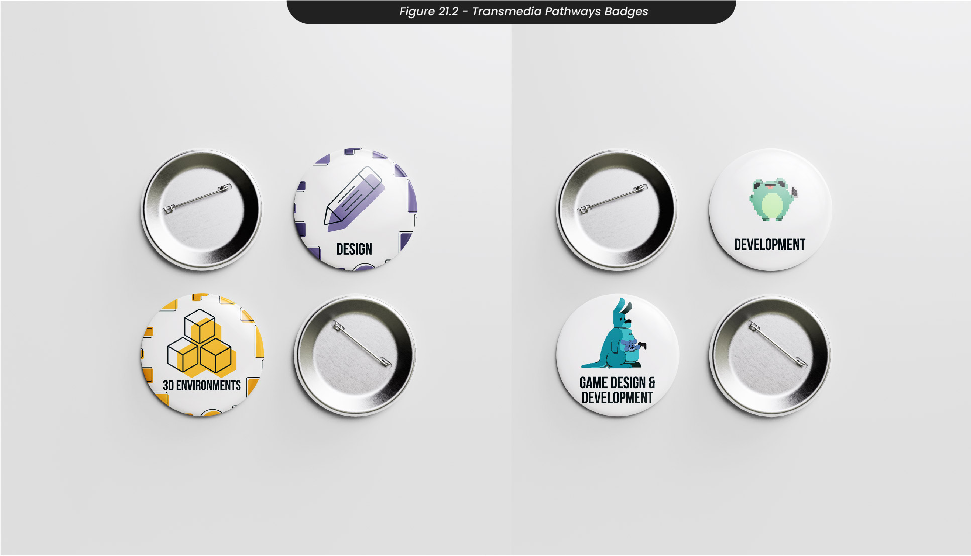
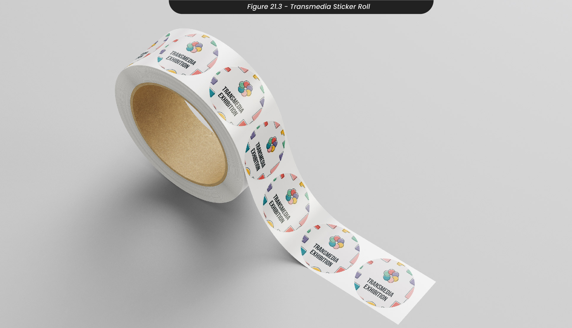
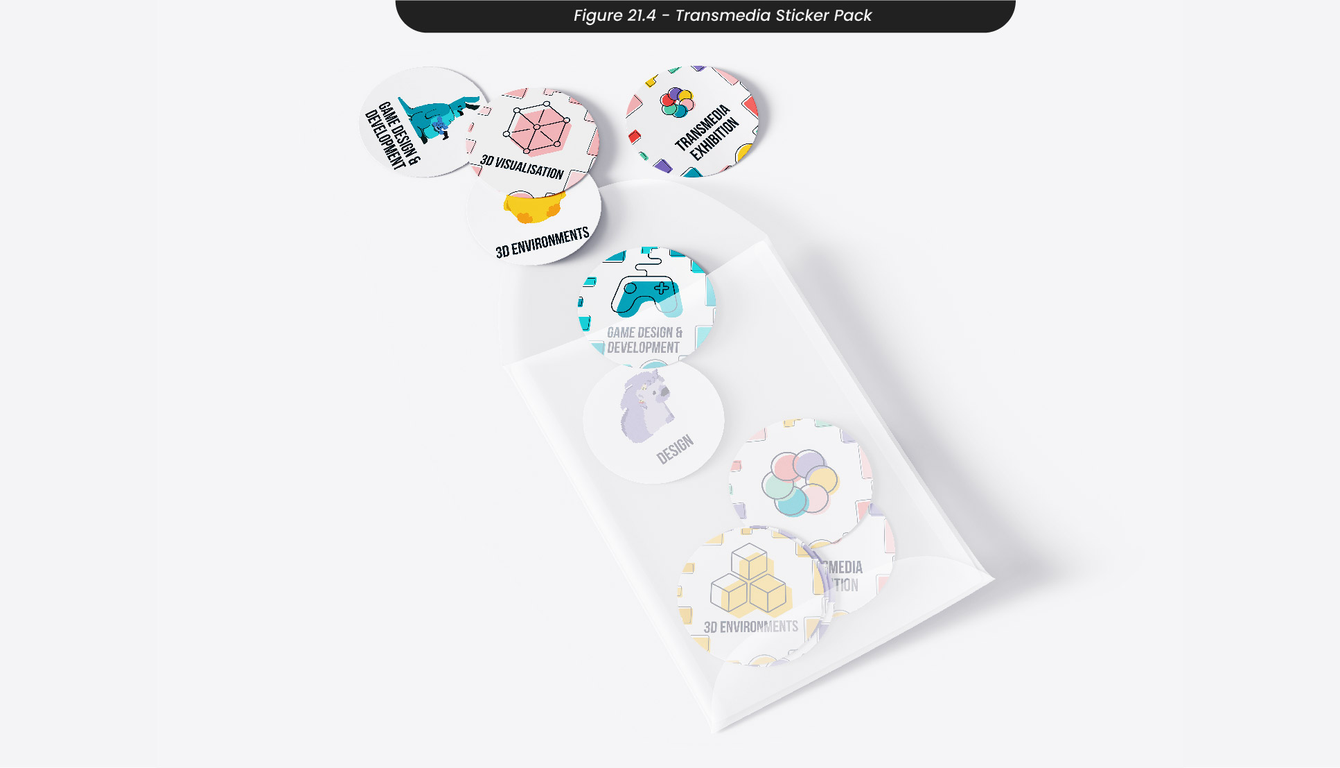
While working on this project and my Social Media Campaign this semester, we were asked to help plan and take on different areas of our end-of-year ‘Transmedia Exhibition’. To extend the work I had done in the first semester, I used my assets and resources to create badges for the event (Figure 21.1). To create a wide range of badges for visitors to collect, I created badge designs for the pathway icons I had created last semester, along with the new characters for our mobile Transmedia game (Figure 21.2). Although we are likely to use these at the event due to printing issues, I also used these badge designs to create stickers that we could place around the venue for visitors to pick up (Figure 23.3-4).
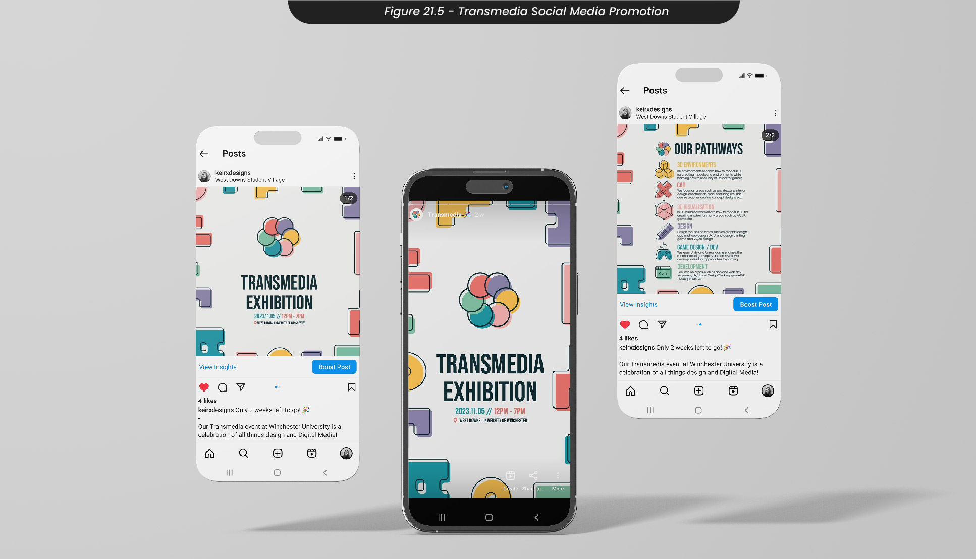
To promote this event online, I created some social media posts with the correct sizes for Instagram posts and Instagram stories that I sent out to the rest of my cohort to spread all over their social media (Figure 21.5).
Finally, I created a logo animation that myself and others could use on any video content, whether that be through social media or for the end of year showreel.
