Online Portfolio
Brief and Research
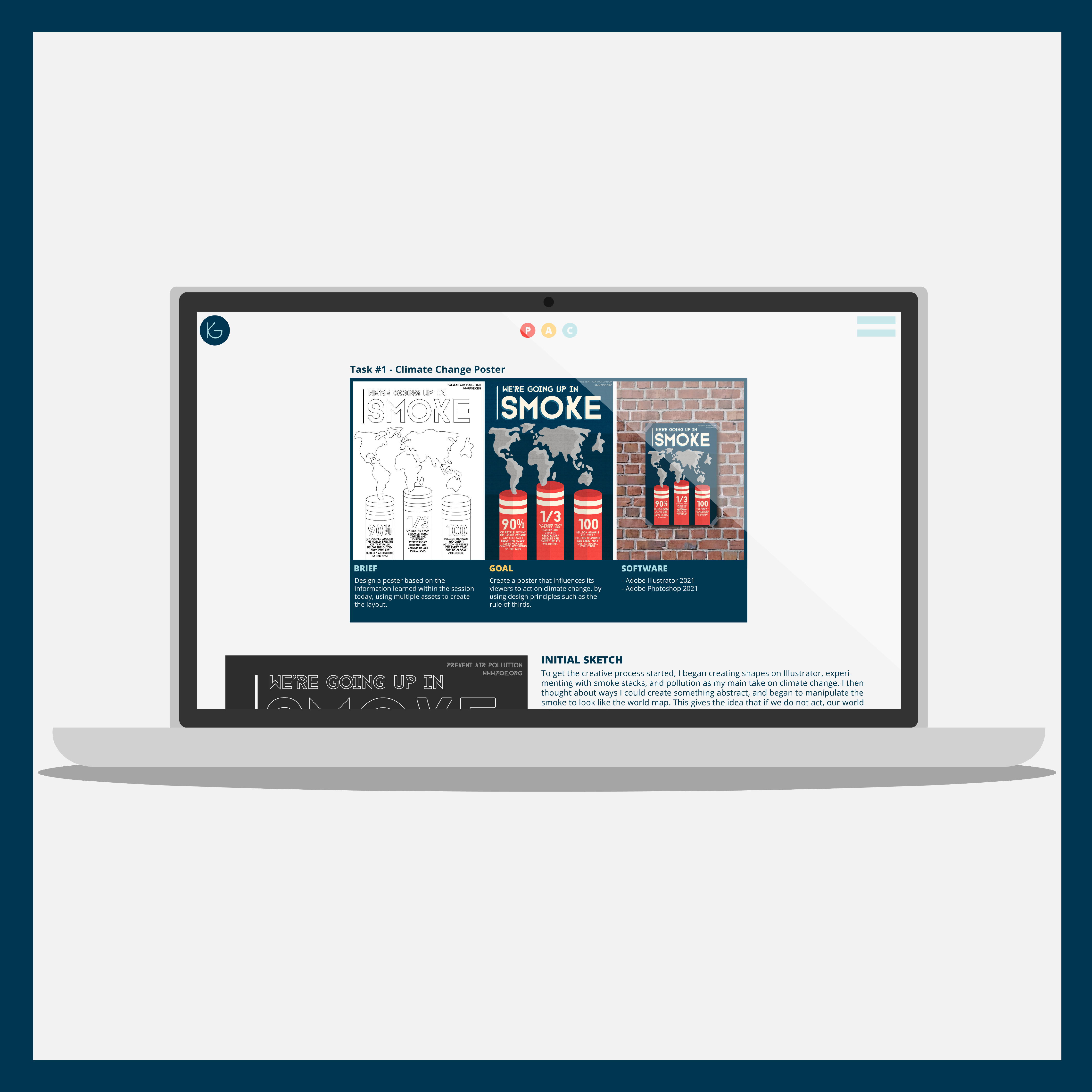
Throughout the majority of the first semester in Winchester, we were given a brief to design and develop an easily navigable website that displays content from our first year, which will be updated throughout my future years in University. This website must allow users to understand who I am, what I do and where to find me. My projects, and any personal work that I have been working on, can be displayed here with details about how I designed each one, along with why I made any decisions during my process.
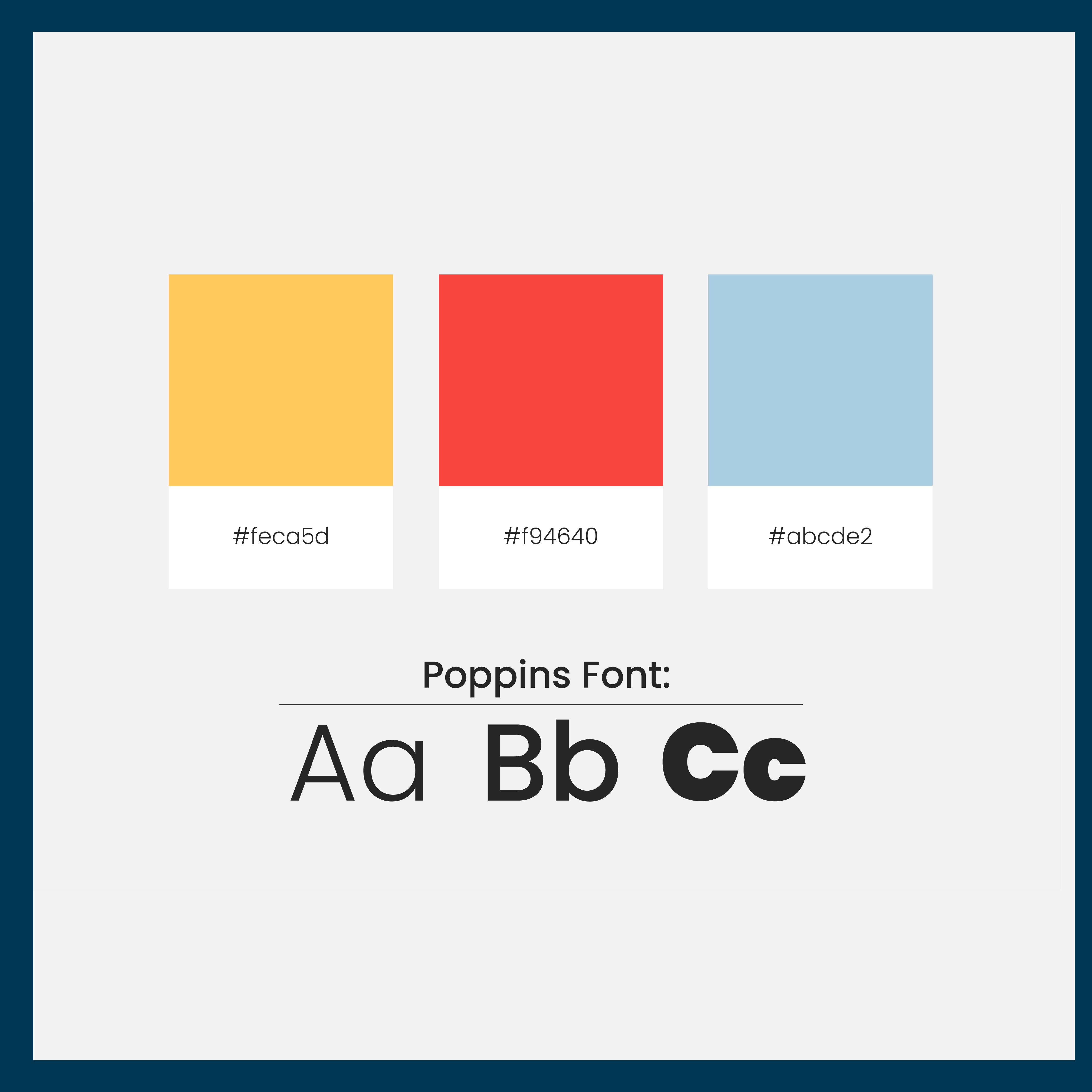
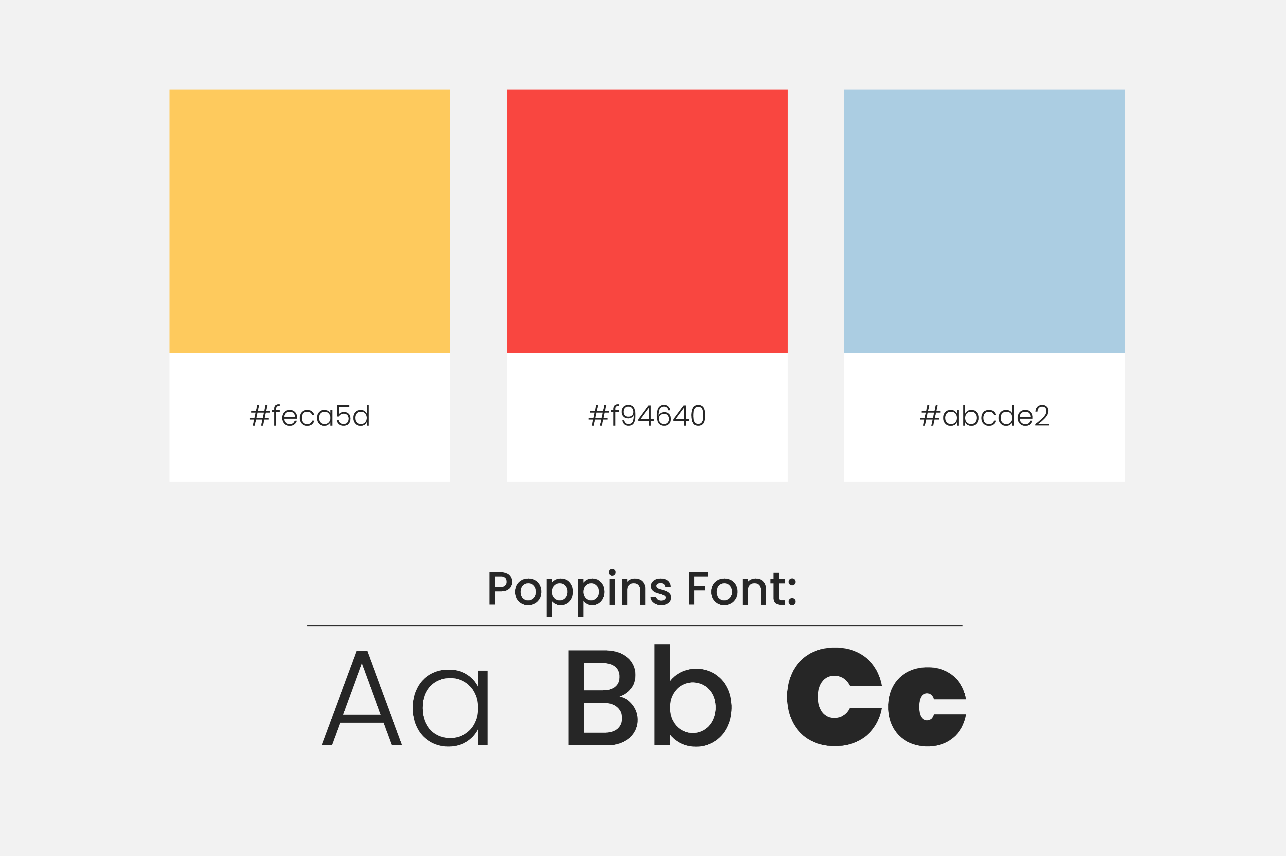
Before I started deciding on a layout and design for my website, I did some research into fonts and colour themes to make sure my website reflected my personality and was easily readable, blending in with the rest of the web. After looking into a variety of different typefaces and font types, such as serif and script, I decided to use a simple sans serif font for the majority of text around my online portfolio. This is the font type that is most widely used while browsing and is the easiest font type to process and read. For my site, I thought these qualities would be important so that my website would fit in amongst all of the others so that any viewers of the site would feel right at home and immediately know how to navigate my site. I didn’t want them to feel confused and click off the site because it was too overwhelming and difficult to understand.
When looking into colours, I decided to use a primary colour palette consisting of red, yellow and blue. These colours each have a different and interesting meaning behind them when used in the design which I wanted to take advantage of when creating my site. For example, red is often perceived as an exciting colour, so using it would make my brand appear exciting and intriguing. Using yellow would make my brand appear fun and welcoming, whereas blue would make my brand appear confident and professional.
Wireframing and Designing
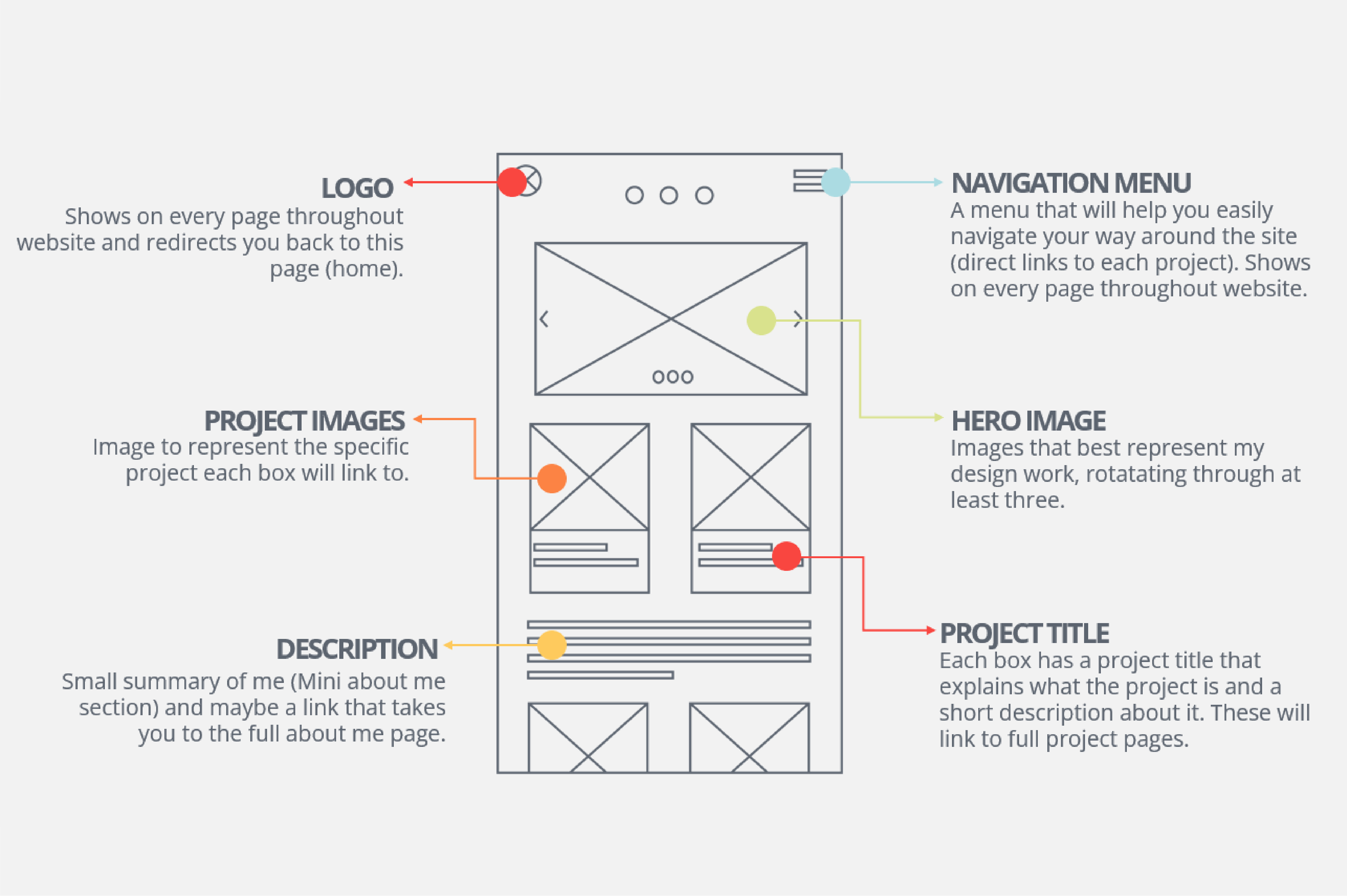
Moving on to the website designing process, I started by wireframing each page on my site. To do this, I sketched them on paper and then digitised them so they would be easier to understand, and could be annotated or changed easily. I started by wireframing my home page and continued to wireframe the rest of the pages from there onwards. I decided that for my homepage, I wanted to incorporate an element that would showcase the projects I was the proudest of so that anyone viewing would immediately see my designs and get a feel for my style as a creative. For this, I wanted to have a carousel that would rotate through three projects of my choosing at the top of my page.
For my navigation bar, I wanted to have buttons in the top right corner that would direct the user to the page of their choosing when clicked. Having these buttons here would allow my user to find what they wanted immediately instead of having to scroll to find anything, which could potentially make them turn away from my site.
To allow me to see exactly how I wanted my site to look before coding, I pushed these wireframes a little further by creating some simple designs for them in Illustrator. I thought about how my site would look if displayed on a computer in this step so that I could easily see what parts of my design would be immediately in view when landing on the homepage.
This also gave me an early look into my fonts, colours and layout choices so that when developing on my site, I could focus on these aspects. As a designer, these areas of my online portfolio needed to be strong, as these allow my understanding of design to be evident throughout.
To record my process in this project, I used a project planning tool that went on to be a favourite of mine throughout the rest of the semester - Milanote.
Learning HTML and CSS
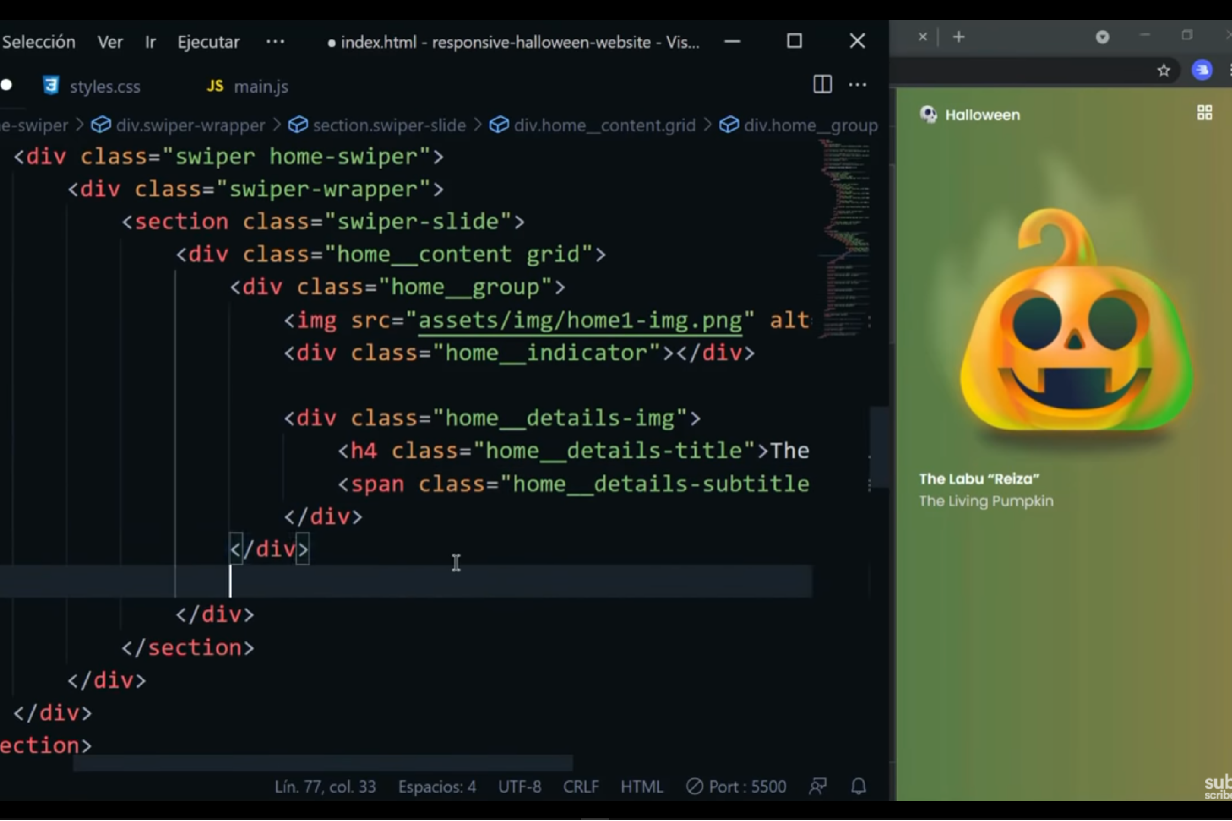
Before starting my coding process, I needed to introduce myself to HTML and revisit the information I had learned in my development principles module over the first semester in University. To do this, I watched a variety of tutorials and beginner introductions to HTML and CSS, as well as watched other people create their own code to learn some new tips. I found that watching others code through ‘code with me’ videos was a much more efficient way of me learning than reading lines of other peoples code.
Reading lines of code presented struggles to understand the content so that when it came to any issues or problems in my own code, I didn’t know how to remedy it as I didn’t really understand what I was writing. Watching instead of reading fixed this and helped me fully understand the code I was creating and helped me fix my own code and create my own ideas, instead of just copying what was written because I didn’t understand it enough to change it.
Coding My Home Page
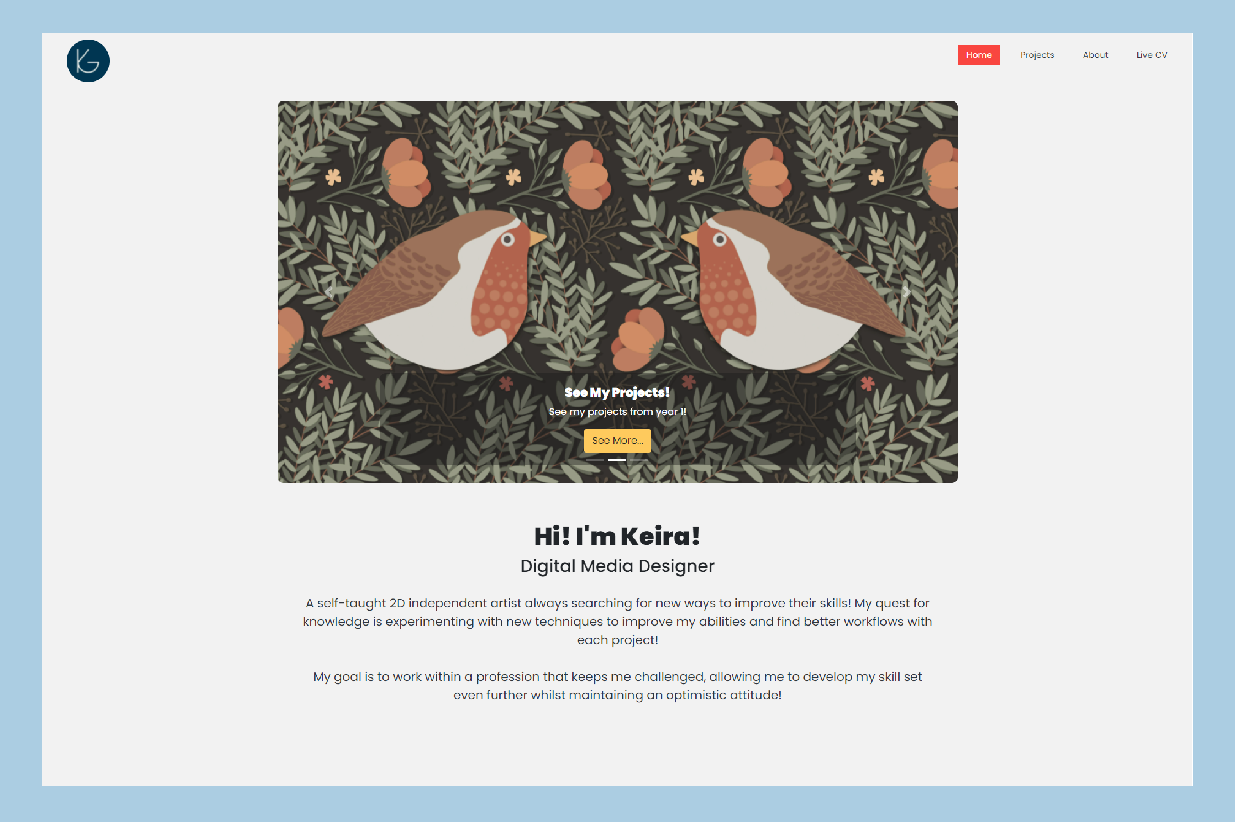
To code the home page of my website, I focused on the main elements of my site before introducing any detail or writing.
On this page, I started out by creating a header and a footer, so that this could act as a template for any future sites as these things would be common among every web page, with different content separating them. Something that I was introduced to when creating these elements was the code for ‘hovering’ over the element. This was something I would continue to use throughout my website to make it interactive and enjoyable to navigate.
The next thing I focused on was the carousel, as this would be the first thing you would see when landing on the home plate. Using the code for a carousel from Bootstrap, I changed the content and adjusted some of the code to fit it in with the rest of my site, such as changing button colours and rounding the corners of the carousel box. However, I had many issues when creating the carousel, such as it not rotating through the images I had selected and the entire carousel not resizing. I remedied this by utilising the internet for information on using Bootstrap carousels and discovered that I was using the incorrect resizing code for this particular element. This helped me move forward because anytime something wasn’t resizing the way I expected it to on my page, I could use this new piece of code I had learned to see if this was a similar issue.
I then moved on to creating cards to show and link to all of my projects. This was probably the smoothest process, as I had already learnt a lot from creating the first two elements of my site. I decided to use bootstrap cards so that if viewed on mobile these would easily readjust accordingly. I found these easy to adjust to the way I wanted them to look and didn’t have any issues with resizing them or moving them around the page.
Once I completed these main elements, I filled in the rest of the site with headers, paragraphs and other minor details, giving me a finished first page that I was happy with.
To improve this first page, I decided I wanted to stop users from rushing through the content on the page, as this fast-paced scrolling might overwhelm them and prompt them to lose interest in what they were seeing. To make sure the information was delivered at a specific space and the viewers would really take in the content, I added a script from Scroll Reveal to my code so that many elements on my site would fade in as you scrolled.
Coding My Projects Page
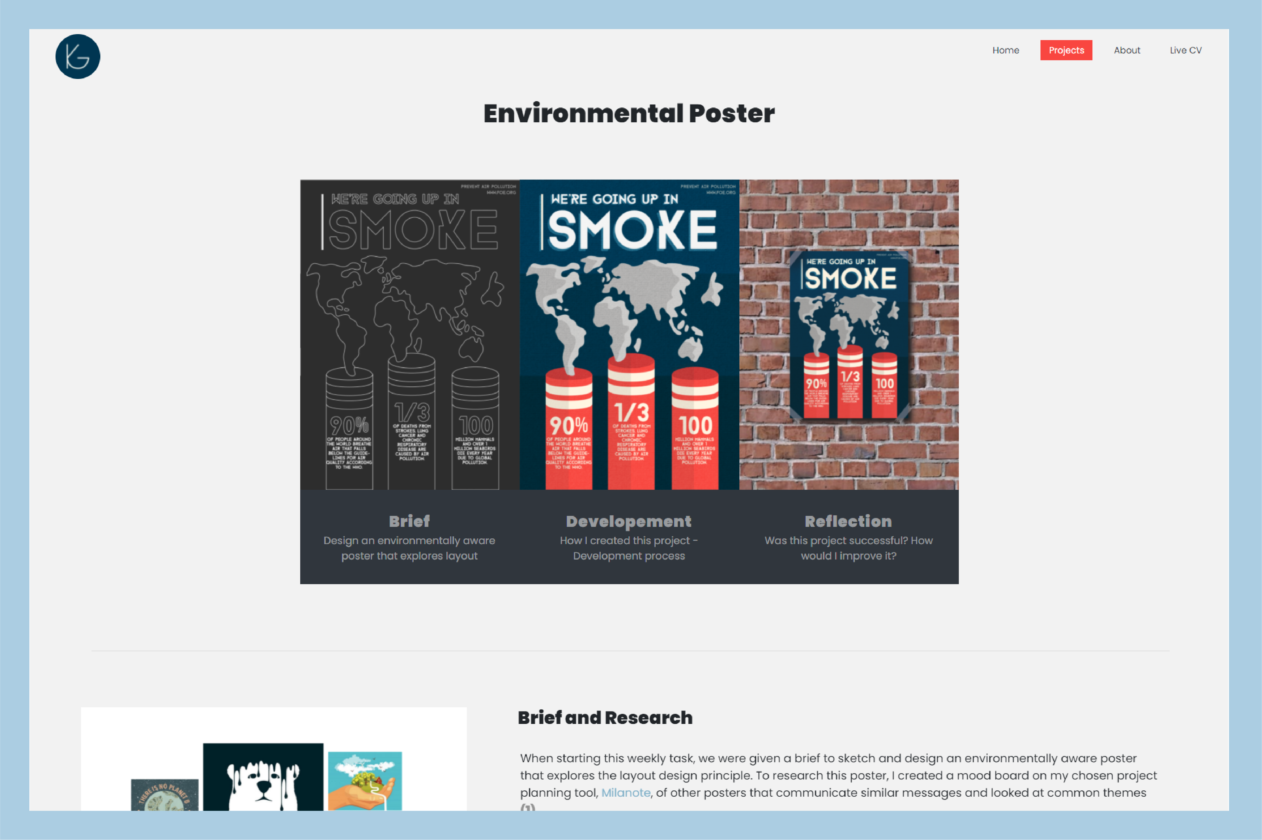
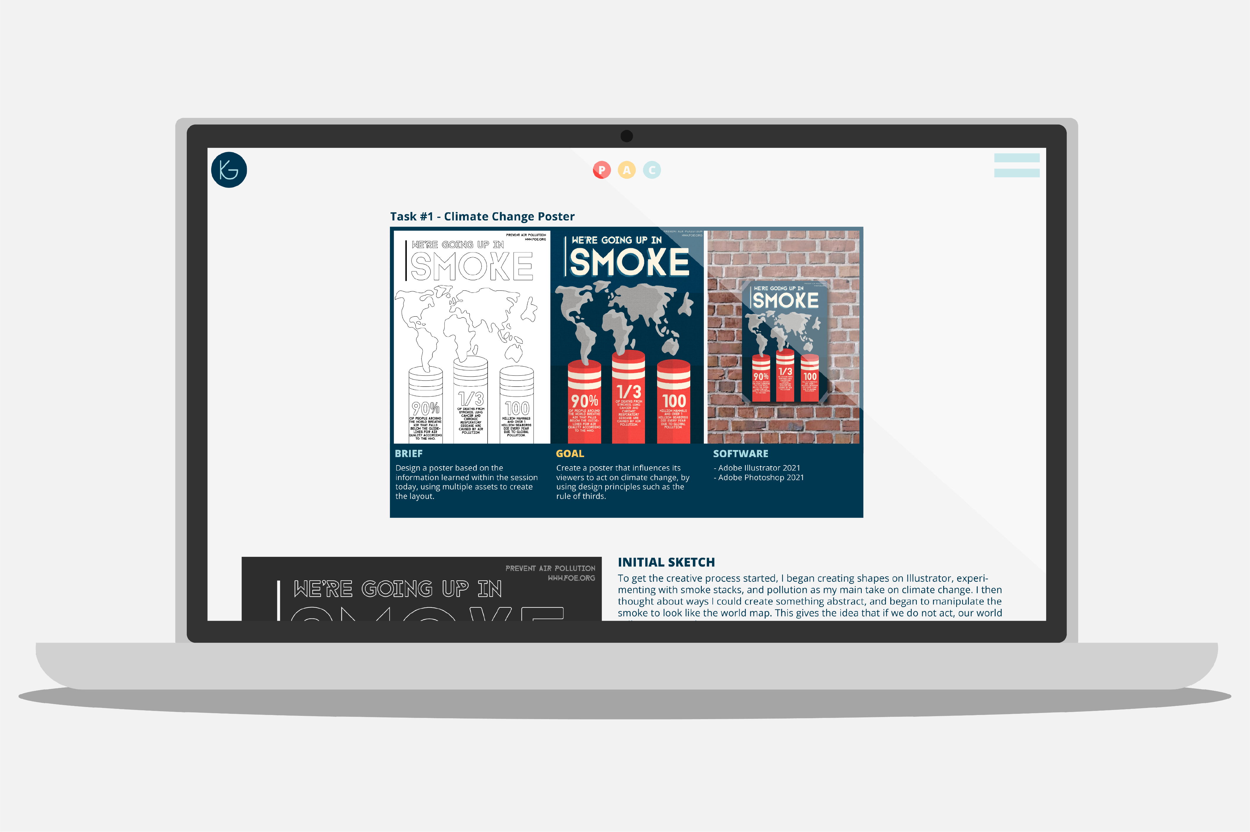
After completing my homepage, I used this knowledge to start creating a template for my projects, so that I could reuse it and adjust accordingly for each project when I started creating a new one. I Started by using the template I already had of my footer and navigation bar from the home page and started to add the unique elements for this page.
The main element for this page was the header image, with interactive buttons that scroll to the correct section so that it is easy to find a specific part of my process. I initially found this incredibly hard to do, because my container was shifting to the left instead of sitting in the centre of my screen as was desired. After looking into this problem, I soon discovered that my entire webpage was stretched and not the correct width. To fix this, I made sure that my overflow was hidden in my body tag.
The rest of this page was pretty simple, as it was mainly just images and paragraphs, to make the text go next to the images I made sure they were floating so they didn’t start of a new line and instead appeared next to the images displayed. I made sure to add margin sizes to all of my text and images in a linked CSS file, so that the content didn’t become messy and overwhelming, taking advantage of plenty of white space.
Finally, I added dividers throughout my page and gave them individual classes so that my buttons in my header could link to them and when clicked, would scroll to the matching section. Similarly to my first page, I added some scroll reveal to the individual elements on the page so that they would appear as you scrolled through the page.
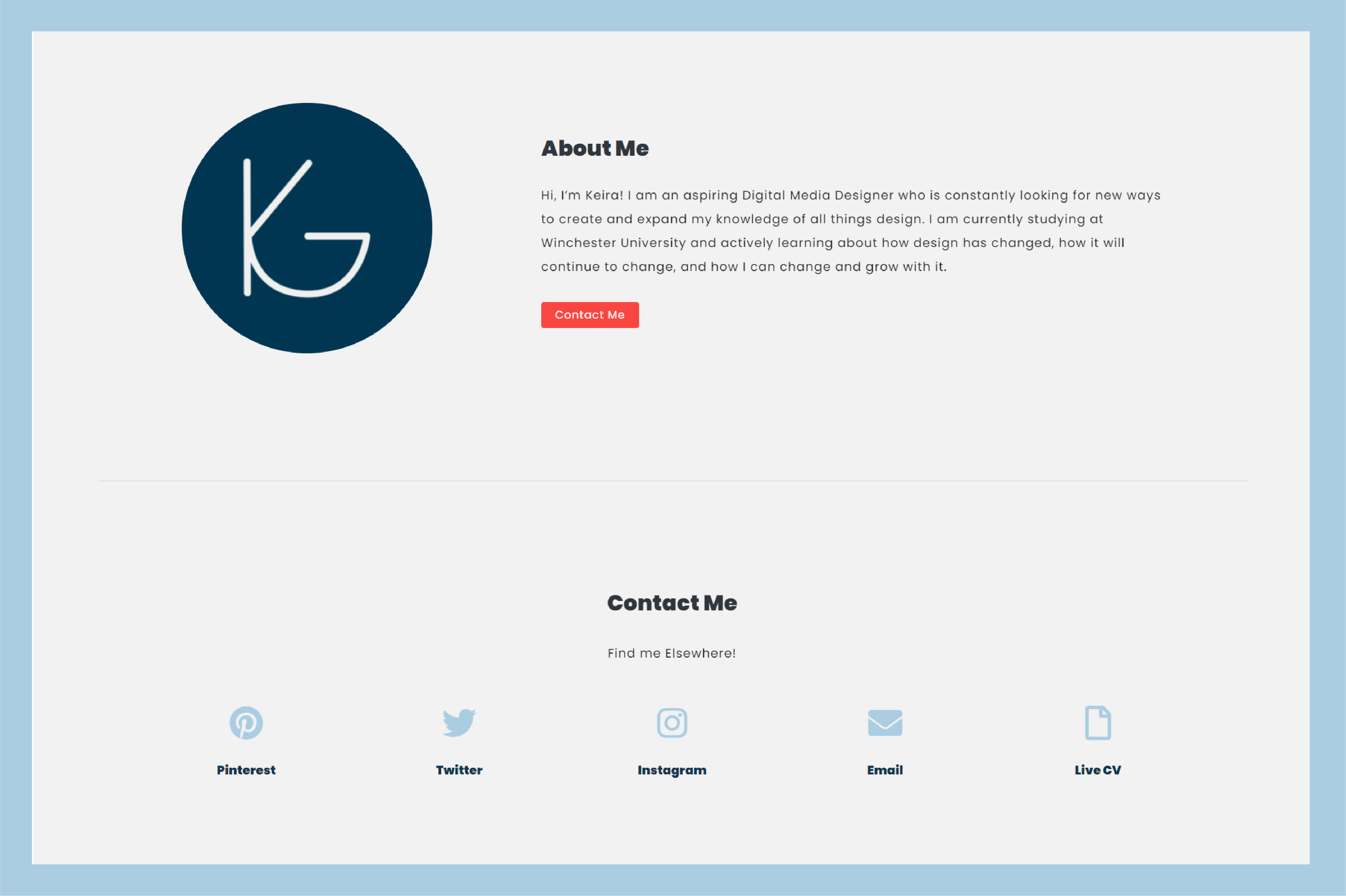
Coding My About Me Page
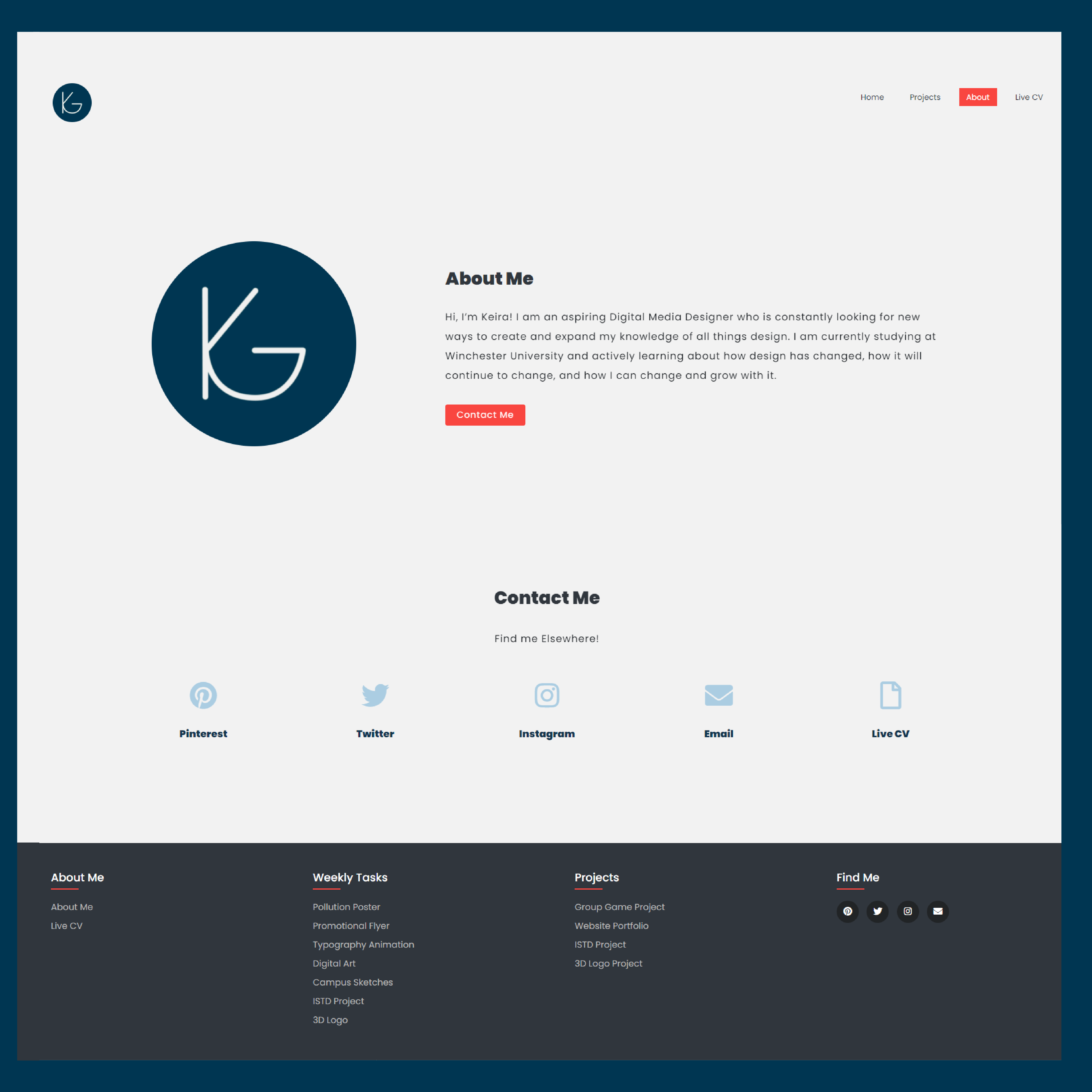
Creating my about me and contact page went particularly smoothly after learning a lot from creating the early pages on my site. I used the same technique for my about me section as I did for the images and paragraphs in my project template, used a divider for the contact section so that the button would scroll the user down to this section, and then used icons from font awesome to create contact me buttons.
Noticeably, these sections have changed from my early wireframes, as they are now one instead of two. I made this decision so that the user wouldn’t have to go through as many clicks to get where they wanted, grouping all of the necessary content on one page.
Uploading Live Site
After coding my entire site and it is ready to go live, I used FileZilla, an FTP, to log into my hosting site and transfer all of my HTML, CSS and element files. I made sure to check the functionality of this site on multiple web browsers so that I could be sure it was widely used. One thing I had struggled to do however throughout this whole process created a responsive site that would change when the browser site decreased, such as viewing on a mobile platform.This is something that I want to continue working on moving forward, as it’s super important that sites
are mobile-friendly.
Reflection of Project
I am very happy with the outcome of this project. Having no prior knowledge, I am completely new to coding and developing websites from scratch some learning all of this in the timeframe we have been given is a real accomplishment for me. This was a project I was particularly anxious about starting since it was a completely new field to me. Therefore, the progress I have made, although I would change a few things, has been very successful overall.
The online portfolio I have created relates to the brief because my site displays all of the necessary content, has been updated regularly and will continue to be updated live, and is an easily navigable online portfolio that my lecturers, peers and any potential clients can view.
If I had the opportunity to do this project again, I would work with a mobile-first thinking attitude, incorporating responsive design as I went to avoid struggling to add it in later. Mobile viewing is incredibly important, particularly in this industry, so I feel as if this should have been prioritised early in the project to avoid the difficulty I am facing adding this to my website now.
