ISTD Project
(1) Brainstorming Ideas
Brief and Initial Ideas
This project introduced us to the ISTD, International Society of Typographic Designers, a group of typographic designers who focus on achieving the highest possible standard of visual communication. The task given to us was to create for ourselves an introduction to typography and learn how to follow a brief over the three weeks we were given. We were provided with the 2022 ISTD student briefs, a variety of multiple briefs we could choose from to explore the use of typography in design.
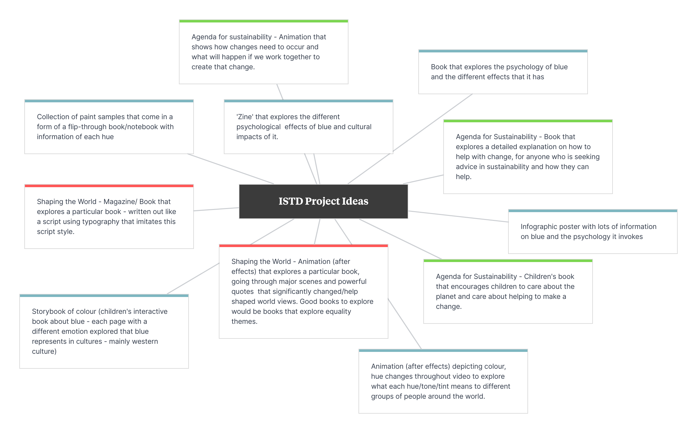
The first thing I did to look into this project was deciding on the particular brief I wanted to focus on. This required me to look at each brief in a good amount of detail and brainstorm ideas for each brief that interested me. To do this, I created a mind map on my chosen project planning tool - Milanote (1). After coming up with a wide variety of ideas, the brief I wanted to continue to work on was ‘A Colourful Story’. Once deciding on a chosen brief, I moved forward to developing my ideas for this particular brief. Some of my ideas for this brief (ideas page) included a children’s book about colour, a small notebook with paint swatches, and a book depicting the history and various psychological responses to colour. The latter is the idea I decided to move forward with.
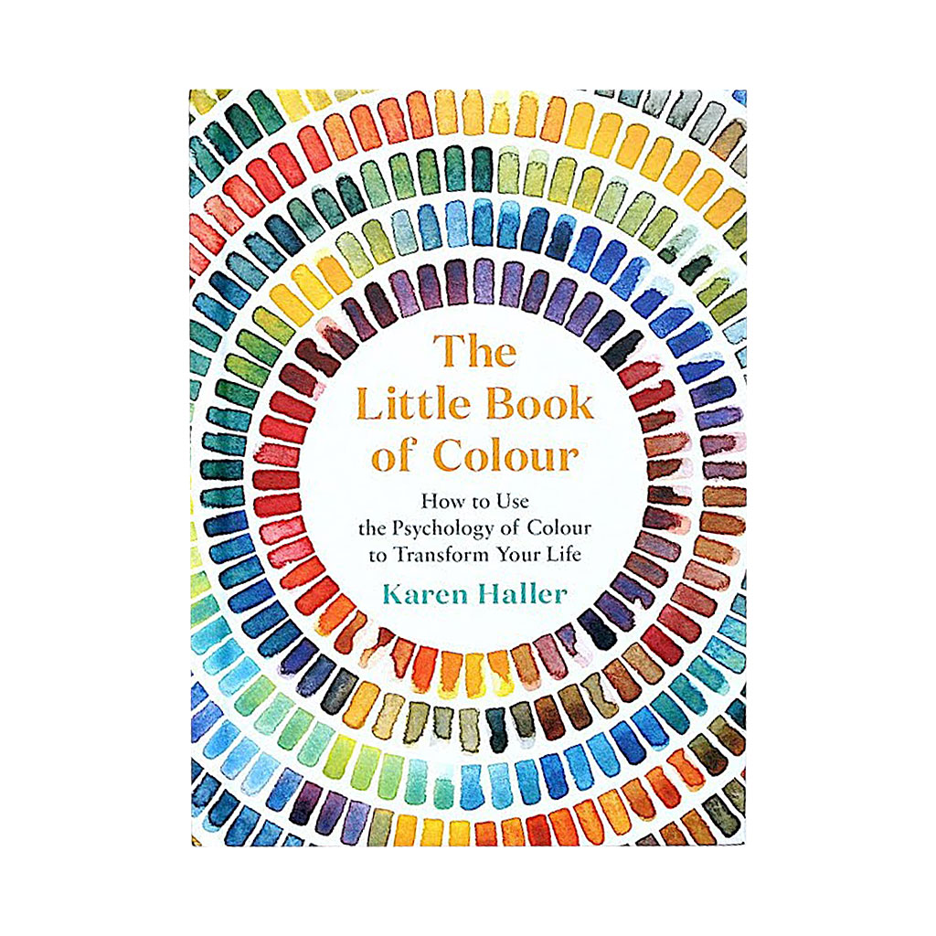
(2) Little Book Of Colour (2019) - Karen Haller
Colour Research
After deciding on the idea I would continue to develop, I started researching the specific brief I was focusing on, this being a colour (colour research pages). Looking into all of the colours I could do this project on, I chose the colour blue, because it has an interesting history and has changed many times over the years. It is known as the worlds favourite colour, and I was intrigued to find out why this was. During my research, it was discovered that although there is no concrete evidence, blue may be a widely loved colour due to its presence in nature, in the sky and the sea. Many parts of my research came from ‘The Little Book of Colour’ from Karen Haller (2), where I discovered this and many other interesting facts about the colour blue during my research and would use this to help construct the content I wanted to include in my project.
Typography Research
Next, I looked into typography to decide which fonts would be the most successful to use for my project. Sans serif is a widely used font type, particularly on products that have an informational purpose, so this is what I decided to go with. For some differentiation, I decided to use a complimentary font type, sans serif, for other elements of my design, such as the page numbers. I learned some tips for using typography in design from some YouTube videos, such as Beginning Graphic Design: Typography to better my understanding going forward.
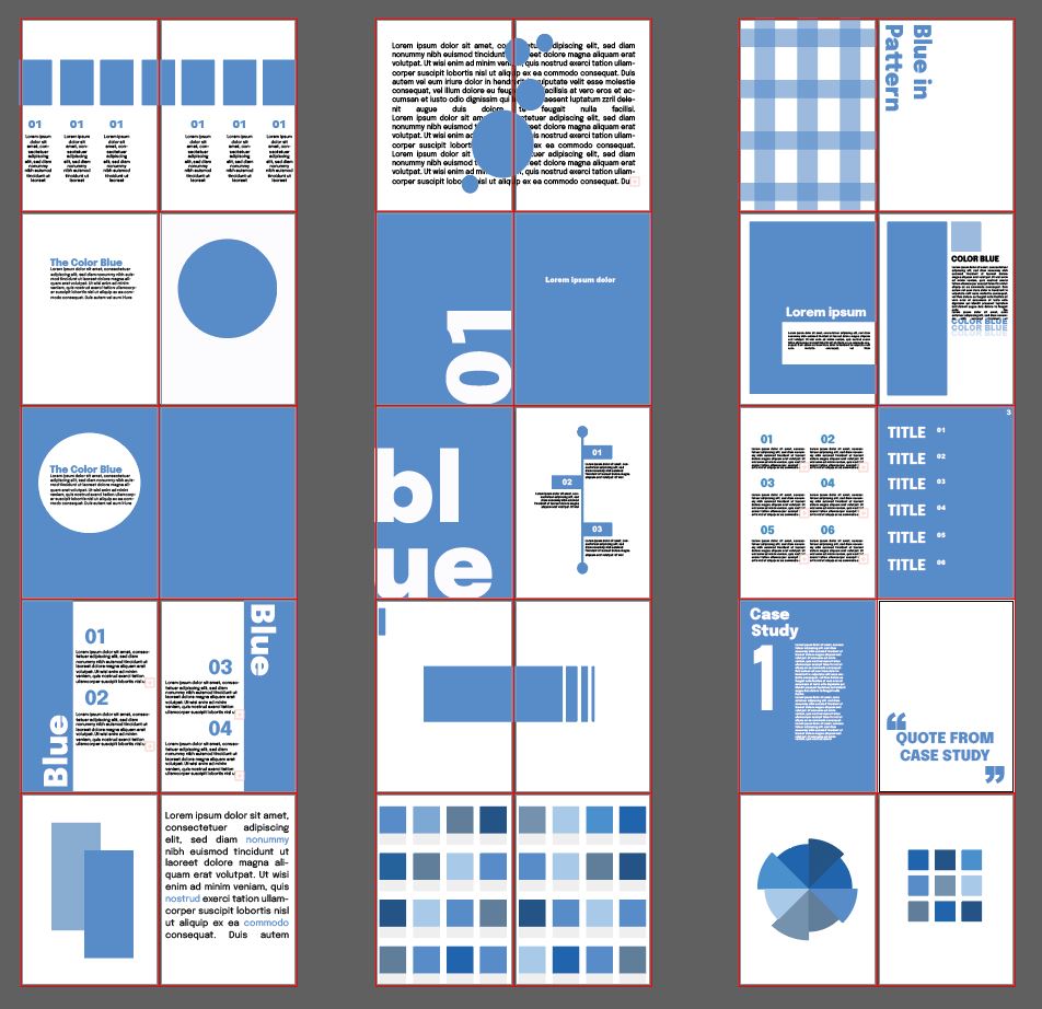
(3) Project Page Ideas
Project Development - Illustrator
To start the design process of this project, I wanted to create some quick designs to get a solid understanding of the direction I wanted to head in. To do this, I made multiple artboards that were a5 size, the size of the book I wanted to produce, using Illustrator (3).
Using Illustrator for these early designs was decided as this process was only for rough first drafts, and Illustrator was the program I was more comfortable and familiar using so I knew I would be much quicker using this program. Since these were only intended to be quick designs, I didn’t want to waste time creating them in a program I was unfamiliar with, as I would spend too much time trying to do the things I already know how to do in Illustrator.
Due to only had three weeks recommended for this project, it was decided that I wouldn’t create the full book, and instead focus on making a solid project proposal. Doing this would allow me to demonstrate the idea of my project thoroughly, instead of running out of time designing too many pages and not being able to develop them to their full potential.
Once developing these rough early designs in Illustrator, I opened up InDesign to start working on designing and developing them into official pages.
Project Development - InDesign
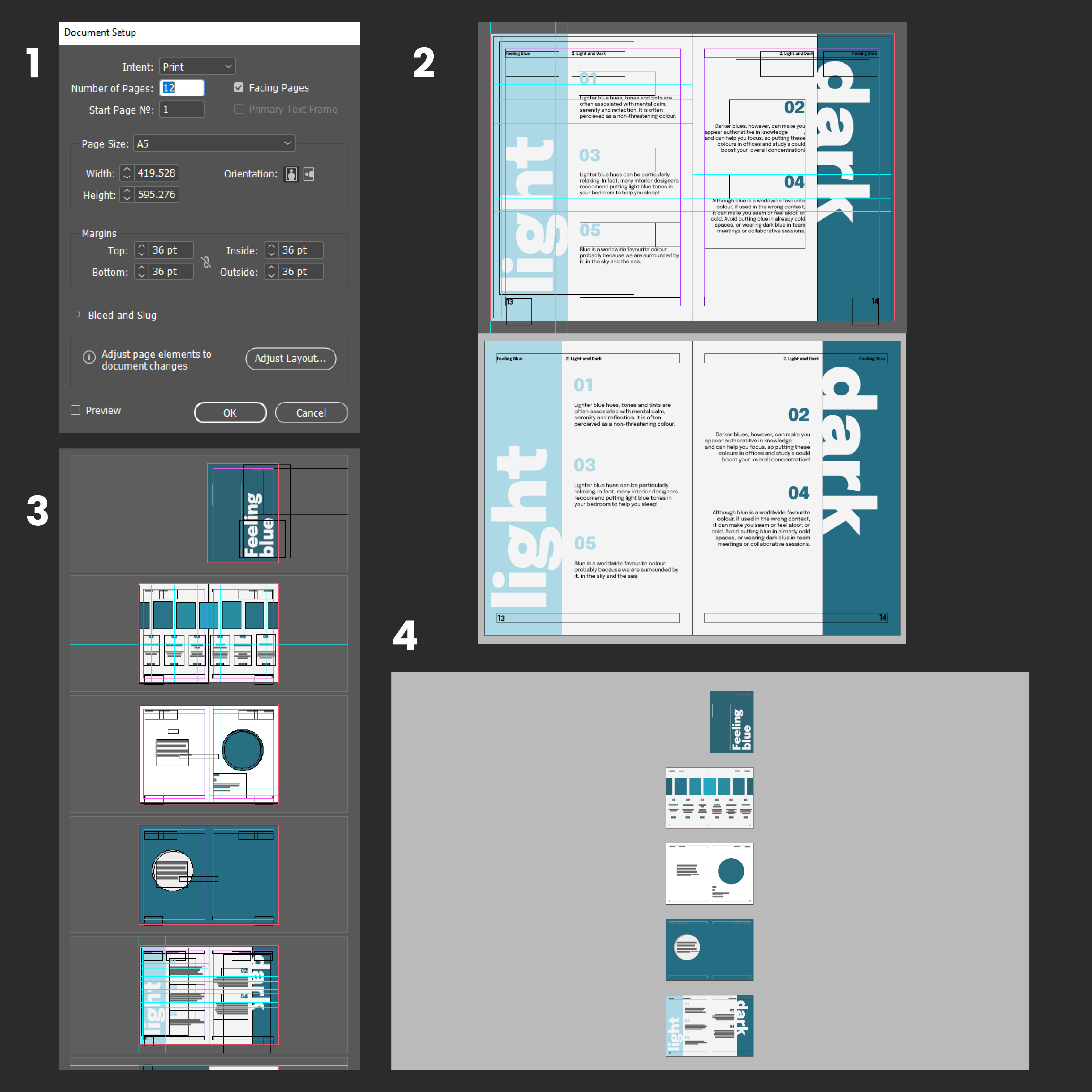
InDesign Process
Starting in InDesign, I created a document with 12 a5 pages, that I could adjust if needed, which allowed me to view and edit each page as I went (1). Since I was only working towards a project proposal, I chose to initially only add 12 pages, although if I was to continue working on this project, I would add many more pages that explore my chosen brief thoroughly. This taught me how to properly set up the document for the desired outcome I wanted in InDesign.
Using rulers and guides, I worked my way through the particular pages I wanted to reproduce from my Illustrator designs. Using these tools allowed me to ensure all of my measurements were correct and everyone was laid out on each page correctly. However, using rulers and guides often meant my workspace quickly became messy, so it was clear that I needed to utilise the preview mode (2), or ‘W’ for short so that I could quickly see my elements the way they would appear in the finished design.
Something I found helpful when experimenting with InDesign was how each page spread I was working was seperated from the next, so I was able to work in each workspace without anything overlapping or being too close for me to manage properly (3). Discovering this about InDesign has helped me see why InDesign is often the suggested program to use over Illustrator when designing print-based products.
After I was happy with my page designs in InDesign, I thought about ways I could display them to truly capture the idea I had in my head.
Project Development - PhotoShop Mockups
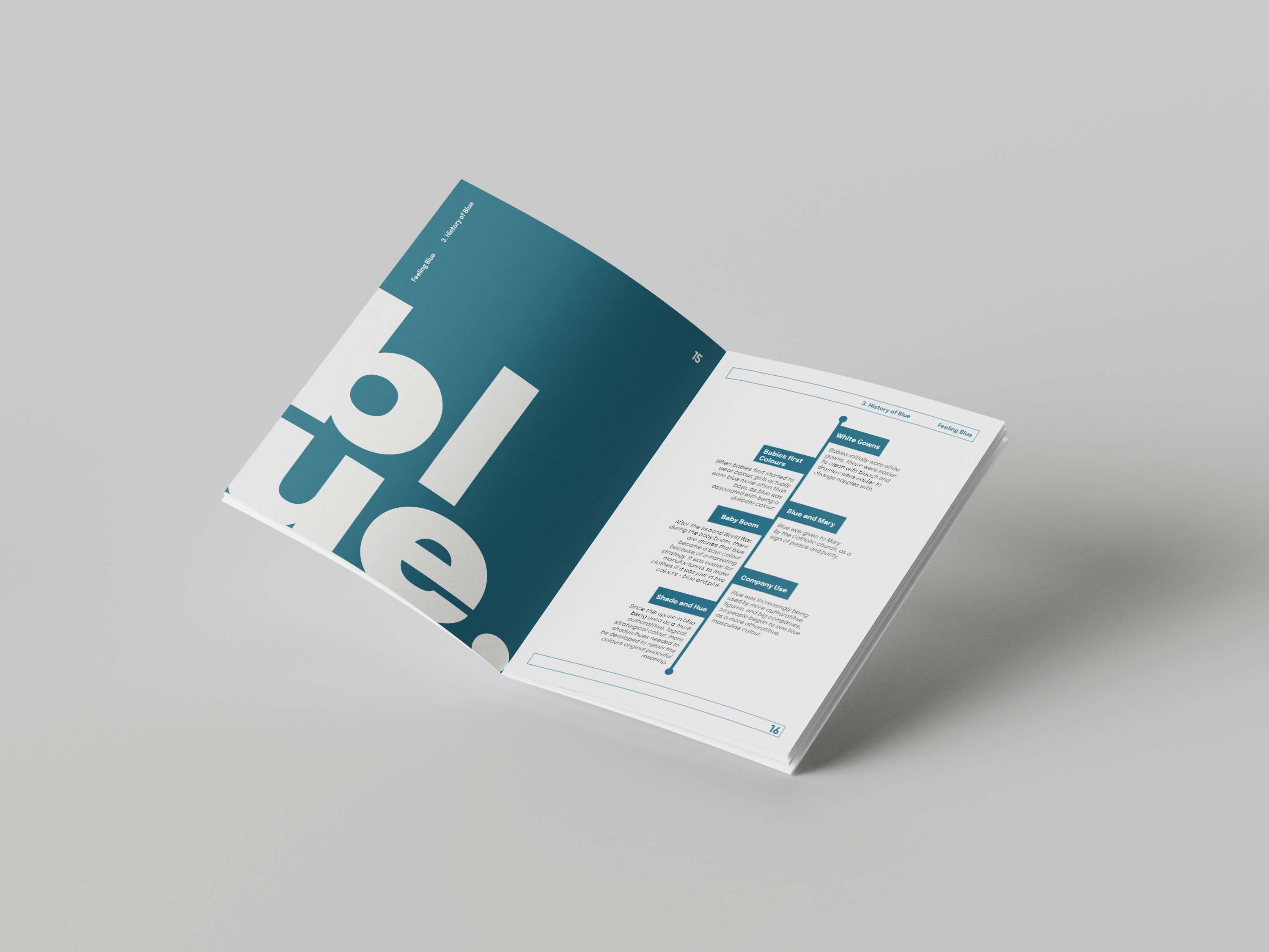
(4) 'Feeling Blue' Page Mockup
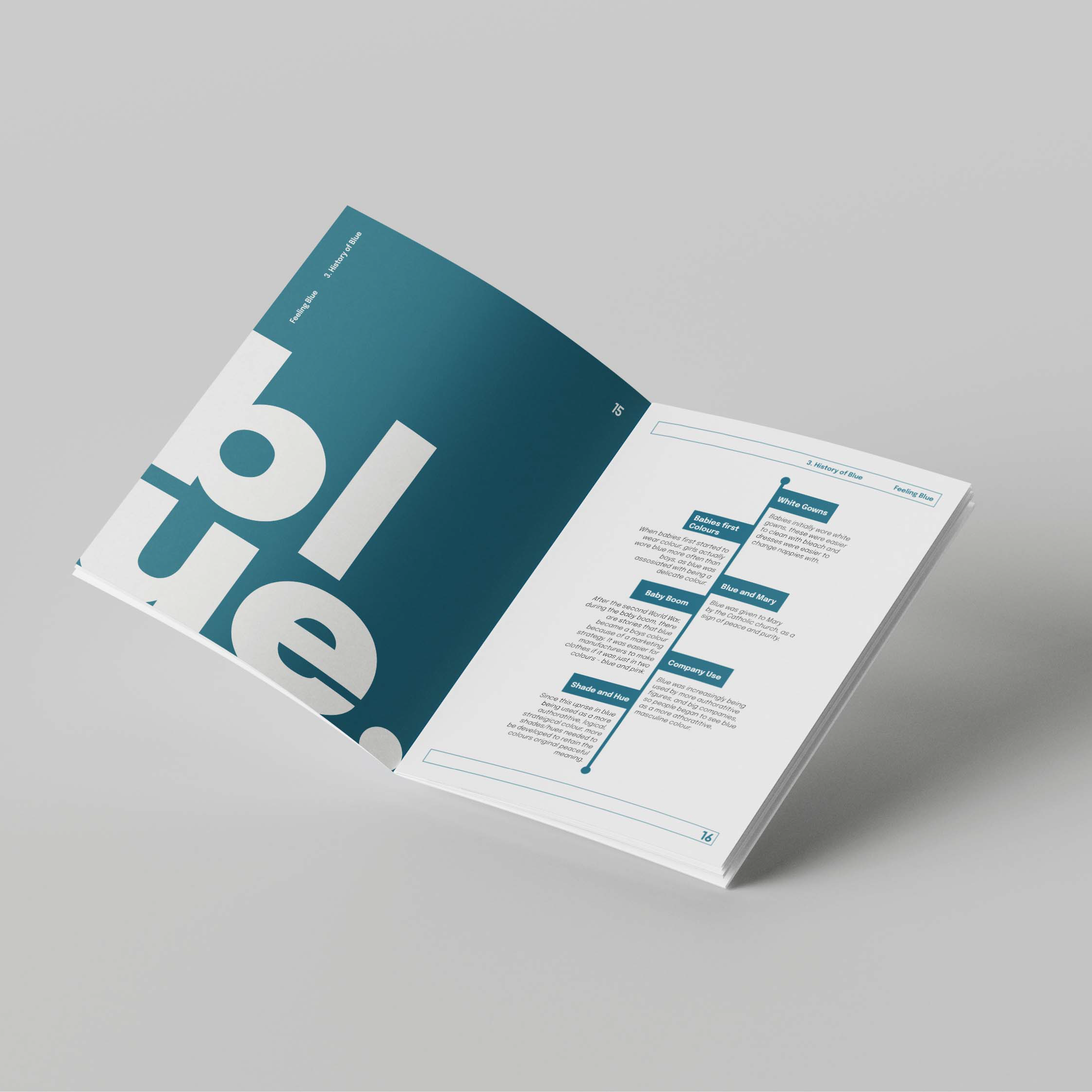
To display my pages, I decided to create mockups in Photoshop using mockup files I had found online so that my pages were displayed in the exact way I intended for them to be (4). This made my idea much clearer and my project easier to understand. To finish these off, the lighting was adjusted slightly so the paper appeared matte instead of shiny, as this would be my desired printing material. This is due to ease of use any readers wanted to highlight or use sticky notes, as I find glossy paper is much harder to do this on.
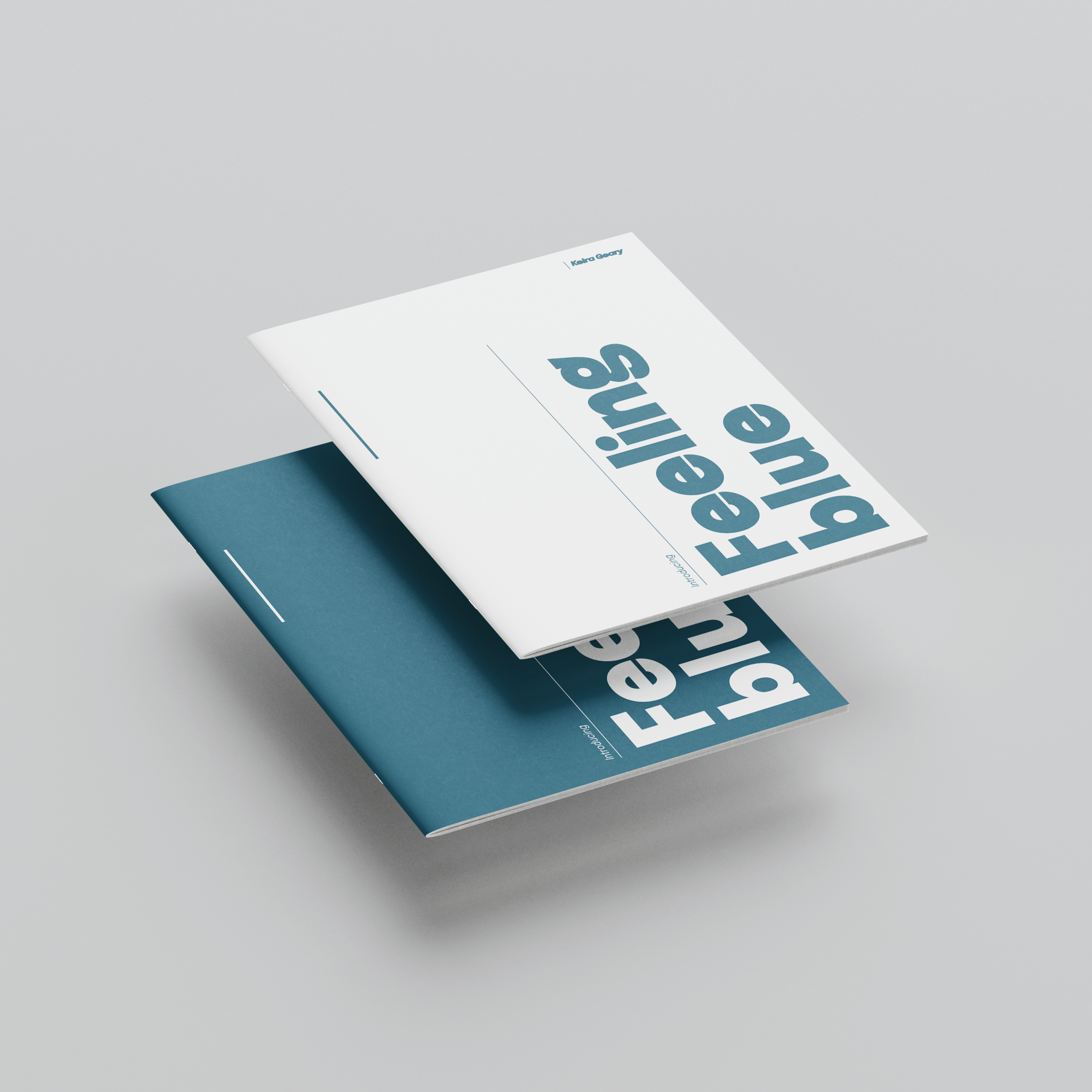
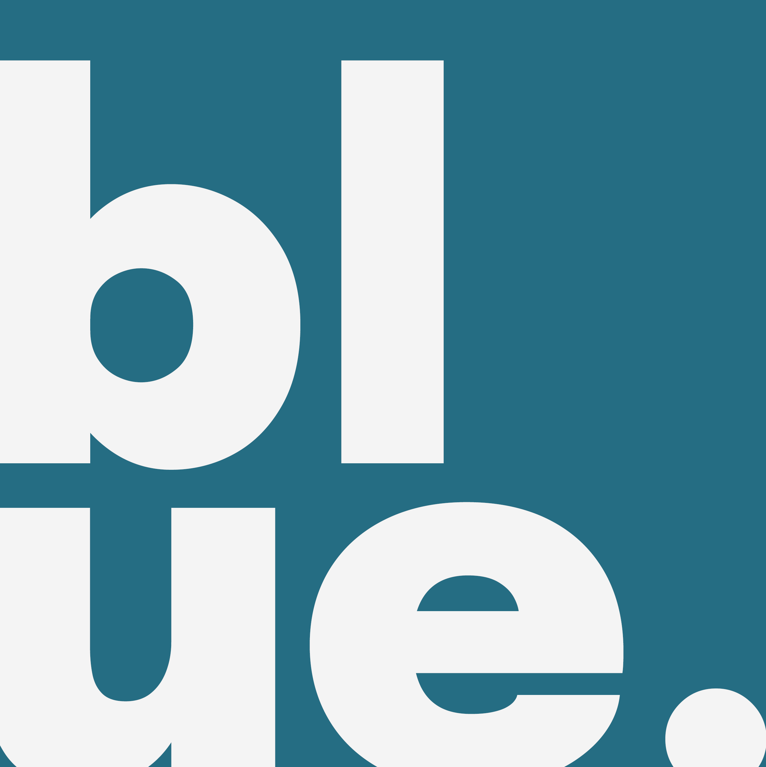
(5) 'Feeling Blue' Cover Mockup
Reflection of Project
Overall, this project was successful as I was able to learn a wide variety of new skills, such as a beginners introduction to InDesign, lots of history about the colour blue which will come in handy when using this colour going forward, some helpful tips about typography, correct ways to create and design specific projects, and many more.
This project relates to the brief as the project was thoroughly researched, right the way from the brief to the typography. This project is a steady project proposal that allows the viewer to see the direction the project would be headed in if it was to be continued.
If I was to continue working on this project or had the chance to do it again, I would create a type and layouts specification sheet, as this would solidify my understanding of typography and demonstrate that I can successfully use type in my design work.
