Interactive Project


(1) Transmedia Exhibition (12th May 2022)

Brief and Idea


For this project, we were asked to design and develop an informative and interactive exhibit for visitors to engage with at the Transmedia Exhibition (1) on the 12th of May, 2022 . We were given the option of incorporating the UN sustainable goals from the first project of this semester, zero hunger and infrastructure. Our team decided we wanted to include 'Zero Hunger' to ensure the projects we had created this semester deeply reflected the sustainable goals from the brief, despite being given the option to leave them out for this project.

We were divided into teams of around six to full explore this project. In my group, there were two designers, two game designers, a 3D student and a developer. As one of the designers, my role was to create designs for all of the characters and cards in our project, which we titled 'Q-Cards'. I also was involved with playtesting and feedback for my team.


Target Audience


Our choice to include the UN's sustainability goal 'Zero Hunger' in this project influenced our target audience. We decided to primarily target school groups, as this is likely when they would be learning about 'healthy living' When researching this target audience, I asked a group of 32 primary school students a variety of questions to find out what engages them and makes them tick. I also asked 7 primary school teachers what would interest them into organising a trip for their pupils. From this, I found that 65% of primary school students were reluctant to do or interact with something that felt like learning outside of school. 56% of primary school students were only interested in engaging with something that involved their friends. Finally, 85% of primary school teachers said they would only organise a trip or show their class something if the pupils could take something away, and learn from the experience.

From this research, we know we need our project to have a learning result, but not for the users to feel like they're learning. A good example of this is 'Top Trumps', and how children have engaged with them since the 70s, learning without knowing they are. We want our project to include multiple people so that it can be enjoyed with friends, as this is valued by primary school children. Our team has also decided to create a website so that pupils can take something away from this event, and teachers can continue to use this as a learning resource in their education.
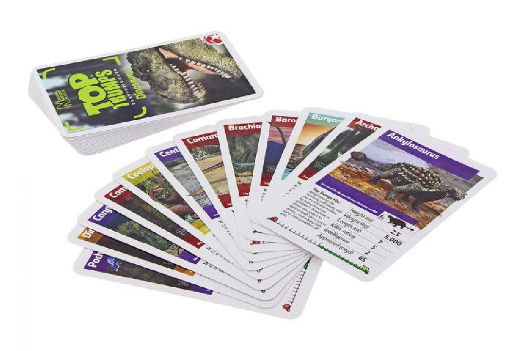


(2) Top Trumps

Project Research


When researching projects with similar goals, we found a few that reflected the direction we wanted to go in, such as 'Top Trumps' and 'Kahoot'.

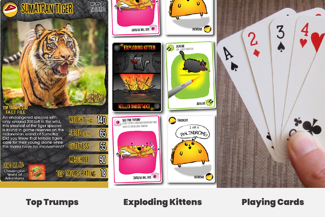
Top Trumps (2) is a card game, where the aim is to compare values in categories from a list of numerical data on the card and win an opponent's card. A wide variety of different packs of Top Trumps has been published since the late 70s, allowing its users to learn about a large collection of topics. Looking into this product allowed us to see the benefits of creating a card game for our project, such as being incredibly cheap to produce, being pocket-sized so they can be played anywhere and having a wide range of subject categories that can be played by all ages that can read.

Kahoot is a game-based learning platform, primarily used as educational technology used in schools. The games consist of user-generated multiple-choice quizzes that can be accessed from a web browser or the Kahoot app. This platform is highly sociable and widely multiplayer, with most games allowing up to 50 players. Having a multiplayer game that involves lots of people is one of the goals we set in our interactive project, so we decided to look into having a digital screen where only one person needs to be hosting, similar to Kahoot.

After researching these two products, we decided to create playing cards that can be scanned digitally with QR codes to be brought to life on a screen, before competing for a winning spot in a digital battle. Similar to Top Trumps, the cards will have a numerical value for multiple categories that players will attempt to win, by playing their highest number. For our 'Zero Hunger' goal, we are going to make our cards have characters that are food-based and the categories will be about nutrition and healthy living. To make our game widely multiplayer, similar to Kahoot, we are going to have the categories for each round appear on a big screen, which will prompt players to scan their cards in to play.
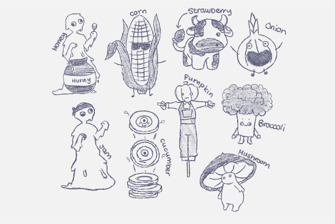


Character Sketches


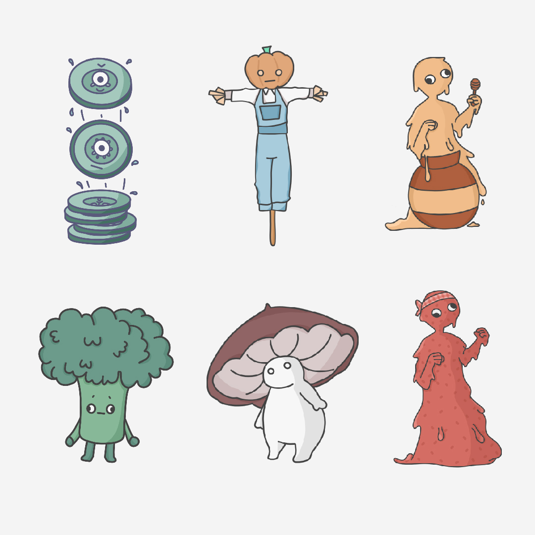
One of my roles in this project was creating interesting characters for our playing cards. Combining ideas from other members of my team, I started sketching my own character ideas in Procreate, making sure to keep a cartoon-style that was age appropriate so that we could appeal to school groups. When creating sketches for these characters, I looked into similar games that were targeted at a similar audience. For example, 'Exploding Kittens' and 'Unstable Unicorns' are card games that is easy to pick up and can be played by all ages that can read, but is recommended for 7 years and up. These games have character illustrations on all of their cards that are usually whimsical. They take regular characters and turn them into something a bit more unrealistic or silly.

I tried to replicate this in my sketches, by turning a cucumber into slices that all have individual faces, or giving a honey character a dipper as a weapon. Although our initial idea was to target technophobes in this project, we decided to switch to school groups and encourage 'Zero Hunger', so I decided to sketch food-based characters. I made a variety of character sketches before finalizing them, but decided only to go forward with a select few because some of my sketches didn't fit with the other characters made my team members, and it was important that our character style was cohesive.
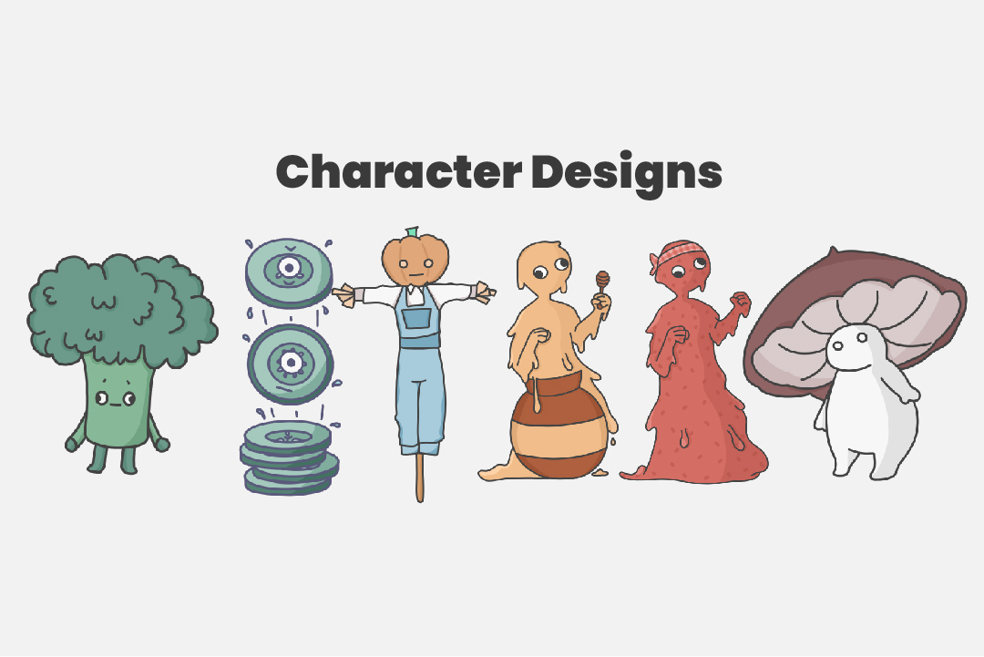


Character Design


After I was happy with my sketches and the sketches from the other members of my group, I drew them officially in Procreate using a monoline brush to ensure the edges of my characters were smooth. I drew them all to match styles and colour themes, so that they would sit nicely on the cards once they were designed. When deciding what colours to use for my characters, I decided to use a softer, pastel colour theme so that the character art wasn't too oversaturated. Doing this also helped make it easier to ensure the characters worked well on the cards themselves, while still standing out from the background.

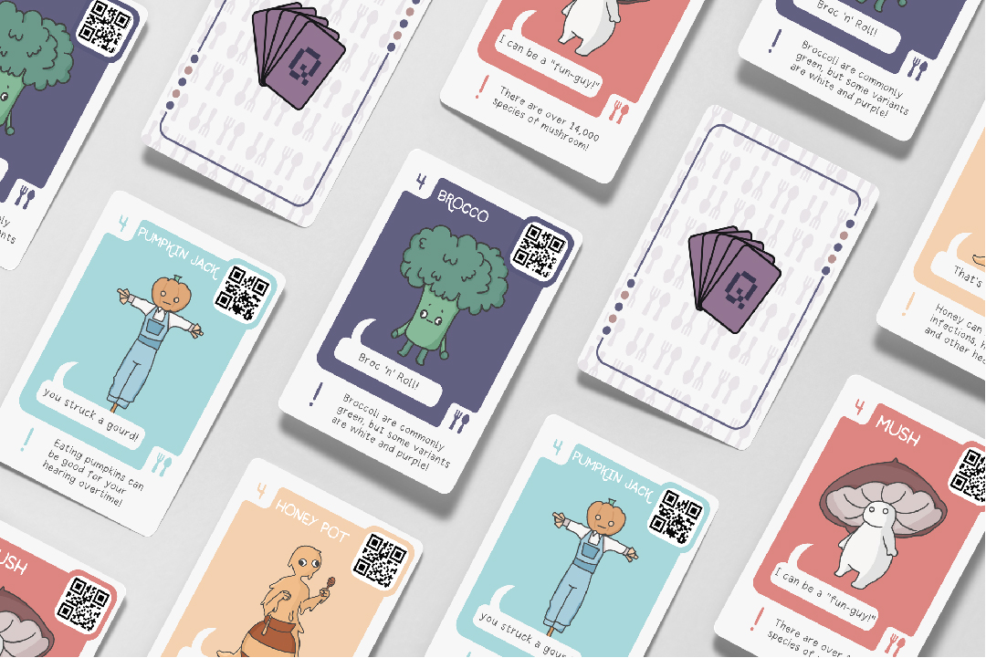
You can see the character designs we decided to use to the right.
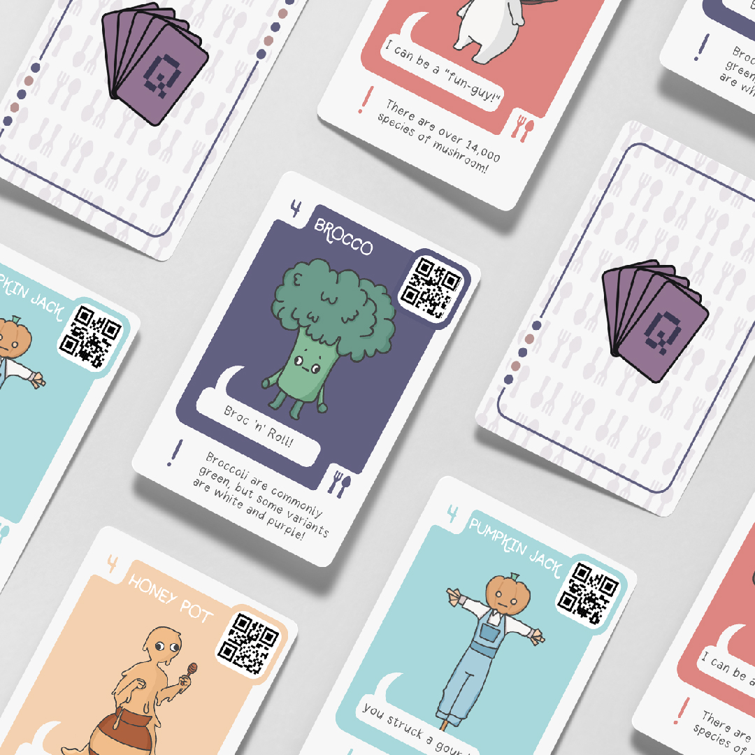


Card Research


One of my roles in this project was to create designs for our playing cards. With any design project, the first important step is to research. Therefore, I looked into some other card games similar to ours, such as Top Trumps and Exploding Kittens, for their card designs to find some common trends and inspiration before starting my own.

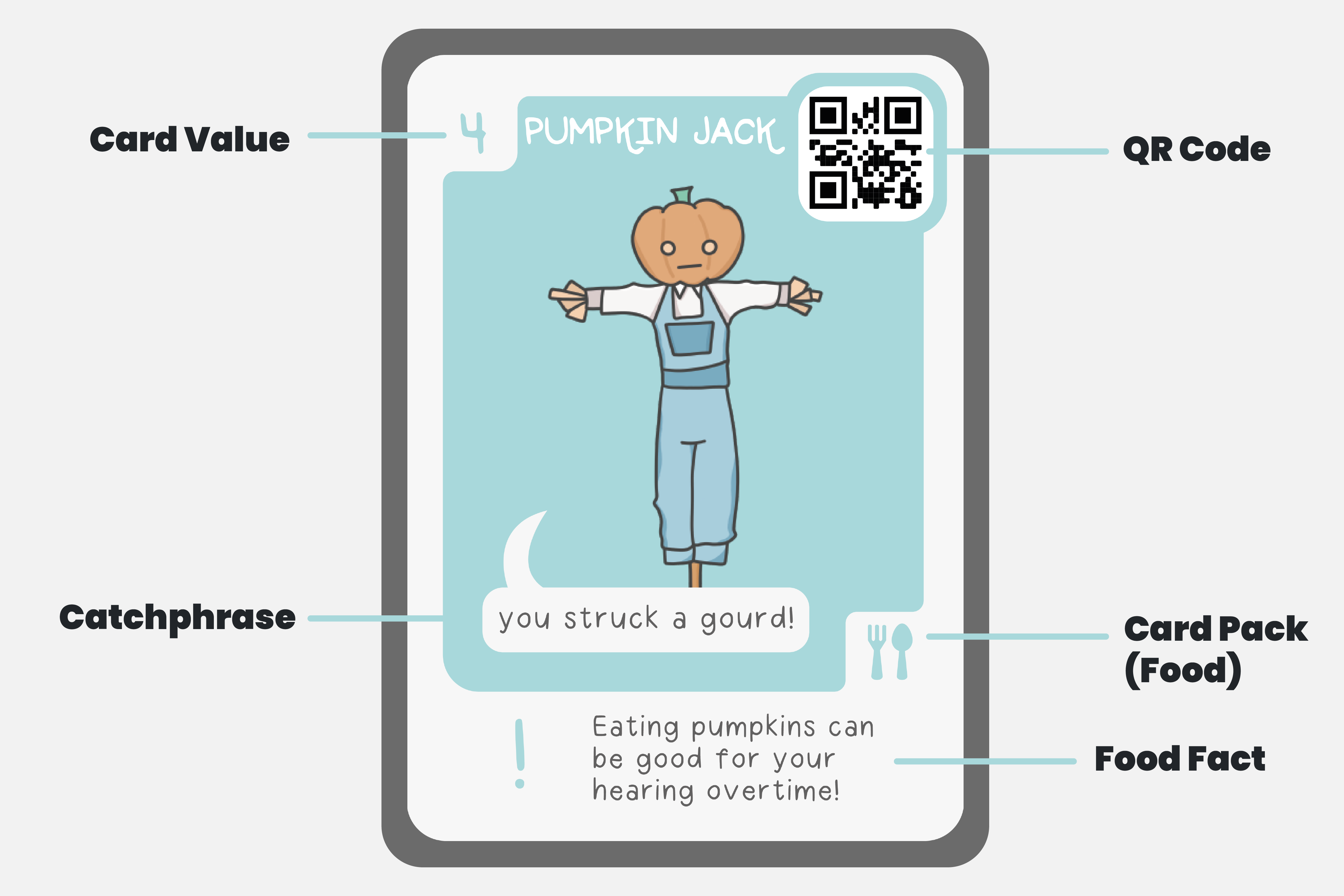
During this process, I found that Top Trumps have an information-heavy design, which is good for informing their players. I particularly liked the use of facts at the bottom of each card for the players to read while waiting for the other player to select their card.

Exploding Kittens focuses on illustrations on their cards, with whimsical characters, similar to the ones I have created in this project. The cards keep a simple design so they are easy to process and quickly pick up. This is something that would work well for our game, as players will need to be looking at the screen as well as their cards, so need to process the information on the cards quickly.

A standard deck of cards have an incredibly simple design, making it easy to play a variety of games with simple rules. Placing the values of each card in the corner allows for players to easily look through their hand by just looking at the corner, making the process of selecting a card much quicker. This could also help our game run much smoother, particularly with a screen involved and scanning the cards.

Something common among all of the cards I researched was their splashes of colour. For my design, I thought having a splash of colour like this as the background would be convenient to use as the category colour, so that players could easily look for colour after seeing the category on the screen, instead of a word.


Card Sketches


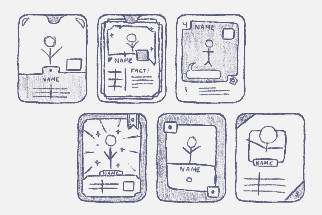
After researching, I moved on to sketch my initial ideas for the playing cards.

Originally, I went with a much more information-heavy design, as we wanted the audience to pay closer attention to the screen rather than the cards themselves. Otherwise, they would miss key information, like the category and the pacing of the game.

I also thought about having the values for each category of each character card, so that the character would only appear once in the deck. However, we decided against this as we wanted players to make real use of the digital platform for this game, and this would have meant four times the amount of characters that would have had to have been designed. Otherwise, there would only be six cards in the deck. Due to our time limit in this project, we decided to take a standard playing card approach, and have categories take up a whole card similar to suits (hearts, clubs etc.)

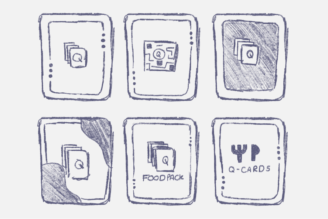
Finally, I decided to create an icon to indicate that this pack of cards was for food-based characters and statistics. This way, if the project was ever to be continued, this icon could be changed to other themes, such as technology or animals. For this icon, I decided to create a knife and fork.


Card Designs


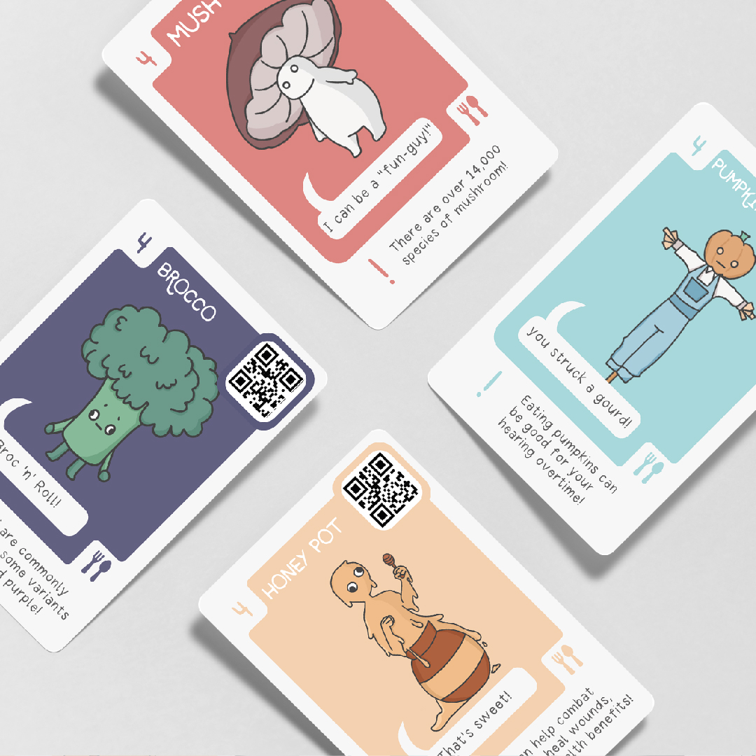
After I was happy with my sketches and decided on the design path I wanted to go down for this project, I opened up Illustrator and created a composition size of 2.5 x 3.5 inches, as this is the size for playing cards. I also made sure to work in a CMYK colour profile, as these cards were to be printed for use at the Transmedia Exhibition.

From the cards, we wanted players to immediately identify the character, the category and the card value, so these were the things I ensured stood out the most when designing, along with the QR code for it to easily be scanned. If the QR code was too small or unnoticeable on the card, it would make the scanning process a lot more difficult. I also included some other information on the card such as a catchphrase and a fact, so that the players would always have something to look at or read when waiting for other players to scan their QR code.

Originally, the colour palette for my cards was a muted and cohesive palette of purples and blues, but I decided to expand the colour palette greatly to reflect the vibrant themes in other card games I had researched. This also allowed me to use a wider range of colours to use for the categories, instead of having them be too similar and non-distinguishable.

Lastly, I put the card value in the corner of the card, similar to standard playing cards, as I wanted the number to easily be found when flicking through your cards to find the right one for the category. For this, you only need to see the corner of your hand, which makes flicking through the cards a much easier and quicker action.


Card Sketches (Back)


After designing the front of the cards, I looked into designing the back. This process would be a lot quicker, as I only needed to create one back for all of the cards. Looking at the same games I used to design the front, I researched the back of the cards too. This showed me that almost all of them were incredibly simile, with the logo or the game name displayed largely in the centre of the card. I sketched the backs of the cards with this in mind, making sure our ‘Q-Cards’ logo was displayed obviously in the middle of the card. I did also think about using the food pack icon I had designed earlier instead of the game logo but decided that our logo was more important for brand identity, and the food pack icon would contribute nothing to this.

I also looked into putting the logo in a QR code on the back of the card, to link to our website, but decided this could be confusing for players, as they may not know which code to scan. Also, this made our logo appear much smaller, as it was in the middle of the QR code instead of largely displayed on the card. This didn’t help our logo stand out and even overshadowed it.


Card Design (Back)


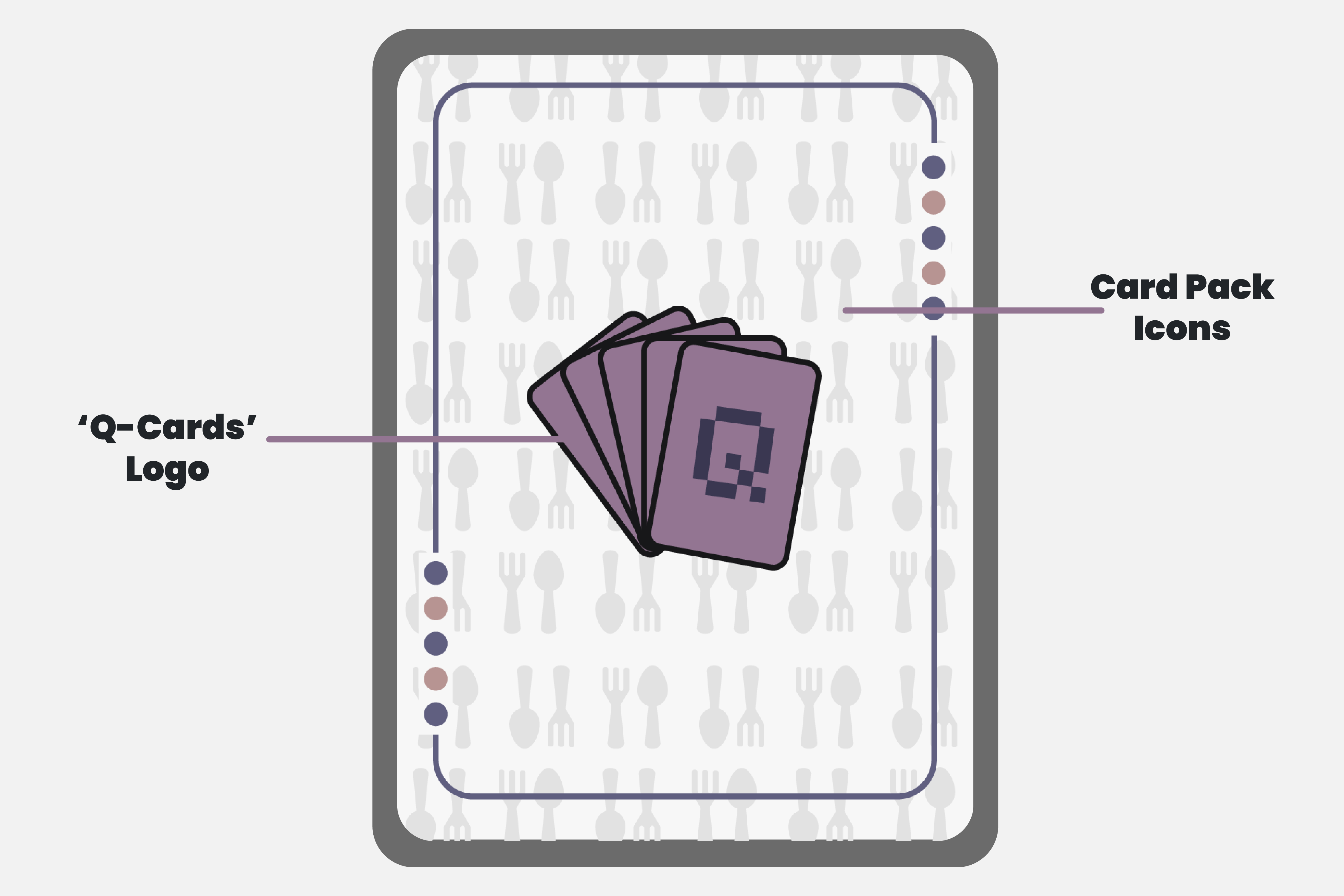
After I was happy with my sketches, I duplicated my composition from the front of the cards in Illustrator, to ensure their sizes would match, and began designing. I decided to incorporate the food pack icon on the back of the card too as when sorting through cards, if the player owned multiple packs and they got muddled, I thought it was important for players to be able to organise them quickly, instead of looking on the small icon on the front of every card.

Something that these could also have in production is the icons on the back of the card could be reflective, to make the cards appear a lot more interesting and set them apart from other playing cards.

When placing our logo, designed by the other designer in our team, I ensured to have it dominate the composition, so that players would constantly be reminded of our logo, increasing the likelihood that they would recognise it as the ‘Q-Cards’ logo.


Poster Sketches


For the exhibition, I decided to create a poster to communicate how to play our card game quickly and efficiently. Instead of explaining it, I thought having a visual way to show our users how to interact with our product would be a good and engaging way to teach them. To start this process, I looked at other informative poster designs, and decided to create a Pinterest board for ideas and inspiration. Something that I found while doing this was that an important technique for information poster designs is guiding the viewers eye through all of the important information in the correct order. For example, many of the posters I was looking at had a very clear direction is which to read them, by using leading lines, or bold text in certain areas.

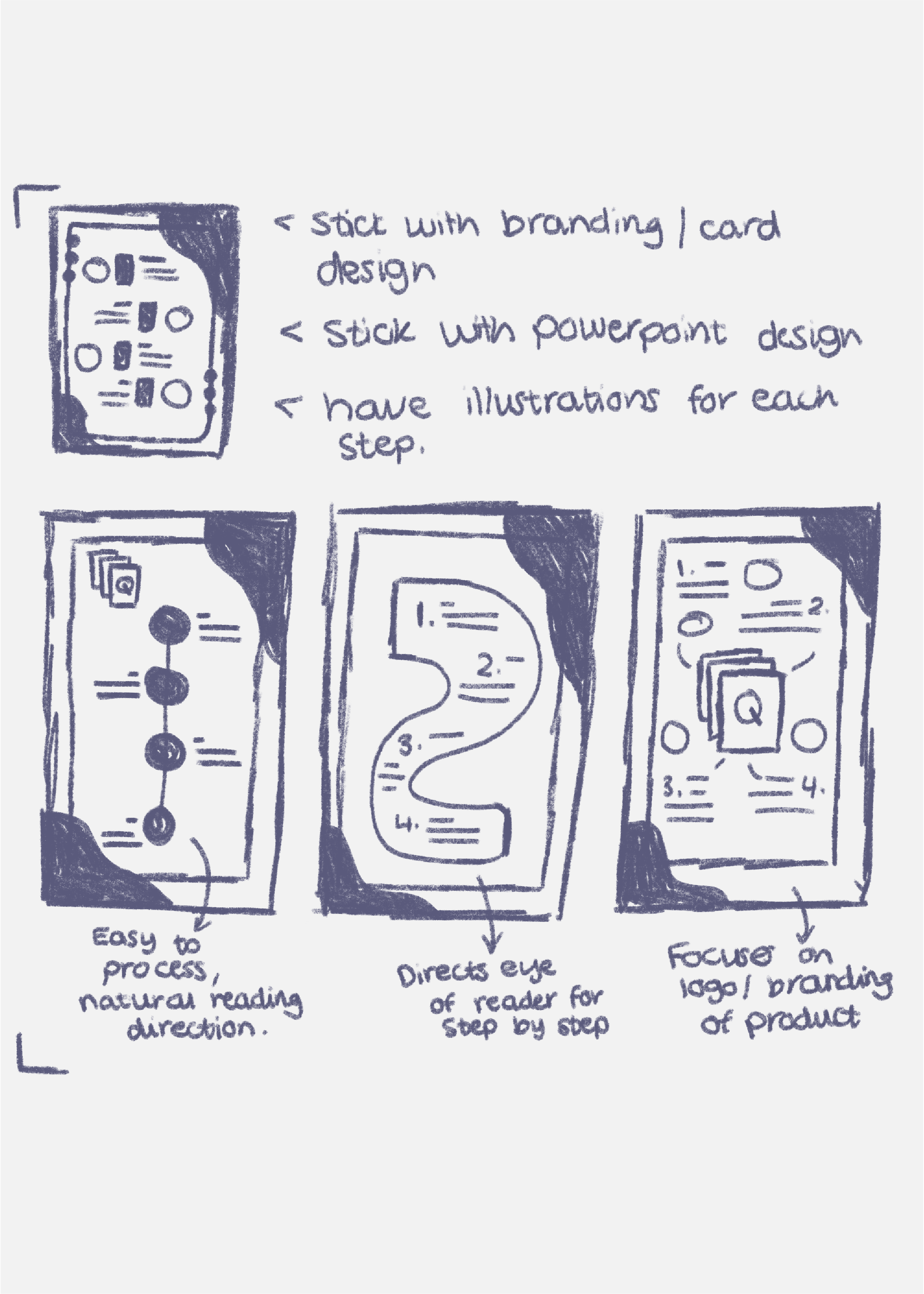
To sketch my own ideas, I used a 6b pencil brush on Procreate. My first idea was having a line down the middle of the poster with points along it, similar to a timeline, with the necessary information. I thought this design was good, as it was easy to read and made use of the users natural reading direction, which is down. However, I thought it was too linear and not interesting enough, potentially losing the viewers interest. The second idea I had for this poster was a roadmap design, with points along the way. This design successfully guides the user through the information, but at some parts it has the user reading from left to right and that could be difficult to read or process. My last idea I had was a mindmap design, with the logo in the middle and steps displayed around it. This design focuses on the logo and branding, but since that is not the purpose of this poster, it comes across as messy and difficult to read.

Finally, I decided to go forward with a mixture of my first idea and my second idea, creating a design that read from top to bottom, but had some movement to interest the viewer as well.


Poster Design


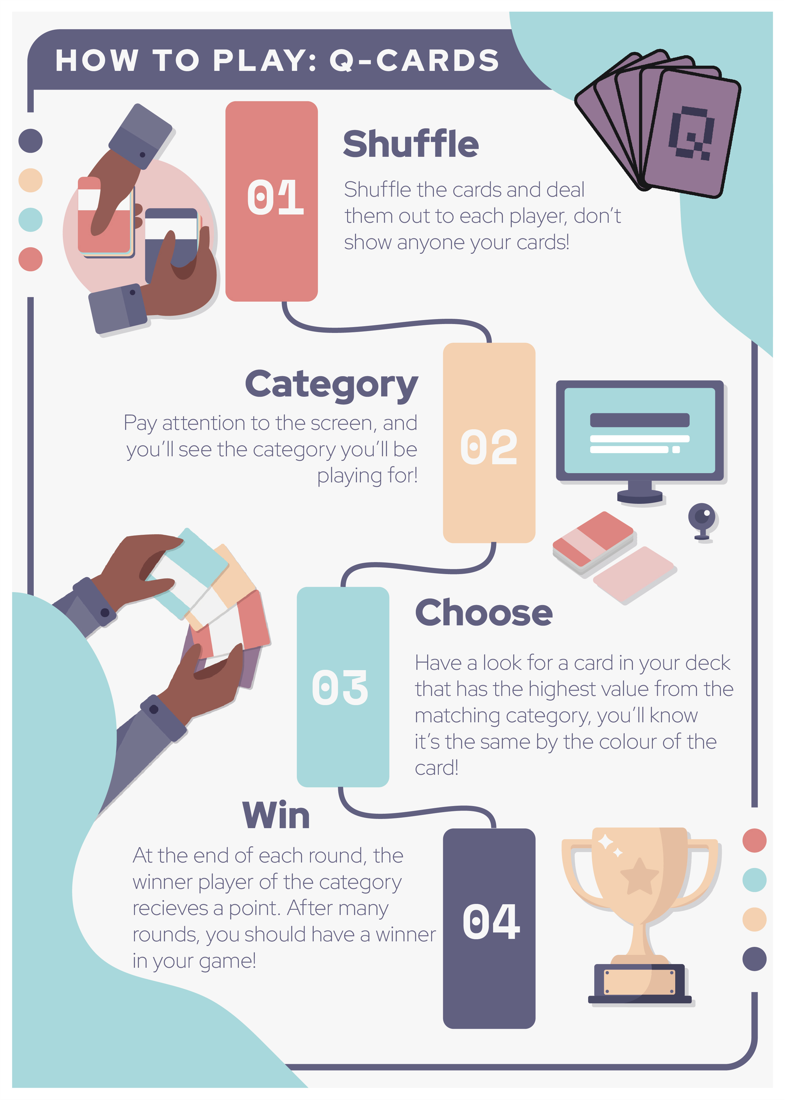
To design this infographic poster, I opened up Illustrator and created an A4 composition with 5px bleed around the edge. I made sure to work in a CMYK colour profile, as this was intended to be printed. To start, I added all of the necessary information to the poster as this was the main purpose of the poster and in this type of design, form follows function. It is important to communicate the information effectively before making it look good. Once I had all of the steps to playing the game written down in their rightful place on the poster, I added some colour to the background and gave the poster a border to match the design on the back of the cards. This helps keep the branding of 'Q-Cards' consistent through all elements, even this poster.

At this stage, I thought the poster could do with some illustrations to communicate each step more efficiently, as words can often be quite boring, whereas an image is easy to read and can say a lot without any words written. It is also a quicker method of communicating information, as you don't have to wait for viewers to read. However, this is only effective if the images make sense and match one another, as users need to understand each image in order to understand the information it is providing. For these illustrations, I decided to create an illustration of a person shuffling cards for the 'shuffle' step, a monitor screen for the 'category' step, a persons card deck for the 'choose' step and a trophy for the 'win' step. Since all of these illustrations matched the text for the step, they effectively help the viewer understand what each step means much quicker.


Reflection of Project


Overall, I thought this project was successful, as it reflected the brief of being interactive and promoting sustainable agriculture and 'Zero Hunger' with its use of food-related characters and nutritional information. It also successfully appeals to school groups, as the characters are age-appropriate and whimsical, similar to other games targeted at school groups. 'Q-Cards' also is widely multiplayer and although we decided to only make it a two-player for the Transmedia exhibit, due to the time restrictions of this project, it has room for more players if the project was expanded further.

If I was to do this project again, I would make sure to communicate more openly with my team, as I often just assumed our project was on track because of my confidence in this project. However, not everyone in my team may have felt like that, so it would have been wise to schedule more team meetings and make sure everyone was on track with their part of the project.