Game Project
Brief and Research
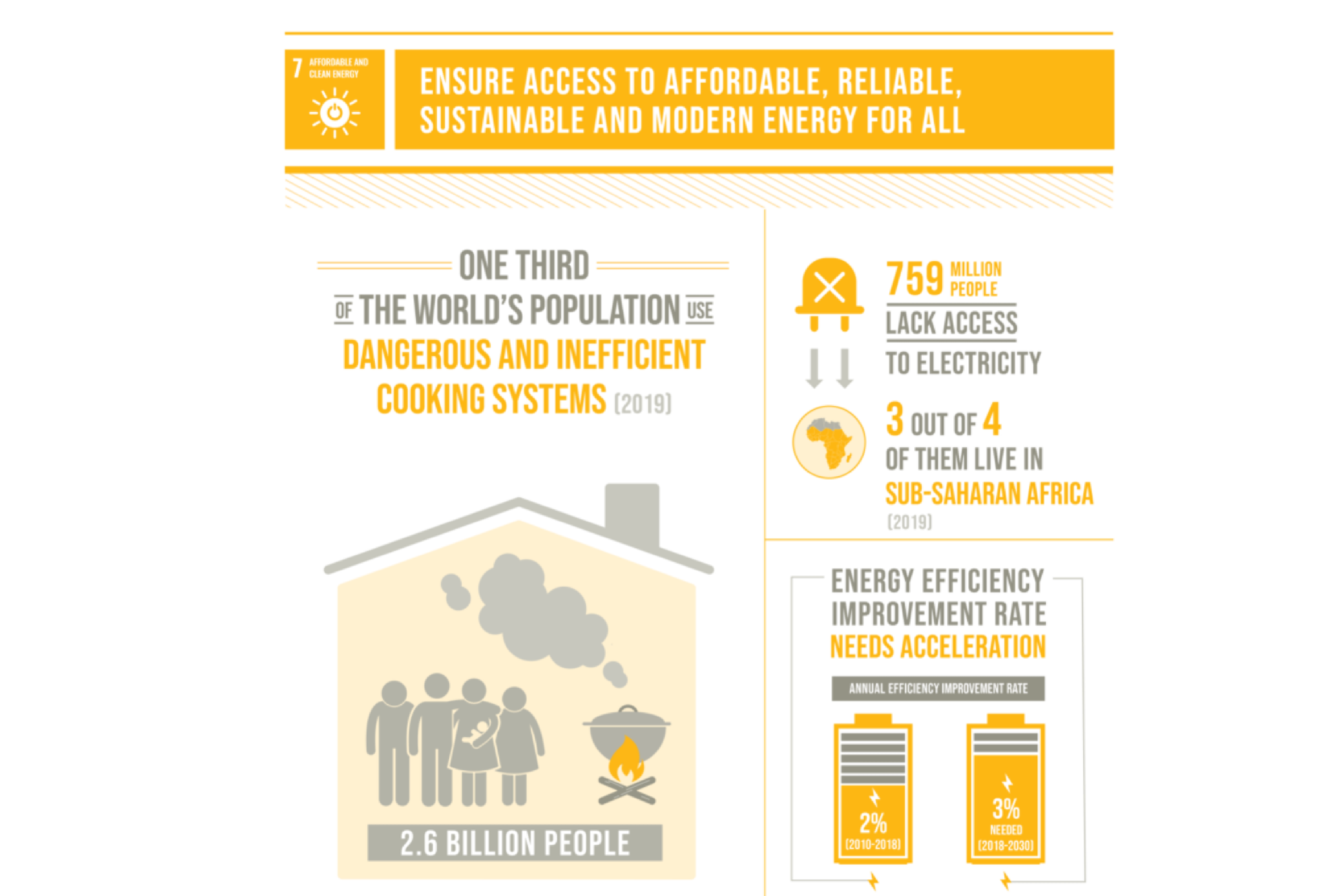
Over the second half of the first semester, we were introduced to a brief to create an informative and educational video game that reflects views from 'Sustainable Goal 7' from the United Nations, which aims to access affordable, reliable and sustainable energy for all. Assigned into groups of around seven, this brief was explored over the six weeks given to progress as much as possible.
My group for this project was constructed of a game designer, a CAD student, a 3D student and multiple designers. My role as a designer was to pay close attention to UI design, logo design, colour combinations, typefaces and social media management.
To start this project, it was clear the first step would be to think about our target audience, in order to decide the direction we wanted our game to head in. With a target audience of 11-15-year-old school children, our game needed to be suitable for a PEGI 7 rating, meaning it could not be overly scary, but still explore spooky themes in an appropriate way. With this in mind, we started to think about the different genres this target audience played and started to develop our initial ideas for this project.
After looking at various ideas from different members of the group, including a tower defence game and a survival game set in space, we decided to go forward with creating a puzzle platformer with appropriate scary undertones, similar to games such as Luigi's Mansion and Hollow Knight. Making sure our idea related to the brief, we ensured the game's narrative followed a sustainable and educational theme, with the protagonist using a wind-up torch as their main source of light and the game's goal being to light up the world using sustainable energy, such as solar panels and wind turbines.
Game Research
After looking at various ideas from different members of the group, including a tower defence game and a survival game set in space, we decided to go forward with creating a puzzle platformer with appropriate scary undertones, similar to games such as Luigi's Mansion and Hollow Knight. Making sure our idea related to the brief, we ensured the game's narrative followed a sustainable and educational theme, with the protagonist using a wind-up torch as their main source of light and the game's goal being to light up the world using sustainable energy, such as solar panels and wind turbines.
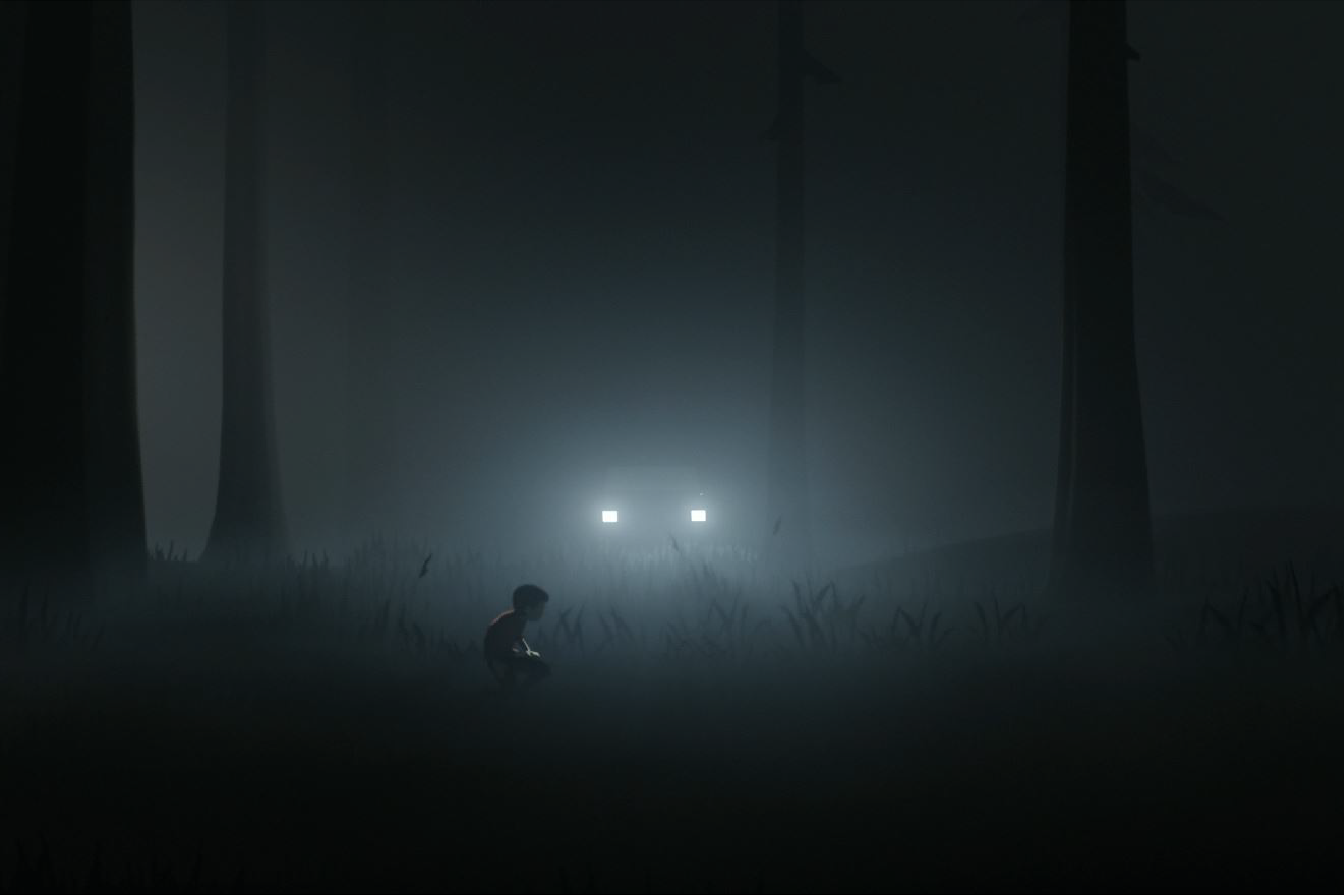
When researching other games to see what has been successful in game design for our target audience and in this genre itself, we found that puzzle platformers often use aesthetics to tell the story and have a limited UI design. For example, Inside and Limbo use lighting and aesthetics to guide their players through the story and its puzzles, making aesthetics a key part of their core loops. Since our game was planned to have a spookier theme to it, we looked at games that did the same thing in an appropriate way for children and found that a common technique to do this successfully is using 'cartoony' art styles to make scary characters more cute than creepy. Games that do this successfully include Hollow Knight and Luigi's Mansion.
The link to this project's Milanote board can be found here.

Game Design - Character Design
As a designer, I presented three ideas to the rest of my group for a child protagonist, as we decided that children would be relatable to our target audience. If a character is relatable to the players, they are more likely to mimic their actions, and since our protagonist's actions involved sustainability, our players would be more likely to care about this if the character was relatable.
My protagonist sketches had a cartoony style, similar to the games we had researched earlier, and they were wearing different styles of pyjamas to reiterate that they were children. I also made a girl character, a boy character and a genderless character, so that if we were to progress this game further, the players would be able to choose which character they wanted to play.
As a group, we decided to move forward with the genderless protagonist, or 'Dinosaur', for the level we were creating, so I went on and created a character profile, thinking about the background of this character, their appearance, and how they fit into the game world. This can be seen in more detail here.
Game Design - Shadow Monsters
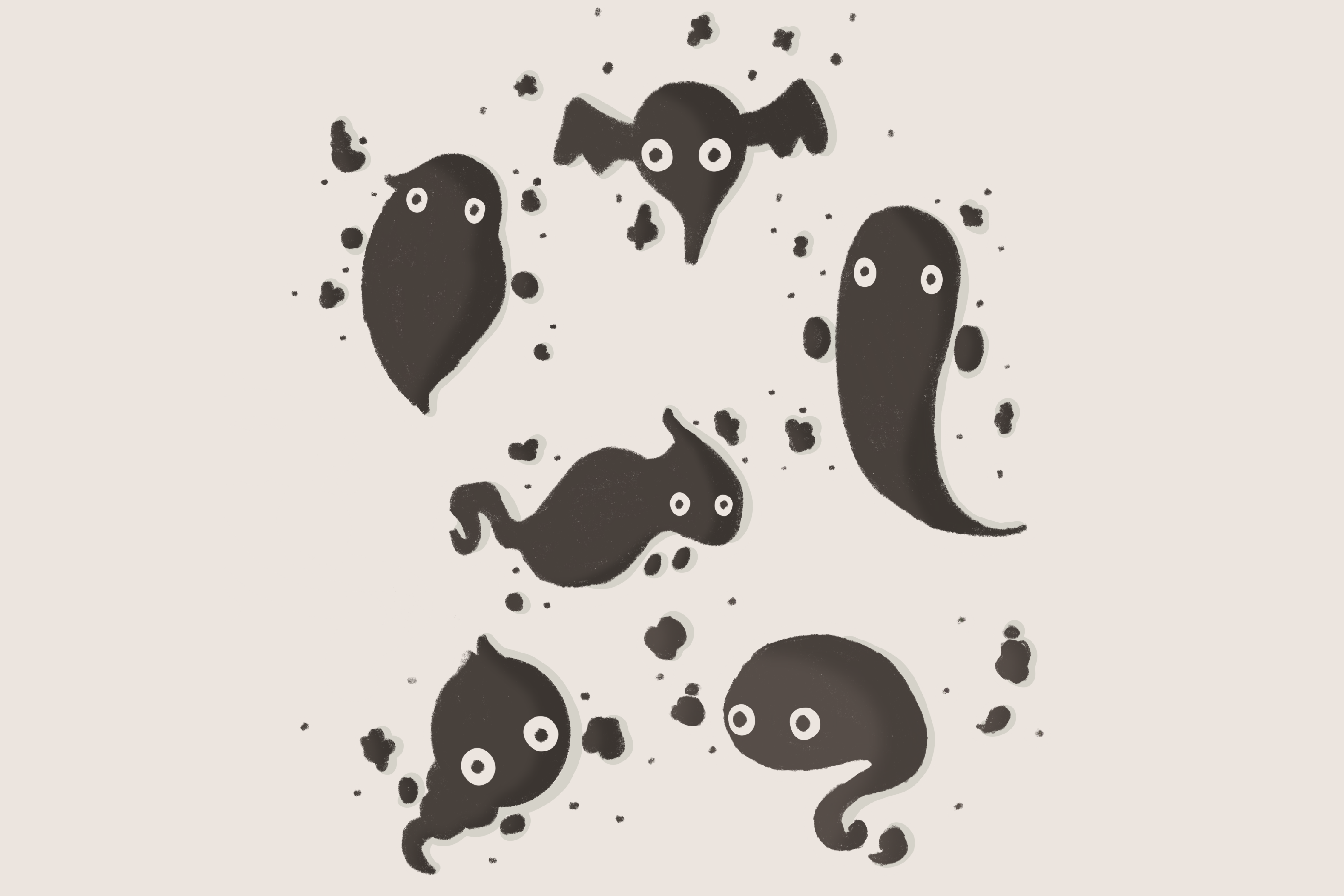
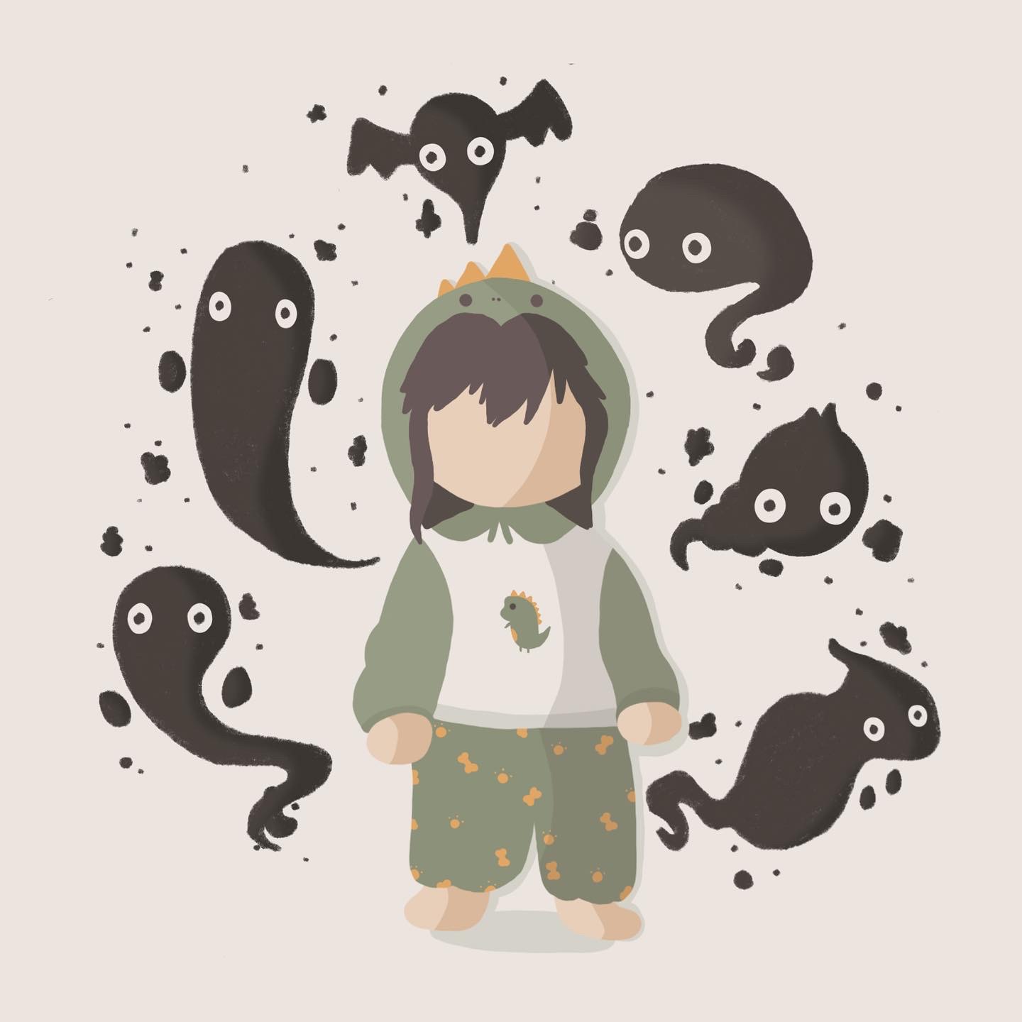
When creating these shadow monsters, I drew large amounts of inspiration from Studio Ghibli's 'soot sprites' and Luigi's Mansions ghosts. These designs make spooky ghosts and mysterious characters appear less scary and cuter so that it is appropriate for children.
Following the same 'cartoony' style as I used for my protagonist ideas, I created simple outlines for these monsters. The decision to create simple shapes for the monsters rather than detailed designs was due to the game being mostly dark, and these characters were only shadows, so the details would be hidden throughout the game for the most part. I also decided to use only black and white, as these characters are only shadowy figures, not living and solid characters that walk around.
Game Design - Level Design
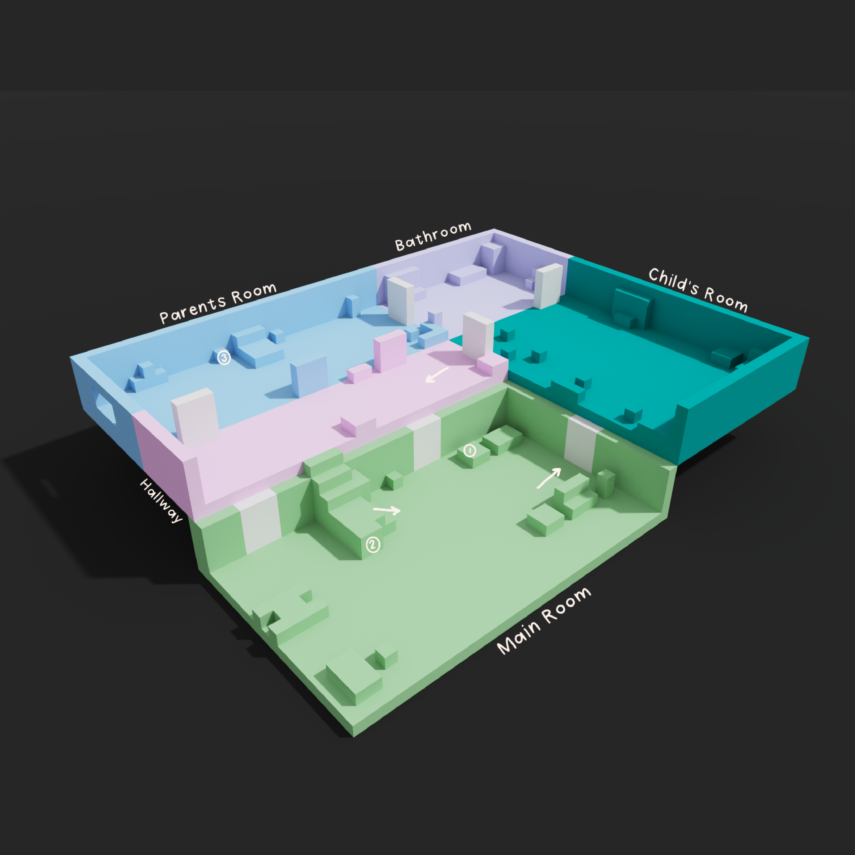
Before designing each room of the house on this level, I decided it would be a good idea to create a level map so that it was easy and clear to see which room would lead into the next when playing so that I could keep that in mind when designing. Doing this allowed me to see where I would need to illustrate doors and assets that would need to be found around the game as you played.
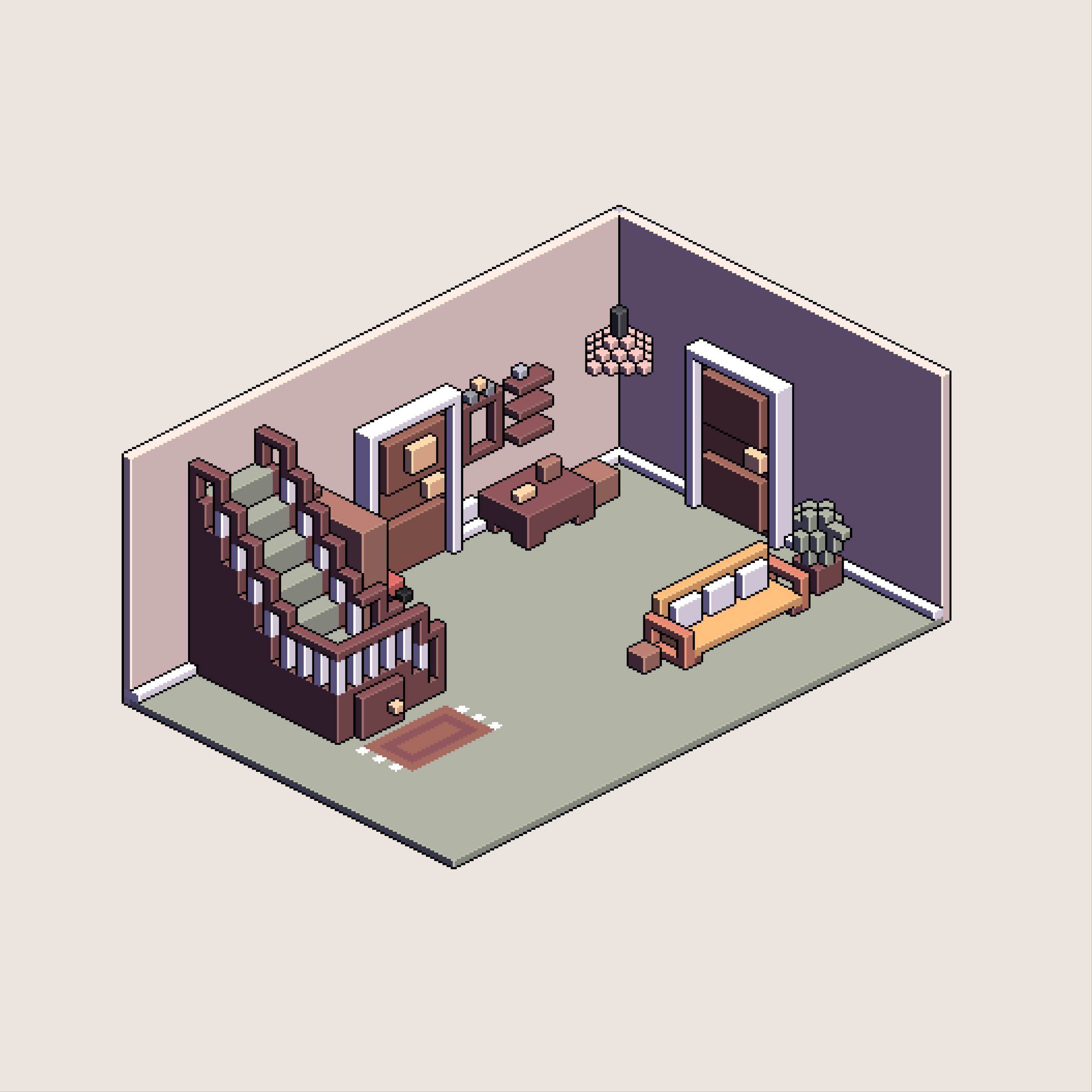
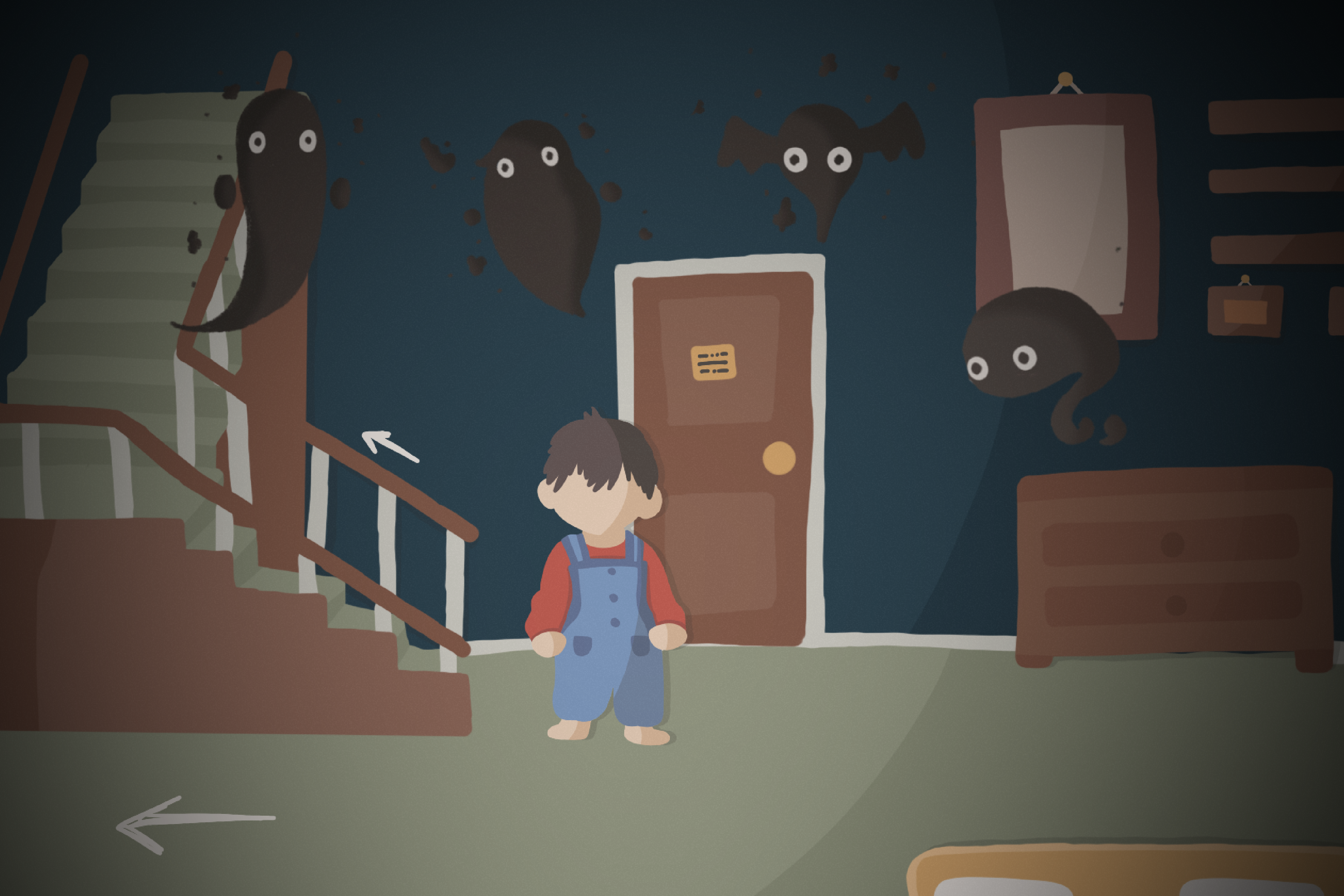
After creating a level map, I moved on to designing all of the rooms for our first level, starting with the living room as this is the central room of the house and the room where many of the puzzles can be solved or found. When designing this room, I wanted to look into a variety of different styles, including flat colour, isometric design and voxel design.
Illustrating the flat colour for this room started by me sketching out all of the main assets, and colour coding them depending on what ground of the game they would be in (foreground, background, and midground). Doing this allowed me to see clearly where everything would be if it was to be rotated or became a 3D design over time, helping my 3D student when he began to develop these into official renders.
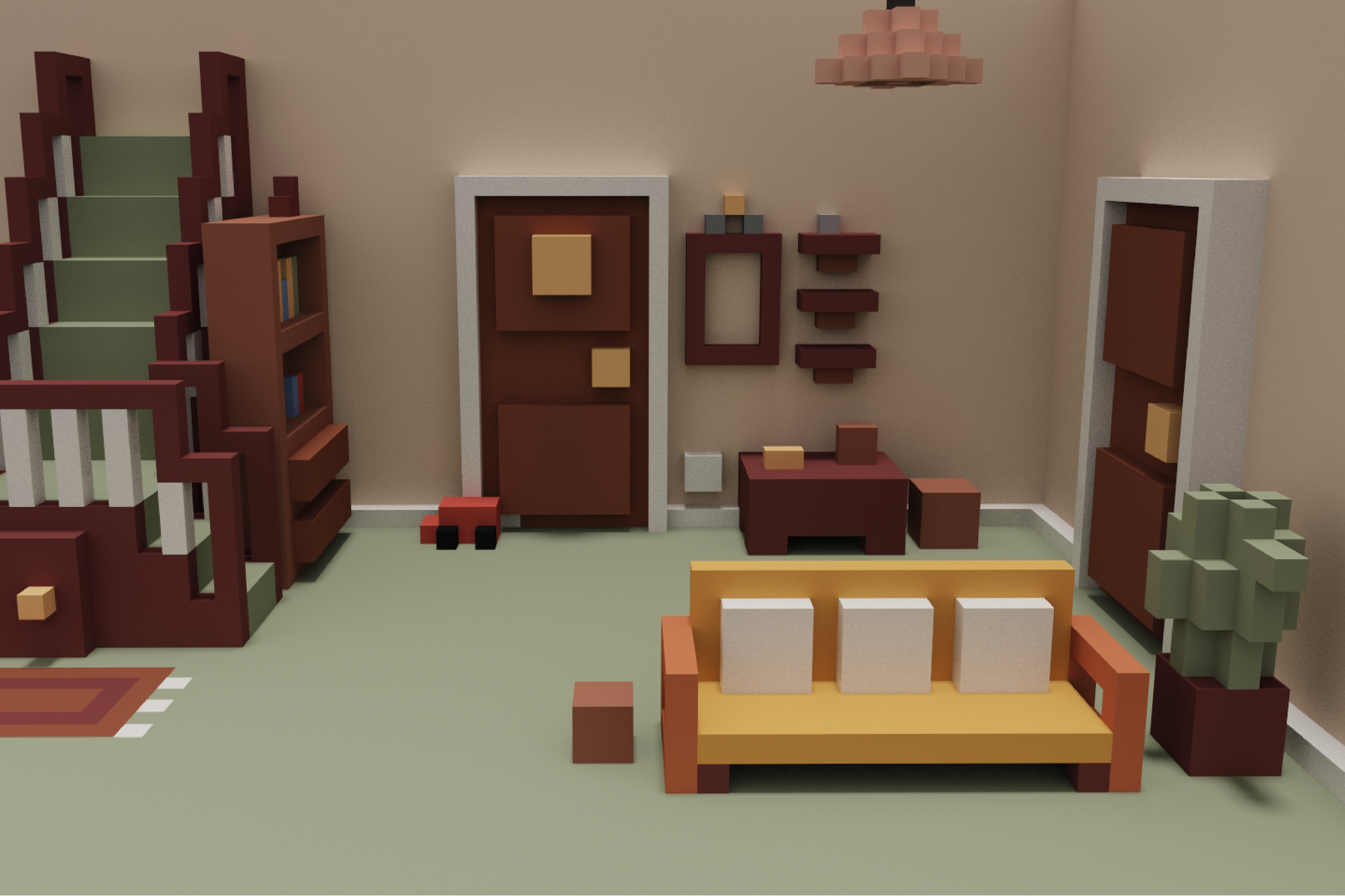
To create my 3D voxel and isometric designs, I used a program called MagicaVoxel. This allowed me to understand the depth of each level and make sure all of the room sizes felt accurate. This was a fun process, as I was completely new to this program and exploring this software allowed me to gain some new knowledge in 3D design, while still keeping it simple for a beginner like me.
Experimenting with lighting was also interesting in this software, as I was able to see what the level would look like if it was dark, which it would be in our game before all of the lights were restored through gameplay. Doing this allowed me to know which parts of my design would be highly visible, so that I could focus on adding more detail to these assets rather than those that would be hidden, either due to lighting or spacing.
My planning and level design process can be found in more depth here.

UI Design
As a designer, it was my job to research UI to help me design my UI assets in an effective way. To keep track of my research, I used my project planning tool 'Milanote' to create research boards. This would be the tool I would go on to use to plan this entire project going forward. For UI, I wanted to ensure I thoroughly researched all areas of UI that we are likely to be using in our game, so I started by creating a list of everything I could think of. For example, I looked into objective pop-ups, health bar designs, menu designs, loading screens and game item pop-ups.
To create my UI designs, I decided to use Illustrator, as this program would allow me to create vector PNGs that could easily be imported into Unity by our groups game designer when creating the functioning menus. This is also the program I am most familiar in, so if there were any file transfer issues, I would be able to quickly determine if it was something that I could fix.
My research board for UI design can be seen in deeper detail here.

UI Design - Objectives
As a group, we decided that we wanted objectives to pop up as they're unlocked, but not stay on the screen. This was a decision made after our research earlier finding that puzzle platformers often have limited UI and mainly use aesthetics and lighting to guide the player through. Although many games don't have any objective pop-ups at all, we decided that for our game some helpful hints would be useful, as our target audience is children and might need the extra helping hand.
When designing these pop-ups, I created them in Illustrator, using my own handwriting as a font. This was so that the objective appeared handwritten so that it felt like jotting down an objective in a notebook. To push this effect further, I made sure to animate the lines and the font itself to jitter when animating the gif in after effects, to demonstrate how the objective would appear in the game.

UI Design - Health Bar
During our game 'Switch On', scaring the shadow monsters off is necessary for survival, but they may end up doing damage to your health as you do. Therefore, we needed to have a health bar appear to indicate how much health the player has left.
When researching health bar designs in other video games, I looked at both detailed health bars and simple health bars to decide what fit best into our game. A complicated health bar I looked at was the health bar from Ori and the Blind Forest. Although the design of this health bar is very detailed and fits in nicely with this games environment, I decided it was not the style needed for our game, as most of the design so far has been very minimal and simple.
Because of this, I ended up designing a health bar very similar to the Minecraft health bar. Due to this design being so well-known amongst children and fans of video games, I thought it would be the most recognisable so that players would immediately know what it was when it appeared in the corner.

UI Design - Menu
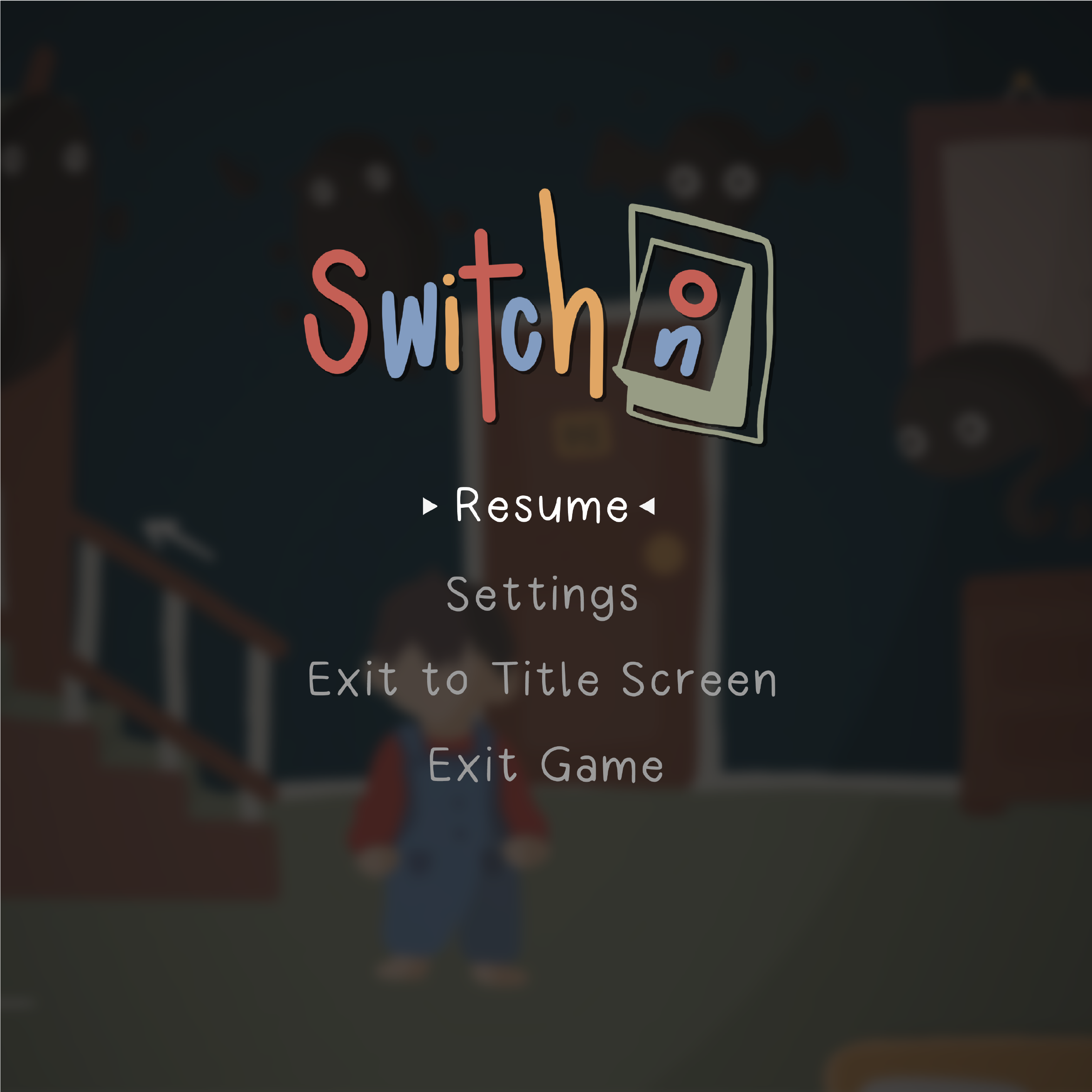
Moving on to designing the menus, I looked thoroughly into the games we had taken inspiration from earlier and how they designed their in-game menus, such as their title screen, pause, level select and settings. A similarity I found in all of these screens was how simple they were, which helped them become easy to use. This was incredibly important to replicate in our game as if our menus were not consistent with other menus in the gaming industry, it could confuse the player when navigating them.
Designing each menu in Illustrator, I made sure to keep them simple and ensured that there was a clear navigation route. To do this, I made sure that when the player hovered over a button, it stood out from the rest by appearing larger and brighter.
Another way I kept these menus simple was by reducing the amount of information on them. For example on the settings menu for 'Switch On', I made sure that only the necessary settings were available, instead of having too many options that may worsen the cognitive load.

UI Design - Loading Screen
Although not all games have loading screens, we decided that a loading screen would be a good idea to help with those computers or consoles that just don't run as fast as the rest. Having a loading screen prevents players from feeling overwhelmed by loading times, as they usually have a central focal point to keep players interested.
When researching these loading screens in other games, I found that a common technique is to have a continuous loop of a small feature in the game floating in either the corner or the centre of the screen. For example, the animal crossing loading screen has a floating island that continuously loops so that the player always has something to look at.
For my loading screen, I decided to animate one of my shadow monsters to float up and down, as if it was flying in a stationary position. To do this, I animated a Y position keyframe in a 2-second composition on After Effects and ensured that the start and end of the video were the exact same so that it would loop. This little animation is satisfying to watch, but not resource-heavy, so it's easy to load for when players are waiting to play.
Once I finished all of my UI designs, I wanted to demonstrate how they would appear and work in the game. To do this, I created a short UI demo in After Effects.
Logo Design
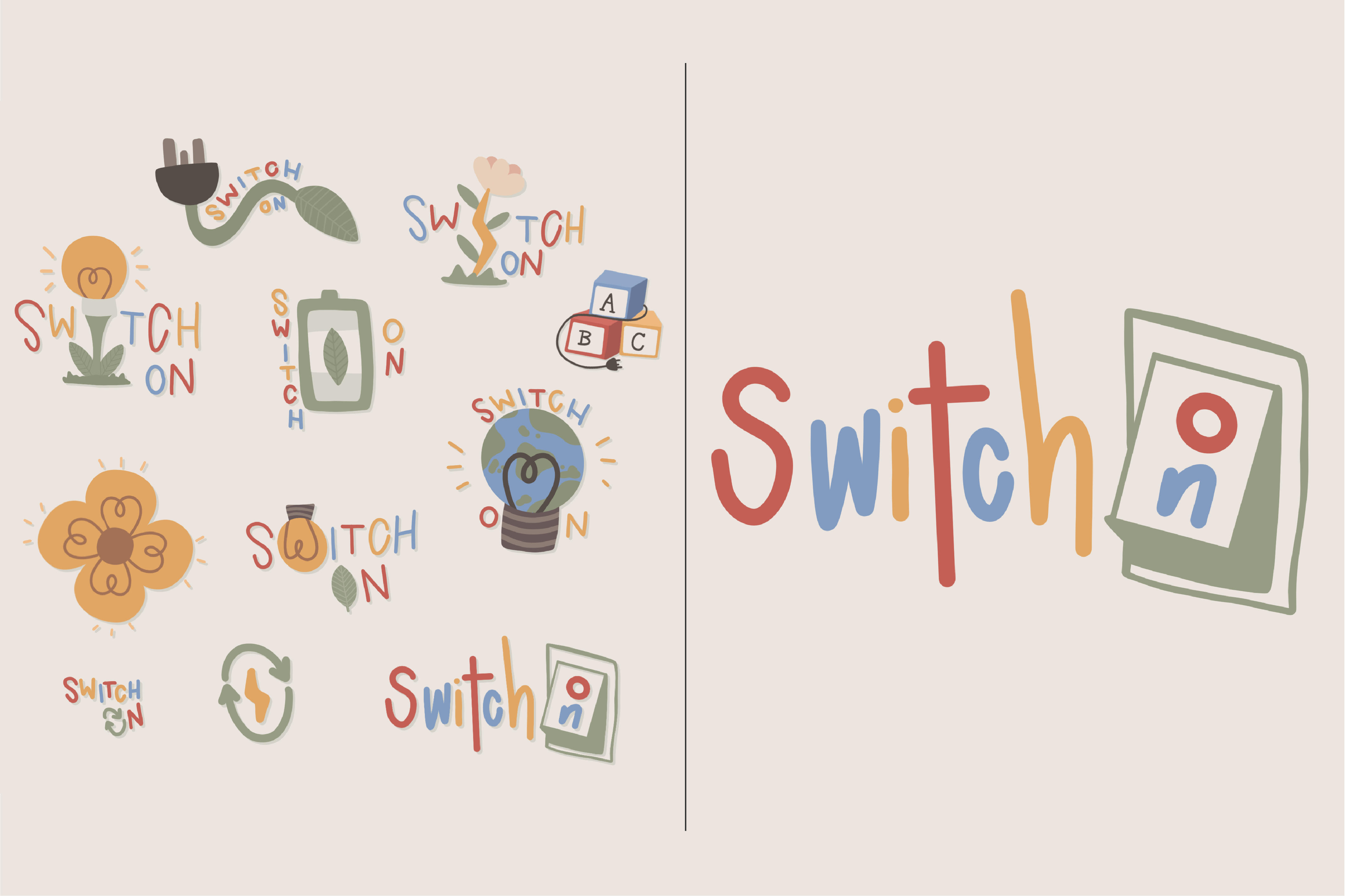
Initially, the logo design was going to be completed by another member of my team but it was decided that I would go into more detail to match the logo with the rest of the game design in my style. In order to find the logo best for our game, I created a large variety of logo options, using my logo design knowledge, before presenting them to the rest of my team to discuss our favourite one.
To create these logos, I used Procreate on my Ipad and my apple pencil, ensuring I used the same colour palette I had been using in all of my other designs over this project. I also made sure to pay attention to my use of iconography, as this is a common technique in logo design. Interesting use of iconography and consistency with the rest of the brand can help ensure the success of the logo.
We decided not to go with the alphabet blocks logo, as this was maybe a little too childish for our game. Since our target audience is 11-15-year-olds, we didn't want them to turn away from the game because the logo was associated with baby toys. We also decided not to use the logos that couldn't be used as a favicon, as if this game was to be an app, we needed a logo that could be seen in a small size for the app icon.
The logo we decided to go with was an interpretation of our initial idea, made by another designer in our group. I decided to add colour and use a softer font for my version so that it was appropriate and consistent with the rest of the game. This logo was a good use of iconography and could be converted easily into a favicon, focusing on the switch icon, rather than the whole game title.
This design process and decision can be seen more in detail here.
Personal Social Media
As a designer, one of my tasks was to pay attention to social media and help manage our central account. To start this process, I did some research into other small game creators and how they advertise themselves online, such as yaldigames and halfpastyellow. During this process, something that became apparent was how small creators often made sure their accounts were consistent with the games colour themes and had simple and clean designs so that the viewer could understand what was posted.
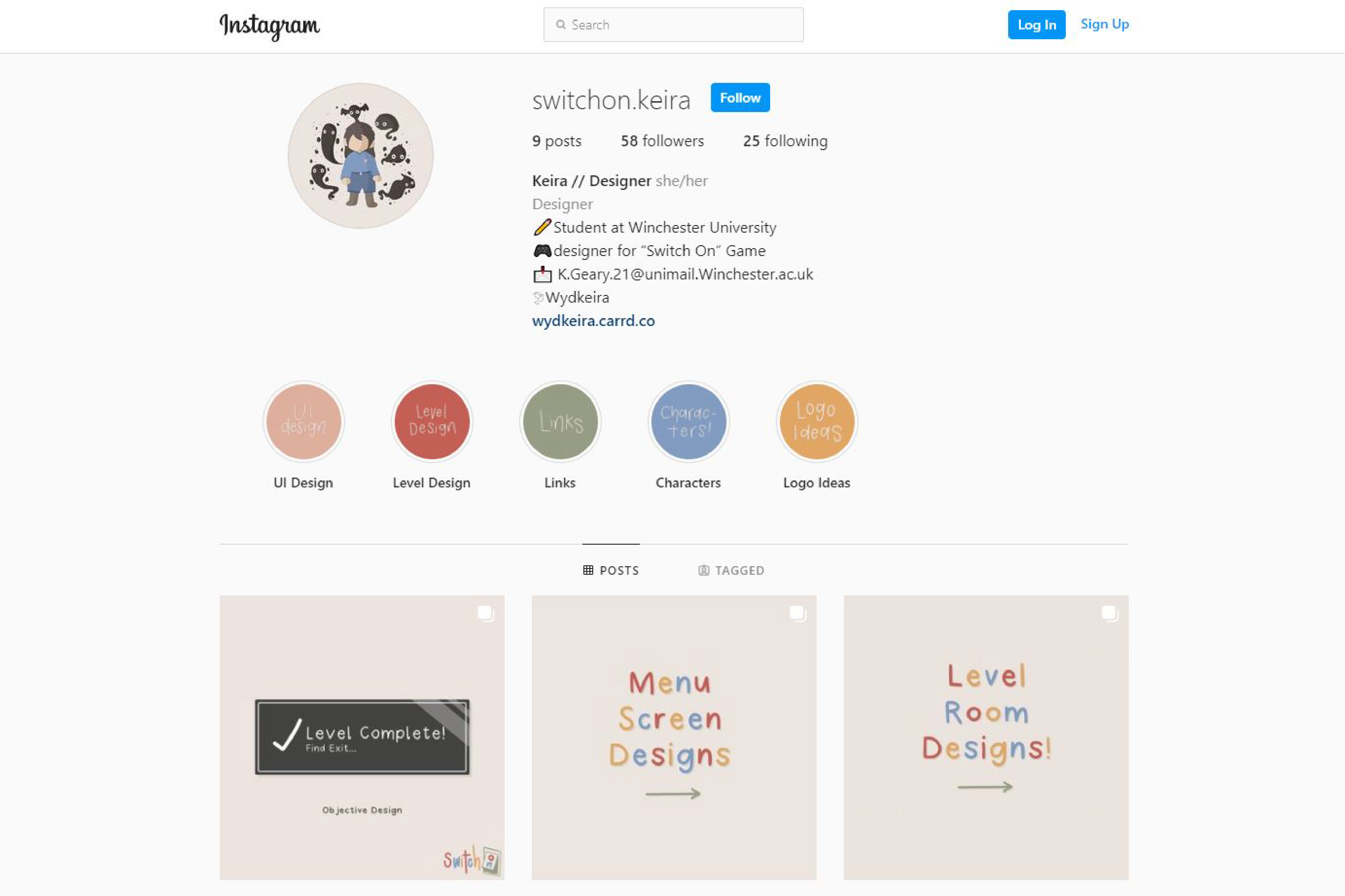
When setting up our accounts as a team, we decided to use a template so that we were all individually recognisable as part of the 'Switch On' team. To do this, we ensured that the name of our account was 'Switch On' followed by our names, and in our account bios, we had our role in the team clearly displayed.
To make sure my account was easily readable and navigable, I created some story highlights so that my work, such as my UI and level design, would be easy to access without having to scroll back through my account.
So that I was easy to find wherever anyone was looking, I created a Twitter account with the same template and made sure that the main central account was following all of our team's individual accounts.
Reflection of Project
Overall I am happy with my progress in this project and think it was successful in relating to the brief as well as improving my design knowledge and strengthening my skills. For example, over the course of this project, I learnt a lot about working in a team which improved my communication skills. This will be very useful to me going forward, as I am likely to work with a team of like-minded people in the future as a designer. My technical skills were also strengthened, as I was able to learn more about UI design, animation in after effects, logo design and voxel design.
If I was able to do this project again, I would make sure to focus on time management, as overtime deadlines kept being pushed back. I also would look into creating an advert for my game so that my social media exploration had a more solid foundation.
This project relates to the brief because we created a concept for an educational video game, focusing on sustainable energy. The target audience of 11-15-year-olds were met, after a large amount of research into their interests and other video games that are popular amongst this age group. Because of this research and success in reflecting the brief, I believe our game encourages young players to care about sufficiency and sustainability.
