Promotional Flyer
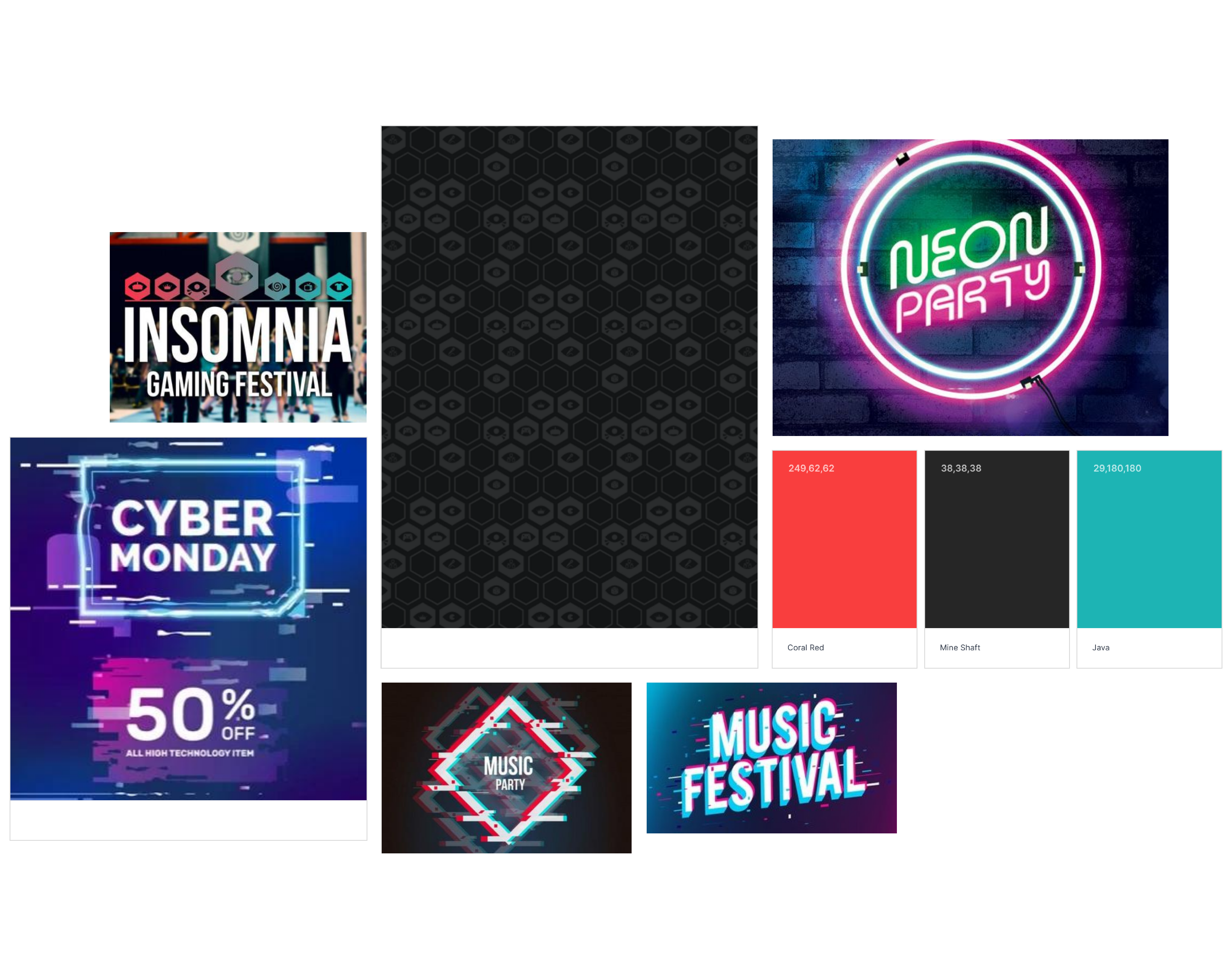
(1) Flyer Moodboard
Brief and Research
For this project, we were given a brief that asks us to design and produce a promotional flyer for an event that uses colour to emphasise the information displayed. Milanote, my chosen project planning tool, was where I planned and tracked this project throughout the whole process.
To research this project, I looked into other flyers for events that use colour and some common themes (1). This allowed me to see that promotional flyers often have a minimal amount of information, but still enough to inform anyone interested what the event is, often including the date, venue, name of the event, website and some USP’s (Unique Selling Points) to intrigue people to come along.
They also often have a cohesive colour palette that matches the theme of the event, speak directly to the target audience using information that would interest them and focus on the benefits of the event. It was clear that when designing my flyer, I would need to pay close attention to these things and demonstrate a good understanding of the layout.
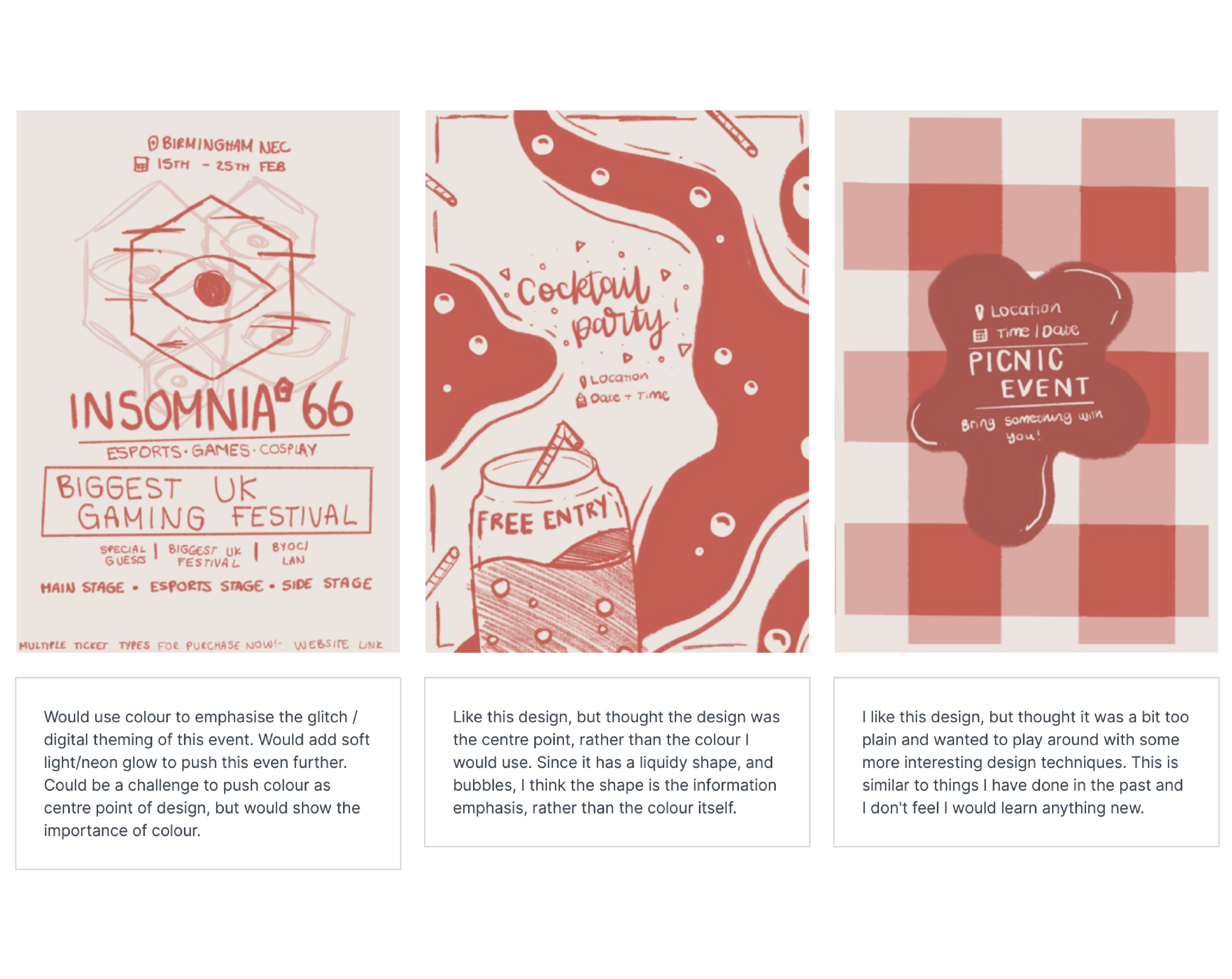
(2) Flyer Initial Ideas
Initial Ideas
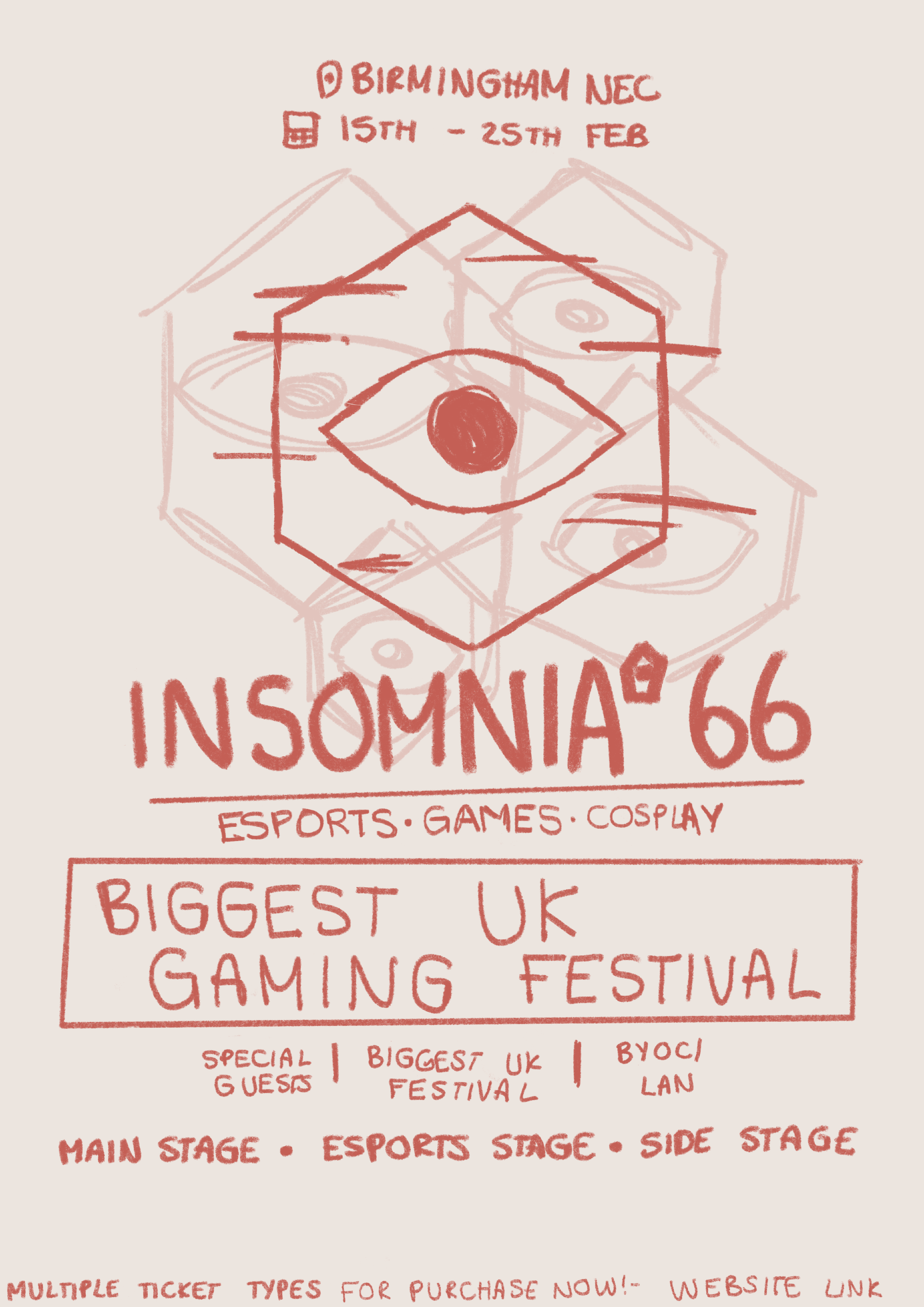
After researching some promotional flyers for common themes and taking inspiration from a few that I liked, I started sketching some ideas for this project (2).
The first idea I planned was a promotional flyer for a picnic event, using a jam spill to create space for information about the event, with the background of the flyer being a picnic blanket. I decided not to go with this flyer, as the colour here would help but maybe not emphasise in the way the brief intended it to. The next idea I thought of was a cocktail party event, using colourful liquid splatters around the flyer to emphasise it was a cocktail or drink event. However, similar to the first idea, I thought that the colour wouldn’t emphasise the information and it would instead be the illustrations themselves. Finally, the idea that I decided to continue in this project, was a flyer for a gaming festival called Insomnia. Taking inspiration from their website and brand, I thought of using colour to create glitch effects and soft colours in the background to imitate lighting at a festival or concert. This idea could be a challenge to continue with as it would be a very subtle use of colour, but the colour would heavily emphasise the information and the theme of the event, thoroughly strengthening my understanding of colour in the design.
Focal Point Process
Project Development - Focal Point
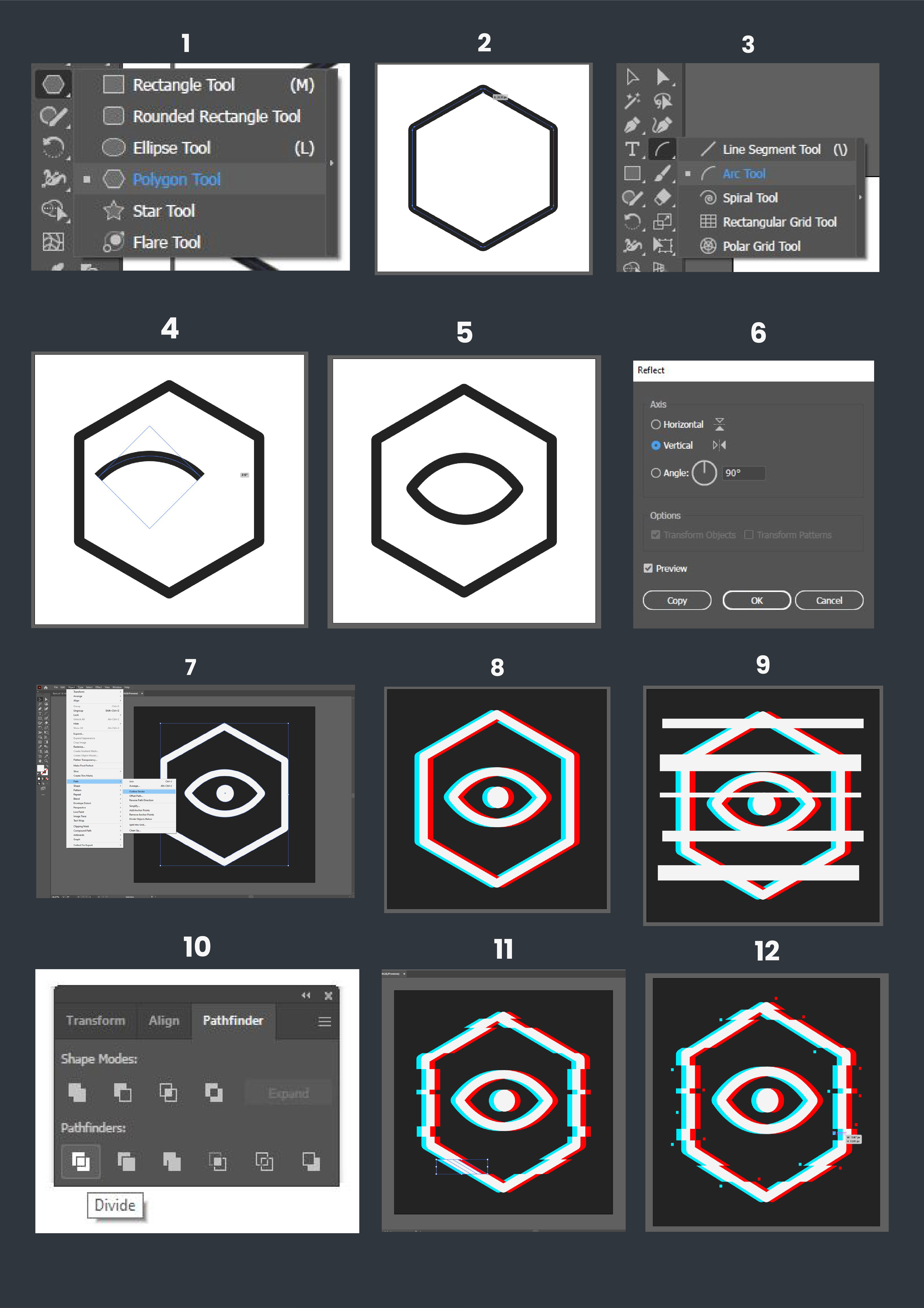
To start developing my sketch into a finished flyer design, I decided the first step in my process would be creating the eye logo, or the focal point, of my flyer. To do this, I opened up Illustrator and created a square artboard to work on and used the polygon tool to create a hexagon for the outer eye shape (1). I didn’t like how sharp the edges appeared, so I rounded the edges to make them easier on the eye (2). I then used the arc tool to create an arc for the top and reflected this horizontally for the bottom of the iris (3), before joining these two together using grouping and the direct selection tool (4). Next, I used the ellipse tool to add a pupil in the centre, finishing the basic eye shape.
Moving on to the glitch effect of the eye, I outlined the stroke so the shape would be easier to work with (7). Then, I duplicated the entire shape and shifted it to either side, changing the colour accordingly to create a glitch illusion (8). To split the shape up and rearrange it slightly, I added rectangles over my shape and selected everything (9). With everything selected, I used the pathfinder to divide and cut parts of the shape out (10). Since this method left me with excess shapes that were not needed, I used the shape builder tool to remove these parts, before shifting around my divided shapes with the select tool (11). Finally, to finish off this focal design I added some squares around my shape to give it a little more depth and detail (12).
Flyer Design Process
Project Development - Flyer Design
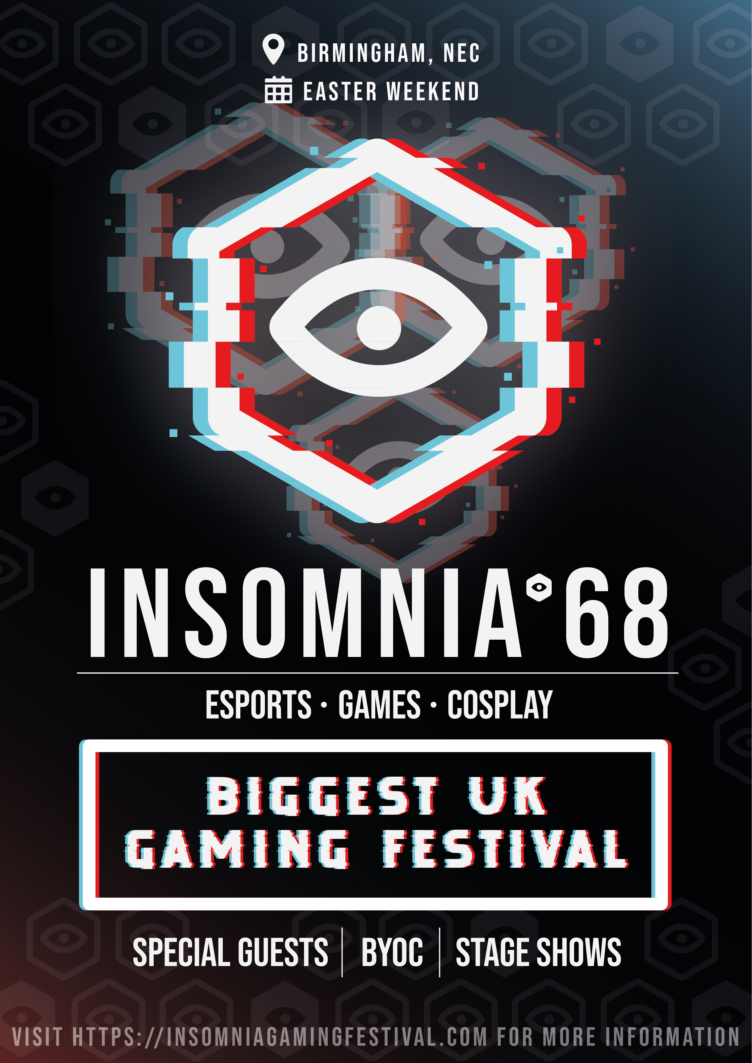
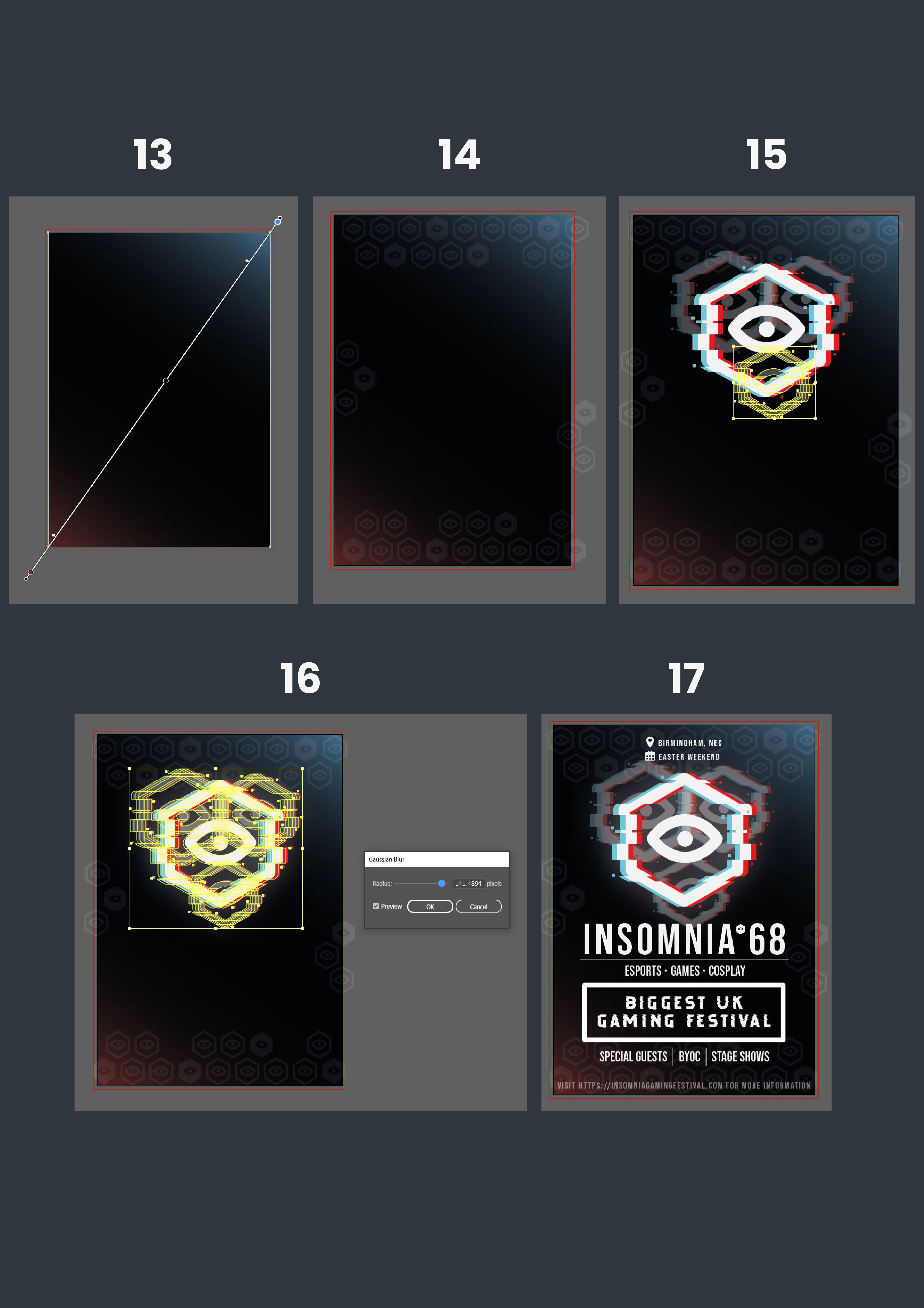
Moving onto creating my finished promotional flyer design, I created a new a5 artboard using CMYK, as a flyer is intended to be printed. colours and a bleed around the edges of 3mm. After establishing my artboard, I added a gradient to the background to begin my design to add some soft lighting (13), which feels like lighting in a concert or a show. I then added some of my original, unedited eye shapes that I created earlier around the background of my flyer in a honeycomb pattern (14), which is a technique often used on the Insomnia website, solidifying brand identity.
Once I established a background for my flyer, I imported my glitch eye element and made it my focal point by letting it dominate a large space on the flyer. I then duplicated and moved it around in the background, messing with the opacity and size to make the flyer design appear less flat (15). Duplicating them and adding blue created a glow effect that made them appear as if they were emitting light, adding to that theme of lighting in a show (16).
Once I had my design set up, I added text for information on the flyer and added a box to display an important USP of the event. Using the same technique as I used earlier for the glitch effect on my eye asset, I edited this box and used a glitchy font to mimic this and keep consistency across the entire flyer (17).
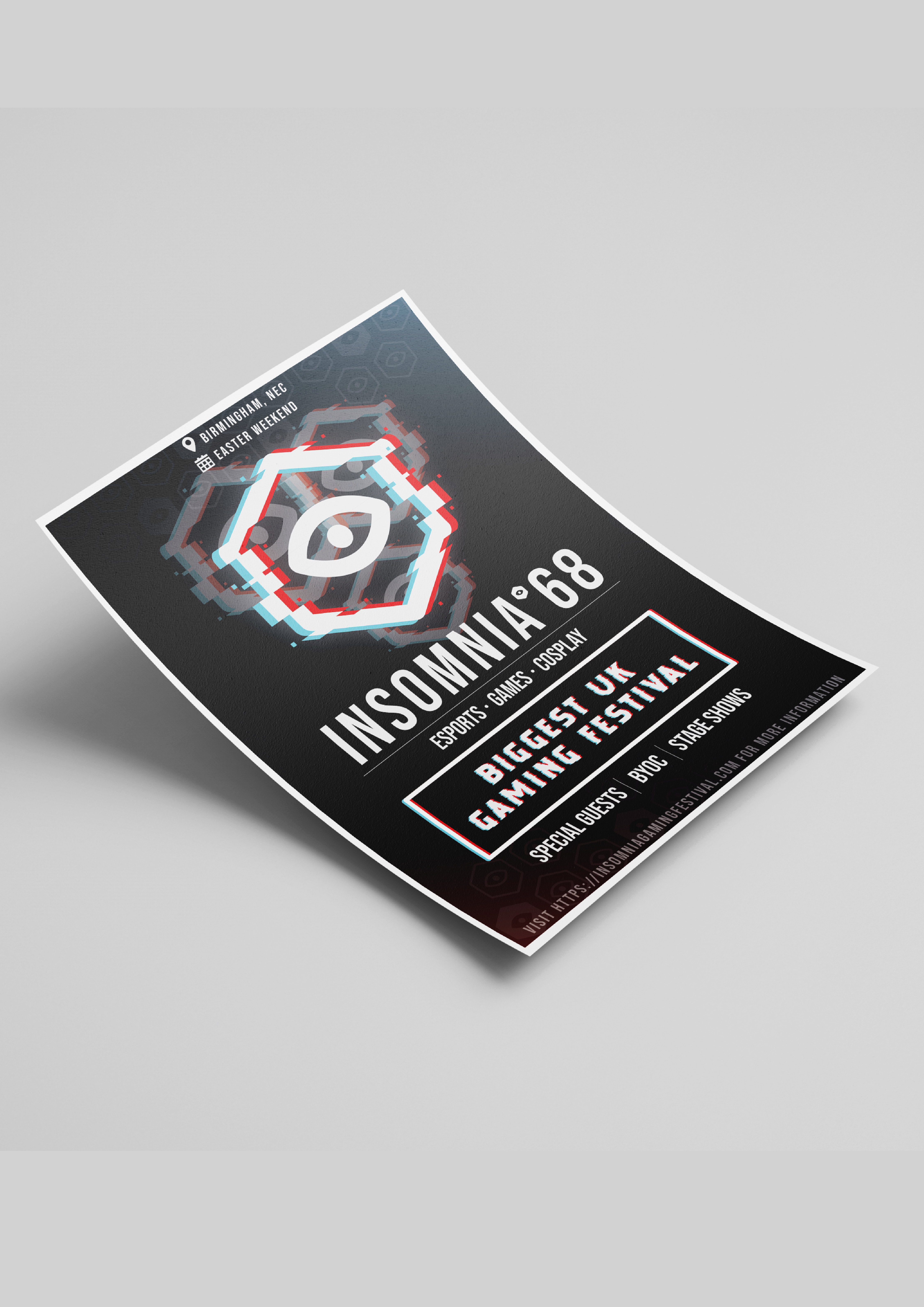
After exporting my flyer as a high-quality JPEG image, I imported it into a mockup PhotoShop file to display my design in the way it would if it was printed.
